July 2009 Archives

Regular readers of greg.org know it, but I'll say it upfront: I'm Team MoMA. I've supported the museum for years--I feel like I grew up in it, art-wise. And film-wise. Right now, MoMA's film department and programming are stronger than I can ever remember. It feels absolutely vital, critical. And even when the old timers SHHH! people for breathing too loud in the theater, it's great to see a movie there.

And yet the Bing theater at LACMA is even nicer. And yet, LACMA is suspending [i.e., killing] its film program. In Los Angeles. It's just mindboggling. They have to be planning a complete, and somehow different reboot, a makeover of some kind for which Michael Govan's only plausible path is going cold turkey.

Two home team analogies: MoMA's Projects series, which lived for a very long time just off the lobby as a small gallery for anointing emerging artists, but which was eventually brought back to the Taniguchi building as a roving showcase for [basically] New York debuts by global artists. Generally speaking, it seems to be working.

The other is more directly film-related: the Modern caught a lot of flak for closing its film stills collection, squeezing out the longtime curator and librarian--who happened to be active in the employee's union, and the whole thing went down around the time of the staff strike--and shipping the whole thing off to the film center in Pennsylvania. It was a controversial action, to say the least, but [film] life goes on. What the net impact is, nearly a decade later?

So yeah, I'm alarmed by Govan's decision and by Kenneth Turan's outrage over it. But I also have to hope that some kind of substantial film program will return, even if it's new and different and takes a while. Because I can't imagine otherwise.

LACMA slaps film in the face [latimes]

So while we were staring slack-jawed at the computer graphics in Tron, Loren Carpenter had already produced and shown Vol Libre, this incredible fractal mountain flythrough animation two years earlier at SIGGRAPH--and had been hired on the spot by Industrial Light & Magic? And you're only getting around to uploading it now, nearly 30 years later?

Vol Libre from Loren Carpenter on Vimeo.

What else you hiding, Pioneers of Computer Animation? [via kottke]

framis_billboard_house1.jpg

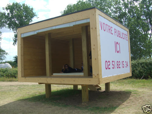
Estuaire is the three-time biennale in beta for the Nantes region. This year, the second incarnation includes I.C.I., Instant Carnet Island, a habitable, riverfront collection of micro-architecture which is for rent--EUR10/person/night, bring your sleeping bag--and for sale.

estuaire_for_sale.jpg

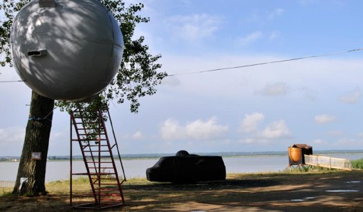
Several of the structures have been put on French eBay. Available items include both Antonin Sorel's L'étoile de l'amour [above, left], which is several puns at once on L'étoile de la mort [the Death Star, though in Star Wars ep. IV, it was actually called l'Etoile Noire]; and Damien Chivialle's ark for "amoreux hedonistes" [above, right]; but not, alas, Ant Farm's time capsule/video lounge recreation of their Media Van [above, center], which could probably teach the kiddies a thing or two about hedonistes, amiright?

There are less than two full days left, and so far, with only one 16-seat picnic table by the Dutch design firm 24h Living meeting the reserve, the whole thing seems destined to be a primarily conceptual exercise.

Unless people start bidding now!

flake_house_ebay.jpg

The Flake House [above, currently EUR2310] by the Paris architects OLGGA is pretty rustic-slick, about as practical as a folly can get; and Dre Wapenaar's Treetent [current bid: EUR2000] is a classic. But I think I'd take Spanish artist Alicia Framis's Billboard House [top] first. The opening bid is just EUR1000 [including breakdown and loading, but not shipping or reassembly].

Originally conceived for the Land project Rirkrit Tiravanija organizes in Thailand, Billboard House consists of just three billboards and a raised floor. It threads the utopian needle very nicely. It's unprecious and low-tech, a totally plausible-seeming affordable housing solution--for folks living the Thai, along the side of the road, do all your cooking and socializing and hygienic activities outdoors lifestyle.

Estuaire 2009 | Instant Carnet Island runs through Aug 16 [estuaire.info via thingsmagazine]
check out Estuaire09's items on eBay France, auctions end July 31 Paris time [ebay.fr]
Billboardhousethailand (2000) [aliciaframis.com]

update: in the end, everything had at least one bid, but only two of 24h Living's three tables sold.

Hah, Shatner reads Sarah Palin's exit speech on Conan.

I'd love to see this poem set to music. And then flash-animated.

Holy smoking man, I'd forgotten about his "Rocket Man":

[via felix]

July 27, 2009

Dance, Memory

I'm surprising myself by how much I feel the loss of Merce Cunningham, or more precisely, how much more acutely I'm feeling an appreciation for his work right now.

From the LA Times' obituary by Lewis Segal:

"When you work on something that you don't know about, how do you figure out what's right for that moment?" he asked rhetorically in the 2005 Times interview. "Using chance can be a way of looking at what you do in another way without depending always on your memory. It helps something else to come out that otherwise you wouldn't have known about."
And from Alastair Macaulay, the NY Times dance critic who's obviously been deeply contemplating for years having to write Merce's obit at some point:
Mr. Cunningham often spoke and wrote movingly about the nature of dance and would laugh about its maddening impermanence. "You have to love dancing to stick to it," he once wrote. "It gives you nothing back, no manuscripts to store away, no paintings to show on walls and maybe hang in museums, no poems to be printed and sold, nothing but that single fleeting moment when you feel alive."
On the other hand, there's always this hilariously insipid interview by R. Couri Hay from a 1974 Cunningham-Cage party at Louise Nevelson's place to lighten the mood. My favorite "question" is around 27:00: "Perhaps, Mr Cage can tell- can we ask you about-- can you tell us some of the--interesting things that happen when you were working with--Mr Cunningham--tell us all about some of the--incredible little things that must have happened when you were working out some, uh, new--fabulous things?"

Was watching this ancient panel discussion, "Time and Space Concepts in Music and Visual Art," from Pleiades Gallery in 1978 with Merce Cunningham, but then I totally fell for Nam June Paik all over again instead. A couple of pull quotes:

In any other profession like lawyers, dentists, sanitation workers, or teachers, if you do fairly well, slightly above average, you can make a living. But only in art and heavyweight boxing, you have to be top five to pay your rent.

[laughter]

It's strange, especially because in heavyweight boxing, you know more or less who wins. The fight can be fixed, but not as easily as in the art world.

And this one, where Paik talks about peoples' complaints that video art is boring, and that it would be hard to write a PhD on the history of video art, because all the material you'd have to sit through would take a hundred years. It's not the random access of an encyclopedia vs the sequential access of video, though, that's strikes a particular chord, but the realization that the panel's participants--Cage, Paik, Cunningham--are now gone [stay healthy, Richard Kostelanetz and Dore Ashton!]:
Life, we cannot repeat. Life is sequential access. However, videotape is changing that: life as a sequential access.

If you freeze a time and retrieve them. So you keep certain access--1967, 1955--frozen. Like an icebox. You can go access cheese, butter, eggs. And you can go back to your twentyhood, thirtyhood, childhood, in random access. That, videotape is doing. So the beauty of videotape produced now will be appreciated in 2000. It's like antique hunting.

On another note, it's kind of comforting/ennervating to see that the medium of panel discussion is still sequential, often boring, and characterized by audience essays in the form of a question.

Time and Space Concepts in Music and Visual Art (Part I) (1978) [ubu]

Bell Labs engineer Billy Kluver helped design photocells so that dancers triggered lights and sounds and films [with images by Stan VanDerBeek and Nam June Paik.] According to
media art net, this excerpt was from a 1965 TV performance of the work in Hamburg. [mediaartnet.org]
Related: Merce Cunningham video at Ubu

auerbach_paulson_1.jpg

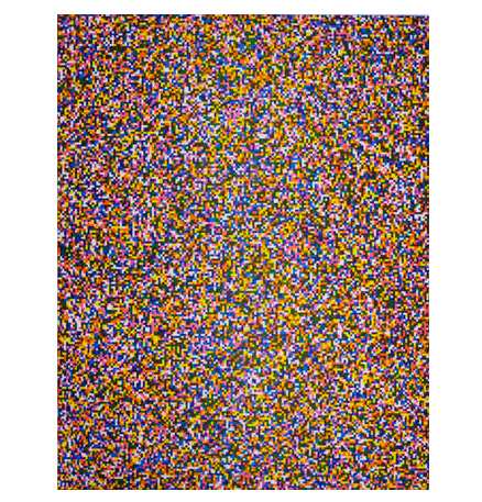
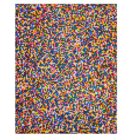
I'd seen Tauba Auerbach's text- or letter-based paintings before, but I didn't know about her prints. She did a couple of pairs of prints using pixels last year with Berkeley-based Paulson Press. There's a black and white set, 50/50, where exactly 50% of the pixels shown are white and 50% are black, and then there's an 8-color set called A Half Times A Half Times A Half.

Without knowing how or why they were made, I was first drawn to the different resolutions, which she calls "fine" [above] and "coarse" [below]. [And the color ones obviously remind me of Gerhard Richter's Farben painting series from the early 1970s, which became the basis for his stained glass window in the Koln Cathedral.]

auerbach_paulson_2.jpg

Then I realize they're aquatints, etchings--Paulson Press specializes in intaglio printing--and not printed digitally, so there's an interesting transition from digital to physical. And the printing technique itself adds a layer of imperfection to a "perfect" digital original.

Of 50/50, Auerbach said [pdf]:

I was thinking about binary as a language, like binary code for computers, as well as just the binaries within the English language, and how in binary code there's just zeros and ones.

You have to represent everything, including the ambiguous, with just those two components.

So she's started introducing randomness. The b/w pixels are randomly placed, but it really pops in the color etchings:
I created three plates. And these three pigment primaries are like the process primaries used for printing --cyan, magenta, and yellow. And on each plate there's a random pattern of colored squares and blank squares, and they overlap at varous probabilities to create seven possible colors--or eight if you include the white. So, the three primaries, the three secondaries, and then a seventh color where all three overlap, and then the white where none overlap.
So if I'm reading that right, each plate could be printed with any of the three colors. The plates x inks would generate a the number of permutations--though it'd be doubled if the top and bottom of the rectangular plates are reversed.

As I'm typing this, it sounds like a Sol Lewitt, too, an early, exhaustive Lewitt serialization made in the mature Lewitt's palette. But there are at least 84 possible combinations for each print--if the top/bottom of each plate don't matter, there are 816--and Auerbach's edition size is only 30. Sounds like introducing a bit of randomness into the process was plenty. I'm sure her printers were relieved.

Tauba Auerbach prints [paulsonpress.com via 16 miles of string]
Tauba Auerbach prints press release - pdf [paulsonpress.com]

July 25, 2009

Heh, Joghurtbecher

joghurtbecher_beiky.jpg

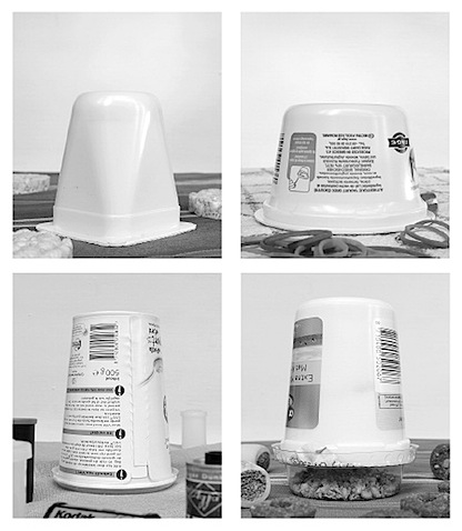
Not only is Becher German for gridding up large assortments of black & white photos of similar things in a self-consciously futile attempt to catalogue the entirety of the built environment, it also means cup!

Beierle + Keijser's joghurtbecher [beikey.net via kottke]

Here are some dots I never would have connected. When Stephen Shore took his photography-changing 1972 road trip from New York to Amarillo, was he going to see Stanley Marsh 3?

No se, but as this portrait shows, Shore definitely made it [back?] to Marsh's by 1975:

stephen_shore_stanley_marsh.jpg

I've been a huge fan of Shore's work for a long time, and I have a hard time seeing myself asking a single one of the questions Steve Lafreniere asks. Maybe that's why this interview is so interesting.

Stephen Shore interviewed by Steve Lafreniere [viceland.com]
image: Stephen Shore, Stanley Marsh and John Reinhardt, Amarillo, Texas, February 15, 1975 [viceland.com]

I was researching a project just now, came across this, and then noticed the date:

ROBERT SMITHSON, 35, A SCULPTOR, IS DEAD

July 24, 1973, Tuesday
Page 41, 227 words


Robert Smithson, a sculptor, was killed in the crash of a light plane on Friday, along with the pilot and a photographer, as they were inspecting one of his "Earth works" under construction on a ranch near Amarillo, Tex. He was 35 years old and lived at 799 Greenwich Street.

[The New York Times]

Wow. This is a commercial for Cellcom, an Israeli cell phone provider. Check out the [so far unacknowledged] original, "Yeah, yeah, We speak perfect English. Just Serve," a documentary short made by Wholphin editor Brent Hoff and Josh Bearman at the oceanfront border of the US and Mexico. It was included on Wholphin vol. 3:

Now check out the Palestinian remake/response:

Unbelievable. [via andrew sullivan]

Damn, but that is one fantastic propaganda billboard. James Hill shot it for the NY Times. Apparently, it's in Abkhazia, and the two guys are the presidents of Abkhazia and South Ossetia, two breakaway provinces of Georgia.

LAXART curates an art billboard pretty well, and I guess the medium's appreciated more there, but I'm really surprised at how rare are the instances of traffic-stopping, naturalistic [sic] photography on a billboard.

There's Felix, of course, and maybe he's part of the problem, because he set my expectations so high with his 1992 MoMA Projects show, which consisted of a photo of his and Ross's unmade bed on billboards around Manhattan. Coming across those things in the cityscape blew my tiny little mind.

But then, it was the early 90s, and Benetton was certainly making use of naturalistic or photojournalistic imagery in its advertising. We're so inured to the standard billboard vocabulary--Alive! Newport compositions, supergraphics, 3D gimmicks, blownup print ads--that they stop registering, if not become completely invisible. And yet unless we go to Abkhazia, all we get is Patrick $#*%ing Mimran's vapid fortune cookie sayings.

July 21, 2009

Convergence

jetty_ball_art21.jpg

If I'm a little high right now, it's just because these conservators just hit like every art button I have:

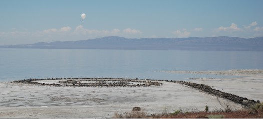
To photo-document Spiral Jetty, we used a tethered helium balloon about 8-10 feet in diameter, attached to a digital camera that would take an image every few seconds until the camera's memory card filled up. Each of us let out string from a spool and sent the balloon up anywhere from 50 to 600 meters, depending on what we were trying to capture and other factors such as wind and amount of helium to give lift. The results were absolutely amazing! Now I have a low tech, low cost way to take aerial images of the sculpture -- something I plan to do on an annual basis. These images can be paired with data that we collected using a Total Station survey instrument in order to create scaled 3D maps and diagrams of the Jetty and its materials.
Extending the Conservation Framework: A Site-Specific Conservation Discussion with Francesca Esmay [art21.org via man]

Saturday night we went to the Kennedy Center in Washington for the National Symphony Orchestra's commemoration of the 40th anniversary of the moon landing, Salute to Apollo: The Kennedy Legacy. It was the wackiest cheesefest of a concert I've ever been to.

We tried to puzzle out how a program like this came together. NASA was heavily involved, of course, and there was a mix of the nerdy with the obligatory and the available. But I have to think that the prime directive for the evening was written by NSO conductor Emil de Cou, who might be a gigantic space nerd.

The Playbill mentions de Cou's multiple NASA colabos, including the smashing success of the NSO's multimedia performance of Holst's The Planets at Wolftrap in 2006, with narration written by de Cou and performed by Leonard Nimoy and Nichelle Nichols.

Three of these planets were repeated on Saturday, only instead of Spock and Uhura, the narrators were Scott Altman [commander of the last space shuttle mission] and Buzz Aldrin, who is a giant, if amiable, ham. But also a good sport, since Neil Armstrong apparently doesn't do parties anymore. In addition to his Presidential Medal of Freedom, Aldrin wore some kind of bulbous, metallic, Airstream bowtie. We had truly excellent orchestra seats, and even the most eagle-eyed among us couldn't figure out what had landed there around Buzz's neck.

The Planets ["Mars," "Saturn," "Jupiter"] were accompanied by dramatic pans of NASA imagery on the large overhead screen. But I'm getting ahead of myself. The performance started, naturally/bombastically enough, with a gorgeous montage of Apollo 11 from Theo Kamecke's long-forgotten, recently rediscovered and remastered 1971 feature documentary, Moonwalk One--which was cut to the theme from 2001.

2001, of course, came out in 1968, in the middle of the Apollo program, but before A11. And yet it suddenly felt inextricably linked to it, or conversely, the NASA programmers and audience themselves felt a continuity between the scientific and engineering facts of their missions and the science fictions of the time. Like how members of actual Mafia families began patterning their behavior on The Godfather. This is not some cockamamie theory, as the rest of the NSO program clearly illustrates:

Horst was followed by John Williams' theme song to--no, not what you're thinking, not yet--Lost in Space. Introduced on video by June Lockhart, who then made a "surprise" live appearance on stage. She was over the moon with excitement, which I took as a sign that she doesn't do much onscreen work these days. She was thrilled to be there.

Then there was a medley of Star Trek themes, introduced on video by a funny/kooky Nichelle Nichols. She looked great. Clearly, de Cou has stayed in touch. About ten seconds into the orchestra's intense rendition of ST:TOS, I realized I should have been recording it on my phone to use as my ringtone. But I didn't.

Nichols didn't appear on stage, instead the orchestra headed straight into its John Williams Star Wars medley.

Then Denyce Graves came out to sing a moon-related aria from Dvorak, which was the accompaniment to, was accompanied by--it was hard to tell--a montage of beautiful film footage of astronauts jumping around the moon and driving their moon buggies, scenes which caused the audience to erupt in bursts of laughter. Which was not funny, because the song, from Rusalka, is basically the Czech Little Mermaid singing about trading her voice for love or something.

Anyway, then Jamia came out. Never heard of her, but she's apparently the black Hannah Montana. Then Chaka Khan came out in a Victorian bordello outfit to sing some NASA-commissioned anthem by a famous jingle composer ["You deserve a break today/ So get up and get away"]. Then the Army chorus sang "America the Beautiful" and John Phillip Sousa. I didn't even know it had words. And then we left.

God bless America and its grandiose cheese spectacles.

Not 2004 when the state put up a sign pointing to it. Not 2002, when my sister first took a college date out to see it but Artforum's Nico Israel couldn't find it. 1994.

After a Salt Lake City artist friend, Patrick Barth, told me that Robert Smithson's Spiral Jetty was partially visible in mid-summer 1994, I drove to the Jetty in my sister's car--no way I'd take my own car--in early August 1994. The larger rocks were visible, forming a fragmentary outline of the structure. They were all covered in glistening salt crystals.

So please, enough with the, it re-emerged whenever the New York Times first found out about it nonsense.

I've had Christy Lange's long 2005 Tate Magazine essay about revisiting conceptual art systems open in my browswer tabs for weeks now, but I hadn't read past the Walter deMaria section that first led me to it. Well, it's just wonderful, and it builds to a wonderfully satisfying failure of an ending. Here are a couple of paragraphs on Jonathan Monk:

In Return to Sender (2004) Monk co-opts On Kawara's series I Got Up (1968-1979), in which Kawara sent postcards to friends and colleagues systematically reporting his whereabouts. Tearing the pages out of a catalogue that documented the work, Monk dutifully sent the pages back to the original addresses, hoping for responses, yet knowing Kawara had long left the location. "That's something where the possibility of failure is there before you start," says Monk. Using Kawara's own system as a point of departure, he created another, more illogical system, resuscitating a work from the past.

...

What contemporary artists such as Ström, Landers and Monk tap into is not the cold rationalism of conceptual artworks, but the cracks in their objective systems, or the vague, fleeting appearance of insecurity or doubt. Combined with their own conflicts about the system of the art world, what they allow us to see is not the patent successes of previous works, but their occasional futility and failure. While some conceptual art is rigorous and methodical, intellectual and distanced, it can also be paradoxical or daft, emotional or romantic. There is something fragile and fallible about taking on a project that can't be finished, performing an act that can't succeed, or creating a work that will never be seen. It is the repeated, unsure attempts and predictable small failures that constitute the self-effacing and endearing quality of meaningless work.

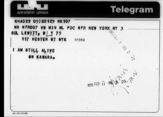
I guess I'll have to get the book, but Kawara's I Am Still Alive is typically described as a series of telegrams, and none of the examples I've ever seen include a return address. Still, great stuff.

kawara_lewitt_hester.jpg

Here's a tidy description from the book [published in 1981 in an edition of 800] of Kawara's daily process, which I guess would be easy enough to reverse engineer from his various bodies of work:

Kawara's days in New York were no different in any respect from those in Mexico. As soon as he awoke, he prepared and sent off his I GOT UP postcard. He spent six or seven hours painting the date. He typed years B.C. on his typewriter. From time to time, in answer to requests for his work or as private communications, he would send telegrams to places around the world saying: I AM STILL ALIVE ON KAWARA. And then, before going to bed, with a slash he would cross off the day on his hundred year calendar.
The book reproduces all of Kawara's 'I am still alive' telegrams through the end of 1977 in original size and chronological order.

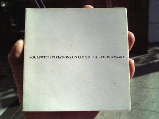
Also, this: Variations on I am still alive On Kawara, by Sol Lewitt, pub. 1988 [image via bookendless]

lewitt_kawara_bookendless.jpg

Bound to Fail, Tate, Summer 2005 [tate.org.uk]
Related to the exhibition,
"Open Systems: Rethinking Art c.1970", which ran through Sept. 2005
Also related:

July 19, 2009

Signed, Richard Nixon

nixon_on_moon.jpg

Left behind on the moon:

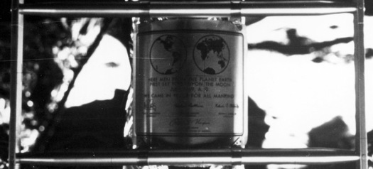
This commemorative plaque, attached to the leg of the Lunar Module (LM), Eagle, is engraved with the following words: "Here men from the planet Earth first set foot upon the Moon July, 1969 A.D. We came in peace for all of mankind."

It bears the signatures of the Apollo 11 astronauts Neil A. Armstrong, commander; Michael Collins, Command Module (CM) pilot; and Edwin E. Aldrin, Jr., Lunar Module (LM) pilot along with the signature of the U.S. President Richard M. Nixon.

[via nasa images]

Like everyone else, I see modern architecture--the whole modern world, or at least the West Coast of it--in glorious black and white, thanks to Julius Shulman. Just as Hugh Ferris's smoky charcoal skyscraper renderings defined Gotham a generation earlier, Shulman's has been the formative, definitive lens through which postwar Los Angeles has been seen and understood.

So even as I miss him in one human sense, I'm kind of relieved he's finally gone. Now maybe a new perspective of modernism has a chance to take hold. Or maybe an old one, who knows? Just something, anything besides relentless Shulmanism.

Christopher Hawthorne has a couple of open-eyed remembrances of Shulman and his double-edged relationship to the city he documented so long and loved so much:

Shulman's vision of modern, stylish domesticity was in many respects an airbrushed one. It's hard to believe anybody actually ever lived the way the carefully posed models in his photographs seemed to, carrying a tray out onto a poolside terrace, or sitting in perfectly pressed suits and dresses on the edge of a Mies van der Rohe chaise longue, city lights twinkling in the distance.

But his images were impossible to resist as a kind of mythmaking, even for the most tough-minded observers of life in Los Angeles. To look for any length of time at a Shulman picture of a great modern L.A. house is to get a little drunk on the idea of paradise as an Edenic combination of spare architecture and lush landscape.
Hawthorne also wrote another, more personal reminiscence of Shulman:
He was known for a certain blunt irascibility by that point in his life - he was 94 when we met, for God's sake - but I never saw that side of his personality. He was dogged in his view that life in Los Angeles, as he told me once, was "simply glorious," and that put him at odds with the generation of photographers, architects and artists who followed him, many of whom were more interested in exploring a grittier, less elevated vision of what it meant to be here.
The one time I met Shulman was after a public event, where his cantankerous charisma was turned up to 11. It was impossible not to be rooting for him all the way that night, even though I kind of regretted it in the morning.

That phrase, though, about others who "were more interested in exploring the grittier, less elevated vision of what it meant to be here [i.e., in Los Angeles]" gets to me. Hawthorne saw Shulman as a promoter; I'd probably go with evangelist. But the point is, sometimes it's not a matter of exploring what it means to be someplace, it's a matter of just being there and seeing what's around you. It's like Shulman knew what he'd see before he ever got there.

greglynn_seed.jpg

Herbert Muschamp in a giant weather balloon movie in Monaco WHAT?

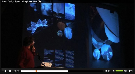
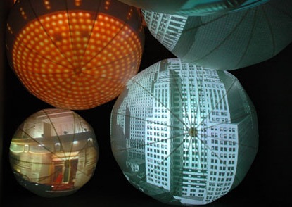
This is something we did in Monaco where we put Herbert Muschamp's text, "Bubbles in the Wine," to film. It was my job to go out and find these weather balloon manufacturers that had these funny-shaped screens that had projectors inside them. And what Peter with Imaginary Forces did was to figure out how to cut a nine-screen film simultaneously so you sometimes get a single image, you sometimes get multiple images on the balloons.
That's Greg Lynn, speaking last year at MoMA's "Design and the Elastic Mind" exhibition, as presented by Seed Magazine.

greg_lynn_grimaldi2.jpg

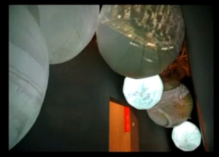
Sure enough, he wasn't making it up. In 2006, Germano Celant brought in Lisa Dennison to help curate, "New York, New York," a giant summer show at the Grimaldi Forum. Lynn, Imaginary Forces, and UN Studios worked as United Architects, the collaborative they formed for the World Trade Center rebuilding competition.

Here's the brief:

UA created an immersive space that told the story of the last 50 years of New York Architecture through an animated narrative, scripted by Herbert Muschamp. Eight synchronized films and a uniquely New York soundtrack told a story of the past, present and future of the city. By suspending eight 20-foot balloons with interior projection from the ceiling and walls, IF transformed the balloons into a new architectural media delivery system.
greg_lynn_grimaldi1.jpg

And here's IF's quick making of video, which Warner Music Group unceremoniously stripped the soundtrack from:

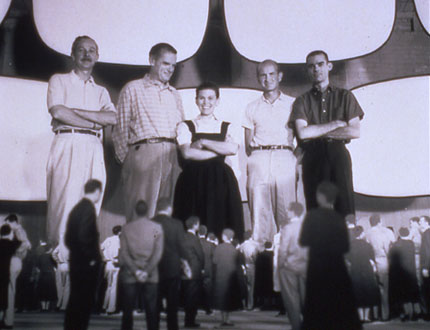
Hmm. First off, this all sounds straight from the Eameses' expo playbook. Their collaboration with George Nelson, for example, at the 1959 American National Exhibition in Moscow. Glimpses of the USA was a 7-screen film epic of American material awesomeness, shown in a dome pavilion, and designed to blow hapless Commie minds. [My mind was blown a little bit just by this photo of the Eameses standing inside a mockup of the pavilion. via]

eames_moscow_mockup.jpg

And of course, the Eameses went on to make approximately one million movie/slide/multimedia presentations and exhibitions for IBM, a format which was later cloned in every Park Service visitors center I went to as a child. So on the bright side, there's no need for a proof of concept!

All told, the installation as realized, with the balloon screens seemingly dispersed on either side of the narrow, Nauman-esque exhibition space, doesn't seem to have quite the impact that UA originally imagined. Check out the drawing over Lynn's shoulder above, where the balloons are all clustered like sperm around an invisible egg. [Which would have been you, by the way, the viewer. You were the egg. And Joe Buck was the sperm. Muschamp is whooping in Heaven right now at the thought, I'm sure.] Point is, the panoramic wall is closer to what UA realized in their "New City" installation at MoMA.

Meanwhile, there's not much online about "New York, New York," which was subtitled, "Cinquante ans d'art, architecture, photographie, film et vidéo." From the Art in America writeup, it sounded like a sprawling mess and a bit of a trophy dump, not necessarily a bad thing. Of course, half the article is about expo logistics and insurance and transporting masterpieces [sic], so who knows? Also, I can't find this Muschamp "Bubbles" essay anywhere online. Please tell me someone somewhere's working on a collected works.

Monaco starts around 3:30: Seed Design Series | Greg Lynn: New City [seedmagazine, thanks greg.org idol john powers for the tip]
Experience Design | Bubbles in the Wine, 2006 [imaginaryforces.com]

talese_shirtboard.jpg

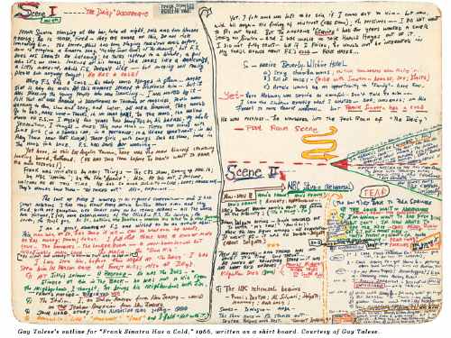
Gay Talese writes everything everyday on shirtboards--

INTERVIEWER
Do you use notebooks when you are reporting?

TALESE
I don't use notebooks. I use shirt boards.

INTERVIEWER
You mean the cardboard from dry-cleaned shirts?

TALESE
Exactly. I cut the shirt board into four parts and I cut the corners into round edges, so that they can fit in my pocket. I also use full shirt boards when I'm writing my outlines. I've been doing this since the fifties.
INTERVIEWER
So all day long you're writing your observations on shirt boards?

TALESE
Yes, and at night I type out my notes. It is a kind of journal. But not only my notes--also my observations.
INTERVIEWER
What do you mean by observations?

--including the outline for the Greatest Magazine Article Ever?

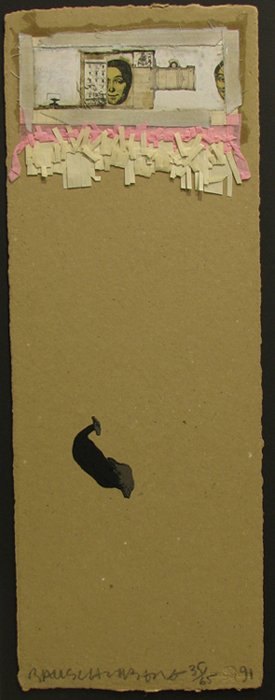
rauschenberg_shirtboard1.jpgRobert Rauschenberg developed his abstract/pop collage techniques on shirt boards, while traveling to Italy and Morocco with Cy Twombly in 1951-3. The pair [couple?] of young artists fresh from Black Mountain College were traveling on Twombly's grant money, which meant Rauschenberg had next to nothing to buy art materials with.

So he collaged cheap prints, newspaper, feathers, drawings, and random stuff onto the shirtboards from their laundry in an irreverent twist of his teacher Josef Albers' technique.

In 1990, just as Walter Hopps' incredible show, "Robert Rauschenberg the Early 1950s" was preparing to debut at the Menil, the artist collaborated with Styria Studio to produce meticulous replicas of 20 of the shirtboard works in an edition of 65.

Within the first five minutes of walking into the Menil for the first time, I met Cy Twombly standing in front of his chalkboard painting in the lobby. He had just completed his interview for Hopps' catalogue. Needless to say, I made it back to Houston for the opening, and then saw the show multiple times at the Guggenheim SoHo.

Beyond instilling a deep appreciation for Rauschenberg's interest in abstraction and conceptualism both, that show changed the way I look at shirtboards forever. Not that I've ever done anything about it, of course, just that it hits a nerve. What's worse about Gay Talese: he lives in my old neighborhood, so we might even share a shirt laundry.

a nice discussion of the Shirtboard works [icallitoranges]

July 12, 2009

Do Tell

Solicitors for the National Portrait Gallery are apparently threatening legal action against a US Wikipedia user for downloading 3,300 digital photographs of paintings in the UK museum's collection, and then uploading them to Wikipedia. Says Londonist:

All of the paintings are thought to be from the Victorian era or earlier, and are therefore in the public domain. The rather gristly bone of contention, however, is whether the high resolution images of those paintings are protected by their own copyright.
Seems that the NPG is claiming both copyright infringement for its photographs and database right infringement. Neither of these rights currently exist under US copyright law.

Obviously, I've been thinking quite a bit latelyabout the issues around reproducing artwork and the incipient loss/cost/penalty when art is transmitted in a copyright culture. It was always my understanding that museums which hold public domain works--which is the vast amount of material in museums, basically everything over 95 years old--tried to control reproduction of the work by limiting access to the work itself, or by requiring contracts for shooting work, or for using authorized reproductions. [Monticello, for example, has an insane, draconian, and expensive shooting policy that practically requires you to hire a gardener to follow behind and refluff the grass where your tripod had been standing.]

According to the NPG's solicitors, at least, US and UK laws differ on whether a photograph of an artwork has a copyright in itself, something distinct from the artwork being depicted. Should be interesting.


National Portrait Gallery To Sue Wikipedia User? [londonist via momalearning's twitter]

So earlier this week, the NY Post's Adam Nichols reported that the owner of the River Cafe, was suing for $3 million damages caused by Olafur Eliasson's The New York City Waterfalls:

Their suit, filed in Brooklyn Supreme Court last week, demands that the project's creators -- New York's Public Art Fund and Danish artist Olafur Eliasson -- be ordered to cough up the cash for repairs.

"There were 90 to 120 days of saltwater rain coming down on us," restaurateur Buzzy O'Keeffe said.

[Waterfalls ran 110 days, from June 26 to Oct 13, 2008, but for the last six weeks, the operating hours were cut in half.] ArtInfo, CityFile, New York Magazine, and some blogs picked up the Post's story.

BUT. I've searched through the relevant court filings, both for the Kings County - Brooklyn Supreme Court and Civil Court, and I can't find any record of an actual lawsuit.

Then on Thursday, the Brooklyn Paper's Mike McLaughlin talked with O'Keeffe for a story titled, "Buzzy prepares his sue-fflé over arborcidal artwork" with details ["The complaint, filed in Brooklyn Supreme Court on June 29..."] which make things even less clear:

The suit says that the River Café, owned by Michael "Buzzy" O'Keeffe, "continues to suffer damage and business loss as a result of the defendant's negligence."

Despite the court paperwork seeking $2.983 million in damages, O'Keeffe told The Brooklyn Paper that "the River Café is not suing anyone." He declined to elaborate.

So what began as a dispute over prematurely browned leaves last summer has now become extensive salt-spray-related structural damage and a year of lost business. And at least two reporters appear to have received, or been shown "court paperwork" by O'Keeffe, but there's nothing independently verifiable from the actual court.

I'll be honest, I started digging in this story to find some interesting/entertaining details buried in the lawsuit filing. But so far, it seems like the real story is just a whiny crank with a sweetheart lease talking smack because business is down in a depression and his city-funded arborists don't come around enough.

July 10, 2009

After After After

From Linda Yablonsky's article on The Pictures Generation in Art in America:

Bloom remembers seeing Levine's appropriated Walker Evans photos and thinking, "Oh my God, that is so radical and so insane. It was also brilliant. Sherrie didn't address any of the esthetic issues, just narrowed it down to the most essential idea about what constitutes ownership of an image, and that was it."

Joel Wachs, now president of the Andy Warhol Foundation, was a city councilman in Los Angeles in the '80s and an avid collector of art. In 1984, he saw Levine's "After Walker Evans" appropriations from 1981 and became the first person to buy one. "I remember having a hard time accepting it at first," he says. "What was this art, copying someone else's pictures? Then it started to open me up to a much broader way of thinking about art. The art itself had all the formal qualities I liked and also made people think about male dominance in the art world. Sherrie's work was $300 and Cindy's was $800, but some male painters were getting $75,000. When Kruger said, 'Your body is a battleground,' that was a clarion call for a political movement."

aftersherrielevine.jpg

Also, hmmm:

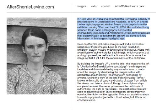
In 1936 Walker Evans photographed the Burroughs, a family of sharecroppers in Depression era Alabama. In 1979 in Sherrie Levine rephotographed Walker Evans' photographs from the exhibition catalog "First and Last." In 2001 Michael Mandiberg scanned these same photographs, and created AfterWalkerEvans.com and AfterSherrieLevine.com to facilitate their dissemination as a comment on how we come to know information in this burgeoning digital age.
Copying as a creative strategy carries within it the assumption of other copies.

Photo Play [artinamericamagazine via afc]
related: Untitled (300 x 404, after Untitled (Cowboy), 2003 by Richard Prince)

July 9, 2009

Chris Burden's B-Car

burden_bcar_pose.jpg

In April 1975, Burden brought something of an end to the series of extreme and/or dangerous performances that brought him such critical acclaim and notoreity. For a piece called "Doomed," he installed himself under a pane of glass in the MCA Chicago, and refused to communicate or move until someone made a gesture to help him. 48 hours into the piece, a museum guard named Dennis O'Shea offered him a drink of water, at which point Burden got up, smashed a clock, and left.

Said Peter Schjeldahl in the New Yorker,

"Doomed" unmasked the absurdity of the conventions by which, through assuming the role of viewers, we are both blocked and immunized from ethical responsibility. In O'Shea's case, the situation was complicated by his duty to maintain the inviolability of art works. There should be a monument to him, somewhere, which would commemorate the final calling of the bluff of art as a law unto itself.
What soon followed was B-Car. Burden:
During the two month period between August 24 and October 16, 1975, I conceived, designed, and constructed a small one passenger automobile. My goal was to design a fully operational four-wheel vehicle which would travel 100 miles per hour and achieve 100 miles per gallon. I imagined this vehicle as extremely lightweight, streamlined, and similar in structure to both a bicycle and an airplane.

Once the project was conceived, I was compelled to realize it. I set the goal of completing the car for two shows in Europe. I saw building the car as a means toward the end of driving it between galleries in Amsterdam and Paris as a performance. When I arrived in Amsterdam, I knew that the accomplishment of constructing the car had become for me the essential experience. I had already realized the most elaborate fantasy of my life. Driving the car as a performance was not important after the ordeal of bringing it into existence.

chris_burden_b-car_cov.jpg

[A book about the B-Car was published by Ronald Feldman in association with his 1977 show of the car and its documentation. With the Internet, nothing is really rare anymore, just varying degrees of expensive.]

The B-Car's adolescent soapbox derby form and Burden's deadpanned motivation for the project--"realiz[ing] the most elaborate fantasy of my life" resonates with Schjeldahl's description of the artist as, "a boyish gimcracker diverting us by diverting himself." In one sense, Burden's ongoing use of toys, and his toy-like deployment of industrial machinery, equates artistic production as a reversion to childhood, a mix of "I've always wanted to do that!" and "my kid could do that!"

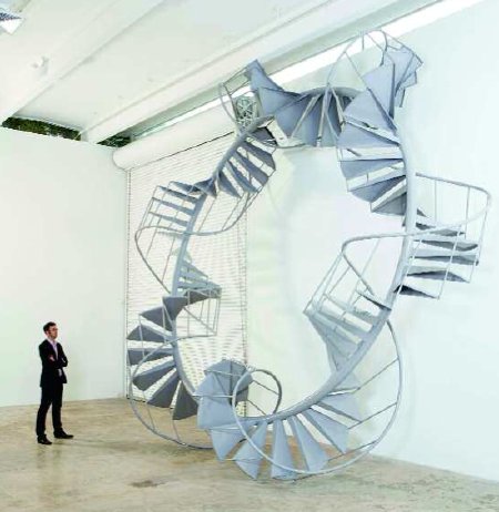
But it reminds me of another seemingly unassuming but obliquely profound artist, Peter Coffin, who said he made his incredible 2007 sculpture, Untitled (Staircase) because "it stuck in my mind." [pdf] Of course, it also reminds me of John Ivers of Bruceville, Indiana, who built himself a roller coaster in his backyard. It's called Blue Flash.

peter_coffin_staircase.jpg

Previous Chris Burden: video of Beam Drop and other projects; Chris Burden's TV ad

July 8, 2009

The DaVinci Crowd

c-monster_mona_lisa.jpg

When I first saw Sebastian's stunning photos of the Mona Lisa at C-Monster, I was, naturally, stunned. I haven't been to the Louvre since 2005, when la Joconde was moved to its new, purpose-built space, designed by Peruvian architect Lorenzo Piqueras, la Salle de la Joconde.

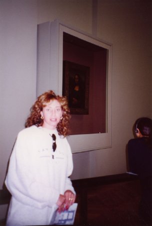
When I'd last seen it, it was in its temporary hyperbaric chamber, and looked a lot like this picture from Steve and Sygi's 2001 Mediterranean cruise [which apparently stopped in Paris?]:

mona_lisa_sygi_2001.jpg

And of course, before that, it was in its own similarly sized but nicer capsule in la Salle des Etats, where it was surrounded by several invisible paintings.

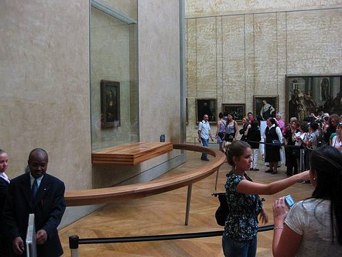
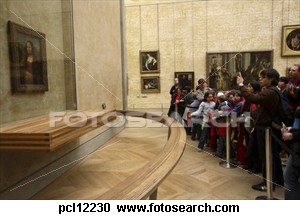
So, stunned. Despite having provided a dedicated room, with a freestanding wall, and a massive laminated podium [whose main function, it seems, is to properly position the painting's LED footlight, which is color-calibrated to counter the yellowing effects of age], and a curved rail, the Louvre finds it necessary to add another, temporary ropeline a couple of meters farther back.

This, ironically, for a picture whose most powerful innovation, according to the Louvre curator of 16th century art Cecile Scaillerez, is "abolish[ing] the distance between the model and the viewer by getting rid of a foreground, which created a barrier in pictures of the time."

The sheer scale of the ridiculousness of this museological condition set my mind racing. The Mona Lisa has been moved eight times within the Louvre. Wouldn't it be awesome to do a show where each work--I don't know what, but they're probably some paintings or whatever, that's not important now--is shown in a recreation of each of these various installations?

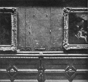
Ooh, there'd be that classic belle epoque 1911 hang it was stolen from:

Mona_Lisa_stolen-1911.jpg

You could just whip up a chair rail out of injection molded plastic or whatever, paint the whole thing White Cube White, maybe Triple Candie the vitrines and railings a bit to provide suitably ironic recontextualization.

And five or so others, I guess. What do they look--wow, searching for photos of the Mona Lisa is mind-numbingly boring. Did you know there's even stock photography of excessive crowd control measures in front of the Mona Lisa that looks like half the photos of the Mona Lisa in the world?

mona_lisa_fotosearch.jpg

Or that the other half are photos of people taking photos of the Mona Lisa? Turns out if someone isn't actually coming to the Louvre on a pilgrimage to see the World's Greatest Painting, they're coming to self-consciously note their position at the vortex of the painting's massive cultural scrum.

So the Mona Lisa and contemporary art: is there anything interesting or useful to be learned, studied or said? When you're one of six billion monkeys who've stepped away from our typewriters for a bit to take in some Art, the odds that you are the one who's going to spit out something worthwhile are pretty damn slim.

But there's a world of difference between "there's nothing left to say" and "there's nothing to be said," and what does it mean for the contemporary art world if all it can do is gawk, sneer, or sigh at the Louvre's greatest attraction?

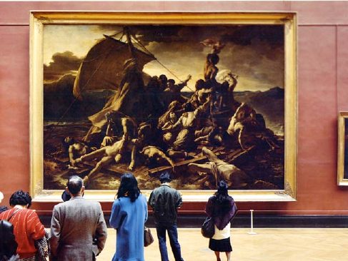
thomas_struth_louvre-IV.jpg
Thomas Struth, Musee du Louvre, IV, 1989

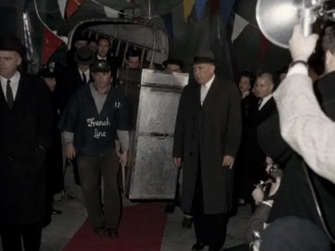
It seems folly to carve it out and claim it's irrelevant. Did you know that the official American artscape [sic] of the last two generations--blockbuster museum exhibitions and the NEA and NEH included--is a direct result of Jacqueline Kennedy seducing Andre Malraux into loaning the Mona Lisa to the National Gallery and the Met in December 1962? And that Jackie enlisted Mark Rothko, Franz Kline, and Andrew Wyeth [?] in her plan? I did not. Until I read Bob's blog post about Margaret Leslie Davis's book, Mona Lisa in Camelot. Here's a picture from Davis's website of the Mona Lisa getting off the boat in New York:

mona_lisa_in_nyc_davis.jpg

lawler_ubs_brochure.jpg

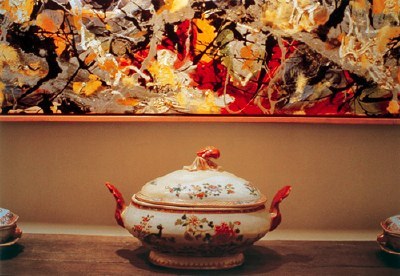
Of all the work in the Met's Pictures Generation show, Jack Goldstein's surprised and intrigued me the most, but I liked Louise Lawler's the best. That Pollock/soup tureen photo that's been making the marketing rounds for the show is smart and sublime.

But I was annoyed enough by the smugness of this wall text on another Lawler that I had to write it down. [And my iPhone typing technique was so bad, it's taken me until now to decode what I wrote--and it turns out to be published on the Met's site anyway]:

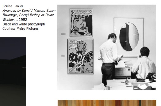
Arranged by Donald Marron, Susan Brundage, and Cheryl Bishop at Paine Webber, Inc. is both deadpan and poignant. Unlike the trophy paintings and sculpture hung proudly in reception areas, this trio of Lichtenstein multiples is lower down on the value scale and thus suitable for the decor of an office. The pictures hover like flies vying for the attention of a pair of anonymous bankers who ignore the "art" while struggling to send a fax. Lawler's diminution of her role as an "author" is meant both to highlight the collaboration of others (here, Paine Webber CEO, Castelli Gallery rep, and corporate curator) and to direct the viewer outside the boundaries of the image and toward the real life of which art is always a part. It is unlikely, however, that any of the arrangers appreciated the irony that Lichtenstein's pictures, originally meant to acknowledge (with a wink) their own status as commodities, now adorned the walls of an office copy room. What Lawler reveals is that the meaning of the artwork lies not in its origins but in its destiny. [emphasis added on the condescending, insidery part]
Really? And why, exactly, is that unlikely? I don't know Brundage or Bishop, and I've only known Don Marron a bit over the years through my fundraising work at MoMA. But it doesn't take a masters in curatorial studies to appreciate the ironies at play here; if anything, there are several layers of irony that seem to have been invisible from within the privileged wall text scriptorium at the Met.

First, there's that wink. When Lichtenstein put Benday dots on a painting, it was an ironic commentary on art's commodity status. When he cranked out prints for sale in editions of 250, not so much.

[One unintended irony: the two Lichtenstein comic panel prints, from 1965, are among his earliest and most important works. The artist himself considered "Sweet Dreams, Baby!" which was produced for the Original Art portfolio, "11 Pop Artists, vol. III," to be among his first successful "Pop prints." So while prints generally are considered to be "lower down the value scale" monetarily, these prints by this artist are in fact, quite significant art historically. Not that anyone at the Met is likely to appreciate that (wink).]

The fact that there are labels next to the works tells me they were selected and installed by Bishop or her Paine Webber staff, and that makes sense for a space that is probably not an office, but a common area or trading floor. But in the art-collecting corporations I've worked in, the commoditized nature of art--and viewer--was made exquisitely aware to you.

lawler_pollock_tureen.jpg

The Met's curator may not know this, but it's not unusual for employees to be permitted to choose the artwork for their office, and to have the value of the artwork be based on his seniority or profitability. First pick from the corporate collection can be as much of a perk or as the view or number of ceiling tiles you get.

But none of that is the reason the Met's wallquote bugged me so much. As awesome as I'm sure it is to be there, or to have your work shown there, or in the collection, the Met--any museum, really--is still a mausoleum for art. Lawler's work is so fascinating precisely because it explores the life [sic] of art outside of the white-glove, white cube of the museum, and it gains power from the unexpected resonance between the autumnal colors of a Pollock and the Limoges; between a Lichtenstein print and a fax machine. It should be a reminder of what gets lost when art's only presumed destiny it do end up in a museum. But it's unlikely that anyone at the Met can appreciate that irony.

update: Louise Lawler, on the other hand, sounds awesome. As does the late Mrs. Burton Tremaine, whose Limoges and Pollock that was. In conjunction with a 2007 show in Geneva reuniting the Tremaine Series, Andrea Miller-Keller, the Wadsworth Atheneum curator who gave Lawler her first museum show and who introduced her to the Tremaines, has compiled a pdf of articles, interviews, and documentation about the series and the people. Mrs. Tremaine provided the subtitle, "You're going to love the thermostat next to the Miro."

Since 2001 here at greg.org, I've been blogging about the creative process—my own and those of people who interest me. That mostly involves filmmaking, art, writing, research, and the making thereof.

Many thanks to the Creative Capital | Warhol Foundation Arts Writers Program for supporting greg.org that time.

comments? questions? tips? pitches? email
greg [at] greg [dot ] org

find me on twitter: @gregorg

about this archive

Posts from July 2009, in reverse chronological order

Older: June 2009

Newer August 2009

recent projects, &c.


our_guernica_cycle_ivanka_320px_thumb.jpg
Our Guernica Cycle, 2017 –
about/kickstarter | exhibit, 2017


pm_social_medium_recent_proj_160x124.jpg
Social Medium:
artists writing, 2000-2015
Paper Monument, Oct. 2016
ed. by Jennifer Liese
buy, $28

madf_twitter_avatar.jpg
Madoff Provenance Project in
'Tell Me What I Mean' at
To__Bridges__, The Bronx
11 Sept - Oct 23 2016
show | beginnings

chop_shop_at_springbreak
Chop Shop
at SPRING/BREAK Art Show
curated by Magda Sawon
1-7 March 2016

do_not_bid_or_buy_iris_sidebar.jpg
eBay Test Listings
Armory – ABMB 2015
about | proposte monocrome, rose

shanzhai_gursky_mb_thumb.jpg
It Narratives, incl.
Shanzhai Gursky & Destroyed Richter
Franklin Street Works, Stamford
Sept 5 - Nov 9, 2014
about | link

therealhennessy_tweet_sidebar.jpg
TheRealHennessy Tweets Paintings, 2014 -
about

sop_red_gregorg.jpg
Standard Operating Procedure
about | buy now, 284pp, $15.99

CZRPYR2: The Illustrated Appendix
Canal Zone Richard Prince
YES RASTA 2:The Appeals Court
Decision, plus the Court's
Complete Illustrated Appendix (2013)
about | buy now, 142pp, $12.99

weeksville_echo_sidebar.jpg
"Exhibition Space" @ apexart, NYC
Mar 20 - May 8, 2013
about, brochure | installation shots


HELP/LESS Curated by Chris Habib
Printed Matter, NYC
Summer 2012
panel &c.


drp_04_gregorg_sidebar.jpg
Destroyed Richter Paintings, 2012-
background | making of
"Richteriana," Postmasters Gallery, NYC

czrpyr_blogads.jpg
Canal Zone Richard
Prince YES RASTA:
Selected Court Documents
from Cariou v. Prince (2011)
about | buy now, 376pp, $17.99

archives