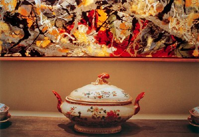
Of all the work in the Met's Pictures Generation show, Jack Goldstein's surprised and intrigued me the most, but I liked Louise Lawler's the best. That Pollock/soup tureen photo that's been making the marketing rounds for the show is smart and sublime.
But I was annoyed enough by the smugness of this wall text on another Lawler that I had to write it down. [And my iPhone typing technique was so bad, it's taken me until now to decode what I wrote--and it turns out to be published on the Met's site anyway]:
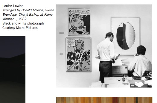
Arranged by Donald Marron, Susan Brundage, and Cheryl Bishop at Paine Webber, Inc. is both deadpan and poignant. Unlike the trophy paintings and sculpture hung proudly in reception areas, this trio of Lichtenstein multiples is lower down on the value scale and thus suitable for the decor of an office. The pictures hover like flies vying for the attention of a pair of anonymous bankers who ignore the "art" while struggling to send a fax. Lawler's diminution of her role as an "author" is meant both to highlight the collaboration of others (here, Paine Webber CEO, Castelli Gallery rep, and corporate curator) and to direct the viewer outside the boundaries of the image and toward the real life of which art is always a part. It is unlikely, however, that any of the arrangers appreciated the irony that Lichtenstein's pictures, originally meant to acknowledge (with a wink) their own status as commodities, now adorned the walls of an office copy room. What Lawler reveals is that the meaning of the artwork lies not in its origins but in its destiny. [emphasis added on the condescending, insidery part]Really? And why, exactly, is that unlikely? I don't know Brundage or Bishop, and I've only known Don Marron a bit over the years through my fundraising work at MoMA. But it doesn't take a masters in curatorial studies to appreciate the ironies at play here; if anything, there are several layers of irony that seem to have been invisible from within the privileged wall text scriptorium at the Met.
First, there's that wink. When Lichtenstein put Benday dots on a painting, it was an ironic commentary on art's commodity status. When he cranked out prints for sale in editions of 250, not so much.
[One unintended irony: the two Lichtenstein comic panel prints, from 1965, are among his earliest and most important works. The artist himself considered "Sweet Dreams, Baby!" which was produced for the Original Art portfolio, "11 Pop Artists, vol. III," to be among his first successful "Pop prints." So while prints generally are considered to be "lower down the value scale" monetarily, these prints by this artist are in fact, quite significant art historically. Not that anyone at the Met is likely to appreciate that (wink).]
The fact that there are labels next to the works tells me they were selected and installed by Bishop or her Paine Webber staff, and that makes sense for a space that is probably not an office, but a common area or trading floor. But in the art-collecting corporations I've worked in, the commoditized nature of art--and viewer--was made exquisitely aware to you.
The Met's curator may not know this, but it's not unusual for employees to be permitted to choose the artwork for their office, and to have the value of the artwork be based on his seniority or profitability. First pick from the corporate collection can be as much of a perk or as the view or number of ceiling tiles you get.
But none of that is the reason the Met's wallquote bugged me so much. As awesome as I'm sure it is to be there, or to have your work shown there, or in the collection, the Met--any museum, really--is still a mausoleum for art. Lawler's work is so fascinating precisely because it explores the life [sic] of art outside of the white-glove, white cube of the museum, and it gains power from the unexpected resonance between the autumnal colors of a Pollock and the Limoges; between a Lichtenstein print and a fax machine. It should be a reminder of what gets lost when art's only presumed destiny it do end up in a museum. But it's unlikely that anyone at the Met can appreciate that irony.
update: Louise Lawler, on the other hand, sounds awesome. As does the late Mrs. Burton Tremaine, whose Limoges and Pollock that was. In conjunction with a 2007 show in Geneva reuniting the Tremaine Series, Andrea Miller-Keller, the Wadsworth Atheneum curator who gave Lawler her first museum show and who introduced her to the Tremaines, has compiled a pdf of articles, interviews, and documentation about the series and the people. Mrs. Tremaine provided the subtitle, "You're going to love the thermostat next to the Miro."

