
I'm as excited as the next guy that there's an app for the Yves Klein retrospective at the Hirshhorn. I bought it the first day to try it out. I did not expect it to be as cool as the Yves Klein app in my head, which is a Brushes-like painting program where the choice of brushes consists of a flamethrower or a tiny, naked 20-year-old Frenchwoman. I would pay $5 for that right now, and send $5 App Store gift codes to a hundred friends.
As it turns out, the app is so mediocre, I started planning my sobering review almost immediately. Alas, I wasn't quick enough to get ahead of the wave of hype which has crashed on top of the app, including, most prominently, a fluff piece in the Washington Post. The most eyerolling nontroversy so far is from @museumnerd, who tweetwhined about an Android version: "isn't @hirshhorn promoting Apple products?" [Yes, just like they promote Weyerhauser products when they print their brochures on paper.]
Now it's important to get some real, constructive feedback out there early, try and nip the horrible practices in the bud before the museum app world is flooded with poorly designed brochureware.
To be fair to the HIrshhorn and the Smithsonian--and even a little bit to @museumnerd--the cross-platform app development imperative lies at the heart of the Klein app's problem. But I'll get to that in a minute, after taking a quick look at what the Klein app is, and where its greatest failings lie:
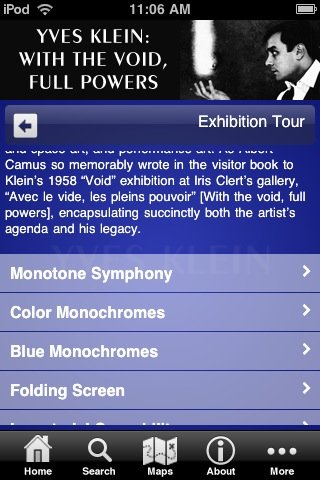
The app contains early iPod-like nested directory/menus of the exhibition and Klein's various bodies of work; a timeline, and basic map/visitor info for the Museum. At the end of each branch is an image of a work. There are a couple of film clips, but I could not get them to play. Throughout, most of the text consists of quotes from Klein himself.
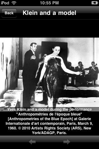
[Thanks to a single image of Klein and a bodypainted model at the Monotone Symphony performance [above], the app carries a warning that nudity makes it suitable for 12yo+. And just like that, the Hirshhorn app corners the 13-yo boy iPhone user demographic.]
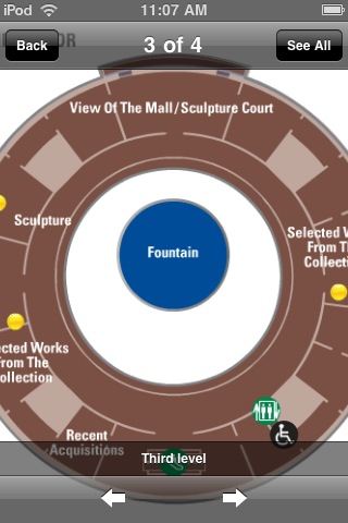
The text is incredibly small; the size cannot be changed. The volume of text, combined with the number of menu items and--most of all--the amount of screen space given over to a static header and a navigation footer, require scrolling to do or find anything. Images are zoomable, but they turn out to be merely web-resolution, so they immediately dissolve into pixels rather than allow any meaningful exploration. For Klein's large paintings and close-up surfaces, this is a dealbreaker. Ditto for maps of the Museum, which don't fit the screen.
I understand that most of the content is taken from a documentary playing in the gallery. This content, which would barely fill a three-fold gallery handout, turns out to be way too much. But the real problem isn't the Hirshhorn's 10 pounds of content; it's with the 5 lb bag.
The Museum built their app using Toura, a multi-platform mobile tour guide content management system from a New York-based startup. Museums just insert their content into Toura's cloud-based template system, hit publish, and voila! Apps for Everybody! Toura's model is to give away their easy-to-use development tools for free, and then split the app revenue with the museums and other tourist and travel site operators later.
To museums with no budgets and thinly staffed IT and design departments, a free, insta-app is as compelling as a 10-week, 5-figure app dev project is unworkable. I can't see that changing soon, and until someone proves otherwise by making a fortune with my nude-avatar-paintbrush Anthropometries app idea, I suspect $0.99 repackaged brochures will be the only game in town for a while.
Which is too bad. Because Toura's standardized design is so suboptimal and user-unfriendly, that it's almost better to do without. Especially if it's as poorly executed on an Android as it is on an iPhone. I checked out the only other Toura-based app available, too, for Pace Gallery's Conrad Shawcross installation in the IBM Atrium on 57th Street. It's marginally better, with less text, more iPhone-style slideshows, and working video, but it's still poorly designed, with tons of wasted screenspace, and no content that can't be found or done online.
For the biggest multiplatform bang for the buck, then, is seems like museums should focus on making their websites more accommodating to mobile browsing. And for the app-happy museum directors trying to get some PR, put out a free app that is basically a portal to your mobile-optimized site. You can then program it right alongside your web content management.
But this seems like the hurdle, both from a development and a user standpoint: if an app can effectively be replaced by an exhibition webpage or a gallery handout, then it probably should not exist. And it certainly should not exist as a paid product.
Of course, this calculation might be different for the Hirshhorn, a museum whose small bookstore maintains a large section devoted to the selling of its own mail--including old catalogues and exhibition brochures from other institutions.


