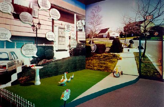
that sidewalk, that exit sign, that door. installation image of Stephen Shore's images, 1976
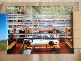
So yes, I've got a million other things to do, but thanks to this Mies thing being auctioned, and Michael Lobel's article on photography and scale--and by implication, photography and painting, pace Chevrier's forme tableau--I'm become slightly obsessed with the history of photomurals.
From what I can tell so far, I have the field largely [sic] to myself, but there is definitely some interesting work out there--and some interesting writing about it. And who should turn up as one of the innovators of these scale-blasting photomurals, but the master of the snapshot himself, Stephen Shore?
Just this past May, Swiss art historian Olivier Lugon published an article in Études photographiques titled, "Before the Tableau Form: Large Photographic Formats in the Exhibition Signs of Life, 1976."
Signs of Life: Symbols In the American City was a groundbreaking and somewhat controversial show held at the Smithsonian's Renwick Gallery as part of the US Bicentennial celebrations. Conceived in 1974 on the heels of the publication of Learning From Las Vegas by Robert Venturi, Denise Scott Brown and Steven Izenour, it was, depending on who you asked, an exultation, an examination, or an elitist excoriation of commercial and populist vernacular architecture and design. They filled the gallery with iconic roadside signs, and they created dioramas of archetypal American living rooms to give all Our Stuff the museological treatment.
And to photograph it all--and to create giant, deadpan photomurals of the American residential streetscape--Izenour selected a young photographer whose seemingly unstudied roadtrip snapshots had just been shown at the Met, Stephen Shore.
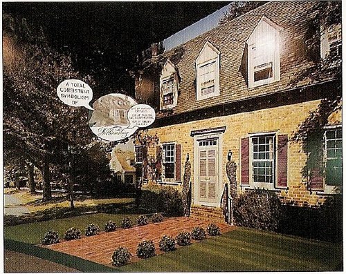
Lugon quotes Venturi & Scott Brown's explanation of the show [I'm translating back here from French, so it's probably off a bit]:
"The idea was to cross the model of the billboard, this image made for distant, fugitive, distracted perception of the driver, with that of the newspaper, which is a density swarming with information." The art museum is thus invaded by two different but interdependent media regimes: the advertising billboard's principle of rapid distraction, and the extreme informational concentration of the newspaper, two opposing models for aesthetic contemplation, where the distance of the viewer from the image is either too far or too close.Despite working at like 100x his previous [and, for the most part, subsequent] scale, Shore's illusionistic photo backdrops manage to capture the banality he loves. Banality in a good way, of course. I think this street is my favorite:
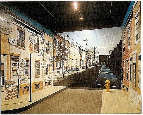
Maybe because he wasn't a fetishy print guy--Shore rather famously sent all his film to Kodak to be developed, just like civilians--he readily embraced the print quality of the photomurals. Which--I love this--turned out to be paintings.
Lugon explains that the Signs Of Life photomurals were made with an expensive, state-of-the-1976-art, 4-color airbrush-like printing system from the Nippon Enlarging Color Company, which had been licensed for the US by 3M. Who marketed it to trade fairs and restaurants as Architectural Painting. With the public and art world attention from Signs of Life, 3M brought Izenour on to promote the new medium for use by artists and museums.
In 1977, Popular Science ran an article explaining how Architectural Painting technology worked. A specially prepared color negative was scanned and split into CMYK, and the quick-drying paint was applied in overlapping strips, inkjet-style, by a computer controlled, scanning sprayer. 3M technicians then touched up the finished print by hand. All in, it cost $10-25/sf.
Expensive enough to be the second largest line item on Signs of Life's budget, and sexy enough that Venturi et al. used it again almost immediately. For their controversial [i.e., steaming hot mess, according to Robert Hughes, who I'll happily believe just this once] exhibition design for the Whitney's Bicentennial blockbuster, 200 Years of American Sculpture, the architects installed a 27-foot-tall cutout photo by Shore of Hiram Powers' iconic marble, Greek Slave, on the canopy of the museum. Ezra Stoller says it was "inspired by Caesar's Palace," which I'm sure was a compliment:
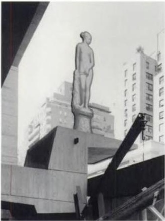
Once again, I start programming a bonus DVD for "The Original Copy," Roxana Marcoci's current show at MoMA on photography and sculpture. But I think the real story here is painting and photography.
Jean Francois Chevrier gets credit for the term forme tableau, which he used to describe the large-format photographs which began to assert a place on the wall and in the discourse that had previously been reserved for painting in the 1980s [and since]. Then Lugon mentions how Sherman, Prince, Kruger, etc. had appropriated the photography of commercialism--advertising and movies [Untitled Film Stills began in 1977]. And now here's Shore, right there in the thick of things, making giant photos with his new-fangled, trade show backdrop printing techniques--which turn out in the end to actually be paintings. [And sculpture. And architecture.]
The kicker, though, is one of the complicating factors for why I'm finding photomurals so interesting right now. And I write this as a guy who has two of Felix Gonzalez-Torres' Parkett billboard/photomurals because, once you install one, it's up, it's done, it's gone: they managed to thwart the market. Here's Lugon:
The photomural reveals itself to be extremely vulnerable. Its own installation, its dependence on conditions of fixation and lamination make it enormously fragil: with rare exceptions, it does not survive its exposition. It's one of the fundamental points that distinguishes it from painting: its incapacity to become an object of collection.I guess I've gotta call Stephen Shore now and see if that's really true, about his photomurals, I mean.When it was developed in the 19th century, photography constituted precisely a pure image for collecting: one acquired it to conserve, because it was capable of bringing all objects in the world together into a system of thesaurisation and generalized comparison, but it's difficult to show. Small and grey, taking poorly to the wall, and with a surface that deteriorates in the light the more one views it. The grand format photos of the interwar years reversed this logic: photography became the image of exposition, but it renders it improper for collecting.
Only the forme tableau would succeed in crossing these two qualities, to make of photography an image at once for exhibiting and collecting--two criteria indispensable for accessing fine art's economic system.

