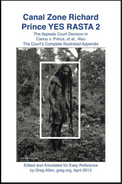
So I try to create a book with as little creative alteration as possible, to hew as closely as I can to the court documents themselves, without changing, editing, or annotating them at all.
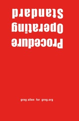
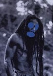
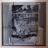
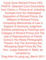
OK, so I weave images from the exhibits they're discussing into the sections of the transcript where they're discussing them. And--NO design--I only use Preview's default annotation settings--giant, red Helvetica--to create the headings, and the table of contents, and the cover.
OK, so I have to cheat a little to get the cover to work, so I do end up re-keying the cover in the cover wizard, so that it matches the annotation typeface. But that is IT.
And what happens when you are aggressive about not trying to create an aestheticized object--or rather, to create an aestheticized object that looks like you did nothing aesthetic to create it? When you try to write less than a hundred words total, including your self-consciously long title?
Well, we can ask Brett in Miami. He's the first one who spotted three--three!--typos on the back cover of the softcover edition. Well, he's the first one to let me know he spotted them, anyway. And for that I thank him.
I corrected two immediately, and I'm still pondering about the third: "...it is intended to serve as an art historical and critical resource, filtering relevant primary information about Prince's biography, practice and wok..."
I mean, couldn't it stay? "Oh, Richard Prince, I love your wok!" Maybe it's the t-shirt.
update: here's the link to the new printer, where you can buy the expanded edition in softcover.

