Well, let's just get this out of the way: if you can only see one Warhol exhibition in Washington this year, see Shadows. The Warhol Headlines show is very slight. It's hard to call it a highlight, but a series of three 1982 or '83 silkscreen paintings of successive pages in the NY Post did remind me a bit of the newspaper On Kawara used to line the boxes of his date paintings. Also, the show includes the three Screen Tests where the subjects appear to be reading and unaware they were being filmed: Alan Solomon, Grace Glueck, and Arman. That really is all.
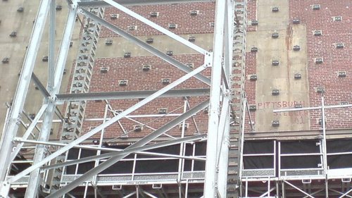
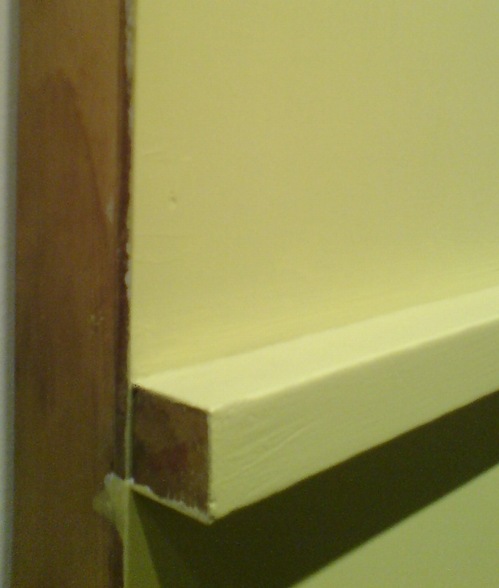
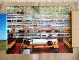
But let's back up because, hey-ho, did you know the National Gallery's East Wing was built with red brick infill walls?? It's like Long Island City up in there behind IM Pei's Indiana granite.
I also love that a construction worker in 1975 declared his allegiance to the Pittsburgh Steelers, practically in the Baltimore Colts' own backyard. That was the year the Terrible Towel was invented, and when the Steelers did, in fact, win their second Super Bowl in a row. Also, I thoroughly approve of this epic-scale scaffolding. Glaze it and set it up at the beach for me, please.
Anyway, after the Warhol bust, I went downstairs for a close look at one of the NGA's current strengths: contemporary monochromes. I'm working on some little monochrome panels right now, and I wanted to see surfaces and techniques--and to see if I'm inadvertently copying anyone I don't want to.
I think I want a really immaculate, glassy, brushstroke-free surface, and I definitely know I want a continuity around the edge of the thin steel and aluminum panels I'm trying. So I figure setting out to study the cleanest, smoothest paintings I can find will be yield some hints.
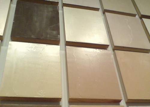
So first up: Byron Kim's Synecdoche (1991-), the multipanel grid of monochromes based on various art world folks' skin tones.
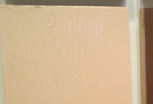
Well, I guess I've been too preoccupied with identifying friends to ever notice that the surface on these things is anything but smooth. Kim looks to have used a knife to apply oil and wax on his birch plywood panels. There are little trickles of primer/gesso along the edges, too.
It's definitely more skin-like this way, matte, imperfect, crafted.
Another wood-support work, Robert Mangold's Yellow Wall (Section I + II) (1964) is also matte oil on plywood, and the edges are also a little rough, or at least unfinished. The surface here is smoother, more featureless, but by no means pristine. In fact, there are painted-over nails all along it which suddenly felt kind of distracting. From the NGA's site:
He applied the paint in the "simplest manner" to create an impersonal surface that alludes to the urban industrial environment of Manhattan. Mangold left the edges of the piece raw and unpainted, implying further additions.So Mangold's not interested in pristineness anyway, just the opposite.
I'm starting to see that, even in monochrome works, isolating one characteristic like brushstrokes or paint surface risks missing the artist's own points of emphasis. But you know, right now, this is not about them; it's about me.
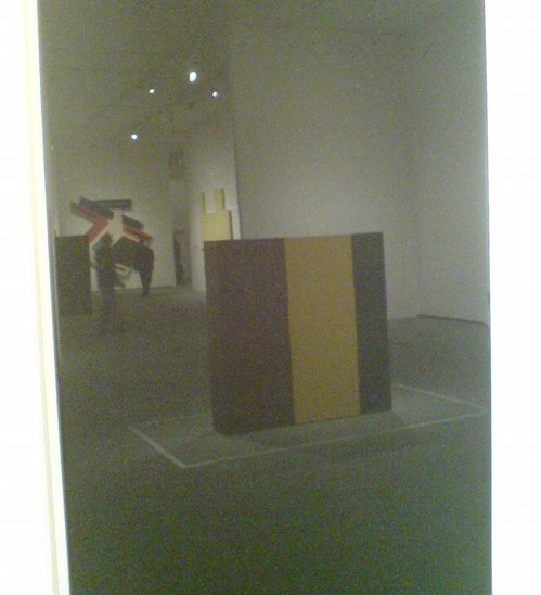
Huge fan, probably important to what I'm doing in a big picture way, but I moved past Anne Truitt's large, early work, Knight's Heritage, because she was using thin acrylic, and you can still really see the marks sort of floating in the color spaces. Not coincidentally, it reminded me a lot of the dark, glaze-like bottom band on the atypical and rather beautiful Kenneth Noland painting, Sound, which is installed in the atrium.
Oh right, the Truitt and the yellow Mangold behind it are reflected in the glassy surface I want but can't ever get--John McCracken's fiberglass Black Plank (1967). That's the smoothness I think I want, but not the gloss. I think I really cannot do that with a brush. I should be hoping for something else, because I think I can't get here from there.
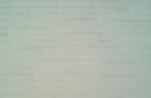
Ooh. I bet the answer to any paint & support question I can ever imagine is somewhere in Robert Ryman's work. Though not really wanting to, I have felt something of this. I know more now for myself about taking a single horizontal brushstroke as far as the paint will go.
I went to visit Stations of the Cross--I always do--and there and in between, I noticed how prominent the texture of the canvas is in so many monochrome or minimalist paintings. The nubby weave is just there. Everywhere. In Newman's case, of course, much of the Stations surface is unprimed and unpainted. But even in his most brushless passages, his black or white zips look to be soaked into the canvas, not appled on top of it.
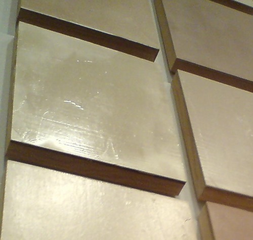
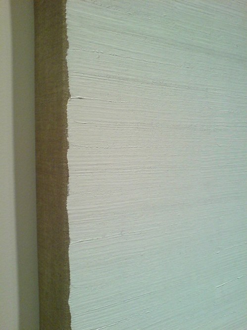
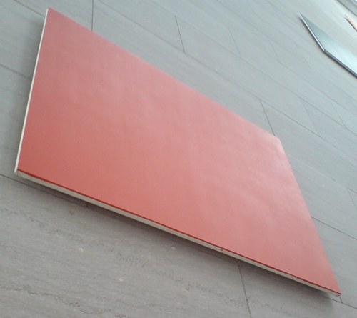
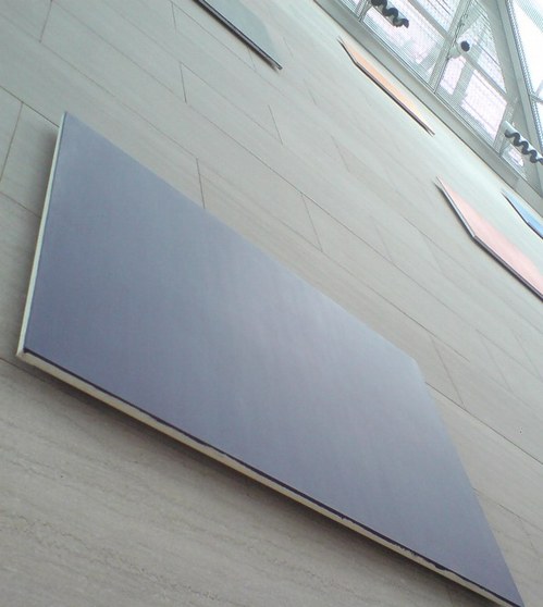
And so I ended up back at Ellsworth Kelly. It's really hard to see Color Panels for a Large Wall (1978) up close, but from this angle, you can really see Kelly's nongestural surface. None of that pesky "I made this" here.
Except, of course, in these carefully half-painted edges. Duly noted. Also, Kelly painted camouflage in the Army in WWII. I think I really need to read up on Kelly.


