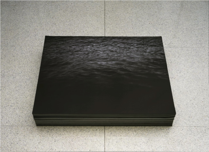
"Untitled", 1991, is an endless stack of prints of a dark image of the sea. Felix Gonzalez-Torres would have been 59 years old today.
Felix Gonzalez-Torres, "Untitled", 1991 [walkerart]
November 26, 2016

"Untitled", 1991, is an endless stack of prints of a dark image of the sea. Felix Gonzalez-Torres would have been 59 years old today.
Felix Gonzalez-Torres, "Untitled", 1991 [walkerart]
November 17, 2016
How quickly can turn the winds of history.
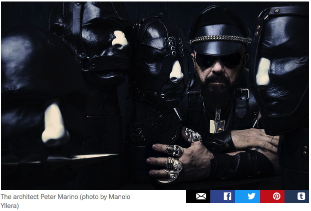
screencap: artspace
In August Artspace published an interview celebrating self-styled "art architect" Peter Marino. The "Dark Prince of Luxury," who has become the architecture dom to the world's wealthiest people and brands, told Andrew Goldstein the secrets of his success and career ascent in the New York of Skidmore, Owings & Merrill and Warhol's Factory.
[AG:] It would seem trauma is an excellent crucible for talent.And of fortuitous meetings with future clients like the refugees Marella and Gianni Agnelli:[PM:] It really is. If you just lead your normal, banal life you don't get enough fried brain cells to be an artist. [Laughs]
Everyone from Europe was coming to New York to see the art scene. And it was a double whammy. The kids today don't remember the violence of the Red Brigades in Italy, but the communists were this close to overrunning the whole country. So all the cultured, wealthy, sophisticated people came to New York. It was a very frightening moment.Part 2 of the interview ended with his wishes for his legacy:And they all needed a place to stay.
And they all needed places to stay in New York.
Enter Peter Marino.
Right place, right time.
I'd like to think that my architecture really expressed the times in which we lived, or helped define the time in which we lived. Because, for me, that's one of the definitions of great art...So, I try so hard in the stores I do, in the homes I do, to make it so that if you took this compendium of my work, it would express the time in which we live.In this, alas, I have no doubt that Marino has succeeded. Whether it's nine-figure flagships for Chanel or similarly costly New York collector townhouse renos, and estates for "rogue Mexican bond traders," Marino's work embodies the defining spirit of our age: immense wealth expended on limitless craft and luxury for the pleasure of a tiny few.
November 11, 2016
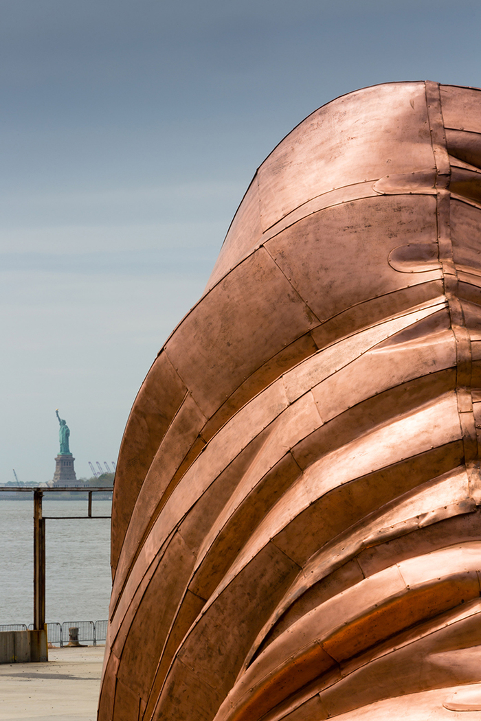
Public Art Fund installation, 2014, image: James Ewing via PAF
I have been thinking a lot about [among other things, obviously] context. How much the time, place, history, experience, and state of mind influence our experience with an artwork.
I think of my encounters with Vermeer's View of Delft, and of reading about Lawrence Wechsler's crucial visits to Vermeers in The Hague while covering Bosnian war crimes tribunals at the International Criminal Court. Art provides solace, sanity, respite, and sometimes, it makes difficult truths known, quietly and powerfully, to those who seek, sometimes through what Berger calls, "a felt absence."
A lot of people I see are turning to art for some of these same things right now, trying to grapple with the devastating results of the US presidential election. Which might be nice. But I can't help thinking of a work I liked immensely, but which now feels all but unbearable.
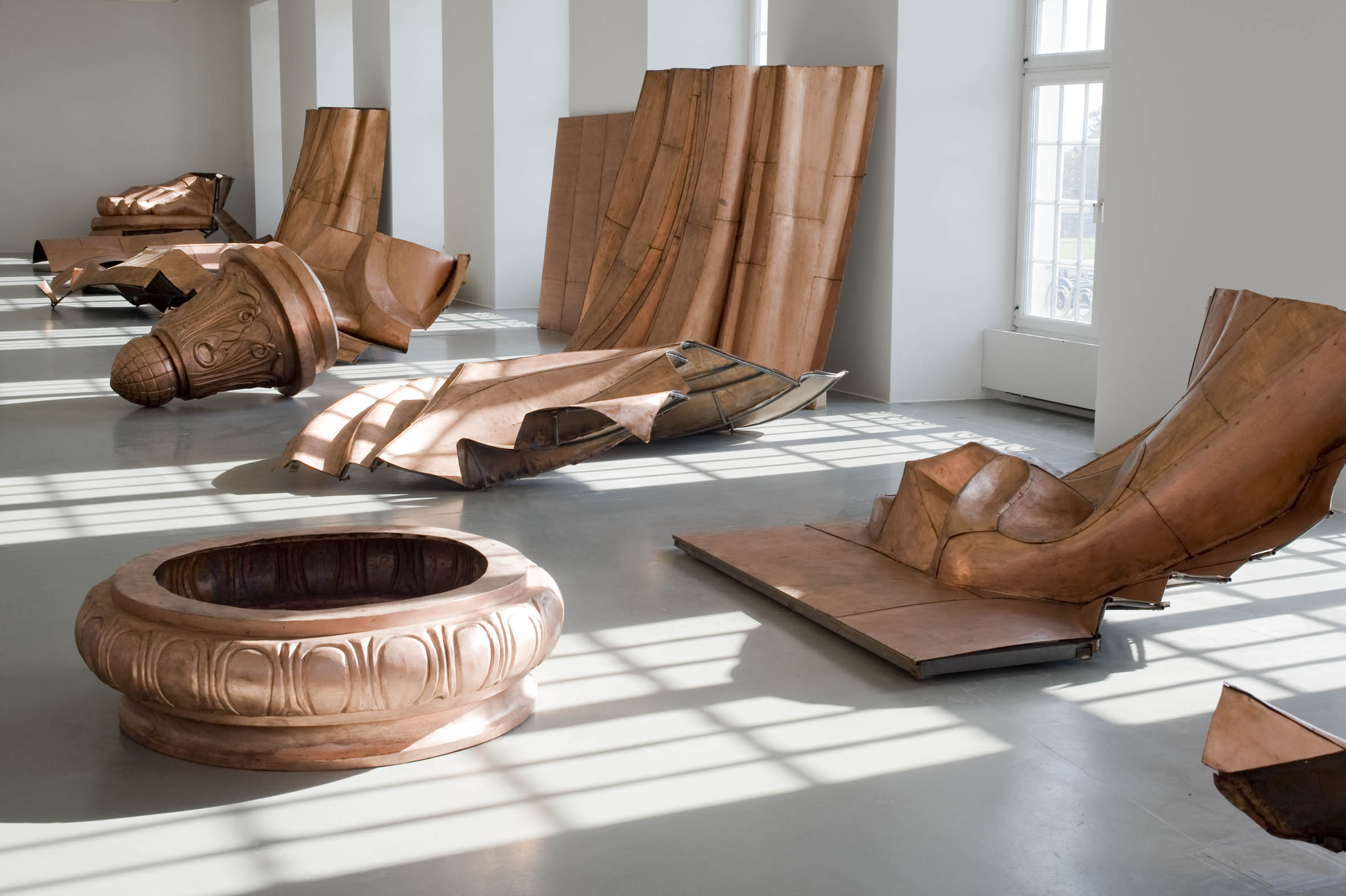
Fridericianum install shot by Nils Klinger via CAD
The Public Art Fund brought some to New York in 2014, but Danh Vo began showing pieces of We The People, his full-scale replication of the Statue of Liberty, at the Fredericianum in Kassel in 2011. That show's title, JULY, IV, MDCCLXXVI, came from the tablet in the Statue's hand.
Oddly, I didn't remember the press release for the show being this explicit:
the sculpture is dissected into its individual parts and thus abstracted. In his recreation, Vo concentrates on reproducing the thin copper skin (the iron scaffolding supporting the figure is missing), which gives WE THE PEOPLE a special fragility. The broken icon, the destroyed allegorical figure of Libertas, forms a strong counterpoint to the massive materiality.Maybe it's the difference between abstraction and reality. Or their collapse into each other. A felt absence.
November 7, 2016
via [instagram/365days_in_nyc]
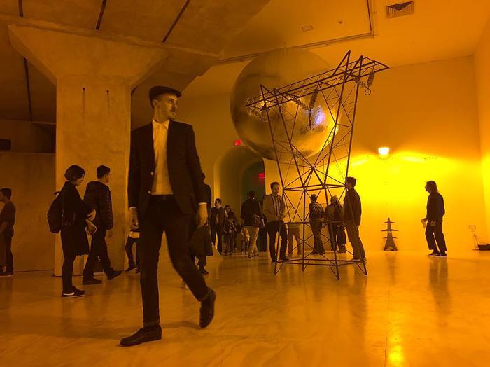
I will have more to say about it because it is blowing my mind in unexpected ways, but it has already taken me too long to shout it out: Mark Leckey has included my piece, Untitled (Satelloon), in "Containers and their Drivers," his survey at MoMA PS1.
The satelloon is incorporated into a new installation of Dream English Kid 1964-1999 AD (2015), an autobiographical piece Leckey assembles through what he calls "found memories."
The satelloon is a refabrication of a Beacon satellite, the 12-foot Mylar inflatable that was shown publicly at the US Capitol and other sites in the run up for NASA's Project Echo. Echo 1A, which launched in 1960, was 100 feet in diameter, and was the first visible manmade object in space. In Leckey's installation, though, the satelloon serves as a reference, I believe, to Echo II, the 135-ft successor, which launched in 1964.
Satelloons have been big around here for nearly 10 years, and I've been engrossed by their aesthetic power, and what can only be called their exhibition and display. They are beautiful objects created to be seen, and they have many implications.
Part of this became the subject of "Exhibition Space," a show I organized at apexart in 2013, which was the occasion for fabricating this particular object. At the time, I was reluctant for a whole host of reasons to declare the show, and the objects in it, to be artworks. But I'm chill with it now, thanks in no small part to Leckey's own powerful and generous practice over the last several years of curation-as-art, as well as my own subsequent developments.
In any case, a huge thanks and congratulations to Mark Leckey, along with curators Stuart Comer and Peter Eleey, and the folks at PS1, who have been a pleasure to work with. I had no idea how Mark would end up incorporating the piece, but it looks utterly transfixing, and I cannot wait to see it in person.
November 4, 2016
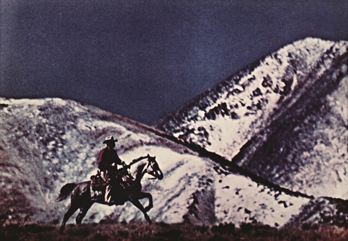
Untitled (Cowboy), 1980-84, Ektacolor, 27x40 in. image:skarstedt
In 1932, when it was still a minor filtered cigarette brand for ladies, Philip Morris sold the Canadian rights for Marlboro to Imperial Tobacco. As Marlboro grew into a globally recognized, male-targeted brand exemplified by cowboys and racing sponsorships, Philip Morris has tried to gain a foothold in the Canadian market by leveraging Marlboro's US & international prominence. And Imperial has fought back, with both litigation and steady cat & mouse marketing.
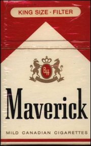
Maverick c.1970s, image via jim's
Imperial sells Marlboro, while Philip Morris' cigarettes otherwise known as Marlboros have been sold using lookalike, soundalike brands such as Maverick and Matador. In 2006, "dark market" laws took effect, removing tobacco products from Canadian store displays, and forcing consumers to ask for cigarettes by name. Though they kept their distinctive-and globally supported-"rooftop" packaging, Philip Morris took off any brand name at all. Imperial filed a trademark infringement claim against these nameless cigarettes. In 2012, Canada's Federal Court of Appeals agreed, finding that Philip Morris's nameless, but not unbranded and not generic, cigarettes courted confusion. [Philip Morris responded by renaming them Rooftop.]
Imperial was not above sowing a little confusion itself. When they got word that Philip Morris was planning to air rebranded cowboy commercials for Maverick in the early 1970s, Imperial had art director William Irish rush out their own Canadian Marlboro Man commercial.

Nameless (Cowboy), 2016, digital inkjet print, 16x24 in., ed. 2+1AP
A laconic voiceover about nothin' much is combined with a man, more farmhand than cowboy, wanderin' through a hilly landscape, looking for a lost sheep. The images seem as unremarkable as the US Marlboro campain was sublime. Which I guess fits a campaign whose purpose is not to seal a brand's relationship to a particular romanticized worldview, but to cockblock it.

Nameless (Cowboy), 2016, digital inkjet print, 16x24 in., ed. 2+1AP
Still, stills from the ad have a certain aesthetic appeal, and they successfully make the necessary associations, if only to ultimately thwart them. They will definitely work on their own terms as nice-sized photographic prints, which look like what they look like. In tribute to their origins, they will not be signed.
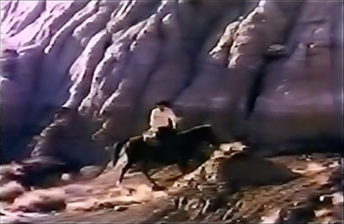
Nameless (Cowboy), 2016, digital inkjet print, 16x24 in.
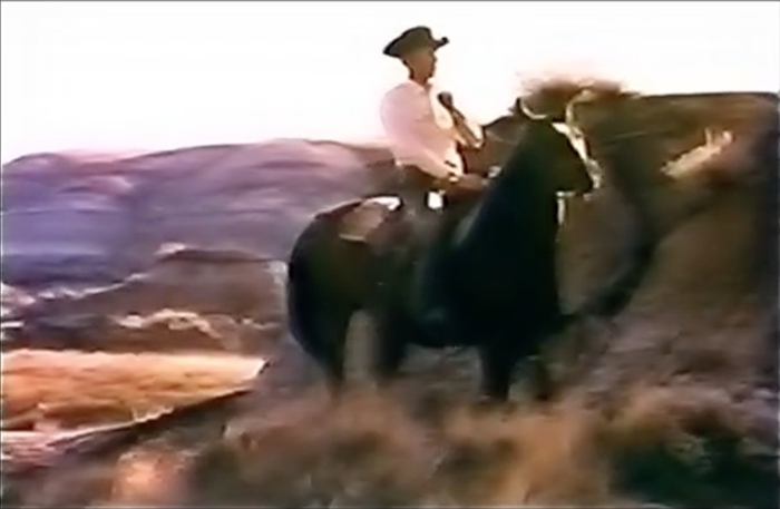
Nameless (Cowboy), 2016, digital inkjet print, 16x24 in., ed. 2+1AP
And my favorite part of the Canadian Marlboro Man ad is also its most distinctive visual: the clunky, pseudo-subliminal product reveal. This is accomplished through a burst of edits, each only a few frames long.

Nameless (Cowboy), 2016, digital inkjet print, 16x24 in., ed. 2+1AP
Thanks to the video encoding, a couple of frames of an unfamiliar, off-brand-looking-but-not pack of cigs is superimposed on footage of a poseur-looking-but-not sheep rancher.
Marlboro (cigarette) [wikipedia]
Maverick as Marlboro [box vox]
Marlborough [sic] from William Irish [vimeo via box vox]
Why Marlboro Country ends at the border [theglobeandmail]