Worlds Fairs turned out to be the perfect venue for photomurals–they were catchy, usually didactic, packed a visual punch, and got the point across to the shuffling masses. And at least in the 1930s, they looked like the future.
So to a government whose future was being immediately threatened, like the Spanish Republic under siege by Franco and his fascist army, a publicity- and sympathy-generating pavilion at the 1937 Paris Expo literally seemed like a matter of survival.
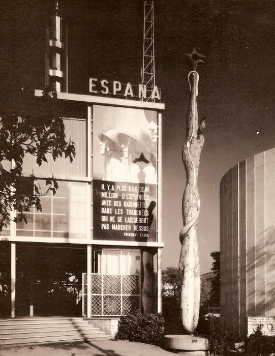
José Luis Sert and Luis Lacasa designed the small, simple pavilion, which didn’t get completed in time for the opening, and which anyway, ended up being overshadowed by the bombastic, dueling pavilions of Nazi Germany and Stalinist Russia.
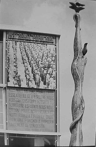
So to get attention, a huge photomural/banner of Republican loyalists was hung over the entrance. [Intriguingly, in two of the three most widely circulated photos from the Expo, including the Le Monde photo announcing the opening, the mural is cropped out or coincidentally obscured by a tree branch.] As kk_redax’s photo on flickr shows, the photomural was changed periodically:

Like breakdancing was to gangs, world’s fairs were designed as a non-violent means for competitive, conflicting nation states to jockey for supremacy. But the Spanish Civil War pushed the Republican government to a new, urgent level of pavilion-building. The war, which was fought on the ground through media, posters, photos and newspapers [and also guns and bombs], also gave birth to modern photojournalism. And the Paris Expo was the site of Spain’s immediate experiement in architecture as military polemic. And then there’s the art.
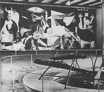
The Republican government sought to garner international support by assembling modern works by sympathetic artists that express powerful and overt political outrage, including a large painting of an upraised fist by Joan Miro . And unveiled on the ground floor was Picasso’s Guernica.

Painted in 24 days in his new Left Bank studio in the spring of 1937, Guernica‘s duotone palette reflects how Picasso and the rest of the world learned of the Nazis’ devastating saturation bombing foray: via newspaper photos and newsreels. Photography had an even more direct impact on the making of Guernica: Picasso asked his companion Dora Maar to document the painting process, and there’s a scholarly case that “the tonal variations Picasso observed in Dora’s photographs appear to have influenced the development of those in the middle stages of the painting.” Though it sets the bar pretty high for the rest, it’s not much of a stretch to call Guernica the greatest photomural of the 20th century.
But wait, that’s not all! In the Pavilion Guernica was installed next to Mercury Fountain, an abstract, kinetic sculptural tribute to the Almaden region of Spain, which at the time produced the lion’s share of the world’s mercury. Oh, the fountain was by Alexander Calder. While Guernica‘s world travels are well known, Mercury Fountain is a Calder whose relocation was both successful and imperative. It currently sits at the Fondacion Miro in Barcelona, sealed behind glass, in order to contain its toxic vapors.
Guernica, meanwhile, is now encased in glass for its own protection.
…The Spanish Pavilion [pbs.org]
A comprehensive post about El Pabellon Espanol, in Spanish [stepienybarno.es]
The Mexican Suitcase, rediscovered Spanish Civil War negatives by Capa, Chim, and Taro [icp.org]
Skip to content
the making of, by greg allen
