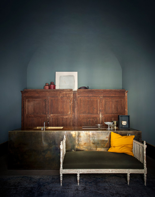
Is it just me who can’t stop thinking about that oxidized brass kitchen in Dimore Studio designers Britt Moran and Emiliano Salci’s Milan apartment? The one in T Magazine this weekend, even though it seems like the Women’s Fashion issue, not Design?
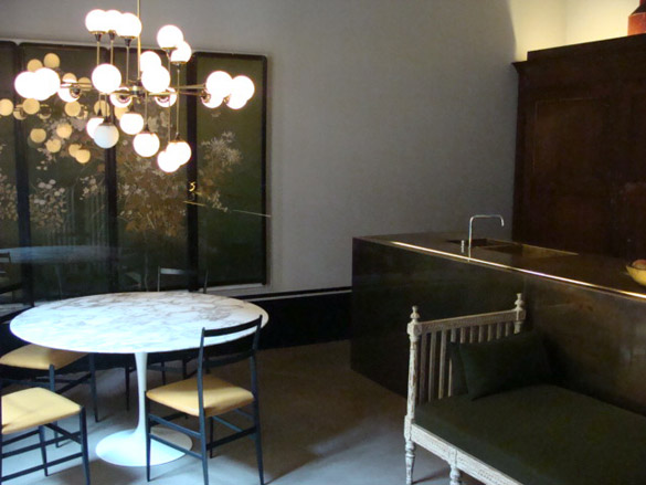
BECAUSE HOLY SMOKES.
A couple of things: they also do have that brass slab cabinet/headboard, which kind of dilutes it a bit, or maybe not. It makes me think they ended up with half a truckload of brass from a client project, and were like, well, we could just make everything out of brass?
Also, I guess two years is the appropriate time to wait to shoot an apartment that has already been featured in other magazines and blogs and debuted at international design fairs? Because these pictures by Emanuele Zamponi are all for Yatzer from 2011. Though they do look pretty much exactly like the Times’s photos.
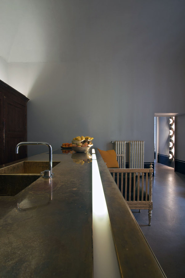
This embedded light strip seems extraneous and unfortunate, though. It will have no place in my oxidized brass kitchen. It looks like a remnant of a planterbox from a corporate lobby, which is always a risk one faces when working with lavishly thick brass, I suppose.
It’s also a fairly stiff repudiation of the elite brass ideology, which, when it is seen on the doors, awnings, siamese firehose connectors, and other brass elements on New York’s finer co-ops, shine brightly as proof of extraordinary, hand-labor-intensive, maintenance. For Dimore, thought, the patina is the point. Splash marks, drag marks buff marks, heat marks, air, it is a new kind of extravagance-through-negligence.
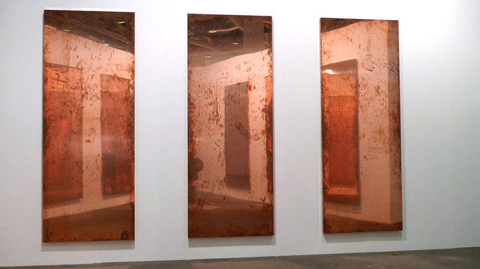
Which, of course, immediately calls to mind the copper pieces of Walead Beshty, both the tabletop-shaped Copper Surrogate wall pieces which appeared at his 2011 Regen Projects show and in last year’s Art Unlimited at Basel [above], which accrete a fine patina through handling and installation; and the smaller, more interesting FEDEX pieces, which really earn their knocks on the street, the handtruck, and the plane. [Now I wonder what the insurance is on shipping these things?]
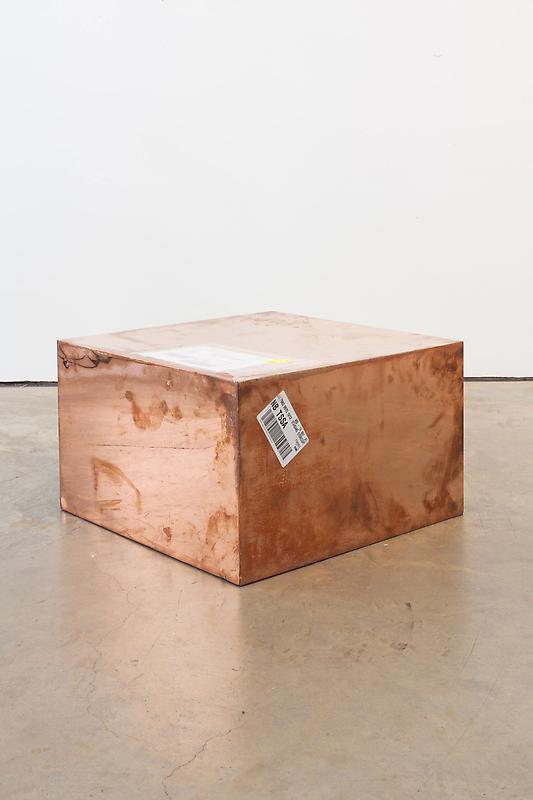
image via phillips
I remember a discussion I once had with someone from Donald Judd’s operation. They told me how Judd was outraged to find out collectors, and even some museums, would put a clearcoat on their copper or brass stacks in order to preserve the pristine look. But Judd’s preference, I was told, was that you damn well better leave his unfinished finish alone. And if you want it to shine, you polish it. And if you don’t polish it, you let it oxidize.
I actually think of this conversation often, because of the shiny brass Judd floor sculpture at MoMA, a 1968 work given to the museum in 1980 by Philip Johnson. It’s probably the single Judd work I’ve seen the most over my adult life. And I’ll be damned if I’ve ever seen it without some visitor’s grubby handprint on it. Conservation does not remove them immediately, though; it’d just be too much. So when I’ve visited the galleries several times in a week, I’ve noticed the same handprint still there. A calculated balance, I’m sure the museum is aware of how many microns of material they lose with each buffing, and plan accordingly.
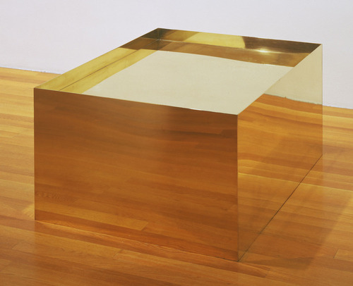
Donald Judd, Untitled, 1968, image:moma.org
Anyway, even after all these years, I’ve never been able to look at that Judd and not think of a coffee table. Not once.
Skip to content
the making of, by greg allen
