
A few weeks ago, I got a correction from Jeffrey Rian about which Richard Prince interview of his I was quoting, and I wanted to see what the one I’d missed actually said. It was from the March 1987 issue of Art in America magazine, and Prince’s work was on the cover. There was an interview, an intro article, and copious full-page images of Prince’s work. The print copy I looked at in the National Gallery’s library looked fresh as the day it was bound.
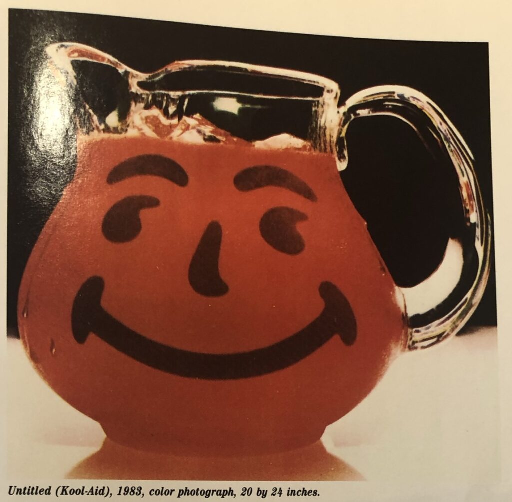
The interview was indeed interesting in unexpected ways, and I’ll get to it in a bit. What jumped out at me, though, was Untitled (Kool-Aid), 1983. It felt unusual, and had I realized why at the time, I would have tried to take a better snapshot of it. #rerephotography
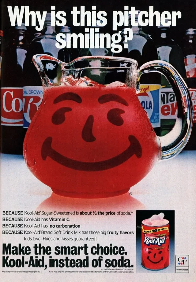
My first instinct was to see if I could find the image Prince had rephotographed, which took no time, but raised a whole set of questions. The 1982 Kool-Aid ad from eBay matches the condensation on Pitcher Man, and the reflections in the ice and the top his head. But obviously the entire background, even inside the spout, has been blacked out or burned away. The registered trademark sign by his butt, meanwhile, has been dodge out completely. Prince’s rephotography practice of composition by cropping has been long recognized, but this kind of aggressive image retouching seems exceptional.
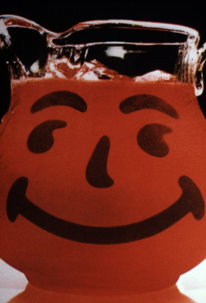
But about that cropping. Only when I saw Untitled (Kool-Aid) again did I realize why it looked odd: it was landscape, and I’d only ever seen it in portrait. The Untitled (Kool-Aid) that has appeared in the Early Photography show that just closed at Gagosian in NYC, in the Brant Foundation’s Deliverance show in 2015*, and in numerous Prince catalogues, is tightly cropped and vertical (24 x 20 in.), while the one published in Art in America in 1987 is full-width and horizontal (20 x 24 in.)
This kind of variation feels different from the seriality that are the entire focus of works like Untitled (Label), 1977, which are rephotographs of different ads.** Untitled (Kool-Aid) had one composition as of 1987, and another ever since. Is there a print out there of Pitcher Man in his full-width glory? Is one question, of course. But a more interesting one is probably how did this whole rephotography practice actually unfold?
In the interview with Rian, Prince does talk about ads not being considered as having an author, but the specifics of his dayjob experience at Time-Life, and the implications of it on his practice are nowhere to be found. That might be the kind of thing that was not brought into art discourse in the 1980s, or maybe Prince needed some time or distance to make sense of what he’d been doing.
It feels like we have settled into one narrative about Prince’s early, important work that gets repeated year over year, when there is actually much more to be told. And seen.
* Actually, there were quite a lot of pictures in Gagosian’s Early Photography that were also in the Brant show. The overlap left me impressed at Brant’s comprehensive collecting, but meant there were fewer revelations after all. It also made me wonder if he was unloading in bulk.
** Variation in cropping and composition are a longstanding practice in fine art photography, of course, but that’s something Prince made a point of not engaging with. But more conceptual artists also made varied crops of an image, like Felix Gonzalez-Torres, for example, who made every print of “Untitled” (Alice B. Toklas’ and Gertude Stein’s Grave, Paris) a little different—though a bunch got deprecated as non-works.