
Greg Allen's 25 Rules For Creating Good Theater [neofuturist.org via x-reference]
January 2009 Archives
January 31, 2009
No, The Other Greg Allen
January 30, 2009
La Monte Young, Mormon Composer
The contemporary art world's three most [only?] prominent Mormon artists are Wayne Thiebaud, Paul McCarthy, and La Monte Young. Of the three, I'd have to say Young is at once the least well known, the most highly influential, and, surprisingly, the most intrinsically Mormon in his work and outlook. I suspect that most people who know Young's work--and Young himself, for that matter--would agree only with the middle statement.
Young is best known for his minimalist musical compositions, which use extended harmonic tones to explore concepts like time and duration. His work sits alongside other major music figures like John Cage and influenced younger minimalist composers like Terry Riley and Philip Glass. Technically, because he composes music, and because his greatest prominence comes from the minimalist classical music world he helped pioneer, you could argue Young's not really an artist artist. He certainly doesn't sell art in galleries for six and seven figure prices like Thiebaud and McCarthy. But Young does make and show work. For decades he has collaborated with Marian Zazeela to create light and sound installations that would be recognized as art in any contemporary art world sense of the word.
But that's not all. By Young's account, he was instrumental to the founding of Fluxus and conceptual art and Happenings as well. Young and Zazeela operate the Mela Foundation in Tribeca, which hosts performances and sound pieces in Dream House, an immersive, meditative light installation created by Zazeela. Like other permanent downtown art esoterica--i.e., Walter de Maria's Earth Room and Broken Kilometer--Dream House has been supported by and/or affiliated with the Dia Center.
Young is also very clear about the Mormon environment in which he--and his work--developed. Most interviews with him include the story that the first sound he remembers was the drone of the icy wind whistling through the cracks in the wall of his Mormon farmer family's log cabin in Idaho. From this mixture of elementalism and nostalgia, Young created music that aspires to the eternal, using just-tones and intervals that are some greater, universal, divine truth.
Almost every reference to spirituality in Young's work is not to Mormonism, however, but to Indian music. Since the 1960's Young and Zazeela have been both disciple and guru for the propagation of Indian sitar music, with its accompanying drones, tones, and ragas.
But a doctoral candidate and musicologist named Jeremy Grimshaw, who is also LDS, has made a highly persuasive study of La Monte Young's concepts of the divine, time, and the nature of heaven, which grounds them in esoteric but orthodox Mormon doctrine. Grimshaw quotes Young on the just-intonation system he employs:
"The sensations of ineffable truths that we sometimes experience when we hear progressions of chords and intervals tuned in just intonation, may indeed be our underlying subliminal recognition of the broader, more universal implications of these fundamental principles." In short, Young believes that intervals based on the harmonic series resonate with the macrocosm in a way that irrational intervals cannot. "When I hear intervals in equal temperament, it's like they remind me of the truth," says Young, "whereas when I hear intervals in just intonation, it's as though I'm hearing the truth."In 2001, Grimshaw published a paper called "The Sonic Search for Kolob: Mormon Cosmology and the Music of La Monte Young" in the musicology journal repercussions. It's available via the Internet Archive.] Heady stuff.
January 29, 2009
Mies Gas Station: I'm So Happy. Now I Have A Place To Put My Skyway
Alright, I know where I'm going to put my decommissioned Skyway: right next to my decommissioned Mies van der Rohe Esso Station.
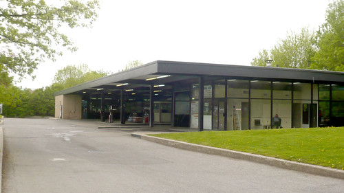
Mies' office designed three apartment buildings on l'Ile des Soeurs in Montreal beginning in 1963, which were joined by a gas station in 1968, a year before he died. [here's the Google Map of the gas station. There's no streetview.2017 update: Oh yes there is. And it had a bouncy castle.]
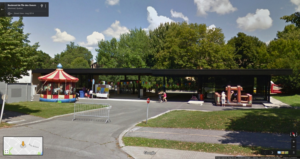
The building is on a corner, and is long and low and mostly a void. The most prominent feature, the black steel awning over the pumps, runs between a glass & buff brick box on one end [the store] and a glass & steel box on the other [the garage and office]. Looking at flickr member zadcat's photos up close, the gas station looks mostly stock; there's none of the material preciousness of, say, IIT's custom profile I-beams, and forget about the Barcelona Pavilion's meticulously matched marble, travertine, and onyx. This is a utilitarian building created by a mature architect's office which, for better and worse, knew its way around the construction industry.
Tucked away on the far, quieter side of an already quiet residential island, the old school Esso station lost business to a newer, more amenity-filled competitor near the bridge, and it was recently closed. Now a debate is on about what to do with the property.
Toronto's Globe & Mail reports that public hearings on the fate of the defunct building, now owned by some developer, were set for this week. There's talk of a flower market which might leave the building pretty much as is, or maybe they make it into a youth center, which means destroying it by remodeling it.
The option that wasn't mentioned in the paper--perhaps because the city peres in Montreal were graciously waiting for me to proffer it--is to let me have the building in exchange for dismantling it and removing it to a new site so I can live in it.
It's already clear that even though it is his only gas station, its timing, and the process under which it was designed mean it is not a super-important example of Mies's work. In other words, Montreal shouldn't get too worked up about it.
And that same standard issue construction quality means you don't necessarily need to sweat wrapping and numbering every brick and plate of glass.
Practically speaking, dismantling, moving, and rebuilding offers the aspiring gas station dweller like myself the best of all possible worlds: the sleek, authentic industrial architecture and space, in the ideal setting of your choice, with absolutely none of the environmental toxicity complications of the original site. The fact that you're preserving and breathing new life into the work of a master of 20th century architecture is pure bonus.
But it's the bonus that makes the whole concept possible. No run of the mill gas station is worth the irrational expense and hassle of dismantling, conservation, and reassembly. And while it'd be arguably cheaper and more practical, building a house from scratch that is a replica of a Mies van der Rohe gas station just seems sad and pathetic to me, like making yourself an exact copy of Southfork. No, saving a Miesian landmark provides the necessary conceptual cover to make an otherwise crazy plan seem rational, even imperative.
And then the Skyway can be my office and editing suite right next door.
You can come live with me, Ritz! The Ritz of gas stations looks for a new life [globe & mail, via archinect and tyler]
Chad loves Mies's gas station [tropolism]
previous residential gas station fantasies here and here
January 28, 2009
Rose C'est La Vie?
What a weird, insane s**tstorm is brewing around Brandeis University's sudden announcement that it's closing the Rose Art Museum and selling off its 6,000 piece collection. All the usual outrages and condemnations are moved and seconded, of course, but there are some things about this disaster-in-motion that just don't make any sense:
First up, it's not at all clear why such a drastic action is even necessary. A $10 million forecast operating deficit is a problem, but it's not the kind of thing you sell your institution's soul for. Greg Cook looked at the last three years of Brandeis's financial statements and found they university was running healthy surpluses.
Obviously, the recent plunge in the financial markets has to have an effect on Brandeis's endowment, but I haven't seen any announcement of what the impact was. There has been talk of a Madoff Effect, with several key donors being hit hard by the evaporation of his hedge fund Ponzi scheme. What I haven't seen is any direct exposure of the Jewish university's own investments. If Brandeis's endowment suffered a mortal blow, you'd think word would get out.
But what's up with this comment to the NY Times from Robert Mnuchin, the former Goldman Sachs partner-turned-dealer, who also happens to be the son of pioneering donors of the Rose, Leon and Harriet Gevirtz-Mnuchin? It was their contemporary acquisitions fund that enabled the young museum to stock up on the works of emerging Pop Art stars in the early 1960's, paintings which Mnuchin fils is now trying to get a piece of:
[Mnuchin] said he had no idea of Brandeis's plans until he read about them. "It's such a shame, particularly at this time in the world," he said, adding, "Obviously as a dealer I'd like to be involved either in buying them or selling them. It's emotional for me."So a dealer eager to broker his parents' legacy, and this, the history of the Rose from the museum's website, what is up with this? It's just odd. Have you ever seen a museum give a chattier, tackier account of its own story, including discussion of what a great deal they got, and how much their stuff is worth now?
A miracle of another kind also occurred during a four month period in 1962 and into 1963. As Hunter describes it, "Leon Mnuchin called from New York one day to announce that he and his wife, Harriet Gevirtz-Mnuchin had inherited a sum of $50,000, with which they wished to fund a contemporary art collection at Brandeis."With what has happened in the art market since, that's like Bill and Melinda Gates calling one day and saying they have $150,000,000 to start a contemporary art collection!Mmhmm. What were you saying? You lost me at "paid $5,000, now worth $200 million." Turns out that's not the woman next to you who talked your ear off the entire flight to Palm Beach. The history's by the current director, and it appears to be a speech transcript, from a celebration, ironically, in advance of the Rose's 50th anniversary in 2011.Hunter reports that he and "Leon immediately set out to explore the galleries. We often made gallery rounds with Robert Scull, a friend of Leon's and a prominent New York collector," especially of Pop Art. During their rounds (which included studio visits during which they bought directly from artists) they managed to gather early and important works by Jasper Johns, Robert Rauschenberg, Roy Lichtenstein, Claes Oldenburg, Jim Dine, Tom Wesselman, James Rosenquist, Adolph Gottlieb, Robert Indiana, Ellsworth Kelly, Morris Louis, among many others. Their limit was $5,000 a painting (which meant several were bought for much less). Warhol had already become a bit expensive, Hunter says, so they went for one of his lesser works from the "paint-by-number series." If the term "miracle" may be evoked for a third time, a couple of years later, Hunter's successor at the Rose, William Seitz, exchanged that Warhol (Do It Yourself Sailboat, 1962) , for Saturday Disaster, 1964. Collectively, at this writing, the Gevirtz-Mnuchin collection along with the Warhol, are worth in excess of $200,000,000
It is important to remember that Hunter and Mnuchin went in search of art, not market value...
January 27, 2009
Ah Yes, I Kind Of Remember When
The week before the Inauguration, Errol Morris called the White House photo editors of the major wire services and asked them to choose and discuss the photos "that they believe captured the character of [George W Bush] the man and of his administration." Santiago Lyon, the editor for the AP, toggles incredibly between seeming awareness and professed ignorance of the extent of the influence of the White House's stagecraft efforts--and more importantly, on the influence on the images the wire service photographers produced.
 On the one hand, this bafflingly naive discussion of one of the most elaborately orchestrated photos of GWB's first term, "Mission Accomplished", followed by a wistful reminiscence of the good old days when the White House really managed your shots:
SANTIAGO LYON: What I wonder about this picture is, Bush didn't go up there and put the sign up there. His people did, or the U.S. military did, and they ran it by the White House Press Office, who said, "Great idea." I don't know the details, but clearly he agreed to speak in front of that sign, knowing that there would be a picture of him with that sign in the background. He has to take responsibility for it. But, you've got to wonder, was he really aware of how silly this looked, given that the war was going on?But even when Lyon acknowledges the obvious staging and prop dressing of "Thanksgiving Turkey in Baghdad":ERROL MORRIS: Anybody who takes photographs knows that getting the podium, the position of the president, the lighting, the sign in the background, so that it can be framed nicely from certain angles, that's not something that happens by accident.
SANTIAGO LYON: There were the "Turf Builders," photographers who accompanied the White House advance teams in the Reagan era, sending one photographer to reconnoiter the photo opportunities on foreign presidential travel. They visited the scenes where the president was going to be photographed and took notes on the locations and distances to assist the photographers who would later travel with the president. They produced a guide that told you what lens to use and what the light was going to be. They no longer do that, but I feel that the existence of such a procedure spoke to the orchestration of White House photo opportunities...
Lyon incredibly excuses the fakery because of the photographer's "daring," as if riding on Air Force One without telling your boss where you're going were the equivalent of jumping in a Huey to evacuate a platoon under fire from the VC.ERROL MORRIS: Another close-up?
SANTIAGO LYON: There are times when I like close-ups. And then there are times when there are moodier pictures that benefit from more atmosphere, but this was a surprise visit to Baghdad, done under cover of night, photographers not allowed, and media people accompanying him not allowed to tell anybody where they were going, and then arriving in Baghdad for Thanksgiving, that most American of things. And there he is, serving a turkey to men and women of the military. It was the classic photo-op, but also pretty daring when you think that, at that time, Baghdad is a dangerous place.
ERROL MORRIS: Wasn't there an accusation (at the time) that the turkey was a fake turkey.
SANTIAGO LYON: Yeah, I remember something about that, too. There was something as to whether that was an ornamental turkey. The way these mess kitchens work, there's no time to actually carve a turkey. It's all pre-carved and put into hot plates. And the troops move along the counter, and the stuff is slopped into their trays, and then off they go. So we concluded that it was a real bird. But that it wasn't one that was necessarily going to be eaten at that meal at that time.
Morris wraps with a quote from Oliver Wendell Holmes about photography as "a mirror with a memory," but Lyon's preference for the photographer's adventure over photographed fiction is not the only example of the limits of photography's effectiveness as a memory device.
When "Mission Accomplished" was first published, there was no public debate of the kind Lyon says he remembers: "At the time, it produced a raised eyebrow for some, 'Well, is the mission accomplished? How do you know the mission is accomplished?' And more importantly, 'What exactly is the mission?'" If anything, the power of that whole photo-op silenced those questioners until months later, when the continued deaths and violence meant the reality of Bush's false declaration of victory could no longer be ignored. The questions about "Mission Accomplished" and who'd "declared it" only arose in the fall, almost five months after the USS Lincoln's comandeered triumphal homecoming.
Lyon's recollection of a skeptical reaction towards "Mission Accomplished" is more than a bit wishful, sort of as if, after the war was over, everyone in France claimed to be part of the Resistance. Which might not be how actual members of the Resistance remember it.
Mirror, Mirror on the Wall [errol morris blog @ nyt]
January 24, 2009
Come Come Ye Saints
I remember people scoffing at the Mormon pioneer hymn, "Come, Come Ye Saints" because its tune is from some English drinking song. But that just seals it for me as a song written by and for some seriously humbled folks who made tremendous exertions and sacrifices for what they believed in.
But that's only one reason I'm posting what may just be the greatest cover ever of CCYS. While shooting his documentary New York Doll about Arthur "Killer" Kane, the glam punk pioneer-turned-Mormon, director Greg Whiteley got surviving Dolls David Johansen and Brian Koonin to sing a couple of old school hymns, unplugged. The guitar-and-harmonica arrangement of "A Poor Wayfaring Man of Grief" runs over the closing credits of New York Doll, and it's as soulful and rocky as any Rubin-era Johnny Cash.
"Come, Come Ye Saints" is only on the New York Dolls DVD, though. I think. They only sing one verse, the last one, which fits all too well.
January 24, 2009
Bill Cunningham On The Inauguration
Do not adjust your speakers. After hearing Bill Cunningham narrate his photos from the Inauguration, I don't know how I ever got by just looking at the newspaper. [nyt]
January 22, 2009
Minnesota NICE: Skyway For Sale On Craigslist
Ho-ly smokes.
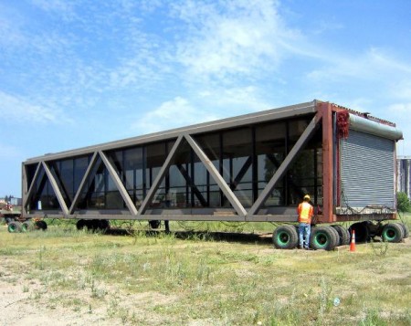
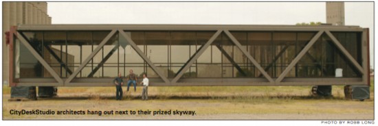
The Minneapolis architecture firm City Desk Studio just put a skyway up for sale on craigslist. A freakin' skyway.
It's a steel girder and glass box, 20 x 83 feet, and 14 tall, designed by architect Ed Baker ["the father of the skyways"] to connect JC Penney's and Powers department stores. The 12-inch concrete floor accounts for about half of the skyway's 280,000-lb weight. [That's half a Richard Serra retrospective, for those keeping score at home.] It was apparently assembled in three sections and filled in with glass after it was installed.
City Desk Studio's asking price is currently $79,500, which is a huge discount from the $1.2 million they expected to bring in by turning the skyway into the Skyway Retreat lakefront cabin and selling 12 4-week shares for $100,000 apiece.
And it's probably a little more than they paid for it in 2006, when the architects bought it on a whim at a University of Minnesota blind auction. According to a report at the time, it cost them more to move it [two blocks] than to buy it.
Right now, the skyway is sitting somewhere "near the University of Minnesota Minneapolis campus," and you'll need to move it. Fortunately, the U of MN is on the Mississippi River, so if you could get the skyway onto a barge, you could float it down the river and into the Gulf of Mexico. From there, you could load it onto a freighter and sail it anywhere on the East Coast. Hell, you could sail it anywhere in the world.
Then plop it down right next to the smug schmuck who just topped off his shipping container house, the one with the 8-ft ceilings and the less-than-10-ft wide rooms. Then invite him over for a hot dish.
Skyway for sale - THAT'S RIGHT - AN ACTUAL SKYWAY! - $79500 (Minneapolis) [minneapolis.craigslist.org, via walker blog, thanks andy]
A Disconnected Skyway: Downtown architectural firm considers new options for an 'icon' of the skyline [2006 downtown journal article, pdf]
City Desk Studio Skyway Retreat (unrealized) [citydeskstudio.com]
January 21, 2009
Sforzian Backlog
I've been collecting a bunch of Last Sforza Posts in my browser tabs for a few weeks now; they just kept coming, but I wasn't in the mood. Then I thought I'd put together some grand summary of the Bush era's strategies for image use and manipulation, but I was definitely not in the mood for that. So here are some things I've been seeing, last things first:
But it seems problematic to me that the entire official web presence of the Bush administration, as tainted and manipulative or enraging as you may think it is, just gets wiped clean from the web like that. People need to remember, reference, discuss, and link to that publicly owned, previously published information; it shouldn't be tossed to the curb like a dead plant or buried in the National Archive backup tape repository. So. Now that it's too late to ask, has anyone been saving archived versions of the White House website? The pages saved by places I'd normally rely on--The Internet Archive and The Memory Hole--are woefully spotty and non-existent, respectively.

Should I really have to wait five years and file a Freedom of Information Act request to see the Christmas 2003 Real Video file of Karl Rove reading "Santa's New Reindeer"? I don't think so. As much as some might like to, we can't just wipe the server clean of the last eight years "as if it never happened."
archive update: Kate emailed with the news that a January 2009 snapshot of the old White House website is available at http://www.georgewbushlibrary.gov/white-house/. Alas, though it shows up in the search results, all mentions of Karl Rove's reading of Santa's New Reindeer have been scrubbed.

What hasn't been mentioned is the controversies around each image: in May 2002, the GOP was criticized for offering $150 commemorative prints of the Sept. 11th photo to party donors. And in Jan. 2006, the White House News Photographers Association mentioned the Katrina image in their protest of the media's use of official White House photographs.
GWB explicitly mentions just looking out the window of AF1 instead of landing and surveying the destruction himself--which, wasn't a mistake, he argues, because if he'd gotten involved, it would have pulled police and emergency response personnel from the scene. As if the only power he had was the power of the photo-op.
And he cops to how the "Mission Accomplished" banner might have been a mistake, too, Even though the banner was just a bit player in the entire victory declaration on the USS Abraham Lincoln, and the whole show was hailed as the masterstroke of a conquering hero until months later when, it turned out, the mission was not, in fact, accomplished. And it wasn't even a mission. And even though Bush had already thrown Scott Sforza under the bus once the banner became a controversial symbol of that failure: ''I know it was attributed somehow to some ingenious advance man from my staff. They weren't that ingenious, by the way.''
Did Bush really see his job as the Imagemaker in Chief? Was he governing by speech and staged photo-op? Or were those the products he was selling to the media while the Administration's less photogenic missions were being accomplished elsewhere? Watching Bush conversate with the White House press corps, I can't help but feel like he's talking shop--their shop, or their shared shop with them, which reminds me of a Karl Rove comment somewhere about treating the press, not as a representative of The People, but as a separate interest group that needed to be dealt with on its own terms. I can't help but come out of the Bush era with the nagging sense that, based on the hard facts of government expenditure, agency destruction and mismanagement, regulatory neutering, massive contractor folly, and even military-backed destabilization, someone's agenda was being pursued and executed while we were distracted by the daily news cycle. I await the realpolitik reading of the Bush/Cheney years to see an analysis of whose interests were successfully served or benefited by what's popularly perceived as "failure."
THE BUSH AESTHETIC: IMAGES AS ACTIONSW. T. F.??? Do things really look so different over there? On paper, Bredekamp looks to be an expert on the history of political imagery. But by the time I got to the utterly ahistorical "so-embarassingly handmade MISSION ACCOMPLISHED staging" comment, the good doctor had managed to burn through all the credibility on the entire continent. I tried reading and Google translating the original interview, but my German's not good enough to say that Allen's translations are off, so I assume they're fine.The Frankfurter Rundschau's Arno Widmann spoke with art historian Horst Bredekamp about the power of images and politics. For Bredekamp, President Bush attempted to reunite images with reality. Where Clinton was a master at staging photo opportunities for the press, Bush dislikes the media and attempted to cleanse images of all traces of showmanship by relinking them to actions.
"The politics of the image under George Bush is very complex and very difficult to analyze," Bredekamp told the newspaper. "It was, if I observed correctly, at first an attempt to leave Hollywood high and dry, so to speak. Bush hates Hollywood. He hates television; he scorns basically all media." Far from identifying Bush as a man of words, Bredekamp characterizes the exiting president as a man of actions. "He attempted to appear as a nonshowman of action. Today, we can no longer imagine why he was reelected. But this is one of the reasons." Using images to illustrate actions belonged to the early media approach of the administration that Bush developed with Dick Cheney and Donald Rumsfeld. "The suspicion that an image was only show--that suspicion was supposed to be taken away from the image," explains Bredekamp, who qualifies Bush as an antipostmodern for shying away from the world of simulacra and simulations celebrated in the 1990s. "The radical bond of images with things and actions--that was his antimodel. Against Hollywood. Also, his so-embarassingly handmade MISSION ACCOMPLISHED staging on the aircraft carrier lies in this line of bringing back images to a concrete bond with reality."
translation update: and I'd be wrong. Christian emailed from Germany to correct the auto-translation of "so-embarassingly handmade": The original says 'so peinlich-handwerkliche Inszenierung'. Its actual meaning comes close to 'painstakingly crafted staging,' in that considerable craftsmanship was used for the staging... While 'peinlich' has come to mean 'embarrassing' its root is literally 'painful' or 'under pain'.
'peinlich' can be used in combination with certain other words for stressing their meaning and suggesting extreme care for detail." So there you have it.
I can only assume that he means to add a layer of strategy on top of all his image vs action talk. If there's one over-arching criticism of the Bush years that sticks, it's failure of their attempt to make reality by controlling the images and accounts of what the government was doing. It reminds me once again of Joan Didion's masterful 1997 takedown of Dinesh D'Souza's paean to Ronald Reagan in the NY Review of Books. Didion unpacks the conservative orthodoxy about Reagan's greatest historical "accomplishments," only to find that they're all speeches, scenes from a script:
This president [i.e., Reagan, but half dozen of one... -ed.] who was not a marionette would be shown making decisions, and not only that: the decisions he was shown making (or more often in this instance, where rhetoric was soon understood to be interchangeable with action, the speeches he was shown making) would have demonstrable, preferably Manichean, results.And so it continued. Or continues. The Sforza is dead! Long live the Sforza!
January 19, 2009
Wait, Where'd Stars Wars A Capella Guy Go?

Why is Corey Vidal's YouTube account suspended? The guy who did the lip synch video for Moosebutter's "Star Wars A Capella" which was seen by over 3 million people, and which was nominated for a People's Choice Award [it lost to Barack Roll] has had his entire YouTube account suspended. The notices say there was a terms of service violation. The Star Wars A Capella video itself was removed "due to a copyright claim by WARNER MUSIC GROUP."
On Moosebutter's blog yesterday, they posted this message:
Vidal's video brought a massive new audience to Moosebutter's song--and recording--after YouTube featured it on their front page, but the song itself is almost ten years old, and Moosebutter have been recording and performing it since at least 2000.
Star Wars video, how we miss you...moosebutter has finally gotten attention from a major music company!
Unfortunately, it came in the form of pre-emptive legal action.
Corey Vidal and our Star Wars videos were taken down by Warner Music Company, or Warner Brothers, or Warner INC ... all we know is, Warner has gotten picky about 'their' content on youtube, and even though there are a dozen other videos on youtube with our Star Wars song, and hundreds of videos that illegally rip footage from Harry Potter DVDs, and fake Batman trailers and etc etc etc Warner has been kind enough to target our stuff.
This means one thing: we've finally hit the big time! Maybe.
So, we apologize about the videos being gone, but the youtube powers are looking into it, so we hear.
We also believe that the music will still be sold from our web site, since we think we've done everything legally... but we thought the youtube videos were legal, too. So, buy the mp3 now before it gets taken down! Hooray!
And it's more than a bit confusing what their actual claim is. One of the six John Williams soundtrack melodies in the composition, Superman, is from a Warner Brothers movie, though Warner Music is making the claim, so maybe they distributed this or some of the other soundtracks. But "Star Wars A Capella" seems like a classic example of transformative, not derivative use, exactly the kind of thing that should be allowed under fair use as a parody.
If the sampling industry's current practice is applied, however, Moosebutter's use of the core melodies of each song--the whole point/genius of their Williams tribute composition is that the sources are all instantly recognizable to moviegoers--the song is an infringement from beginning to end. Only they didn't use recordings, but compositions [and dialogue, which almost all comes from Star Wars episodes.]
Whatever the claim, this court finds Warner to have made a dickheaded move.
January 16, 2009
A Prophetess Has No Honor In Her Own Five Towns
The only thing worse than daytrippers is being one.
Every week, we'd drive into the city, parking our cars in another section each time and walking till our legs gave out. It was revitalizing just to see the differences! The differences in buildings, people, stores, sidewalks, streets. We'd spend hours in a strange food store, choosing things to take back home. Often, we'd strike up a conversation with the people we'd meet. Negroes. Puerto Ricans. Italians. I felt I was part of the world again!One Woman's Confession: I HATE SUBURBIA (Lady's Circle, Sept 1965) [modernmechanix.com via city of sound]
January 15, 2009
Boro Boro
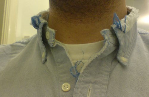
I just have get this out there, even though I know it drives Jean quietly crazy. I like wearing clothes with holes in them. I just do. Not cutouts, obviously, and not really rips, but stuff that wears out, wears through.
I don't know when exactly it started, but I have some clues, and I suspect Rei Kawakubo bears a lot of the blame, even though my Comme des Garcons is in great shape. And it's not entirely her fault, because I know I was holding onto at least one wonderful cashmere sweater I bought at the opening of Fellissimo on 56th street which got a hole in it the middle of the chest just a couple of years after I bought it, and that was before I bought The Shirt.
The Shirt is this blue CdG dress shirt that's plain in every way, except that it has wrinkles permanently pressed into the lower half of the sleeves. There's no better way to really get to know your dry cleaner--and to have him remember you--than to bring him a shirt that must be ironed in such a way that the wrinkles don't disappear. It's over ten years, and The Shirt is still properly wrinkled, and I think the conscious choice of buying and flaunting, frankly, a piece of disheveled clothing helped pull me over the line between not throwing out something [expensive/comfortable] I liked and wearing something with a hole in it, even if I looked like a hobo.
The Fellissimo sweater was a start, but the real foundation of my shredded wardrobe is a Ralph Lauren blue buttondown oxford shirt [pictured], which I wear with something akin to cheapskate preppy pride. It's almost 20 years old, and the collar and cuffs have been ragged for at least the last 5-6 years. Everything else about the shirt is solid--oh wait, no, the left elbow wore through last fall, a result of my typing posture. It's happened on a couple of great sweaters recently, too.
But I think the point the shirt makes [to me] is clear: I'm not going to replace this shirt. First off, there is no way in hell I'd buy a blue buttondown oxfordcloth shirt at Ralph Lauren today, in 2009. Ralph and I have both traveled too far, and it is just not the same thing. [And it's not some Made in USA, not Sri Lanka problem, either. I think mine was made in Hong Kong. And it's not like I'd ever buy a vintage shirt, shredded by someone else. Maybe if it was deadstock, but who's got time to hunt down vanilla 1980's Ralph Lauren shirts these days?]
In the last few months, I found an old white Ralph Lauren oxford in a box of clothes I'd packed and stored after business school. I put it into heavy rotation, and now it, too, is starting to fray along the collar.
One shirt with a scraggly collar might make people wonder--don't worry--if I didn't notice, or worse, maybe that's the only shirt option I had. But put a cashmere sweater with a worn out elbow over it, and they'll have to know it's a choice. Not that they'll know what to make of it.
The real holey clothes, then, are the cashmere sweaters. I have 30- and 40-year-old cashmere sweaters that look brand new, and I have 4-year-old sweaters that are falling apart. [Cashmere has really diminished since it went mass market a while back, and paying a lot for it is no guarantee of quality or durability. It's really a shame.] But worn-through cashmere feels kind of nostalgic, I guess, not just too expensive or wasteful to toss out.
Up until World War II or so, dirt poor Japanese farmers used to save every scrap of fabric they could get their hands on, repairing and reusing indigo-dyed cotton and linen with great care. The Japanese term for worn out, boro boro, has since become its own aesthetic, and the more intricately patched and repatched the futon cover or jacket is, the more highly it's prized.
I get it, but that's not quite where I am yet, I think. For one thing, I haven't figured out any strategy to mend any of my holey sweaters. They're all too far gone for the French-American Reweaving Company to do anything about them, though they do excellent work repairing snags or the occasional moth hole. Really great work. But mending something or reworking it, or patching it, is a conscious move; it's doing something about the holes instead of just letting them be. I think I'd rather be comfortable and content to let the clothes run their course.
But for the question of why I bring this up at all: I think wearing clothes with holes in them is going to be increasingly popular over the next couple of years, and I just want it to be clear that I was doing it first.
January 15, 2009
Will The Owner Of The Chrome Car Parked At The Hirshhorn In 1974 Please Come To The Information Desk?
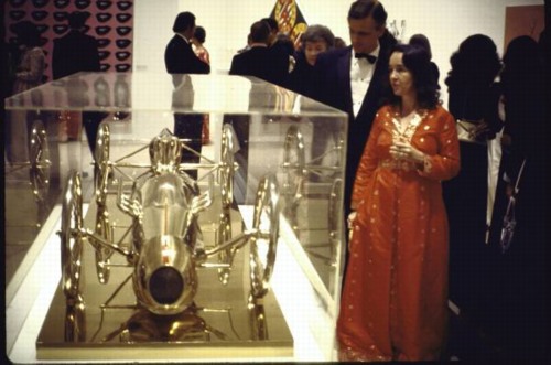
LIFE Magazine's digitized photo archives includes a few sweet pictures by Gjon Mili from the opening party at the Hirshhorn Museum in 1974. [here's a great shot of a whole gallery full of Giacomettis. Do they still have all those Giacomettis?]
Besides the fashion and the hair and the realization that the Hirshhorn came into being in the Nixon and Ford administration, [The opening was in October 1974, a couple of months after Nixon resigned.]--well, actually, that's quite a lot.
Anyway, I've tried and failed to figure out the artist who made this chrome Formula 1 race car sculpture. If you have any ideas, I'd love to hear them. Or I could ask Jeff Koons about it; didn't he work as a valet parker at this party? [see the full size image]
Trova. Mister Ernest Trova Thanks to Peter Reginato for identifying Study: Falling Man (Carman), 1965, one of Ernest Trova's series of Futurist-meets-Surrealism Falling Man sculptures which explored the changing nature of man in the technological age. Carman is the largest of the 14 Trova works [three sculptures, a portfolio, some other prints] that were part of Joseph Hirshhorn's initial bequest. It wasn't included in the Boca Raton Museum of Art's 2007 Trova retrospective; maybe they used another of the edition of six.
As Peter points out, a streamlined, nickel-plated Falling Man study used to be in the lobby of the Whitney "forever." I tried to look it up, but--is this right?--the Whitney Museum's collection is not searchable online? I remember the Whitney being one of the first museums on the web, hosted at my old ISP/BBS, echonyc.com/~whitney. But that was 15 years ago. It seems like they've been behind the curve ever since.
January 14, 2009
Photographing Photographing Dan Graham's Project For Slide Projector

For their first show in 2005 Orchard, the collaborative gallery/exhibition space on the Lower East Side, recreated Dan Graham's 1966 Project for Slide Projector:
Project for Slide Projector was presented as a set of instructions for an experimental work and a theoretical text that interrelated minimalist ideas of three-dimensional work with the conventions of photographic representation. Graham published his text in no less than three versions in 1969. In the period 1969- 70, a student of Graham's at the Nova Scotia College of Art and Design in Halifax realized a set of slides for the work with Graham. To execute the piece, a rectangular structure of four glass panes with an open top and a bottom pane made of mirror was constructed, along with four glass boxes designed to nest within the first box. To create the photographs, a 35mm camera was placed close-up and parallel to the rectangular face of the large box so that the edge of the photograph and the edges of the box align. The camera operator shot each side of the glass and mirror structure, moving clockwise, and did the same as each additional box was added within the larger structure. The resulting set of twenty slides is duplicated in order to produce a set of slides that arrays the images in a forward and back-ward motion as they project.Over the carousel projection of 80 images, the degree of reflectivity and spatial ambiguity of the mirror space Graham conceived moves cyclically and inverts, building and un-building. Located somewhere between the materials and experiences of sculpture and photography though essential to neither, Project for Slide Projector captures the experience of walking around a sculpture, that is, the spectator's perception- a site for significant artistic experimentation in the sixties. Project for Slide Projector can also be read as an image of the experience of looking at sculpture via its photographic reproduction, a subject artists such as Robert Smithson explored in visual work, exhibitions, and writing.
Graham wrote: "The sculpture is the photographic residue, and effect of projected light. What is seen must be read in terms of the conventions of still photography: two-dimensional objects which appear at once solid and also as transparent, and which function simultaneously in two entirely different planes of reference (two-dimensional and three-dimensional)." (Films 1977)

Meanwhile, for his film project Orchard 2, Jeff Preiss created a flickering, Muybridge-like animation documenting the process of shooting a new set of slides for Graham's piece. All that's left is to download Preiss' film to your iPhone and play it while you're watching Project for Slide Projector in a gallery. I miss Orchard.
Part Two | Orchard [orchard47.org]
Photographing PROJECT FOR SLIDE PROJECTOR by Dan Graham at ORCHARD [jprq on youtube]
January 14, 2009
Nice Hustle, Dia, You Get Right On That.
Red-headed Dia director Philippe Vergne was dressed in optimism--the new armor under Obama--and spoke of his mission this week to save Robert Smithson's Spiral Jetty from contamination by oil companies planning to drill into Utah's Great Salt Lake. "We're going to win," he said. I believe him.- quoted by Linda Yablonsky last week, nearly a year after the oil drilling permit issue arose, and several months after the collapse in oil prices decisively returned the thick, sticky, low-quality crude at Rozel Point to unprofitability. [artforum]
January 13, 2009
Refreshments
Of the three Mormon-raised artists I'll be talking about at the Sunstone Symposium on January 31st, painter Wayne Thiebaud is probably the most recognizable and accessible. Thiebaud's brightly lit paintings of cakes, pies, candy, and other American diner delights were shown along side Pop Art from the earliest days of the movement, particularly seminal Pop exhibitions in 1962 at Sidney Janis Gallery and the Walter Hopps-curated show at the Pasadena Museum, "New Paintings of Common Objects."
You kind of half-think it's a joke that Thiebaud's subject matter--desserts--would have a link to his Mormon upbringing. Surely, I'm not making a serious point that Thiebaud is painting that most culturally Mormon of all foodstuffs--refreshments. Actually, I think he makes the point himself.
Compare the language in these passages from a 2001 interview Thiebaud gave for the Smithsonian Archive of American Art. The first is about growing up and the Church:
WAYNE THIEBAUD: My grandmother had, I think, eleven children. She lived to be 99. And my father, coming from another religion - Baptist, I think, if I remember - joined the Mormon Church, and was eventually an enthusiast, or was a- It's a lay ministry, Mormonism, and he finally became a bishop. So I was a bishop's son.Thiebaud then ties his paintings to the past--his past--in a couple of relevant ways:SUSAN LARSEN: Did the-
WAYNE THIEBAUD: But the Mormon community is very, very intersupportive. And- and so it was a very nourishing environment. I was what you'd call today, I think, a spoiled child.
SUSAN LARSEN: Mm-hm. Did you have a lot of people around you and people caring about you?
WAYNE THIEBAUD: Lots of aunts and uncles, that large family, so that it was- it was a wonderful kind of way, I think, to grow up, psychologically. In terms of the intellectual tradition, Mormonism has a very strange association with that, so it's... That division occurred later on, and I'm no longer involved very much at all with it.
...
SUSAN LARSEN: In your family circle, was there much interest in culture, either music or art or pop- popular culture?
WAYNE THIEBAUD: Yes, on a kind of- a kind of very basic, almost folk level. The Mormon Church sort of encourages all kinds of performances. People get up and talk, and we were often encouraged to do, like, what they call one minute talks or three minute talks.
SUSAN LARSEN: What were they about?
WAYNE THIEBAUD: Mostly- well, mostly kind of hearty and humorous and religious or... little talks.
SUSAN LARSEN: Uh-huh, right.
WAYNE THIEBAUD: Lots of plays, dances. But very family oriented always.
SUSAN LARSEN: And so this was a- a factor in your weekly life, and things to look forward to and take part in? You took part in these?
WAYNE THIEBAUD: Yes, oh yes, very much so.
SUSAN LARSEN: Yeah, yeah. Uh-huh. It wasn't just watching, but participating.
WAYNE THIEBAUD: Yes, pretty much- pretty much centrally involved. Even if I were, for instance, to go in the - which I eventually did - become a scout, the scout troop was in the Mormon church. And if you went to a dance, it was at the Mormon statehouse [i.e., stakehouse. -ed.]- or church house. So it really was a- a community, a rather close knitted, intersupported environment.
SUSAN LARSEN:...The- the classic still life paintings that you've done often seem to feature comfort food or middle class kind of things that most people can access, that most people have access to, or have tasted or have...Joy, pleasure, comfort, nostalgia, continuing support, no troubles, these are the motivating feelings and evocations Thiebaud cites for his work.WAYNE THIEBAUD: Right, and they're available in almost every place in America. Same buffet spread in almost everywhere.
SUSAN LARSEN: Is that something that- that is important in the choosing of things to your, or was there...
WAYNE THIEBAUD: I think maybe part- certainly, part of it. But I start out with these very formalist problems. But certainly, toy counters and restaurants, which I've worked in, those experiences always, for me, have to have some footing in them, in that world that I, you know, I've lived in. And people will often ask, "Well, you never painted pizza, you never painted spaghetti." And I'll say, "Well, it's not..." Yes, now everybody has pizzas everyplace, but my things have a lot to do, I suppose with nostalgia. I think Allan Kaprow once said that they're very nostalgic paintings. They go, really, back to the thirties and forties. And the evolution of, let's say, European influence on the decoration of pastries doesn't really reach Medicine Bow, Wyoming; it's just not the same. So there is that part, I think, which is crucial. Gumball machines, gambling machines, automobiles Even American cities and the juxtaposition of strange architectural differences, all the way from gothic to modern, and that the cities sort of grow up without plans, like Paris and so on. And even American agriculture, I think, was seemingly different in terms of its mechanization. But also, it's sort of artfulness, in terms of how they make fences or design roads or...
...
SUSAN LARSEN: People seem to take enormous immediate pleasure in your paintings. (inaudible)
WAYNE THIEBAUD: Yes, that's- I think that's an inherent- can be an inherent danger, I'm supposed. But I'm delighted when people are able to smile at the work, and I- I hope it has a sense of humor and- and joyousness; that would be my- my hope.
SUSAN LARSEN: It seems because those things are in most of our common experience, I think there- there's almost a kind of endearing welcome that- that the subject matter proposes to a lot of viewers. It's- it's as though you were there when they were a kid. You remember those tastes, those things. And there's- those are moments of inexpensive pleasure that is available to most people. Very democratic, kind of. Better than showing something special and strange that only...
WAYNE THIEBAUD: It's an interesting question, isn't it, about how that comes about. I don't think it can be faked. Like people who, say, try to fake... We were talking earlier about misery or- or inhumanity to man. That's... I mean, if you're raised in an atmosphere of continuing support and no troubles, then it's very hard to make agony a real thing, or to affect primitivism or...Or in the case of even something like joyousness. If your life hasn't been joyful, I don't know how you'd ever get it into your paintings.
The references and resonances between Thiebaud's work and Edward Hopper's are commonly recognized, as are his bigger picture interest in exploring consumerism and popular culture generally. But the idyllic past in Thiebaud's memory is not just American, Western, or Californian; it's Mormon.
January 13, 2009
"An Unannounced Preview At The Coronet" Of Pasolini's Teorema
From Vincent Canby's April 22, 1969 review in the New York Times:
Pier Paolo Pasolini's "Teorema," which opened yesterday at the Coronet, is the kind of movie that should be seen at least twice, but I'm afraid that a lot of people will have difficulty sitting through it even once. At least there were some who had that problem Friday night when the film was given an unannounced preview at the Coronet, supplementing the regular program, headed by "The Prime of Miss Jean Brodie."Can you imagine a theater today showing an unannounced preview after the feature? Or showing Pasolini at all? I still have a raincheck ticket in my wallet from the Coronet [aka the Baronet Coronet, aka the Coronet I & II, which was demolished to make way for an Urban Outfitters] to go back and see Dancer In The Dark. I went to a noon showing, only to realize I was crazy and had a call at like 2pm, so I left before the trailers ended. Oh wait, I just pulled it out. The ticket was from the Cinema 1,2,3,4 up the street. Never mind. The Pasolini thing's still crazy, though.It was a disastrous combination. "Baby Love" is a straightforward, skin-deep narrative movie that elicits conventional responses to familiar stimuli. "Teorema" (theorem) is a parable, a movie of realistic images photographed and arranged with a mathematical precision that drains them of comforting emotional meaning. For the moviegoer whose sensibilities have been preset to receive "Baby Love"--or just about any other movie now in first run here--"Teorema" is likely to be a calamitous and ridiculous experience.
...
There is very little dialogue in the movie--923 words, say the ads (but I'm not sure whether this refers to the Italian dialogue or the English subtitles). Even though Pasolini is a talented novelist and poet, the film is almost completely visual. The actors don't act, but simply exist to be photographed. The movie itself is the message, a series of cool, beautiful, often enigmatic scenes that flow one into another with the rhythm of blank verse.
This rhythm--one of the legacies of the silent film, especially of silent film comedy--was impossible for the Coronet audience to accept. The seductions are ticked off one after the other with absolutely no thought of emotional continuity. So are the individual defeats, which are punctuated by recurring shots of a desolate, volcanic landscape swept by sulphurous mists.
There is also a kind of rhythm within the images. Someone seen in right profile is immediately repeated in left profile. An action that proceeds to the left across the screen may be switched 90 degrees, directly away from the camera, or into the camera. Early scenes are in black and white. Later scenes are so muted they almost look like the old Cinecolor process, only to go monochromatic again at the end.
Theorem (1968) The Screen: A Parable by Pasolini: Teorema' in Premiere at the Coronet Terence Stamp in Role of a Visiting God [nyt, via sal mineo's ghost, thanks ready for the house]
January 13, 2009
Gregor Schneider's Cube Venice At Sotheby's
Buy this nice c-print study of Gregor Schneider's unrealized Cube Venice at Sotheby's next month, and they'll throw in a fatwa for free!
Sale L09621, Feb 6, 2009, LOT 213: GREGOR SCHNEIDER, CUBE VENICE, 2005, numbered 2/6, 3,000--4,000 GBP [sothebys.com]
January 12, 2009
David Hammons On Not Liking To Show In Gallery Spaces That Much
On a visit to Alexandria, Egypt, artist David Hammons asked a curator to ask a local non-profit, Alexandria Contemporary Arts Forum, if he could do a project with them:
I had to explain that it wasn't going to be in their gallery. They had hoped it would be--it's a very nice space, a marvelous, beautiful restoration of an apartment. As beautiful as the space was, that was too easy to do. I don't particularly care for galleries. I'd rather walk through the city and find my own spaces.Then there's this. about works where he predicted rainbows over Paris and rain in Munster:I do that a lot in New York. I'll find something and call people up with the address and tell people to go look at it. It could be a stack of wood in the subway or something that looks like a Joseph Beuys or something lying around. [emphasis added]
was watching a video on YouTube in which Ornette Coleman presents a tune called "Spring" in Germany; he tells the audience, "Follow the idea of the song, not the song itself." He also said, "Follow the idea, not the sound." I was impressed with that. Follow how my ideas are put together, as opposed to whether the rainbow appears or the rain comes. I use this logic a lot. It moves in the realm of poetry as opposed to the actuality that people are used to or expect.[via artforum]
January 12, 2009
W-T-F-K-E-Y M-O-U-S-E
I'm a fan of Walt Disney. I used to work at Disney. Disney has a place in the history of art. But Paul Richards' four-page curatorial fantasia in the Washington Post yesterday calling for more Walt Disney in Our Nation's Museums is the height of obtuseness. Unfortunately, it's all too of a piece with the facile counter-intuitive stuntwriting that passes for the Post's coverage of cultural topics. [cf. Blake Gopnik's review of the National Gallery's gelato collection; watching Metro riders ignore violinist Josh Bell, insultingly uninformed reviews of fashion and John Cage concerts, &c., &c.]
Richards gives six reasons--unpersuasive, sure, but also so off-the-wall they're unanswerable--that Disney "deserves more than the video store. He should be in the museums":
Interestingly, he doesn't mention what I suspect is the real reason he wants to curate Disney. Here's the self-aggrandizing kicker of Richards' 2005 reminiscence of Walter Hopps, the legendary curator and museum director who was as famous in art world circles for his erratic, irreverent behavior as for his prescient, influential exhibitions:
Hours, sometimes days, would pass before one heard his low, rich voice, often on the telephone in the middle of the night. It was always worth the wait. He was the best art talker I have ever heard. His speech was like a Jackson Pollock drip painting, swooping, swelling, doubling back. He mesmerized. He taught.Luckily for Hopps, he died without having to watch a fanboi/critic try to turn some offhand party chatter about the worst show ever into a mouse-eared museum manifesto.One night, I remember, at the headachy end of a noisy artists' party, I asked him to conceive a show on the spot. "Okay," he said. "We'll call it 'Seven Enormously Popular American Painters.' Five supporting actors, and two stars. For the five, Walt Disney, N.C. Wyeth, Norman Rockwell, Rockwell Kent and Saul Steinberg. And for the two competing stars, Audubon and Warhol."
The death of Walter Hopps makes the modern-art museum world feel somehow pale and tame.
January 11, 2009
"Topaz Carpenter"
I'd had the idea all worked out, and the script outline--or a draft of it, anyway--all ready for a couple of years, but my paternal grandfather Champ passed away before I was able to make the original documentary about him I'd envisioned.
In 2001, I rather impetuously set off to interview my grandmother Avis, his wife, about their life. Which is when I learned he'd been in a band. With outfits and everything. A dance hall country band that traveled the desert towns in Utah and thereabouts. It's how he and my grandmother had met. I guess that made her a groupie.
As long as I'd known, he was only ever the gregarious, Center Street businessman, the guy who ran the dry cleaners where everyone took their Sunday clothes. But my childhood memories of him picking songs for me on his guitar changed as I imagined how, for him, playing music was also a reminder of the life he'd given up when he had a family.
I'd met my great uncle Wayne, Champ's brother, twice. At Champ's funeral, and then a little over a year ago at Avis's. It occurred to me that I should talk to him, hear his stories, see his photos and mementos. Because he is only one of a few people left who can provide some sense of my grandfather as a young man.
And so over Christmas, I took a few hours to visit with him and his wife. And that's when he told me in addition to a musician, my grandfather had been a hobo. In central Utah in the Depression [aka, the last Depression, -ed.], there wasn't enough work in your tiny hometown, so you had to hit the road to find a job.
And in the Summer of 1942, after he and Avis married and had one, maybe even two kids, he left them and traveled to the desert town of Delta, where he got a job building the Topaz Internment Camp, where over 8,000 Japanese Americans were imprisoned for up to three years.
Like most all the internment camps, Topaz Camp was built in a hurry, on a grid, using plans adapted from military barracks. Tarpaper-covered sheds were finished in sheetrock on the inside, and each block was divided up into apartments in a range of sizes--all too small--to accommodate different sizes of families. If they wanted any furnishings beyond the military cot provided, the internees had to build it out of the scrapwood the carpenters--including my grandfather--left behind.
Specifics of the camp's buildings and design were collected by the National Park Service, which conducted a survey in 2005 of all the sites and artifacts associated with the imprisonment of Japanese Americans [pdf], in order to identify candidates for National Historic Landmark status. In their report, it says,
Local craftsmen were used, but the requirements were not always stringent; in Millard County, Utah, near the Topaz Relocation Center, "Topaz Carpenter" is still a derogatory term, since anyone who showed up at the site with a hammer would be hired.And a damn good thing, too, I guess. It's an odd feeling to suddenly find oneself--or one's family--on the wrong side of history. On several wrong sides, actually, if the "Topaz Carpenter" dig were real. I don't doubt that some people say/said it, but it so happens that my maternal grandmother grew up in Delta, and neither she nor her people seem to have ever heard the term.
Until I posted about it, the NPS survey was the only Google reference to Topaz Carpenters. It was someone's insult generations ago in the middle of BF Utah, and it ended up in a government history survey, sounding pretty official. Part of me wants to defend my grandfather by disproving the term's popularity, as if that would somehow change its accuracy. Because he really was a guy who showed up with a hammer, got hired, and who, in just a few weeks, built a prison camp for his fellow Americans.

After the camp was closed in 1945, the barracks were either torn down or sold to local farmers, who used them as barns, even a home or two. There was one left nearby--half of one, really, a 20 x 60 section, being used as a shed--which was donated and restored in 1991 to help create the Topaz Museum. [images: greatbasinheritage.org] Which is now on my list of places to visit next time I'm in Utah with a couple of days to spare.
Previously:
This [Japanese] American [Internment Camp] Life [greg.org, 2007]
Ansel Adams Japanese American concentration camp photos from Manzanar [greg.org, 2003]
January 8, 2009
Richard Prince Sued For--What Else?--Appropriating Photographs
Via Cityfile, we learn that Paris photographer Patrick Cariou has filed suit against Richard Prince, Gagosian [the man and the gallery], and Rizzoli for copyright infringement. Prince used photos from Cariou's 2000 book Yes Rasta in the Canal Zone paintings he just showed at Gagosian NY last month [Rizzoli published a book of Prince's works, too.]
In the suit [embedded pdf at cityfile], Cariou repeatedly calls Prince an "appropriation artist" [quotes included], who "boasts" of "copying" other peoples' work. What's different in this case, Cariou argues, is that instead of copying "anonymous commercial imagery, such as advertisements," Prince has copied Cariou's work. Which happens to be hard-won portraits of camera-shy Rastafarians, "approximately 100 strikingly original black-and-white photographs, mostly close-up portraits of stern, mystical-looking men within a distinctive tropical landscape."
As fun as it might be to watch the bedlam if Cariou was granted the relief he seeks--namely, monetary damages for copyright infringment and conspiracy; having every painting, scrap, scan, page and byte of the infringing works turned over to him and destroyed; having Gagosian send out notices to the buyers of Prince's paintings that it is illegal to display or sell their infringing works--I don't see Prince or his people losing much sleep over this case.
First off, it's not like the advertising imagery Prince has used before is either "anonymous" or the product of happenstance. When Prince's versions of his Marlboro Man photos were shown at the Guggenheim in 2007, the NY Times interviewed well-known photographer Jim Krantz. He clearly had issues with the appropriation--rephotography in this case--and if he hadn't assigned his copyright to Philip Morris, Krantz would probably be able to get a settlement from Prince, just like the rephotographed Brooke Shields photographer Garry Gross did.
Reading Cariou's complaint, you'd almost think Prince was simply re-presenting Cariou's images as his own. In fact, Prince's process and his use of Cariou's images are much more complex, and it will almost certainly be the basis for a judgment in Prince's favor. As the Canal Zone press release explains, process is central to the works:
..[the paintings] are, literally, "put together," like provisional magazine lay-outs. Some images, scanned from originals, are printed directly onto the base canvas; others are "dragged on," using a primitive collage technique whereby printed figures are roughly cut out, then the backs of those figures painted and pasted directly onto the base canvas with a squeegee so that the excess paint squirts out on and around the image. On top of this are violently suggestive swipes and drips of livid paint and scribbles of oil-stick crayon which, together with the comic, abstract sign-features that mask each figure's face, add to the powerful push-pull between degree and effect. This has become a completely new way for Prince to make a painting, where much of what shows up on the surface is incidental to the process.Collaging and reworking and changes in format, size, medium and styles, they're all transformative creative techniques that were directly addressed in the 2005-6 case, Blanch vs. Koons, where the same court [the US Southern District] found that Jeff Koons did not infringe Andrea Blanch's copyright when he collaged a pair of legs from her photograph--published in a 2000 issue of Allure magazine--in a painting. Blanch lost on appeal, too.
Prince's process means his works, like Koons's, will almost certainly be declared transformative, not derivative works, and as such, they're fair use, not infringing. But Cariou's filing also sows the seeds of another fair use argument, that of criticism and commentary. Cariou waxes on about the Rastafarians,
...a spiritual society, living simply, independently, and in harmony with nature, apart from the industrialized world of environmental pollution and materialism which they reject and refer to as "Babylon." Naturally, the Rastafarians do not trust outsiders, such as Plaintiff, and it was only after living with them for years that Plaintiff was finally permitted to photograph them.Prince's Canal Zone project is precisely a critique of this sort of European Caribbean romanticism:
Prince has transformed the former reality of his birthplace [i.e., the Panama Canal Zone] into a fictive space: "Canal Zone" provides an anarchic tropical scenario in which extreme emanations of the (white American male) id - fleshy female pin-ups, Rastafarians with massive dreadlocks, electric guitars, and virile black bodies - run riot.And then he takes it further, critiquing utopias wherever they're found [sic], including Thomas More's original Utopia, an island "that possessed a seemingly perfect socio-political-legal system." Sound familiar?
By roughly juxtaposing distinctly unclassy porn against Cariou's photos, Prince calls bullshit on the myth of the White Man's humble, harmonic embrace of and by the "simple," "stern," "mystical" Rastas. Cariou might as well sue Andy Samberg and NBC for defamation while he's at it. He'd probably have a better case.
Richard Prince and Larry Gagosian slapped with suit [cityfile via afc]
Canal Zone, Nov 8 - Dec 20, 2008 [gagosian]
Is it even in print? Could the controversy lead to a new edition? LIMITED AVAILABILITY - Yes Rasta by Patrick Cariou [powerhousebooks.com]
If the Copy Is an Artwork, Then What's the Original? [nyt, 2007]
January 7, 2009
Google StreetView Van Reflections
by Joe McKay. Awesome.
Now if someone'll do Every Google StreetView Van Reflection On The Sunset Strip, we can close the loop. [via jmb's best of the web @ afc]
Previously: every building on the sunset strip--and then some
January 7, 2009
A Favorite Kippenberger Made From A Favorite Richter
The Martin Kippenberger retrospective closed yesterday at MoCA, which means it's just a few weeks away from opening at MoMA, which means I'll finally be able to see one of my favorite-from-afar Kippenbergers in person.
The Happy Ending To Franz Kafka's Amerika is always fun. And I love the Metro-Net subway stairs and vents for the trains that connect the world--the NY-style ventilation grate in the front lawn of LA's Schindler House on Kings Rd still conflates those two cities for me.
"Haven't you people ever heard of coasters??"
But the one I've been waiting to see is Modell Interconti. It's a coffee table that Kippenberger made in 1987, and the top is made from a Gerhard Richter Grau painting. Kippenberger bought the painting as a Richter, then sold it as a Kippenberger, promptly destroying--or at least disappearing--a significant percentage of its market value.
Though I'm sure he didn't take too big a hit. Richter's grey paintings have never been as pricey as his less boring work: the blurred photo-based paintings, the gloppy aerial landscapes, the hard color grids, the squeegees. Which is part of why I like the grey paintings so much; they can be so successful at eliminating the extraneous elements and letting you focus purely on the paint, the surface, the object. And the range is anything but boring. Those giant grey glass paintings at Dia:Beacon create a space as seductive and perceptually disorienting as any Serra.
Ten years after Kippenberger made Modell Interconti, you could get a slightly smaller Richter grey painting at the Armory Show for around $10,000. Which was probably the price of a major Kippenberger by then, too. So within a decade, Kippenberger had caught up with Richter's market. And now a major Kippenberger--like, say, Modell Interconti--is surely worth more than a small, demure Richter. At least it was pre-meltdown.
Modell Interconti, 1987, collection Gaby and WIlhelm Schürmann [image: swo.de, link broken (2016)]
The MoCA photo used by the LA Times is probably better. [latimes]
2016 update: Chin-Chin Yap's case study of the moral rights associated with Modell Interconti, from July 2009 [artasiapacific]
January 3, 2009
Muji Village: "Green, Plain, Community"

Muji has teamed up with real estate developer Mitsubishi Chiso [Mitsubishi Estate] to create Muji Village, a three-building condominium complex in Chiba Prefecture, the New Jersey of Tokyo. Or maybe it's the Westchester of Tokyo, and Saitama's New Jersey, but still. [here's a Google map of the site. It's near Maebara and Tsudanuma stations, and it used to contain a six-building municipal housing complex from 1960.]
The concept for Muji Village boils down to three points: Green, Plain, and Community. Green means trees, not ecologically sustainable. Plain means "white, 100 year concrete" and design that won't go out of fashion [sic], plus flexibility to remodel as your family configuration changes, and Community means common spaces like libraries and a couple of gardens.
Frankly, even though Muji is pervasive to the point of saturation in Japan, I'd still suspect that Muji Village is being built on the premise of a particularly brand-centric "feel good lifestyle," and that it is intended to attract like-minded Muji aficionados--Mujillas in this case, not Mujillahs.

Last month at the flagship store in Yurakucho, Muji Atelier exhibited poster-sized Muji Village floorplans in a grid of stacks on the floor. They were meant for you to roll up and take home, so you could discuss them at your kitchen table and decide the layout you preferred best. Such presentation, such collaborative spirit, such freedom of choice! It's as if Muji Village's exclusive broker was Felix Gonzalez-Torres.
I can't find any info on prices, or photos, or renderings. And yet the Muji Village website says they are currently looking, not for buyers, but for "members."

update: Aha, here it is. 9 stories, 152 units, Sounds like Mitsubishi came with an existing project. Muji's doing the exterior, unit interiors, and common areas, including the Community "living rooms." Sales and model room debut in late January for Feb. 2010 occupancy. [via nikkei business preess, sept. 08, before the real estate development world ended]
Muji Village info page and exhibition [muji.net]
Muji Village website [muji-village.com]
January 3, 2009
Yet Another Muji House

While New Yorkers still can't believe they finally have three Muji stores, Japan last year got its third model of Muji House.
Last spring, the company introduced Ki no Ie 3-kai-date, a vertically oriented, 3-story variation of their 2-story Wood House. [The other model is Mado no Ie, Window House.] The 3-story model home was unveiled in April 2008 in Toyonaka, the Osaka metro city where Kansai Airport is located.

Holy smokes, it's tiny. Less than 100 sq. m inside, 130 sqm including the carport, porch and balconies. Still, the interior feels pretty spacious, if only because it is; the third floor bedroom opens onto the living/kitchen below. If you need a second bedroom, there's an office/storeroom on the ground floor.

Muji Houses aren't prefab; they're manufactured, and assembled onsite. Ki no Ie is pretty spartan, and it uses a post & beam construction system of engineered wood which, as you can see, you can see. I couldn't find price info for the 3-sty, but the 2-story Ki no Ie sells for about 108,000 yen/sq meter, or about $110/sf.
Muji Ie: Toyonaka Model House [muji.net/ie, in japanese. via mocoloco and jean snow]
Muji Ie - Muji House, main page [muji.net/ie, no mention of the 3-story model]
Muji House Blog - Toyonaka [ie.muji.net, their web presence is pretty damn complicated for such a pared down company]
January 1, 2009
The Fake Wedding Singer
Even he had to admit that this was as pleasant a concert setting as could be imagined. The stage was a flatbed trailer set up in front of a log cabin; it was a breezy summer afternoon, and people brought folding chairs and beach blankets. His mother was there, with a collection of aunts and uncles. Parsons, shirtless in swimming trunks and as skinny as advertised, sang some charming, shambling mountain songs with his band, and then there was a fake marriage ceremony, in case the neighbors were watching--they had been told that the gathering was for a wedding, on the theory that this would make them less likely to call the police. Then Oldham took the stage, with Parsons and the band surrounding him. He was wearing a maroon tank top, orange-and-pink pants, blue Crocs, and a pink Boston Red Sox cap, with "cam" and "odia" scrawled on either side of the "B."- Will Oldham transfigures American music, by Kelefah Sanneh [newyorker.com via southwillard]
recent projects, &c.

Our Guernica Cycle, 2017 –
about/kickstarter | exhibit, 2017

Social Medium:
artists writing, 2000-2015
Paper Monument, Oct. 2016
ed. by Jennifer Liese
buy, $28
Madoff Provenance Project in
'Tell Me What I Mean' at
To__Bridges__, The Bronx
11 Sept - Oct 23 2016
show | beginnings

Chop Shop
at SPRING/BREAK Art Show
curated by Magda Sawon
1-7 March 2016

eBay Test Listings
Armory – ABMB 2015
about | proposte monocrome, rose

It Narratives, incl.
Shanzhai Gursky & Destroyed Richter
Franklin Street Works, Stamford Sept 5 - Nov 9, 2014
about | link

TheRealHennessy Tweets Paintings, 2014 -
about

Standard Operating Procedure
about | buy now, 284pp, $15.99

Canal Zone Richard Prince
YES RASTA 2:The Appeals Court
Decision, plus the Court's
Complete Illustrated Appendix (2013)
about | buy now, 142pp, $12.99

"Exhibition Space" @ apexart, NYC
Mar 20 - May 8, 2013
about, brochure | installation shots

HELP/LESS Curated by Chris Habib
Printed Matter, NYC
Summer 2012
panel &c.

Destroyed Richter Paintings, 2012-
background | making of
"Richteriana," Postmasters Gallery, NYC

Canal Zone Richard
Prince YES RASTA:
Selected Court Documents
from Cariou v. Prince (2011)
about | buy now, 376pp, $17.99