
Trying to clear some browser tabs. From John Hilgart, the guy who brought the world Comic Book Cartography, comes his next foray into the overlooked, undersung details of comics history, Four Color Process. It's an incredibly beautiful collection of vintage comic book scans made with an eye to the unique aesthetic qualities of the cheap, obsolete, half-tone printing process.
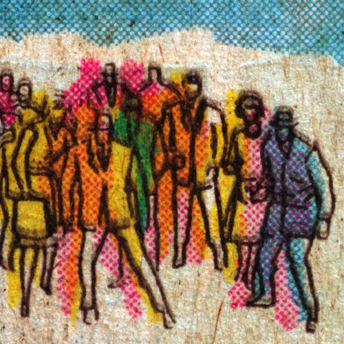
For a while, I'd always considered it more an exercise in artful magnifying and cropping, but a post a couple of weeks ago changed my mind. In discussing some psychedelic examples from 1968 of Jim Steranko's groundbreaking work on Nick Fury, Agent of S.H.I.E.L.D., Hilgart writes:
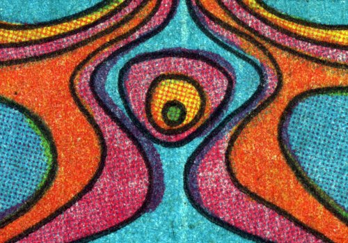
Perhaps a great artist, but not a realistic illustrator, Steranko tended to emphasize the flatness of comics even when he piled on the detail. It is design not illusion, dynamic yet inorganic.This resonated with something a friend said to me about my recent looks into early Lichtenstein paintings and the unusual seascapes collaged from reflective materials. And not because dots is dots. Just the opposite. He mentioned seeing a bunch of early, large Lichtenstein paintings recently and being struck by how "Op" they are, in that they induce all sorts of optical effects of moire-like shimmering, etc. He noted that because this aspect of the work is dependent on experiencing the painting in person, and is totally lost in reproduction, that it's rarely discussed or acknowledged by critics and historians. [Which makes right now a good time to take Roberta Smith's advice and see the wealth of Lichtensteins on view in New York right now, especially the early drawings show at the Morgan Library, which is a tour de force of Ben-Day dotsmanship.]All of these factors make Steranko a fascinating case when considering four-color process in the history of comic books. He clearly had an interest in solid colors, embracing rather than running from the limited building blocks of the process. He also freely acknowledged the divide (and the arbitrary yet essential relationship) between the line art and the lurid color that process printing smacked down on top of it. Many of his panels use color as an illustrative element, completely separate from the black ink beneath it. His art was only "finished" in the printed comic book itself.
Steranko's early work systematically exploits the same aesthetic forces that the 4CP gallery foregrounds as defining elements of mid-Century comic books generally. In 2010, when vintage comic book art is reproduced in crisp, acid-free, book format, the original reproduction of Steranko's art begins to look and feel closer to fine art lithography. Forty-year-old pulpy reproductions may in fact be the definitive editions, anything else being a cheap approximation. [emphasis added]
In case anyone needs more convincing, Hilgart went on to post a pair of images, one vintage and 4cp, and the other contemporary and digitally remastered. The differences are alarming. And though I could see an artist's point who preferred a higher-resolution, more refined reproduction, the lost historical accuracy is undeniable.
This morning, the kid was trying to memorize a phone number, and I found myself explaining area codes to her. How they're linked to a city or a whole state, even, and how you can tell where a phone number's from. And then I stopped short trying to explain why New York City got 212, because I realized that without a rotary phone handy, there's no way she'd get that it was the quickest number to dial. And of course, then there's number portability, and overlays, and speed dial, and is she even ever going to need to memorize a phone number anyway? But that doesn't negate the real history and context behind them.
Jim Steranko and Four-Color Process, 1968 [4cp.posterous.com via khoi]


