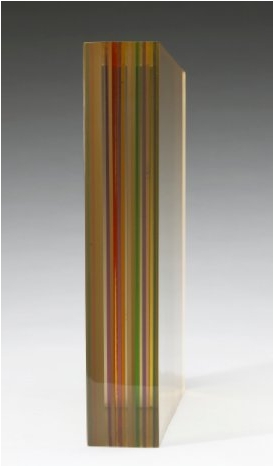
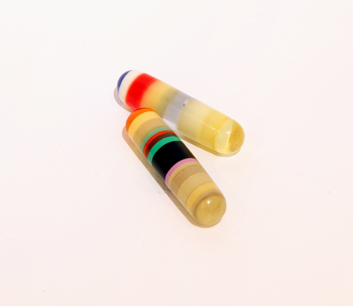
Terrance O'Shea, late 1960s, 11x11x2 slab of laminated plexiglass
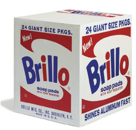
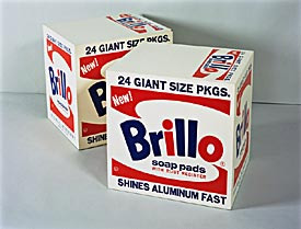
This summer while poking around into the conflicted treatment of the Pasadena Art Museum's Warhol Brillo Boxes, I found a tangential mystery: 10 or 30 or 40 or more Kellogg's Corn Flake Boxes Warhol authorized for the LA County Museum of Art seem to be unaccounted for. Warhol "donated" 100 boxes in 1971; the donor/collectors on LACMA's influential Contemporary Arts Council paid for the fabrication; but now the museum only has 57 in their collection, and at least ten have turned up in private collections and/or at auction.
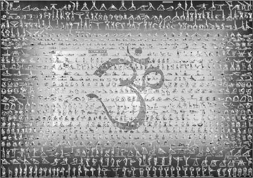
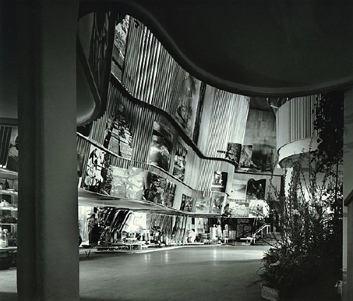
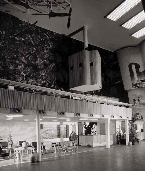
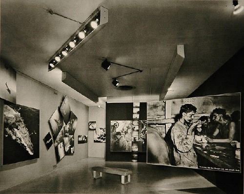
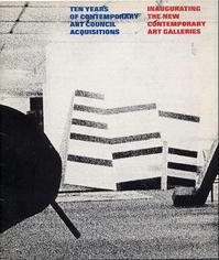 Still haven't figured that out. But one thing leads to another, and so I'm looking at the catalogue for the last known appearance of "all" the Warhol boxes, a 1973 show organized by Maurice Tuchman titled, Ten years of contemporary art council acquisitions, inaugurating the new contemporary art galleries, [left] and I see this title, how can I not?
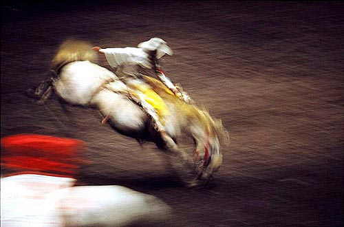
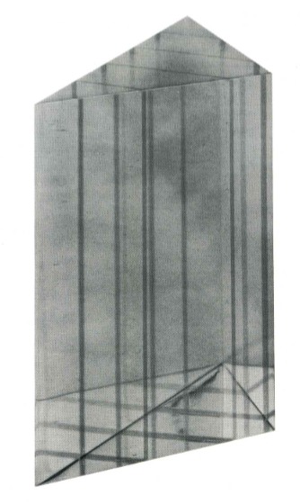
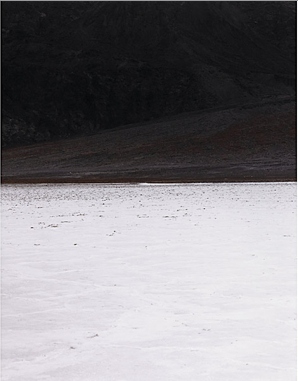
Documentation of the Artist's Act of Placing One of His Sculptures in the La Brea Tar Pit, 1971, by Terrance O'Shea.
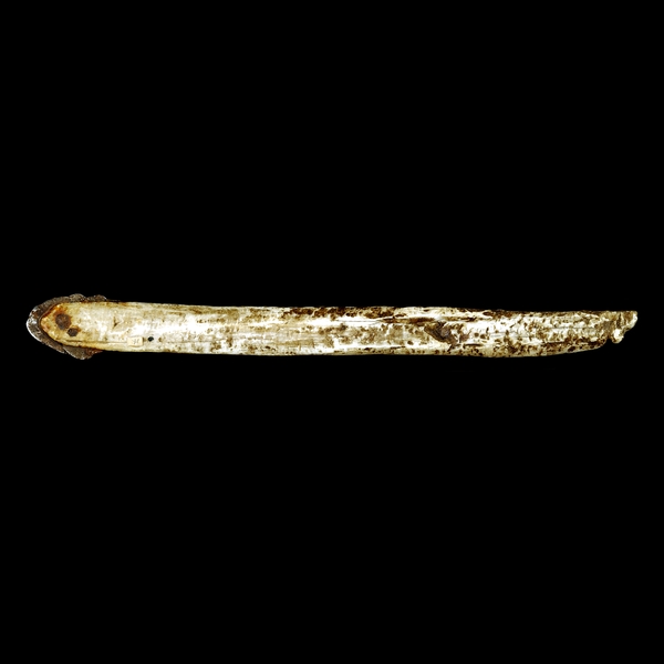
And the work consists of a photograph--a 4x5 transparency, actually, and a notarized letter/certificate. And the sculpture is a Lucite-looking prism or wedge, and there's no letter, and the LACMA website only has a thumbnail image of the letter, no text.
And the web searches for Terrance O'Shea are incredibly meager-to-nonexistent. Even though he was apparently the first LA plastics artist to win the museum's [CAC-funded, btw] New Talent Purchase Award--in 1966.
But I turn out not to be the only guy looking at Terry O'Shea in 2010. The folks at Cardwell Jimmerson in Culver City had just restaged a pivotal 1971-2 CalArts exhibition titled, "The Last Plastics Show," which had included O'Shea's work. Both times. Here's how their press release set it up:
By then [1972] the subject of plastic, resin and arious automobile-body technologies as expressed in California art had been thoroughly explored in multiple exhibitions up and down the west coast and extending east to Detroit and the Jewish Museum in New York. Moreover, the sunny technological optimism associated with California in the nineteen sixties had suddenly darkened; the hostile reception greeting LACMA's 1971 blockbuster "Art and Technology" exhibition being a case in point. This was indeed the end of an era, as older art practices and institutions (plastics and Chouinard Art Institute, for instance) gave way to the new (Conceptualism and CalArts). It was in this historical context that the artist/curators Judy Chicago, Doug Edge, adn DeWain valentine gave the exhibition its decidedly self-mocking and surprisingly poignant title: "The Last Plastics Show."
So I spoke with Tom Jimmerson, who gave me a brief sketch of O'Shea's work and life. He was sort of an artist's artist's artist, it seems, difficult to work with, and yet friend to many. Apparently holding artspeak and underwear in equal disdain, O'Shea was known to suck in his gut and let his pants fall to the ground at openings when the conversation got too hi-falutin'.
Runes, 1968, Terry O'Shea
He made impossibly tiny works out of the shards of plastic he'd salvage from his buddies' castings: intricate capsules, spheres, eventually some book-sized slabs, which he'd keep in black velvet bags and present with a magician's flourish for the viewer to hold and manipulate. The gallery is working on an O'Shea show for 2011, Tom said, and it sounds fascinating.
But Tom didn't know the details of the LACMA piece, or the story behind it. So he put me in touch with Doug Edge, one of O'Shea's best friends [O'Shea himself died from complications associated with a life of heavy living], he'd know. And so he did. I just spoke with Edge the other day. Here's how it went down:
In 1966, Terry went to see Maurice Tuchman and showed him his work, which he pulled out from one pocket after another. O'Shea was soon awarded the New Talent Award, which meant the museum would purchase a work for the collection. Only Tuchman or whoever never really followed up. Perhaps there was some ambiguity about the artist's responsibility to produce or present options for the curator [or the collector's committee] to choose from. Or maybe the museum was supposed to approach the artist, visit his studio. Either way, though there was, in fact, a sculpture--it was a clear, polished wedge with channels carefully routed out and filled in with colored resin, like all O'Shea's sculptures, it was laboriously fabricated and detailed--the acquisition hung in the air until 1970.
On May 28 1970, O'Shea and two friends--Edge didn't name names, but would only say that one was "a real big guy--went to the museum at about 2AM, and using the fence surrounding it in some sort of catapulting maneuver, Terry had his big friend heave the little wedge into the tar pit next to the museum.
Not that LACMA knew, of course. It wasn't until many months later, perhaps precipitated by an administrator at the museum following up on an unfulfilled pledge of work, that O'Shea informed the museum that he had, in fact, delivered their work, and they were already, in fact, in possession of it.
He created a sculpture and then he--he didn't destroy it, exactly; he "placed" it in a way that it can now only be experienced as a photograph.
This work lingered in my mind for a few months. But after seeing "The Original Copy," Roxana Marcoci's show of photography and sculpture at MoMA, I really picked up the pace on tracking down O'Shea's LACMA work. Which seems almost entirely undiscussed in the art and art historical world. And yet, not only does Documentation of the Artist's Act... fit Marcoci's premise like a glove, but O'Shea himself was operating at a critical juncture in LA's artistic history, a singular link between plastics and finish fetish--which he deployed toward his own, idiosyncratic ends--and the Conceptualist irreverence of, say a Nauman or an Oppenheim, or a Ruscha, who also happened to make a work involving LACMA and fiery destruction.
But anyway, keep that all in mind while reading O'Shea's letter, which Edge graciously read to me over the phone. It's after the jump, because even though I've found some other of O'Shea's work that shows this LACMA piece was not just a one-off joke, it's hard to imagine this post going even longer that it already has.

 The report also mentions the 100 Pasadena type boxes, plus "as many as 16" additional Boxes identified in the CR that were "given as gifts or sold." Two of those 16 are the
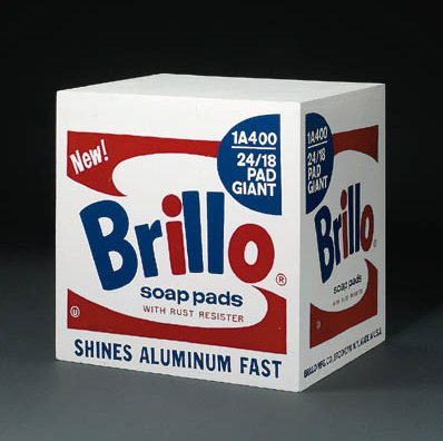
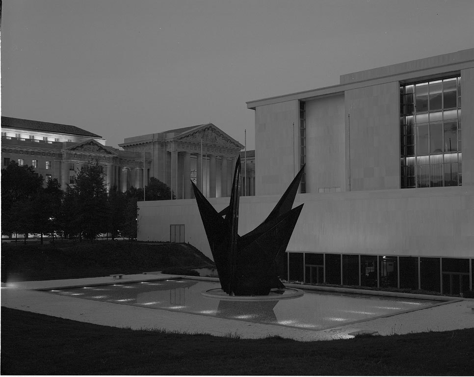
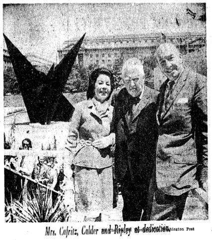
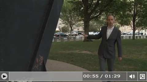
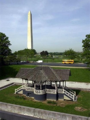 None of which seemed to slow down the Smithsonian which decided in 1983 to move the site-specific sculpture and replace it with a Victorian-era bandstand from the grounds of a Jacksonville, Illinois mental hospital. Or the Washington Fine Arts Commission which approved the move over the objections of--well, of almost no one, since Calder himself had died in 1976. The Washington Post did run an angry column by Robert Hilton Simmons, though, criticizing the trouncing of the artist's intentions and the Museum's claim that the sculpture's new site, in a grove of trees on the corner of Constitution Ave & 14th Street, would "allow it to serve more fully as a focal point."