Sometimes I can't tell when something is obvious, or when it's just obvious to me.
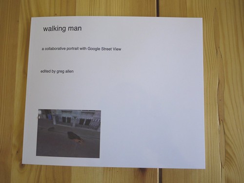
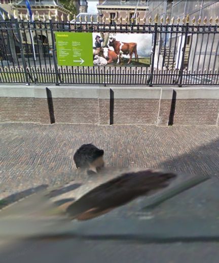
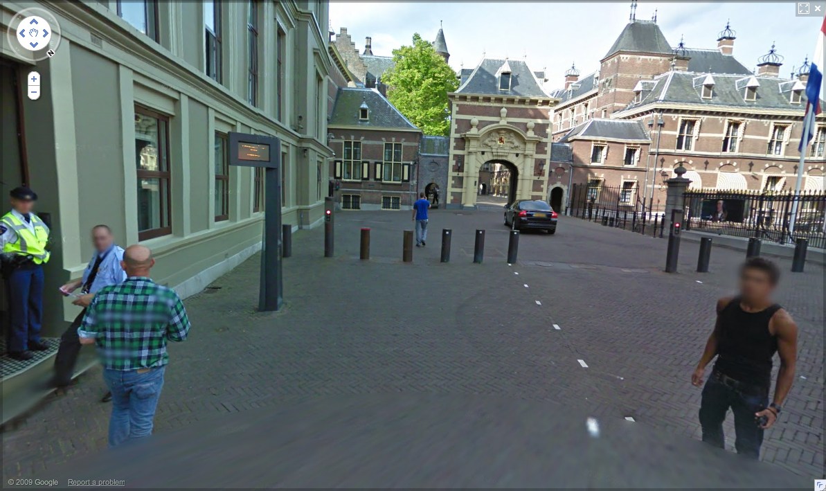
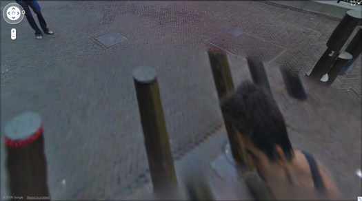
But whichever this was, the idea came to me as soon as I figured out that the unidentified guy who was photographed at least 62 times in Google Street View's mapping of the Binnenhof in The Hague was almost certainly a Google employee and not, in fact, a tourist who happened upon the Google Trike, figured out what it was up to, and followed along, quietly but persistently inserting himself into the company's massively ambitious effort to map, photograph, and simulate the entire world.
Obviously, someone should quietly but persistently insert himself into the company's massively ambitious effort to map, photograph, and simulate the entire world. And if the algorithms that stitch those panoramas together are going to erase everything but the top of that guy's head, it might as well be me.
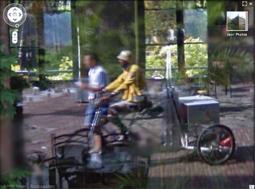
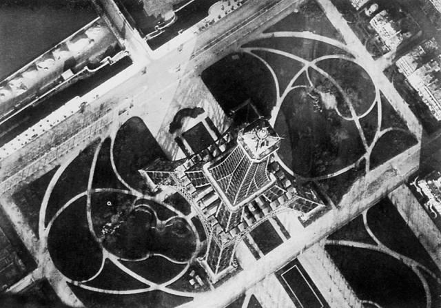
Google Trike and Google Guide at Kasteeltuinen, the Netherlands
Not to say that the Binnenhof Walking Man didn't plan and execute his awesome portrait series--an inside job--but just to make sure, it's important to re-create it by following a Google Trike somewhere. But where? Google's been using the Trike as a non-threatening promotional tool, running contests to gin up excitement about where it should roll next. So anywhere the company would be likely to go on its own is already, by definition, a somewhat compromised artistic context.
And just angling to get your picture on Street View's no good, either. There are plenty of people who ambush the Street View camera, or who react to or engage it, whether as an act of protest or "Look, ma, I'm on TV!" giddiness.
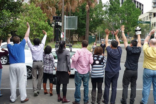
man with panda puppet, others waving at the Street View car in Sydney [via smh]
So it would need to be an art context. That's a Google Trike no-brainer, or at least Google Trike-compatible. Ideally, it's interesting in its own right, spatially, architecturally. If it had some spiraling and doubleback elements that could help replicate the atemporal incongruities of Walking Man's walk around the Binnenhof. Is it obvious yet?
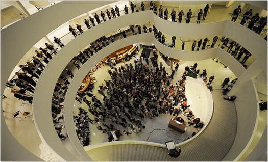
Henry Brant's "Orbits" performed in the Guggenheim rotunda in 2009 [via nyt]
The real problem I saw for taking the Google Trike into the Guggenheim and up the ramp was neither logistics nor permissions. The Google Trike's first outing was offroad, on far rougher, steeper terrain than Frank Lloyd Wright's rotunda would offer. And the Guggenheim has obviously made itself available for artists' productions, from Matthew Barney to Vanessa Beecroft to Francesco Vezzoli.
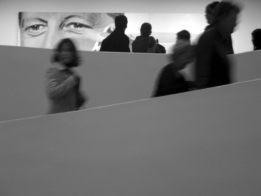
via newyorkinfrench.net
Even curatorially, the obstacles did not seem insurmountable. In 2010 Nancy Spector launched Intervals, a site-specific projects series that was inspired by, among other programs, Hans Ulrich Obrist's Migrateurs projects at the Musee d'Art Moderne in Paris. In a 2009 interview Spector did with Sarah Hromack, she tapped one of my formative memories of the Museum:
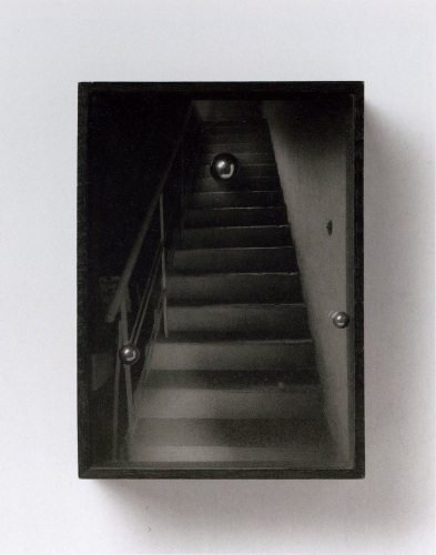
SH: It's a compelling space. Frank Lloyd Wright tucked many interesting details into the museum's tertiary areas; they are so easily overlooked.
NS: The triangular staircase, for instance, is a beautiful space. It has been rarely used by artists-in fact only twice if I recall correctly: in theanyspacewhatever exhibition Douglas Gordon installed his phrases in the stairwell. And Felix Gonzalez-Torres installed one of his light strings in 1995.
She went on to describe Intervals as interesting artistic responses to "situations that could be perceived as marginal." Forget marginal; there's nothing more marginal than not appearing in the museum in the first place. I figured that the best way to execute Walking Man was to
not exhibit it at all, but just to let it appear, and be found organically on Street View itself. No announcement, no press release, no opening; one day it's just there to be discovered.
And that is where I was confounded. The biggest obstacle I saw was persuading Google to ever be interested in adding the interior of any building--even one as awesome and iconic as the Guggenheim--to Street View.
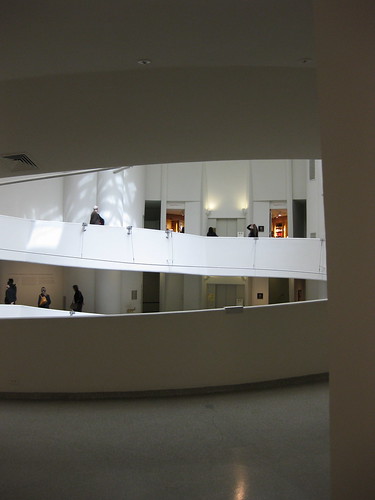
via keithbradley's flickr
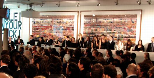
When I went to the YouTube Play event at the Guggenheim last fall, I'd discussed a bit of this with Spector, and later, when talking about the Binnenhof series with a Google PR, I floated the idea of bringing the Trike up the ramp. In retrospect, now that I know the Google Art Project was well under way, and Street View images from 17 museums were already in the can, her bemused and slightly cagey responses make more sense.
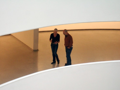
via rhino8888's flickr
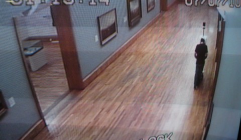
So now the idea's out there, but the context is somewhat changed. Seeing the Guggenheim's rotunda on Street View would now generate less surprise than it would have a couple of weeks ago. But the modernist, curved abstractions and planes would still make for the most spectacular interior on Street View. Better than Versailles, you ask? Well, let's put the Gugg on there and find out!
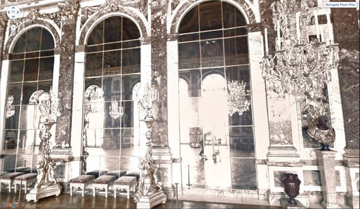
Oh look, there's the guy pushing the Street View camera through the Hall of Mirrors!
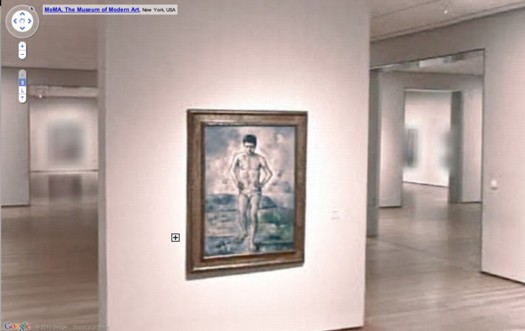
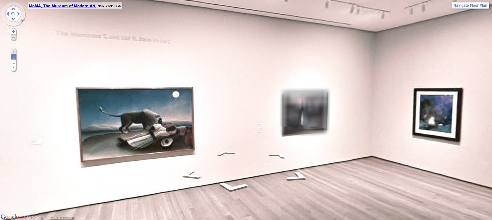
And it really is and should be about the space. The other idea that seemed crucial to me was shooting the rotunda empty, focusing on the architecture [and avoiding the rights clearance issues that blurred half the artworks on MoMA's Street View foray.] That means mapping while the rotunda is closed for deinstallation of a show. Have it full of crates, or workers--populate the panos with the staff themselves, make it a [blurred out] portrait of the Museum as an organization and a network as much as a space.
Anyway, that's the idea.


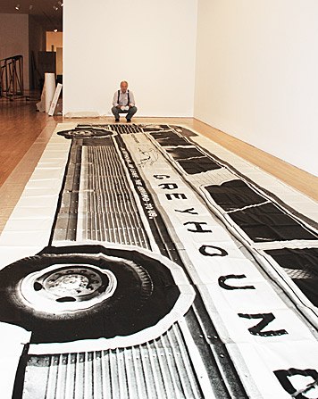
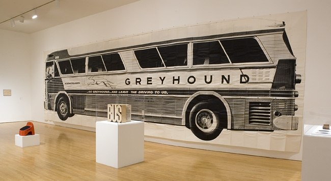
 by Raino Gellenthin, via


 It's true, I like
  You can't go too architectural without treading on


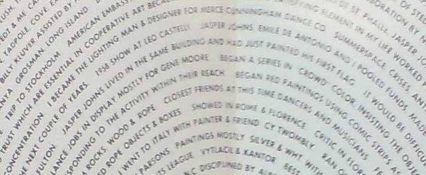
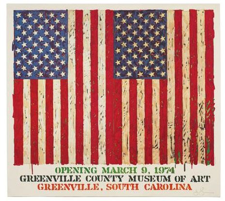
 Wow, so I'm just throwing Jasper Johns' name into the archives of New York Magazine, and up pops