January 2012 Archives

johns_flag_moma.jpg

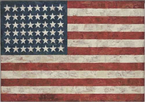
The stories of Jasper Johns' Flag is almost as famous as the artwork itself. In 1957, Leo Castelli had come for a studio visit with Robert Rauschenberg, only to find Jasper Johns' work there, and offer the younger, unknown artist a solo show on the spot. That 1958 show, Johns' first, ended up on the cover of Art News. Alfred Barr bought three works out of it for MoMA. When more conservative trustees balked at the possibility that the till-then-unknown artist might have unpatriotic intentions, Barr leaned on Philip Johnson to buy a fourth, Flag.

And of course, there's the story of how Johns made it, which MoMA lays out succinctly:

"One night I dreamed that I painted a large American flag," Johns has said of this work, "and the next morning I got up and I went out and bought the materials to begin it." Those materials included three canvases that he mounted on plywood, strips of newspaper, and encaustic paint--a mixture of pigment and molten wax that has formed a surface of lumps and smears. The newspaper scraps visible beneath the stripes and forty-eight stars lend this icon historical specificity. The American flag is something "the mind already knows," Johns has said, but its execution complicates the representation and invites close inspection. A critic of the time encapsulated this painting's ambivalence, asking, "Is this a flag or a painting?"
But what's not exactly so clear is when Johns actually made Flag. It became so famous and influential so quickly, and its story is so fantastic--a dream! a flag! a magazine cover! MoMA!--that the pre-1958 history gets compressed into a largely uninvestigated corner.

MoMA's listing officially, and oddly, notes the date for Flag as "1954-55 (dated on reverse 1954)." So 1954-55. But perhaps 1954. Not an idle difference, I think. But there's more.

From an awesome footnote in Michael Crichton's awesome 1977 Whitney catalogue:

Occasionally his working methods cause curatorial problems. One long-standing question concerns the date of his first Flag painting, originally purchased by Philip Johnson in 1958, and now in the collection fo the Museum of Modern Art. The painting was dated 1954, but Johns argued that it was done in 1955. Recently someone noticed that the collage included newsprint from 1956, and the museum wanted to change the date accordingly. Johns stated that the picture was damaged in his studio in 1956, and that he repaired it that year, but that the painting was still properly dated 1955. He also points out that certain early works include collage elements that are old--much older than the paintings themselves--thus obviating entirely such direct methods of dating. [p. 65]
So this painting, "his first Flag painting," has 1954 written on the back. The artist argues for 1955. Some collage material visibly dates from 1956. And then the artist warns against attempting to date a work by the date of the collage elements. But isn't the issue here not that it could appear to be earlier than it is, but that it's actually later than the artist claimed? Twice?

I would think that contemporary analytical tools exist that can test whether Flag was repaired as Johns claimed. Or maybe close looking is sufficient. Crichton set up this curatorial dating problem with one of my favorite quotes from the catalogue:

A note of caution: Often John's [sic] "laborious efforts" to cover actually draw attention to what has happened. One may speculate that the layered meanings in a Johns work have their analogue in the layers of paint and wax that sometimes conceal, sometimes reveal, what lies beneath. That is one way to look at it. Another way is to recognize that he is a painter whose interest in process leads him to reveal the process--as an action over time--to the viewer. That is, a series of events and decisions led to the final picture; Johns often seems as interested in the sequence of steps as he is in the final result--at least, he often tries to show "what happened" along the way. It may be exaggerated to say that a Johns painting contains its own biography, but that kind of idea is present in many pictures.
Maybe it's the artwork's instant iconic status, or maybe it's the power of the alluringly iconic image it depicts, but lately, it feels like I've begun taking closer looks at Flag for the first time. And it's pretty surprising.

One thing's for certain, though: Flag is not Johns' first flag painting. [cont'd]

Jasper Johns, Flag, "1954-55 (dated on reverse 1954)" [moma.org]
Fred Orton's 1996 book Figuring Jasper Johns is one of the few in-depth analyses I've found of Flag. [amazon]

January 29, 2012

Death Watch

Alright, the mourning process seems to be ending, but the Guggenheim still hasn't posted video of the crazy/awesome/all over the place speeches from "The Last Word," the TED-like symposium marathon organized last weekend for the end of Maurizio Cattelan's "All." And for his supposedly looming retirement from artmaking.

So I've gone ahead and posted a Storify recap of the livetweet commentary I did, almost involuntarily, when I stumbled across the webcast, about mid-way through Francis Naumann's discussion of Duchamp's supposed retirement.

Let's see if this works:

This 1963 episode of I've Got A Secret pops up periodically. From this week on Boing Boing to Alex Ross's 2007 blog post searching for Karl Schenzer.

And it is, indeed, pretty interesting. John Cale was recently arrived in New York City--Ross notes that he got a ride down from Tanglewood in Iannis Xenakis's car--and still a couple of years away and a stint under LaMonte Young's sway from forming the Velvet Underground. John Cage enlisted him and some other sympathetic pianists to perform Vexations, an epic 1949 composition by Erik Satie, for the first time. That was Cale's secret. Schenzer's was that he alone stayed for the entire 18-hour performance.

Of course, Cage himself had appeared on I've Got A Secret in 1960, giving a raucous rendition of his composition, Water Walk, while dressed, typically, like a Methodist minister.

Three years later, Cale and Schenzer also exude a buttoned-up, Cageian seriousness, but what caught my attention was Schenzer's namecheck of the concert's sponsor, the Foundation for Contemporary Performance Arts, which Cage and Jasper Johns had just launched.

By 1963, I guess these folks were becoming better known, and certain of them, particularly Johns and Rauschenberg, were selling a fair amount of artwork. Yet as soon as they had two nickels to rub together, these artists were using the money to support and propagate the work of their fellow artists.

And it really amazes me to think that the cultural factions of the time were still so close together that this avant garde crew could turn up on a network TV game show. John Cage may have turned up at some point in the intervening 30 years, but it's very easy for me to imagine that the first mention of Erik Satie on CBS was also his last.

hugonnier_kelly_nyt_wildness.jpg
Marine Hugonnier, Art for Modern Architecture (Homage to Ellsworth Kelly), The New York Times (Week of February 21st to February 27th 2005)

Now this gets very interesting very quickly. Jason, a sharp-eyed greg.org reader in Paris, just sent along a link to a recent post on We Find Wildness about the very interesting work of Marine Hugonnier:

Art for Modern Architecture (2004-ongoing) investigates the role of the image, its abilities and its limitations and reverses the process by obstructing the press images on the front page of a week's worth of newspapers (the series include The New York Times, The Times, Die Tageszeitung, Le Monde, The Herald Tribune, The Neue Zürcher Zeitung and Al Ayaam) with collages made of cutouts from ELLSWORTH KELLY's book Line Form Color.

ELLSWORTH KELLY claimed that art was to be made for public spaces and buildings, thus establishing the modernist utilitarian project of art serving modern architecture. This project renews KELLY'S ideas and re-elaborates them within another medium, that of a newspaper, the 'architecture' of which frames everyday life.

Hugonnier's series is not an unknown quantity by any means. Her 2007 Kellyfication of The Times of London, for instance, was acquired by MoMA in 2008. If Cornelius Tittel, the Welt's culture editor responsible for the newspaper's special all-Kelly edition somehow did not know of Hugonnier's work, which is one of the more prominent contemporary examples of art that directly deals with newspapers as media, Kelly and/or his crew certainly knew. I would chalk this one up as a great idea that positively demanded to be realized.

FREAKY HUGONNIER-IN-THE-AIR UPDATE I just caught up with it now, but Ro/Lu also posted about Hugonnier's Art for Modern Architecture series, including some gorgeous images of her more recent pieces, where she uses her own abstract cut-outs. Great minds &c., &c.!

Previously, and still definitely related, also, from 2003, so really, who even knows what kind of amazing material the guy's got squirreled away? Ellsworth Kelly on Ground Zero

January 27, 2012

Wade's Welt, Excellent

I stopped by a friend's studio yesterday--which was fantastic, btw--and as I was leaving, and I noticed the cool, old Ellsworth Kelly exhibition poster in the bathroom, I so I was all, have you seen the Kelly edition of Die Welt, and he's all, it's fantastic, I just got it as a gift! and I'm all, right here right now? and he's all, yeah, I just brought it in, do you want to see it? and I'm like, well, yeah, and he's all, well, everyone should see it, Ellsworth's so lucky, and then the adult in the room was all, you should have some white gloves, and then we had to figure out who was actually the best at turning the pages, and anyway, long story short, it's completely incredible, and it would never happen in the US, but we all pretty much agreed that USA Today should do it. Can you even imagine it?

wades_world.jpg

Ausgezeichnet!

kelly_welt_cerealrecords.jpg

To promote his two shows in Munich this fall/winter, at the Pinakothek and the Haus der Kunst [which closed this week, btw], the local paper die Welt published a special issue in which all photos were replaced by Ellsworth Kelly paintings. Cereal Records points to Burning Settlers Cabin, whoprocured a copy, which makes me all the more determined to track one down myself.

kelly_welt_cerealrecords2.jpg

Unfortunately, all I can find on the Welt website is an offer for a facsimile edition of the front page [top], printed on archival paper in an edition of 100. I mean, it's signed, but I'm not sure that this works quite as well as a print as the newspaper does as an awesome object.

Any German-reading newspaper hoarders out there, please get in touch.

Great story: Just Say No To Safe [burningsettlerscabin via cerealrecords]
Die Welt's all-Ellsworth Kelly issue [cerealrecords]
Limitiert und handsigniert: die Kelly-Edition zur Zeitung, 499 Euro zuzüglich versicherten Versands [welt.de]
Previously, and definitely related: Ellsworth Kelly on Ground Zero
Previously, related, and not as awesome: Robert Rauschenberg's Piece of Tropic, 1979, ed. 650,000

January 25, 2012

Deeecoding Hirst

Basically, yeah, there was no way I could just let Daniel Barnes' hearsay claim that there's a secret text encoded in each of Damien Hirist's spot paintings go untested last night.

Thumbnail image for hirst_spots_key_ngs.jpg

But the mechanics of decoding a Hirst Code, if it does, indeed, exist, are non-trivial. Sure, there's a key painting [on which more in a second], but the whole public premise of the series is that no color repeats within a painting. Yet there are many spots in a large painting which seem nearly indistinguishable from each other. So matching up the ABC0-9 color key precisely to the hundreds of similar spots is, to use the term of the season, a challenge.

The trick, I think, is to have a computer color match the Pantone PMS codes between the Key Painting and the others. Which requires color-matched images. But Hirst's catalogue of the complete spots doesn't drop until July. So I just went ahead and grabbed one of the largest spot images I could find, and then I combined it with a Key Painting, and ran it--or babystepped it, really--through Photoshop.

Tate Modern was the single, go-to source. Tate has both a key painting, Controlled Substances Key Painting (Spot 4a) [above], and a large [2x2.5m] spot painting, Anthraquinone-1 Diazonium Chloride[below], from 1994.

hirst_tate_L02864_9.jpg

A quick note on the Key Paintings: according to Tate Modern, Hirst made four of them, in different dimensions [1" to 4" spots], and they are the only Spot paintings in which the color layout is identical. Which would imply, then, that there is a single key. Though there are definitely plenty of cryptographic methods for thwarting an assumption like that, too.

Anyway, I combined the two Tate images in one Photoshop canvas, and started waving my Magic Wand over each Key Painting spot in turn, looking for matches among the larger painting's 2,050 spots. Immediately, when several A's came up, I confirmed that I still had a matching problem; theoretically, there should be one, at most. The color scales of Photoshop, the compression algorithms of JPGs and TIFFs, all of these mediations affect the precise matching between two Hirst paintings. [I just realized that Hirst's spots actually almost pre-date Photoshop itself, which first launched in 1989, and which didn't get color management until v5.0 in 1998.]

There were also matches I thought were obvious, but which PS didn't even touch. I decided to be systematic, and to err on the side of more information now, in hopes of detecting a pattern later. So I checked tolerances at 5 and 8%, and only marked spots where the central majority of the spot was highlighted. Having no letter matched up felt more validating somehow than having just one. When I did Q, I jumped to U. I did the digits, too, because they were provided, and because 733tspeak did exist in some form since the 80s, and maybe Hirst was a phone phreakin' BBS nerd in high school, who knows?

I put all the text into a separate layer, which is below. It was really late last night, like around 1:30, so I can't be entirely sure until I check it again in the daylight, but I think I have seen something.

hirst_code_tate_deeelite.jpg

There seems to be a structured passage in the top center of the painting. Here's a detail:

dhloves_deeelite.jpg

I'm going to doublecheck my work, but in the mean time, please don't go running to Gagosian trying to claim a free spot painting and pretend you are the one who found Hirst's secret message from 1994.

rijksoverheid_rood_20121220.jpg

Alright, I think we finally may be onto something. I switched to a high-density foam roller for this next coat, and though it looks kind of eggshelly in the photo, it actually ends up drying to a smoother finish than any brush so far. And it uses less paint, which means no drip/stalactites around the edges, which need to be cut/sanded off.

The rhythm is sort of set now: when I start a new coat, I flip the panel over and wetsand and tack the coat from two sessions prior. That way, the coats go on each side sort of interlaced [I'm painting both sides, and I think it'll be done when the panel builds up a sufficient edge of paint, not support, and there's a pretty clean, non-painterly surface with no discernible front/back.] They're not there yet, but it now seems like they will be.

On the question of posting this kind of log/journal-style info, yeah, it's still kind of boring to me, mixed with a bit of incredulity that really, why would anyone care? But that's fine.

Because one of the things I've found is that these posts almost always draw out some helpful and interesting emails from people who know paint far better than I do. So it's really nice to hear from people, to get advice and feedback, to check my assumptions, and to see what other people are doing.

Part of my decision to paint was to learn what it's really like, to see what paint does, how it behaves. And part of it was definitely to actually see some particular objects in person that I've seen in my mind, and which I haven't really found anywhere else. So it's all pretty good.

January 23, 2012

The Hirst Code

Speaking of texts written in entirely unlikely places...

I really have no idea what to make of the kicker in Daniel Barnes' Artslant review of the Brittania St installation of Damien Hirst: The Complete Spot Paintings:

As to be expected with Hirst, there is yet more spectacle. A member of Gagosian staff tells me that the key paintings which correlate specific colours with letters of the alphabet are the start of a game: if you look at each painting carefully, a sequence of colours will reveal a hidden word, and if you get the word first you win a spot painting.
I mean, first, second, and third: W, T and F? [Or in Morse Code, ⚈ - - - ⚈⚈-⚈?]

hirst_spots_key_ngs.jpg
image via tate modern, © Damien Hirst. All rights reserved, DACS 2009

A secret word embedded in each painting? Is there one word repeated or 1,200 or 1,500 separate words? Is there one key for all of them, or one for each of them? Is there one free painting for each of them? If you crack the Hirst Code, do you become overnight the artist's single largest collector, the Mugrabis of Hirst? If so, doesn't Viktor Pinchuk already have a team of ex-KGB cryptographers working on this problem?

Entirely aside from the "win a painting" sweepstakes element--the Secret Hirst's Other Spot Challenge--what are the conceptual contours of a Hirst Code? Are the words encoded in The Complete Spot Paintings random, or a list, or do they constitute a single, secret text? Is it an essay, a manifesto? An epic poem or sacred text? Is it the first page of a great novel,, or did Hirst randomly encode a page from his pharmaceuticals catalogue--or from a Tesco mailing, or his cable bill, whatever he had lying around the studio? Or does it just say ARSE 1,500 times?

tp_moby_dick_01.jpg

There is much to do, and much to write, but it'll have to wait. Because right this minute, a copy of Moby Dick typed on six rolls of toilet paper is for sale on eBay:

MY FRIEND AND I ONCE JOKED THAT TOILET PAPER SHOULD HAVE INSTRUCTIONS PRINTED ON THEM FOR CERTAIN PEOPLE
ONE DAY, THE CONVERSATION GREW FROM THERE AND TURNED INTO A WAGER THAT I COULDN'T (OR WOULDN'T) BE ABLE TO TYPE OUT A NOVEL ON TOILET PAPER.

YES, WE DID HAVE SOME TIME ON OUR HANDS BUT, AS YOU CAN SEE BY THE FOLLOWING PHOTOS, I WON THE BET.

THERE ARE FOUR FULL ROLLS, ONE ROLL (EPILOGUE) IS ABOUT 1/5 OF A ROLL AND ONE HALF-ROLL
ALL OF THE ROLLS OF TP CAME OUT OF A BRAND NEW -- CLEAN -- PACKAGE OF 2-PLY COTTONELLE
THEY'VE BEEN HANDLED VERY GINGERLY AND INFREQUENTLY

AS YOU'LL SEE IN THE FOLLOWING PHOTOS, ONE OR TWO ROLLS HAVE A TEAR AT THE BEGINNING
THIS IS WHERE I WAS TRYING TO PULL THE PAPER THROUGH THE TYPEWRITER

I'VE KEPT THIS MOD ODDITY IN A BOX IN A COOL, DRY PLACE FOR THE LAST 10 YEARS
AND HAVE ONLY BROKEN IT OUT TO PROVE TO DOUBTERS THAT I ACTUALLY DID IT

CONSIDERING WHAT IT'S BEEN THROUGH, IT'S IN AMAZING CONDITION

tp_moby_dick_ch001.jpg

I mean, there's so much we still don't know. Like who did it? In this day of Facebook non-privacy, how can an artist be known simply as The Toilet Paper Moby Dick Master? And how long did it take? Wait, before that, even, what, really, was this conversation that led to this bet? And how did the bet end up involving one of the longer novels in the canon? Why not something shorter? Something like On The Road?

on_the_road_scroll.jpg

Moby Dick typed on toilet paper, opening bid, $399.95 plus free shipping, auction ends Jan. 29 [ebay via @cthon1c]
Kerouac Scroll Tour [ontheroad.org]

UPDATE: since posting this, the opening bid has been raised, appropriately, to $999.95.
UPDATE UPDATE: or one like it. "The seller has relistedthis item or one like it."
PRICELESS UPDATE: On the one hand, especially if I were the one who had typed it, and protected it in a shoebox all these years, I would KNOW KNOW that $320 is a ridiculous insult of a result. How dare eBay? On the other hand, there were four bidders on this thing, so, not entirely unnoticed. The Master Of The Typed On Toilet Paper Moby Dick needs to keep it and turn it into a family heirloom, or he needs to let it go, and let the world--and specifically, the knucklehead(s) contemplating spending several hundred dollars for it--take care of it.

picasso_bloomsbury_fabric_1.jpg

I've come across ads while surfing through New Yorkers from the 1950s, but this is one of the first times I've seen actual Pablo Picasso silk screened fabric turn up on eBay. And there's a whole 16-yard run of it, too. $46/yd doesn't seem like that much, either. Why, you could pay that much for the "fluoridized with DuPont Zepel ®" part alone.

picasso_bloomsbury_fabric_2.jpg

Vintage Bloomcraft Picasso Line & Dots Fabric 16yd+ Screen Print RARE! UNUSED! starting bid $749

It's funny, all this time I've been looking hard at the brushstrokes of modernism, abstraction, and monochrome, trying to figure out how they were made--and, thus, how I might make some paintings myself--and I've ignored Jean Arp.

When I started wanting to figure out how to do crisp abstraction, I went to look at Dove and Mondrian, only to find drawing & filling in. Sheeler's precisionist paintings were actually paint-up-to-the-pencil-line sketches.

truitt_insurrection_corcoran.jpg

When I started wanting to figure out monochrome objects, I looked at Truitt in front of Kelly, and surprised myself to find brushstrokes just all over the damn place.

Still, Truitt's still Truitt, and Kelly's still Kelly. I was at the National Gallery yesterday, accompanying the kid's field trip, and their Truitt is pretty slick. And of course, their Atrium Kelly seems fantastic, if hard to see from the ground.

kelly_orange_diagonal_marks.jpg
Orange Diagonal, 2008, via matthewmarks.com

And Kelly, talking about his recent relief paintings, did tell Carol Vogel, "What I've made is real -- underline the word real. It becomes more of an object, something between painting and sculpture." Which I am totally onboard with.

scheibitz_venice_2005.jpg

But which also suddenly reminded me of something I'd read about Thomas Scheibitz a few years ago, from a 2008 show at the Camden Arts Centre:

Scheibitz has developed his own grammar for painting on sculpture, which like his paintings, bows simultaneously to a residual interest in illusionism and representation and at the same time relishes the drips, splashes and material traces that are the legacy of painterly modernism. Indeed the whole point of painted sculpture rests upon it being a real object in space, which simultaneously inhabits an "artificial world", by virtue of its disguised and painted exterior and its imagined and constructed form. It therefore exists in that realm of "second nature" that Scheibitz describes as the location of his work: the paint helps to suggest that the sculpture has a correlative in the "real" world, while simultaneously undermining any such belief. [emphasis added]
Which at one point, I guess I thought I was onboard with, but now I guess I either don't understand or believe anymore. About Scheibitz's undermining, that is. Painted sculpture is just not not real; it's paint. On sculpture. Paint on an object. If line or color vary from form, I don't see why that has to be illusory or not "true to the material." Can't it look like one thing at first, until you look more closely? Tension or complexity is feature; it shouldn't all boil down simply to instant perception. I think this is particularly true in Scheibitz's case as well as Truitt's and Kelly's.

arp_nga_01.jpg
The Forest, detail, 1916, nga has no image

And finding myself with time to stare at Jean Arp's painted reliefs yesterday doesn't change that one bit. First off, they are fantastic. The surface is slick, smooth, pristine, nonpainterly.

arp_nga_02.jpg
Shirt Front and Fork, detail, 1922, for which nga also has no image?

Without planning to take up Arp in relation to Kelly, Scheibitz, or Truitt, I found myself impressed by these painted lines, painting on wood. They exist apart somehow from the painterly modernist practice of their time, and seemingly in transgression of sculptural modernism, and yet they're real. Underlined.

I don't really know much beyond the Mod101 slideshow blurb about Arp, but I guess I'll start digging and looking.

epic_foia_tsa1.jpg

I've been using and working on the Internet for almost twenty years now. I've done start-ups and IPOs. I've worked for huge companies. I worked for Disney when they didn't know the web from a CD-ROM. I have been involved and engaged with copyright and intellectual property law and their relationship to art and culture for over a decade.

So my opposition to the entertainment industry's maximalist online power play, in the current form of two pieces of legislation being considered in the US Congress right now, SOPA and PIPA, is neither fleeting nor naive.

As many people with far greater expertise than I have discussed in great detail, these proposed laws are a grave threat to the Internet as a platform for economic, cultural, and political exchange. They are unnecessarily broad and ambiguous and give vast, new, unchecked power to corporations who have consistently lied and misrepresented their case and the supposed threat they face.

Stop SOPA and PIPA by calling your US Congressional representatives today, but also get smart on the issues surrounding these bills. And keep following them, and keep holding politicians and the companies they're serving accountable, because this crap won't end today or this week.

Public Knowledge primer and updates on SOPA & PIPA [publicknowledge.org]

Another Sunday painting. Or another Sunday spent painting.

noordwijk_camo_20120115.jpg

I did another round of taping off and painting on the Dutch Camo Landscape photo of Noordwijk today. The first time, I did two identical gray polygons This time, I did three, with different greys.

The taping is the most time-consuming aspect of the process, the mixing the most uncertain, and the painting itself the most anti-climactic.

Not really knowing anything about color systems or theory, I'm just eyeballing each match. At the moment, there's something going on, I think, with the way the polys get grouped; I mix one grey, then change it for the next, and then the next. They end up being sequential in a way, related to each other, composed of the same constituent pigments. Until they're not; the last poly was turning out to be not just lighter, but pinker, redder, and so I gambled and added a new paint, a single drop of red oxide, which blew the whole thing. It eventually came around, though.

Though I'm clearly counting on it somehow, I don't know what'll happen when I try to paint next to an already-painted polygon. I mean, on the one hand, I don't know how paint will handle the tape. On the other, there's a ridge there now. So I could just paint up to it. But that'd mean some edges will be taped and crisp, and others will be brushed.

At this point, I guess I'm still seeing if paint actually does what I think it'll do when I do it.

In unrelated news, that brown poly in the center of the photo looks kind of like Iraq.

January 14, 2012

Rijksoverheid Rood 7: Roller

rijks_rood_20120114_01.jpg

Well, that was a total surface disaster.

The size and disposability of this crappy little foam roller made it irresistible. The bubbly eggshell finish that even contains a few crumbs of foam made it a total failure putting paint down on the monochromes.

The instructions on the back are so specific, I was tempted to call following them a conceptual conceit:


  1. Pour 1/2 inch of paint into tray

  2. Roll back and forth on slanted section of paint tray to load roller thoroughly

  3. When painting, increase pressure on roller as it dispenses paint to pull paint from inside the foam reservoir

  4. Performance improves as roller becomes fully saturated with paint

  5. Finish with light strokes

But no.

On the bright side, there aren't any brushstrokes.

FEW HOURS LATER UPDATE: OK, maybe it's not so bad. The eggshelling thing is a bit subdued, but there's far less paint per coat with a roller, no drip, and it's generally smoother overall. I think I will continue with them a bit and see how it sands and builds up.

Previously: Rijksoverheid Rood paintings: the making of

A couple of things that I still wonder about about Rauschenberg's Erased de Kooning Drawing:

What did de Kooning think? The story of making it is always told by Rauschenberg, or from his side. Did de Kooning ever tell the story? Did he ever see the result? Or talk about it? Did anyone ever ask him about it? I've never found any reference at all.

When did Rauschenberg actually make it? The date's all over the map. SFMOMA currently says it's 1953. For a long time, it was dated 1953-55. James Meyer had it as 1951-2, but I don't think I've seen anyone else put it that early. Even the extraordinary timeline in John Elderfield's de Kooning retrospective catalogue has only the basics of Rauschenberg's travel schedule and his account to go on ["Probably April or After," it says, since April 1953 was when Rauschenberg returned from his European trip with Twombly.]

[UPDATENever mind. I got the EdKD dating ambiguity mixed up with Johns' Flag, which has been variously dated between 1954 and '56, whereas the date for EdKD has consistently been given as 1953 from its very earliest forays into the public view. Thanks to Sarah Roberts, research curator at SFMOMA, who took a moment from her multiyear project documenting Rauschenberg's work, to point out my error.]

What did people at the time think? Who actually ever saw it? Even someone as early to the work as Leo Steinberg apparently only talked to Bob about it on the phone.

And what about Johns? Who knew about his involvement? What is up with that? For forty-plus years, while Rauschenberg claimed or let others write or publish that he came up with the title, and drew the hand-lettered label, Johns stayed silent about his role in the collaboration. But others surely knew, certainly in the early years when the work was taking shape.

Just before the holidays, I got in touch with Edward Meneeley, and artist and photographer who became friends with many artists and dealers in 1950s and 60s New York because he photographed their artwork. Meneeley created Portable Gallery, a subscription slide service that provided regular installments of art images to libraries, colleges, galleries, and collectors.

I found him because it was his monthly newsletter, Portable Gallery Bulletin, to which Jasper Johns wrote in 1962, explaining that it was artist's prerogative, plus an agreement between himself and Rauschenberg, not "politics," behind the refusal to let Portable Gallery publish and distribute slides of Short Circuit.

In a multi-chapter biography published online by Joel Finsel, Meneleey says that he was friends with both Johns and Rauschenberg in the late 1950s, and that he had an affair with the latter behind the former's back. [He tells Finsel of Johns coming to his loft one morning looking for Rauschenberg, and inviting him in to talk about it, all the while Bob is hiding in Meneeley's bedroom, eavesdropping on the conversation. Which sounds like a dick move to me, but there you go.]

Anyway, after talking to Meneeley for a while about Short Circuit--which he first saw in 1955, when it was first exhibited at the Stable Gallery--I asked him what people thought or said at the time about Erased de Kooning Drawing.

"Everyone at the Cedar Bar knew," he told me, but they thought it was just a stunt, a joke. After finishing it, Rauschenberg didn't do much with it or, as Meneeley put it, "he didn't know what to do with it." Until Jasper came along.

[Remember, Bob apparently acquired the original de Kooning sketch of a woman sometime after April 1953. He met and quickly became involved with Johns in the winter of 1954.]

In Meneeley's recollection of the time, it was Jasper who basically saved Erased de Kooning Drawing from ending up as a barroom one-liner. He mounted it, gave it a title and a label, or really, a drawing of a label. "Bob made it," Meneeley told me, "But Jasper made it art."

Which is why I'm interested in hearing what people thought at the time it was made.

erased_dekooning_sfmoma.jpg
Erased de Kooning Drawing, 1953, "drawing | traces of ink and crayon on paper, mat, label, and gilded frame." via SFMOMA

TIMELY BUT UNNECESSARY HOOK: LAST VISIT TO THE DE KOONING RETROSPECTIVE
Part of the reason I hustled back to MoMA Sunday was to look through the de Kooning retrospective from the perspective of his relationship to other artists [or really, vice versa].

Last summer, while mapping out the history of the reception of Robert Rauschenberg's Erased de Kooning Drawing, I thought Leo Steinberg got it the rightest when he called the work "a sort of collaboration" which treats erasure as generative, not destructive. And sure enough, de Kooning's drawings and paintings of the 50s are filled with erasures, and smudges, and obliterations; they're accepted as legitimate markmaking strategies. Which could make Rauschenberg's project an extension or variation on de Kooning, not a patricidal, rebellious break, as it's come down to us. There's a continuity and dialogue right in front of us which we are not-told to ignore.

But while I'm glad to give attention to what I think are Steinberg's and Tom Hess's persuasive arguments about the deK/RR affinity, I don't really have much to add to them.

MUCH OF WHAT WAS KNOWN AND THEN SAID ABOUT ERASED DE KOONING DRAWING TURNS OUT TO BE DIFFERENT OR YES, WRONG
What I'm still trying to pin down are the basics of Erased de Kooning Drawing's history. Because it's become very clear that it has been presented and interpreted differently over time. It was not even exhibited until 10 years after it was made. Many prominent critics, especially those who considered it an ur-Conceptual masterpiece, seemingly wrote about it without seeing it. For decades, Rauschenberg claimed and everyone assumed, that he had created the work alone, but in 1999, when he gave EdeKD to the San Francisco Museum of Modern Art, he revealed that Jasper Johns had given the work its title and had hand-drawn the "label." And it turns out that Rauschenberg physically altered the work over the years, after exhibiting it at least twice, in ways that have never been addressed.

The Erased de Kooning Drawing we know is not just a drawing. According to SFMOMA's complete description, it is comprised of "traces of ink and crayon on paper, mat, label, and gilded frame." To get the point across clearly, Rauschenberg wrote, "FRAME IS PART OF DRAWING" [all caps and underlining in the original] on the paper backing.

But in Emile de Antonio's 1970 film, Painters Painting, Erased de Kooning Drawing appears unframed and unmatted. The sheet with de Kooning's original drawing is mounted on a longer piece of paper on which Johns [it turns out] drew the precise, label-like box of text.

erased_unframed_deantonio.jpg

Now I think the way it appeared in Painters Painting is how the artist meant for it to be seen. The earliest exhibition sticker on the back of EdeKD is from 1973. Which made me wonder if the work had even been shown before then. Finally, I found out. Yes. At least twice.

DO WE EVER CALL EDEKD PROTO-MINIMALIST?
In January 1964, Samuel Wagstaff organized "Black, White + Gray" at the Wadsworth Atheneum. The "Zeitgeist show," to use James Meyer's term, came to be considered the first museum exhibition of "minimalism," and Wagstaff specifically asked Rauschenberg to provide "works that have no color...the sparser the better."

WERE THERE EVER PHOTOS OR REPRODUCTIONS OF IT BEFORE 1976?
According to the exhibition checklist, Rauschenberg loaned exactly what the title called for: a black painting, a white painting, and a relatively gray work, Erased de Kooning Drawing. The registrar's record [graciously investigated by Atheneum assistant archivist Ann Brandwein] indicates the work was unframed and unmatted, and that it measured 12x18 inches. [It was also valued at $1,200, but listed as "not for sale."] There was no catalogue for the 4-week show [Jan 9 - Feb 9], and EdKD doesn't appear in the few installation photos that survive.

But the piece did get noticed. In her review for The Hartford Times critic Florence Berkman wrote:

Perhaps the most unusual work is one called "Erased Drawing" [hmm] in which two leading artists, Willem de Kooning and Robert Rauschenberg are involved." Mr. Rauschenberg erased a de Kooning drawing, leaving enough of the design so that it can be seen in a strong light.
And soon after the Wadsworth show closed, on Feb. 29, 1964, Calvin Tomkins' first long profile of Rauschenberg appeared in the New Yorker. It included the artist's first published discussion of EdeKD. When Lawrence Alloway showed the work in his American Drawings survey at the Guggenheim that fall, he included the paragraph from Tomkins' article in the catalogue checklist, the only piece to warrant [or maybe to require] an explanation:

rr_edekd_guggenheim64.jpg
American Drawings catalogue, p. 60, Sept 1964, curated by Lawrence Alloway via guggenheim.org

Of course, just a couple of months after I chased down and bought my own copy of the catalogue, the Guggenheim released an electronic version on their website.

The dimensions here are slightly different--16 3/4 x 13 3/8 inches--but the medium is the same: "pencil on paper." Whatever their internal variations, though, the drawing's 1965 dimensions differ significantly from its current, frame-like object state, which SFMOMA lists as 25.25 x 21.75 x 0.5 inches. Here's a handy, pixels-per-inch graphic to show the relative sizes.

erased_dek_dimensions.jpg

erased_dekooning_sfmoma.jpg

However it was perceived before the early 1970s, whether as patricidal Dadaist prank or Minimalist forebear, Erased de Kooning Drawing came to be seen as an uncannily prescient, process-oriented, Conceptual object. But that's not just because the art world finally caught up with Rauschenberg, 20 years later. It's because Rauschenberg himself reconceived and transformed the work in the wake of, or in response to, Conceptual Art.

Previous greg.org posts on Erased de Kooning Drawing

January 9, 2012

段ボールの村上

qma_takashi_ego_01.jpg
"@takashipom #EGO Takashi with H.E Sheikha Al-Mayassa bint Hamad bin Khalifa Al-Thani" via @QatarMuseumsAut

I am in awe of the new, Povera-meets-Lars von Trier direction Takashi Murakami is taking his work. It's like pure signifier now. A master's bravura gesture. A late de Kooning brushstroke. A wax Degas dancer body fragment. A spray bottle-in-the-sun Olafur rainbow.

qma_takashi_ego_02.jpg
via

Of course, making a grand destination exhibition entirely out of cardboard and backdrop paper gestures is only possible because our visual memories have already been stuffed full of so much of the same high-production, branded, manically kawaii, visual overload cruft for so. many. years now.

qma_takashi_ego_03.jpg
via

I swear, I'm not angling for a junket when I say that the Qatar Museum Authority's bold self-criticality and curatorial acumen is a groundbreaking model other world-class art institutions ignore at their own peril.

January 7, 2012

Artificial Snow

Oh man, JWZ's digital TV plays analogue static when there's no HDMI input:

Video static is caused by amplifying random radio white noise and feeding it to the input stage of a scanning electron gun. HDMI is digital and DRM'ed all the way through: there is no analog phase here at all!

This TV is playing a built-in MPEG of static, instead of just displaying solid blue or solid black like they used to do.

I think that's kind of awesome. The map has become the territory.

Skeumorphantastic comments, too.

Snow Crash [Simulated] [jwz.org]

January 6, 2012

'Imagine A World Of Spots.'

hirst_john_john_moma.jpg
John, John, 1988, installed at Ann Temkin's Color Chart show in 2008, via moma

Alright, before this thing gets too much farther, let's check what we know. From the Gagosian Gallery exhibition page::

The exhibition will take place at once across all of Gagosian Gallery's eleven locations in New York, London, Paris, Los Angeles, Rome, Athens, Geneva, and Hong Kong, opening worldwide on January 12, 2012. Most of the paintings are being lent by private individuals and public institutions, more than 150 different lenders from twenty countries. Conceived as a single exhibition in multiple locations, "The Complete Spot Paintings 1986-2011" makes use of this demographic fact to determine the content of each exhibition according to locality.
Eleven galleries in eight cities. "More than 300 paintings," exhibited, if I read this correctly, based in part on the locations of the lenders. I recall reading that around a third of the paintings will be for sale.

So the Spot Challenge could be a shopping trip for someone, someone looking for just the right spot painting. Which, interesting, they used to be [still are? are also?] called Pharmaceutical Paintings, and a 2006 Sotheby's catalogue entry starts the series in 1991, not 1986. Writing for Tate Modern in 2009, Elizabeth Manchester noted that the series began with a definitive suddenness in 1988, at the Hirst-curated group show, Freeze.

She also says there were over 800 spot paintings at the time, and that, "In 2004 Hirst announced that he would end the series, soon." Well, I believe there are now over 1,200, which seems to complicate the name of the 300-piece Gagosian show: "The Complete Spot Paintings." Perhaps the clue is in a quote from the catalogue for Hirst's 1996 Gagosian show:

I want them to be an endless series, but I don't want to make an endless series. I want to imply an endless series ... Imagine a world of spots. Every time I do a painting a square is cut out. They regenerate. They're all connected ... this is more sculpture than painting. I guess it's infinity ... I don't like the idea of doing them forever because it implies that there is no escape. I like the idea of working it out of my system before I die. I like to imagine that art is more theatrical than real. So an involvement forever is real whereas an implied 'forever' is theatrical.
Maybe "Complete" is not "total," but "finished." Or maybe an implied finished.

But there's plenty of time for this later, if necessary. Back to the Challenge. How, exactly, is this supposed to happen? Because Carol Vogel's description is pretty vague:

unless a private plane is at your disposal, and money is no object, it's anyone's guess how much the airfare to tour the galleries would cost; some clever folks might be able to use air miles or get a lucky last-minute deal.
Plane, money, airfare, frequent flyer miles, luck. In fact, Vogel's ruminations are each more unhelpful than the next.

In addition to money and means, to see all 11 shows, in 8 cities requires time. Sure, you might travel regularly along one or two axes between Gagosian-blessed cities--New York London, NYC-LA, London-Paris, LA-Hong Kong, even. But I'll bet that no one not named Gagosian will already be in all those cities, plus Rome, Athens and Geneva, between next week and the end of February. So picking up these off-the beaten path galleries will require effort of anyone. Effort and time. And money, of course, but in this case, that's a given, and so the real constraint is time, or time and money in just the right combination.

gagosian_lon_rom_par.jpg

It's possible that someone with an even slightly aggressive travel schedule already--say, Mr Zeitgeist, Tyler Brûlé--could simply add a weekend jaunt here and there to complete the Spot Challenge.

It's also possible that someone with a plane and no plans for the next six weeks--the snow is pretty crappy in Aspen this year--could just decide to hit the road. Over, and over, and over. Thus the Spot Challenge is really a challenge to fill the vast emptiness of someone's life, to provide purpose [sic of the biggest kind] to someone's leisure time. It's literally the answer for someone who doesn't know what to do--not just with their money, but at all. If the spots weren't so relentlessly, pharmaceutically happy, I'd say that was a little sad.

I've begun running the numbers and constructing itineraries, and Hirst is right, it is "pretty difficult to visit all the galleries." Flying commercial, round-the-world, NYC-NYC, there's really no way to hit all eleven sites in less than six days. Airfare alone is over $10,000. In coach, which, WTF. For a one-hour hop from Geneva to Paris it's no big deal, but for the longhaul flights at least, you'd really want to fly business. At least.

Switching to a private jet can ease some hassle, and avoiding the security, check-in, and boarding rituals of the masses will certainly tighten up your time on the ground. But then when you try to pack a couple of cities into one day, you run into the constraints of the galleries themselves. Rome and Geneva don't open til 11AM, but close at 7. London's locations open at 10, but close at 6. Athens is 4 hours away and not open Saturday, except by appointment.

And there's the key. When I started putting itineraries together, I treated the gallery hours as fixed. But what if they were a variable? So say total flight time is 40 hours. Give yourself 3 hours on the ground in each city: an hour each way for transport, plus an hour in each gallery [which means 5 hrs for NYC and 4 hrs for London].

Barring local airport restrictions, if it were possible to coordinate with the galleries so that they'd open for you as soon as you landed, day or night, whatever day of the week, you should be able to complete the Spot Challenge--and get home--in 66 hours, less than three full days. It'd be like an i-banking roadshow on steroids. Or pharmaceuticals.

LOL UPDATE: No sooner to I hit publish than I see Felix Salmon has calculated the total cost of the entire trip for a barely-fictional collector named Pictor Vinchuk. Awesome.

Though I'd suspect that the duration of his deluxe, 5-star scenario--19 days--would be the heaviest investment for our Mr. Vinchuk. Otherwise, if Damien Hirst can really compel a pack of oligarchs to move around the world for three weeks, visiting his seemingly indistinguishable shows, we have truly underestimated his power.

HIPSTER UPDATE: And now Jen Bostic weighs in with a very enticing Hipster/fashionista itinerary. No specific flight info, but there are nice, funky hotels all along the way--and it clocks in at just $13,000 and change--for two.

DUH UPDATE: It's so obvious, and standing right in front of me, asking if I'd like a warm nut cup. The perfect demographic for dominating the Spot Challenge are flight attendants. International flight attendants with enough seniority to pick their routes would be at the top of the pyramid, of course. They could book the Hirst cities and fill their card without breaking a sweat. Those who can't work their way to each Gagosian city can still jump seat their way around. [Assuming, probably incorrectly, that their time in between work flights is uncommitted.]

I'd love to see the travel workers who knit our global village together totally take over the Spot Challenge, and secure a high-ticket artwork they could flip easily. But of course, the larger the pool of Challengers, the larger the edition of "Personal Spot Prints," and hence, the lower the value of each print. With a print factory like HIrst or Murakami, it should be possible to model the effect of dimensions, format, and edition size, to determine how quickly a work approaches £480, the retail price of a Hirst X Supreme skatedeck.

supmreme_othercriteria.jpg

January 5, 2012

The Complete Spot Challenge

complete_spot_challenge.jpg

Oh, man, just last night I was goof-tweeting about this, and it turns out it's already a thing. Registration for The Complete Spot Challenge starts tomorrow:

Visit all eleven Gagosian Gallery locations during the exhibition Damien Hirst: The Complete Spot Paintings 1986-2011 and receive a signed spot print by Damien Hirst, dedicated personally to you.

Registration begins on January 6 and ends on February 10, 2012.

Via Two Coats comes a link to a Carol Vogel story in the Times from last month [whoops, from Jan. 6. Note to self: 12 is the year now, not the month. -ed.] with a few details on the challenge:
To apply, they give their names, the dates their journeys begin and photo identification, like a passport or driver's license.

Each registrant will then be issued a special "Spot challenge registration card," with 11 empty circles. At each location the person shows identification and has the card specially stamped (each gallery has its own color) by one of the designated gallery officials. The contestant's presence will be noted on a gallery database.

Asked how he came up with the idea, Mr. Hirst responded in an e-mail: "I figured it would be pretty difficult to visit all the galleries, and totally admirable if anyone managed it, so admirable in fact that I thought they would deserve a work of art, so we came up with the idea to do the challenge. I'd love it if people manage it. I remember the golden tickets in Willy Wonka, maybe it's a bit like that."

How awesome that he invokes the utterly deranged Willy Wonka for this thing, which goes beyond difficult; I think it'd positively hellish. Which is really perfect.

It's not an overstatement to say that the art pilgrimage has been a key organizing principle of mine for most of my adult life. I've considered the personal experience of art, visiting it, going out of my way for it, making special trips for it, sacrificing for it, as a form of collecting, equal to or greater than actually buying works. There have been plenty of times too, when I've chosen to travel to see some art rather than buy some.

And I've done compleatist tours in the past. I traveled to the various locations of John Cage's Rolywholyover and Felix Gonzalez-Torres' retrospective, and visited works I love when they're installed in different locations. And let's not even start on biennials and art fairs.

And now, Damien Hirst is turning the idea of a transformative art pilgrimage into a grueling, round-the-world race, with a "free" five-figure print at the finish line. It's kind of despicably brilliant, really. Like a Black Friday riot for billionaires. Fantastic.

Obviously, I'll be registering immediately.

UPDATE FROM THE REGISTRATION: the "Personal Spot Print":


Acceptance and use of the Personal Spot Print constitutes permission (except where prohibited by law) to use your name, image, likeness and photograph (all at the discretion of the Sponsor) for future advertising, publicity in any and all media now or hereafter devised throughout the world in perpetuity, without additional compensation, notification or permission.

Damien Hirst Spot Challenge [gagosian.com/spotchallenge]

lawler_richter_spruth_magers.jpg

It was a favorite in the Met's Pictures Generation show. And I liked her recent, similar show at Metro Pictures. But hey-ho, how awesome does Louise Lawler's show at Sprüth Magers look??

I mean, I might have been content to stop at the enlarged-to-fit, distorted vinyl mural of the oblique view of Gerhard Richter's Staffel. But not Lawler.

From now on, I think the question demanded of any installation should be, "Why are you taking the giant disco ball out?"

No Drones, Louise Lawler, at Sprüth Magers in London through Dec. 23, 2011 [contemporaryartdaily.com, thanks andy]
Sprueth Magers London [spruethmagers.com]
Previously: last days of disco balls
Part disintegrating Deathstar, part disco ball

future_systems_lords_media.jpg

I just pulled out some Future Systems books last night, and I'd forgotten how hard I'd fallen for them. And though I knew they were The Future at the time, it's still pretty awesome/eerie how much our 2006 ended up looking like their 1993. It seems like Jan Kaplicky and Amanda Levete's tenacious, visionary modernist pursuits, their interest in prefab and industrial manufacturing in architecture and energy efficiency, became dominant themes, even as FS's own practice split apart with the end of its principals' relationship.

The other thing that seems prescient, for better or worse, is Kaplicky's voracious image consumption. Those little source/idea books Future Systems put out, filled with hundreds of photos and drawings culled from the seductive, Western "image cascade" that washed over Kaplicky after he left Communist Czechoslovakia, feel exactly like the world's favoritest tumblr.

[Of course, they also feel like a conditioned response to the multiscreen info overload of capitalist love the Eameses made for exhibition in Moscow in the Cold War, and Kaplicky's own "vast collection" echos the 310,000+ piece image archive Ray Eames donated to the Library of Congress.]

But that's the good part. Future Systems also anticipated the thing that most annoys the hell out of me about Tumblr and FFFound and the entire world now, the carefree casualness with credit and sourcing.

By that I obviously don't mean I have hangups with attribution, or--double obviously--copyright infringement. [The title page of one catalogue has this refreshing disclaimer, "All reasonable efforts have been made to trace the copyright holders of the photographs. The Publishers and Future Systems apologise to anyone who has not been reached."] It's just that when I see an image that interests me, I want to know more. I want context. Origin. History. Tangents. I want to learn things that don't necessarily only involve how something looks.

future_sys_modular_shed.jpg

So anyway, does anyone recognize this kind of awesome prefab construction system Kaplicky included in his Influences: A Visual Essay [on the top of page 28 of Marcus Field's 1999 Future Systems monograph, btw]? If I had to guess, I'd say it's some random Prouvé follower, but that doesn't narrow it down.

UPDATE And we have a winner, Doug from Materiality Office has identified Fritz Haller as the designer of this steel frame building system, probably from a house in Solothurn, Germany. Many thanks!

After processing the odd hippie hipness of the idea of John Cage driving Merce Cunningham and his dance company around the country in a VW Microbus, it was really dancer Carolyn Brown's excellent memoir that persuaded me to see the bus as central to this incredible, historic period. So I'm going to quote from an extended section of Chance and Circumstance: Twenty Years With Cage And Cunningham, and then expect everyone to go read it themselves. Because it's an awesome tale of an exciting career. Brown really shows both self-reflection and an awareness of those around her. And those around her included some of the greatest artists of the last hundred years.

Anyway:

Since 2001 here at greg.org, I've been blogging about the creative process—my own and those of people who interest me. That mostly involves filmmaking, art, writing, research, and the making thereof.

Many thanks to the Creative Capital | Warhol Foundation Arts Writers Program for supporting greg.org that time.

comments? questions? tips? pitches? email
greg [at] greg [dot ] org

find me on twitter: @gregorg

about this archive

Posts from January 2012, in reverse chronological order

Older: December 2011

Newer February 2012

recent projects, &c.


our_guernica_cycle_ivanka_320px_thumb.jpg
Our Guernica Cycle, 2017 –
about/kickstarter | exhibit, 2017


pm_social_medium_recent_proj_160x124.jpg
Social Medium:
artists writing, 2000-2015
Paper Monument, Oct. 2016
ed. by Jennifer Liese
buy, $28

madf_twitter_avatar.jpg
Madoff Provenance Project in
'Tell Me What I Mean' at
To__Bridges__, The Bronx
11 Sept - Oct 23 2016
show | beginnings

chop_shop_at_springbreak
Chop Shop
at SPRING/BREAK Art Show
curated by Magda Sawon
1-7 March 2016

do_not_bid_or_buy_iris_sidebar.jpg
eBay Test Listings
Armory – ABMB 2015
about | proposte monocrome, rose

shanzhai_gursky_mb_thumb.jpg
It Narratives, incl.
Shanzhai Gursky & Destroyed Richter
Franklin Street Works, Stamford
Sept 5 - Nov 9, 2014
about | link

therealhennessy_tweet_sidebar.jpg
TheRealHennessy Tweets Paintings, 2014 -
about

sop_red_gregorg.jpg
Standard Operating Procedure
about | buy now, 284pp, $15.99

CZRPYR2: The Illustrated Appendix
Canal Zone Richard Prince
YES RASTA 2:The Appeals Court
Decision, plus the Court's
Complete Illustrated Appendix (2013)
about | buy now, 142pp, $12.99

weeksville_echo_sidebar.jpg
"Exhibition Space" @ apexart, NYC
Mar 20 - May 8, 2013
about, brochure | installation shots


HELP/LESS Curated by Chris Habib
Printed Matter, NYC
Summer 2012
panel &c.


drp_04_gregorg_sidebar.jpg
Destroyed Richter Paintings, 2012-
background | making of
"Richteriana," Postmasters Gallery, NYC

czrpyr_blogads.jpg
Canal Zone Richard
Prince YES RASTA:
Selected Court Documents
from Cariou v. Prince (2011)
about | buy now, 376pp, $17.99

archives