June 2012 Archives

I've been annoyed for six weeks now by Laura Gilbert's op-ed in The Art Newspaper which argues, rather speciously, that "'appropriation'" [her scare quotes] is somehow a less "savvy" artistic practice than licensing images or seeking permission. She frames this as somehow "rarely reported," as if there's a taboo in the art world about acknowledging that some highly successful artists who have been accused of copyright infringement find the process annoying and expensive, and thus seek to avoid it going forward. This is certainly true, but such burdens could just as easily be used to argue, as some TAN commenters have, that the copyright litigation system is unwieldy and favors the big and powerful. [The examples of happy happy licensing Gilbert cites--Koons & Marvel; Warhol & Disney--support this.]

But whatever, I decided way back when the Cariou v. Prince complaint surfaced that I wasn't going to go tit for tat on every column or blog post concern trolling about copyright infringement.

rauschenberg_pull_hoarfrost.jpg
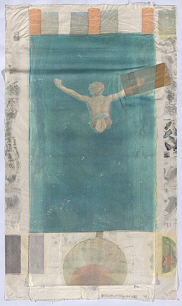
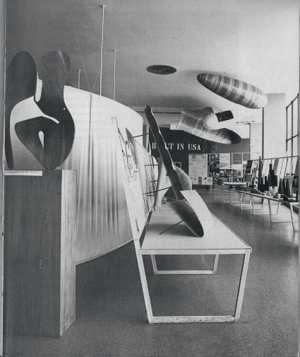
Rauschenberg's Pull (Hoarfrost Series), 1974, 8x4 feet, offset and silkscreen
on fabric, silk, and cheesecloth collage and paper bags, ed. 29 plus a bunch of proofs, image: nga.gov.au

What I will do, though, is confess that for all the soaking I've been doing in appropriation, I had never heard of the case Gilbert discussed at the greatest length: when Robert Rauschenberg was sued for using an image from a magazine ad in one of his collages by the photographer who took it, Morton Beebe.

San Francisco photographer Morton Beebe only discovered that Robert Rauschenberg had used two of his photographs in the 1974 print Pull when his friends, artists Christo and Jean-Claude, were looking at his portfolio. Christo pointed to the photograph Mexico Diver and said: "My God, is that yours or Rauschenberg's? Have you seen Time magazine this week?"

Beebe got hold of the magazine and saw in a feature about Rauschenberg that he had not only used Mexico Diver but also his photograph of a native New Guinean repeated across the top of the print. Both pictures were part of a series Beebe had shot for an advertisement for Nikon cameras that had appeared in 17 magazines.

Beebe sued. Rauschenberg's printer testified that the artist had showed him the Nikon ad and said: "I'll just lift it."

Rauschenberg settled, paid the photographer's legal fees and gave him a numbered print of Pull. He promised that whenever the image appeared in print Beebe would be acknowledged. Later, when Beebe discovered another unauthorised use of Mexico Diver, Rauschenberg gave him another print of Pull, which Beebe sold for $13,000.

Beebe points out that potentially high legal fees makes photographers reluctant to sue (in the US litigants typically bear their own costs). After the suit settled, in 1980, Rauschenberg shifted to using his own photographs exclusively for the next 28 years if his life, according to the Guggenheim Museum and others.

I am quoting Gilbert's entire account of the case here because it sounds quite compelling and authoritative. But it is also biased--it's based entirely on Beebe's version of the claim and the settlement. And after investigating the original court documents, it's clear that Beebe's take leaves out key details and facts that could significantly affect how the case is perceived, and what it means.

There's no doubt that Rauschenberg used Beebe's image without permission, nor is there any uncertainty that Beebe felt wronged by the far more famous artist's action. It's also the case that Rauschenberg insisted, even after settling with Beebe, that his collage process was fair use, and that it resulted in entirely new work. If for no other reason, Beebe v. Rauschenberg should be better known because it embodies these emotional, economic, and power complexities so concisely.

Ultimately, though, I think the case does not support the anti-appropriation position that Beebe and Gilbert are promoting. [As recently as 2010, Beebe used his Rauschenberg complaint to lobby the White House (pdf) to strengthen IP laws "to better protect the creative community from piracy even from our fellow artists."] I'll get to that in the next post[s].

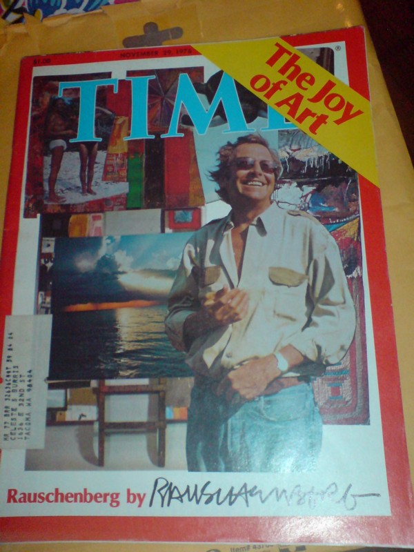
The other thing that's amazing and feels important about Beebe v. Rauschenberg is the similarity--which Gilbert surely caught onto as well--between Rauschenberg's appropriations and Prince's. I mean, seriously, people, Rauschenberg had made Pull from a Nikon ad in 1974, three years before Richard Prince rephotographed his first magazine ad at all--and six years before he rephotographed his first Marlboro cowboys. And while Prince was working in the bowels of Time Magazine making tear sheets, Rauschenberg was designing his own Time cover--and putting a little registered copyright symbol in the corner.

rauschenberg_time_cover.jpg

No Longer Appropriate? by Laura Gilbert [theartnewspaper]
One of the few articles to discuss Beebe v. Rauschenberg, Gay Morris's 1981 Artnet article, "When Artists Use Photographs: Is it fair use, legitimate transformation, or rip off?", is excerpted in the 2007 textbook, Law, Ethics, & The Visual Arts

Seriously, people, maybe I should just start documenting the artists and avant garde music folks in the 1960s who didn't roam around in a VW Bus. Here is composer Terry Riley, published in William Duckworth's 1999 interview collection, Talking Music:

DUCKWORTH: When did you move to New York?

RILEY: I came to New York in 1965. After the In C performances, I went to Mexico on a bus for three months. I was actually looking for something, but I didn't know what. I guess after In C, I was a little bit wondering what the next step was to be, you know. And I guess what I really wanted to do was go back and live in Morocco, because I was interested in Eastern music, and at that time, Moroccan music attracted me the most. I had lived there in the early sixties. In 1961, I went to Morocco and was really impressed with Arabic music. So we went to Mexico. My point was to get to Vera Cruz, put our Volkswagen bus on a boat and have it shipped to Tangier, and live in Morocco on the bus. We drove all the way down to Vera Cruz, but couldn't get a boat; nobody would put our bus on the boat. So we drove all the way up to New York. We were going to try to do the same thing from New York, right? But I started hanging out with La Monte [Young] again and renewing old acquaintances. And Walter De Maria, who was a sculptor, had a friend who was leaving his apartment. THis guy had a fantastic loft on Grand Street. And he said, "Do you want to trade the loft for the bus?" So I did, and that began my four-year stay in New York.

Riley also had a wife and small kid at the time, and she supported the family by substitute teaching along their nomadic journeys. Amazing.

Previously: Walter de Maria's stainless steel sculptures, including a musical instrument for La Monte Young, produced in 1965

Welcome to another episode of The VW Years, greg.org's ongoing mission to seek out firsthand accounts of John Cage and Merce Cunningham's VW Bus.

These are some mentions of John Cage in The Living Theatre: Art, Exile, and Outrage,, John Tytell's 1995 history/biography of Living Theatre founders Judith Malina and Julian Beck, which were compiled by Josh Ronsen and posted to silence-digest, a Cage-related mailing list in 1998:

"At the end of September, they visited Cage and Cunningham who had expressed an interest in sharing a place that could be used for concerts and dance recitals. Gracious, unassuming, the two men lived in a large white room, bare except for matting, a marble slab on the floor for a table, and long strips of foam rubber on the walls for seating. The environment reflected their minimalist aesthetic. Cage proposed to stage a piece by Satie that consisted of 840 repetitions of a one-minute composition. He advised them not to rely on newspaper advertising, but to use instead men with placards on tall stilts and others with drums." --pg 72

...

"the only person Judith admitted caring about was John Cage, "mad and unquenchable" with his "hearty, heartless grin." With Julian, she visited Cage in Stoney Point in the Hudson Valley. ... Julian thought Cage was the "chain breaker among the shackled who love the sound of their chains." Cage collected wild mushrooms, which Julian interpreted as a tribute to his reliance on chance as much as to his exquisite taste. ... [Paul] Williams wanted to help them find a new location that Cage and Cunningham could share with The Living Theatre." -pg 121

"In the middle of 1957, they saw Cunningham dance at the Brooklyn Academy of Music to Cage's music. At a party afterward, C&C laughed all night like "two mischievous kids who had succeeded in some tremendous boyish escapade."" -pg 125

"[they] visited Cage in Stoney Point, where they made strawberry jam and gathered mint, wild watercress, and asparagus for dinner. Feeling a surge of confidence in his own writing, he [Julian] gave Cage a group of poems to set to music." -pg 128

"With Judith, Julian, Cunningham, and Paul Williams, John Cage drove from "columned loft to aerie garage" in his Volkswagen bus, smiling despite the traffic and the fact that their search was now in its 4th month. Finally, they found an abandoned building, formally a department store on 14th st and 6th ave, which Williams declare would be suitable for sharing as a theatre and dance space." - pg 129

"Early in December, with Cage's assistance, [Cunningham] moved some of his backdrops into the space. Cage brought with him a variety of percussion instruments--he owned more than 300 at that time--which he donated to the theatre. Julian thought there was a distance about Cage that prevented intimacy and the fullest communication, but he felt Cage's gift was a real sign of the artistic support that would be crucial to the success of The Living Theatre." -pg 140

June 26, 2012

On Johns On Newman

jj_ventriloquist_mfah.jpg
Jasper Johns, Ventriloquist, 1983, image via: MFAH

And now to the second oldest tab in my browser, an essay by Barbara Rose on Jasper Johns' references to works by Barnett Newman, which accompanied an excellent 1999 show of Johns's and Newman's editions at Brooke Alexander Gallery.

From his earliest days in New York, Johns saw and collected Newman's work, and Rose proposes an ongoing personal relationship between the artists that can be seen in Johns's work, even from the very beginning:

In the paintings he exhibited at Betty Parsons [in 1951 and 1952], Newman accomplished a goal Pollock was also intent on resolving; he eliminated the distinction between figure and ground. Instead of separating one from the other, he proposed a format in which the image was identical with the field, with no background left over. No shapes were depicted, not even as flattened silhouettes. Rather the field was divided into regular zones. This is of course the format of the iconic Flag that Johns dreamed of and then painted for the first time in 1954. Because Johns' image is both literal and identifiable, his medium is encaustic rather than oil, and he is more of an easel than a mural scale painter, the obvious debt of the horizontal bands of the flag, which line up to the horizontal framing edge as Newman's "zips" line up to the vertical frame, has hardly been noticed.
In the 80s, Johns began inserting pictures within pictures, both of his own artworks and works he collected.

bnewman-untitled-1961-lithograph.jpg
Barnett Newman, Untitled, 1961, image via baeditions

Rose discusses several examples of these autobiographical works, including Ventriloquist, top, which includes a mirrored/reverse image of Newman's 1961 lithograph, Untitled, which Johns owns, and the artist's own inverted double flag, a color combination Johns used for a 1969 fundraising edition/protest poster for the Committee Against the War in Vietnam. [The unsigned poster version, below, says "MORATORIUM" on the bottom; the signed, numbered edition does not. Maybe the customers for the more expensive version preferred their Johns Flags straight, so to speak, with less politics.]

jj_moratorium.jpg
Johns' 1969 Flag (Moratorium) poster sold for just £300 last Spring

Anyway, two interesting things Rose doesn't really get into much: the way Johns makes work about [and with] work he collects, not just work he admires. It's something that would resurface later in his Catenary series, which seem to relate directly to an early Rauschenberg combine Johns owned, then sold, which has the shroud lines from a small parachute hanging off it. And the resonance this picture-in-picture construct has to Rauschenberg's Short Circuit. I've always thought that Short Circuit was an outlier somehow for incorporating works by other artists; but it turns out that Johns himself eventually began doing something similar in his own paintings and prints.

Johns & Newman: An Encounter In Art, by Barbara Rose [baeditions]
Previously: Johns and Manet's Execution of Maximilian

atlas_elipticalis_ta3sk.jpg
Plate from Antonin Becvar's Atlas Elipticalis,1958, via ta3.sk

Welcome to the oldest tab in my browser: the Wikipedia page for the Czech astronomer Antonín Bečvář, who produced some extraordinary sky atlases which became indispensable astronomical reference tools around the world for decades.

Beginning with the Atlas Coeli in 1948, and then Atlas eclipticalis, 1950.0 (1958), Atlas borealis 1950.0 (1962), and Atlas australis 1950.0 (1964), Becvar and his team of students at the Skalnaté Pleso Observatory in Slovakia calculated, plotted, drew, and colored by hand every visible star in the sky over a certain magnitude, nearly 50,000 objects. The Sky Atlases were published in various editions, including large format, six-color printing with transparent overlays.

Harvard's Sky Publishing Company acquired the international rights to Becvar's atlases, and paid royalties, at Becvar's request, in the form of astronomical photographic plates for his Observatory. I would imagine they are similar to the state-of-the-art emulsions developed by Kodak for the Palomar Observatory Sky Survey.

Which would all seem like plenty of hooks to get me interested, but there's more. Because I learned of Becvar's work while poking around the visual aesthetics, image, and artifacts of John Cage.

cage_atlas_eclipticalis_cello.jpg
a page of the part for Cello II from Cage's Atlas Elipticalis

Cage himself discovered the Sky Atlases in the observatory at Wesleyan, where he was teaching, and he used them to compose his first orchestral piece in 1961-2, Atlas Elipticalis. Cage overlaid the star charts with musical staves, and then used chance operations to determine pitch and to construct events ["constellations"] within each instrument's part. Any number of the 86 parts can be played at any time, according to the conductor's and performer's discretion.

The piece debuted where it was commissioned, in Montreal in 1962, but it was the 1964 debut in New York that caught my attention. It was a shitshow, and Leonard Bernstein was at the center of it. Atlas Elipticalis was the first Cage composition performed by the NY Philharmonic. And the musicians--with Bernstein's acquiescence, if not his collusion--basically sabotaged it, refusing to follow the score, or to take the instructions and parameters of the music seriously at all. They booed Cage along with the audience when he came out at the end of the piece. And Cage was apparently as angry as a Zen Buddhist could be.

cage_clock_nyphilharmonic.jpg
image via the cover of benjamin piekut's book, experimentalism otherwise

At least part of the problem stemmed from Cage's use of a clock to "conduct" the piece. Actually, a clock sculpture. Designed by Cage's Stoney Point patron, the architect Paul Williams. In the chapter of his intricately researched historic snapshot of the NY Avant-Garde in 1964 titled, "When Orchestras Attack!", Benjamin Piekut's thorough reconstruction of the Atlas Elipticalis scandal includes a description of the workings of Williams' clock, which marked the beginning, end, and the 2, 4, and 6 minute marks in the 8-minute performance with green, red, and white lights, respectively. The fate of this clock sculpture is at present unknown to me. But the hunt is on.

Becvar's atlases [ta3.sk]
Antonin Becvar's various Sky Atlases and catalogues on Amazon [amazon]

June 23, 2012

Forever Moore

The other day I had to laugh while watching one of the Thomas Houseago interviews Andrew Russeth posted to Gallerist NY, and the artist was talking about sculpture and time and the universe, and then he taps on his own work and goes, "in this case, bronze, which will definitely live longer than me, right? I mean, I'm gonna die much faster than that. So you have this uncanny feeling..."

Riiight. I guess Houseago hasn't had this Guardian article open in his browser tab for the last two weeks then?

"Stolen memorials: melted down means lost for ever"

Though Sarah Bakewell's hook is a recent uptick in the theft for scrap of bronze memorial plaques, and the loss of community and cultural memory that entails, the article is illustrated by Henry Moore's Reclining Figure, 1969-70, (LH 608):

henry_moore_hertfordshire.jpg
"This huge bronze Henry Moore sculpture, worth £3m, was stolen in 2005, chopped up and sold as scrap. Photograph: Hertfordshire Constabulary/PA"

In 2005 thieves chopped up a two-tonne sculpture by Henry Moore, managing to reduce its value from £3m to about £1,500 in scrap bronze. Yet it would seem odd to say that £2,998,500 somehow fell out of the metal and vaporised when the axes cut into it. A small part of its value does survive in images and memories of the lost work. Conversely, the attack damaged something not precisely located in the work itself: our confidence in the safety of large public sculptures.
Odd indeed. And it made me wonder what had, in fact, been lost, when this sculpture we expected to exist for thousands of years, was carted off in the night on a stolen flatbed truck.

And whose fate was unknown for several years until its hacked remains were tracked to a scrap exporter in Rotterdam.

And yet whose date and title--Reclining Figure, 1969-70, LH608--the Guardian never saw fit to mention.Though accounts do report that the Henry Moore Foundation, from which it was stolen, acquired it in 1987, which, let's come back to that.

The 3.5m-long piece had only been installed the year before (in 2004) at the Foundation's Perry Green sculpture garden. It had been brought 'home' from an extended loan to the Snape Maltings concert hall in Suffolk.

In 1977, when he was nearing 80, Moore created a foundation to manage his body of work and legacy and to preserve his property in Hertfordshire. He passed away in 1986 at the age of 88, but he had taken ill and by the mid-80s, he had all but stopped working.

And yet activity at his company only intensified, with what the Foundation's collection catalogue calls a "sudden late rush" to cast and sell everything possible while the artist was still alive:

The amount of casting during Moore's final years was considerable, and not just of new work, since the Trustee [of the new Foundation] had become aware that many artist's copies of sculpture made before 1977 remained uncast.
Reclining Figure LH608 was one of nine late 1986 castings of artist copies of large, pre-1977 works to move into the Foundation's Collection.

And it's an edition.

moore_LH608_louisiana.jpg
Reclining Figure LH608 in the entrance courtyard of the Louisiana Museum, image via, jaime silva's flickr

There are other examples of LH608 in at least three public collections: at the Hakone Open-Air Museum in Japan; and at the entrances to the Louisiana Museum in Denmark [above], and the Tel Aviv Museum. And presumably, there's a maquette somewhere, and who knows if there are other examples in whatever other sizes, in private hands. So we've got plenty beyond just "images and memories" to rely on

Which, I confess, though it makes it logistically easier, kind of takes the urgency out of my blindingly obvious idea: to recreate the lost Henry Moore sculpture. Which has only not been recast already because of the evolved, arbitrary constraints of the [non-Rodin] sculpture industry, which views posthumous casts differently from casts made 25 years late, while the artist was on his deathbed.

Anyway, we have the technology to bring Reclining Figure LH608 back, to rebuild her. A 3-D computer model capable of driving a CNC milling machine or a 3-D printer can readily be derived from snapshots of the sculpture. All that's missing right now is a shot of the backside, and we can help the world's culture recover from its hypothetically tragic £2,998,500 loss.

So, please, visitors to Denmark, Israel or Japan, send photos, so that Zombie Henry Moore Figure can recline once again.

moholy_nagy_em3.jpg

Now, I see it's been out there for at least 40 years--and it's right there in a book on my shelf from just a few years ago--but I did not know that Laszlo Moholy-Nagy did not actually phone in his Telephone Paintings. Or that someone says he didn't.

The account I've always heard is the artist's own, written in 1944:

In 1922 I ordered by telephone from a sign factory five paintings in porcelain enamel. I had the factory's color chart before me and I sketched my paintings on graph paper. At the other end of the telephone, the factory supervisor had the same kind of paper divided in to squares. He took down the dictated shapes in the correct position. (It was like playing chess by correspondence.)
MoMA has two of these five paintings, Construction in Enamel 2 and 3. They were given to the museum by Philip Johnson in 1971. The paintings are identical except for the dimensions; EM 2 is 48x30cm, and EM 3 is a quarter the size, 24x15cm. EM 1 is, in turn 4x bigger, 96x45cm. They were exhibited together in 1924 at the Sturm Gallery in Berlin, while Moholy was at the Bauhaus. I don't think there was an EM 4 or an EM 5, though. Or maybe I'll have to add them to my missing paintings list.

moholy_nagy_sturm_3em.jpg

But Johnson gave the two paintings to the Modern in memory of his friend, architecture critic Sibyl Moholy-Nagy, who was the artist's second wife. It was his first wife, Lucia Moholy, who was with him when he made the enamel paintings, who cast doubt on the phone story. In a 1972 book, Margin Notes: Documentary Absurdities, Lucia tried to counter the embrace of the Telephone Pictures by the Minimalist, Conceptualist, and Systems Art movements by insisting that he didn't actually call anyone; he went down to the sign shop and placed an order. Which was so easy, she said he said, "I even could have done it by telephone." Could have.

Which seems like it'd matter. Was the geometric composition of the painting really just so simple that, 20 years, one rise of Nazism, one divorce, one remarriage and one escape to the US to set up a new Bauhaus later, Moholy decided to embellish the mediated, distancing, telephonic aspects of the work? And who'd fact check such a thing, right? Oh, right.

Or maybe it doesn't really matter. That's what Brigid Doherty argues in the catalogue for MoMA's 2009 Bauhaus exhibition. Doherty cites a 1924 statement about the Sturm Gallery show:

One can have works of this sort manufactured on demand on the basis of the Ostwald color charts and a scaled grid. One can therefore even order them by telephone.
Can. What's important about these enamels is that Moholy could have used a phone, not whether he actually did; that the information needed to execute them was not visual. They represented a switch from--as Moholy wrote about in 1920, in an essay titled "Production Reproduction"--reproduction of a given image to instruction- and data-based production.

common_objects_poster_ruscha.jpg

Which, I guess my point is, I had no idea about any of this. At least I'm not alone. If Lucia's corrective didn't surface until 1972, and no one could question the august Bauhaus leader/refugee's own account, if only because the artist died in 1946, a year before his "I called" story was published, everyone took it as face value. And now I wonder just how true the other phone-it-in stories are out there: like Walter Hopps' anecdote of Ruscha ordering the New Painting of Common Objects poster over the phone. And Judd's whole Bernstein Bros. creation myth, [which Michelle Kuo called "largely false"].

June 19, 2012

Lozenge Camo Stoffbilder

191419cover

Will the wonders of WWI-era camo never cease? The Wary Meyerses have an awesome post about early German & Austrian Lozenge Camo, which was used primarily for airplanes. An asymmetrical polygon pattern was printed onto aeronautic linen, which comprised the body skin of early bi-planes. Colors were keyed to the viewing perspective: lighter lozenges were used on underside of the plane, to blend with the sky, while darker colors were meant to blend with the ground when viewed from above. There was also a night-time colorway.

First let's get the adorable synchronicity between German fighter plane camo and Dutch Google Map camo out of the way right now. Noted and appreciated.

Now let's ask the obvious question: fabric? Where can I get some? Because obviously, it should be made into Blinky Palermo-style Stoffbilder, Fabric Paintings [as seen below at the Kunstverein Düsseldorf in 2008]:

palermo_stoffbilder_rundw.jpg

And the not-as-immediately-obvious answer: Vintage Aero Fabrics of Bardstown, Kentucky, where Ross Walton produces historically accurate--and FAA-certificated--lozenge camo fabric for the vintage plane restoration community using authentic Belgian linen and original production techniques.

vintage_aero_lozenge_fabric.jpg

Flight of the Lozenges [warymeyers]

jazvac_TSG_Upgrade.jpg

One more addition to the burgeoning [?] collection of vinyl car wrap art comes from Canada. And it's early, too. Post-Max, to be sure, but definitely pre-Koons and -Hirst.

Kelly Jazvac was commissioned by the Toronto Sculpture Garden to create Upgrade in 2007. Using only vinyl wrap inside and out, Jazvac magically transformed a used 1998 Pontiac Sunbird into a brand new 2007 Porsche 911. It's amazing. It looks just like it. If it weren't for the occasional creases and puckering around the door handle, you could never tell.

more pictures: Kelly Jazvac, Upgrade (2007) [kellyjazvac.com via the awesome david from artistsbooksandmultiples]

June 16, 2012

Corcoran Fire Escape

corc_firestairs.jpg

Last fall, right after posting a 1958 press photo of a temporary fire escape stair set up in MoMA's Sculpture Garden, I went to the Corcoran in DC.

And look at that, they have a nearly identical fire escape tucked right in back there, by the vacant lot that once held their future. I suspect this is the staircase Sanity used when she fled the Corcoran board room several years ago.

Previously, slightly related: "epic-scale scaffolding" at the NGA

This week Alan Taylor posted some more amazing historical photos from the NYC Municipal Archive's recently digitized collection.

NYMA_NYCPano_sm.jpg

Among them, an impressive 1940s panoramic view of West St, which is stitched together from several photos taken from different vantage points. It's very carefully done, but the distortions and cropping in the [less important?] foreground give it that awesome Street View flavor we've come to know and love.

NYMA_NYCPano_det.jpg

The Atlantic is also hosting a full-size, 5,424-pixel version of the pano, which, I'm jealous, because they somehow managed to register a user account with the NYMA to get larger images.

And this matters to me because this photo I stumbled across is both great and small.

nyma_aerial_rephoto_1937.jpg

There's not much metadata about it, but it's clearly a rephotograph of a contact print of an earlier [1932? 1937?] aerial view of lower Manhattan, tacked onto a crate or something. It reminds me of those rephotographs Carleton Watkins did of his earlier images that Tyler discussed a couple of months ago. It makes me want to see what else the archivists were rephotographing, but alas, that tag wouldn't be invented for 40 more years.

Four words that I, for one, ever expected to type in this sequence, but here we are.

After Long Resistance, Pynchon Allows Novels to Be Sold as E-Books [nyt]
Thomas Pynchon on Kindle someday, but not yet [amazon]

Last year I wrote a piece for Humanities Magazine about considering Ray and Charles Eames as artists, not designers. I don't mean by rewriting history or retrofitting a contemporary definition of artist onto them. It's just that I think there's a lot of insights to be gained today by adding them and their studio and their collaboration and their output to the discussion of contemporary artistic practice.

eames_ply_sculpture_01.jpg

Of course, the fact that the Eameses made a molded ply sculpture in 1943 and showed it at MoMA in 1944 kind of complicates my "they weren't artists but" conceit a little bit.

eames_ply_sculpture_02.jpg

But just a little. The show at the Modern was called Design for Use, and was curated by Serge Chermayeff, so about as all-applied and non-art as you could get.
Even though it couldn't be more useless. And so it was shown on a pedestal, like a sculpture, away from the array of useful products. Also, it nominally has a front [top].

eames_ply_sculpture_moma.jpg

And though Christie's East decided it belonged in an "Important Design" auction when Chermayeff unloaded it 1999, this time around it's in--oh, it's in decorative arts & design. Guess I had my browser tabs confused for a second.

eames_ply_sculpture_03.jpg

But then, this is how they're pitching it, after basically attributing its form to Ray's Arp-meets-Hofmann paintings:

Despite their furnishings being successfully received, Charles remained frustrated at the absence of suitable plywood molding technology -- a situation that was to alter when, in early 1943, the Eames' received a commission from the U.S. Navy to produce lightweight plywood leg splints -- the first ever fully three-dimensionally molded plywood structure. Embracing the opportunity to experiment with professional industrial molding equipment and high-strength waterproof adhesives, the Eames' created a series of hand-guided machine-made forms, structures and sculptures, including the present example, that must be regarded not solely as experimental industrial products, but as resolved artistic expressions that were to define the identity of post-war design.
So it's not a design study, or a manufacturing experiment. Or not only that, but a "resolved artistic expression," or as their ambitious mid-six-figure estimate would have it, "a highly important and unique sculpture."

Lot 176: A HIGHLY IMPORTANT AND UNIQUE SCULPTURE, 1943, est. 400,000 - $600,000 [christies]

Some additional reviews have come in for Richteriana, which is up through June 16, next weekend.

The German original of the Der Spiegel review won't be released online until after the show closes, and there will be no official English version, so thanks to Google and some advice on nuance from Joerg, there is now an unofficial translation at Postmasters.

Also in English: Blake Gopnik ran Fabian Marcaccio's painting from the show as his Pic of the Day; it looks great.

And at ArtInfo, Kyle Chayka called me a fanboy, which, well, OK, I paint because I love. But I really don't think I'm a prankster. Still, he's got a very thoughtful take on the show and its arguments.

Previously: Richteriana in the news

Ray Bradbury reading a poem, "If only we had taller been," at JPL in 1971, just as Mariner 1 was about to go into orbit around Mars. Here's the text, which was published in a collection of Bradbury's poems, When Elephants Last in the Dooryard Bloomed, in 1973. [via boingboing]

UPDATE: A reader, Sara, noticed differences between the version of the poem Bradbury read in 1971, and the one he published in 1974. Sure enough, there are a few additional lines, and a tweaked word or two. Interesting.

June 7, 2012

The VW Appears

merce_vw_cage_trust.jpg
image: copyright the John Cage Trust, used with permission

So awesome. Last winter, I tried to dig up all the published firsthand accounts and references of The VW Years, Carolyn Brown's term for the early days of the Merce Cunningham Dance Company, when the troupe would tour the country in John Cage & Merce's white VW bus, which Cage had purchased using the winnings from a rigged Italian game show.

In addition, I've tried to figure out what happened to the bus itself. So far, no luck at all. But when she was helping with the transfer of the Cunningham Foundation archives to the NY Public Library, John Cage Trust director Laura Kuhn spotted this little image of the company hanging out next to the bus. And she very graciously sent it along. Many thanks.

The VW Years, Ch. 1
Ch. 2, Remy Charlip & Steve Paxton
Ch. 3, John Cage
The VW Years: Carolyn Brown, Part I, Part II

June 3, 2012

Prince On Vinyl

prince_vinyl_wrap_buick.jpg

Maybe I was blinded by the, uh, headlights, but I somehow have not added Richard Prince to the greg.org survey of artists working in the medium of vinyl wrapped car. Dear Mary, 2008, a 1987 Buick Grand National coupe covered in Prince's biker chick pin-up Girlfriends was shown at Gagosian during Canal Zone.

Dear Mary, 2008 [richardprince.com]

Like, apparently, a lot of folks, particularly writers who are bombarded with awful art press releases, 303 Gallery's announcement for their current show of Richard Prince paintings came as an atypical surprise. It begins:

303 Gallery is pleased to announce our first exhibition of new works by Richard Prince since 1991.

Some people see leaves falling from a tree and see it as, leaves falling from a tree. Others see it as an inexhaustible mystery of the signified from the mundane closed-off simulation of a world sign.

The world is intolerably dreary. You escape it by seeing and naming what had heretofore been unspeakable.

Naming the unnamable and hearing it named.

These paintings should be shown to the man from Mars.

And it goes on with a refreshing WTF-ness that clearly had to be the artist's work, not the gallery's. [That it reminded me of some crypto-poetic, surreal, and increasingly cultish press releases from the early days of the shuttered Daniel Silverstein Gallery only reinforces my impression that Lisa & Mari or whoever did not come up with this stuff.]

What still left me scratching my head, though, was a passage from Richard Prince's deposition where he totally hates on press releases, even when they're written well. Patrick Cariou's lawyer Dan Brooks asked Prince whether he agreed with the press release Gagosian director Louise Neri wrote for Canal Zone [pp293-8 or so]:

DB: But do you find this to be an apt description of your paintings in the Canal Zone exhibition?
MS BART [Gagosian's attorney]: Objection to form.
RP: It's not necessarily the way I would have described it had they asked me to write the press release. But I don't write press releases and I don't read them.
DB: And this is the first time--
RP: I find them -- sorry.
MS. BART: No, you were talking. He interrupted you.
DB: Go ahead.
RP: I find press releases incredibly silly and boring, and I just don't -- I've never wanted anything--because they're really just trying to hype the work. And I don't particularly like to get involved in that.
DB: And, again, this is the first time you're seeing this press release?
RP: This is the first time I'm seeing this.
And so I was kind of amazed that Prince would actually write something for a press release. And so I, like a lot of folks, read it and wondered what it all means.

And it means that I, like most people, haven't read enough of Richard Prince's writings, because if we had, we'd recognize the press release as excerpts from the artist's ongoing accumulation of quips, quotes, comments, and Deep Thoughts, which he has termed, "Bird Talk."

There are a few mentions of it online, and Prince quotes it on his book tumblr, Fulton Ryder, but I can't yet figure out yet when Bird Talk began. The range of texts, though, shows it to be a living document. One comment about audience ["I would imagine my immediate audience are people just like me. People who are thirty-five."] sounds like it's from 1984. A rare book dealer's catalogue description for a proof of Pynchon's Gravity's Rainbow comes from 2003. Most bits sound like Prince's observations ["Heavy metal is retriabalizing. (sic)"], but there are two [uncredited] Marshall McLuhan quotes, a reference to a 1965 Ad Reinhardt interview with himself, and at least one fantastical speculation ["Vermeer lost over one hundred paintings in a ship wreck."]

Which means Bird Talk could be seen as a miniature Atlas or Arcades Project on the one [ambitious/generous] hand, or as Prince's fridge door on the other. Whatever it is, it's a useful and highly accessible primary source for the artist's thinking, and even his work ["Rephotography could be a form of re-adjusting sensory bias."] Which almost no one has ever quoted or discussed; on almost every quote I checked, Prince's own website was the sole Google result.

Bird Talk [richardprince.com]
Fulton Ryder, Prince's bookstore/imprint/gallery/tumblr [fultonryder.com]
2010 Prince interview mentions Bird Talk--and the Cariou case [russhmagazine.com]

gwb_portrait_MCT_LAT.jpg

The first thing I noticed about George W. Bush's official White House portrait unveiled yesterday was the way he stared off into space. Also in the painting. And the next thing was the painting-in-painting right over his shoulder. It was a western-style painting of men on horseback charging up a hill, and all I remembered about it was that it was Bush's favorite painting, and that's why he had it right next to him in the Oval Office.

Well, Christopher Knight has the almost too good to be true story of the painting, which was originally uncoverd by Jacob Weisberg in 2008. The work was commissioned from Wilhelm Heinrich Detlev Koerner in 1916 by the Saturday Evening Post, and it was apparently used to illustrate several entirely different stories over the years before finally acquiring the religious associations Bush fell in love with it for.

Knight goes into exquisite detail on them, but my favorite caption has to be from the painting's 1917 appearance, "Bandits Move About from Town to Town, Pillaging Whatever They Can Find." Bush said the posse reminded him of the people who served in his administrations, which, well.

[And if you're wondering, yes, having Chinese Paint Mill make one is the obvious thing to do, and hell no, I'm still not going to make a near-lifesized portrait of George W. Bush.]

George W. Bush's unusually frank portrait [latimes, image: Olivier Douliery, MCT via LAT]

Since 2001 here at greg.org, I've been blogging about the creative process—my own and those of people who interest me. That mostly involves filmmaking, art, writing, research, and the making thereof.

Many thanks to the Creative Capital | Warhol Foundation Arts Writers Program for supporting greg.org that time.

comments? questions? tips? pitches? email
greg [at] greg [dot ] org

find me on twitter: @gregorg

about this archive

Posts from June 2012, in reverse chronological order

Older: May 2012

Newer July 2012

recent projects, &c.


our_guernica_cycle_ivanka_320px_thumb.jpg
Our Guernica Cycle, 2017 –
about/kickstarter | exhibit, 2017


pm_social_medium_recent_proj_160x124.jpg
Social Medium:
artists writing, 2000-2015
Paper Monument, Oct. 2016
ed. by Jennifer Liese
buy, $28

madf_twitter_avatar.jpg
Madoff Provenance Project in
'Tell Me What I Mean' at
To__Bridges__, The Bronx
11 Sept - Oct 23 2016
show | beginnings

chop_shop_at_springbreak
Chop Shop
at SPRING/BREAK Art Show
curated by Magda Sawon
1-7 March 2016

do_not_bid_or_buy_iris_sidebar.jpg
eBay Test Listings
Armory – ABMB 2015
about | proposte monocrome, rose

shanzhai_gursky_mb_thumb.jpg
It Narratives, incl.
Shanzhai Gursky & Destroyed Richter
Franklin Street Works, Stamford
Sept 5 - Nov 9, 2014
about | link

therealhennessy_tweet_sidebar.jpg
TheRealHennessy Tweets Paintings, 2014 -
about

sop_red_gregorg.jpg
Standard Operating Procedure
about | buy now, 284pp, $15.99

CZRPYR2: The Illustrated Appendix
Canal Zone Richard Prince
YES RASTA 2:The Appeals Court
Decision, plus the Court's
Complete Illustrated Appendix (2013)
about | buy now, 142pp, $12.99

weeksville_echo_sidebar.jpg
"Exhibition Space" @ apexart, NYC
Mar 20 - May 8, 2013
about, brochure | installation shots


HELP/LESS Curated by Chris Habib
Printed Matter, NYC
Summer 2012
panel &c.


drp_04_gregorg_sidebar.jpg
Destroyed Richter Paintings, 2012-
background | making of
"Richteriana," Postmasters Gallery, NYC

czrpyr_blogads.jpg
Canal Zone Richard
Prince YES RASTA:
Selected Court Documents
from Cariou v. Prince (2011)
about | buy now, 376pp, $17.99

archives