August 2013 Archives

Visitor posted this comment from Richard Serra's 1974 interview with Liza Bear, quoting his own statement from the catalogue for Maurice Tuchman's 1970 show at LACMA, Art and Technology, about technology being "a form of toolmaking, body extension." Also, "Technology is what we do to the Black Panthers and the Vietnamese."
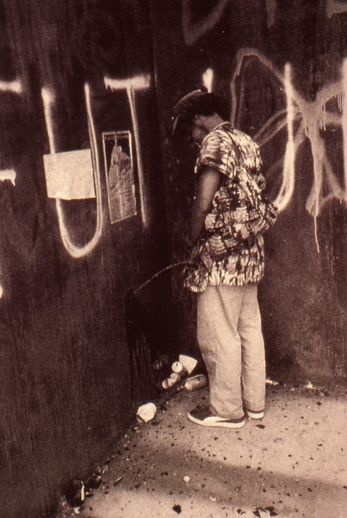
He goes on to say that "It reflects my political responsibility to the public--not that I have any idealistic notions of swaying the masses through television. I think commercial TV is basically show business, and that means show business is used to reflect corporate America's interests."

Of course, one of the criticisms leveled at Art & Technology was that it was using art to reflect those same corporate interests. Tuchman arranged for 64 men of the art and industry to pair up to produce artworks, which would be exhibited at the Museum, and also the US Pavilion at the Osaka 70 World's Fair. The results were mixed at best.

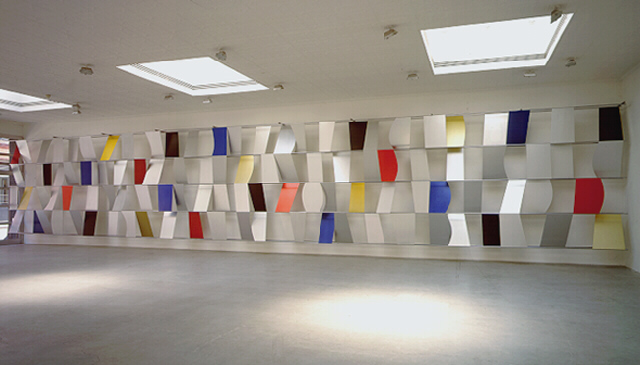
Roy Lichtenstein worked with Paramount to make 35mm painting/film installations. Warhol made some wacky lenticular rain machine. Rauschenberg made a bubbling pool of lubricating mud. Tony Smith tried to make a cave from thousands of cardboard tetrahedrons. And all of it went down when opposition to the Vietnam war and Nixon and the Establishment were hitting new nadirs every day. If the show was meant to heal, bridge, transcend, or even paper over the cultural chasms between art and the American corporate machine, it has to be considered a failure.

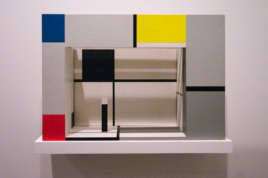
And yet, somehow I hadn't noticed this, and I can't remember ever hearing it discussed, the work Richard Serra made for Art and Technology seems like some of the most crucial of his career. I'll look again, but in terms of the artists' own practice, I think Serra made what turns out to have been the most important art in the show.

Serra was, remarkably, the seventh artist Tuchman tried to match with Kaiser Steel Corp's Fontana mill. [Among the first six attempted matches: Smithson and di Suvero, which, sure, but also Jules Olitski and Len Lye, which, what?] He proposed work that would "be related to both the physical properties of the site and the characteristics of the materials and processes concomitant to it."

The three "categories" he envisioned were, casting, overlaying/stacking, and constructions.

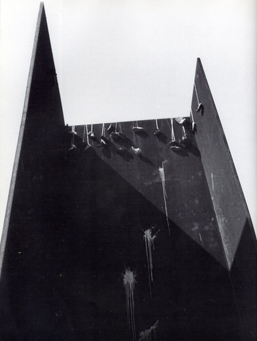
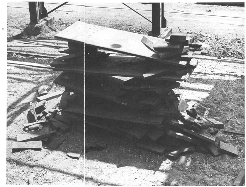
And that's just what he did. Serra worked nights with the crew assigned to him to get a feel for steel in its different forms, for the site, and for the processes available to manipulate the material. After several weeks working in the skullcracker yard, where scrap steel was moved around with a giant magnetic crane for reprocessing, he used the machinery to execute 12 different constructions [or 20, depending] within two intense, final weeks. "The procedure would be to erect a piece, and, if he considered it successful, to have it recorded photographically when possible. The structure was then dismantled."

serra_aandt_stack_stools.jpg
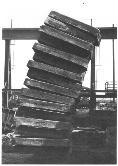
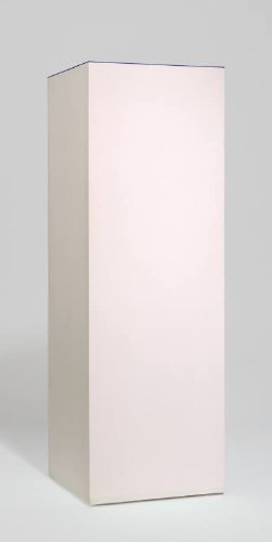
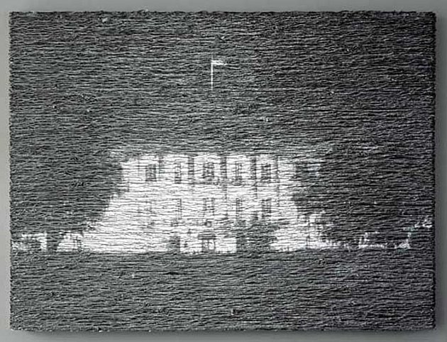
Stacked Steels Slabs (Skullcracker Series), 1969, constructed at Kaiser Steel, Fontana, CA

The first of these pieces is probably the best-known, a leaning stack of sixteen 6-ton slabs of cast steel known as stools, the photo of which has circulated under the name, Stacked Steels Slabs (Skullcracker Series). These Skullcracker Series works became more structurally complex; Serra created loose piles of steel scrap, then propped large slabs against or on top of them.

serra_aandt_stack_crops.jpg

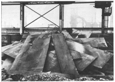
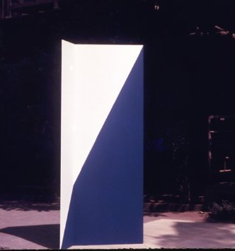
He made counter-balanced structures with plates jutting out in various directions. They remind me a bit of the block towers architect Eliot Noyes made to demonstrate balance in a 1955 educational film. I'm sure, of course, they were completely different.

serra_aandt_stack_crops_3.jpg

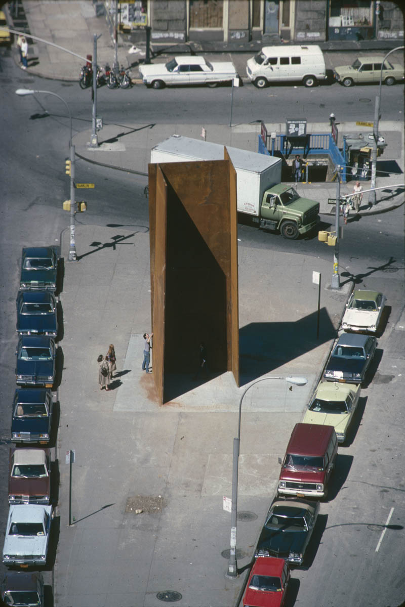
After a second, less successful stay in 1970, Serra agreed to return in the Spring of 1971 for the actual LACMA show. He would erect a Skullcracker Series at the museum, and also install "a piece related to his more recent thinking; the idea derived directly from what he had learned about steel at Kaiser."

serra_andt_contour_cut.jpg

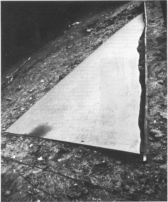
His idea was to measure a site and install a steel plate, which would be cut along the edge of the ground, thereby taking the contour of the topography into which it had been installed.

Though the cutting is, I think, unique, a form of drawing, this creation of sculpture that marks the contours of a site is immediately, obviously recognizable as central to Serra's work at the time. He was doing it at that exact moment in St. Louis with Pulitzer Piece, and in Ontario with Shift. And he says that it all came "directly from what he had learned about steel at Kaiser." [Those links are both to Tyler Green's Modern Art Notes, who's written one of the very few art-aware accounts of actually visiting Shift.]

Serra's steel mill-based practice is something else that, in the intervening decades, has become central to Serra's work. In interviews, it's usually explained by biography, by early factory jobs in college. But those jobs didn't get a mention in Tuchman's Art & Technology catalogue, and Tuchman's complicated show rarely gets credited for arranging the corporate collaboration at Kaiser Steel that gave Serra his first studio in a steel mill.

Previously, related: Stop & Piss: David Hammons' Pissed Off

gretchen_bender_sensurround.jpg
Gretchen Bender, Sensurround, 1983, silkscreen and c-print on tin

From Andrew Russeth comes Cindy Sherman's 1987 interview with Gretchen Bender, published in BOMB Magazine:

CS There's an article in an L.A. paper describing you as a TV terrorist, saying that you can attain a critical edge through overload.

GB Yeah. There are artists who talk of using silence as a weapon, an alternative and an act of resistance. That's one end of it. I've gone in the opposite direction but with the same desire. I think it's more important to mimic and provoke at this point.

CS Your theatrical pieces are counterpointed by the tin pieces, which ironically, make objects out of paradigms.

GB Either way, it's only temporarily effective. Hans Haacke uses part of the dominant high culture to criticize the function of the whole system through his object/displays. The question is--how broadly effective do you want to be? That is a difficult question with artists. Artists can be confused about their situation as a powerless elite. We operate from the protective base of the art world, a situation in which we can develop ideas but a place from which it is complicated to launch media-related art work without it getting co-opted by the very structures it criticizes. Although I use those structures. I'm resisting one channel television because I haven't figured out how to effectively communicate except in a theatrical setting.

Again, I started wanting to quote the silence and art's engagement/fear of politics, and I didn't want to stop reading. Plus, it's all talking about the tin pieces:
CS You've been criticized for being high tech, which is another way of infiltrating popular culture--using the technology that they use.

GB It's something visual artists tend to resist although that resistance is steadily breaking down. More artists are figuring out how to use computer technology . . . there's so much that's happening visually. It's strange that the art world resists using the visual tools of our time. What's that about? It is scary when you have this heritage that you invoke--art history.

CS It's supposed to be more pure if you use materials like paint or make it all yourself or use another person to make it for you.

GB The art world is trying to protect this antiquated territory and what is most disturbing about switching over to the newer technologies is that there is no authority to invoke. There aren't any guidelines to tell you that you're making 'good' art. No one knows enough or understands enough. There's so much experimentation to do, so many blind visual forays to risk, so many conceptual implications of the newer technologies to try to comprehend. Many artists aren't willing to take those risks. You don't know if you are going to be effective or not, if you are going to make silly or profound works. I think that's what terrifies most artists and I think that's why the art world is so slow to accept the culture of today.

CS You have used imagery from other people's art work in some of your own pieces. I interpreted that as reducing expensive works of art by male artists--paintings--to this disposable imagery level.

GB I wanted to use the art as signs and not as valuable objects. I decided to combine those found art reproductions as one combines words in a language or even just parts of an alphabet. I saw them as a moving language. I have been working with the equivalent flow of television. Before that, I was actually dealing with the equivalent flow of art objects. What's really being said? At the same time, I realized that because we had gotten so much of our art out of magazines and reproductions, we weren't contemplating art anymore. So I made those tin pieces to be a scan. You couldn't fall into the pieces and contemplate. I go into galleries to see shows, to be aware of what is going on and it takes three minutes to see a show. Where are we? And what are we doing? It's our nervous system--the time we live in--it's not about reverie.

...

GB Artists using media have taken on a more complicated position in the culture than painters. Painters like tradition. And I think it's a hundred, or a thousand times more difficult for a painter to make politically engaged work. They know that if it smells like art and looks like art and tastes like art--it's painting. There's not much risk in the art world.

CS Especially now, it seems really dull right now.

GB At the same time, I constantly examine my . . . I'm still operating within the art world. There is that base. Maybe it's a base to reaffirm your goals or your sanity in trying to develop ideas. You do have people who want to see you succeed in producing important work.

Silkscreen on sheet metal must have caught Cady Noland's attention. BOMB Magazine: Gretchen Bender by Cindy Sherman [bombsite]

When I started transcribing this section of Mike Kelley's 2004 Q&A with Gerry Fialka , I was only in it for the Duchamp and Cage. But I'm glad I stayed for the art, entertainment, and politics:

[49:31] Gerry Fialka: Duchamp said, "How do you make a piece of art that's not a piece of art?" Well Cage did it with music, maybe 4'33", [Kelley shaking head]
Mike Kelley: No,
GF: Well--
MK: Duchamp did never not make a piece of art, and Cage did never not make a piece of art. That's a game they played, that's a game they played to pretend they were doing something that wasn't art. Of course it was art. What else was it?
GF: Well put, let me finish. And then Joyce wrote uh--
MK: Pshhh
GF: Finnegan's Wake and invented the Internet, and disguised it as a book. And George Manupelli--
[Audience noise]
George Manupelli is someone we both encountered in Ann Arbor, Michigan, who started the oldest experimental film festival in the world, the Ann Arbor F--
MK: The Ann Arbor Film Festival, which is, I tell you, I got my whole film education from that festival.
GF: It was a great place for me, too. to view experimental films
MK: They don't do things like that anymore.
GF: And he had a piece called Film for Hooded Projector, so why is it important to shake up constructed belief systems, and do we need'em?
MK: Of course. Why else would you want art?
The only social function of art is to f things up. It has no other social function. Absolutely none. That's why, if you merge it with the entertainment industry, make it about the desires of the masses, it doesn't have any social function.
Also, what that idea about art--what separates it from politics, politics has a purpose. It's about power relationships. Art doesn't have anything about power relationships. It's simply about fucking this up for the pure pleasure of fucking them up.
So it's about formal--it's about analysis, and formal, uh, uh, scrambling, and it both escapes the practicality of politics and the--what was the other side? I forget.
Audience: Entertainment.
MK: Eh?
Audience: Entertainment.
MK: Yeah, entertainment which is, drugging the masses. So art should be something in between that's not practical in terms of power relationships, because it's fantasy, but it allows for power. Because art allows for power shifts over a slow time because people's minds change. Entertainment never changes people's minds. It just drugs them to reality, and I completely agree with Marx in this, in this way.
So I'm, I'm against the idea of art being subsumed either into the political sphere, or into the entertainment sphere. I think it has to be a separate social entity, especially in America.
I think in Europe, social and class differences are different than they are here. But in America, since it's such an anti-intellectual culture, it has to be a separate milieu, that's purposely--um. What would I say? Purposely purposeless.
It has to be. Otherwise it has no social function.

dimore_brass_kitchen.jpg

Is it just me who can't stop thinking about that oxidized brass kitchen in Dimore Studio designers Britt Moran and Emiliano Salci's Milan apartment? The one in T Magazine this weekend, even though it seems like the Women's Fashion issue, not Design?

dimore_brass_kitchen_2011.jpg

BECAUSE HOLY SMOKES.

A couple of things: they also do have that brass slab cabinet/headboard, which kind of dilutes it a bit, or maybe not. It makes me think they ended up with half a truckload of brass from a client project, and were like, well, we could just make everything out of brass?

Also, I guess two years is the appropriate time to wait to shoot an apartment that has already been featured in other magazines and blogs and debuted at international design fairs? Because these pictures by Emanuele Zamponi are all for Yatzer from 2011. Though they do look pretty much exactly like the Times's photos.

Dimorestudio_palazzo_kit_blox.jpg

This embedded light strip seems extraneous and unfortunate, though. It will have no place in my oxidized brass kitchen. It looks like a remnant of a planterbox from a corporate lobby, which is always a risk one faces when working with lavishly thick brass, I suppose.

It's also a fairly stiff repudiation of the elite brass ideology, which, when it is seen on the doors, awnings, siamese firehose connectors, and other brass elements on New York's finer co-ops, shine brightly as proof of extraordinary, hand-labor-intensive, maintenance. For Dimore, thought, the patina is the point. Splash marks, drag marks buff marks, heat marks, air, it is a new kind of extravagance-through-negligence.

beshty_copper_surrogate_basel.jpg

Which, of course, immediately calls to mind the copper pieces of Walead Beshty, both the tabletop-shaped Copper Surrogate wall pieces which appeared at his 2011 Regen Projects show and in last year's Art Unlimited at Basel [above], which accrete a fine patina through handling and installation; and the smaller, more interesting FEDEX pieces, which really earn their knocks on the street, the handtruck, and the plane. [Now I wonder what the insurance is on shipping these things?]

Beshty_20-in_copper_jc.jpg
image via phillips

I remember a discussion I once had with someone from Donald Judd's operation. They told me how Judd was outraged to find out collectors, and even some museums, would put a clearcoat on their copper or brass stacks in order to preserve the pristine look. But Judd's preference, I was told, was that you damn well better leave his unfinished finish alone. And if you want it to shine, you polish it. And if you don't polish it, you let it oxidize.

I actually think of this conversation often, because of the shiny brass Judd floor sculpture at MoMA, a 1968 work given to the museum in 1980 by Philip Johnson. It's probably the single Judd work I've seen the most over my adult life. And I'll be damned if I've ever seen it without some visitor's grubby handprint on it. Conservation does not remove them immediately, though; it'd just be too much. So when I've visited the galleries several times in a week, I've noticed the same handprint still there. A calculated balance, I'm sure the museum is aware of how many microns of material they lose with each buffing, and plan accordingly.

moma_judd_1968_212250.jpg
Donald Judd, Untitled, 1968, image:moma.org

Anyway, even after all these years, I've never been able to look at that Judd and not think of a coffee table. Not once.

Alright, I know it all looked like a black hole of boring embarrassment last week, but Amazon Art just broke through to the other side.

artisoo_mccollum_surrogate.jpg
Artisoo Surrogate Painting [No. 783] - Oil painting reproduction 30'' x 26'' - Allan McCollum, $193

Kriston Capps and Joy Garnett were tweeting this link to what seems to be an Allan McCollum Surrogate Painting (No. 783), a 30x26-in original oil painting, offered on Amazon by a gallery called Artisoo--for $193. Kriston pointed out that Amazon's gallery system has a forgery problem, or at least an authenticity problem. Which could very well be the case! But this is not why.

Because Allan McCollum's Surrogate Paintings are not oil on canvas, but acrylic on plaster. Or as in the case of [No. 783], which was made in 1978, acrylic on wood. They're painting-shaped sculptures, really. And what Artisoo is selling here is actually an original oil painting of the jpg reproduction of the McCollum. Artisoo is making an artwork that's the picture of an artwork that the original artist hoped would help a gallery "become like a picture."

Artisoo guarantees that your Surrogate Painting [No. 783] will be "100% hand-painted by our experienced artists. We stand by our top quality." And you can order with confidence knowing that "The original motifs presented by Artisoo are created by artists from the most prestigious art schools and academies of fine arts. [emphasis added, because, 'motifs'! -ed.]"
Chinese Paint Mill has appropriated Google Images and put it up for sale on Amazon. There are at least 18 other McCollum jpgs available as oil paintings. They all appear in the first page of the artist's Google Image results. Artisoo currently offers 8,124 other paintings on Amazon, and unnumbered thousands more on their own website. In your choice of seven sizes.

lifesphere_zazzle_ties.jpg

It's the fine art equivalent of LifeSphere, the Spamerican Apparel botcompany Babak Radboy wrote about that systematically turns every public domain image into every possible Zazzle product.

At least it's trying to be. After a quick surf, I'd say that this Artisoo McCollum Surrogate Painting counts as a rare conceptual gem; easily 98% of the company's merch is Chinese Paint Mill fluff. I'd call it pure over-the-sofa art, but that'd only account for one of the eight options in their Shop By Room function.

But there's something sublime about the way a painting of a photograph of a minimalistic, monochromatic painted object encapsulates the entirety of orthodox post-war art history, collapses it, and drops it into the world's biggest online vending machine. It's painting pared down to its barest essence as a privileged cultural signifier: a decorative picture of whatever, made by hand. Painting sells its soul for Dino Sponges. But wait, there's more!

artisoo_truitt_austr_spring.jpg

Like any serious collector, I like to shop for my art alphabetically, which means the first post-war artist to emerge in Artisoo's stable is Anne Truitt. Artisoo offers 62 paintings with an Anne Truitt "motif," including installation shots of her trademark acrylic on poplar columns; monochromatic works on paper; sumi ink drawings; and even the barely visible washes of the Arundel paintings. Can't wait to see how those come out.

Artisoo's daring paintings, uh, interrogate the conventions of scale as deftly as the notion of medium, date, authorship, context, and form. At 30x10 inches, this painting of a Parva sculpture is easily three times the size of Truitt's original.

artisoo_truitt_signal.jpg
Artisoo Signal - Oil painting reproduction 30'' x 28'' - Anne Truitt

In a move that feels appropriated from my own playbook, Artisoo even offers paintings of early works that Truitt destroyed, the aluminum sculptures she created in 1964 while living in Japan. Unlike Destroyed Richter Paintings, however, Artisoo's Artisoo Signal - Oil painting reproduction 30'' x 28'' - Anne Truitt ($204) does not attempt to recreate the experience of being in the original's presence; it promises only its own, bold self: a painting of a vintage Kodachrome of a nautically colored sculpture bathed in the light of Tokyo courtyard.

I'm on slow wireless at the moment, so I gave up hope of surfing through all 340 pages of Artisoo's products, and instead started plugging in names of artists I liked, or rather, artists I'd like to see appropriated by Amazon Chinese Paint Mill. It didn't really pan out. No Kosuth, no Andre, no Beuys, Lewitt, Gober, Sherman, Levine, Hesse, Newman or Prince, and no Richter. The company's web-indexical curation strategy is clearly still a work in progress. There are several dozen Johnses on Artisoo.com, though. I wonder if I could order a copy of Flag in the exact dimensions of the Short Circuit original? Yes, there's no Sturtevant.

artisoo_reinhardt.jpg
Artisoo Abstract Painting - Oil painting reproduction 30'' x 30'' - Ad Reinhardt, $221

There are Alma Thomases, though. And 63 Calders. Would you like a painting of a stabile? Oh, nice, there are 50 Ad Reinhardts. Those ought to be interesting. Likewise the 23 Agnes Martins.

artisoo_agnes_martin.jpg
Artisoo Happy Valley - Oil painting reproduction 30'' x 30'' - Agnes Martin, $239

Here's a standout, though, which reveals a lot about Artisoo's practice. It's a painting called, Http En Wikipedia Org Wiki File Hamilton Appealing2 Jpg 1956, and it comes 4x-36x larger than Richard Hamilton's 10-inch paper collage.

artisoo_hamilton_screen.jpg
Http En Wikipedia Org Wiki File Hamilton Appealing2 Jpg 1956 ($125-650)

Everything about Artisoo is so immediately and obviously fantastic, I almost don't want to spoil it by seeing actual paintings. Almost.

I'm surprised to not be hearing or reading more about "Here and There," Peter Coffin's show at the Hirshhorn, curated by Kelly Gordon.

coffin_colby_hh_chagall.jpg
Hirshhorn installation view via @bluelikechagall

Maybe it's the show's unusual format; with seven works, it's bigger than a project, but smaller than a mid-career retrospective, and Coffin's works are dispersed throughout the museum (and one online). Jane Holzer's copy of the eyecatching Untitled (Spiral Staircase) is in the courtyard. And my absolute favorite of Peter's work, Untitled (Designs for Colby Poster Company), is on view, all 80 posters, in the elevator landing. [The Hirshhorn apparently bought Colby Poster in 2008, which was definitely the right time to get it, but the checklist and walltext says these particular examples are Collection of the Artist. I hope there's a trivial explanation for this, especially now that Colby Poster Company is gone. (RIP). Also, has it ever been shown in the museum before? I don't think so. I would've put that thing up at the end of Warhol's Shadows instead of that Estate Edition Flavin wall. Just sayin'.]

moffett_alum_whitehouse.jpg
Donald Moffett, Aluminum/White House Unmoored, 2004, image via marianneboeskygallery

Anyway, the big news is the center of the show, a [commissioned?] project, Untitled (Smithsonian Hirshhorn Museum), 2013, a 12-minute animated projection/installation on a dozen or so works from the collection. It's not so much site-specific as institution-specific and work-specific; each projection is timed and tailored for a particular painting or drawing.

When Donald Moffett first showed projected still video landscapes on paintings in 2003 (above), his silver and gold monochrome canvases served as uneasy, even dubious screens. Coffin, though, has selected a wide mix of figurative and abstract work onto which he projects Jeremy Blake-like animations that overlay their own representational/abstract painterly arguments.

sargent_vlasto_hirshhorn.jpg
For Jasper Johns' pastel 0-9 (1962), for example, Coffin articulates each collapsed digit in turn, rendering the illegible temporarily legible. For Sargent's portrait of random London shipping heiress Catherine Vlasto (1897) [left], Coffin highlights different elements of the picture, including the piano keys, her décolletage, and the gilt frame, referencing the viewer's own reading process, the very museum experience that has been digitally usurped.

I've watched the program through several times, and I got to where I can identify and anticipate favorite passages, moments where the original artwork and Coffin's projected images work well together (or against each other.) The last 5 seconds or so of the video clip above, for example, where Coffin makes de Kooning's painting seem to blur in and out of focus, is a standout that deftly addresses the painting's abstraction.

Overall, though, Coffin's various animations don't seem designed for contemplation. Instead they fall under the rubric Gordon calls, "serious fun," a new, different, and "subversive" way of looking at traditional artworks. I imagine that for many viewers, especially those who wander in from Air & Space, Coffin's 12 minute loop will be several times longer than they'll spend strolling through galleries where they can actually see the paintings. In that sense, they're the apotheosis of a certain kind of entertainment-centric museum-going experience, just what the curator ordered.

Peter Coffin: Here & There runs through Oct. 6, 2013 [hirshhorn.si.edu]

August 14, 2013

Day For Detroit: Aphrodite

dia_aphrodite.jpg
Torso of Aphrodite, 1st c. BC Roman copy, collection Detroit Institute of the Arts, acquired 1924 by the Founders Society.

Tyler asked me to join the Day for Detroit, and show support for the Detroit Institute for the Arts by highlighting works from its incredible collection. The museum and its artworks, donated and acquired by generations of Detroit's residents, are now apparently under threat from the bankruptcy proceedings instigated by the city's unelected emergency manager.

Which is not a new situation for art. Here's Pliny the Elder, writing in the 1st century AD about Greece's most famous sculptor, Praxiteles, who lived in the 4th century BC:

Praxiteles...outdid even himself by the fame of his works in marble. Statues by his hand exist at Athens in the Kerameikos, while famous not among the works of Praxiteles, but throughout the whole world, is the Aphrodite which multitudes have sailed to Knidos to look upon. He had offered two statues of Aphrodite for sale at same time, the second being a draped figure which for that reason was preferred by the people of Kos with whom lay first choice; the price of the two figures was the same, but they flattered themselves they were giving proof of a severe modesty. The rejected statue, which was bought by the people of Knidos, enjoys an immeasurably greater reputation.
The Aphrodite of Knidos became one of the most famous and most visited statues in the ancient world. Knidos installed it in an open temple in the center of town, so it could be viewed from all sides. Pliny continues the tale centuries later:
King Nikomedes subsequently wished to buy it from them, offering to discharge the whole of their public debt, which was enormous. They, however, preferred to suffer the worst that could befall, and they showed their wisdom for, by this statue Praxiteles made Knidos illustrious.
In 1924, in anticipation of the new Woodward Avenue building, conceived as a "temple of art," the Founders Society used general membership funds to acquire the torso of Aphrodite above, a Roman copy of a Greek original, made in Nikomedes' day, the 1st century BC.

50 years later, Christina and Henry Ford II donated funds for the DIA to acquire a later Roman copy of a lost Greek draped Aphrodite, too.

dia_draped_aphrodite.jpg
Romany copy of Torso of Aphrodite, Venus Genetrix type, 1st century AD, collection the Detroit Institute of the Arts, acquired 1974

Art doesn't exist for itself. Art doesn't exist in a vacuum. Art is evidence of the culture we build and the history we write. It will tell the stories of our time to the generations to come. The attempts of Detroit's itinerant would-be kings to use art as a bargaining chip, or to loot the city's public trust for private benefit will stand as testimony against our country and our culture for centuries to come.

See other great works from the DIA by following #DayDetroit on Twitter. And join me and many others by becoming a member of the DIA or donating to support the Museum today.

August 13, 2013

Mao Hope

fahlstrom_mao-hope_march.jpg

I shouldn't have to explain, but it's just really important that this photo get out there even a little bit more. That it should be here. Because seriously, it's a 1966 march through New York City by people carrying giant head shots of Bob Hope, and one of Mao Zedong.

I've been kind of fascinated by different aspects of Öyvind Fahlström's work lately, so seeing this photo, a still or documentation from Mao-Hope March, on grupa ok reminds me of how few dots I've connected yet.

Fahlström was a contributor to 9 Evenings: Theatre and Engineering, the ambitious-but-mixed-but-historic series of happenings, performances, music, and events organized by Experiments in Art and Technology. Folks like Rauschenberg, Whitman, and Billy Klüver kind of soak up much of the E.A.T. limelight, and John Cage and Bob loom especially large, in the remembering of 9 Evenings.

Which is all a way to say that I've never really paid attention to Fahlström's contributions to the program. The Langlois Foundation has a fairly detailed account of the 100-minute performance, titled, Kisses Sweeter Than Wine, which strikes me as one of the most politically charged elements in 9 Evenings.

Performers in Kisses carried Mao and Hope placards live, but Fahlström also showed a short film of a Mao-Hope March shot on Fifth Avenue. No explanation for the demonstration was given to passersby, and none was made in Kisses. But New Yorkers were interviewed by a popular WBAI radio announcer on the scene about whether they were happy. That's it. [Fahlstrom.com has a complete transcript.]

Mao, of course, was the Communist hegemon looming over Vietnam, while USO veteran Bob Hope was the aw shucks face of the US military. Both, then, stood in for but were at least one degree removed from the actual war. But the associations and allegiances were clear enough that, even if the demonstration's agenda was not clear, people could easily, reflexively take sides. Me, I am mostly just in awe of the bold and gripping and ambiguous content of those placards.

Some years later Fahlström showed Mao-Hope March as an independent work. MoMA acquired the film in 2009.

Mao-Hope March,1966 [fahlstrom.com]

Öyvind Fahlström | Kisses Sweeter than Wine (performance)
[fondation-langlois.org]
A 20-second clip of Mao-Hope March playing at the Pompidou [youtube]

mondrian_ephemeral_werner.jpg
Model for set design, "L'Ephemere est eternel," 1926, recreated in 1964, photographed in 2008 at Vanabbemuseum by Jeff Werner

After reading Michel Seuphor's Dada play "L'Ephemere est eternel" in 1926, Piet Mondrian surprised his friend by designing sets for each of the three acts. The little models were photographed amidst Mondrian's paintings in his studio, a nice parallel to the play's denouement, in which a model of a theater is destroyed by an executioner. It also resonates with a play Mondrian himself wrote in 1919, which ends in his studio. For someone trying to change all the world, the stage was a nice place for a dry run.

mondrian_studio_model.jpg

Susanne Deicher noted that Mondrian refused to be photographed painting in his studio.

Mondrian often said that "new life" could be found in the free space opened up by reason and thought. The empty plane at the centre of the small painting on the easel reflects the absence of the artist.
During this period Mondrian frequently spoke of the end of the subject in the new age to come. He designed his studio as an imaginary setting for a theory without an author, where the "new" appears to evolve in the non-space of the empty center of his abstract paintings.
This absence to Mondrian's ideas for the staging of "L'Ephemere" as well. He really wanted sets that concealed the actors as they delivered their lines. To what extent Seuphor was on board with Mondrian's creative involvement, I don't know.

I also don't know in what form it circulated at the time, or how widely it was read or known, but Seuphor's play was not actually ever performed until 1968. By then Mondrian's original models had been lost; someone--perhaps Seuphor himself--had refabricated one in 1964. It's in the collection of the Vanabbemuseum in Eindhoven. [That's where Vancouver designer/blogger Jeff Werner photographed it in 2008.. I first saw it a few months ago in "Inventing Abstraction" at MoMA.]

Remarkably, the US premiere of "L'Ephemere est eternel" took place in 1982, at the Hirshhorn Museum. It was one of several ambitious elements of Judith Zilczer's exhibition, "de Stijl: Visions of Utopia: 1917-1931." The show also included a large-scale recreation of Theo van Doesburg's lost interior of the cinema/cafe in the Aubette in Strasbourg. The opening was attended by Queen Beatrix, who, on a state visit, discussed nuclear proliferation and anti-NATO protests with Ronald Reagan.

Georgetown University theater professor Donn B. Murphy directed his and Zilczer's 60-minute adaptation of Seuphor's absurdist, plotless, and wordplay-filled script, which ran for at least seven public performances during the weekend of June 25-27. The show was in the museum's auditorium, which barely has a stage, more of a podium, but which was apparently able to accommodate a full-scale version of Mondrian's spare, shallow set.

The Washington Post hated it. In his review David Richards summed up the play's Dadaist, traumatized historical context as "the intellectual's version of 'Hellzapoppin,' music-hall for the nihilists born of World War I." Which, well, I guess it could be worse. Whatever could Dada tell the world of Washington during the throes of the Culture and Cold Wars and at the onset of the AIDS pandemic? [On the same page, the Post hated on John Carpenter's remake of The Thing, starring Kurt Russell, even more.]

In the Dada spirit of non sequitur, and to add one more datapoint to calibrate the Post's critical settings, I can't not quote from the their review of a local stand-up performance by one Jay Leno:

Leno's nasal delivery, which resembled Andy Rooney's, expanded to a colorful palette of characters as he worked through subject matter including the Phil Donahue show, photo stores ("How come they can transmit pictures 80,000 miles through space, and you walk across the street to Fotomat and they can't find yours?"), male strip shows, Steven Spielberg movies, video games, and even local deejay Howard Stern.
Anyway, the Hirshhorn has a [VHS!] videotape of the performance in their archive. I will be making my appointment pronto.

Serra_TWU_PAF_Svennevik.jpg
T.W.U., 1980-81, photo by Donna Svennevik, via publicartfund.org

Richard Serra was on a roll in NYC in 1980. In the run-up to the debut of Tilted Arc, he had two Cor-Ten sculptures installed in Tribeca: St John's Rotary Arc was in the exit plaza of the Holland Tunnel, and T.W.U. (above) was in front of the Franklin St. entrance for the IND subway. It was named for the Transport Workers Union, which had just gone on an 11-day strike as the sculpture was being installed.

david_hammons_dawoud_bey_twu_1.jpg

By 1981, T.W.U. was looking a little beat, strewn with empties, and covered with wheatpasted flyers and graffiti. That's when Dawoud Bey shot a series of photos, posted recently on Black Contemporary Art's tumblr, of David Hammons pissing on the sculpture.

The sequence apparently begins with Hammons in khakis, Pumas, and a dashiki, with a matching shoulder bag, just standing there in the south-facing space of Serra's sculpture. In the next photo, he's turned away from the camera, doing his business.

david_hammons_dawoud_bey_twu.jpg

Then we see Hammons, talking with an NYPD officer, presenting papers, maybe a passport? The caption reads, "David Hammons receiving a citation from a police officer." Which might have happened! But really, we don't know.

david_hammons_dawoud_bey_twu_3.jpg

These photos are not journalism; they're documentation of a performance Hammons titled Pissed Off. I don't know when or how the title emerged; it's hard to trace the historic trajectory of Hammons' practice apart from the art world's later embrace/interpretation of it.

But considering that other tellings of the story say that Hammons was "arrested" or "almost arrested," I feel more comfortable in just saying we don't know.

What happened, and what's in the photos, are not the same thing. There were actions and interactions here beyond the frames and before, after, and in between the clicks of the shutter. Like, where'd the white shopping bag and folder Hammons is holding in the first photo go? Is Bey holding them? It makes me think of one of the best pieces I've ever read on Hammons' work, by Christian Haye and Coco Fusco, from Frieze, May 1995:

[Hammons] is, in actuality, a masterful investigator of how an oppositional black cultural identity can be generated through a dialogue with 'high' culture, particularly as it is articulated through standard English. His method relies on punning and other kinds of word games that short-circuit the dominant cultural interpretation of any given object or term to be redirected for his own purpose.
This practice, which Haye discusses using Henry Louis Gates' concept of signifyin', applies as much to Bey's photos as to Serra's sculpture. The art world can think it's funny and transgressive to see Hammons pissing on Serra, but do they even notice that he's splashing onto their shoes, too? That everyone assumes or accepts the retributive outcome of Hammons' encounter with the cop may just be the most critically damning aspect of Pissed Off.

david_hammons_bey_serra_shoetree.jpg
David Hammons, Shoe Tree, 1981, on Richard Serra's T.W.U., 1980, image via grupa ok, (who rightly call it an assemblage)

Speaking of shoes, Hammons did another performance at T.W.U.. For Shoe Tree (1981), Hammons threw 25 pairs of sneakers over the top of Serra's 36-foot tall steel plates. Some call it a performance, but unlike his documentation for Pissed Off, Bey's photo shows no artist, no action, no street, no building, even, just the stark angles of the top of Serra's paint-splattered sculpture against an empty afternoon sky.

clui_las_vegas_piece.jpg

The question is not whether you can visit Walter De Maria's Leaving Las Vegas; the question is, does it still exist?

Already in 1972 when discussing the land art project with Paul Cummings, Walter de Maria seemed to emphasize the difficulty of actually experiencing Las Vegas Piece as part of the actual experience of Las Vegas Piece. He'd graded a mile-long square onto a barren desert valley north of the city, and you'd have little chance of even finding it, much less seeing it, much less seeing it all:

it takes you about 2 or 3 hours to drive out to the valley and there is nothing in this valley except a cattle corral somewhere in the back of the valley. Then it takes you 20 minutes to walk off the road to get to the sculpture, so some people have missed it, have lost it. Then, when you hit this sculpture which is a mile long line cut with a bulldozer, at that point you have a choice of walking either east or west. If you walk east you hit a dead end; if you walk west you hit another road, at another point, you hit another line and you actually have a choice.
And on and on for several hours, until your choices and backtracking end in some combination of experiencing the entire sculpture on the ground; declaring victory or defeat partway through; and dying of exposure in the desert because you can't find your car.

In a 2003 NYT interview, Virginia Dwan and Michael Kimmelman got a little myst-y eyed about being alone. They made Las Vegas Piece sound like an emotion machine that manipulates art world people into contemplating their solitude by losing themselves in the desert landscape. [It was also, De Maria acknowledged, a way to grab a viewer's attention for hours, a whole day, not just the minutes or seconds it took to circle a sculpture in a gallery.]

In both those ways, Las Vegas Piece is still functioning perfectly, whether it actually exists or not. In 2008, the Center for Land Use Interpretation had listed Las Vegas Piece as "apparently, no longer visible." And their map was uselessly vague.

But today, CLUI's entry for the work has more information, if not more answers:

The piece is visible on online satellite maps, and there apparently are some discernable fragments of the lines on the ground.
Yes, well. here is their latlong marker for Las Vegas Piece on Google Maps, [above] and I'll be the first to admit I don't see a thing. So I plugged the coordinates into the USGS' database of historical satellite photographs and still came up empty. Maybe a better mapsearcher than I will find it.

And in early 2012, in the run-up to "Ends of The Earth," her landmark land art show at MoCA, UCLA art historian Miwon Kwon engaged CLUI to lead her and her grad students on a road trip to visit Las Vegas Piece. UCLA Today reports that Kwon's SUV had a blowout on the way:

Instead of giving up, they stuck it out. Eventually the first car did return, the expedition guide helped replace the tire, and Kwon was able to give her students an experience that, she hoped, would transform the way they thought about art and art history.
What was that experience, exactly? Was it just like the MOCA show itself, that of not seeing a De Maria? We who weren't there will never know.

But check out CLUI's own account from their Winter 2013 report, and I think we can read between the lines:

Some would argue that it isn't there at all, that the piece is gone. Certainly, as originally intended by De Maria, the piece no longer exists, just as "none" of Heizer's dry lake pieces exist, even if traces can be found. Of course these are ruins of land art, not land art. But for a group of art historians, the interest in going there was not to experience the piece, but to experience the place where the piece was. To understand it better forensically, and archeologically. And to ground truth the land art that usually exists to us only in photographs-to verify its historic existence heuristically.

Only the faintest sense of the lines of Las Vegas Piece is discernable, and barely so enough to leave some unconvinced that they saw it at all-its existence is a matter of interpretation. It's on the limits of perception, conjured up in the mind's eye and space by lining up mountain ranges in the background of photographs in art history books with those in the distance of the actual site. In a paralaxed overlay, when the alignment lines up, the viewer descends into the photo at the same time the piece in the photo emerges into the viewer's live view. You are there, even if it is not.
Yes, well. To the extent archeological interpretation and three SUVs full of grad students excitedly pacing off every bald spot in the desert has supplanted the evocation of existential solitude and man's lonely movement through time, then yes, Las Vegas Piece no longer exists. This is an important takeaway for land art pilgrims whether they're in Kwon's seminar or not.

But it still makes me wonder what De Maria was actually intending for his work. He rejected the gallery rendition, the groundlevel photodocumentation, and the all-seeing satellite/aerial photograph. But how did the people who went to see it actually find it? Did he tell them? Did he give them elaborate directions? Did he draw them a map? Did he plot it on a map? Did he give people bad directions just for fun? Does it matter if he actually ever bulldozed it in the first place? Why would we be inclined to want to walk exactly along De Maria's paths, but not, say, Richard Long's?

demaria_las_vegas_piece_det.jpg

And if we're going to be in an archaeological mode, why not just use lidar to pinpoint the exact location? But the more interesting question, I think, is what's stopping someone from just driving a bulldozer out across the desert one morning and redrawing it? Just do it, stick it out there somewhere in the general area, and let someone MFA stumble across it after the next Google Earth update?

August 1, 2013

'The Fine Art Of Banking'

nga_kelly_orange.jpg

I've mentioned Ellsworth Kelly's Color Panels for a Large Wall before; though they were hard to see up close, the 18-canvases were the only monochromes at the National Gallery that have that tasty, gestureless surface I was craving when I started plotting the Rijksoverheid paintings.

kelly_18_panels_nga.jpg

The panels, made in 1978, look so at home there on the giant wall of the East Wing atrium that even though I knew they were a fairly recent acquisition (2005), I somehow never considered they lived anywhere else. So just take a look at that provenance [on the NGA's newly upgraded website? Congratulations]. They have really been around the block:

Commissioned 1978 by the Central Trust Company, Cincinnati, and installed 1979; gift 1992 to the Cincinnati Art Museum; de-accessioned 1996 and returned to the artist; purchased 30 September 2005 by NGA.
Central Trust Bank's building in downtown Cincinnati had a 140-foot long wall, where Color Panels were originally installed in two rows of nine. There's a long, skinny Gemini lithograph from 1979-82 titled 18 Colors (Cincinnati) that gives a flavor for the original configuration:

kelly_18_colors_cinc_gemini.jpg

Reports at the time praised Central Trust's investment savvy and connoisseurship, joked about color coding the teller windows, and mocked the idea of loaning Kelly's "paint chips" to an exhibition in Amsterdam. My favorite attempt to explain Kelly's abstract canvases is this uncredited illustration from Cincinnati Magazine's coverage of the work's unveiling, which consisted of three one-dollar bills, each cut into six parts:

kelly_cinc_fineart_banking.jpg

So awesome. I'm getting some uncirculated bills first thing in the morning to start working on the edition.

But back to that provenance. Central Trust was bought by PNC Bank in like 1988, which then sold parts of it to Banc One in 1991, which probably explains the gift of Color Panels to the Cincinnati Art Museum in 1992. But what baffles me is the deaccession of such a major work by such a major artist just four years later. Was there just not a wall large enough, not even in the Great Hall, which had been freshly renovated in 1993? I guess not.

kelly_marks_sculpture_wall.jpg
image via matthew marks' artnet page

1996 was a big year for big Kellys. It was when the artist and his dealer Matthew Marks began working to save Kelly's 1957 anodized aluminum Sculpture For A Large Wall from demolition when Philadelphia's Penn Center was being remodeled. [Herbert Muschamp rhapsodized about the piece in 1998. Then the Lauders bought it for MoMA. Amusingly, it's back in Philadelphia right now, for a show at The Barnes.]

It found its way to the East Wing's 25th anniversary in 2001 as a 2-year loan, reconfigured into three rows of six. "Kelly believes that this incarnation of the piece is preferable to the original.", the press release said, which probably assuaged Glenstone's acqisition of it for the museum, which the press release did not say. Anyway, I like it very much and miss it, and wonder what the story is, and why they're not quite the 4x6 feet they were originally said to be.

Previously: What I looked at today: NGA Monochromes

Since 2001 here at greg.org, I've been blogging about the creative process—my own and those of people who interest me. That mostly involves filmmaking, art, writing, research, and the making thereof.

Many thanks to the Creative Capital | Warhol Foundation Arts Writers Program for supporting greg.org that time.

comments? questions? tips? pitches? email
greg [at] greg [dot ] org

find me on twitter: @gregorg

about this archive

Posts from August 2013, in reverse chronological order

Older: July 2013

Newer September 2013

recent projects, &c.


our_guernica_cycle_ivanka_320px_thumb.jpg
Our Guernica Cycle, 2017 –
about/kickstarter | exhibit, 2017


pm_social_medium_recent_proj_160x124.jpg
Social Medium:
artists writing, 2000-2015
Paper Monument, Oct. 2016
ed. by Jennifer Liese
buy, $28

madf_twitter_avatar.jpg
Madoff Provenance Project in
'Tell Me What I Mean' at
To__Bridges__, The Bronx
11 Sept - Oct 23 2016
show | beginnings

chop_shop_at_springbreak
Chop Shop
at SPRING/BREAK Art Show
curated by Magda Sawon
1-7 March 2016

do_not_bid_or_buy_iris_sidebar.jpg
eBay Test Listings
Armory – ABMB 2015
about | proposte monocrome, rose

shanzhai_gursky_mb_thumb.jpg
It Narratives, incl.
Shanzhai Gursky & Destroyed Richter
Franklin Street Works, Stamford
Sept 5 - Nov 9, 2014
about | link

therealhennessy_tweet_sidebar.jpg
TheRealHennessy Tweets Paintings, 2014 -
about

sop_red_gregorg.jpg
Standard Operating Procedure
about | buy now, 284pp, $15.99

CZRPYR2: The Illustrated Appendix
Canal Zone Richard Prince
YES RASTA 2:The Appeals Court
Decision, plus the Court's
Complete Illustrated Appendix (2013)
about | buy now, 142pp, $12.99

weeksville_echo_sidebar.jpg
"Exhibition Space" @ apexart, NYC
Mar 20 - May 8, 2013
about, brochure | installation shots


HELP/LESS Curated by Chris Habib
Printed Matter, NYC
Summer 2012
panel &c.


drp_04_gregorg_sidebar.jpg
Destroyed Richter Paintings, 2012-
background | making of
"Richteriana," Postmasters Gallery, NYC

czrpyr_blogads.jpg
Canal Zone Richard
Prince YES RASTA:
Selected Court Documents
from Cariou v. Prince (2011)
about | buy now, 376pp, $17.99

archives