May 2014 Archives

What you need is a system. To keep you going, to avoid artist's block, to keep the pipeline filled.

I think Lewitt's cubes were less a system than an idiom. Flavin's fluorescent tubes, too.

mccollum_shapes_cookie_cutters_petzel.jpg
Shapes from Maine, 2009, image: petzel.com

Allan McCollum's got a few systems going. Systems are his medium. Define some parameters, calculate the total set, start producing, and don't stop till you--or your market--drops. The Shapes Project, started in 2005, has 31 billion possible permutations, enough for everyone ever to be born on earth to have one. Personally, I'm largely unmoved by McCollum's results, but I respect their jawdropping systemic integrity.

on_kawara_date_zwirner.jpg

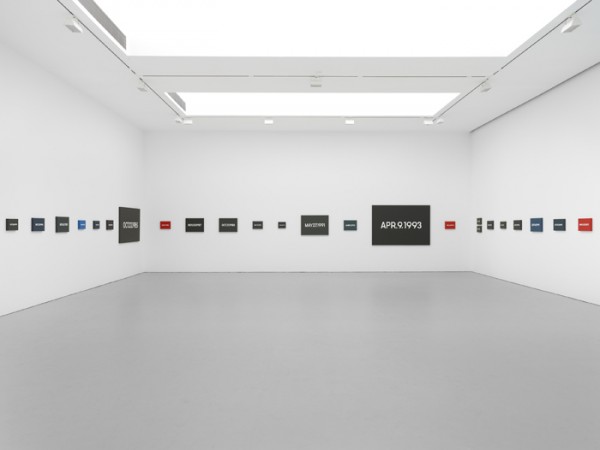
But On Kawara's Today Series, now that's a system I can get behind. It's a bonus when your system is conceptually tight, also when it can carry you out of this world.

hirst_lying_spot_nyt.jpg

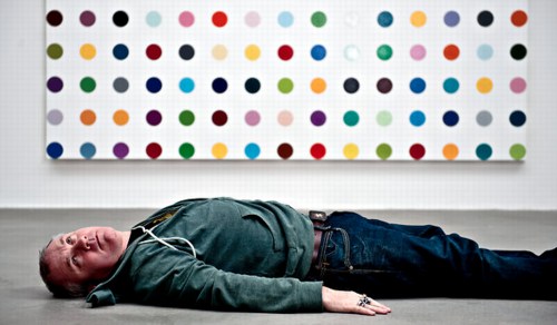
As that Kawara link above mentions, Hirst's spots are also a system, which operates autonomously and, he's even hinted, which could continue posthumously. [Kawara's date paintings and Hirst's spots were up in NYC at the same time in 2012, and Karen Rosenberg said one series was about time, and the other was about money. I love that.]

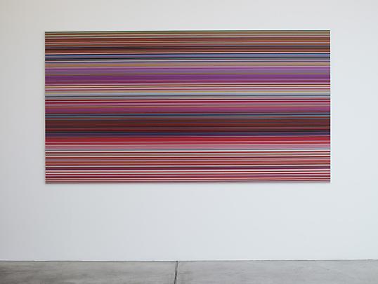
Anyway, you want to make sure you don't get trapped by your system. Flavin had a helluva time with that, especially towards the end. So keep enough irons in the fire, throw a system or two into the merchandise mix. Like Richter's new Strip paintings; he'll be able to pull those off the printer till the very last. And he could leave the print queue open in his will, even. [I wish him all the continued health and happiness and look forward to seeing his show at the Beyeler.]

richter_strip_mgp.jpg

One would want a system to be ambitious, to stake a large claim, but to be doable, sustainable, saleable over the course of its realization. When Bruce High Quality Foundation announced their project to recreate all 17,000 objects in the Metropolitan Museum's antiquities collection in Play-Doh, it seemed daunting. I guess you could say they'll probably have product available as long as they're able to keep selling.

PAF_DanhVo_WeThePeople_JamesEwing-0915.jpg.jpg
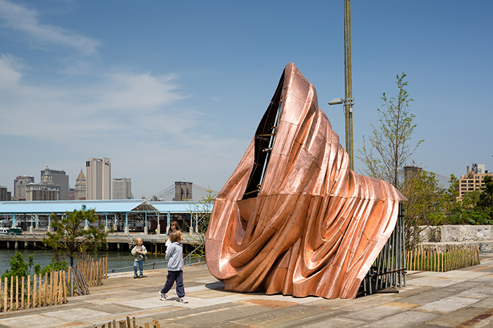
Danh Vo, We The People, 2014 installation at Brooklyn Bridge Park, Public Art Fund, image: James Ewing

Danh Vo's We The People project to recreate the Statue of Liberty as 250 separate panels, meanwhile, has a finite end, even though the ridiculously awesome scale of the project seems impossible. On a purely physical object level, this has to be one of my favorite art undertakings ever, a confluence of abstraction & representation, metaphor & literalism, presence & absence. As soon as I get to Vo's pieces on view in City Hall Park and Brooklyn, I'll try to write more about it.

From Kawara [solo] to Hirst [factory] to McCollum [vector files] and Richter [digital] we can see a diminishment of the artist's hand in inverse proportion with the expansion in scope, approaching capitalist nirvana, an industrial-scale infinity.

This is all nice and terribly important, but it's also prelude to what might be the most ambitious readymade art generation system ever, which I'm totally calling dibs on: Webdriver Torso.

webdriver_torso_screenshot.jpg

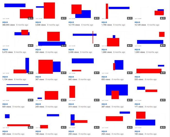
Webdriver Torso is the largest of at least four related YouTube accounts which have been uploading randomly generated videos [the pace is currently two videos ever 8-12 minutes] since mid-2013. Webdriver Torso has nearly 80,000 videos now; on all four accounts there are more than 130,000 videos total. Webdriver Torso's channel now has more than 38,000 subscribers. Where a few weeks ago, almost all the videos had zero views, or maybe one, now videos of seemingly nothing immediately get several dozen views. [The other channels still have mostly zero views.]

Since being discovered and publicized a few months ago, various websites have speculated on the purpose and origin of Webdriver Torso, calling it an alien communications tool, or a crypto-spy numbers station, or a test channel for some video software developer. The most persuasive explanation I've seen so far is Italian blogger Paolo B.'s theory that the Webdriver channels are connected with a YouTube uploader development initiative for 3D videos or multiple videos, run out of Google's Zurich office.

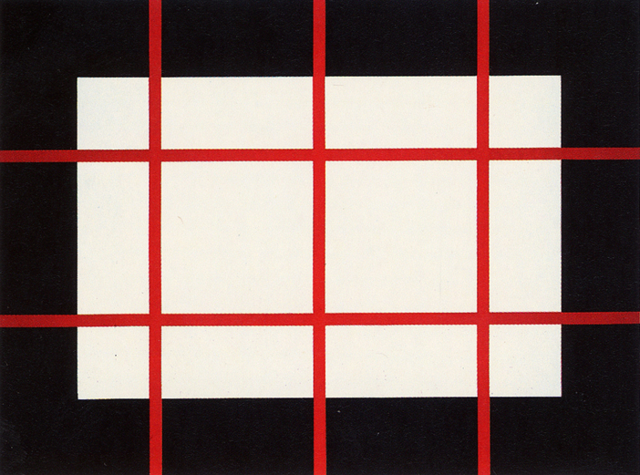
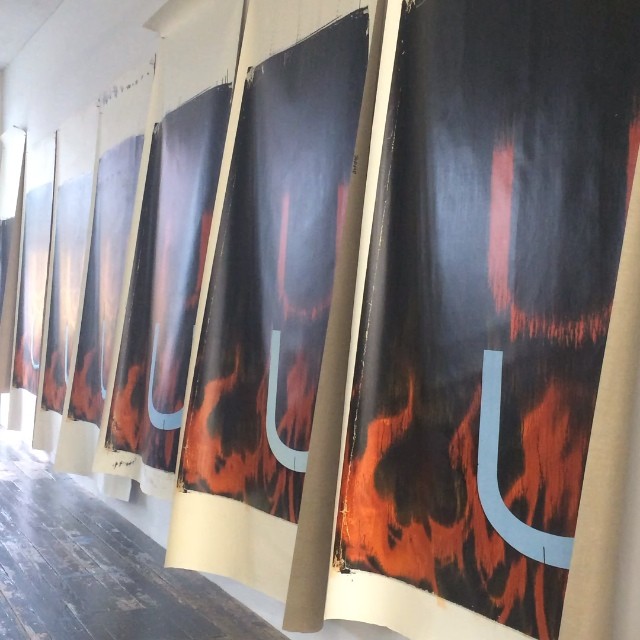
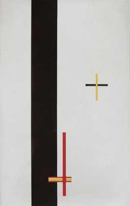
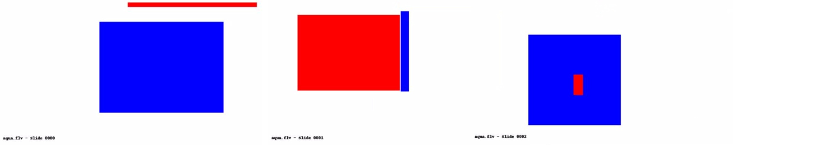
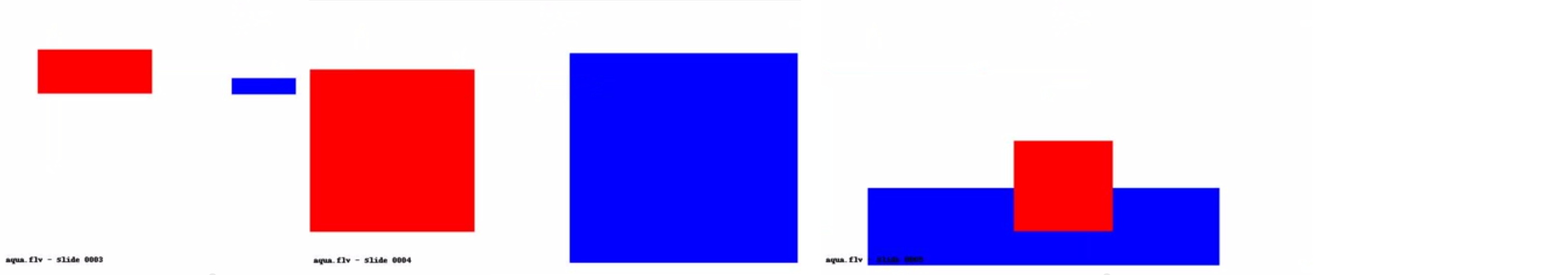
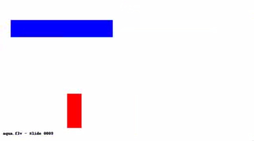
Each video is eleven seconds long and contains ten slides, each with a composition of blue and red quadrilaterals. That's 1.3 million possible compositions, with more being added at an average rate of one every six seconds. And they all look more or less like a Malevich, or Lazslo Moholy-Nagy's Telephone Paintings.

moholy_nagy_em3.jpg

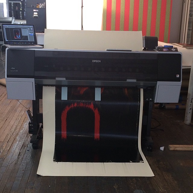
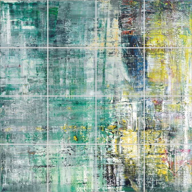
So obviously turn them into paintings. It seems impractical to sort through all the videos, looking for some "best" composition. Better to stay true to Webdriver Torso's random nature, and grab a few. Or even grab one and use it [all], make nine paintings at a crack. Or maybe use the slides in the most recently uploaded file from the moment you make a sale, or the moment you place the order with Chinese Paint Mill. Then it becomes an indelible, but meaningless, marker, an index of its own creation. Like On Kawara's date paintings, they can be made in various sizes. Maybe you get a giant hard edge monster to anchor an important wall. Or maybe you get a smaller, complete set and grid them up, a la Olafur.

A web storefront that offers paintings in only the compositions from the last few minutes of uploads wouldn't just reward quick purchase decisions: it would demand it. Out with this fair-wandering nonsense of, "Oh put it on hold for me, I'll let you know." and in with Buy It Now. Of course, what'll happen is that someone will sit there and hit refresh all day, in eternal hope that the next batch of nine will have the Webdriver Torso Mona Lisa in it. [Just a second, gotta check Twitter.]

webdriver_torso_tmpK89znn_00-02.jpg
webdriver_torso_tmpK89znn_03-05.jpg
webdriver_torso_tmpK89znn_06-08.jpg

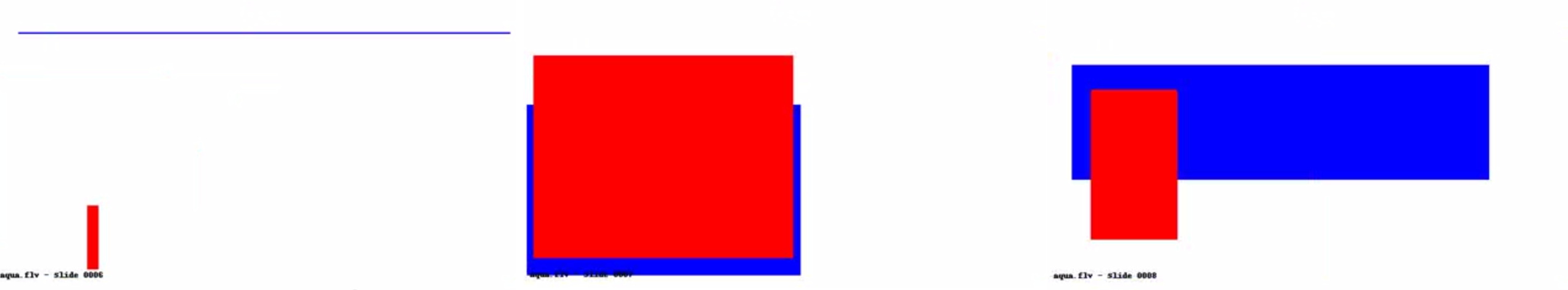
Ooh, tmpK89znn, which just went up, has some really nice ones in it:

webdriver_torso_tmpK89znn_09.jpg

Let's see how those turn out.

A timeline of Webdriver Torso [botpoet via @soulellis]
the truth about Webdriver Torso [ventunosu21]

untitled_guyton_uu.jpg

When this arrived last week, I immediately thought of something Sturtevant said in her short Frieze video last year, how due to cybernetics, "Simulacra was becoming minor in terms of its force."

Also: "Repetition is not repeating. Repetition is like interior movement, It's also difference, and it's also pushing the limitations of resemblance."

Because all those things feel very, very true right now.

Previously: Wade Guyton and Anxiety In The Age Of Mechanical Reproduction

pirate_bay_riotshields.jpg

Furtherfield Gallery has opened an exhibition of art and archival material from Piratbyrån [Piracy Bureau], the Swedish art and activist group that became instrumental in the filesharing and access conflicts of the 00's.

The exhibit includes a lot of material relating to the group's trans-European bus tour pegged to Manifesta 07. My favorite things, though, are these "riot shields 2.0," created by James Cauty. Even though Piratbyrån officially dissolved in 2010, these feel incredibly up-to-date right now. Unfortunately.

Piratbyrån and Friends runs through June 8 at Furtherfield in London [furtherfield.org, image via @Cybrsalon]
Piratbyrån and Friends album on furtherfield's flickr [flickr]

UPDATE:

Here is a making of video from Cauty, showing the production of 1.0, the first edition of 30 Smiley Riot Shields. Apparently v0.9 was created in 2011 for Occupy St Paul's. Actually, @jamescauty's twitter feed has a step-by-step tutorial for making your own SRS, since the others are sold out. Very handy.

Previously, related:
Mar 2007: Million-Real Idea - advertising on Brazilian riot shields

expo67_ masey.jpg

One thing I noticed while researching Warhol's World's Fair commissions, is that the US Pavilion in Montreal had this sweet photomural of the moon.

expo67_photomural_masey.jpg
both images by USIA's Jack Masey

And it also had this sweet photomural of the moon. I can't tell which came first or why.

expo67_bogart_charstad.jpg
Bogart, image via CHarstad

I think the way giant photos--of the moon and the stars alike--were used alongside giant paintings and giant graphics in the World's Fair exhibition was one of the most advanced levelings of these supposedly distinct image hierarchies.

expo67_flag_lifemag.jpg

I've really got to get into the USIA Archives for this stuff. Actually what I need to do is get Jack Masey on the phone while I still can.

judd_artists_against_torture.jpg

This Donald Judd woodcut caught my eye at Sotheby's print sale this month, as much for its title as its contrast and complexity: Artists Against Torture, which, well.

It turns out Judd was one of 19 Artists Against Torture who were invited to make a fundraising print portfolio for the Association for the Prevention of Torture. I'm sure there are many more artists against torture, including, no doubt, many women, but for whatever reason, in 1992-3, the Geneva-based NGO commissioned these 19 men to make some art against torture.

So this Judd was a loosie from the portfolio. Which was published in an edition of 150, plus 40 APs, including one for each of the artists, not AP, ed. 40, as Sotheby's sold it. Anyway it only sold for $3,750, a bargain for a Judd woodcut, so whoever bought it must have known something of the work. [The Judd Foundation sold their copy of the portfolio in that 2006 sale at Christie's.]

Thumbnail image for newman_daley_feigen.jpg

The print reminds me a bit of Barnett Newman's 1968 sculpture, Lace Curtain for Mayor Daley [above], in which a grid of barbed wire across a window frame protests Chicago's police brutality against war protestors at the Democratic Convention. But for the similarity to be anything other than a coincidence, Judd would have to introduce representational content and metaphor into his work, which seems impossible. And yet that does look like bars on a cage, doesn't it? If you let it?

Also I'm kind of interested by Judd's political involvement. I wouldn't have expected that, even though I know he was directly involved in mobilizing to protect SoHo. Turns out the Judd Foundation had a show in Marfa in 2011, "The Public Life," about the artist's political, social, and environmental activities.

1 May 2014 | Lot 225, Donald Judd, Artists Against Torture (sic), sold for $3,750 [sotheby's]
APT's Artists Against Torture portfolio was exhibited at the Ritter Museum in 2012. [museum-ritter.de]

I know it's folly to take auction catalogue text as art history, but it is of a piece, at least in this case.

rr_1954_combine_taylor_recto.jpg
Untitled, recto, 1954, Collection Paul Taylor, image: Sotheby's

Last night's sale at Sotheby's included a very early, underdocumented 1954 combine by Robert Rauschenberg, which he gave to the dancer and choreographer Paul Taylor a decade later. [I say underdocumented because I can't find any mention of it in Paul Schimmel's otherwise exhaustive Combines catalogue, or anywhere online not associated with the auction.]

rr_1954_combine_taylor_verso.jpg
Untitled, verso, 1954, Collection Paul Taylor, that polka dot fabric turns up on at least six other combines, including Short Circuit, image: Sotheby's

The piece is freestanding, tabletop-size, with a double-sided painting/collage mounted on what seems like a 2x4 wood base. There's a lightbulb sandwiched in between the support slats, and a pair of radiometers, those little gadgets with black & white panels that spin when exposed to light.

rr_man_with_two_souls_1951_hopps.jpg
The Man With Two Souls, 1950, photographed by Rauschenberg in 1951 in his UWS apartment, where Twombly told Walter Hopps he'd seen it. He later got it. image: Hopps's Rauschenberg: The Early 50s

As soon as I saw it, I thought of Rauschenberg's earliest surviving sculpture, made in 1950. Cy Twombly got it after Rauschenberg's 1951 show at Betty Parsons, but before he and Bob took off for seven months to Africa, leaving Susan Weil and the baby behind. The piece is called The Man With Two Souls, and it consists of a glass rod flanked by a bulbous pair of wine bottles inserted in a cast plaster block. Charles Stuckey suggested it was an homage to Barnett Newman's sculpture Here I, which was shown at Parsons earlier in 1951. Yes, that might be one allusion.

twombly_sculptures_by_rauschenberg_1954.jpg
Twombly and sculptures in Twombly's studio, 1954, photographed by Rauschenberg, image via Schimmel's Combines

It also might be similar to almost every Cy Twombly sculpture in these photos Bob took in 1954, the year Taylor's combine was made. The year, in fact, when Rauschenberg made what's considered the first of his combines, set pieces for Taylor's debut as a choreographer after leaving Merce Cunningham's company in mid-1954.

And depending on which side you're looking at, Taylor's piece looks an awful lot like Minutiae, the free-standing set piece Bob made for Merce's December 1954 performance at BAM. Which is all set up for my complaint about Sotheby's catalogue text, which acknowledges that Rauschenberg was "informed by the influences" of his contemporaries like Jasper Johns, and then immediately distances the two artists:

Though their practices were fundamentally at odds, both conceptually and aesthetically, the two men supported each other's stylistic experimentation during this critical time of immense growth and evolution.
Unfathomable difference has been the starting point of any discussion of Rauschenberg and Johns' early work since at least 1963, when Allan Solomon gave them each one-man shows at the Jewish Museum. It's a presumption of separateness that shuts off any exploration of similarity, much less exchange or collaboration. And especially in the case of Rauschenberg and his artist/partners, it heads off any questions of joint creation or shared authorship.

rauschenberg_minutiae.jpg
Minutiae, made with help from Johns in time for Merce Cunningham's Dec. 7 1954 performance at BAM

Johns has said publicly he worked on Minutiae. Twombly drew on Rebus and who knows what else. Johns even said he made a Rauschenberg with Bob later signed, and that he came up with the term "combine."

But whether it's historic or persistent institutionalized homophobia, emotions & ego, the demands of the market, or the lone genius paradigm of the times, it's apparently still impossible to ask if there are similarities or connections between these artists' contemporaneous work.

jj_construction_with_toy_piano_crichton.jpg
Construction with Toy Piano, 1954, image: Michael Crichton's Jasper Johns

Twombly and Rauschenberg are both gone, alas, and Johns doesn't seem too interested to elaborate, seeing as how he has systematically hunted down and destroyed his own work from before 1955. But at least one piece that survives, Construction with Toy Piano, a book-sized wooden object covered with painted collage, looks like it could have been made in the same room as Paul Taylor's combine, if not by the same mind or hands. Just asking the question.

I like to keep up with the discussions and presentations at NYU's Institute of Fine Arts. They recently posted video of a panel I'd been waiting for from late April titled, "Protocols of Participation: Recent Models of Socially Engaged Art in the United States and Europe," where Creative Time's Laura Raicovich, and Xavier Douroux and Thérèse Legierse from Nouveaux Commanditaires, who commission and mediate public artist projects in France. IFA's own professors Thomas Crow and Alexander Nagel participated as well. [It was organized as part of ART², a whole month's worth of events I missed across the city.]

It was an interesting comparison of the two systems designed to facilitate artists' engagement in their politics, culture, and communities. So watch the whole thing.

I had it playing in the background while I worked, and during the audience questions, I was suddenly alerted to the change in cadence. I knew what was coming: the long, winding, potentially discourse-derailing statement disguised as a question.

It's a cliche of the panel discussion/public lecture format, the kind of interaction that organizers sometimes like to head off by explicitly warning against, or even by soliciting written questions. It's almost always an uncomfortable, flow-breaking moment, met with either indulgence or annoyance. No one's come to hear some rando bounce his pet theory off the headliners.

It breaks form, yet it is the form. Such questions and their possibility are intrinsic to the very format of open, public discourse. So when the breach of protocol came for an event titled, of all things, "Protocols of Participation," I resisted the urge to close tab or tune out. And I was transfixed by this unseen, unidentified woman's speech, how she said it, and even what she said. It occurred to me that probably no one would ever take her comment seriously, or even know about it.

[I vividly remember my first audience question in New York City. It was to Brice Marden at MoMA's Cy Twombly artist panel. Years later, when WPS1 posted the audio of the event, it omitted the audience Q&A segment entirely. Which can be interpreted on several levels.]

In every panel or discussion I attend, I, like everyone else, always fantasize about revolutionizing the format. Or at least fixing it. It never feels optimal. And yet it never, ever changes. So I'm going to start collecting these marginalized, random, dodged, cut-off, derailing statement/questions from audience members and see what comes of it. Do you have a favorite? Send a link, let's add it to the collection!

As you can see from the complete transcript of the audience member [with a couple of interjections and a response by Prof. Nagel], maybe these things should be written down and studied after all. Because as a text, I think it's rather fascinating. Expectations and context.

Watch/listen to the question, beginning around 1:27:10. I wanted to capture the sense of hearing it, so I left in the ums and repetitions. Line breaks are pauses.

I'm going to fail
um I missed a little bit, but I was misdirected to the wrong place, sorry
um

christies_skateboarder_guyton.jpg

Personally, the thing I remembered about Carol Vogel's puff piece a couple of weeks ago for Loic Gouzer, organizer of "If I Live I'll See You Tuesday," Christie's Edgy Sale, was that she'd used the word "seminal" twice in one sentence. But if I were an artist whose painting was being used as Exhibit No. 1 to illustrate it, I could see how the headline might catch my eye, too: "For Those Who Can Afford It, Christie's Is Selling Anxiety".

The sale was supposed to be a "mould-breaking auction," a "risky operation" meant to "shake things up" with artworks that "capture the raw angst" that the current "generation of rich embryonic collectors" are all hot for.

wade_guyton_fire_studio_07.jpg
image: burningbridges38/s IG

Christie's own idea of raw shakeup: a promotional video skateboarding video, showing skate pro Chris Martin tooling through the galleries and the back of the house, passing works and staff along the way. It was the most brilliantly ridiculous thing ever. For a day. Then someone pointed out embryonic auction star Parker Ito's own YT videos of his skateboarding around his studio. And someone else ran the numbers and realized that many lots were presold via third-party guarantees/irrevocable bids, so the actual angst of the evening's outcome depended entirely on one's own market ignorance.

wade_guyton_fire_studio_03.jpg
image: @burningbridges38's IG

Until Wade Guyton entered the game. Wade's 2005 painting Untitled (Fire, Red/Black U) had a starring role in the sale, the video, and the Anxiety article. And last week, as the video racked up views and scorn online, Wade introduced some real anxiety--by making more than a dozen new paintings, identical to the one at Christie's, using the same digital file. He then posted the images to Instagram. They stream out of his trusty Epson inkjet printer, are strewn across the studio floor, and flutter in the breeze like a fiery curtain on the wall.

wade_guyton_fire_studio_02.jpg

When she declared a slightly bent & restored aluminum painting destroyed last year Cady Noland reprogrammed all her remaining work, instilling collectors with the fear that the tiniest nick or bump might render their precious object unsaleable. Similarly, by revealing even the hypothetical existence of infinite digital replication--so far, all he's done is post pictures of canvases to Intagram--Guyton has stripped away the presumption of uniqueness, and has seized his work back from the outsized speculative frenzies that swirl around it. And the greatest part is that he did all this just days before the big sale [where he doesn't have anything to win, and much, potentially, to lose].

As Jerry Saltz wrote, "Whatever happens tonight, I admire an artist willing to tank his own market by flooding it with confusing real-fake product." And except that there doesn't need to be anything fake at all about the resulting works, I completely agree. This is awesome. [Even though it didn't slow down the sale one bit: Untitled sold for $3.5 million, a record. So win-win, depending on what actually qualifies as a win here.]

matson_jones_melon_pomegranate.jpg

Melons and Pomegranates, 1956, hand-painted plaster, Matson Jones Custom Display

When these hand-painted, cast plaster works were sold at Swann in 2005, they were dated "circa 1955." But I believe Gene Moore only began working with Tiffany & Co. in 1956. In 1956 and 1957, he commissioned at least seven window displays for Tiffany & Co. from Matson Jones, including a series inspired by still life paintings. Matson Jones was the commercial pseudonym for Jasper Johns and Robert Rauschenberg.

matson_jones_pomegranate_madamemeow.jpg
Tiffany & Co. window display designed by Matson Jones, 1956, image: madammeow, probably from Gene Moore's 1990 book

The filmmaker and impresario Emilio de Antonio had, as "an artists' agent," been involved in arranging commissions from Moore for Rauschenberg, Johns, and Andy Warhol. One project Matson Jones executed for Moore client I. Miller involved "a kind of three-dimensional window display" interpretation of Andy Warhol's shoe drawings, which were featured in the company's ads at the time.

Another display for a Moore client [and Tiffany neighbor] Bonwit Teller included Johns' 1957 painting, Flag on Orange Field. After Construction with J.J. Flag/ Short Circuit's inclusion at the Stable Gallery Annual in 1955, this may have been the second public exhibition of Johns' Flag paintings; neither was credted to him.

Despite this professional overlap, and their mutual friendship with de Antonio, Johns told Paul Taylor in 1990 that he only met Warhol for the first time in 1961, when Andy bought a drawing out of Johns' second solo show at Castelli. Soon after that, Warhol's own comic strip-based paintings were shown in a Bonwit Teller window display, where they were likely seen by Roy Lichtenstein.

Except to whoever bought them in 2005, the current whereabouts of Matson Jones' melons and pomegranates is unknown. Though I have heard some things.

"With the certificate of authenticity from the Robert Rauschenberg Foundation." ! Nov 17 2005, Sale 2057 Lot 223 EARLY SCULPTURE BY JOHNS AND RAUSCHENBERG POP ART, est. $5,000-8,000, sold for $10,925 [swanngalleries.com]

stiviano_visor_gawker_splash_do.jpg
Vanessa Stiviano & counsel, image via Gawker/Spalsh/DesignObserver

I've tweeted before, and I'll tweet it again, but Vanessa Stiviano's boss anti-paparazzi visor is the greatest thing about the entire Donald Sterling/Clippers/racist billionaire debacle. Stiviano's photo-thwarting look will have far-reaching implications for our media and celebrity culture, you heard it here first.

Well, technically, you probably already read something along those lines at Design Observer, where Rob Walker did a great analysis of the visor as a part of Stiviano's carefully constructed, photo-mastering looks:

This object privatizes the face in a manner that's undeniably a protest (stop taking pictures of me!) and just as undeniably a confrontation (you cannot resist taking pictures of me wearing this object!).

vstiviano_screenshot_lhooq.jpg
vstiviano screenshot via @MichelleLHOOQ

Me, I see it as the vanguard of a broader trend that really speaks to this moment in history:

stiviano_visor_riot_police_trendwatch.jpg
screenshot: google images

Rob Walker| Object in the News: The Face Privatizer [designobserver]

bookgert_kwakkel_colorchart_1.jpg

Last week medieval scholar Erik Kwakkel tweeted about a largely unknown, undocumented, and apparently unique book he found in the Bibliothèque municipale/Bibliothèque Méjanes, in Aix-en-Provence.

boogert_color_chart_greyscale.jpg

Titled Traité des couleurs servant à la peinture à l'eau [Treatise on the colors used to paint with water], it's an amazing 892-page, handwritten documentation of every available watercolor pigment and combination, each at three levels of dilution. It was written in Dutch in 1692 by an A. Boogert. Kwakkel is currently translating the introduction, but in the mean time, the illustrations are worth a long look.

boogert_color_chart_red-orange.jpg

In addition to the systematic process and grid of conceptualism, there are obvious resonances with the color charts [top] and monochromes [below] of mid-20th century painting. The book format especially reminds me of Yves Peintures, the concocted catalogue for an imagined show of Yves Klein's monochromes.

boogert_color_chart_blue.jpg

But even more than that, the starting palette for Boogert's project is uncannily similar to the 16 colors of the Dutch government's own unified, official palette, the Rijkshuisstijl, released in 2011. The RIjkshuisstijl was meant to centralize and strengthen the visual identity of the national government with colors inspired by Dutch landscape painting.

rijkshuisstijl_kleuren_grid.jpg

Kwakkel doesn't mention any details yet about the context for Boogert's book, but the bibliographic record keys it to the textile trade and the Dutch East India Company.

Read and follow Kwakkel's discovery: A Colorful Book [erikkwakkel.tumblr.com]
See full scans of Traité des couleurs servant à la peinture à l'eau MS 1389 (1228) at the Bibliothèque Méjanes [e-corpus.org]

Previously, related: Rijkshuisstijl: the 1 Logo Project
Yves Peinture

richter_cage_grid_i_complete_17296.jpg

I was kind of baffled when I saw this Richter in Christie's February sale in London, and I've had it on my desktop ever since. It's called Cage Grid I, and it's a 16-panel giclée print [!!, oh how I hate that word] mounted on aluminum that reproduces the 2006 squeegee painting, Cage 6, basically at 1:1 scale.

In fact, if you include the small gaps between the 75cm square panels, the giclée version is slightly larger than the 3x3-meter painting. It pulls the painting apart instead of occluding it with a grid overlay. Though there are digital prints and inkjet prints in the artist's CR, Cage Grid is the only edition listed as a giclée. There are both complete editions Cage Grid I and 16 individual quadrants, Parts A-P, Cage Grid II.

Richter has chopped up his paintings before, turning full-size squeegee paintings into a series of tiny squeegee fragments. He's made giant gridded photo panels before, like Strontium (2004), at the deYoung Museum. He's got reconfigurable grid paintings [mounted on Aludibond, btw], like 4900 Colours.

He's made photos of Strip paintings, which are actually manipulated photos of fragments of another squeegee painting, digitally printed, and mounted on aluminum and sometimes under plexi.

And he's made photo versions of paintings before. These 1998 Orchid offset prints are done at full-scale of the 1997 painting, but cropped in five different ways. Herr Heyde is a little 2001 offset print on Aludibond that's the same size as the little 1965 painting. [Richter favored offset prints, then a few c-prints, before going digital, except for Ice 2, a 2003 half-scale reproduction of a 1989 squeegee painting that's actually a 41-color screenprint.] There's 1:1 Uncle Rudi (2000), and the 1996 photo edition of the painting of the photo of his wife, which I thought would make a good Richard Prince nurse painting. Seven Two Four (2005) are 1:1-scale blurred photos of a 1990 squeegee painting. [A painting for which Richter has atypically posted 21 detail photos.]

richter_mustang_print_glass_7072.jpg

Wow, when you shoot it that way, the 1:1 photo edition of Mustang Squadron (2005) looks amazing, and not at all like a bridge line version of the couture original. Speaking of which, back in 1998 Richter made a 1:1 photo edition of 48 Portraits, his landmark blurred painting grid from the 1972 Venice Bienale.

richter_48_portraits_photo_edition_5324.jpg

And this is one thing that nags at me about Cage Grid: even if I buy the arguments about photo vs. painting, experimentation, or materialist variation, I feel like what's actually being sold is iconic sameness. It's not so much the Capitalist Realism that--actually, yes, it's the capitalist reality that gets me, but not the supply, the demand. I feel less undone by the artist churning out a towering Kinkadian pyramid of merch than by the critico-consumer desert criss-crossed by collectors, institutions and speculators that swallows it up.

It's not that Richter makes readily monetizable editions of iconic works he loans to museums. [The Cage series is at Tate. Modern. The Cage Grid prints were actually sold by Tate Modern, during the 2011 Panorama retrospective.] It's that despite my ambivalence, I want some. [Oh, look, that Mustang Squadron that sold at Phillips in 2006 is up for sale at Sotheby's.]

14 Feb. 2014, Lot 120: Gerhard Richter, Cage Grid I (Complete Set), 2011, 15/16, plus 4ap, sold for £566,500 [christies.com]
15 May 2014, Lot 243: Gerhard Richter, MUSTANG-STAFFEL (MUSTANG SQUADRON), ed. 39/48, 1 AP, est. $250,000-350,000 [sothebys]

Previously, uneasily related, partly because I only just now remembered I had similar qualms about a similar situation last year: Gerhard Richter's Septembers

Since 2001 here at greg.org, I've been blogging about the creative process—my own and those of people who interest me. That mostly involves filmmaking, art, writing, research, and the making thereof.

Many thanks to the Creative Capital | Warhol Foundation Arts Writers Program for supporting greg.org that time.

comments? questions? tips? pitches? email
greg [at] greg [dot ] org

find me on twitter: @gregorg

about this archive

Posts from May 2014, in reverse chronological order

Older: April 2014

Newer June 2014

recent projects, &c.


our_guernica_cycle_ivanka_320px_thumb.jpg
Our Guernica Cycle, 2017 –
about/kickstarter | exhibit, 2017


pm_social_medium_recent_proj_160x124.jpg
Social Medium:
artists writing, 2000-2015
Paper Monument, Oct. 2016
ed. by Jennifer Liese
buy, $28

madf_twitter_avatar.jpg
Madoff Provenance Project in
'Tell Me What I Mean' at
To__Bridges__, The Bronx
11 Sept - Oct 23 2016
show | beginnings

chop_shop_at_springbreak
Chop Shop
at SPRING/BREAK Art Show
curated by Magda Sawon
1-7 March 2016

do_not_bid_or_buy_iris_sidebar.jpg
eBay Test Listings
Armory – ABMB 2015
about | proposte monocrome, rose

shanzhai_gursky_mb_thumb.jpg
It Narratives, incl.
Shanzhai Gursky & Destroyed Richter
Franklin Street Works, Stamford
Sept 5 - Nov 9, 2014
about | link

therealhennessy_tweet_sidebar.jpg
TheRealHennessy Tweets Paintings, 2014 -
about

sop_red_gregorg.jpg
Standard Operating Procedure
about | buy now, 284pp, $15.99

CZRPYR2: The Illustrated Appendix
Canal Zone Richard Prince
YES RASTA 2:The Appeals Court
Decision, plus the Court's
Complete Illustrated Appendix (2013)
about | buy now, 142pp, $12.99

weeksville_echo_sidebar.jpg
"Exhibition Space" @ apexart, NYC
Mar 20 - May 8, 2013
about, brochure | installation shots


HELP/LESS Curated by Chris Habib
Printed Matter, NYC
Summer 2012
panel &c.


drp_04_gregorg_sidebar.jpg
Destroyed Richter Paintings, 2012-
background | making of
"Richteriana," Postmasters Gallery, NYC

czrpyr_blogads.jpg
Canal Zone Richard
Prince YES RASTA:
Selected Court Documents
from Cariou v. Prince (2011)
about | buy now, 376pp, $17.99

archives