February 2015 Archives

February 27, 2015

Black Boxes, White Cubes

mccracken_black_box_pdx_tinariversryan.jpg

This tweet from Tina Rivers Ryan's visit to the Portland Art Museum caught my attention tonight like an eBay alert. Everything about McCracken's 1965 Black Box, starting with the camera angle and the installation itself, felt very familiar.

caleb_larsen_deceive_slaughter.JPG

Because it looks almost identical to the most common image of Caleb Larsen's 2009 sculpture, A Tool To Deceive And Slaughter. McCracken's cube is 16 inches, while Larsen's is only 8 inches on a side. The Box is resin- and fiberglass-coated wood, while the Tool is acrylic. Also Larsen's has a computer and an ethernet connecton, and automatically tries to resell itself on eBay. It's the little differences.

Black Box, John McCracken, 1965 [portlandartmuseum.us]
A Tool To Deceive and Slaughter, 2009 [caleblarsen.com]

informedspace_plastic_furniture_1.jpg

Realtors and developers pay several thousand dollars/month to stage properties for sale. Staging companies move out the seller's accumulated lifetime of crap and move in a whole array of tastefully bland furniture and accessories to make the place look or feel bigger or nicer. Remember that aristo hobo couple in Charleston in the Times a few years ago who basically live for free by moving themselves and their heirlooms into the plantations and spec homes they stage?

informedspace_plastic_furniture_3.jpg

Wow, that was 2011, too. Which turns out to have been peak staging? Because I just found this bonkers story from Curbed in 2011 about InFormed Space, a staging startup that provides gatorboard ghosts of high end furniture, starting with a $14 million townhouse gutjob in Chelsea. From a NYDN story:

it's easy to move the ultra-lightweight prop furniture in and out of spaces and it minimizes the pitfall of turning off potential buyers because of questionable dĂŠcor choices.

"This helps you understand the space without confounding you with design," [InFormed Space founder Douglas] Pinter said. "This shows you scale and volume in a way that doesn't get in the way of your thinking."

informedspace_plastic_furniture_4.jpg

The "cool and minimalist" design of Pinter's creations - many which are modeled after real pieces but aren't legally copyright infringements because they are faux - may turn off diehard fans of, say, Queen Anne furniture. [emphasis added for awesomeness]

But wait, there's more. There is art. Or as InFormed Space's website [tagline: "A Stylish QuickieÂŽ"] calls them, "art panels."

informedspace_plastic_furniture_2.jpg

After Ad Reinhardt's last paintings, after the monochrome, after the final declaration of the death of painting--for good this time, really, stake in the heart--the ghosts of paintings remain to haunt the walls of the living, until they are released by the exorcism known as the closing.

$14 million Chelsea townhouse gets decked out with fake furniture [nydn via curbed]

February 26, 2015

Sturtevant's Relâche

sturtevant_relache.jpg
Relâche, 1967, via Christie's

Sturtevant's Relâche poster, from her canceled reperformance of a Picabia original. Or rather, a reperformance of Picabia's original cancelation.

Either way, I'm kind of reluctant to draw any attention to this silk screened edition before the sale, it seems so approachable.

If you do end up buying it out from under me, let me know, and I'll trade you a painting or something for it. Nah, it's got too many condition issues, maybe we trade it for a clean drawing or print instead.

Mar 6, 2015, Lot 197, Sturtevant, Relâche, ed. 7/10, 1967, silkscreen on paper, est. $5-7,000 update:, sold for $12,500, so a $10k final bid, not bad. [christies]

Thumbnail image for therealhennessy_tweet_dilf.jpg
@TheRealHennessy Tweet Painting, DILF, 2014, 14x11 in., acrylic and screenprint on canvas

Monochromatic with a sharply contrasting silk-screened text, @TheRealHennessy Tweet Painting, DILF belongs to one of greg.org's most iconic series--the @TheRealHennessy Tweet Paintings.

Distilling his canvases in a humorous simplicity, he has disassembled the process of artistic representation and its interpretive demands. Placing his control over the viewer, we read the tweet, laughing or groaning in response. Echoing the uncluttered monochromes of an esteemed range of artists form Kazimir Malevich to Yves Klein and Ad Reinhardt to Brice Marden, @TheRealHennessy Tweet Painting, DILF has the emphatic simplicity of Minimalism. And yet, deliberately puncturing the seriousness of art history's great monochromes, he has printed a classic pick up line at its center. Recalling the zips of Barnett Newman's paintings, greg.org's selection of a deliberately unobtrusive font places the canvases serious and authoritative appearance in strange tension with the flippant content. "The subject comes first. Then the medium I guess," he has explained. "Like the tweets. They needed a traditional medium. Stretchers, canvas, paint. The most traditional. Nothing fancy or clever or loud. The subject was already that. So the medium had to cut into the craziness. Make it more normal. Normalize the subject. Normality as the next special effect" (greg.org, quoted in R. Rian, 'Interview', pp. 6-24, in R. Brooks, J. Rian & L. Sante, London, greg.org, 2003, p. 20)

Minimal in composition and lacking the painterly presence of the artist's hand, greg.org's @TheRealHennessy Tweet Paintings parallel the "rephotography" that he became so well known for in his photographic works. Surreptitiously borrowing, appropriating, or as he refers to it, "stealing" is a trademark of his work. Even the location from which he draws his content has become a staple to his oeuvre. "Tweets are part of any mainstream magazine," he explains. "Especially magazines like the New Yorker or Playboy. They're right up there with the editorial and advertisements and table of contents and letters to the editors. They're part of the layout, part of the 'sights' and 'gags.' Sometimes they're political, sometimes they just make fun of everyday life. Once in a while they drive people to protest and storm foreign embassies and kill people." (greg.org quoted in B. Ruf (ed.) Tweets, n.p.)

Previously: @TheRealHennessy Tweet Paintings
@TheRealHennessy Tweet Paintings, Cont'd.

daniels_malls_landmd.jpg
Chapter 7: Pending Cipher for the Open Present, image: Daniel R. Smalls via hyperallergic

Daniel R. Small's contribution to LAND's land were installed in New Mexico, where they have upset the locals with their scary symbols and indecipherable glyphs. From an email Small sent to Hyperallergic's Kemy Lin:

There was also a very hostile reaction from a local neighborhood when the installers from Lamar were up the billboard ladder. A group of locals surrounded the base of the pole shouting obscenities and claiming that the billboards were either Satanic or Islamic.
Which sounds a lot like what happened when the Washington Project for the Arts installed David Hammons' How Ya Like Me Now? across from the National Portrait Gallery as part of Richard Powell's 1989 exhibition on Black Culture and Modernism:
But a billboard-size portrait of a pink-cheeked Jackson suddenly appearing on the streets of DC with no explanation and a Kool Mo Dee lyric for a title was bound to arouse controversy. And when WPA curator Powell, who is black, left three white staffers to finish installing the piece, a crowd of young black men formed, voiced their protest against the artwork--and then took a sledgehammer to it and tore it down.
On the bright side, that work ended up in Glenstone, so maybe Small should just ride it out.

Billboard Art Project Sets Off Terrorism Scare Near US/Mexico Border [hyperallergic]
previously: How Ya Like How Ya Like Me Now?

city_desk_skyway_in_situ.jpg
Skyway in situ, before the U of MN bought it for $1, and City Desk Studio bought it for $5,000

City Desk Studio is still selling the epic skyway they rescued in 2006. They originally planned to adapt it into a timeshared Skyway Retreat lakefront cabin for $1.2 million. Then when the economy imploded they offered it for sale for just $79,500. A year later they dropped the price to $49,500.

And now they're willing to pay $5,000 to whoever removes it from the vacant lot near the UofM where it's been parked for nearly a decade. There's an RFP, and if no qualified bidder steps forward by the end of the month, the skyway is slated to be demolished.

skyway_bing_scr.jpg
bird's eye view via bing

The skyway, designed by Ed Banks, the "father of the skyways," is W20 x L83 x H14 ft and made of steel, glass and concrete. It weighs 280,000 pounds, roughly half of which had been attributed to the 12-inch concrete floor. But using the standard for reinforced concrete of 150 lb/cu ft, I get a weight for an 18x80 ft floor of 218,000, more than 75%. Maybe the floor's not an actual foot thick. Or maybe it's smaller than I've estimated. Either way, a significant weight reduction can be achieved by removing the concrete floor before transport.

Which is significant. Because City Desk Studio says it cost them more than their $5,000 purchase price to move the skyway two blocks from UMN to the vacant lot near the railyard where it still sits. But that means it had moved nearly four miles, and across the river, from Nicollet Mall & S 5th St to somewhere near the university stadium site. So put it on a barge and float it down the Mississippi.

load_skyway_onto_barge_here.jpg
load_skyway_onto_barge_here.jpg based on google maps' hunchback brother google earth

The train right of way goes west and gets very close to the river near a commercial/industrial waterfront site under the 10th Ave Bridge. That's where you bring your barge and load it on. BAM. Your skyway is now connected to the entire world. You have two weeks to work out the details for removing it, and plenty of time after that to figure out where to take it.

I say you because I have been forbidden from pursuing this perfect plan. But it must happen, and soon. If you use my detailed schematic in your successful rfp, I expect an invitation to your skywaywarming.

Salvaged Minneapolis skyway could be your next home [startribune]
Previously:
2009: Minnesota NICE: Skyway For Sale On Craigslist
2010: That Minnesota Skyway For Sale Again/Still

February 13, 2015

The Executioner's Form

utah_firing_squad_installation_2010_nbc.jpg

I think this is the official photo of the firing squad execution chamber for the State of Utah. It was executed in 2010 for the killing of Ronnie Lee Gardner, who had requested death by firing squad. Though the firing squad was banned as a method of state execution in 2004, four other Utah death row inmates who had requested death by firing squad have been permitted to keep their choice. Today one house of the Utah legislature voted to reinstate the firing squad as a method of execution.

The structure consists of a chair made of welded steel square tube and a perforated seat; nylon and Velcro restraining straps for the executed person's feet, chest, and arms; and a height-adjustable steel neck and head brace, which has a piece of black impact foam where it hits the base of the skull, and a strap.

The chair is welded to a two-tiered pedestal; a steel plate box is bolted to a larger, painted wood box below. The top of the steel pedestal is not level, but is angled slightly toward the back. It is inset on the sides, and appears to have a small lip at the rear edge. A black painted wooden step is aligned with the chair, and is slightly shorter than the wooden pedestal.

A screen sits behind the executed's chair. Perhaps it is affixed to the wall. It comprises fourteen pieces of 2x4, painted black , and arranged vertically and set into an angle iron frame; and two half-width panels of steel, hinged, and kept open at an obtuse angle with locking brackets on top.

The spaces on either side between the platform and the rear screen panels are filled with sandbags. The sandbags are black nylon, cinched at the top with the tops all facing out. Nine sandbags are stacked vertically on each side and held in place with a single vertical nylon belt, and with horizontal nylon belts tight between every two sandbags. The 9th sandbag on top is lashed separately. At least three sandbags are propped diagonally against this stack to act as buttresses, bringing the total to 24.

February 11, 2015

And To Think That I Saw It

untitled_andiron_attr_met.jpg
Untitled (Andiron Attr. to Paul Revere, Jr.), 2015

It's not an easy thing, to meet your maker.
- Roy Batty, Blade Runner

Saturday I went to the Metropolitan Museum to see their installation of my piece, Untitled (Andiron Attributed To Paul Revere Jr.), which until now I'd only known from photos.

untitled_andiron_install_20150207.jpg

I think it's the one on the right.

The thinking this work has generated for me is immense and entertaining and rather ridiculous. Even in a week when Danh Vo sold basically an entire visible storage unit of Martin Wong's stuff to the Walker as his own installation.

danh_vo_martin_wong_wac.jpg
Danh Vo, I M U U R 2, detail, 2013, 4,000 objects and artworks from the estate of Martin Wong, image: Walker Art Ctr via TAN

Vo showed Wong's collection and artworks as his Hugo Boss Prize exhibition at the Guggenheim, but he turned it into an artwork in order to save it, to prevent Wong's ailing mother from being forced to sell and disperse the collected objects at a garage sale. As The Art Newspaper put it, "Vo got the idea of turning it into an installation from a curator who suggested that would increase the chance a museum would acquire it."

Which technically means I M U U R 2 moved in the opposite direction fromUntitled (Andiron &c.), which was a decorative collectible embedded deep in a museum, and turned into an artwork in order to, uh...

I still don't know. And of course, I wasn't thinking of this specific relationship on Saturday, but more about the presence of the andiron's unknown/unphotographed twin, and which was which. Did they have their accession numbers painted underneath? I was thinking about their attribution, and what it's based on, who made it, how did they compare to the actual [sic] Paul Revere andirons nearby? I thought about that pedestal which, when I started to move it to take a cleaner picture, turned out to be a fire extinguisher cover, so I left it alone.

How nice their location is--in one sense--on the end, near a wide aisle, right by the doorway, and how crappy it is in another--it's around the corner of a dead end corridor, through a darkened vestibule lined with fireplace mantles. It really might not be that different from the Lexington Ave. antique shop where I imagine Mrs. Flora T. Whiting first buying them. How far they've traveled, and yet almost not at all.

It reminded me of the Costume Institute, and how it was set up to accept the tax-deductible donations of last year's fashions from Nan Kempner and whomever. The Met's functioned that way a lot, as the hallowed dumping ground of New York's ruling class. If the Smithsonian is America's Attic, the Met is the Upper East Side's. The soft underbelly of the late Met curator William Lieberman's professed strategy to "collect collectors," not paintings. [Actually, huge swaths of the Met's 20th c./Contemp. collection reflect the same "We'll take it all!" spirit. But that's for another day.]

There's a lot of room between museum quality and garbage: studies, archives, and visible storage collections to the left; destroyed works, misattributions, and garage sales to the right. And value in its various forms accrues accordingly. To the extent that they rejigger these value tallies within the museum-object-author-viewer relationship, I guess I M U U R 2 and Untitled (Andiron) are not opposites at all.

February 5, 2015

Untitled (Post-It), 2015

cattelan_working_hard_biennale1993.jpg
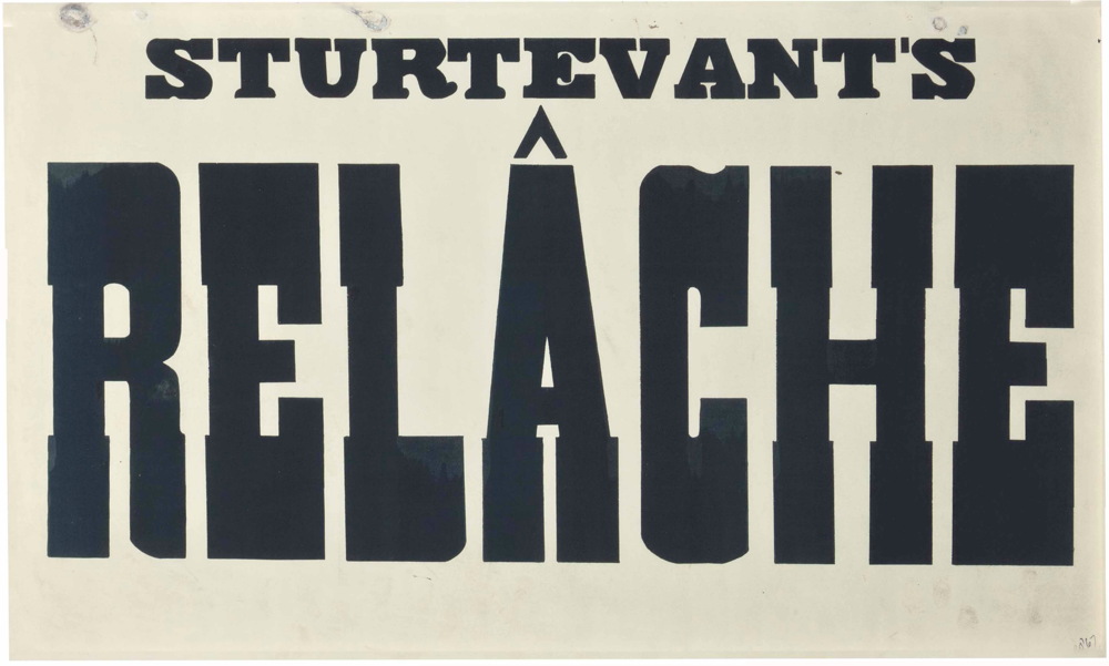
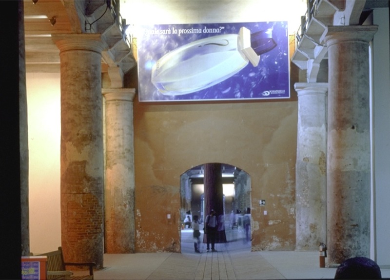
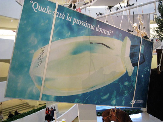
Lavorare e un Brutto Mestiere, (Working is a Bad Job), 1993, installed in Aperto '93 Emergency/Emergenza, 45th Venice Biennale. image: from all over, but this time via contemporaryartnow

Maurizio Cattelan was invited to contribute work to Aperto '93 at the Venice Biennale. Aperto's shows-within-a-show format, conceived by FlashArt editors Helena Kontova and Giancarlo Politi and curated by Kontova and twelve others, focused on emerging artists and would prove highly influential.

Cattelan offered his space to Gruppo Armando Testa in Torino, the head office of Italy's largest advertising agency, which had just been taken over by the deceased founder's son Marco. Cattelan said he "assigned" it, but he is often described as having leased his space; he also signed a contract with Testa to promote whatever they decided to display.

According to an article at the time titled "L'Arte Cerca Publicitta [Art Seeks Advertising]" Testa decided to use the Biennale opportunity as a teaser for the launch of a new perfume by Roman fashion designer Pino Lancetti. Though the licensing company Schiapparelli's logo is in the corner, Lancetti's name is only visible obliquely on the bottle. The perfume turned out to be called Suspense.

cattelan_donkey_cart_perrotin_15423.jpg
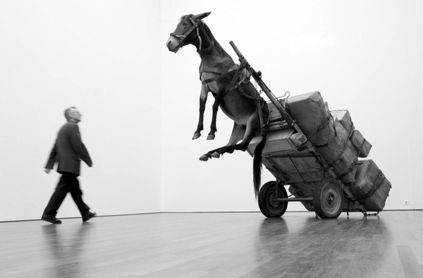
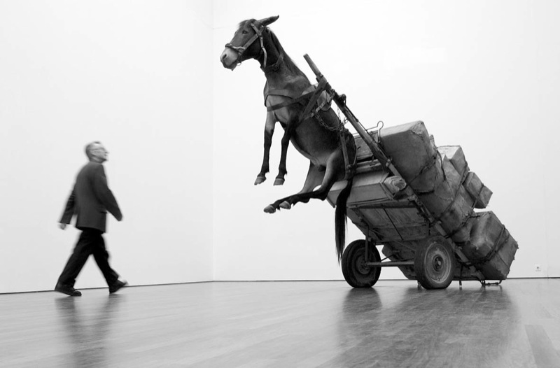
Untitled, 2002, photo: perrotin

Cattelan told FlashArt the project was meant to "encourage people to reflect on the internal working of the Aperto." In 2005 a nameless Sotheby's cataloguer wrote, "By allowing an exterior, non-artistic, body to infiltrate this sanctified world he was exploring the hierarchies and politics of choice which selects the participants." What's not quite clear is the degree to which the art informed the advertising. It's hard to tell the cart from the horse, much less tell who's in front.

The world of the Biennale was not so edenic as the auctioneer imagined, nor was Cattelan's gesture its Original Sin; biblically speaking, art and advertising already knew each other's bodies very well. Armando Testa had been prominent in the Italian art world, and aspired to "pure art's" ability "to play with ambiguity." Lancetti, the client, trained and identified as a painter, and he was known for creating several collections using imagery from artists like Kandinsky and Picasso. Elsewhere in the Arsenale, another Aperto curator installed crotch shots by Oliviero Toscani, the famously iconoclastic ad man for Benetton. All that was left, directionally, was for an artist to reciprocate the ad love.

cattelan_working_guggenheim_nysd_krementz.jpg
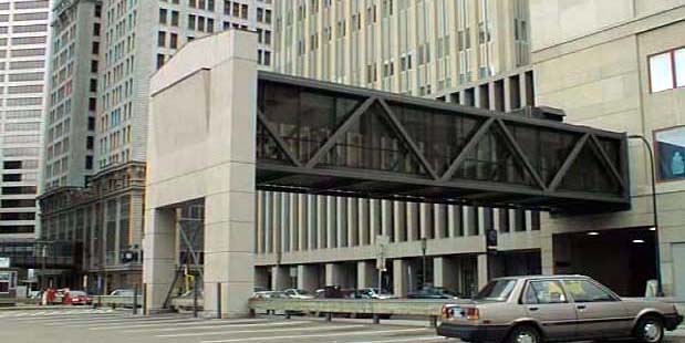
Lavorare e un Brutto Mestiere, 1993, installed in the Guggenheim, 2011, photo: jill krementz/nysd

Cattelan eventually sold the 3x6m billboard as an artwork titled Lavorare e un Brutto Mestiere, (Working is a Bad Job). Surprisingly, maybe a little ironically, it later took two attempts, in 2005 and 2006, for Sotheby's to sell Lavorare for just 10,200GBP. On a square inch basis, that's probably the cheapest Cattelan of the century. Like everything else, it hung in the Guggenheim rotunda in 2011. [above] [UPDATE: The Rubells got it, well done, as usual.]

I thought of all this this morning [except the auctions, which I hadn't known, but now regret missing] when I saw the latest addition handwritten Post-It note in Hans Ulrich Obrist's Instagram feed, which was from Paul Chan. Technically, I saw the autotweet first: "Letter from Paul Chan EROTIC ROMANCE IS THE FUTURE!!"

pchan_erotic_romance_huo.jpg
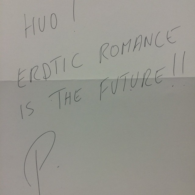
Paul Chan's @badlandsunlmtd note in @hansulrichobrist's IG today

Unlike the series' typical self-conscious banalities or Deep Thoughtz, Paul's note sounded unexpectedly promotional. Because I'd recently received an invite to the launch of Badlands Unlimited's New Lovers erotic fiction collection. Then I clicked through to HUO's pic of Chan's note, and it's not a Post-It at all! That's what he means by "letter." And "#LilithWes." Paul sent Hans Ulrich a note with the books. Which, you go, Paul! I'm an admirer of both their work, and have only ever had engaging, genial interactions with either of them. But this felt like a shift, a disruption in the making.

I'm thinking HUO's leaving a lot of mindshare on the table. Most of HUO's notes respond to his request for a thought, and most all those thoughts at that moment are non-promotional. [An inevitable exception: Alex Israel, who can never not promote himself.] But HUO's got like 90,000 followers. Once you move beyond the initial "it's a personal brand boost to be asked for a Post-It note," why wouldn't you artfully pitch your book? Or obliquely reference the work in your upcoming show? There's a lot of promotional room to travel between HUO's status quo and Alex Israel.

Which is how and why I came up this project:

Like a director who always has his thank you speech in his pocket if he needs it, I will make sure that whenever Hans Ulrich gets around to asking me, I'll have something on point and monetizable to scribble down. And that's the witty brand message or hashtag that I've been supplied with, exclusively, by a thinkfluential social media professional. Email for rates and terms.

Your message can't be too terribly time sensitive, of course, since there's no telling when HUO's tap is gonna come. With kids and shows and all, we don't hang out as much as we used to. But with an/your important message in place, I would definitely make it a subtle priority to make it happen. If it doesn't, of course, well, that's HUO. I'll gladly write your content on a Post-It note and help get the word out in my own channels as a make-good. The important thing is the concept, and that we tried.

Since 2001 here at greg.org, I've been blogging about the creative process—my own and those of people who interest me. That mostly involves filmmaking, art, writing, research, and the making thereof.

Many thanks to the Creative Capital | Warhol Foundation Arts Writers Program for supporting greg.org that time.

comments? questions? tips? pitches? email
greg [at] greg [dot ] org

find me on twitter: @gregorg

about this archive

Posts from February 2015, in reverse chronological order

Older: January 2015

Newer March 2015

recent projects, &c.


our_guernica_cycle_ivanka_320px_thumb.jpg
Our Guernica Cycle, 2017 –
about/kickstarter | exhibit, 2017


pm_social_medium_recent_proj_160x124.jpg
Social Medium:
artists writing, 2000-2015
Paper Monument, Oct. 2016
ed. by Jennifer Liese
buy, $28

madf_twitter_avatar.jpg
Madoff Provenance Project in
'Tell Me What I Mean' at
To__Bridges__, The Bronx
11 Sept - Oct 23 2016
show | beginnings

chop_shop_at_springbreak
Chop Shop
at SPRING/BREAK Art Show
curated by Magda Sawon
1-7 March 2016

do_not_bid_or_buy_iris_sidebar.jpg
eBay Test Listings
Armory – ABMB 2015
about | proposte monocrome, rose

shanzhai_gursky_mb_thumb.jpg
It Narratives, incl.
Shanzhai Gursky & Destroyed Richter
Franklin Street Works, Stamford
Sept 5 - Nov 9, 2014
about | link

therealhennessy_tweet_sidebar.jpg
TheRealHennessy Tweets Paintings, 2014 -
about

sop_red_gregorg.jpg
Standard Operating Procedure
about | buy now, 284pp, $15.99

CZRPYR2: The Illustrated Appendix
Canal Zone Richard Prince
YES RASTA 2:The Appeals Court
Decision, plus the Court's
Complete Illustrated Appendix (2013)
about | buy now, 142pp, $12.99

weeksville_echo_sidebar.jpg
"Exhibition Space" @ apexart, NYC
Mar 20 - May 8, 2013
about, brochure | installation shots


HELP/LESS Curated by Chris Habib
Printed Matter, NYC
Summer 2012
panel &c.


drp_04_gregorg_sidebar.jpg
Destroyed Richter Paintings, 2012-
background | making of
"Richteriana," Postmasters Gallery, NYC

czrpyr_blogads.jpg
Canal Zone Richard
Prince YES RASTA:
Selected Court Documents
from Cariou v. Prince (2011)
about | buy now, 376pp, $17.99

archives