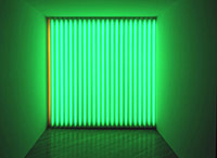
 And it is good. Just got back from the newly opened Dan Flavin retrospective at the National Gallery this morning, and it's pretty wonderful. Some of the galleries are oddly cramped--anyone realize how unfriendly I.M. Pei's actual galleries are to art?--especially if you're used to seeing Flavins in dedicated spaces like Dia:Beacon, Dia:Bridgehampton, or Judd's Spring St. loft.
But every time I start to write how there are too many Tatlin pieces in this gallery, or how that gallery would be better with just three pieces, not four, I remember the single-room Tatlin installation at the Menil. Or how I didn't mind the ground floor of Dia:Chelsea being crammed with his work right after he died. Now that I think about it, it's really only because the utter perfection of the all-white Flavin show at Paula Cooper's cathedral-like gallery a couple of years ago still burns like phosphenes on my retinas.
Flavin's great success, like his kindred artistic spirit Donald Judd, arises from the complex spatial awareness he creates with such industrial, apparently unartistic means. His flourescent sculptures activate the spaces they inhabit; their light seems to hang in the air, outclassing and setting itself off against the "normal" light we otherwise ignore.
Although ads and posters feature the most visually complicated Flavin grid, to me the most wonderful work is the single horizontal flourescent tube spanning a corner. There was a two-toned white one at Paula Cooper, but the example in this show is blue, magically backlit with red, green, and yellow. It positively floats on air. [ModernArtNotes has a reproduction and excerpts of Tylers review for Bloomberg.]
At 10AM the galleries were empty, except for still-unconvinced guards and a pair of bitter old southern queens who repeatedly unloaded their pent-up hostilities on Flavin's work ("What're we supposed to see? They're all untitled!" "Nothing, this was YOUR idea." "The kids at the day care could do that." "I'd hope so.")
Of course, the untitles couldn't be more loaded with meaning and reference, as even the quickest glance at the works list would show. untitled (to Barnett Newman to commemorate his simple problem, red, yellow and blue) is only one rich example. There's a Work List in the drawings gallery at the end of the show from the early 60's, on which serious, momentous-sounding titles are divided into "In Process" and "To Be Completed." Only two are checked off, but we know now how it turned out. It's useful to look back through the other end of the telescope and remember that these ephemeral, experiential works of off-the-shelf materials grew from their untitles.
It reminded me of a statement curator Laura Hoptman made about her inspirations for the about-to-open Carnegie International:
I have been thinking about all the artists making work immediately after the Second World War both in Europe and in the United States. Those artists had hubris. Barnett Newman felt that he could sum up the world in a single vertical zip! It might seem ridiculous, but there's something very potent about the notion that with this kind of abstract gesture you could take on a subject like monotheism.
 And no one had more hubris than Flavin and Judd (although Flavin may have grown out of it; the last piece he completed before he died was for the Christmas windows of the newly opened Calvin Klein boutique on Madison Ave.) Perhaps the greatest thing about the exhibition catalogue is the appendix, which features a chipper first-person timeline/biography, written by an obviously younger Flavin, and a 1965 interview, republished from Artforum, where his powerful artistic hubris shines through.
Dan Flavin: A Retrospective, at the National Gallery of Art through Jan. 9, 2005
Buy the exhibition catalogue, or better yet, pre-order Dan Flavin: The Complete Lights, 1961-1996, which includes the catalogue plus all the rest of the artist's sculptural work.
Related: In Search of The Ultimate [Laura Hoptman with Roberta Fallon on Artnet]

