March 2007 Archives

Spiral Doily, found at the Sinclair Station, Corinne, UT, 2005
"Spiral Doily" postcard, Corinne, UT, 2005

Yow, didn't realize how radio silent it's been around here. I've been working on a couple of deadlines, one article I'll go into later, and a lecture I'm just tightening up right now.

I'm heading off to Salt Lake City to speak at the University of Utah's Visiting Artist [sic] Lecture Series. Given the venue, I'll be talking a bit about Robert Smithson [who also rather famously gave a lecture at the school in 1972], the Spiral Jetty, and some of the stories and themes from both the blog here and my articles for the NY Times.

If I were pressed for a poetic theme, it'd be the mutable afterlife of a work of contemporary art. If I were presenting at CAA, I'd try to come up with a zingy title involving money. One thing that strikes me about most of the art historical world is the willful blindness on subjects of the market and its relationship to art and how it's produced and consumed.

Once when I was talking to Tobias Meyer of Sotheby's, he used the term "economic curatorship," something of an attention economy wherein works get greater attention and exposure precisely because of their prices. It's an undeniable effect, but unless you're an auctioneer, money is usually only mentioned in relation to art in an uncritically pejorative way.

This is all part of what I'm thinking about for the talk--the audience will include BFA and MFA students as well as art history folks, as well as my Utah relatives up to two or three times removed, I hear--how much of it goes in is still TBD.

If you're the reader of greg.org who's in Salt Lake City and who's not related to me, you should feel free to come, too. Tuesday, Apr. 3 at 5pm, ART 158, in the Fine Art building, just between the library and the museum.

There's some webcasting/podcasting/streaming element to it as well; as soon as I figure that out, I'll post it here.

hohensinn_prison.jpg

Verner Panton chairs in prison? Custom ply built-ins? I mean, day-um.

Josef Hohensinn's Loeben Justice Center is like Richard Meier's Perry & Charles Street towers, only warmer inside, with some Dominique Perraultian Bibliotheque National wooden touches.

29 photos here [hohensinn-arhitektur.at via kottke and carniola]

March 19, 2007

The Million Dude March

I got on the subway last Sunday just as the Imax screening of 300 had let out, and the 1/9 platform was packed with amped up clumps of guys. Just the night before we'd joked at dinner about A.O. Scott's review ["as violent as Apocalypto and twice as stupid"] that, even if it didn't turn out to be Battlefield Earth, we should still go see 300 because it sounded like it's a landmark of cinema, a touchstone for something, anyway.

But the excitement/incitement of this trainful of stoked dudes--they didn't all seem like the out & proud, rightist sci-fi nerds to which Neal Stephenson attributes the film's box office success in the NYT yesterday--made me realize Scott, at least, has a blind spot to the critical reference points of wildly popular genres such as video games and graphic novels. I also worried about my own quick dismissiveness of something that was clearly resonating with a lot of people.

By the time I read the reaction of artist/friend John Powers, however, at Art Threat, I was convinced a lot more attention needs to be paid and serious thinking needs to be done about gloriously violent media--films in particular, but TV and games, too--that stokes the flames of "total war":

300 is following up on the success of Sin City. Both films are adaptations of comic books by Frank Miller, who also is credited as a producer for both films. The films share an aesthetic of digitally abstracted violence, real flesh is turned into the consistency of cartoon ink: it gives way like warm butter, without resistance and without regret or consequence. These are worlds of deep black and white. Sin City pioneered this aesthetic at the service of noir nihilism. With 300 this stylized violence is harnessed to the cause of glorifying total war. 300 is a pornographic vision of power and perfection and has only contempt for the disfigured and unfamiliar. It plays on the contemporary fear that we are facing a clash of civilizations, and stokes that fear with racist imagery. By calling up old Aryan dreams of a classical world peopled by blond haired blue eyed individuals, and threatening that world with an undifferentiated dark-skinned horde, the film panders to the ugliest aspect of America. Race separates good from evil in this film, this is part of the way it promotes total war. 300 would have us believe that no quarter can be given to our enemies because they are sub-human and hideous.
300: Racist Propaganda with Septic Timing [artthreat.net]

I assembled a table from Italy the other day. From the accompanying instructions, I learned a Phillips screwdriver is called a cacciavite inglese, or English screwdriver, in Italian. [vite is screw.]

Which is odd, because Phillips was American.

I did know that in Japan, they're called "plus" and "minus" screws, which seemed very sensible.

byu_alumni_kyle_sampson.jpg

But for some reason, the BYU Alumni Association recently deleted their 2002 Alumni Spotlight profile of one of the most powerful and prominent BYU Cougars out there, one who "oversaw all of President Bush’s lawyer-related appointments. Last year, he assumed additional duties as a member of the White House Counsel’s office. Sampson provides legal advice to the President, helps develop policy initiatives, and ensures that the constitutional powers of the Presidency are both protected and exercised appropriately."

Fortunately the Internet Archive has preserved a copy, and I went ahead and reprinted it below.

exercito_gwb_knuttz.JPG

Have I been reading too much David Foster Wallace, or would these Brazilian army riot shields make awesome venues for the right advertiser? [image via knuttz.net]

Muji has always been a luxury of a simple, affordable sort. On March 30th, Muji will open a new store in the Tokyo Midtown complex. Instead of the standard, aggressively humble, utilitarian Muji products, though, they will feature high-design, high-touch manufacture, high-quality furniture with commensurately high prices. The're going to launch with 30 pieces of furniture and 190 home products. [I'd put up an autotranslation, but Muji's announcement page is just one big graphic.]

Last year, Muji bought Idee, a slightly troubled maker of high-end minimalist furniture. Jean Snow, rightly, I suspect, predicts that Idee is being leveraged into this new direction. I'm keeping my eye on Jean's flickr stream

In a related note, it seems Muji's theme for 2007, at least in Japan, is "renovation." There's an essay on their site about how, in an aging Japan where the population is not increasing, yet where the paradigm of disposable newness still holds sway in the housing market, undervalued "used" buildings can make put your individualized desires for a home within reach. A nice strategy for someone who sells primarily the stuff that goes inside a home, not the homes themselves:

For instance, just switching from the notion of buying a new apartment expands the possibilities greatly. In Europe, people don't compete by throwing up new buildings; instead they adapt, redecorate, and reuse the interiors of old buildings to fit their lifestyles. The long-lasting exterior of a building they call a "skeleton," and the interior is called "infill." People in Europe value and reuse the skeleton while they freely adapt the infill. They also have the view that the long-term use of architecture should only be reconsidered after 50 years of so have passed.
[adapted from an excite.jp translation]

Let's talk houses
[muji.net, japanese only]

One of my big regrets was not urban scavenging the old Bendel's when I had the chance. My office used to be above the store during the gutjob renovation that followed the store's purchase by Columbus-based The Limited. See, a friend's mom had worked there way back in the day as a cosmetics buyer, so she remembered that all the cast bronze vitrines, counters, and stools had been designed by Diego Giacometti. Dozens of them. They'd been painted over and knocked around for decades, ignored, seemingly forgotten, now sold off to some Ohioans, who called in the demolition crews.

I watched the dumpsters, but never tried to seek them out, fearful, I guess, of tipping off anyone to their provenance and value. Besides, what was a 23-year-old guy supposed to do with 18 8-foot-tall, bronze-and-glass vitrines and 36 bronze barstools? I've never heard or seen a peep about the stuff since; these dressing table stools are the closest I've seen, and they're short.

diego_giacometti_stools.jpg

Anyway, the demolition of another interior and the impending dispersion or destruction of a host of unappreciated fixtures was on my mind one evening a couple of summers ago when I passed 2 Columbus Circle, Edward Durrell Stone's building that had held the NYC Visitors Bureau for many years.

In 2000, when it was still in decent shape, but largely unused, I'd actually considered trying to have our wedding party in the walnut-panelled, Central Park-balconied top floor of the building. [Another, slighter regret. Not having the party there, I mean. Not the wedding. Hi, honey!]

2_columb_circle_lights.jpg

So seeing it fenced off, ready for demolition and transformation into The Craft Museum, the ceiliingful of sweet, Bauhaus-by-way-of-Pop-Minimalism light fixtures lighted up for one of the last times, I couldn't resist taking a picture.

The red lights remind me of a similarly shaped piece from 1966 in MoMA's design collection by Peter Hamburger [below, l] and a simpler, 1920 design by Gerritt Rietveld [below, r].

peter_hamburger_light_moma.jpg rietveld_hanging_lamp_moma.jpg

The architectural salvage industry has grown tremendously since the early 1990's, and 2 Columbus Circle's preservation and gutting was high-profile enough that these lights should have a better survival rate than the Giacomettis. Still, my impulse to go ask about them was quickly squelched. The security guard saw me and my phonecam and stormed over to the window, gesturing furiously at me to stop taking pictures from the street.

Related: a series of photos of lights and light-based art Tyler Green posted today on MAN.

March 14, 2007

Economist Class

Tom Scocca does a great takedown of The Economist, and by association, the unalloyed Economist worshippers in the magazine industry: "When other magazines say they want to be like The Economist, they do not mean they wish to be serious. They mean they wish, by whatever means, to be taken seriously."

[He neglects to mention Monocle, though, which launched itself with the suggested tagline, "it's The Economist-meets-Vice." [Aside: There's a conservative power-worshipping sycophant streak that runs through Monocle which will be interesting to watch develop. As if Tyler Brule wants to be the secret, unaccountable ruler of the world--Karl Rove, just with a gym body and hand-stitched shoes.]

Also unmentioned is The Economist's one true strength--at least it was, I only read it to get into business school--its wry photo captions.

But Scocca's bitingly close reading reminds me of another great Observervation of an uncritically praised media organ: the Zagat Guide. Sometime in mid-to-late 1990's, someone--maybe Michael Thomas?--identified review-submitting diners as suburban boors transfixed by their own imagined superiority, dealing out criticisms like "filled with model wannabes" and "one-car garage decor" and self-inflating praise such as "just like the ratatouille in Marseilles."

So, can anyone find that article again? Or has it been sent downt he memory hole now that the paper's owned by a guy from New Jersey with a six-car garage?

bmw_h2r_concept.jpg

It had sparked one of those jump-the-shark anxiety attacks when I heard that one of the artists I most admire, Olafur Eliasson, had been commissioned to do an Art Car for BMW.

Even as it included such respected artists as Warhol, Lichtenstein, and Jenny Holzer, BMW's Art Car series has always epitomized the superficial lameness of corporate co-optation of artistic practice.

For someone as serious and critically engaged as Olafur to decorate a BMW--and not just any BMW, but a hydrogen-powered PR-mobile, the H2R, the promotion of which would only deflect attention from the German auto industry's complicity in global climate change and their aggressive efforts to thwart greenhouse gas emissions cuts--well, I was worried. And the BMW press release didn't help

But then I read an account of a speech Olafur just gave at the NAI in Rotterdam, where he talked about the car: "‘They are increasingly unhappy about it’, he says about his commissioner. But it is about the relation between the automotive industry and global warming."

I guess I shouldn't have worried. but still.

"It makes a difference to make art." [eikongraphia via archinect, image via mwerks]

I did something yesterday on the train I never do anymore: I read a print copy of the newspaper. I was reminded how, by scanning the page, I used to discover articles about fascinating new things, insights, or perspectives, things that I never would have taken the effort to click through on. Not that anything like that happened to me, of course; since what I picked up from the seat next to me was the Style section of the Washington Post.

In the absence of many facts, Robin Givhan, the Post's Woman In Paris, threw her analytical hat into the ring, attempting to put fashion shows by Miu Miu, McQueen, and Theyskens into context for readers with an actively hostile, anti-fashion fashion sense:

Prada excels in merging creativity and logic, a rare ability in the fashion industry. The most exuberantly imaginative designers are often the least reasonable. They don't care if a woman can't sit in a dress as long as those giant mirrored discs on her rear end look "fierce."

...

At Hermes on Saturday, the collection from Jean Paul Gaultier emerged as a blur of luxurious materials: crocodile, cashmere, glove leather. The theme was biker chic, but it really could have been anything at all so long as the house's handbags -- Birkins and Kellys -- were prominently featured. The ready-to-wear at Hermes serves as a mise-en-scene for the handbags. The clothes are beautiful but not especially memorable. They don't define an Hermes ready-to-wear aesthetic; they simply imply wealth.

Contrast that with the ready-to-wear collection at Louis Vuitton. It, too, is a brand defined by its handbags. But while Hermes bags are about longevity and the idea that a woman might pass one down to her daughter, the Louis Vuitton brand is focused on trends. It is an absurdly expensive disposable fashion.

The clothes at Vuitton are fashion-conscious. A wearer may not necessarily feel rich, but she'll feel hip. They are unveiled with blaring fanfare. The grandeur of the show is in marked contrast with the availability of the collection, which is generally limited to flagship Vuitton boutiques. But the point is not to sell the clothes, but to sell Louis Vuitton as a fashion brand. Subliminal message: Go buy a bag. Or two. Or five.

And even so, Miuccia got off better than John Cage. Here's a review of a recent all-Cage concert at the National Gallery:
Cage's work often transcends gimmickry through unmistakably musical rhythmic drive highlighted by prominent percussion. The dancelike "Amores" came across as ideal music for a love scene. Percussionists Thomas Jones, William Richards and guest Michael Zell drummed softly with their hands and effectively conveyed a gentle but vital intimacy. They brought virility to the jungle sounds of "Third Construction," using cowbells and conches with equal abandon.

"Nocturne" featured poignant performances by Johnson and violinist Lina Bahn.

Throughout, the Contemporary Music Forum displayed uncommon scope and sensitivity and brought out the best of an important and still underappreciated composer.


No sooner did Chanel let slip how they spent a whole extra million dollars to finish the sides of their narrow tower on 57th Street in granite to match the street facade, than rival LVMH announced they were building next door. They promptly tore down the 5-story 19th century townhouses, and Chanel's property line granite was covered up by Christian Portzamparc's faceted glass tower.

whitney-hagen_steir.jpg

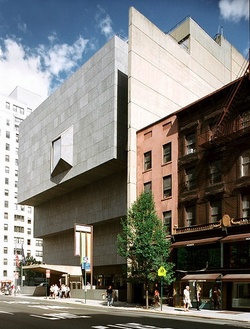
I thought of this because until I saw Hagen Steir's photo of the Whitney Museum on Tropolism, I had literally never noticed the facade-matching-granite-faced concrete wall built along the south lotline, the way it looms over the Breuer building's hapless little brownstone neighbors. [ed. note: Chad points out it's just concrete. and he's right. -ed.]

The height of the wall is keyed, not to the potential buildable height of the townhouse, though, but to the height of the museum. In fact, there's a similar wall running along the rear, eastern lotline, too. They're really only apparent because Breuer's design did not conform to the street grid or maintain the curtain of facades that were the backdrop of city street life.

In fact, they serve as backdrops, scrims, a pedestal, even, for the building itself. The building is a sculpture, an object in a thoroughly delineated volume of space that just happens to be on a corner in a neighborhood of a city.

The Whitney was finished in 1966, a year after the creation of the Landmarks Preservation Commission, but long before the designation of the Upper East Side Historical District. It's always been a part of my Upper East Side, but considering how they literally walled themselves off from the neighborhood, I can't be surprised at the Whitney's never-ending confrontations with the LPC&co over its various expansion plans. Even when, as in the most recent Renzo Piano plan, they involved tearing down the two adjacent landmarked townhouses--which the Whitney now owns--along with that wall.

Tropolism contributes to Gridskipper's Ugly Buildings list
[tropolism]
Additional Whitney photos at Great Buildings Online [

In 2004, Volvo released The Mystery of Dalaro [note: there's supposed to be an umlaut over the o], a very serious-sounding 8-minute documentary about a small town in Sweden where 32 people suddenly bought the same Volvo on the same day. It was supposedly directed by one Carlos Soto.

It was, in fact, directed by Spike Jonze, who also put together "Soto's" own site where he questioned the facts of the "documentary" and wondered if he hadn't, in fact, been duped into making an ad.

The original Mystery is on YouTube, like everything else these days. Everything but the fake Soto rebuttals, unfortunately. For people like me who weren't giving a damn about Volvos in Europe in 2004, this project exists now only as a fragmented stunt, like the chocolate-syrup-coated ephemera after a piece of performance art.

Though they should be embarassed by its lameness, I'm sure the people at Ford Media thought their own slightly ambiguous Dalaro press release was a real hoot.

Uh, both/neither. It's advertising: The Mystery of Dalarö: Fact or Fiction? [media.ford.com]

Didion has some notes in today's NYT about adapting her memoir, The Year of Magical Thinking, into a play. She could write a laundry ticket and I'd be impressed, but it really is fascinating stuff.

I have been asked if I do not find it strange that Vanessa Redgrave is playing me. I explain: Vanessa Redgrave is not playing me, Vanessa Redgrave is playing a character who, for the sake of clarity, is called Joan Didion. At points before this character appears onstage, she loses first her husband and then her daughter. Such experiences of loss may not be universal, but neither are they uncommon. If you take the long view, which this character tries to do, they could even be called general.

This does not close the subject. “But Vanessa Redgrave is nothing like you.”

This is not entirely true. As it happens I knew her before I ever thought of writing a play. Tony Richardson, to whom she was married, was until his death in 1991 one of our closest friends. I had known their daughters since they were children. She and I understand certain kinds of experience in the same way. We share the impulse to make things, the fear of not getting them right. I would even guess, although I have not asked the question, that she has had the nightmare in which you get pushed onstage without a script.

I say some of this.

“But she’s taller than you are.”

This is true. She is taller than I am.

I try to suggest that her task in this play, for better or for worse, offers more elusive challenges than height impersonation.

Then I give up.

The Year of Hoping for Stage Magic [nyt]

March 3, 2007

We're Sforza Like That

Come sparando pesci in un barilotto. Remember September 10th!

giuliana_washtimes_cpac.jpg

mussolini_rome.jpg#

mussolini_union_square.jpg#

mussolini_from_below.jpg

mussolini_duce_discorso.jpg#

Before he was the Mayor of 9/11, he was the Mayor of New York City.

Since 2001 here at greg.org, I've been blogging about the creative process—my own and those of people who interest me. That mostly involves filmmaking, art, writing, research, and the making thereof.

Many thanks to the Creative Capital | Warhol Foundation Arts Writers Program for supporting greg.org that time.

comments? questions? tips? pitches? email
greg [at] greg [dot ] org

find me on twitter: @gregorg

about this archive

Posts from March 2007, in reverse chronological order

Older: February 2007

Newer April 2007

recent projects, &c.


our_guernica_cycle_ivanka_320px_thumb.jpg
Our Guernica Cycle, 2017 –
about/kickstarter | exhibit, 2017


pm_social_medium_recent_proj_160x124.jpg
Social Medium:
artists writing, 2000-2015
Paper Monument, Oct. 2016
ed. by Jennifer Liese
buy, $28

madf_twitter_avatar.jpg
Madoff Provenance Project in
'Tell Me What I Mean' at
To__Bridges__, The Bronx
11 Sept - Oct 23 2016
show | beginnings

chop_shop_at_springbreak
Chop Shop
at SPRING/BREAK Art Show
curated by Magda Sawon
1-7 March 2016

do_not_bid_or_buy_iris_sidebar.jpg
eBay Test Listings
Armory – ABMB 2015
about | proposte monocrome, rose

shanzhai_gursky_mb_thumb.jpg
It Narratives, incl.
Shanzhai Gursky & Destroyed Richter
Franklin Street Works, Stamford
Sept 5 - Nov 9, 2014
about | link

therealhennessy_tweet_sidebar.jpg
TheRealHennessy Tweets Paintings, 2014 -
about

sop_red_gregorg.jpg
Standard Operating Procedure
about | buy now, 284pp, $15.99

CZRPYR2: The Illustrated Appendix
Canal Zone Richard Prince
YES RASTA 2:The Appeals Court
Decision, plus the Court's
Complete Illustrated Appendix (2013)
about | buy now, 142pp, $12.99

weeksville_echo_sidebar.jpg
"Exhibition Space" @ apexart, NYC
Mar 20 - May 8, 2013
about, brochure | installation shots


HELP/LESS Curated by Chris Habib
Printed Matter, NYC
Summer 2012
panel &c.


drp_04_gregorg_sidebar.jpg
Destroyed Richter Paintings, 2012-
background | making of
"Richteriana," Postmasters Gallery, NYC

czrpyr_blogads.jpg
Canal Zone Richard
Prince YES RASTA:
Selected Court Documents
from Cariou v. Prince (2011)
about | buy now, 376pp, $17.99

archives