May 2010 Archives

May 30, 2010

Orbit: Final Conflict

Kapoor_Orbit.jpg

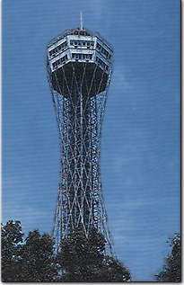
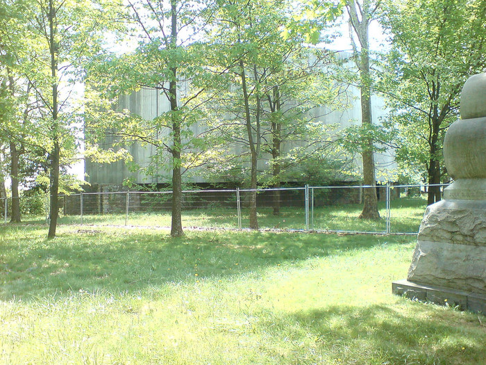
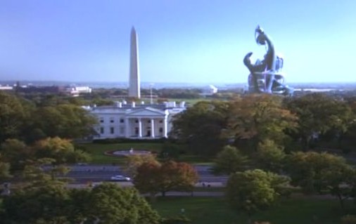
Took me a couple of months, but I finally figured out which, out-of-place alien Washington embassy in the short-lived, suspiciously-generous-aliens-move-into-Earth TV series Anish Kapoor's wacked out Orbit Tower reminded me of: the one in Gene Roddenberry's Earth: Final Conflict.

earth_final_conflict_embassy.jpg

Glad to have that off my plate.

Into Orbit [kosmograd via things]
[images via willwiles and rivenwolf]

maskelyne_portrait_stokes.jpgSure, there's Dutch Camo Landscapes, and Razzle Dazzle, and the Civilian Camouflage Council, but it all pales in comparison to the truly epic WWII camo accomplishments of Jasper Maskelyne and The Magic Gang.

Maskelyne was a British magician-turned-Army camo mastermind who, in 1941, led a ragtag band of desert artists and illusionists who created a series of incredible camo techniques that protected Allied forces in North Africa from aerial reconnaissance and bombardment.

Using burlap and sticks, they disguised trucks as tanks, and tanks as trucks, and they created devices to enable tanks to cover their own tracks across the desert sands. But the most amazing achievements are in his 1949 memoirs, Magic - Top Secret where Maskelyne--whose grandfather, also a magician, invented the pay toilet--tells how he saved the port of Alexandria, Egypt from night bombing by building an elaborately lit decoy port, several miles away in the desert. Using incendiary devices and real anti-aircraft artillery, he and his Magic Gang fooled the German bombers with realistic-looking "hits" and return fire; and by morning, his crews would strew papier-mache rubble around the real port, giving simulated damage for the reconn pilots to report back. [below: a German spy photo of part of the port]

alexandria_maskelyne_stokes.jpg

The success of the Alexandria decoy was only surpassed by Maskelyne's brilliant [literally] strategy for protecting a vital supply route for the Allies, the Suez Canal. He designed "Dazzle Lights," a rotating structure of made up of mirrors and 24 powerful anti-aircraft searchlights that, when set into motion, gave off a "Whirling Spray,":

[Maskelyne] managed to create beams nine miles long, twenty-four of them from each searchlights [sic] ... the magic mirrors were a success, and the next job was to get the device into mass production. With them, we made twenty-one searchlights serve for the entire one-hundred-mile length of the Suez Canal.
That's right, the Suez Canal was saved from being bombed by the biggest lightshow in history: the 100-mile-long, Whirling Spray of almost two dozen Dazzle Lights.

How is it possible that I did not know this before now? Why is this miracle of modern warfare not taught in our military academies? Our elementary schools, even? How are these mindblowing aesthetic achievements not celebrated as a landmark in the history of art? Why is there no Bruckheimer movie, starring Josh Hartnett as the daring soldier magician? Maybe because the entire thing is bullshit.

In 2004, military historian and magician [seriously] Richard Stokes published the findings of his multi-year investigation into Maskelyne's claims. They are gathered in the exhaustively paged website, MaskelyneMagic.com. Working with the magician's son, he had access to Maskelyne's archives and scrapbooks from the war. Stokes also cross-referenced official records, declassified intelligence reports, and consulted experts and historians in the North African war. And there is nothing in the historical record to support Maskelyne's fantastical claims.

On Alexandria, the place where he said he built a decoy port doesn't even exist; neither does the geography he describe match to any in the vicinity of the city. There are no pictures or corroborating eyewitness accounts, and no documentation.

On the Suez front, Stokes demolishes Maskelyne's claim to have invented Dazzle Lights by pointing to similar, tank-based tactics under development since WWI. Again, no record of Dazzle Lights can be found in the historical source material, and extensive accounts of the actual defense of the Canal provide well-documented alternative explanations to Maskelyne's. According to Stokes, Maskelyne didn't actually come up with the Whirling Spray idea until 1942, after the aerial threat had subsided. And he quotes the illusionist's son: "The 'Dazzle Lights' were an idea which was, I believe, constructed only in one prototype and tested on one occasion."

Which appears to be the scene depicted in the photo gallery on Stokes' site, where a searchlight is being outfitted with a faceted, mirrored cone extension:

dazzle_light_proto_stokes.jpg

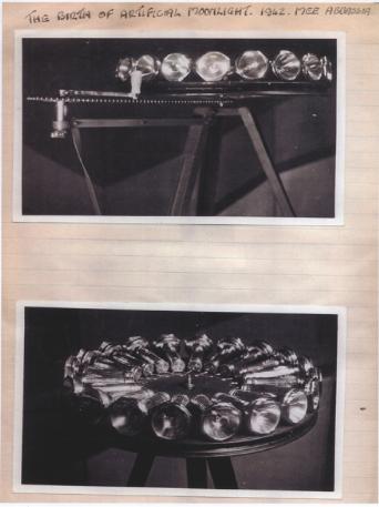
Which means the photo below, showing an awesomely Duchampian folly, 18 flashlights on a turntable, is somewhat confusing to me:

dazzlelights_stokes.jpg

But with a caption like, "The birth of artificial moonlight, 1942," I'd think that Maskelyne's imagined heroics are long overdue for [re-]creation.

The War Magician| ""Myth is invulnerable to mere facts" - Barthes [all images via MaskelyneMagic.com]
Previously: Bombardment Periphery, Rotterdam, and Los Angeles's 'wigwam' of searchlights; Forrest Myers' light pyramid

I've got browser tabs full of sweet, sweet updates and extensions to some earlier posts. I'll start with Tomasons.

thomasson_neojapon.jpg

Tomasons [also Thomassons], but really, トマソン, are the inadvertent, useless architectural leftovers, vestiges of a city's churned and rebuilt history. They were invented/ discovered and documented beginning in the 1980s by the Japanese art/architecture collective Rojo Kansatsu [Roadside Observations] and its co-founder Akasegawa Genpei.

At the time, Japan was in the middle of a crazy, real estate-fueled economic bubble, and the built environment was in constant flux. Akasegawa made Tomasons the humorous, overlooked fodder for a magazine column, the compilation of which became a hit in the 80s.

Now, thanks to Kaya Press, Akasegawa's Thomasson writings have been published in English. Should be great stuff. [via metafilter]

Previously, 02/08: On Tomason, or the flipside of Dame Architecture
Related: Roadside Observation [neojaponisme.com]
Related from last week: Berthier's (and Boudvin's) Door, a fake Tomason in Paris [bldgblog, who else]

May 28, 2010

The Togs Must Be Crazy

obama_kanga.jpg

Colorful, cheap African textiles: they're not just for Yinka Shonibare anymore!

Called Pagne in West Africa and Kanga [also khanga] in Tanzania, 1x1.5m screenprinted cotton wraps are produced all across Africa. There is a tradition to make commemorative kanga for major events, such as the official visit or inauguration of a US president.

gwb_kanga_dcdiary.jpg

Or more typically, the inauguration of a local political leader. Politicians in newly independent nations quickly adapted a traditional practice, and distributed the government-produced fabric for free or at a subsidized cost to their supporters.

As Linda reports in full-color glory on All My Eyes, the Tropen Museum in Amsterdam has a show, "Long Live The President | Portrait Cloths from Africa," which includes over 100 examples of these textiles. Many come from the extensive private collection of Bernard Collet and can be seen online. The Tropen show runs through August 29th. Obviously, everyone should go.

Even more obviously, though, everyone should be commissioning Pagne and Kanga designers to make commemorative patterns for whatever event or non-event they want to propagandize, too. The mind reels at the awesome possibilities.

African Portrait Cloth [all my eyes]
Long Live The President | Portrait Cloths from Africa [tropenmuseum.nl via all my eyes]
Adire African Textiles [adireafricantextiles.com via a.m.e., like basically everything in this post]

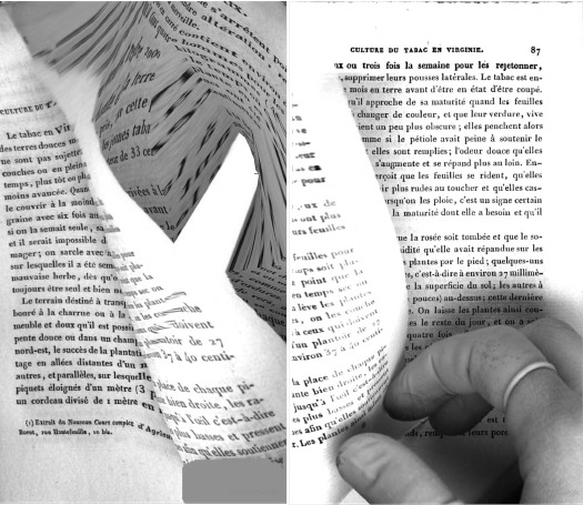
culture_du_tabac_diptych.jpg

So fantastic. I stumbled across this inadvertent diptych in Google Books, it's pp. 86-7 of P. Ch. Joubert's 1844 addition to the Manuels Roret series, Nouveau manuel complet du fabricant et de l'amateur de tabac.

It's beautiful, somewhere between the process-heavy, content-free abstraction of Walead Beshty and the reverential physical investigations of Abelardo Morell, with a bit of those weird Weegee funhouse mirror photos thrown in for good measure.

And yet they're also entirely of their own time, place, and making.

A few years ago at John Connelly, my buddies Jonah Freeman and Michael Phelan showed some sweet prints of crumpled aluminum foil shot on a flatbed scanner. [Mitterand+Sanz has images] Which could be a great process here. But I'd really love to figure out how to create negatives from these scans and make up some big, old school silver gelatin prints. [thanks GF-R for the heads up on Morell]

Related from last October: Why is Google giving us the finger? [designobserver.com]
Google Image collection of Google Books Finger [via BoingBoing]

boetti_puzzle_mip_6.jpg

Hans Ulrich Obrist, is there anything you haven't done? In 1993 as part of the Museum In Progress project, Obrist helped the Italian conceptual artist Alighiero e Boetti realize a longtime idea of putting art on airplanes.

In addition to double-page spreads in their in-flight magazine, Austrian Airlines made six seatback tray-sized puzzles available of Boetti's drawing series, Cieli ad alta quota (High in the Sky).

If any puzzles survived to be collected or traded, they're not generating the typical online info flotsam. Maybe in this case, it should be jetsam.

Museum in Progress On Board [mip.at]

May 24, 2010

Everyone's An Artist

Artist/curator Anton Vidokle reworks an excellent lecture on the problems of curator/artists in the latest issue of e-flux journal

I feel that whereas artists' engagement with a range of social forms and practices not normally considered part of the vocabulary of art serves to open up the space of art and grant it increased agency, curatorial and institutional attempts to recontextualize their own activities as artistic--or generalize art into a form of cultural production--has the opposite effect: they shrink the space of art and reduce the agency of artists.
Curators claiming the mantle of art for their shows is an issue at least as old as the 1960s, but it has been exacerbated, Anton says, by the demise of the critic's power. All in all, a sharp read. [via afc]

Related: Gregory Battcock and 'The Essential Triad'

This 11-minute documentary short by Brisbane animator Simon Cottee gives a nice look at contemporary pixel art and its origins.

Unsurprisingly, game developer Jason Rohrer has the most thoughtful perspective on the idealized, ex-post-facto perception of pixels as these perfect, hard-edged squares, which he attributes in part to looking back at old low-res games on new, hi-res monitors.

Cottee et al make the connection between pixels and pointillism, but the focus on animation leaves out the influence both pixel-centric image software, like Photoshop, and pixel-related art shown in galleries. [Juan Cespedes, Cory Arcangel, Sherrie Levine, Joerg Colberg or Thomas Ruff, or even Tauba Auerbach or Gerhard Richter] Still well worth a view.

On the occasion of Apichatpong Weerasethakul [1] winning the Palme d'Or, Frieze's Dan Fox has a incisive recap of the debate over Slow Cinema that erupted after Nick James' Sight and Sound recent op-ed calling the genre out as a passive-aggressive dare to the audience to admit they're bored.

The row among film critics and festivalgoers is as annoyingly insidery and lingo-obsessed as any art world argument. [Fox is careful to give equal time to competing terminologies. One blogger critic, Harry Tuttle, thinks Slow Cinema is pejorative, and proffers Contemporary Contemplative Cinema instead, which seems arbitrary. Might as well call it Minimalist Meditative Movies.]

Fox's dead-on point is how insulated and blind these two systems of production and distribution--theater/festival/DVD vs gallery/installation/edition--are from each other. And this, despite the remarkable confluence of interests, strategies, and styles among filmmakers and artists on both sides of the divide:

Much as I admire Tuttle's spirited engagement with his favoured genre of contemporary cinema, nowhere on his timeline of CCC/Slow Cinema is there anything that represents, for instance, the achievements of Structural cinema. This is curious, for if 'plotlessness', 'wordlessness', 'slowness' and 'alienation' are what he is trying to chronicle, where are Andy Warhol's Empire, from 1964, or Michael Snow's 1967 film Wavelength for example? Nor is there any acknowledgement of how these multiple strands of experimental cinema history have fed into the work of artists today.
Artists such as Tacita Dean, Sharon Lockhart, and Matthew Barney, for example. [On the other side of the fence, I'm not sure why no one seems to have mentioned my own personal favorite Slow Cineman, Gus Van Sant, who emptied Sundance theaters with Gerry and whose lingering, looming Elephant also won at Cannes.]

Barney has broken theatrical and festival ground with his Cremaster Cycle, of course. But I think Frieze, which has commissioned projects from Weerasethakul, has high hopes for him as a candidate for bringing the worlds of these two film traditions together. We'll see.

Slow, Fast and Inbetween [frieze]
[1] yes, he's in the art world pronunciation guide.

May 23, 2010

Slate-Roofed Houses

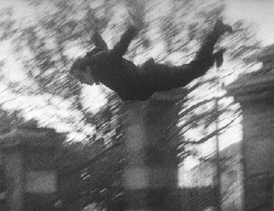
A couple of months ago, I wondered aloud about the reason Yves Klein schlepped all the way out to the Parisian suburbs to make the leap into the void for his famous photocollage, Leap into the Void.

The site, 3, Rue Gentil Bernard, Fontenay-Aux-Roses, has changed since October 1960, but it houses a church dedicated to Sainte Rita, with whom Klein had a spiritual connection. [A votive offering assemblage Klein made during one of his pilgrimages to St. Rita's monastery in Italy is in the Hirshhorn's just-opened retrospective.]

As it turns out, I should've just been reading my Art News instead. Kim Levin wrote about Leap Into The Void in the March 2010 issue, and reports that it wasn't Catholic mysticism, but Klein's other passion, judo, that drew him to Fontenay-Aux-Roses.

She cites the 2006 obituary for photographer Harry Shunk who, with his assistant Janos Kender, shot Klein as he "climbed to the top of a wall and dived off it a dozen times--onto a pile of mats assembled by the members of his judo school across the road."

But wait, is it the judo school or the pile of mats that was across the road? After a bit more searching, I found this intro to a 2006 monograph, L'envol d'Yves Klein: L'origine d'une legende, which basically puts Fontenay at the center of Klein's story. [It might help that it was written by a couple of Fontenaysiens, Terhi Génévrier-Tausti and Pierre Descargues.] Anyway, Klein was raised there, and his friend had the Olympic Judo Club there. So yeah.

The best part of Levin's story, though, comes from Michelle White, who curated "Leaps into the Void: Documents of Nouveau Réalist Performance," at the Menil:

after she discovered an odd object in the Menil archives: a piece of slate. It wasn't art--just a piece of slate "collected" by Dominique de Menil in 1981 from the mansard roof that Klein presumably leaped from.
The Matteses would be so proud.

White's show includes other photos from the Leap, including this spectacular action detail, which are in the Menil's holdings:

klein_saut_menil.jpg

Looks like someone's gotta book a trip to Houston.

Yves Klein's Leap Year [artnews via @johnperrault, yes, he's on twitter now]
Leaps into the Void: Documents of Nouveau Realist Performance, through August, 8, 2010 [menil.org]

May 23, 2010

National Houses, Inc.

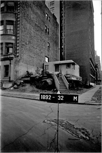
So weird/awesome. A steel panel, prefab, moderne house designed by William Van Alen, and built on top of a craggy boulder at 107th & Riverside, in 1937, seven years after completing his somewhat higher profile project in Midtown, the Chrysler Building?

vanalen_prefab_house_nyc.jpg

Christopher Gray has the story--and finds this picture in the Municipal Archives--in
NYT's Streetscapes column.

According to "A Home in Cellophane," a chirpy 1935 Time story about prefabs [found via the Van Alen Institute], Van Alen was actually a director of National Houses, Inc., just one of several prefab startups that were going to pull America's housing market out of the Depression.

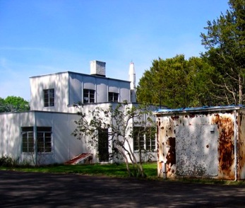
The focus of Time's article was actually another venture, American Houses, Inc., who unveiled architect Robert McLaughlin's modular, modernist "machine in which to live," the Motohome, at Grand Central Palace, the same place where Albert Frey & Lawrence Kocher's Aluminaire House had debuted in 1931. [Aluminaire was extensively re/dis/covered here on greg.org in August 2009. Here's a contemporary photo by curator Erik Neil of the house, which is currently on the Islip campus of the NY Institute of Technology.]

aluminaire_house_eneil.jpg

Aluminaire was a hastily constructed one-off; the Motohome was a product. It went on "sale," tied with a red bow, and wrapped in cellophane [like the future!] at Wanamaker's department store on April 1. [The half of Wanamaker's that didn't burn to the ground now houses the Astor Place KMart.] There must be some publicity shots or newsreels of this somewhere.

winslow_ames_motohome.jpg

As our country is not dotted with tens of thousands of early International Style or Moderne steel- or asbestos cement-paneled cottages being tended and detoxified by new generations of design-loving caretaker owners, these products failed.

American Houses scrambled to traditionalize its design and materials, and apparently sold around 150 peaked-roof, woodframe Motohomes by 1938. But as of 1991, it sounds like only two of McLaughlin's original modernist Motohouses were still standing; that was when one was discovered in New London, CT, and preservationists persuaded its owner, Connecticut College [image via] to restore, not demolish it. Now the College is working to restore the other modernist prefab next door, dubbed The House of Steel. [Both were bought and used as rental properties by an adventurous museum director named Winslow Ames, who wanted to test the 1930s media's prefab hype.]

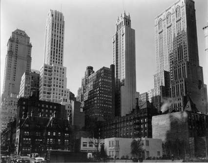
Van Alen's National Houses designs did not fare so well. In 1936, his 2-story steel prefab design, called "The House of the Modern Age," was erected for three months on a vacant lot at 39th & Park. It's the little white box in Berenice Abbott's photograph:

abbott_van_alen_mcny172.jpg

The house at 107th & Riverside was an exhibition house, too. And it was obviously torn down, because if it still existed, I'd be living in it. I can't find any other mentions of Van Alen's prefab structures being built, much less surviving.

That is so Epic.

spiral_jetty_ipa.jpg

From Epic Brewing Company, Salt Lake City, Utah.

Spiral Jetty IPA | Epic Brewing Company [epicbrewing.com via the freshly relocated tyler green]

Related? The Shoppes at Rozel Point, from Visiting Artist (sic), a lecture involving Smithson which I gave at the University of Utah:

shoppes_at_rozel_point1.jpg

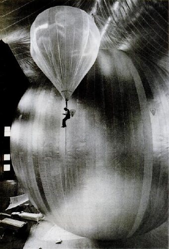
A digitized collection of vintage NASA Goddard Space Flight Center newsletters led me to the June 23, 1963 issue of LIFE Magazine. If it were possible for any photo of a Project Echo satelloon to be slightly less than awesome, this photo would move forward to be the awesomest:

echo_lakehurst_life63.jpg

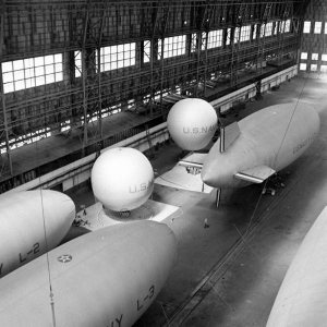
It's a technician inspecting for leaks during a test inflation of the Echo II at Lakehurst, New Jersey, which was long the Navy's site for giant inflatable vehicles. From the 1930s construction photos of the massive dirigible hangars to the parades of Navy blimps during WWII, the "Lakehurst" is a stealth candidate for awesomest single search term Google's LIFE Magazine image archive. Unfortunately, this photo is not included. I'd love to find it, though; someone deserves a credit.

Here's one of the same test, only there's no location, and it's misdated. credit: NASA. And it's public domain. Here's one of the first ever photos of an Echo satelloon; famous LIFE photojournalist Grey Villet took it while standing next to the antenna used to bounce the first radio signal off Echo I in 1960.

lakehurst_lifemag_strock.jpg

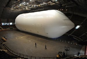
All of this is related to my master plan to show a satelloon as an art object, sure, but it's also precipitated by NASA's latest, the Bullet 580, dubbed, depressingly, "the world's largest inflatable airship," which was test inflated last weekend. At 235 feet long and 65 feet across, it practically fills the Garrett Coliseum in Montgomery, Alabama [below]

bullet-airship_1640394i.jpg

If there were a clearer sign that Our Nation has lost its way in the field of Giant Balloons And The Buildings That Hold Them, I can't think of it. A sad, sad day. [images: George Strock/LIFE; AP]

att_christo.jpg

The ad's been running for a while now, but Jean just spotted this disclaimer at the end of AT&T's "Blanket" commercial last night: "The artists Christo and Jeanne-Claude have no direct or indirect affiliation or involvement with AT&T."

I will assume they tried to contact Christo by calling him on his iPhone, but they got cut off.

AT&T Rethink Possible - Blanket Commercial [search youtube if the link is broken]
Previously: The Gates Bill

My buddy John Powers has been working on this insane project forlikeever: an artists commentary track--with pictures!--that runs alongside Star Wars IV. Tonight he's presenting it at Philoctetes, and discussing it along with Colby Chamberlain and Luke duBois, who's made a sick score.

I've seen pieces Star Wars and Modernism: an artists commentary emerge in pieces over the months, but tonight's the first time a big section of it will be screened large, and in public. I'm very jealous of all those who can make it out there tonight:

Star Wars and Modernism, an artist commentary conceived and directed by artist John Powers, explores the original 1977 science fiction film as an object. Juxtaposing video with film stills and historical archives, Powers creates a compelling argument that the visual program of the blockbuster can and should be understood in terms of the art, architecture, and politics of Cold-War America. An essay by Powers published in Triple Canopy, with important editorial contributions by Colby Chamberlain, was the genesis of the project. Composer Luke DuBois created the film's original score.
Details at Philoctetes.org

koons_52_bond_1975.jpg

I think we all know that Jeff Koons worked on Wall Street before he became an artist. It's mentioned in many of his profiles. But what, exactly, did he do? And what relevance, if any, does it really have for his work? And on the reception of his work?

Ben Davis provides a perfect example of this bio-factoid-as-analysis in his ambitiously thoughtful unpacking of the aftermath of postmodernism:

Unprecedented new wealth, a more mercurial environment of speculation, the celebration of individualism brought on by the attack on the welfare state, demoralization and fragmentation -- all these form the background for the artistic vocabulary of "postmodernism." I mean, jeez louise, Jeff Koons actually started out as a commodities trader!
In her 2005 book, Understanding Interational Art Markets and Management, Joan Jeffri wrote that "Jeff Koons gave up his job as a trader of cotton futures on Wall Street to become an artist."

But the Wall Street connection is not just used to bolster theoretical arguments, or to connect with middle-managers; it's definitional to the art itself.

Holy smokes, this is so incredible. Vincent Ocasla beat (sic) Sim City by spending three years designing and building Magnasanti, a six million person city that runs flawlessly (sic, again, obv) for 50,000 years. The YouTube video is ominously awesome.

It reminds me of Joep van Lieshout's creepy totalitarian project, Slave City. I'll find some links when I get off this blog-hostile iPad.

slave_city-sleep_module.jpg

Originally called Call Centre, Van Lieshout began designing Slave City, a theoretically self-sufficient, eco-neutral, and highly profitable city of 200,000, in 2005. Reg wrote about Slave City on the occasion of Tim Van Laere Gallery's 2006 show. If I remember correctly, Joep talked about Slave City a lot during his 2007 Tate Artists Talk.

Slave City itself is a little reminiscent of Pig City, the provocatively dystopian proposal to concentrate the Netherlands' sprawling pork industry into highrise farms, which was floated in 2000 by Joep's Rotterdam neighbors, MVRDV.

pig_city_mvrdv.jpg

This is how we end up building The Matrix, people; one cautionary-but-a-little-too-enticing concept study at a time.

interview with Ocasla: the totalitarian Buddhist who beat Sim City [viceland via @jadabumrad]

Do you find yourself wanting to talk about Group Zero, but the only names you can pronounce are Fontana and Klein [and Westwater]? Do you ever call galleries you're about to walk into, just to hear them say the artist's name? [I just asked at the desk, it's von HILE.]

You may be suffering from Gigli Syndrome, a condition where you avoid saying an artist or designer's name because you're not sure of the pronunciation. Bennifer can't cure all possible outbreaks of Gigli Syndrome, any more than Nomi Malone could inoculate us against the dangers of unknowing mispronunciation, Versace Syndrome.

After typing [well, cut-n-pasting] 0100101110101101.org yesterday morning, I realized a universal cure to either condition is impossible. Americans will never switch to Van Gohchhhh, and Thaddeus Ropatch may never give you more than 10% off, but that doesn't mean we shouldn't do all we can to treat and prevent.

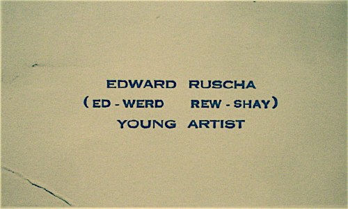
ed_werd_rew_shay.jpg

So inspired by my friend Sam, who once helped me avert disaster at Lever House [it's A-B Rosen, not Abby], and as a tribute to the young artist who once printed up business cards reading, "Ed-werd Rew-shay", here is a quick roundup of high-risk artworld names and their correct pronunciations by curators, interviewers, and even the artists themselves:

  • 0100101110101101.org: zero-one-dot-org [thx their dealer @magdasawon, pronounced sah-vawn, btw]
  • Eija-Liisa Ahtila: AY-ya-lisa AHH-tilah [youtube]
  • Richard Anuszkiewicz: AN-ehs-KAY-vitch [mike wallace via youtube]
  • Giuseppe Arcimboldo: Arch-im-BOLD-oh [washpost]
  • Kutlug Ataman: KOOT-loo ATTA-mun [tate channel]
  • Huma Bhabha: HOO-mah BAH-bah [public art fund via youtube]
  • Alighiero e Boetti: Ali-GYAIR-oh BO-etty [he was just one guy, btw. Stuck the "e" in there himself. moma]
  • Carol Bove: Bo-VAY [I called Maccarone to confirm, because I've heard people calling her Bove (rhymes with clove) to her face, and introducing her as Bove, for literally YEARS. She is too polite and well-known to deserve this any longer.]
  • Eli Broad: rhymes with road [thx @manbartlett]
  • Marcel Broodthaers: ooh, a Britdown between BROAT-haus and BROOT-ers, with a bit of long O thrown in. I vote for the latter. [mk-g.org]
  • Vija Celmins: VEE-ya Sell-muns [youtube thx @lucretiab]
  • Chinati: Chih-NAUGHT-y, not Shih-Naughty or Kih-Naughty. [member since 1994, plus I just called and listened to their answering machine.]
  • Wayne Clough: rhymes with rough and censoring stuff. [nyt]
  • Dan Colen: CO-lin [via nyt]
  • Bice Curiger: short for Beatrice, [Just imagine Che Guevara taking an interpretive dance class: "Be a tree, Che." and then leave out the "a tree," cuz you guys are tight.] Koo-REE-gare, rhymes with Care Bear [via youtube]
  • Dada: Da-DAH [Marcel Duchamp and Richard Huelsenbeck, both founders of Dada, pronounced it Da-DAH at The Modern in 1961. clocktower.org]
  • Walter De Maria: de Ma-REE-uh [youtube w/English accent, thanks judy]
  • De Stijl: de STALE, maybe Dutch it up a bit with a little h: ShTALE [youtube]
  • Marlene Dumas: Mar-LANE du-MAH [moma]
  • Rineke Dijkstra: RIN-uh-kuh DIKE-stra [moma]
  • Ekow Eshun, ex-ICA, current (2014) Fourth Plinth guy: Echo Ession rhymes with session [lisson gallery youtube]
  • Omer Fast: Homer without the H, not Omar [via @magdasawon]
  • Os Gémeos: Ose like dose, ZHEH-meh-ose [coolhunting, alt. pron.: Barry McGee]
  • Joseph Grigely: Grig-lee [via hans ulrich (han-ZOOL-rick) at moma]
  • Cai Guo-Qiang: Cy, like Twombly, Gwoh, long O, Tsee-ahng, somewhere between a Ch and a Ts [moma]
  • Francesca von Habsburg-Lothringen: Hops-burg Lote-ring-en, though I've never heard the Lothringen used/said. [youtube]
  • Thomas Houseago: House-ago, like it was two words. [public art fund via youtube]
  • Pierre Huyghe: I say Hweeg to his face, but I almost hear Peter Eleey say Whee. [thx @analogc]
  • Dakis Joannou: DOCK-iss ZHO-new [numu youtu]
  • Emilia and Ilya Kabakov: KA-buh-Koff, Ka like Kat [youtube, bonus: Andre Putman: PUT like in Putin, man, rhymes with yawn]
  • On Kawara: Own, as in rent-to-. Kawara is his family name, so it's Kawara On (河原温) in Japanese. [dude, I speak Japanese. 25 years.]
  • Paul Klee: Clay [thx paddy]
  • Guillermo Kuitca: GYAIR-mo hard G, KWEET-kuh in Minneapolis and Buffalo, anyway. In London, they say KWIT-kah [youtube; publicbroadcasting.net]
  • Yayoi Kusama: Yah-yoy Koo-saw-mah. Again, Kusama is her family name, so Kusama Yayoi (草間彌生). [me]
  • Wifredo Lam: THERE IS NO L, PEOPLE, NO L!! LOOK CLOSELY. Anyway, it's pronounced like Wilfredo WITHOUT THE L. [Italian on vimeo, thanks @aljavieera]
  • Laocoön: Lay-UH-kuh-wahn, rhymes with go on. [britishmuseum.org]
  • Aristide Maillol: My-yole [moma]
  • Iñigo Manglano-Ovalle: In-EE-go Mawn-glawn-o O-VA-yay [though the guy at SAIC also says peda-GO-gee, so...]
  • Julie Mehretu: MARE-Eh-too [metmuseum]
  • Modigliani: Mo-DEE-lee-Ah-nee [metmuseum via youtube]
  • Laszlo Moholy-Nagy: LAZ-low rhymes with Hasbro, Moley as in holy, Nazh, like gnaws, with a zh on the end [german youtube, but you get the idea. update: But the artist and his family also accept the Americanized "nadgie" new idiom]
  • Vik Muniz: Moo-NEES [5min]
  • Edvard Munch: Moonk [thx paddy]
  • Albert Oehlen: Uhrlen, classic umlaut O [moma]
  • Maja Oeri, of the Schaulager: Ury, like Early without the "L"; Show- like shower and lager like beer. moma]
  • Meret Oppenheim: Merit [moma]
  • Francis Picabia: Pih-CAW-bee-uh [moma]
  • Otto Piene: PEEN-uh [german youtube]
  • Fondazione Sandretto Re Rebaudengo: Ray-Ray-bo-DANG-go, a little like Bojangles [italian youtube]
  • Gerhard Richter: For Americans, it's like the scale. For the Teutonically inclined, go ahead and let'er rip, GAIR-haht REESH-tah [gerhard-richter.com]
  • Gerrit Rietveld: two R's, one T, people. REET like street, feld, like fell down the stairs. [dutch youtube, thanks craig]
  • Dieter Roth: Rote [german youtube]
  • Edward Ruscha: "(Ed-werd Rew-shay)" [walkerart.org and colette.fr thx @valeriemargolis]
  • Anri Sala: ON-ree SAHL-LAH [google video]
  • Yinka Shonibare: YEEN-kuh SHOW-nih-Bar-eh [tate channel]
  • Alec Soth: rhymes with both [youtube, thx @jenbee]
  • Sperone: Spare-ownee [just call, you'll see]
  • Thomas Struth: [SHTRoot, he has never corrected me, but that's how he says it at the Met]
  • Alina Szapocznikow: Ah-LEE-nuh Shah-POTCH-nick-off [UPDATE: this moma audio has it as POTS, but thanks to Rachel Wetzler, we learn that the 'cz' combo in Polish is pronounced "CH", like chalk. cf. a Polish curator's youtube video. To practice hearing the difference, please listen to this 4-hour symposium at MoMA. Thanks Rachel and thanks Andrew for the suggestion]
  • Thyssen-Bornemisza: Tissen BORN-uh-Meesa [youtube]
  • Rirkrit Tiravanija: Hans Ulrich says Tier-uh-vah-NEE-juh, and Rikrit says TEER-uh-van-EET. So maybe there's a reason people just say Rick-rit. hans ulrich at moma; studiobanana.tv]
  • Günther Uecker: GOON-ter OO-ker, like a clipped booker [german youtube]
  • Ulay: OO-Lie, as in, "Ooh, lie down naked with this skeleton on top of you for eight hours." [that's how Marina prounces it, anyway]
  • Joep van Lieshout: Yoop fawn LEASE-howt, [dutch tv, whoops, I've said van lees-hote to his face, too]
  • Danh Vo: Yahn, it's a "Vietnamese soft 'd'. [ex. Talking at Walker Art Ctr, via youtube]
  • Apichatpong Weerasethakul: A like apple pih-CHAT like room pong WEIR like weird -uh-suh-THA like Thatcher cull like a herd [cannes 2010 press conf]
  • Susan Weil: Vay, "like Simone Weil" [Rauschenberg Fndn oral history, page 1]
  • Ai Weiwei (艾未未): Eye way way, family name is Ai [paleycenter.org]
  • Rachel Whiteread: reed, not red [moma]
  • Witte de With: VITT-uh de VIT [dutch youtube]
  • David Wojnarowicz "(pronounced voy-nah-ROH-vitch)" [PPOW, his dealer since 1988]
  • Lisa Yuskavage: Yuh-SKA-vedge, sounds like savage [youtube, thanks john]

Some build on each other; once you know Bas Jan Ader [Boss Yan Adder], you can do Jan Dibbetts, Jan Schoonhoven [Skoon-ho-ven], Christian Jankowski [Yan-KOFF-ski], and so on. If your favorites aren't on the list, please feel free to send them along.

May 17, 2010

Chip Of Fools

Washington Post art critic Blake Gopnik commenting on the tiny chip of porcelain Eva and Franco Mattes, the formerly anonymous artists behind 0100101110101101.org, reportedly took from one of Marcel Duchamp's urinal sculptures:

In the case of Duchamp's "Fountain," could it be that the Italians are actively helping his art do its work? The Duchamp urinals we now see in our museums are visibly handcrafted replacements for his mass-produced industrial original, which disappeared early on. By pawning off a piece of handicraft, made by a hired artisan, onto his collectors, I think Duchamp was poking fun at any fool who insisted on getting an "original" Duchamp, instead of heading to their neighborhood plumbing supplier. The chip of porcelain in "Stolen Pieces" is an extension of Duchamp's chipping away at precious art and its status as collectible commodity.
Ah, um, no.

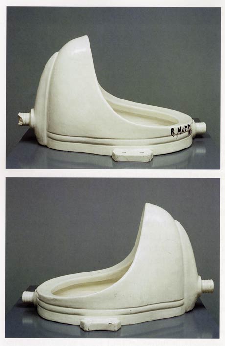
Actually, as has been reported recently by no less august a source than The Economist, Duchamp's Fountains replicas include two or three actual, vintage urinals Duchamp signed, showed, or sold; and somewhat more than twelve which were cast, just as porcelain is, from a clay sculpture [aka "the prototype"] made from Arthur Stieglitz's photo of the "original."

duchamp_prototype.jpg

16 are included in Duchamp's catalogue raisonnee, including the lost original and a presently lost 1953 reproduction, but not including the prototype or the additional casts Duchamp's dealer Arturo Schwarz apparently made and has been shopping around privately.

Now to Gopnik's fools. Here is a list, as compiled by Cabinet Magazine in 2007, of traffickers and current owners of Fountain:


  • The Philadelphia Museum of Art

  • Moderna Museet, Stockholm

  • San Francisco Museum of Modern Art

  • Tate Modern, London

  • National Gallery of Canada, Ottawa

  • The National Museum of Modern Art, Kyoto

  • Dina Vierny Foundation-- Maillol Museum, Paris

  • Indiana University Art Museum, Bloomington

  • National Museum of Modern Art, Pompidou Center, Paris [which has been both pissed in and attacked with a hammer since the Matteses' own assault]

  • The Israel Museum, Jerusalem

  • National Gallery of Modern Art, Rome

  • Duchamp dealer and MoMA trustee Sidney Janis

  • Duchamp dealer and edition publisher Arturo Schwarz

  • Larry Gagosian, who sold one to its present owner


Three are in private collections, not including Schwarz's extras. The prototype was sold to Andy Warhol in 1973. Dakis Joannou purchased it at Sotheby's auction of Warhol's estate in 1988. In case you couldn't tell, that's the prototype up there, glazed and signed just like the rest of them.

Which ones of these does Gopnik consider fools and the butt of Duchamp's joke? The Moderna Museet, whose Fountain was donated at Duchamp's request? Or the Philadelphia Museum which, thanks to the Arensbergs, indefatigable Duchamp collectors and supporters for decades, now houses the largest collection of the artist's work in the world, and which was secretly chosen by him as the posthumous recipient of his elaborate, last work, Étant donnés? All the rest? Or just all of them?

update:At AFC, Paddy has a great 1961 quote from Duchamp about his object selection criteria. Me, I unfortunately started my period commentary search in the 1973 Duchamp retrospective catalogue by Anne d'Harnoncourt and Kynaston McShine. But so far, it's really thin. So much effort appears to be devoted to his surrealism and his traditional works: drawings, etc., that really strike me as uncompelling. Funny what a couple of generations of soaking in interpreted Duchampisms will do to a discourse.

Anyway, my point, I hope it's clear, was not just to harsh on Gopnik, but to correct what I believe to be an inapt an unsupported claim that Duchamp considered buyers of readymades (et al) "fools" or that they didn't know what an "original" meant in the artist's context. Just consider how many boites en valise he published. I'm happy to be set straight, but I believe that Gopnik doesn't have a clue that he's basically implying that Duchamp's entire object-based oeuvre is a prank--which the leading museums of the world have apparently fallen for for fifty+ years.

December 1942, the US is at war, and everyone is tinkering in his basement, doing his part to protect the civilian and industrial landscape against the latest technological threat: aerial photo reconnaissance. From a lengthy, fascinating article in Popular Mechanics:

But today civilians around the world, particularly in the United States where the home workshop abounds, are beginning to do what nature forgot: fooling the spy in the sky with camouflage. A recent estimate indicates that more than 5,000 civilians have taken up camouflage research as a serious occupation.
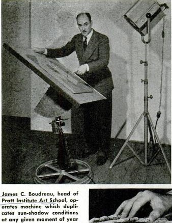
That number did not include the teams of artists and theater designers and architects at various museums, or much of the art and design departments at Pratt, where dean James Boudreau could be seen demonstrating Pratt's "sun machine," which "duplicates sun-shadow conditions at any given moment of the year":

pratt_sun_machine_popmech42.jpg

"Since military camouflage is well in hand," Pop Mech said reassuringly, and while "the government has not yet completely coordinated local civilian camouflage efforts," the field is "wide open to patriotic and inquisitive minds."

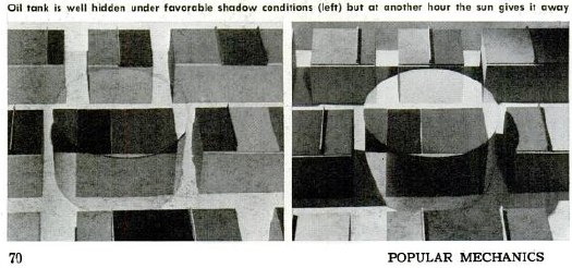
popmech_camo_1942.jpg

There followed a primer on basic camo strategies--including Dazzle painting--shadow and lighting, and photo mapping, all illustrated with photos of people photographing painted and sculpted models as if from the air.

Though they were namechecked, the groundbreaking, eerily prescient work of New York's Civilian Camouflage Council [!] went unremarked.

Founded by Long Island architect Greville Rickard, the CCC had, with Pratt's Boudreau, organized an exhibit of industrial camouflage designs at the Advertising Club, which opened December 8, 1941. In Dec. 14 review of the show titled, "Art In A Practical Service To War," the NY Times' Edward Alden Jewell said,

This is a show that every one should see. It illustrates vitally important defense methods as applied to needs that are immediate all over this country. A fortnight ago such needs might have been looked upon by the public as remote and more or less theoretical. Such is the terrible swiftness with which events have moved, they must now be recognized as of prime consequence.
Jewell then went on to discuss shifts in camouflage as they related to art history:
The progress of the art of camouflage in, say, the last three decades seems not altogether unrelated to certain "key" phases in the development of painting and sculpture. As I understand it, principles oof Impressionism and even of Cubism were examined and to some extent adapted to the uses of the camoufleur during the last World War. But in contradistinction to this trend, teh present trend parallels what in art parlance we designate as Naturalism. It may be said that in the year 1941 camouflage, whether industrial or strictly military, goes with marked singleness of purpose "back to nature."
The show also included contributions from Stanley McCandless, then at Yale, who is known as the father of modern stage lighting.

In August 1942, the CCC-sponsored Pratt exhibit had been combined with military material and restaged at The Museum of Modern Art. Organized by The Modern's Carlo Dyer, "Camouflage in Civilian Defense" was one of at least eight war-themed shows The Modern organized and sent on tour in 1942. Doing its part to beat back isolationism!

Fooling the Spy in the Sky, Pop Mech Dec. 1942 [via google books]

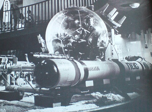
Makakai acrylic pressure hull submersible

I saw a citation in a footnote somewhere, but in the three weeks it took for the Design Review: Industrial Design 23rd Annual, 1977, to arrive, I'd completely forgotten why I'd ordered it.

No matter, this insane image of a Makakai deepwater transparent hull submersible (THS) is worth the $2+shipping.

There's a lot less info online that I'd expect for such an awesome-looking rig, but according to Globalsecurity.org, it was developed at the Naval Undersea Research And Development Center [NURAD?] in San Diego:

Two standard spherical hull designs were available; (a) 66 inch outside diameter and 2.5 inch thickness for 600 ft. operational depth and (b) 66 inch outside diameter and 4.0 inch thickness for 1000 ft. depth. The hulls were fabricated by adhesive bonding of 12 thermoformed spherical pentagons, two of which incorporate metallic hatches.
I've just added it to my military industrial geodesic sphere government surplus save search list on eBay. Competing bidders, be warned.

Deep Submersible Rescue Vehicle [globalsecurity.org]

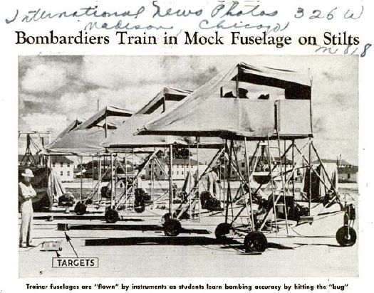
mock_fuselage_popmech_dec42.jpg

First up, let me just say these are fantastic; I would love to see this row of bombardier training simulators parked in any gallery in the world, right next to Chris Burden's homemade B-Car.

But then you'd have to ask The Question: a full year after Pearl Harbor, and this is really as far as we'd gotten? If all you had to go by was the pages of Popular Mechanics, you'd have to conclude the US's entire wartime response consisted of scale models, plywood mockups, and canvas bombers on rolling stilts.

Bombardiers Train in Mock Fuselage On Stilts, Popular Mechanics, December 1942 [popmech via google books]

Apex Art just announced that Courtenay Finn and Gary Fogelson were selected for this year's open curating slots. Finn's proposal uses a work by Bruce Nauman as a jumping off point for a show about "the role of reading in artistic practice." Fogelson's will tell the incredible-sounding history of alternative, arts, and experimental filmmaking shown in the 1970s on Boston's WBBI TV. Congratulations to both of them, and get cracking, time's a wastin'!

I'd had an idea for a show percolating for a while, so I submitted it. As I re-read it now, it's fascinating how much of it is stuff I've blogged about over the last couple of years. In a real sense, the blogging process was central to the development and coalescence of the show's ideas, if not for the actual proposal, which I wrote up and submitted anonymously, as Apex Art requires.

It tied for 45th place out of 320 entries. 86th percentile, which is alright, I guess, in a B-show kind of way.

Anyway, it was inspired, as the title suggests, by Enzo Mari. It challenges the common conception of aura by applying Mari's autoprogettazione reproduction strategy to instructions-based art practice.

And because it also includes references to the great gatherer of Unrealized Projects, Hans Ulrich Obrist, I thought I'd go ahead and share my proposal here. If you're one of the 40 international, anonymous judges who rated it less than 4/5, I do hope you'll drop me a line and tell me what might have improved it for you.

Many thanks to those folks who gave me feedback and art historical suggestions on the idea as I was putting it together, too. I don't want to sound namedroppy--until we polish this bad boy up and put on this jargon-laden, Stingelpainting party somewhere else, then I'll be thanking you often and loudly, I'm sure.

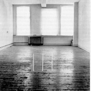
apex_dibbets.jpg

Proposta per un'auraprogettazione

A project for making easy-to-assemble furniture using rough boards and nails. An elementary technique to teach anyone to look at present production with a critical eye. (Anyone, apart from factories and traders, can use these designs to make them by themselves. The author hopes the idea will last into the future and asks those who build the furniture, and in particular, variations of it, to send photos to his studio...) - Enzo Mari, Proposta per un'autoprogettazione, Duchamp Center, Bologna, April 1974
Walter Benjamin's concept of aura is commonly understood as a quality that distinguishes an original art object from its mechanical reproduction. Recent alternative readings [Samuel Weber, 1996], particularly of cinema--Benjamin's archetypal medium of modernity--consider aura as something not lost in (re)production, but instead contingent upon it. Aura is generated through contextualized reception via dispersed, multiple 'originals,' as literary or musical aura is transmitted via books and scores.

When coupled with Benjamin's functional reconfiguration of the distinction between author and reader ["through a highly specialized work process...the reader gains access to authorship"], production of an auratic artwork at a [spatial/temporal] remove from the artist herself becomes feasible. The instruction performs such a distancing function.

From Moholy-Nagy through Lewitt, artists have used instructions and plans to challenge the privileging of gesture and authorship. The emergence of Conceptual art saw the concurrent normalization of instruction-based practice and the "dematerialization of the art object" [Lucy Lippard, 1973].

apex_stingel.jpg

Lippard's own seminal exhibition 557,087 (Seattle, 1969) was executed remotely using artists' instructions, which comprised the show's catalogue. Similarly, Do It (1993-) an ongoing exhibition/archive by Hans-Ulrich Obrist, solicits, executes and disseminates instructions from contemporary artists. ["With Do It in hand, you will be able to make a work of (someone else's) art yourself."]

Despite their critique of object/market complicity, instructions are regularly sublimated by capitalist constructs [i.e., editioning, certificates of authenticity] that reassert control and facilitate commodification.

Authorization thus emerges as a crucial and highly contested point of inflection/exchange for instruction-based work. Only five of 168+ instructions in Do It generate objects. One, a Felix Gonzalez-Torres candy pour (1994), was problematized when the artist's catalogue raisonné [Cantje, 1997] reclassified it as "non-work" and reconfigured fabrication authority only for Do It's curators, not its audience.

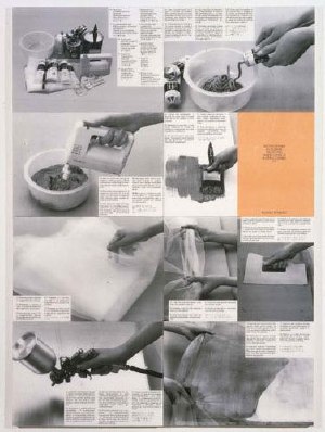
apex_mari.jpg

A more conceptually robust corollary is art that applies a model exemplified by the Italian designer Enzo Mari, whose 1974 exhibition/catalogue, Proposta per un'autoprogettazione, (Proposal for a self-project) included not just blueprints for making 16 pieces of furniture, but explicit authorization to do so.

Mari's autoprogettazione structure synthesizes Benjamin's potential for multiple, auratic originals with the critical empowerment of readers-qua-authors, consumers-qua-producers, viewers-qua-artists.

apex_zittel.jpg

Auraprogettazione will be the first ever survey of this distinctive, exceptional genre: auratic objects, fabricated by whomever, in accordance with artists' published instructions and authorization. Preliminary research has identified consonant works--painting, sculpture, photography, assemblage, clothing--by at least eleven artists: Daniel Buren, Jan Dibbets, Stephen Kaltenbach, Lia Maisonnave/Ciclo de Arte Experimental, Yoko Ono, Tobias Rehberger, Rudolf Stingel, Joep van Lieshout, Franz West, Zhuang Da, and Andrea Zittel.

Alongside the 'originals' exhibition, the gallery may be activated as a site of open, facilitated art production, or as an aggregator/repository of audience-made originals. Additional artists may be solicited to create new, permissioned, instruction-based work. And as with Mari's original, Auraprogettazione's publications in print and online will propagate instructions for the exhibited works.


May 12, 2010

Beckstrand Lodge, 1950

I saw the mention while searching for something else, shocked that I'd never heard of it:

"Beckstrand Lodge, UT, 1950"

A quick search, and there's no information, no photos, no documentation, no nothing.
Some fruitless Google Map surveying, then some offline inquiries, and sure enough, whatever piece of land was called 60 years ago, it's not called that anymore on any official records.

So I called a couple of people whose jobs--really, I'd think it's their job to know this kind of thing. One charged me $10 to tell me what I already knew [see above]. The other thought it was an April Fool's Day joke. So I began researching myself.

Dr Grant Beckstrand, noted oncologist, and his wife Mildred had a house in Palos Verdes, built in 1940, but it turns out he'd been born in Utah. And you know how it goes: you can take the boy out of Utah... So they built a little place to use for hunting.

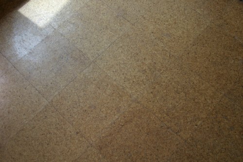
The current owner remembers it being built, though. Said that back then, no one in the county had money to build anything at all, much less a vacation home, complete with imported Italian cork tiles:

beckstrand_cork_floor.jpg

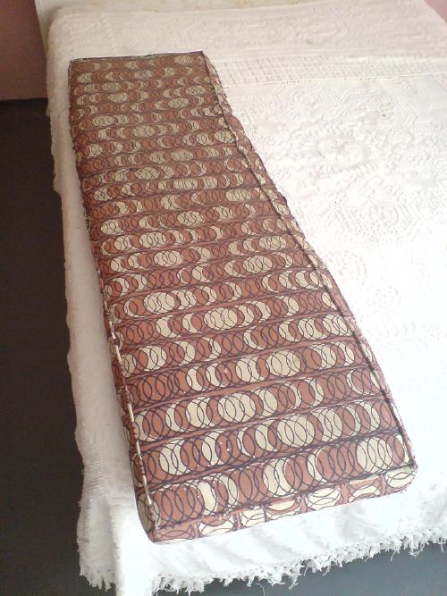
The Beckstrands passed away without any kids. They set up the Beckstrand Cancer Foundation with their money. The lodge changed hands a couple of times, but it's settled down, pretty much as it was, same as the Beckstrands left it, right down to the cushions:

beckstrand_cushion.jpg

And curtains:

beckstrand_sofa_ed.jpg

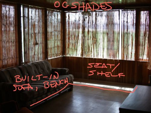
An elderly man from a nearby [sic] town, run out of money, moved in for a couple of years. Helped keep the place up, but had a hard time with the built-in sofa in the living room, so he took that out. Same with the counter by the front door:

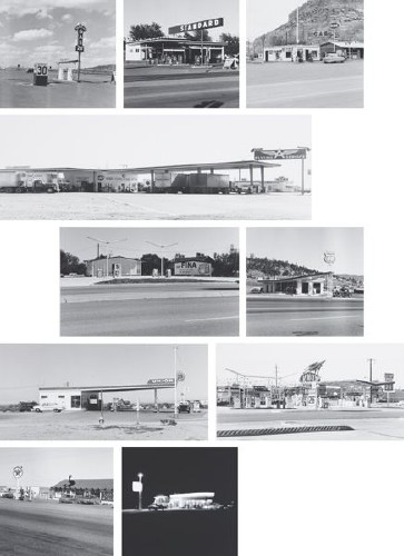
ruscha_gasstation_grid.jpg
10 works from Twentysix Gasoline Stations, 1962/1989, each 50x58cm, edition of 25

I am a huge Ed Ruscha fan, have been for a long time. His artist books of typological photographs were some of the first works of art I bought out of college [fortunately, since they're all 10-20x more expensive now].

But I confess, though I find them entirely appealing, I've never really been completely comfortable with the sets of 1960s photos Ruscha republished in large-scale, large-ish editions, beginning in the late 1980s and 1990s.

They're important images, but they seem so inextricably linked to the books to me. And books are hard to show, and not as sexy to collect. So yeah, it's totally fine, of course, but these have always seemed a little bit too much like eye candy and cashing in.

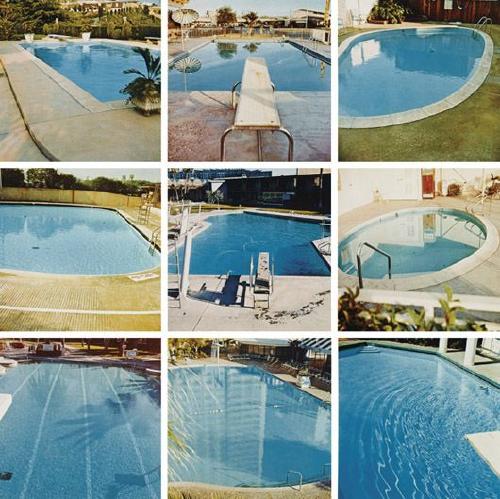
ruscha_pool_grid.jpg
Pools, 1968/1997, each 40x40cm, edition of 30 plus 10 artist proofs.

So it's not at all surprising to me that these two particular sets were in Halsey Minor's collection, and will be auctioned off this week.

But even though they're dated 1962/1989, Phillips de Pury's exhibition history for the [to me problematically named] set up top, 10 works from Twentysix Gasoline Stations, says they were shown in 1982, at the big Ruscha mid-career show at SFMOMA [but oddly doesn't mention the follow-on venues, the Whitney and LACMA. Or maybe it's not so odd; Phillips' catalogues have always been a little spotty, with just as much verbiage and annotation is necessary to move the merch, not further the scholarship.]

Which I didn't see, obviously, but maybe I'd be a little less skeptical towards these works if Ruscha has had a history of showing them in larger, exhibition-size formats? If anyone knows where Ruscha talks about these republished photos, or where they're discussed at all, I'd love to hear about it.

It has been fun reading The New Art (1966), one of critic Gregory Battcock's contemporary anthologies of critical art writing. Also sobering, how dated and/or blinkered many assumptions these pre-eminent minds operated under turned out to be. Not the least of which is the illustrious role of the critic himself, and I do mean him. Here are some choice quits from Battcock's own introduction, which are not unrepresentative of the attitudes of many of the contributors:

Art is humanism and reality, and as such cannot be seen accurately in terms of the past. At this point, responsible criticism becomes absolutely essential. The critic has, as it were, to paint the painting anew and make it more acceptable, less of a threat than it often is. It is scarcely an exaggeration to say that the art of our time could not exist without the efforts of the critic. It is, however, to be remembered that words are ores and art is art; in presenting art, the critic cannot resate or reproduce it. All he can do is assume some of the concern for clarification in his effort to leave himself free to experiment as obscurely as he likes, unhampered by any need to compromise his integrity for the sake of public approval.

Objections to this state of affairs can logically be only of degree and not kind, since an art of total clarity wouldn't be art, and would need no criticism at all...modern Art is a discipline, not a World's Fair all three members of its essential triad-- artist, critic, and viewer--obtain only such rewards as they are prepared to work for or for which they have the love to spare.

love that. Sounds pretty tough. Here's another part about one of those marginal figures left out of the essential triad:
another characteristic aspect of the new criticism is revealed in the way it's practitioners tend to review group or retrospective exhibitions almost solely in terms of the selectivity displayed by the person responsible for the show, while oaring little or no attention to the merit of the individual artworks or artists included. This peculiarity is very much a part of the new way of looking at art; the position of the curator or director is regarded as equivalent to that of the artists whose work he selects, since he is the creator of the exhibition, if not of the individual works within it. The critic's own right to creativity comes through his relationship with the artist whom he alone fully understands, appreciates, and can interpret to others.
good times, good stuff.

May 8, 2010

What's Happening?

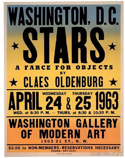
oldenberg_stars_poster.jpg

This explains the "two or three Happenings" discrepancies; there was a matinee Happening on Thursday.

Also: "Globe Poster - Baltimore."

I've had this on my desktop so long, I've forgotten where I ganked it. Oh, that's right, Oldenburg's print poster & ephemera catalogue raisonne, ">Printed Stuff.

Previously: What's Happening? Claes Oldenburg's Stars via Time and Alice Denney
What's Happening? Tracking Stars, Claes Oldenburg's 1963 Washington DC Happening

neutra_cyclorama_wide.jpg

The Park Service's stated goal for Gettysburg is the "rehabilitation" of the battlefield to its 1863 condition by removing modern structures like Richard Neutra's Cyclorama Center [designed, it should have been noted a long time ago, with Robert Alexander] and the visitors center next to it [already gone] which are built on "hallowed ground." Which is not quite so simple.

In Gettysburg: memory, market and an American shrine, his 2003 history of the ongoing cultural battle over the site and its meaning, Jim Weeks looked at the controversy over the Park Service plan to create a big, new privately operated visitor center/museum offsite. This wasn't "Disneyfication," it was, in the words of John Latscher, the Gettysburg superintendent who spearheaded the deal, "re-sanctifying" the battlefield. [emphasis added on the tiny but powerful rhetorical device that automatically transforms anyone who disagrees into John Wilkes Booth.]

The rehabilitation/re-sanctification plan to remove post-1863 structures does have some loopholes: anything in the middle of the battlefield but on private land across the street, as long as it serves popcorn chicken and/or deliciously dark chocolate pies for a limited time only; the 1392 or 1600 markers and monuments placed by "the veterans themselves," or whomever; and the three remaining observation towers the War Department built.
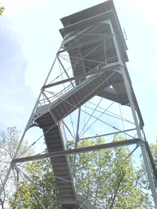
gettysburg_war_dept_twr.jpg

Let me go on record that, should it ever be threatened with demolition, I will email every architect and journalist I know to save the observation tower on West Confederate Avenue; that thing is a freaking masterpiece. Let's get that out there right now, because I don't find much information or discussion about it at all. [Here's another of the three, dated 1895, the year the War Dept took charge of the Memorial Park, which is super-short. It looks like there were structural problems, and it was chopped in 1960. Note that it wasn't torn down completely; I think I'll come back to that in a minute.]
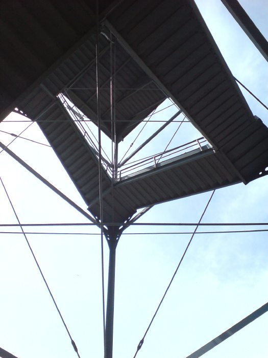
gettysburg_obstower_det.jpg

What do you get for your steep, 6-7 story climb up the steel cage? A great view, of course. But also understanding. Context. Orientation. It's the place where people tell stories of troop movements and battle strategies. There is much pointing. All across a vast landscape like this, we saw people orienting themselves, spotting landmarks, and telling stories. They were mapping the action and the meaning, translating history onto the site in front of them.

Weeks' book notes that observation points have been a popular and vital feature of visitors' experience at Gettysburg from very early on. Some are natural spots, like the promontories of Little Round Top and the Copse of Trees at Cemetery Ridge. Some were built, like Round Top Park, the War Dept. towers [there used to be five], the Pennsylvania State Monument--and the Cyclorama Center. The biggest observation tower, built on private land, was seized and destroyed in 2000 after an intermittent, 26-year legal battle. Weeks draws the connection between the dioramas and orientation maps, the cycloramas--almost all of which had their origins in commercial/entertainment enterprises--and the site itself; arguably, facilitating this mental transition from representation to site was the major justification for placing the Cyclorama so close to its focal point, the top of Cemetery Ridge, in the first place.

One common feature of these observation points is the orienting device: arrows pointing toward key sites or events. Here is the welded steel plate on the War Dept tower:

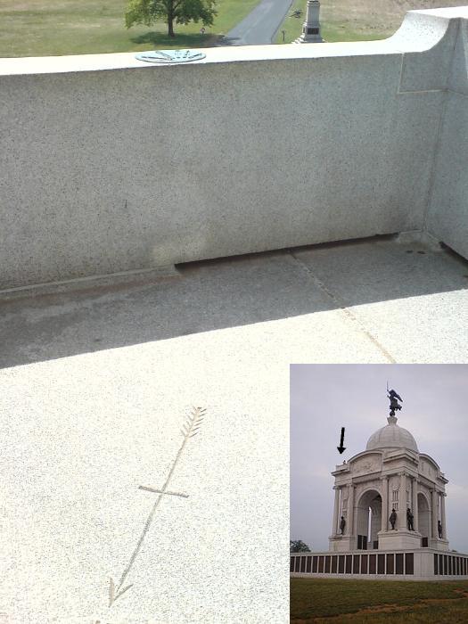
gettysburg_obstwr_orient.jpg

gettysburg_pa_arrows1.jpg

Which was the third one I noticed, after [1] the compass mark handcarved into the granite floor and [2] the incredible cast bronze plaques on the parapets of the Pennsylvania State Monument. [Which, by the way, is a gigantic Beaux Art mess, a Columbia Exposition knockoff whose looming, continued presence exposes the whole idea of re-creating the 1863 battlefield to be little more than conceptual cover fire to advance a subjective set of pre-determined alteration strategies.]
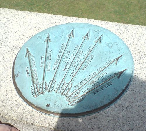
gettysburg_pa_arrows_cu.jpg

These arrows, on these structures, point, I believe, to a possible future for Neutra's Cyclorama: restore and reconfigure it as an observation and orientation platform for Cemetery Ridge. Neutra already included an observation platform and ramp [see house industries' photo below]; adapting the empty rotunda for observation would hew close to the building's original function on its original site, while minimizing the loss of Neutra's and Alexander's key design elements.

cyclorama_houseind.jpg

Then there's precedent: the Park Service's stated strategy of 1863 rehabilitation nevertheless preserves several post-1863 observation structures, including the unassailable Pennsylvania Monument and three of the five towers apparently installed by the War Department at the founding of the Memorial Park. One is apparently historical and/or functional enough to preserve even after being truncated to just one story up--roughly the same height as the Cyclorama's existing deck.
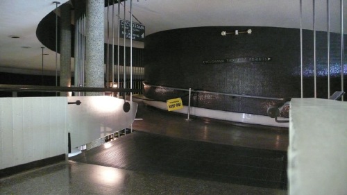
neutra_cyclorama_houseind_2.jpg

A Cyclorama Observation Platform would also offer something completely unique: accessibility. All other observation spots we saw involved stairs, curbs, or uneven wooded trails. [The Pennsylvania Monument's vantage point is reached by a single, awesomely treacherous spiral staircase lined with stamped bronze paneling that'd do a SoHo loft ceiling proud.] Much of the battlefield itself--and thus the monuments scattered across it--quickly becomes inaccessible to disabled or wheelchair-using visitors.

An entirely ramp-based observation structure would enhance the battlefield experience for millions of visitors who would otherwise be confined to their cars. [Oh, look! Neutra's already got two ramps built right in! image above: houseindustries.com]
cubework_neutra_cyclorama.jpg

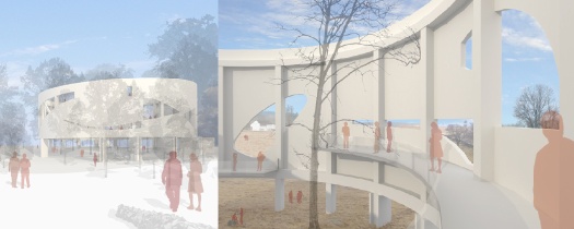
In fact, a speculative observation platform proposal has already been floated. The Boston-based architecture firm CUBE design + research used Neutra's Cyclorama Center to illustrate a range of alternatives to strict historical preservation. One idea [above]: turning the Cyclorama as "informant" and "information hub," by making strategic, view-framing cuts in the rotunda. It's a pretty radical alteration, the kind of thing that keeps traditional preservationists up at night. And as proposed/rendered, I think many of Cube's solutions go way too far. But they're spurring discussion, not answering an RFP, and in that, they succeed.

Piercing Neutra's rotunda in places might still work, perhaps in combination with another of CUBE's suggestions, to place the Park Service's historic electric relief map in the building. Or perhaps a large-scale relief map could be made for blind visitors to gauge the scale and detail of the terrain. In either case, a multi-sensory narrative program could be devised that integrates such artifacts with views out of the building onto the actual battlefield. [Something like the light and sound effects on the new Cyclorama installation, which seem to be state-of-whatever-art-these-sorts-of-things-are.]
olafur_hirshhorn_ext.jpg

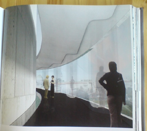
Another possibility just came to me this morning: the 2006 proposal Olafur Eliasson made for the Hirshhorn Museum, a similarly love-to-hate, modernist concrete barrel on a major civic site. Eliasson proposed wrapping Gordon Bunshaft's building with a suspended glass walkway that afforded sprawling views of the National Mall, something akin to the exterior escalator tubes at the Pompidou. [images: from the bookshelf-straining insanity that is Taschen's Studio Olafur Eliasson: An Encyclopedia.]
olafur_hirshhorn_int.jpg

Maybe an information-filled ramp could spiral up the inside of Neutra's rotunda--a history of the wounded, perhaps, and their heroism and their tales of endurance and remembrance--and then let visitors out to wind their way down the outside, where they could then descend along the original ramp onto the battlefield itself. At least as far as their wheelchairs can take them.

The Park Service and Gettysburg Foundation claim the current battlefield rehabilitation plan provides great "environmental benefits," even as the courts find they have failed to undertake the basic impact studies required by law.

Worse than this, though, is the active, and ongoing denial of the equality of us all--by denying equal access to key parts of the battlefield experience, such as observation platforms--on the very battleground of freedom made sacred by the sacrifices of life. And limb.

Next: Observations from/on Towers and The Wound Dresser, set in stone, rest stops on the journey Toward a Cyclorama-shaped Gettysburg Memorial to The Wounded
cyclorama_houseind.jpg

So a quick recap: the National Park Service is determined to demolish the Richard Neutra's Cyclorama Center, built at the Gettysburg National Military Park in 1961. It was designed to house Paul Philippoteaux's massive panoramic painting, made in 1884, depicting Pickett's Charge, and it was sited on Cemetery Ridge, the central target of the assault and the focal point of the cyclorama. [above, a House Industries view from the narrow observation deck and ramp to the battlefield back toward the rotunda, which is largely hidden by trees.] The Cyclorama Center and a nearby Visitors Center were built as part of the Park Service's Mission 66 program, a 10-year strategic plan to upgrade visitor and interpretive facilities and to make historic sites more car-friendly.

But that mission, and the many modernist-style buildings and structures it spawned, are viewed with disdain by the current Park Service; just as mid-century architecture is becoming eligible for historical preservation status, and as scholarship and critical appreciation is picking up, Mission 66 buildings are under threat of destruction or major alteration in line with current tastes and trends in exhibition and interpretive practice.

As it turns out, the battlefields of Gettysburg have been the site of many strategies of remembrance, commemoration, and visitor/tourist experience. More than 1,600 structures, buildings, sculptures, markers, and memorials have been erected on the site over the last 147 years, not including the railroad station, dance hall, casino, brothel, or souvenir photo studio which were on-site for the massive 50th anniversary/veterans reunion in 1913. Which means that whether officials choose to acknowledge it or not, there is a constant debate at the site about significance, appropriateness, meaning, experience, memory, and history, and that bears directly on the fate and future of the Cyclorama Center.

When I asked about the Cyclorama Center at the information desk in the sprawling, new, historicist, farm building-looking visitor center last weekend, my question was met with brusque disinterest. "It's just a round building, nothing significant about it," said the Friends of Gettysburg volunteer.

The Friends of Gettysburg merged with the Gettysburg Foundation in 2007. For almost two decades, the Gettysburg Foundation had helped the Park Service develop and realize the Gettysburg Battlefield Rehabilitation Project, the stated goal of which is to "rehabilitate the land to as close as possible to its 1863 appearance," in order that the site's "important physical qualities [will help] tell the story of the Battle of Gettysburg."

A great deal of a 2007-8 project summary [pdf] talks about altering the terrain--removing or planting woodlands, replanting orchards, redividing fields, repairing roads and paths--which will generate vast "environmental benefits." "The rehabilitation effort will preserve nature as it preserves history," promises the Foundation.

But the language makes a sharp shift when discussing parts of the Cemetery Ridge Project:

...in the 43.5-acre area of Cemetery Ridge, many of those features have succumbed to natural vegetative growth and other aspects of evolution. The Cemetery Ridge project was initiated to rehabilitate this highly significant land. This project involves:

  • Removal of the original Gettysburg visitor center building, which sits on the hallowed ground of Zeigler's Grove. This older structure is being replaced by a new 139,000 square foot Museum and Visitor Center, which will open in April 2008. The new center is situated on an area that saw no major battle action, about 2/3 of a mile from the former park visitor center.

  • Removal of the 1962 Cyclorama building and the parking lots and roads associated with the Cyclorama building and original visitor center building--all of which lie on soil where nearly 1,000 soldiers fell.
  • ...

  • Relocation of seven Civil War monuments to the sites where they were originally placed by veterans of the battle. These monuments were moved during the construction of the 1962 Cyclorama building and surrounding parking lots. [emphasis added]
I'm sure that the Foundation is not impugning President Eisenhower or the previous generation of Park Service officials who paved over the fallen soldiers' hallowed ground in the first place. And I'm sure that the parking lot set to remain on the site will be only on the unhallowed parts, just like the roads that traverse the Ridge now.

gettysburg_mcdonalds_m66.jpg

And I'm sure that it wasn't the Park Service's fear of antagonizing the local business community that kept them from including the eventual removal of General Pickett's Buffet, Colonel Sanders' place, and McDonald's [above, via jetsetmodern] from the hallowed ground across the street where several thousand other soldiers surely fell.

gettysburg_tower.jpgAfter all, the Park Service had no problem using eminent domain to seize and demolish the Gettysburg National Tower [left]. Built in 1974 on private land adjacent Cemetery Ridge, the controversial 307-ft tower was destroyed with great fanfare in 2000.

And then there's the to-be-resited monuments, part of the "largest collection of outdoor sculpture in the world," which were not, of course, present in 1863, but which were "originally placed by veterans of the battle." Which is, of course, the second-most-irrefutable argument after "hallowed ground where soldiers fell." [I'm sure the hundreds of additional markers placed by the War Department, and all the other non-veteran-related structures that have accreted on the site--including the incredible WWII-era, government-issue observation towers like the one along the Confederate line--will be rehabilitated away in Phase II.

Next: Some Pointers, or What To Do With Neutra's Gettysburg Cyclorama Center?

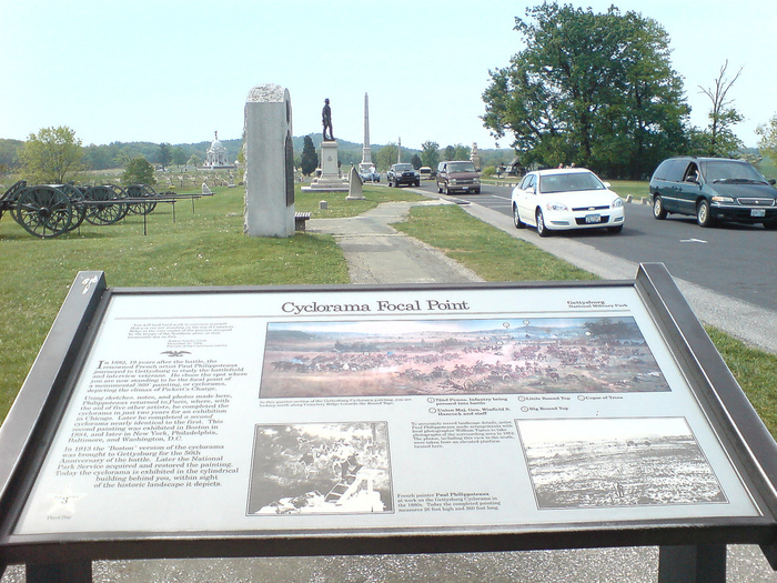
neutra_gettysburg_cyclorama_focal_point_052010.jpg

The significance of the battle at Gettysburg was seized upon almost immediately, both for the vast scale of the casualties, but also because of the strategic and symbolic importance in the North of repelling the Confederate incursion. Dealing with overwhelming death, destruction, and injury immediately overwhelmed the town, and thousands of visitors streamed in to find and help family members.

Efforts to memorialize the battle and secure the battlefield also began immediately. Lincoln's address just four months later was, after all, at the dedication of the National Solders Cemetery on a fought-over piece of land. Within weeks, historian John Bachelder began interviewing officers and attempting to pinpoint key movements and events leading up to and following the battle. And after the war, he prepared a comprehensive, if unreconciled, report of thousands of interviews and onsite surveys with survivors. Land acquisition also kicked in immediately, and a Gettysburg Battle Memorial Association was quickly formed. Because of its proximity and well-developed transportation, Gettysburg quickly became a popular tourist destination.

Memorials were placed on the battlefield to mark the sites of action engaged by individual regiments in the 1870s, but the pace picked up in the 1880s, as the 25th anniversary of the battle approached. As Wikipedia has it, survivors of the battle returned to the land to remember their individual and collective experiences, and to mark their significant events--battles, movements, victories, deaths--on the site itself:

For the Union side, virtually every regiment, battery, brigade, division, and corps has a monument, generally placed in the portion of the battlefield where that unit made the greatest contribution (as judged by the veterans themselves). Most regiments also have boundary markers placed to show their positions in defensive lines or in the starting lines for their assaults. The placements are not always definitive, due to sometimes faulty memories of the veterans or to the problems resulting from attempts to represent multiple days of battle fought on the same ground, most notably Cemetery Ridge.
When the site was transferred to the War Department, over 1,600 bronze markers were erected, based on the official history of the battle [not Bachelder's].

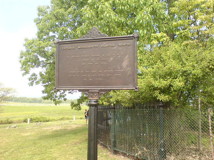
neutra_gettysburg_cyclorama_mass_marker_fence_052010.jpg

The non-profit Gettysburg Foundation calls it "The largest collection of outdoor sculpture in the world." But it's even more than that. All these structures, sculptures, and monuments fill the landscape and connote a previous generation's specific strategy of remembrance. And each, no matter how subjective, seemingly incidental, or retrospectively problematic, now bears the weight of that generation's history.

Even a fence. At some point in the past, a section [reportedly a quarter of the original size] of the Copse of Trees which was Gen. Lee's chosen focal point for the Confederate attack was rendered sacred, like a home cemetery, and fenced off from public access. The generic 19th century wrought iron fence, damaged by a fallen tree, but set for restoration, is visible behind this c.1880s War Dept. plaque for the Fifteenth Massachusetts Volunteer Infantry:

The position of this regiment in line of battle
is marked by its monument
235 yards due south.

It charged up to this point and attacked Pickett's
division in flank as his troops were coming
over the stonewall.

The battlefield sprouted other structures alongside these markers and memorials. In 1884, at the height of the Cycloramas' popularity, the railroad laid tracks across the field of Pickett's Charge to its new Round Top Park, an entertainment center on Little Round Top. A casino was added in 1913, the year the Boston Cyclorama came to Gettysburg in time for the Great Reunion, a conciliatory event that brought over 50,000 Civil War veterans together at Gettysburg. The veterans from all states re-enacted Pickett's Charge, which ended with the exchange of handshakes and speeches. [It wasn't until 1939, after the 75th anniversary, that the amusement park's structures, and the tracks themselves, were removed.]
After WWII, Pres. Eisenhower's development of the interstate highway system was coupled with the National Park Service's Mission 66, a 10-year strategic plan to increase the accessibility of its sites to cars, and to provide high-quality interpretive services for its increasing throngs of visitors. Eisenhower took particular interest in Gettysburg where, while president, he decided to purchase his first home, a farm, precisely because it was built on battlefield ground. He retired to the house in 1959; it is now a presidential memorial within the expanded Military Park.
Thus is the victory of World War II, and the postwar boom, and our modern entertainment experience culture inextricably intertwined with the memorial to the bloodiest battle of the Civil War. And now we have a brief movie lesson by Morgan Freeman, and an economy where the only jobs in town that don't involve wearing a hoop skirt are selling Civil War Orange Fudge at the Gettysburg Outlet Mall. But as the railroads and casinos and dance halls--and the Cyclorama itself--show, this spectacle- and souvenir-centered culture is not a transformation or desecration, only an upgrade in technology.

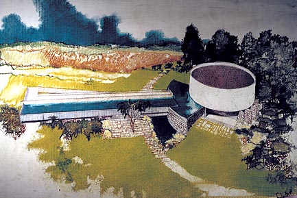
neutra_gettysburg_rendering.jpg
Cyclorama Center rendering, Richard Neutra, via mission66.com

But Mission 66 was too much of a good thing. The Park Service has long strained under its visitor volume; some structures were outgrown, others left to decay because of deferred maintenance. Many, like Neutra's Cyclorama, were built in a mid-century modernist idiom, which preservationists have been slow to preserve, and which the Park Service [currently] hates. According to Mission 66 architectural historian Christine Madrid, the Park Service considers the modernist structures "a post-war mistake." And they bridle, not only at their historical significance, but at the very notion that the Park Service is not the author and custodian of history, but just the biggest of its many actors.

Next: The Eternal Sunshine of a Spotless Battlefield

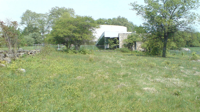
neutra_gettysburg_cyclorama_ext_1_052010.jpg

We just got back from a weekend trip to Gettysburg, PA, and I was not quite prepared to be so fascinated by it. Gettysburg the town was attacked the Confederate Army in the Civil War partly because of its symbolic value [as a Northern target], but also because so many roads converged there. It turned out several of the meandering paths I'm interested in converged there, too.

neutra_gettysburg_cyclorama_ext_2_052010.jpg

Without knowing exactly where it was, I was interested in seeing the closed Cyclorama Center, designed in 1962 by Richard Neutra. In 2008, after relocating the Cyclorama itself--one of four extraordinary 359-ft long panoramic paintings made in the 1880s by Paul Philippoteaux [three remain]--to a new Visitors Center, the National Park Service began trying to demolish Neutra's Cyclorama Building. Neutra's son Dion and other preservationists are contesting this plan in court.

Well, it turns out the Cyclorama's right on Cemetery Ridge, near the Confederate Army's key attack on the center of the Union line. Which turns out to make sense, because that site was the focal point Philippoteaux chose for the paintings. This Cyclorama was on display in Boston for many years, until it was relocated to Gettysburg the town in 1913. The Park Service bought it, restored it, and then re-sited it to the very site it depicted, in time for the 100th anniversary of the battle.

neutra_gettysburg_cyclorama_focal_point_052010.jpg

The Park Service's reasons against keeping the Cyclorama Building are partly logistical--it couldn't accommodate the current number of visitors and cars; partly technological--the state of the Cyclorama art now involves multimedia light and sound elements, as well as 3D dioramas, which were apparently present in Boston, but not in subsequent installations. But its main argument is curatorial--it's now considered inappropriate to place such interpretive structures directly on the site itself. The contemporary building thus thwarts their attempt to restore the battlefield to its pastoral, pre-1863 condition.

The first argument is undoubtedly true, but it doesn't preclude the NPS from adapting the building to some kind of other, lower-impact use. The second argument is true, too, and I'd guess that they feel they're getting the most out of their Cyclorama Experience now. Plus they now get to charge $10.50 for a ticket.

It's the third argument that turned out to be so confounding and complicated, because the battlefield is literally jammed with markers and structures, not just monuments and memorials, that have been put there by successive generations as part of the remembering and memorializing process. The Cyclorama and its building are among the most important chapters in the post-war history of Gettysburg, and the Park Service's plan to destroy the building would be highly questionable even if it hadn't been designed by one of the country's most well-known modernist architects.

Just about a month ago, a federal judge found that the Park Service had failed to study or consider the impact of demolishing Neutra's building, which they had lobbied to keep off the National Register of Historic Places.

I think I'll be breaking this up over several posts.

Next: 'The largest collection of outdoor sculpture in the world'

ian_wilson_panza_discussion.jpg

'There was a discussion January 1972'

That's it. The complete documentation of one of the conversation works by Ian Wilson in the Panza Collection, as reproduced in Art of the Fifties, Sixties and Seventies the second edition of the collection catalogue, published in 1999.

Only the caption lists the artist as Jan Wilson [ouch]. There are inventory numbers running from IW 1 [above] to IW 13, so it appears Panza and Wilson chatted quite a bit over the years. [At what point, I wonder, does being a conceptual artist working in the medium of conversation start to complicate your daily interactions with people? Are you like Midas, cursed to turn every topic you touch on into art?]

The catalogue includes Christopher Knight's lengthy interview with Panza, but as mentioned before, it also includes a trove of documentation--sketches, working diagrams, specs, certificates, and invoices--for a great number of artists, including several pages of reproductions of instructions between Panza and Donald Judd concerning the fabrication of his pieces. Great stuff.

Since 2001 here at greg.org, I've been blogging about the creative process—my own and those of people who interest me. That mostly involves filmmaking, art, writing, research, and the making thereof.

Many thanks to the Creative Capital | Warhol Foundation Arts Writers Program for supporting greg.org that time.

comments? questions? tips? pitches? email
greg [at] greg [dot ] org

find me on twitter: @gregorg

about this archive

Posts from May 2010, in reverse chronological order

Older: April 2010

Newer June 2010

recent projects, &c.


our_guernica_cycle_ivanka_320px_thumb.jpg
Our Guernica Cycle, 2017 –
about/kickstarter | exhibit, 2017


pm_social_medium_recent_proj_160x124.jpg
Social Medium:
artists writing, 2000-2015
Paper Monument, Oct. 2016
ed. by Jennifer Liese
buy, $28

madf_twitter_avatar.jpg
Madoff Provenance Project in
'Tell Me What I Mean' at
To__Bridges__, The Bronx
11 Sept - Oct 23 2016
show | beginnings

chop_shop_at_springbreak
Chop Shop
at SPRING/BREAK Art Show
curated by Magda Sawon
1-7 March 2016

do_not_bid_or_buy_iris_sidebar.jpg
eBay Test Listings
Armory – ABMB 2015
about | proposte monocrome, rose

shanzhai_gursky_mb_thumb.jpg
It Narratives, incl.
Shanzhai Gursky & Destroyed Richter
Franklin Street Works, Stamford
Sept 5 - Nov 9, 2014
about | link

therealhennessy_tweet_sidebar.jpg
TheRealHennessy Tweets Paintings, 2014 -
about

sop_red_gregorg.jpg
Standard Operating Procedure
about | buy now, 284pp, $15.99

CZRPYR2: The Illustrated Appendix
Canal Zone Richard Prince
YES RASTA 2:The Appeals Court
Decision, plus the Court's
Complete Illustrated Appendix (2013)
about | buy now, 142pp, $12.99

weeksville_echo_sidebar.jpg
"Exhibition Space" @ apexart, NYC
Mar 20 - May 8, 2013
about, brochure | installation shots


HELP/LESS Curated by Chris Habib
Printed Matter, NYC
Summer 2012
panel &c.


drp_04_gregorg_sidebar.jpg
Destroyed Richter Paintings, 2012-
background | making of
"Richteriana," Postmasters Gallery, NYC

czrpyr_blogads.jpg
Canal Zone Richard
Prince YES RASTA:
Selected Court Documents
from Cariou v. Prince (2011)
about | buy now, 376pp, $17.99

archives