Ro/Lu is en fuego these days, in case you didn’t know, and I’ve been lucky enough to get warmed by their fire.
First off, they’ve been doing this Simple Chair project, an exploration of how and where our stuff is made. It’s making its second appearance at Mass MOCA. I was planning to just write about it more when I saw the publication [to which I contributed a brief article of my Enzo Mari X Ikea table project], but Ro/Lu just keeps on doing stuff, so I can’t sit silently by.

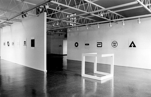
And then, as if reading my mind–or my blog drafts, or maybe communicating telepathically with me through the minimalist/modernist/design/art ether–they posted a link to an awesome-looking 1980 exhibition at The Renaissance Society in Chicago, “Objects and Logotypes: Relationships Between Minimal Art and Corporate Design”.
Whoa. It’s fascinating to see how Minimalism, modernism, and corporate branding were perceived and presented thirty years ago. They all feel digested and processed now, but I get the sense that what curator Buzz Spector is talking about in his essay is not quite the same thing we use those terms for today.
Which may be a way of saying I take issue with many of Spector’s definitions and points, but I’m not quite able to articulate why I think he’s wrong. I mean, I can say that I think Greenberg’s Minimalism-as-“mannerism” does not seem related at all to the principles of usage in corporate visual design. Or that the ubiquitous, homogenizing proliferation of a corporate logo seems like the diametric opposite of Robert Morris’s sculptural gestalt, not its twin.
But Spector’s show still seems like an interesting, important first step for the coming revisiting of Minimalism. And siting avant-garde art practices in parallel to mid-century corporate marketing is pretty compelling to think about. And I really like the idea Spector hangs his show on, that these designers and artists are alike in conflating form and value, i.e., that they “reflect a common faith in the efficacy of form as a means of restructuring society through public exposure to works executed within particular systems of use.”
As I sit here in the middle of a mild obsession with the Netherlands government’s new, painting-inspired rebranding and centralized visual identity system, this idea feels as relevant as ever.
So thanks, Ro/Lu!
Skip to content
the making of, by greg allen
