The Renwick Gallery’s neon sign is utter garbage, and they’re defending it like it’s made of gold. It’s a ridiculous institutional embarrassment.
The Washington Post reports that the Smithsonian is concocting its own legal theories for stiffarming DC’s official preservationist fussbudgets, who are demanding the unapproved [and banal and tacky as hell] sign be removed immediately.
This groundless tantrum can only end badly. And for what? For WHAT? Some dumb slogan cooked up around some marketing department conference room, and then gee whizzed into existence at some misguided museum executive’s whim? This is the fight you’re going to pick, Smithsonian and Renwick?
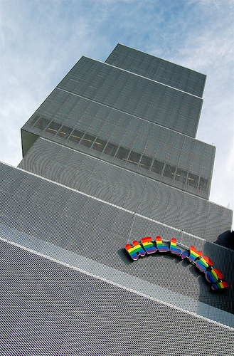
Because it seems pretty clear where the Renwick got the idea for slapping a garish sign on a building: from Ugo Rondinone at the New Museum [lmao, Fred Bernstein sure hated the hell out of that sign, but wins for calling it “Hello, Kitschy.”]

image: dominiqueb/flickr
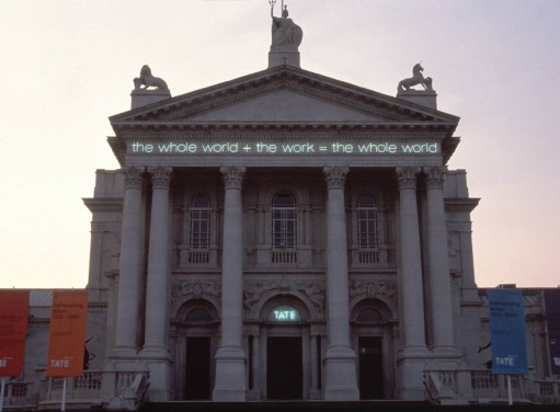
Or from Martin Creed at Tate Britain.

Work No. 232, the whole world + the work = the whole world, 2000, installed on Tate Britain, image: kunstkritikk.no
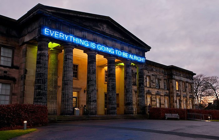
Or from Martin Creed at the National Gallery of Scotland.

Ibid., image: contentcatnip
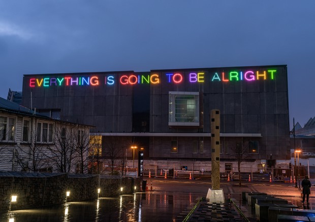
Or from Martin Creed at the Christchurch Art Gallery (NZ).

Work No. 2314, 2015, image: radionz.co.nz
The difference between these signs and the Renwick’s is everything. Can they not see that? Is that what craft is now: arty minus artists? This will not end well, but it should end soon.
Signs of rebellion? Renwick Gallery is flouting signage rules, groups contend [washingtonpost]
Skip to content
the making of, by greg allen
