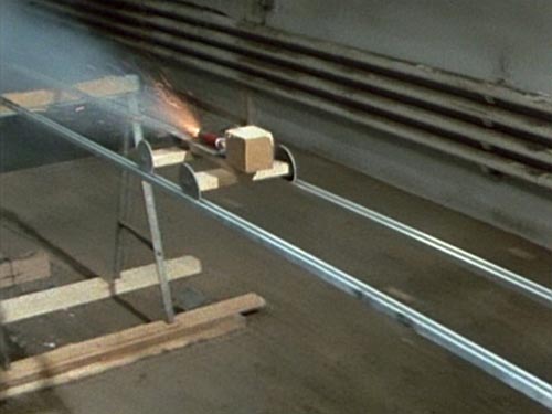
Artforum reports that Fischli & Weiss’s 1987 film, Der Lauf der Dinge, (The Way Things Go), [1] was recently sold at Christie’s in Zurich for 1.02 million Swiss francs. Which is awesome [2], I first thought, since I have that work, and I only paid $20 for it. [d’oh, it’s only $15 on amazon!]
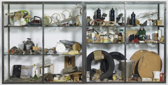
Of course, the Dinge that sold was not the DVD, which is available all over, or even the exhibition copy, which is always a crowdpleaser at museums. [It’s pleasing crowds right now in one of the Hirshhorn Museum’s hallways interstitial spaces, in fact. update: and Vik Muniz put it in the hallway of his show at MoMA, too. Thanks Steven, Tyler, Maggie and Melanie for the tip.] Instead it was, in Artforum’s words, “the original film reel along with a series of relics from the film set.” They said as they cranked up the music and danced on Walter Benjamin’s grave.
Before seeing the making of video for “Cog,” Weiden + Kennedy’s insane, single-shot 2003 Honda Accord commercial which knocked off Fischli & Weisswith spectacular effort and precision [3], I hadn’t given much thought to the making of Der Lauf der Linge or how it existed as a work of art; I just thought it was what it obviously was.
But now it wasn’t so obvious. It had taken W+K 606 takes to get their 2-minute sequence perfect, and even that turned out to have been edited. [It’s really two one-minute sequences edited together where the muffler rolls across the floor. Watch the floorboards.]
Sure enough, there are edits all through Der Lauf der Dinge, mostly dissolves executed by taking the camera in close to something abstract–a spinning garbage bag [2:00] or a pool of foam [2:55, 3:43] smoke from dry ice [7:22], more foam [9:31]–or something abrupt and distracting–the flare of a lightbulb [11:09], the firework exploding on the side of a tire [12:04], a flare of a fuse [13:21] or a candle [13:47] [4]. If F&W had had script girl on set, she might have noticed that a fuse appears out of nowhere at the edge of the flaming pool [14:11], or that the lighting is significantly darker in the second shot.
Actually, that 14-min. cut marks something of a second act. The sequences that follow are all darkly lit, which accentuates their flames and fireworks. There are two more hard-to-spot cuts [15:51, burning hay], [17:26 bucket glare] before a bold, smoky dissolve [18:33] and an even more conspicuous–well, it’s really a montage, what else can you call it?–set of a weighted doll-like device tottering off a plank [19:17]. A dissolve in the blackness at the center of a wheel brings the lights back on [20:18]. More pools of flame on the floor [21:28]. Explosion under a teapot [21:51]. The close-up foam dissolve is now an official motif [22:22, 23:33]. As is the flame-on-floor [24:57]. And the dry ice [25:25].

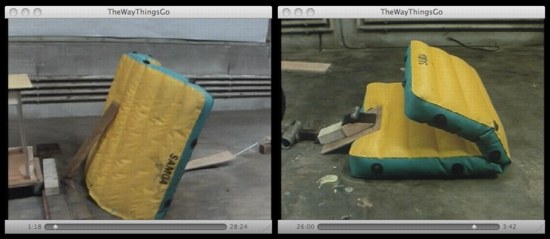
They’re reusing props, too. The orange board that was so obviously being manipulated off-camera [8:00] is now a simple ramp [20:40]. And there’s that air mattress [1:15], now turned and folded [26:00]. Foam [27:00]. Smoke [28:54] whoa, fade to black. [29:02] the end. An edit to nothing, effectively.
23 edits in a 29 minute film, including one seemingly unnecessary one at the very end. Re-used and staged props. If you studied the walls carefully, you’d see the devices are not wrapped around a giant factory, but are staged in the same general strip of space. It turns out The Way Things Go is not the way things are purported to go. Which made me wonder who’s doing the purporting, and who’s doing the assuming?
The artists and their production companies and distributors seem happy to perpetuate the idea that Der Lauf is one, giant, continuous Lauf. Here’s the copy on my DVD case:
Inside a warehouse, artists Peter Fischli and David Weiss build an enormous, precarious structure 100 feet long made out of common household items…Then, with fire, water, gravity, and chemistry, they create a spectacular chain reaction…
Guess they forgot to mention the editing. I haven’t found reactions to the film’s debut in the summer of 1987 at Documenta 8, but when it was first shown in the US, at PS1 in 1988, the NY Times critic marvels at the duo’s “masterpiece to date,” where “the artists manage to sustain a chain reaction of ever-more-absurd materials and events for 30 minutes.”
The edits are clear, even obvious in places, and yet casual observers and critics alike appear to miss or ignore them, preferring the enjoyable spectacle of a 30-minute, non-stop trick. I’ve never heard of this dichotomy discussed in terms of Fischli & Weiss’s work, certainly not in regard to this piece. A cynic could have a lot of fun with the idea that people choosing to believe something enteraining but self-evidently false is, in fact, The Way Things Go.
I should have mentioned much earlier that all my Der Lauf der Linge questions might already have been answered. This whole post might be another in an embarrassing series of RTFM-themed posts, where I could just get the damn book and find out what’s going on. Jeremy Millar wrote a book-length paean to The Way Things Go, the publication of which coincided with a 2006 Fischli & Weiss retrospective at the Tate, which went to Hamburg and Zurich.
And then there’s Making Things Go, a making-of documentary by ex-critic/curator Patrick Frey, who had filmed his friends Fischli & Weiss in 1985 experimenting [rehearsing?] with their various entropic stunts and devices. Though, reading Frey’s account in Tate Magazine, the answers may not be there at all:
The first version was a relatively short loop, which Fischli/Weiss call Sketch for The Way Things Go: a three-minute Super-8 film, in which key sequences of the later 30-minute 16mm film are outlined and tested.
The present film documentation was created during the three-day preparations for this ur-version of The Way Things Go.
Christie’s engaged Frey to lecture on Der Lauf der Dinge as part of the pre-auction excitement, but I haven’t found an account of the event online.

But back to the other anomaly, the “originality” of the million-franc version of Der Lauf der Linge. The piece Christie’s sold was from the collection of Alfred Richterich, and though the auction house’s press release [pdf] includes lofty quotes about Richterich’s foundation using the proceeds to support new generations of Swiss artists, there is no mention at all about his own apparently seminal relationship to the film–even though it seems intrinsic to the existence and nature of the work itself.
Richterich is an heir to the Ricola cough drop empire, such as it is, and he pursued his family’s tradition of collecting art and supporting various creative endeavors. According to the monograph of Herzog & deMeuron, who received early commissions from Richterich, he was “instrumental in facilitating” the production of Der Lauf der Linge. Sure enough, Richterich’s film production company is credited on my DVD case, right alongside T & C Film, the production company who provided the crew–and who had produced Fischli & Weiss’s with their earlier film projects.
I had always assumed that Matthew Barney pioneered the art of financing films by packaging props into more easily monetizable vitrines, but Fischli & Weiss had him beat by a full Documenta.
Did Richterich receive a somehow definitive version of Der Lauf der Dinge along with his two vitrines full of ephemera in exchange for funding the production? Was his film reel more “original” than the prints that museums and collectors used before the advent of decent video transfers? Is it the artists’ actual negative or master print? Or is the market’s throwback preference for “objects” as opposed to “art”–even when it comes to the sale of this “icon of Swiss art”–just the way things go?
[1] the artist’s chosen English title is The Way Things Go, which lacks the flowing, riverlike connotation of the direct translation, The Course of Things or The Current of Things.
[2] Of course, it’s slightly less awesome for Christie’s and Richterich, because the pre-sale estimate was CHF1-1.5 million. With premium and VAT, I calculate the hammer price at CHF 790,000, which is an odd increment and well below the low estimate. Looks like even the “icon of Swiss art” market is down these days.
[3] Whatever its knockoff-ish crimes, “Cog” is rightly praised as one of the greatest commercials ever made. It took dozens of people months to design, engineer, and produce. It involved taking apart one of just six pre-production Accords in existence, cars that had been hand-built by Honda. In fact, I’m going to watch it again right now, I’m so jazzed by writing about it.
[4] this one is almost a jump cut; the camera ends up on the other side of a metal sawhorse when the candle ignites its target.
