Olafur: The Magazine??

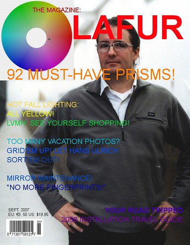
Olafur: The Magazine
This is what I get for not going to the Serpentine Summer Party this year…

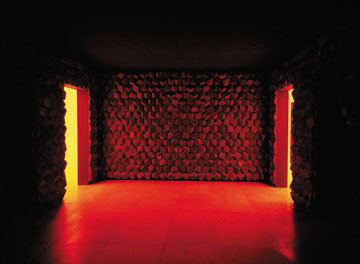
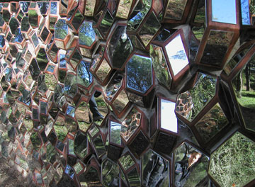
Publisher of a new magazine that melds artistic and architectural experimentation, Eliasson is currently involved in numerous architectural projects such as the Icelandic National Concert and Conference Centre in Reykjavik (design of the building envelope).
Serpentine Gallery Pavilion press release

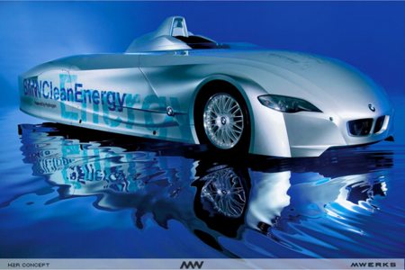
Whew: Olafur Eliasson’s Art Car For BMW

bmw_h2r_concept.jpg

It had sparked one of those jump-the-shark anxiety attacks when I heard that one of the artists I most admire, Olafur Eliasson, had been commissioned to do an Art Car for BMW.
Even as it included such respected artists as Warhol, Lichtenstein, and Jenny Holzer, BMW’s Art Car series has always epitomized the superficial lameness of corporate co-optation of artistic practice.
For someone as serious and critically engaged as Olafur to decorate a BMW–and not just any BMW, but a hydrogen-powered PR-mobile, the H2R, the promotion of which would only deflect attention from the German auto industry’s complicity in global climate change and their aggressive efforts to thwart greenhouse gas emissions cuts–well, I was worried. And the BMW press release didn’t help
But then I read an account of a speech Olafur just gave at the NAI in Rotterdam, where he talked about the car: “‘They are increasingly unhappy about it’, he says about his commissioner. But it is about the relation between the automotive industry and global warming.”
I guess I shouldn’t have worried. but still.
“It makes a difference to make art.” [eikongraphia via archinect, image via mwerks]

Proof of Concept: Il Heliostat di Viganella

The idea to use a large heliostat to deliver winter sunlight to a small village deep in a valley of the Italian Alps, was a success:

The mirror — 870 meters, or 2,900 feet, above Viganella and measuring 8 meters wide by 5 meters high — is motorized and constantly tracks the sun. Computer software tilts and turns the panels throughout the daylight hours to deflect the rays downward. But from Viganella’s main square, bathed in reflected sunlight, all that is visible of the false sun is a bright glare from the slope above.
“At first no one believed it could be possible, but I was certain. I have faith in physics,” said Giacomo Bonzani, an architect and sundial designer who came up with the idea of reflecting sunlight onto the square and made the necessary astronomical calculations. The project languished for a few years until funding — about €100,000, or $130,000 — came through last year from private and public sponsors.
The mirror was designed by Emilio Barlocco, an engineer whose company specializes in using reflected sunlight to light the entrances to highway tunnels. He read about Viganella’s plight on the front page of the Turin daily La Stampa and offered the village his expertise and services. “Whenever you do something for the first time, you’re either a pioneer or stupid,” he said. “We hope we’re the former.”
A concrete plinth was anchored to the rock face of the slope above Viganella to serve as the mirror’s base. The mirror panels were flown up by helicopter. The software that tracks the sun’s rotation is so sophisticated that the rays can be directed anywhere by the computer, which is in the town hall. “If the church or the bar in the town next door has an event, like a baptism, or a wedding, we can shoot the rays there,” Midali said. “It’s very versatile.”

When I first thought up a project to do this in 1999, even when I started talking to Olafur about it in 2003-4, I didn’t even know I was talking about a heliostat. But now with the Wikipedia, and the advent of the Solar Positioning Algorithm and the more comprehensive libnova celestial mechanics library–and the successful testing in Viganella, of course–my excuses for not building me one of these are rapidly diminishing.
Computer age brings sun to village in shadow of the Alps [iht via tmn]
Previously: On an Unrealized Art Project

Modernism: Any Color As Long As It’s White

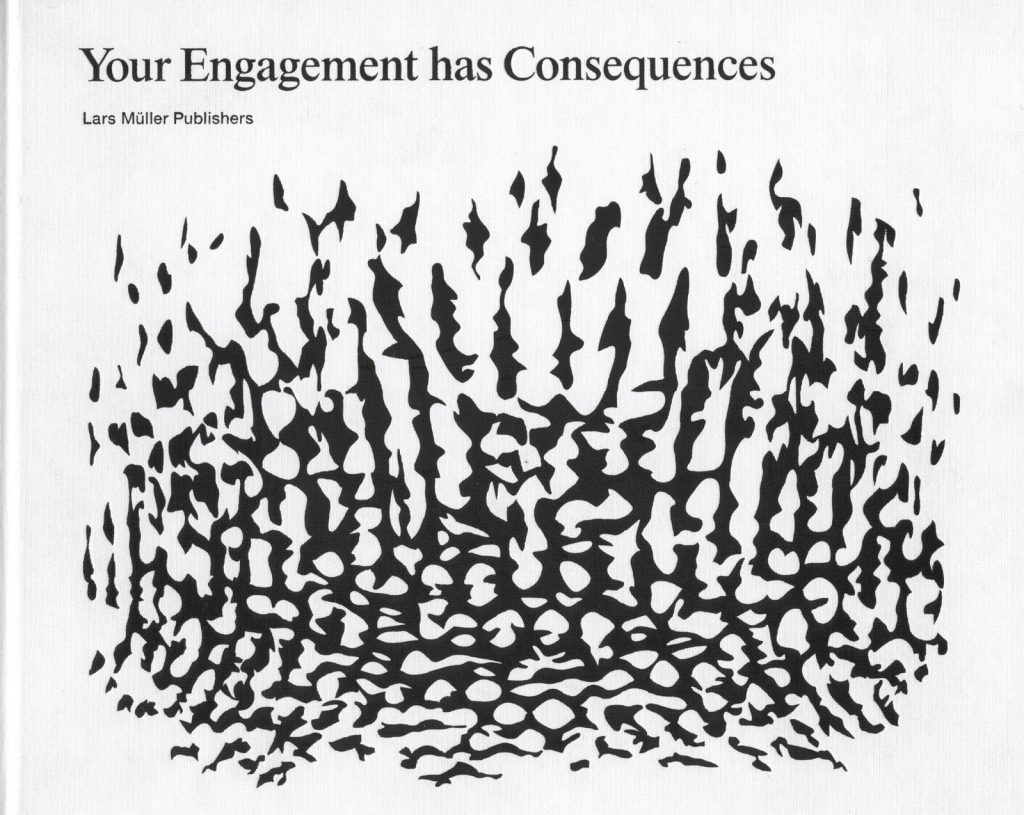
Olafur Eliasson, Your Engagement has Consequences, 2006

For a couple of months now, I’ve been really pre-occupied by this discussion of the color white and its association with modernism. It’s between Olafur Eliasson, curator Daniel Birnbaum, and Mark Wigley, the dean of Columbia’s architecture school and author of White Walls, Designer Dresses: The Fashioning of Modern Architecture, and it’s in the latest exhibition catalogue of Olafur’s work [which was maddeningly unavailable in the US for a long time, except at Tanya Bonakdar Gallery. It’s a stunning, eye-opening book, no pun intended.]

DB: How did modern architecture become white?
MW: Well it only became really white after the mid-century.
DB: It was not in Stuttgart? [at the Weissenhof siedlung, an architectural showcase/manifesto featuring work by Mies van der Rohe, Le Corbusier, and other pioneering modernist architects]
MW: No. The polemical exhibition of modern buildings in 1927 had a kind of off-white. It takes a long time to become white white, like that of a Richard Meier building today which is completely unlike the white of classic modern architecture. The pioneering buildings had more like an eggshell color, so there is a way in which modern architecture whitens over time. One could argue that it does so as a reaction to the black-and-white photographs. The eggshell color looks white in black-and-white photos and all of the other colors on the buildings, green, brown, and so on, tend to go very dark. So a first result of the photographs is that you don’t realize that there are many colors. One of the main points of the White Walls book was to say that modern architecture was not white but multi-colored. In that system of many colors, white was playing a crucial role as a kind of reference point. So of course I was interested in the ideological construction of the idea of white as a default frame of reference. The famous black-and-white photographs make white famous, and then the buildings try to look more like the photographs and become really white and all the other colors are removed. So that somebody can make a building that is really super white today and people would think that it is modern.
OE: You mean the photograph representing the actual spaces?
MW: Yes. If you look at the photographs of the Weissenhofsiedlung exhibition houses they look absolutely white but Mies van der Rohe’s building was a kind of pink. [emphasis added]

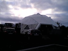
Geodesic dome house in Reykjavik


Geodesic dome house in Reykjavik

Originally uploaded by gregorg.

So Olafur Eliasson’s work includes many references to the work of Buckminster Fuller, especially to geodesic domes. There are some hanging on the wall right next to me, in fact.

Turns out thanks to the work of a former student/collaborator of Fuller, Einarr Thorstein, the Icelandic power company used geodesic domes as their standard architectural form. They now dot the country, situated on geothermal wellpoints and along pipelines.

AND there’s a double dome house [pictured] in a Reykjavik housing development. Down the street is a double pyramid house, too; otherwise, the place looks like Fullterton, California circa 1980.

Some Iceland Photos: Richard Serra

I went to Iceland a couple of weeks ago, and I just put some photos up on flickr from the trip.

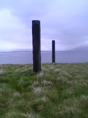
This one is of Afangar, a sculpture/installation by Richard Serra. The tops of these squared off basalt columns are level, but one column is 4m high, while the other is 3m. The distance between them, then, is determined by the slope of the land.

Serra placed nine pairs of colums around the periphery of one half of Videy, this island in the Reykjavik harbor, and some of them are quite close together; others, like these, are far apart.

The main feature as you walk, though, is bird droppings. When I first visited Videy in 1994, it was November, and except for a couple of Icelandic horses, I was alone on the island. This time, though, the place was teeming with sea birds, and the faint trail through the grass was chock full of tern turd. When you’d inadvertently get too close to an invisible nest, the birds would get really agitated. One nest was right next to the trail, and we didn’t see it until the mother flew out from underfoot and startled us. A lot of the Serra columns on the leeward side of the island are topped with a crown of guano, but the windward side is pretty clear.

It surprised us to see Olafur Eliasson’s Blind Pavilion from the 2004 Venice Biennale perched on top of the hill above the ferry dock, though. Apparently, they installed it there in early 2005 as part of his show at the National Museum. It looks like a gun turret up on there, though.

Your Photoshared Experience: Olafur Eliasson On Flickr

olafur_aedes_republish.jpg

It’s funny, I’ve never really found the worlds of art and flickr to have that much overlap. Just look at the number of photos posted after the Maker Faire 2006 [4,055] compared to those posted after, say, Art Basel [295].
But it turns out some artists have a fairly deep presence on flickr–and by some artists, I mean Olafur Eliasson. There are over 600 photos referencing Olafur in either the tags or the text. [At Tropolism, Olafur posse member Chad posted about a particularly sweet photoset [above] from republish.org, which was taken at an opening last week in Berlin at Galery Aedes.]
[An aside on the one-name thing: people drop single last names all the time in the art world, “Oh, I have some Gursky, some Richter, Demand…” But there are a few artists who get the first-name treatment–Maurizio, Olafur, and Felix come to mind–and it’s funny how different the implications of intimacy make it sound. Whether it’s actually there or not, there’s a hint of friendship/confidance, like saying ‘Marty’ instead of ‘Scorsese’ or babbling about Bob at Sundance. This can obviously be both good and embarassingly tacky.]

olafur_flickr.jpg

Anyway, it makes a certain sense that Olafur’s work turns up as frequently as it does. First, it’s pretty sexy, and it looks hard to take a bad picture of it. Second, the elements of spectacle he explores make people want to take pictures of it. But most importantly, I think, is the self-conscious experiential nature of the work itself: it is art about the experience of perceiving and seeing, not just art, but everything. And that’s the sweet confluence with flickr, a site where people who pay attention to seeing–and photographing–the world as they experience it meet and mingle.
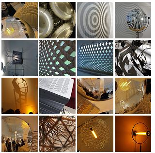
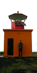
mcleod_carey_lighthouse.jpgTaken even further, you could look at how Eliasson’s own taxonomy/typology/experiential photography resonates with the tag-friendly world of flickr, as if flickr-ites’ collective efforts are generating their own Eliasson-style photogrids of Icelandic landscapes, or waterfalls or geodesic domes. I love this one, for example, “F— Off, Olafur Eliasson,” [left] with the caption, “I was taking snaps of Icelandic Lighthouses long before that twat,” which both hits and totally misses the point. [There are tools now for creating photogrids from flickr images, pal, so have at it.]
Olafur himself seems to be adapting his work to account for this collective/collaborative element, and not just by making less photographic work [although that does seem to be the case, which bugs, because I still want me some, and it’s getting harder and more expensive to come by]. At least three times, including in the 2004 The cubic structural evolution project , [on flickr here, of course] and his work in the 2005 Tirana Biennial, the artist put hundreds of pounds of white Lego blocks into the hands of the audience, who built utopian fantasy cityscapes with them.
With flickr, then, it’s Olafur Eliasson’s world; we just live in it. And vice versa.
Olafur Eliasson: Mediating Space – A Laboratory runs through July 20 at Aedes am Pfefferberg, Christinenstr.18/19, 10119 Berlin.

Here Comes The Sun (Olafur Eliasson @ Portikus)

You may know Brian Sholis from such venues as Artforum and his as-time-permits blog, In Search of the Miraculous.
Brian just posted some behind-the-scenes shots of the first of twelve installations Olafur Eliasson’s doing at Portikus, the Frankfurt art space. As anyone familiar with Olafur’s work knows, the behind is usually as important as the front.

A sneak peek at Olafur Eliasson’s ‘Light Lab’
[insearch]

Art: We’re Here To Please

Regine just posted about some artists in the Hungarian Pavilion at the Venice Biennale who made portable chairs available to visitors, [correction: turns out the chairs were sponsor-driven, not artist-driven.] and it got me thinking about the customer service side of artviewing, especially in a setting like Venice.
So much art is about the White Cube, the experience of seeing it, a “critique” of the institution/process, but yet so little of that actual process is actually addressed. A curator friend once told me of escorting her trustees around Venice (the last one, when it was August-hot at the June opening), and they actually had to debate going to see some art based on whether or not the venue was air-conditioned.
An artist like Francesco Vezzolli makes his art movie-trailer-short, sex-filled, and full of fashion and celebrity in order to stand out from the blur of Venice’s gossip-saturated, art-overloaded opening festivities. But that’s just a shrewd reading and anticipation of the setting.
I just came back from Tokyo with a hoard of Takashi Murakami fans, which they were handing out to people as they got off the Roppongi subway stop. It’s not art, I know, but it’s an artist’s move, based on a retailer/developer’s understanding of the viewer experience.
Then there’s Rirkrit Tiravanija’s meals, or last Venice’s Utopia Station, to an extent. Or 2001’s Venice cafe collaboration between Olafur Eliasson and Tobias Rehburger and ___ [I forget, but it doesn’t matter, because apparently it was altered so badly the artists removed their name from it. Somewhere in there, it lost the sanctity that non-artists grant to artwork.]
So what I’d love to see, I guess, is some kind of art-as-customer-service, someone who toys with or explores or highlights the fact that viewing and encountering and contemplating art is often –not exclusively, or even mostly, but often, and especially in the event-centered cases of fairs, biennials, and openings where much of the “art world” places itself– a cultural experience, an activity that its viewers choose over shopping, movies, other forms of travel or tourism, reading, what have you.
Anyway, just rambling when I should be heading out. It’s so hot, I think I’ll take one of these fans.

The Views Of Venice

Finally hearing more reports and reviews of Venice. So Francesco Vezzoli’s trailer for an imaginary remake of Gore Vidal’s Caligula is the favorite of Artforum-istes and the Guardian alike? How amazingly uncritical of these critics to not notice that a star-filled, 5-minute trailer filled with S&M orgies–a contrived and condensed meta-work for a film that won’t exist, a series of shorthanded, empty, titillating referents–is perfectly and cynically designed for ADD-addled art worlders at a sprawling Biennale? Don’t these people know when they’re being targeted?
Also in Artforum: “I’m still bored.” and “Math is hard! Let’s go shopping!
The Times is pleasantly relieved, if not surprised.
And WPS1, well who knows what WPS1 thinks, since their live-via-FM programs from Venice are still not online?
[update from Our Man In Venice:

Subject: Hands off my boy Vezzoli.
> Sorry my friend — Vezzoli’s work was one of the highlights of an absolutely
> terrible Biennale. Ignore (as usual) Kimmelman’s review; Claire Bishop at
> artforum.com had it about right. The arsenale was the worst p.o.s. I have
> ever seen — so terrible that I have issued a fatwa against Rosa Martinez.
> The national pavillions were passable; the italian pavillion was perfectly
> respectable. Offsite, Pippilotti Rist, Karen Kilimnik and Olafur Eliasson
> looked great. The Lucian Freud show at Museo Correr was perhaps the best
> thing in all of Venice (other than Paul Allen’s yacht — any relation?).

On the list of somewhat dubious accomplishments, then, “Highlight of the Biennale” ranks slightly below “better than Phantom Menace,” but still miles ahead of “well-known blogger.”

Olafur Eliasson: West of Rome, East of LA

Who’s the must-have light installation artist in Los Angeles these days? If you answered, “James Turrell,” pack up your Uggs and get out. In Pasadena this week, Olafur Eliasson debuted a modernist hill houseful of installations and interventions, organized by his Italian gallerist, Emi Fontana.
Check out pictures and descriptions at arcspace, or pour yourself a glass of whine at artforum diary, which features largely content-free Olafur soundbites and bitching about the opening’s lack of valet parking. Or go yourself, until May.
Olafur Eliasson: Meant to be lived in [arcspace.com]
LA Residential [artforum diary]

On an Unrealized Art Project

In 1999, I conceived and contrived to make a piece of art. It began as an idea for a commission for the artist Olafur Eliasson, but my idea was so embarassingly specific and complete, there’s no way I could bring myself to ask him to do it. Even though I cannot imagine myself as an artist, or a maker of art, I had to admit that this was not an Eliasson, it was Eliasson-esque, at best.
The piece is a sort of reverse sundial.*
Our apartment in NYC faces north, and so receives no direct sunlight. At various times in the day, the sun would reflect off of windows across the street, creating sharply angled patches of bright light, which would move across the wall or floor, marking a specific moment in the day.
I devised to place a mirror on the roof of the recluse’s townhouse across the street, which would reflect sunlight directly into our apartment. It would have a motor which would track the movement of the sun, thereby maintaining the reflecting angle throughout the day. [Constructing this motorized mirror was a great obstacle. Last year, when I finally told Olafur about this piece, he said a German company made such a mirror, called a heliostat, which was exhibited at the Hanover 2000 Expo.]
Rather than the naturally changing light of a normal day, the apartment would receive constant, consistent, direct light. The light wouldn’t shift, the shadows wouldn’t lengthen, then contract. At first, the brt lt praised by realtors and sought after by apartment hunters would be welcome, but I expected that, after a while, it would become unnerving, even maddening.
[2007 update: soon after posting this, I told this story to a couple of Olafur’s dealers, who, instead of laughing with/at me, said I really should have proposed it to Olafur, because he would have loved doing it. Which is a huge bummer, because then I could have paid 1999 Olafur prices for the piece. Oh well, it’s mine now.]
* Olafur actually made a sundial-like piece in 1997 by cutting a round hole in the roof of the Marc Foxx gallery in Los Angeles. The circle of light tracked beautifully across the empty gallery space. The piece was titled, Your Sun Machine. I never dreamed to call my piece My Sun Machine, though.

olafur_sundial_marcfoxx.jpg