June 2009 Archives

The "What art should the Obamas hang in the White House?" story rolls slowly onward. Last week in ArtInfo, Ruthie Ackerman published the suggestions of several of the art world's greatest minds. Greatest among equals, obviously, is Magda Sawon of Postmaster Gallery, whose list began,

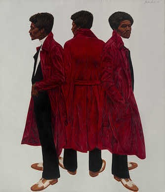
"I am seconding Greg Allen of the brilliant blog greg.org to bring Sir Charles aka Willie Harris (1972) by Barkley Hendricks to the White House. It's a tremendous painting from a still-under-the-radar master that puts Kehinde Wiley to shame.
Hear, hear!

Now that we have consensus, let's move this plan forward, shall we? The National Gallery of Art brought Sir Charles into the collection in 1973, along with another remarkable Hendricks portrait, George Jules Taylor. Neither have ever been shown in the National Gallery itself, though both are included in "The Birth of Cool," the highly acclaimed Hendricks retrospective organized by Trevor Schoonmaker of Duke's Nasher Museum of Art.

b_hendricks_nga.jpg

By the criteria the Obamas set for themselves, that means the works couldn't come into the White House until they go back out of public view, 2010, after the retrospective winds up in Houston. Plenty of time to make the case for this awesome painting; let's take a closer look at it!

Duke art historian Rick Powell explains that Sir Charles was the professional name of a Dixwell Avenue drug dealer in New Haven whose customers were mostly students from the little college a couple of blocks to the east, where Hendricks was studying for his MFA. The Willie Harris reference, meanwhile, is from A Raisin in the Sun; like that fictional Harris, Powell says, Sir Charles "would frequently disappear with [his customers'] money."

Hmm, could the Obamas ever really bring themselves to hang a painting in the White House of a small-time, money-thieving, pimped out, drug dealer--from Yale??

super-fly.jpg

Hendricks described Sir Charles's style as "player chic," which the ever-proper Powell feels compelled to address at some length:

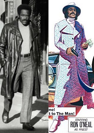
While the term "player chic," hinting at illicitness and misogyny, points to the ostentatious fashion statements of pimps, street hustlers, and other disreputable members of a black demimonde, the same style of dress--platform shoes, body-hugging jumpsuits, leather pants and maxicoats, real and artificial fur--was worn by a broad spectrum of African Americans. Most were not connected with life's shadier side, but many did feel an affinity for this provocative "outlaw" persona. The most obvious broad-based celebration of the "player chic" aesthetic in the early 1970s was the commercial success of Super Fly (1972), a feature-length film directed by Gordon Parks Jr., about a drug dealer who undergoes a change of heart...
Uh, not to quibble, but wouldn't the phenomenal critical and financial success of Shaft, made in 1971 by Gordon Parks Sr., count as a broad-based celebration of player chic, too?

in which case, wasn't the swaggering black male "outlaw" archetype thoroughly established, even romanticized in popular culture, making Hendricks' choice of Sir Charles as a subject a little less transgressive or controversial, at least among the edgier liberal audiences at Yale and--

Wait a minute, where was Hendricks' audience? The guy was still in art school when he painted these things in 1972, and then they were in the National Gallery a few months later? How'd that happen?

Stay tuned.


ikea x Mari mashup being mashed up, originally uploaded by gregorg.

I realized I'd been putting off the actual assembly of my Enzo Mari table, daunted by the impending exactitude and fearful of the commitment of actually screwing all the pieces together.

Which seems to fly in the face of Mari's original "just hammer it together" intentions for the autoprogettazione series.

I knew that without jigs and a flat surface and proper squaring equipment and such, I was invariably going to misdrill something, and then I'd be trying to redrill holes 1/8th of an inch to the left somewhere, and--

The joint that really made me nervous was the first one I'd have to do, drilling a 5/16" hold through the center of all the side truss pieces [right about where the knot is in this photo] AND through the ends of the center truss, so that I could thread a carriage bolt through, and hold the entire table together properly. Forever.

Rather than risk screwing this up, I decided to piece each truss together with a steel bookend, and then hammer and wood glue enough joints to hold it. Then I'll drill and screw the major joints after it's together.

The carriage bolt and wingnut assembly method is a nod to the original autoprogettazione kits of precut wood, which were produced in 1973 by Simon International and sold briefly as the Metamobile Series.

mari_christies_simon.jpg

I hadn't thought of how much those simple wingnuts changed the nature of the autoprogettazione concept. They're the difference between project and product.

The Metamobile kits weren't just precut wood; they were also predrilled. And that required the construction of jigs, the use of some workshop- or factory-grade hardware, and probably even an assembly line, or at least some batch work. In other words, they were exactly what the autoprogettazione series was supposed to not be: mass produced.

mari_effe_table.jpg

Furniture sold as a kid of parts that comes ready to assemble, with just one tool, just follow the slightly baffling instruction diagrams exactly, and voila! Sound familiar? Enzo Mari beat me to an Ikea mashup by about 35 years.

Related: 14 June 2000, Lot 103: ENZO MARI, A PINE DINING TABLE
"designed 1973, manufactured by Simon International for the Metamobile Series, the square slatted top on open understructure secured by wing-nuts", sold for £5,875. [christies.com]

Dec 15, 2006, Lot 2: ENZO MARI, AN EXTREMELY RARE "EFFE" TABLE
"Manufactured by Simon International, ca. 1974. from the Metamobile series...Acquired directly from Dino Gavina, c. 1975," sold for $14,400 [sothebys.com]

globe_arena_with_house.jpg

Josh Foer is on fire, and I'm like a moth to the flame. Foer's guestblogging at BoingBoing, and is just lobbing up one crazy-awesome megasphere after another. It was his charticle in Cabinet a while back about the history of giant spheres that introduced me to satelloons in the first place.

So it's no surprise that he surprises me again with an offhand reference to the Globe Arena in Stockholm, which is just "the largest spherical building in the world." And it also happens to be at the center of the Sweden Solar System, the world's largest scale model of the solar system, where Pluto is a ball 300km away.

No, the Globe, which Ericsson just paid to have renamed the Ericsson Globe, also has a small stuga, a traditional red Swedish cottage stuck on top of it for the summer.

A month ago, the Swedish artist Mikael Genberg, whose primary medium seems to be the traditional red Swedish cottage, attached one to the Globe in preparation for his much larger project, which is to dispatch a traditional red Swedish cottage-building robot to the moon in 2012, and have it build a traditional red Swedish cottage there. On the moon.

I'm not sure how this syncs with the Sweden Solar System, where I assume the 100-m diameter Globe is standing in for the sun, not the moon, but the visuals are pretty irresistible.

Sweden Solar System [atlasobscura.com via boingboing]
Ericcson Globe, aka Stockholm Globe Arena [wikipedia]
houseonthemoon.com project blog [houseonthemoon.com]
MikaelGenberg.com [insane, optimized for Netscape 4, unclickable]
Swedes sending robot to the moon to build nice little cottage [gizmodo.com]
image and video: Röd stuga på Globens topp [svt.se]

June 27, 2009

Do You Know Who I Am?

Artforum's William Pym covering the extremely non-chalant X-Initiative opening this week:

Jordan Wolfson, hovering by Barcelona's Latitudes, took several prods before he could even remember that he was participating in a group show with healthy buzz opening at I-20 Gallery round the corner later in the week. Eventually waking up to the idea that he was a professional artist talking to a writer, Wolfson pointed at a nearby projector. "I lent that to them," he volunteered with a goofy puff of pride. "That's my claim to fame."
International Association of Art Critics cardholder Tyler Green twittering his way through the museums of New England:
So much attitude from admissions staff. MFA needs to train them on AICA members. Geez.
10:04 AM Jun 22nd from UberTwitter

...

At Worcester Art Museum, where admissions person tried to keep me out. Train the staff on accredited press, WAM...
10:00 AM Jun 21st from UberTwitter

Me at Larry's, for John's late Picasso show last month:

Me: I wonder if you can tell me about the documentary screening in the corner gallery?

Gallery attendant: No.

Me [flummoxed]: I mean, is there any information ab--

Attendant: No, there isn't.

Me, [baffled]: Is there someone who does know who I can ask, I'm just interested to find out who prod--

Attendant: No, there isn't anyone.

Me [weighing whether to ask for people at 24th street by name, or whether to just do the cold, "Do you know who I am?" and then deciding against it, since she clearly doesn't give a flying $#% who I might be, and why should she, there's only like three of these paintings for sale, and my question isn't even remotely on the trajectory for someone who might want to buy one, and can't I just go dig up the early 70's Picasso filmography onilne anyway?]: Ooo Kaay. Thanks.

It occurs to me that we invariably bring a cartload of subjective baggage along with us when we see art, and often we're only vaguely aware the extent to which that subjectivity and expectation colors--no, it's more than that, it shapes and molds and transforms--our experience.

Whether we see as an artist or a collector, a curator or a trustee, a flaneur, a writer/critic/journalist, a complete civilian, if such a thing is possible anymore, makes a difference.

And when I couldn't find it online, I made a quick call, and some very helpful folks at Gagosian told me the film was Picasso: War, Peace, Love, (1970), by the artist's long-time friend, photographer Lucien Clergue, and that it was originally produced in 1968 for Condor Films, in Zurich, as Picasso: Krieg, Frieden und Liebe.

I've got to remember to add it to IMDb.

June 26, 2009

Beat It

"They'll kick you, then beat you,
Then tell you it's fair"

Spectacular video from Michael Jackson, Iranian Freedom Fighter. [via the awl]

While this 1857 ambrotype of John Steiner's balloon preparing for an international crossing from Erie, Pennsylvania to Canada is the first known photograph of a flying machine, Steiner's was not necessarily the first balloon.

Still, kind of awesome.

FWIW, Steiner had to bail out over Lake Erie in dramatic fashion. His balloon made it to Canada and was found some time later.

The Smithsonian has the story--and the photo, which is on display at the National Air and Space Museum.

photochrom_journeyskull.jpg

On his incredible illustration blog A Journey Round My Skull, Will has posted several selections of photochromes, or photochroms, or photochromosomes. [here and here] They were color-retouched photolithographs popular around the turn of the last century. They used at least six, and usually 10-15 tinted stones for each image.

I think the eerie light and tone looks like Darren Almond's Full Moon photographs, but I like Will's alternate description of the process, too: "Max Ernst photoshops livestock into the xeroxed ruins of Caspar David Friedrich paintings."

From Linda Yablonsky's account of a Matthew Barney/Elizabeth Peyton colabo on Hydra, sponsored by Dakis Joannou:

"Barney looked at his watch. 'Just about two hours,' he said to Peyton. 'Not bad. After all, there's a limit to how long you can ask people to wait.' Coming from the king of slow, this seemed even more astonishing than the event."
Reminds me of the demolition derby/used car gig he put together in LA a little while back. If nothing else, Barney is a masterful social engineer, transforming his guest list/audience "from jaded personalities into humble acolytes."

airform_nothing_inproc.jpg

Steve Roden's sculpture and sound installation, nothing but what is therein contained is in the previously closed off top rooms of Founder's Hall at Girard College. It was created as part of the Hidden City Philadelphia festival, and this weekend, June 27th and 28th, is the last chance to see it. Which is really bumming me out, because we'll be in Philadelphia for the 4th of July.

I'd emailed my compliments to Roden, praising how the "pure arbitrariness" of the system he used to construct this sculpture turned out so fantastically. When he emailed back and thanked me, he also pointed out there was "indeed there was much more specificity to the project than arbitrariness." I felt like smacking my head, "that's what I meant, not arbitariness, specificity!" as if they were somehow interchangeable.

And yet, it was kind of what I meant. Roden described his process on his blog. The title is a phrase from Girard's will, instructing the architect what kind of building he should design:

I took the phrase and translated it into numbers based on the alphabetical sequence of the letters, and then cut pieces of wood accordingly.

these pieces (running from a 1 foot length for an "a" to an 8 foot plus a 12 foot for a "t") were then painted in groups, a different color for each letter.

...

i then began to build the structure, beginning with the first letter - "n" - and drilling and wiring the consecutive parts improvisationally, essentially using the letter sequence as a score towards determining what piece of wood would come next.

The colors and painting, meanwhile were partly inspired "by the sketchbook of amish deaf mute craftsman henry lapp, who lived outside of pennsylvania just around the time the building was finished..."

airform_nothing.jpg

So yes, highly specific, and to an outsider, seemingly purely arbitrary. And yet, they are also the deeply intuited choices of an artist who has spent two years researching and experiencing the building, the institution, the space, the history, the city, the work inhabits. And out of that experience and those choices emerges a singular, even inevitable object. [The work itself also contains sound and text elements.]

I realized while I'd remembered Roden's explanation of how Stephen Prina's green monochrome paintings with dimensions based on Manet's oeuvre informed his early explorations of constraints and systems from his interview with Catherine Wagley last year, I'd forgotten the intuition, which was the objective, if not the whole point:

it opened my eyes to how process could potentially be used to generate a relatively awkward or difficult stage for an intuitive process to then take place. so i started a painting with a ridiculously stupid idea - taking an issue of art in america and building an image using the first letter of every name in an advertisement for an exhibition, in the same font and same relative scale. it was the kind of thing i would have reacted against, so i tried it. it was incredibly frustrating, even boring at times, but also freeing. i started to make works using found letter structures within books and texts to see what might happen - what was i gaining and what was i losing by following such a process? i wasn't sure, but both the process and the finished works were more interesting to me.
Great stuff. I wish we were in town.

nothing but what is therein contained, Saturdays & Sundays through June 28 [hiddencityphila.org]
more pics and making of: nothing but what is therein contained... [airform archives]

The Grand Palais was already the best of the three venues in the world capable of accommodating my Satelloon project--a re-creation of NASA's Project Echo (1960), the 100-ft metallic spherical balloon which was world's first communications satellite, and which was also known as the most beautiful and most-viewed object ever launched into space--but now it's practically inevitable.

Unless someone tells me that the Pantheon or Grand Central Station have already hosted legendary air shows dating back a hundred years...

These photos from Branger & Cie via the Smithsonian show balloons and blimps on display at the 1re Exposition Internationale de Locomotion Aerienne, which debuted in the nave of the Grand Palais in September 1909. They ran until 1951. Which makes bringing back the spirit of the Air Show both spectaculaire et logique!

satelloon_grand_palais.jpg

Previously: Les Satelloons du Grand Palais]

pt_lou_philippe_ballon.jpg

On June 19, 1885 Gaston Tissandier and Jacques Ducom set off in across Paris in a balloon. They were on a photo expedition, and managed to get seven shots. This one, of the pont Louis-Phillippe, at the western tip of the Ile St-Louis, was the most successful, in that it was nearly straight down. Though it was not the first aerial photo of Paris, it caused a sensation and was exhibited and reproduced widely for many years.

The photo historian Thierry Gervais wrote about it in a 2001 article in Etudes Photographique, "Un basculement du regard, Les débuts de la photographie aérienne 1855-1914":

In 1885, Gaston Tissandier and Jacques Ducom know the objectives and results of aerial photographs obtained by Nadar. When they fly over the capital on June 19, their goal is clear: "After many attempts, it still needs to be demonstrated that the proofs obtained in a balloon may be as sharp as those taken on land in the ordinary conditions and resolve in a word completely the problem of free balloon photography."

Beginning at the Auteuil aeronautical workshop, the 13 x 18 camera, known as a touriste, is set on the edge of the platform, with the lens oriented to the ground. The crossing of Paris is done from Porte d'Auteuil to Ménilmontant via a light wind from south-west which takes them up to Meaux. Seven photographs are made, five of the capital and two of the banlieue. If "all are good enough to be reported," that of the Ile Saint-Louis holds particular attention, taken at 600 meters, this photograph is of a perpendicular sharpness that "leaves nothing to be desired."

The photograph of Île Saint-Louis gained real notoriety. Mentioned in the columns of le Bulletin de la Société française de photographie, it was noted that "now that any party was able to shoot the Geography, Topography and Military Arts," it will be reproduced on many occasions. It is published in an article in la Nature describing the expedition. In 1886, Gauthier Villars printed rotogravure and photoglyptie in the book of Tissandier titled, La Photographie en ballon. Two years later, Albert Londe chooses to illustrate his chapter on aerial photography in La Photographie moderne. In 1889, it appears alongside the tribute of Paul Nadar at the Exposition universelle.

But the diffusion also means that the photograph of the Ile Saint-Louis is one-of-a-kind in the late 1880s. Tissandier and Ducom's experimentation was not followed by an intensive production of aerial photographs. Commandant Freiburg made several attempts to shoot from a balloon, but the military are confronted with a problem context. To be out of reach of projectiles, the balloon must be at least 5000 meters. Accordingly, the camera needed to be equipped with a telephoto lens to produce legible images. Having noticed, during the Exposition of 1889, the value of aerial photography for the strategy, the military focuses its attention on getting results with long lenses.

What strikes me is how little has changed in over 100 years, at least from this perspective.

Here's the same shot today on Google Maps:

tassindier_google_map.jpg

Downtown Megastructures, originally uploaded by sokaris73.

I can't find any details online about this "Downtown Megastructures" image by Klaus Pinter and his colleagues in the Austrian architecture collaborative Haus-Rucker beyond what sokaris73 put in the flickr caption: it dates to 1971, and was apparently included in a 2000-1 show, "Radical Architecture," which traveled from Dusseldorf and Koln to Villeurbanne.

haus_rucker_moma.jpg

MoMA showed a similar-looking 1971 gouache/photo collage last year, though, in Andres Lepik's "Dreamland: Architectural Experiments since the 1970s". Titled Palmtree Island (Oasis), it's a dome island [an Uptown Megastructure?] super-imposed on Nervi's 1963 bus terminal at the George Washington Bridge.

Seems the 60's and 70's love affair with inflatable architecture was not just contained to America and the nude Stones fans at Ant Farm. In 1968, the Musee d'Art Moderne de la Ville de Paris showed "Structures Gonflables," a giant show of blow-up design and architecture. Not big enough, though, if this photo of a dirigible blimp being stuffed into the museum is any indication:

struc_gonflables_paris.jpg

Coming at this balloon genre from the NASA point of view--not to mention the corporate and government world's fair pavilions point of view--it's beyond ironic that inflatable megastructures were often considered embodiments of anti-establishment, countercultural ideology. The Architectural League had a traveling exhibition on the subject in 1998, "The Inflatable Moment: Pneumatics and Protest in '68," which Metropolis Magazine wrote about at the time. Good stuff.

wohnseifer_berliner_stuhl.jpg

I'd seen this installation shot of Johannes Wohnseifer's show at Johann Koenig in Berlin, but I couldn't track down any details of the sculptures until now. But I see from Contemporary Art Daily that Koenig has finally posted some awesome detail images.

In an exploration of representation and tranformation/distortion through production, Wohnseifer has created a series of sculptures using the same nine components as Gerrit Rietveld's 1923 Berliner Stuhl. Rietveld originally sold this chair as a build-it-yourself kit [the all-white example of the chair's original configuration can be seen below, and in the background of the installation shot].

wohnseifer_cadaily.jpg

In each of his shelf-like but ultimately non-functional sculptures, Wohnseifer "plays with the idea of object 'recycling,' a widespread practice in non industrial countries, in which discarded materials with almost no more value are transformed into practical or also humorous products." I guess "plays with" here means "doing the opposite," since he transforms an unconventional-looking but functional chair into a definitionally non-practical object, a sculpture of almost classical abstract form.

Wohnseifer's show closes tomorrow in Berlin

marc_jacobs_beanbags.jpg

Lot 706: A PAIR OF SILVER LEATHER BEAN BAGS,
LABELED 'MARC JACOBS', est. $300-500, "from the runway fashion show"
. No reserve. Winning bid: $550, plus premium.

For future reference, having a lot open in your browser tabs for two weeks and willing the items into your house does not work, even for no reserve items. You must actually bid. [christies.com, apologies to reference library]

libeskind_prefab_int.jpg

Bwahaha, if ever there were an architect whose work looked like it was all churned out of an idea factory from weary bins full of identical parts, it's Daniel Libeskind. And sure enough, just in time for the prefab business to be declared dead, the NY Times reports that Libeskind has unveiled a "limited artistic edition" 5,500-sf prefab villa, which can be yours--installed, in Europe--for just EUR2-3 million apiece.

Mr. Libeskind says he was involved in every aspect of the design, from the door handles to the kitchen layout to the placement of a barbecue area.

...

"We never really wanted it to be a prefab," Mr. [Michael] Merz [spokesman for the Berlin company distributing the villa] said. "We want to position this as a piece of art."

Buyers will also be promised regional exclusivity, ensuring that they are the only ones in their neighborhoods with the design.

And don't forget, everything's symbolic! There are no renderings of The Barbecue Of Community, but here's a picture of the Sectional Sofa of Solace, criss-crossed by the Zig-Zags of Enlightenment.

The size, too, is important, 5,500 equaling both the number of passengers on the ship little Danny sailed into New York Harbor on as a boy, and also the drop in the Dow since the project began.

Libeskind Designs a Prefab Home [nyt via curbed]

I thought Hirokazu Koreeda was going to be making a samurai jidai-geki. Wait, he did, in 2006. Hana yori mo naho. Here's a review: "The only samurai movie with pink flowers on the cover."

Odd then, that even considering how much they talk about his films being somehow representative of Japan, the period movie doesn't come up at all in his interview with Shimon Tanaka, published at The Rumpus.

The Rumpus Interview with Hirokazu Koreeda
Previously: A 2004 interview with Koreeda after Nobody Knows won for best actor at Cannes

Christopher Hawthorne writes about the latest trend in prefabricated modernist architecture: going out of business.

Michelle Kaufmann, Marmol Radziner, Empyrean...

Apparently, when you design houses for a perennially small niche, build them at a cost premium, and no bank will provide loans for them, it's hard to make a go of it in a depressed real estate market. Who knew?

Prefab movement needs to rethink its model [latimes via christopher's twitter]

colombo_20x200.jpg

Jen Bekman's Art for The People gallery, 20x200 is having a sale, 20% off all prints and photos through Tuesday. [see details and promo code info here.]

There's a bunch of interesting stuff; among my favorites are Jorge Colombo's iSketches famously created, like his recent New Yorker cover, with the Brushes iPhone App. They're a really nice mix of painting, drawing, digital, and street...what's the word, photography? reportage? Whatever sketches are.

jason_polan_20x200.jpg

Another great series is Jason Polans' larger-scale prints based on drawings from the American Museum of Natural History. Great stuff.


Verner Panton Vilbert Ikea chair, originally uploaded by JForth.

The dates for Verner Panton's Vilbert Chair run the gamut, but they cluster around 1993.

He created the chair for Ikea, and it didn't sell for very long--I've seen "six months," "a season," and "a year"--and apparently, it didn't sell very well, either.

As you'd expect from Ikea, it's made out of melamine-coated MDF. I'm not a huge fan, but I find it very amusing to see how Panton fans and modernist furniture aficionados spin a famous designer's commercial failure on the cusp of his resurgence.

One hack design site gets just about everything about the chair wrong in one, short sentence: "IKEA began a Panton revival when they reproduced his Vilbert Chair in 1994."

One Dutch dealer says, "Only shortly Sold as Ikea made the Chair from different Materials as Verner Panton Required."

But the most frequently repeated explanation, is "The design was perhaps too radical for IKEA shoppers and not that many were sold, making them rare to find today."

and

This chair proved to be too abstract for the mindset of the Ikea clientele..."

Oddly, the Vilbert is not faring much better in its afterlife as a rare, connoisseur's collectible, either. At auction, one sold for $450 in 2002; an unopened Vilbert didn't sell in 2003; six sold for EUR 266 apiece in 2006, two didn't sell for 400 pounds in 2007. Examples for sale online range from EUR275 to EUR450, while the most sensible prices are still in the thrift shop/garage sale range: EUR25 and "Sure, whatever, just take it."

Dear Bootleggers of Christian Marclay's 4-channel masterpiece, Video Quartet,

First off, you're fabulous. Second, rather than pan back and forth and back and forth across the four screens, if you would please station yourself to the side and get as wide a fixed shot as you can, maybe get a wide angle lens, even? Mkay? Great, thanks.

Hey, look at that, Video Quartet is showing at the Nasher Gallery at Duke until July 26th! School's out, could be pretty uncrowded!

June 11, 2009

Check In Kiev

Artforum reports today that The Art Newspaper reported Tuesday that the Washington Post reported that Ukrainian mogul/collector Viktor Pinchuk is the "fourth stakeholder" in the made-up "sale" of Damien Hirst's £50 million diamond skull.

What no one reports, though, is that the Post published this claim over a month ago in a feature story by Their Man in Ukraine, John Pancake, about a Pinchuk-backed Hirst "retrospective" in Kiev. Pancake did not make any characterization of his source, treating it as a passing fact. [The only Pinchuk-related source Pancake's piece is Pinchuk Art Center director Eckhard Schneider, whose appointment was announced last fall in a press conference where the collector also admitted he was a repeat buyer at Hirst's landmark Sotheby's auction.]

I won't speculate why it took the art world press more than a month to find out about an art story in the Washington Post. As for the reported sale of the skull "to a group of investors" in 2007, though, it would be nice if anyone could report what actually happened: that the "investors" who supposedly bought the Hirst from Hirst, his manager, and his dealer, were Hirst, his manager, and his dealer.

The involvement of an outsider, even as a minority "investor" whose percentage of ownership is then used, venture capital-style, to calculate the valuation of the venture. But with dozens or more transactions, charity auctions, and exhibitions between Pinchuck and Hirst, Pinchuk's would hardly be considered an arms-length transaction.

And so the skull's sole conceptual triumph--as a manipulative value distortion field which renders art and pop journalists powerless--continues.

Previously: Damien Hirst skull how-to photos
Also: No way that thing cost $20 million to make

I was a bit skeptical when Nannette Brown and her husband Jeff Lubin bought Mrs John L. Strong, the venerable Madison Avenue stationer in 2002. But if Mrs Lewis, who'd been seeking to retire, was willing to sell to them, what could one do but trust her?

And for sure, the expansion opportunities--the readymade papers, stationery, and related gift products--that the Lubin-Browns saw as the brand's low-hanging fruit seemed plausible, even though the company didn't consider itself something as crass as a brand. [We gave the little desk calendars as Christmas gifts, and they were always exceptional, right down to the packaging.]

Once one overcame the conceptual hurdle that Mrs Strong was a brand, a business, it seemed possible, maybe even not undesirable, that it could be grown and evolved into, say, an American Smythson. But it didn't seem necessary, more like renovating an ancient house to triple mint.

As Mrs Brown told Forbes just last November, "Although the company turned a small profit at best, I thought it was a great opportunity to build a much bigger brand and to introduce it to a larger audience." That audience, she figured, would order frequently if Mrs Strong's products were more closely linked to the fashion world:

"For example, if Marc Jacobs is using a certain coloration, or Lanvin a certain beadwork, that might translate into company designs," she says. "Two seasons ago, Zac Posen did a caramel-colored croc that I loved, and I used that for envelope linings."
Well that didn't turn out so well. One has a right to be surprised and more than a bit dismayed to learn that a couple of weeks ago, Mrs Brown abruptly pulled the plug on Mrs John L. Strong and announced the death of luxury:
Eighty-year-old luxury stationer Mrs. John L. Strong is closing due to the economic downturn, according to a press release CEO Nannette Brown sent out today. "This is a sad day for Mrs. John L. Strong and a sad day for luxury as the world has become increasingly bereft of unique, hand-finished products," Brown says in the release. The brand's Madison Avenue atelier and Barneys boutique will both close, as well as its finishing facility in the garment district and outpost in Beverly Hills. The company built a following of A-list clients over the years, from Oprah Winfrey and Bruce Springsteen to Tommy Hilfiger and Anna Wintour.
Let's just acknowledge upfront that one problem might be targetting, the perception of who constitutes an A-list clientele. Wintour's obviously a special case, but I can't imagine a single, solitary customer of Mrs. John L. Strong who would be swayed or encouraged by an association with Oprah, Bruce, or Tommy. [When we were ordering baby announcements post-Brown buyout, one of the samples in Mrs. Lewis's stack was for Francis Bean Cobain, and another for a Matt Lauer kid. I didn't blink at the latter, but I've always wondered whether the Cobain thing was a plant, a prop.]

Which wasn't even my point. My point was that Mrs Strong was a profitable, if small, business as it was. NY Mag didn't include it, but Mrs Brown's press release had two other quotes with which one must take issue. First, from Tom Kalenderian, EVP GMM, Men's and Chelsea Passage Barneys New York: "Upon assuming the stewardship of Mrs. Strong, Nannette Brown restored the luster to the brand infusing her exquisite taste and infinite dedication..." Not to impugn Mrs. Brown's fashion sense or dedication in any way, but the fact is, she was basking in a luster, not restoring it.

Then there was this other, somewhat oddly tensed quote from Mrs Brown herself:

"...investor's failure to finance the business' expansion plans combined with a challenging retail and economic environment, left the company with no alternative but to close its doors. Further efforts to capitalize or sell the business had failed."
It is always awkward to talk about one's own money. The investor in Mrs Strong was, of course, Mrs Brown and her husband, Mr. Lubin, who, it was just announced Monday, was leaving his post as managing partner of the European operations of Cerberus Capital Advisors, the private equity firm whose controlling equity stake in Chrysler was just wiped out by the company's bankruptcy and acquisition by Fiat. [As an aside, soon after Lubin joined Cerberus, the company named former Bush treasury secretary John Snow as its Chairman. Mr. Lubin's nominal former boss, the head of Cerberus' International Advisory Board, is Dan Quayle. Another partner is indicted Bernard Madoff associate Ezra Merkin.]

Which is not my point, either, except that the "challenging economic environment" Mrs Strong faced can be particularized to some degree to the reversals facing Mrs Brown and Mr. Lubin. And to the customer segment who looked to Oprah for luxury and fashion inspiration.

Which is to say that there exists at least the possibility that Mrs John L. Strong might be able to find a new life, not as a global luxury brand, but as the small, largely invisible, extremely specialized business it once was. At the very least, Mrs Strong's archives and inventory of dies and papers should be brought back into service, and not just as a side business of Kate's Paperie or whatever.

I would expect that an old guard clientele of Mrs Strong would show sufficient goodwill toward a talented, slightly obsessive, self-effacing, stationery connoisseur--a Jonathan Hoefler of paper with a passion for understated service--to sustain a small, efficiently run business. Then let the brides have their thing, properly guided, and when the status quo ante is stabilized, the new steward can explore thoughtful, appropriate, organic product growth--or not.

Mrs John L Strong perfected a certain rareified tradition of personal paper as a direct embodiment of personal identity. Unfortunately, Mrs Brown's fashion-focused strategy was dependent on people whose identity stood solely on their Zac Posen crocs. One hopes that Mrs Brown will take her stewardship seriously enough to pass Mrs Strong into appreciative, if humbler, hands. Because I've got two boxes of stationery left, and I will be needing to reorder in a year or so.

Untitled (300 x 404, After Untitled (Cowboy), 2003 by Richard Prince)

I just got my first edition of Untitled (300 x 404, after Untitled (Cowboy), 2003 by Richard Prince) from the printer. It's a 1px = 1mm version, which came out to be 12 x 16 inches, inkjet printed on aluminum.

Though it's crazy to feel any sense of accomplishment for an image I appropriated whose fabrication I outsourced, I'm actually kind of stoked. The print looks fantastic, with a graininess that doesn't map to the supposed pixel dimensions.

When you zoom in on a screen, a pixel is so nice and tidy and square. But unless you're a mosaicist or a North Korean cardflipping stadium extravaganza director, physical pixels are probably not going to be square. Who knew?

Anyway, since it cost the same to make one as a dozen, there's an edition of ten, with a couple of proofs. If I had a dealer, a gallery, an artist career, or an idea to have any of the above, I'd probably sell them. I'm sure they'd be cheaper than the Richard Prince.

Previously: West Trademark @)#(*$ed Up
Untitled (300 x 404): the making of

update: Just found out via Joerg's post that the original photographer was not Jim Krantz, but Sam Abell, the great National Geographic photographer. He shot it in 1996 for Leo Burnett, Marlboro/Philip Morris's agency. PDN had an interview with Abell about it last year, on the occasion of Untitled (Cowboy)'s prominence in Prince's Guggenheim retrospective.

June 9, 2009

Yes We Kandinsky!

That would be the President and all his men getting a private view of the Pompidou's Kandinsky retrospective, as seen in the official White House flickr stream. Also: Calder; Goncharova, Matisse [whoops, Suzanne Valadon! quel horreur, being confused with a man in the elles@centrepompidou show. thnx nicolas for the correction.]

the show travels to the Guggenheim in NYC in Sept. [centrepompidou.fr via walker art center's twitter]

Francesco Bonami, director of the 2003 Venice Biennale, writing for the NY Times' blog, The Moment:

...the sculptor Bruce Nauman, the Sam Shepherd of Contemporary Art, was awarded the Gold Lion for best national pavilion. (A sign that the Obama effect has lifted the ban that during the Bush era made the US pavilion "unfit" for the award.)
Really? There was a ban? Just so we're clear what Bonami's claiming, let's go to the tape:

49th Biennale, 2001: Germany won for Gregor Schneider's insane, awesomely claustrophobic house. The US Pavilion showed Robert Gober, who had been selected under the Clinton era. Clear winner: Schneider.

50th Biennale, 2003, Bonami's incarnation: Luxembourg won for Su-Mei Tse's sound installation. The US Pavilion showed Fred Wilson, who invited African street sellers to display counterfeit Vuitton/Murakami bags in the courtyard. Clear loser: Wilson. [Obviously, I would've given the award to Olafur's transformative Danish Pavilion, but Wilson shouldn't have won anything, and didn't.]

51st Biennale, 2005: France won for Annette Messager's puppet/stuffed animal thing. The US barely got its shit together in time to pick Ed Ruscha. Clear winner? None, really.

52nd Biennale, 2007: So does that mean that, if it weren't for a "ban," Nancy Spector's installation of Felix Gonzalez-Torres, which was as damning a condemnation of the Bush era and ideology as a could be imagined, could've/would've/should've won over Hungary's Andreas Fogarasi, who showed black box video of various European street scenes.

Is that what you're saying, Francesco? Are you just talking post-game smack? Was there really ban, where jurors took a brave, but apparently totally private stand--one that ended up denying an award to an artist who did speak out even after he died? Or was it the kind of stories we tell to ease our minds, like how everyone in France was in the Resistance?

June 9, 2009

This. Is. Sewious.

I'd never much thought of it before, even when I was reading Mondo 2000, and I don't know enough to say whether splitting blocks and products will help. But for the record, I too want to register my concern "about people using nanocomputers to brute-force AI without knowing what they are doing, and ending up with a recursively self-improving human-indifferent superintelligence."


Aviary, originally uploaded by AmosTheWonderPig.

There's not much of it, and it has some rather determined enemies, so when modernism happens or survives in Washington DC, it feels like somewhere between a happy accident and a miracle.

Or maybe it's just me. It's taken me five years of visits to the National Zoo--a five minute walk from our place in DC--to open my eyes to the awesome rarity that is the Great Flight Cage.

Not to say I didn't notice and like it sooner; its functional yet elegant structure is a standout. From the striking arches; to the curved concrete entrance hut and its twin inside, which serves as a coop of some kind; to the struts under the footbridge connecting the aviary to the banal brick box of the Bird House; it feels like an understate, especially successful, early Santiago Calatrava--from the engineering days, before he got so showy.

The Great Flight Cage was finished in what turned out to be a Golden Age of Aviary design, 1964. And yet, does anyone know who designed it? Do we sing their praises? No. Near as I can tell, the architect was Richard Dimon at the firm of Daniel, Mann, Johnson and Mendenhall. DMJM was awarded a major expansion project for the Zoo by the Smithsonian, which included the aviary and remodeling the Bird and Antelope Houses.

But the archives of the Washington Post contain no discussion of the aviary's architecture, and barely ever acknowledges its existence at all, except to mention its initial cost and its completion. And that silence seems to have echoed beyond DC.

At the same time Dimon was designing the National Zoo's aviary, Lord Snowdon, Cedric Price, and Frank Newby were finishing the angular Snowdon Aviary at the London Zoo. And Buckminster Fuller was building a large geodesic dome for the New York World's Fair which would become the aviary for the new Queens Zoo, and which would be dubbed one of the great interior spaces of New York.

As the link above shows, Dimon appears to have left architecture behind and taken up landscape painting. Though his brief bio says he has designed "many buildings" in the Washington DC area, the only ones I can identify are at the zoo. And the only one of those that's any good is the aviary, and it's spectacular.

Hmm, looks a little familiar?

ben_jakober_swarovski_bucky.jpg

Ben Jakober created "Bucky Life" for the Swarovski exhibit at the 2004 Milan furniture fair, where it was overshadowed by Ron Arad's LED crystal news ticker lamp, the Lolita. Says the press release:

Renowned sculptor Jakober coalesced fibre optics and geometries to create light from air. The chandelier's geodesic shape was inspired by a Buckminster Fuller work from the sixties. Using 270 polycarbonate hollow transparent tubes, 36 Swarovski optical fibres and 72 Swarovski crystals this retro shape was realised using modern materials and technology.
Hmm, even if I didn't despise Swarovski for their rampant colabo-whoring--everything does not look better with your friend's family's rhinestones on it, hipster designers--I don't think I'd be all that into this.

The prisms set light in play across the whole thing, not just pinpoints at the corners. Plus, it's just hard to beat a futuristic chandelier, hand-tied and with no actual lights with anything, but plastic straws? Uh-uh. Jakober should've gotten ahold of a batch of Fortress of Solitude-style Swarovski prisms, then we could talk.

Still, it gets an A for inspiration. [press release in pdf, image via mocoloco]

Enzo Mari x Ikea - Joinery, originally uploaded by gregorg.


The tile in the guest bathroom in North Carolina was handmade and sun-dried in Mexico, as you can tell by the single square with the artful flaw, a footprint from a wandering dog.

Woodworking aficionados get off on things like grain patterns and joinery, the more intricate the better. So it's at once surprising and totally not that after spending so much time finishing this wood, I'm starting to dig its industrial qualities, its intrinsic Ikeaness.

Ikea's IVAR shelving system is made from unfinished pine, but that's barely half the story. When you start looking closely, you see that even the simplest board is actually made up of several pieces of wood, spliced together.

It's never the same, either. Each identical-seeming 72-in. post is unique. It's almost like they piece all these scraps together with this insane, zig-zag scarf joint, into a single, endless piece of wood, which gets extruded, drilled, and cut to length on the other end.

Once you notice these joints--this one is the highest-contrast of the whole pile--your eyes are drawn to them, like learning a new word and suddenly hearing it everywhere.

The shelves are glued up from pine strips, that's obvious. But was I really so focused on selecting the "right" color ranges that I didn't notice this string of lozenge-shaped plugs which filled a massive gap in one of the the shelves? I think that will be the table's dog footprint.

But enough about muscly, young, naked performance art hustlers in Venice staging homoerotically charged events for attention and acclaim for a moment.

My friends Michael Elmgreen & Ingar Dragset just won a Special Mention Award at the Biennale for their awesome, curated installation at the Nordic and Danish Pavilions, The Collectors. Here's a picture from the Guardian:

elmdrag_nude_dude.jpg

chris_burden_through_night.jpg

In 1973, Chris Burden bought a month worth of late-night ad time on a local TV station in Los Angeles, and aired a 10-second film clip of Through the Night Softly, a performance where Burden, clad only in bikini underwear, crawls across a parking lot full of broken glass with his hands behind his back.

Below is a video of Burden explaining the work, its background, and its reception. [It's taken from a 35-min. compilation reel where the artist documents some of his performance pieces from 1971-4, which he exhibited in 1975. The whole thing is at UbuWeb.]

The poetic title, Through the Night Softly is mentioned in an intertitle in the commercial itself, but the piece is treated separately. Burden calls it "TV Ad," and "TV Ad piece," as in "The TV Ad piece came out of a longstanding desire to be on television." Burden's ad is preceded by a Ronco record ad and followed--almost too perfectly--by another naked guy, lathering up in a soap commercial.

In retrospect, Burden's ideas for the piece are almost quaint. He wanted to be on "real TV," which he defined at the time as "anything you could flip to on a dial. Anything else--cable, educational, video--was not real TV."

And he also expressed "satisfaction" at knowing that 250,000 people a night would see his video "stick out like a sore thumb" and "know that something was amiss."

The juxtapositions certainly look absurd, or surreal, anyway, but did the work really generate the cognitive dissonance Burden hoped for? The artist's action in the film reminds me immediately of the kind of head-down, low army crawl that would have been a familiar experience for veterans--and a common sight from news coverage of Vietnam, the "First Televised War," which was, by 1973, one of the longest-running shows on the air.

I haven't really read much about Burden in terms of politically charged art, and his slightly self-absorbed narrations of these early, controversial pieces don't betray any real hints of the political references--about crime, gun control. domestic violence, war, Vietnam--that have been ascribed to them.

Still, Burden made directly political work later on--the video I linked to yesterday shows him talking about The Reason for The Neutron Bomb (1979) and how he used 50,000 nickels and matchsticks instead of commissioning 50,000 toy tanks because being stuck with a garageful of toy tanks was as the same kind of crazy as amassing the real things on Europe's border, just on a different scale.

burden_other_vietnam.jpg

And his 1992 work, The Other Vietnam Memorial, The giant copper Rolodex containing three million computer-generated Vietnamese names, representing the missing and killed--soldiers and civilians alike--who weren't mentioned on Maya Lin's walls, blew my mind when I saw it in 1992 at MoMA.

As Christopher Knight pointed out at the time [in the run-up and aftermath of what would later be renamed the First Gulf War], the power of Burden's work lay in its contrast to the gut-wrenching personalization of The Vietnam Memorial, its unflinchingly cold acknowledgment of Americans' general lack of interest in the specifics of the wars being fought in our name:

Transcending topical politics, the hoary conception of a Homogeneous Us versus an Alien Them allowed the fruitless slaughter. "The Other Vietnam Memorial" is as much an officially sanctioned tribute to American fear, ambition and loathing as it is to slain men and women. Its shocking moral ambivalence is the source of its riveting power.
It all makes me want to see a Burden retrospective on The Mall. Would the Hirshhorn or the National Gallery ever be up for the challenge? Come for the flying steamroller and the Erector set skyscrapers, stay for the excoriation of our national indifference to the predations of the Military Industrial Complex? Hmm, the pitch might need a little work.

Apparently, it's Chris Burden day. Kottke just posted a clean clip of Chris Burden's 1979 work, The Big Wheel, in which a massive, 19th century iron fly wheel is set into rapid motion by a little motorcycle wheel. I think he took it from this longer video of a 1989 Burden retrospective, which includes Samson, in which the museum visitors passing through a turnstile slowly expand a 100-ton jack which is pushing against the gallery's loadbearing walls; and his awesome-looking B-Car, 1976, a 200-lb bicycle/car hybrid with a fabric skin. More of which later.

So no sooner did we finish watching his flying steamroller installed last year at Tate Britain,

than an email announcement arrived for Burden's retrospective at the Middelheim Museum in Antwerp. The "climax" of which, I'm told, will be--or was, since it happened last week--a re-creation of Beam Drop, a work originally executed in New York in 1984 at Art Park. Using a remote controlled latch, Burden dropped steel I-beams into a pit of wet cement.

The Belgian sponsors rather over-enthusiastically proclaim Beam Drop Antwerpen to be at once a "performance," an "action painting" and a "large abstract expressionist sculpture using coincidence and gravity." My favorite part of the videos of the all-day construction is the audience's polite clapping after each beam is dropped, as if they're watching an oversized game of lawn darts. Or quoits. It's Europe, after all.

"Beam Drop" on flickr [flickr]

Incredible updates to the Tank Man photographs story from yesterday's NY Times Lens blog.

After twenty years of just telling friends about it, Terril Jones, a former AP reporter who had been covering the Tienanmen Square demonstrations for several weeks, came forward in the Times with his own photograph of Tank Man.

Jones was shooting on the ground in front of the Beijing Hotel, and his photo captures the chaos of people running and ducking for cover--while Tank Man waits calmly in the middle of the street, prepared to confront the oncoming column of tanks alone.

Meanwhile, in the comments, Robert Dannin, a former director at Magnum Photos who says he's the one who sent Stuart Franklin to Beijing, reveals that Franklin's original slide, which was provided to Time [he'd been put on assignment to the magazine], disappeared before it could be returned. Time hastily settled with Franklin and Magnum, which had made good duplicates, but the original, 1st generation slide has apparently never surfaced.

Behind the Scenes: A New Angle on History [lens blog]

stuart_franklin_magnum_tankman.jpg

The NY Times' Lens blog has absolutely riveting accounts of the four journalists who shot photos of Tank Man, the still-unidentified man with two shopping bags who confronted a column of People's Liberation Army tanks rolling into Tienanmen Square on June 5th, 1989.

Because he was shooting for AP, Jeff Widener's version got the greatest immediate distribution, but it's arguably the lowest quality photo of the bunch. Magnum photographer Stuart Franklin's wide shot [above] with the burned out bus has a more powerful composition. Newsweek's Charlie Cole and Reuters photographer Arthur Tsang Hin Wah were both new to me.

tankman_frontline1.jpg

Tsang's editors actually didn't release his facedown photo until twelve hours later; instead, they went with his "action shot" of Tank Man climbing up onto the tank and confronting the driver. Tsang's is the only account of the four which mentions this detail, even though they all remember People's Security Bureau agents apprehending the man after he climbed back down.

tankman_frontline2.jpg

Which unfortunately supports Cole's point:

In my opinion, it is regretful that this image alone has become the iconic "mother" of the Tiananmen tragedy. This tends to overshadow all the other tremendous work that other photographers did up to and during the crackdown. Some journalists were killed during this coverage and almost all risked being shot at one time or another. Jacques Langevin, Peter and David Turnley, Peter Charlesworth, Robin Moyer, David Berkwitz, Rei Ohara, Alon Reininger, Ken Jarecke and a host of others contributed to the fuller historical record of what occurred during this tragedy and we should not be lured into a simplistic, one-shot view of this amazingly complex event.
As remarkable as these stories are--and the lengths these photographers went to to not have their film confiscated is truly mindblowing--they all ignore an important fact: the most memorable and widely seen image of Tank Man and his whole brave dance with the tank was actually TV footage.

Behind the Scenes: Tank Man of Tiananmen [nyt lens blog]
PBS Frontline overproduced a Tank Man documentary in 2006. The confrontation footage begins about five minutes in. [pbs.org, where I took the climbing images above]

You remember how Buckminster Fuller had some folks handwire together a basketweave Perspex prism truncated icosahedron chandelier as his wedding present [two years late] for Princess Margaret and Lord Snowdon? Of course you do.

Now it turns out that the rare book dealer who sold it to the current owner probably bought it at Sotheby's Olympia in May 2003. The estimate was 300-400 GBP, and it went for 1,920:

LOT 208

Property of the Right Hon. Earl of Snowdon, GCVO
W - An unusual perspex spherical ceiling light by Buckminster Fuller

89 cm diameter

So now not only do we have a price range, but also a complete photo suitable for insane knocking off. Stay tuned.

buck_fuller_chandelier_sothebys.jpg

Wow, the 2-minute clip of Daniel Martinico's 15-minute Khaan! is fantastic. This is more what I thought Douglas Gordon and Philippe Parreno's Zidane would be like, but wasn't.

LA Weekly review from a 2008 screening [laweekly via boingboing]

Since 2001 here at greg.org, I've been blogging about the creative process—my own and those of people who interest me. That mostly involves filmmaking, art, writing, research, and the making thereof.

Many thanks to the Creative Capital | Warhol Foundation Arts Writers Program for supporting greg.org that time.

comments? questions? tips? pitches? email
greg [at] greg [dot ] org

find me on twitter: @gregorg

about this archive

Posts from June 2009, in reverse chronological order

Older: May 2009

Newer July 2009

recent projects, &c.


our_guernica_cycle_ivanka_320px_thumb.jpg
Our Guernica Cycle, 2017 –
about/kickstarter | exhibit, 2017


pm_social_medium_recent_proj_160x124.jpg
Social Medium:
artists writing, 2000-2015
Paper Monument, Oct. 2016
ed. by Jennifer Liese
buy, $28

madf_twitter_avatar.jpg
Madoff Provenance Project in
'Tell Me What I Mean' at
To__Bridges__, The Bronx
11 Sept - Oct 23 2016
show | beginnings

chop_shop_at_springbreak
Chop Shop
at SPRING/BREAK Art Show
curated by Magda Sawon
1-7 March 2016

do_not_bid_or_buy_iris_sidebar.jpg
eBay Test Listings
Armory – ABMB 2015
about | proposte monocrome, rose

shanzhai_gursky_mb_thumb.jpg
It Narratives, incl.
Shanzhai Gursky & Destroyed Richter
Franklin Street Works, Stamford
Sept 5 - Nov 9, 2014
about | link

therealhennessy_tweet_sidebar.jpg
TheRealHennessy Tweets Paintings, 2014 -
about

sop_red_gregorg.jpg
Standard Operating Procedure
about | buy now, 284pp, $15.99

CZRPYR2: The Illustrated Appendix
Canal Zone Richard Prince
YES RASTA 2:The Appeals Court
Decision, plus the Court's
Complete Illustrated Appendix (2013)
about | buy now, 142pp, $12.99

weeksville_echo_sidebar.jpg
"Exhibition Space" @ apexart, NYC
Mar 20 - May 8, 2013
about, brochure | installation shots


HELP/LESS Curated by Chris Habib
Printed Matter, NYC
Summer 2012
panel &c.


drp_04_gregorg_sidebar.jpg
Destroyed Richter Paintings, 2012-
background | making of
"Richteriana," Postmasters Gallery, NYC

czrpyr_blogads.jpg
Canal Zone Richard
Prince YES RASTA:
Selected Court Documents
from Cariou v. Prince (2011)
about | buy now, 376pp, $17.99

archives