March 2010 Archives

I've already mentioned the May 3, 1963 Time Magazine article about the Washington Gallery of Modern Art's Pop Art Festival; it's really not much, but it contains the most extensive contemporary account of Claes Oldenburg's 1963 Happening, Stars. Here's how they reported the grand finale:

Red Gee String.
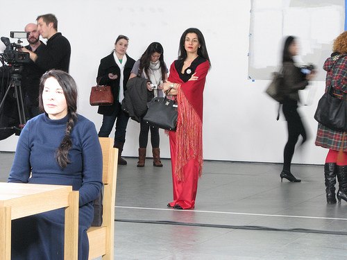
As the evening wore on, slides of naked women were projected, suggesting that pornography has its place among the neo-Palladian splendors of the alabaster city. Waiters spilled bits of plastic from trays onto the audience. A woman came on wearing a shredded American flag on her head; her spine was as stiff as a flagpole. It had to be, since it was part of the monument to the victory at Iwo Jima, and three soldiers held her at the appropriate tilt. A 14-year-old boy in a Lincolnesque beard entered the room, was shown to his seat, and sat there waiting to be shot. Zow.

For the closing number, Miss Washington, stacked like the melon gallery, appeared in a mass of red taffeta. She pulled her rip cord, and there she stood--after all, it is the nation's capital--not quite nude. An aw-gee string. A suggestion of red taffeta there-there and there.

She turned and bolted like a moose, followed by official Washington, gurgling hip-hip for happenings.

All these activities map very closely to Oldenburg's script, which was transcribed and published with his Raw Notes in 1971. But these incomplete accounts generate as many questions as they answer about how Stars took shape, what actually happened, and what happened afterward as a result.

I finally decided to go to the source. Last week I spoke with Alice Denney, who organized the Pop Art Festival and curated the Popular Image show it accompanied. She was generous and awesome, and not a little bemused at my questions--or that I was asking them at all.

How many Happenings were there? When and why did the site move from the cleaners to the Gallery, and how did that affect it?

AD: We thought we could do it in the rug cleaning place on P Street, but a few days before, a couple of the trustees came in and said, "You couldn't do it there, there's no egress." So we moved it.

...

[The content] didn't change, even though the space was much tighter. We used the stairway so that Olga Kluver could come down.

Ah, so Olga Kluver was the one in the red taffeta dress. In 1963, though she was living with Billy Kluver, she still went by Olga Adorno. Kluver, of course, had helped organize another major event for the Festival, a multi-stage dance performance by the Judson folks at a roller skating rink in Adams Morgan. Meanwhile, in 1964, Andy Warhol threw a party to celebrate Adorno and Kluver's marriage.

olga_adorno_st184-5.jpg

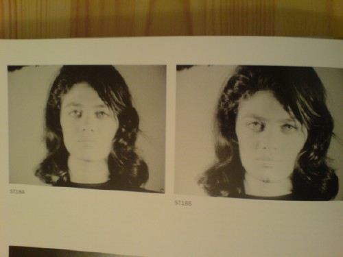
Adorno appeared in at two of Warhol's Screen Tests, ST184 and ST185, both in 1964. She also performed in Happenings by Allan Kaprow, Red Grooms, and Robert Whitman. Apparently, Adorno's still going strong, creating enigmatic performance works from her base in Nice, France. But back to Mrs Denney, who was the gallery staffer mentioned in Time as making blue ice cream and serving it on picnic plates, and whose son was the stand-in for Lincoln:

...It was all about Washington: the monuments, the dinner parties...

Everybody wanted to go, and all the fancy folks wanted to be in it.

But it was pretty much my gang of crazies, [Claes] didn't want society ladies.

And it turned out to be quite popular. The reservations filled right up for all three Happenings [one on Wed., Apr 24, and two on the 25th]. Mrs Denney mentioned that in addition to performing in Stars, Claes's first wife, Patty [Pat Muschinski], worked on many of Oldenburg's soft sculptures and costumes, and wrote a memoir of the Happening for Art in America. And so the chain continues.

binnenhof_google_earth.jpg

I've been looking into how Google Street View panoramas are made, and it's been kind of awesome. Each equirectangular panorama is stitched together on the fly out of 21 photos.

Equirectangular projection, or plate carrée (flat square), is a technique that maps coordinates onto an evenly spaced grid of latitude and longitude, which produces significant distortions, especially along the perimeter. Like how Antarctica ends up looking bigger than the rest of the continents put together. Flickr user swilsonmc's images of flattened out Street View panoramas show the axis of distortion quite nicely.

I think there are other distorting elements in Street View, though; it appears that each panorama is anchored to a specific set of lat/long coordinates. [The Street View data layer on Google Earth shows this beautifully by plopping these 3D pano bubbles down on its own 3D landscape. (top) It's like simulation-within-simulation. Also, they look like inverted satelloons, only they're projecting back their surroundings from the center, rather than reflecting from the surface. I mean, just check out the highly reflective surface of the PAGEOS global mapping satellite for a minute. Am I right? Wait, did someone say mapping?]

Anyway, the panoramas pull together the best images of that spot, which are not necessarily taken at that spot. Google's roving cameras are shooting constantly, so there images approaching and leaving a particular panorama site. This introduces multiple POV and perspectival distortions into a single panorama. Which can result in awesome, zig-zagging thickets of tree trunks, fence posts, stanchions, and disembodied pedestrians. And which all remind us that these panoramas are not photos, but photomontages.

But wait, that's not all! swilsonmc also created a php script that turns every flattened Street View panorama into a frame of video. The flickr video above shows the trip up the Long Beach Freeway in LA, from Seal Beach to Glendale. It reads as a continuous trip, of course, but if you watch the traffic and the clouds, the other Street View distortion--time--so obvious it's invisible, becomes clear: there are photos taken on different days.

Roland Barthes described photography as "the presence of a thing (at a certain past moment)." The always didactic John Berger said,

Photographs bear witness to a human choice being exercised in a given situation. A photograph is a result of the photographer's decision that it is worth recording that this particular event or this particular object has been seen
and on the intrinsic temporal content of photography, he said, "This choice is not between photographing x and y: but between photographing at x moment and not at y moment." I think it becomes clear that in the traditional, theoretical sense, whatever Google Street View images are, they are not photography.

So the last couple of months, I've been working on an idea for book, and I wanted to see a mockup/proof. It's mostly photographs/images, with a very text introduction, and I wanted only one image per spread, like a nice little monograph. Which means a lot of blank facing pages. Which is fine if you're printing a run of books, even a small one. But it sucks if you use an on-demand printer, which usually start charging $1-1.50 for each page over, say 20.

I decided to use Blurb.com for the proof, partly because they offer a nice variety of formats and finishes, but also because their stepped pricing structure was quite reasonable. Also, their BookSmart tool is pretty flexible for putting the book together. There's a large selection of page layouts, which I was able to pare down and edit to my own liking. So far so good.

Here's my first and only tip for anyone thinking about using Blurb & BookSmart: BE $)(%ING SURE AND HAPPY WITH THE SIZE AND FORMAT OF YOUR BOOK, BECAUSE IF YOU WANT TO CHANGE IT, YOU'LL HAVE TO START OVER FROM $#*(%(ING SCRATCH. HOW THE HELL CAN SOMEONE CALL AN APPLICATION "BOOKSMART" WHEN IT IS TOO )($*#%ING STUPID TO BE ABLE TO ACCOMMODATE THE MOST BASIC CHANGE OPTION OF ALL?

So yeah, the proof arrives in a few days, we'll see how it looks [besides, too big, obviously.]

The Archive of American Art's collection of transcripts of Paul Cummings' interviews with art world figures is always good for a firsthand account and an interesting nugget or reflection. But I don't think I've ever had quite the visceral reaction I got reading Ivan Karp's account of the emergence of Pop Art in New York in 1961-2. At the time Karp was director of Leo Castelli Gallery. Roy Lichtenstein had just brought in some paintings done from comic books, which Karp and Castelli both found extremely unnerving. Here's an extended excerpt, but you could really read almost anything and just be hit by the sense of discovery and amusement of Karp's story:

But we kept I think four of them. And then Leo saw them and had his own set of reactions to them. Which was pretty startling. And we both were jolted. We thought well let's look at them again; we'll put them in the racks and we'll take them out again and see how they feel as the days go by. I told you earlier in the tape about how other reactions were; we showed them to people who came into the gallery. And it was not good. It was a bad scene. There were really truly unpleasant moments there because people thought that if we'd show art like that it would be the end of our situation, that we were pushing things too hard. And we said, "No, no, it's really an intelligent and original innovation. It's peculiar and alien and strange and we're going to look at them some more." I don't know if I told you that Warhol, who was a collector to a certain extent at that point, (I didn't know who he was ) he came in with some young men who had also been buying works from me, and I remember Warhol bought a little Jasper Johns drawing for $350. What a beautiful drawing! Wow!

[ed note: The invoice for Wahol's Johns drawing, Light Bulb, 1958, graphite wash, 6 1/2" x 8 3/4", dated 8 May 1961, is in the amount of $450, which Warhol paid in installments. Here's the sketch; it was in Sotheby's Warhol sale in 1988, and it was resold at Christie's in 1998.]

johns_lightbulb_warhol.jpg

PAUL CUMMINGS: Warhol bought the drawing?

IVAN KARP: Warhol, yes. He came back the next week. And I said, "Oh, there's a curious painter downstairs that I'd like you to look at; very strange." (I didn't know who Warhol was or what he did. All I knew was that he was a man with a crop of gray hair who came in an bought a Jasper Johns from me). He issued one of his curious little sounds like an astonished "Oh!" that he says every so often, which he still says in a state of astonishment. He said, "Good God" -- or whatever he was exclaiming -- "I'm doing something like this myself!!" He said, "What are these paintings doing here!" Whose work is this! What is this man! What is he thinking!" He was really shocked and at the same time he was appalled. And I think he was very troubled that somebody else was doing the same thing. And he asked me if I wouldn't come to his studio and look at what he was doing. I said, "Do you mean to say that you're really concerned with the same kind of images?" He said, "Yes. I actually am doing cartoon things and like commercial subjects. But they're different, of course; they're very different. Would you come and look?"

You know, it's really too long for the front page, so I put the rest of it after the jump.

In her 1998 biography of Mary Pinchot Meyer, Nina Burleigh used Stars, Claes Oldenburg's Happening at the Washington Gallery of Modern Art's 1963 Pop Art Festival, as a bellwether for sophisticated Georgetown/Washington's temperament towards contemporary art. Here's how Burleigh described the event [from p. 202]:

Stars: A Farce for Objects Designed by Claes Oldenburg and involving twenty-one players, the happening lampooned official Washington and satirized the capital's iconography. One pieces was a huge sewn miniature of the Washington Monument moving around by means of seven people huddled inside. One scene involved a very well-endowed naked woman coming down some steps, and included such absurdities as a roller skater, a waiter carrying a tray and spilling colored foam rubber bits, a girl brushing her teeth, two men spraying room deodorant, a woman undulating inside two mattresses, a girl ironing, and a child dishing out blue frosting. It was accompanied by drumbeats and a rendition of "Sweet Leilani." Each action was repeated twenty-four times. It was received with annoyance by the art critic for the Washington Evening Star, who found the whole evening tedious. The show, he wrote, "will be repeated and repeated and repeated tonight."
Here's another rendition of "Sweet Leilani," by the incomparable Hawaiian duo Basil and Pat Henriques.

March 27, 2010

Waiting For Gopnik

tejo_remy_moma.jpgHello, English-speaking media world! What have you been doing the last twenty years that you have not ever produced an article on Tejo Remy, the only designer to consider the borders of furniture and art?

Never mind, Blake Gopnik is here to correct this unforgivable travesty of public relations and/or poor Nexis searching skillz:

It has been two decades since Remy's stunning debut, and this article is the first one in the English-speaking world to try to take his measure.

"We are walking a line: 'Is it art or design?' " Remy says. And they are walking it almost alone.

Yes, alone except for the designer of every single item between Milan, Miami, and Moss--and half the people who passed through Utrecht in the last twenty years! But please continue, o design historian!
Even most avant-garde designers have come up with new models for comfort and ease -- turning away from Victorian velvet-on-oak, for instance, to embrace Bauhaus, then Danish modern. What few designers have done is work to abolish comfort itself as a design principle, in favor of objects that disconcert. That's the Remy and Veenhuizen model.

...

You can still order one of Remy's drawer-piles from the Dutch distributor Droog, which sponsored some of his early work and has become much better known than Remy himself.

llewelln_gopnik.jpg"Distributor"? "sponsored"? Droog began as a design collective, with Remy as one of its early members. His drawer-piles [sic], aka the You Can't Lay Down Your Memory bundled bureau, dated 1991 and exhibited in Droog's Milan debut in 1993, was the collective's signature design.

I don't begrudge Remy or any early Droog participants for seeking to build their own brands outside the increasingly corporatized Droog umbrella. In the last several years, Remy's been using language to distance Droog from his design and process, by saying they "commissioned" the dresser. Now it's "sponsored." But only someone completely ignorant of the history of design generally--and of Dutch design and Droog specifically--could write something as wrong as this.

Dutch design team Tejo Remy and Ren & [sic] Veenhuizen mount first U.S. 'solo' show [washpost]
image and completely contradictory explanation of Droog and Remy via moma.org

antioch_bubble_factoryschool.jpg

Domes, inflatables, World Expos, Buckminster Fuller, every once in a while around here, it feels like I'm just blogging about whatever artist Steve Roden blogged about three years ago.

The Antioch Bubble is one of those times. [Though, to my credit, I was within range in Feb. 2008]

After its main Ohio campus was shut down by a student strike, Antioch College began establishing satellite campuses around the country. The school's hands-on, experiential learning approach lent itself to the development of a giant, one-acre bubble structure in Columbia, Maryland to house administration, classes, and other student activities. There were domes and other bubbles inside the 32,000 sf Bubble.

antioch_bubble_nyt_sauro.jpg

Considering they're mostly used for tennis courts and sports stadiums now, it's interesting to how politically polarized this inflatable structure concept had once been. Ant Farm was promoting inflatable lounges for naked hippies at Altamont at the same time the USIA was building a giant, balloon-roofed pavilion for the Osaka World Expo. And at the center of a master-planned real estate development of a city, Activist/architect Rurik Eckstrom was ranting against evil corporations from his Ford Foundation-funded dome.

The Antioch Bubble was contemporaneous with it all; there was a full model and 1,000sf mockup in the bag by 1971, and the real thing started going up in the Fall of 1972. An early Nor'easter flattened it in November of '73. Design and construction were overseen by Ekstrom, an architecture professor at UMD, and a team of 15 students.

It's still blowing my mind a little bit that such a radical-sounding guy as Eckstrom could be spearheading a truly experimental program to rebuild America's schools, and with widespread institutional support. And at the same time that Popular Science is announcing the Glorious Inflatable Future has arrived, and we'll all soon be living in Goodyear houses. PopSci called it "Antioch's one-acre Pneumatic Nomadic Campus," and touted its inexpensive portability.

From a NY Times article on May 26, 1973 [interior photo above], it appears a bit of the educational/collaborative value of the project was lost in a rushed to complete in time to host the National Conference on Air Structures in Education, which sounds like an event created to tap a funding source:

[Student/designer/participant Mike Krinsky] said he came here in January because he thought Antioch and the bubble project might help him learn to become a "competent activist." He said he had become, instead, a poorly paid day laborer. "I'm leaving right now feeling I've been used."
An important lesson for the interns of the future.

On the bright side, when Roden posted about Antioch in 2007, there was almost nothing online about it, or about Ekstrom. That has now changed. Factory School is building an archive of historical material and first-person accounts of the Bubble, which is being helped along by the likes of Google Books.

And the DC area may see another Pneumatic Event Space yet. If the Hirshhorn's DS+R courtyard-filling donut bubble comes to fruition, the inflatable future may yet be upon us.

Event Architecture [airform archive]
Learning from Antioch - Columbia [factoryschool.com]

oldenburg_wapo_041663.jpg

The week before The Pop Art Festival in Washington DC, Art Buchwald had lunch with Claes Oldenburg, WGMA Assistant Director Alice Denney, and publicist John Mecklin. The topic was Oldenburg's upcoming Happening, Stars. Buchwald wrote (in the first person plural) about the lunch in the April 16, 1963 edition of the Washington Post:

Pop art, in case you're wondering, is the latest thing, in which artists use anything form comic strips to American flags to give a new concept to reality and illusion. (It's more than that too, but we're not sure how much more.)

...

"Mr. Oldenburg," we said, "What is a Happening?"
"There is no definition. I don't know myself what a Happening is. It's putting all the elements and senses together and composing a picture. Sight, sound, smell, imagination. Everything plays a part."
"I see," we said. "How do you organize a Happening?"
"I buy things at the Goodwill Industries, the Salvation Army, and second-hand shops. Then I find a place to have a Happening in. It must have three-dimensional space and it's best if the thing you find is characteristic of the composition you're trying to create.
"Naturally," we said. "Where is your Happening going to take place?"
"I've had a lot of difficulty finding the right spot. You see, at a Happening the place where you do it is as important as what you do. I found a rug cleaning shop which looked just perfect, since tehre was lots of junk in it. But the Fire Department wouldn't let me use it. Fire Departments and Police Departments and vice squads give us the most trouble about our Happenings."
"That's because they're square," we said.
"So I've decided to give my Happening to the Washington Gallery itself. Now I know you're going to say this violates the idea of holding a Happening in a typical place. But in this case the gallery is okay because the walls are white and it's typical of the Washingtonian's yearning for everything in the city ot be white. Therefore it's really a good place for a happening."

...

As we left the restaurant we stopped by Mrs. Denney's station wagon, which she had lent him to scout for things for the Happening. In the back were a baby carriage, six small footstools, a bird cage, a first-baseman's mitt, a mirror, an iron bedstead, and two pairs of saddle shoes.
"What are you going to do with all that?" we asked.
"I don't know," Mr. Oldenburg said. "I might use them in the Happening and I might not. It all depends on how I feel."

March 25, 2010

Photography Is Dead

In Frieze, Jennifer Allen [no relation] declares the death of photography. Film photography, that is:

Digitalization brings photography closer to cinema, too. The galloping horse that Eadweard Muybridge photo-graphed with 24 cameras can now be captured with one high-speed digital camera. While analogue cameras take five frames per second, the digital 'burst mode' can take 30 high-quality frames per second (and over 1,000 in lower quality). Photographers may keep their fingers on the button and choose the best frame later. In light of these developments, artists who made photographs look like film stills - Cindy Sherman in her series 'Untitled Film Stills' (1977-80) or Raymonde April in her series 'Sans titre' (Untitled, 1979-80) - anticipated the transformation of photography from a fleeting image to a moving one.

Yet, if a camera can take 1,000 frames per second, are the resulting images photographs, stills or clips? If an artist prints one frame selected from 1,000 is she a photographer or an editor? Words like 'snapshot' and brands like Kodak's Instamatic cameras reflected the old desire to capture a moment that would otherwise disappear. With the speed and storage of today's digital cameras, it becomes hard to miss any moment.

If photography actually is dead, I'd hope it'd get a little better sendoff. Allen's onto something, but her piece ends before she's even able to make an argument. The obsolescence of film- and chemical-based photo technology is undeniable--not that anyone's denying it--but that means that photography's really just as dead as the medium it once supposedly killed: painting.

Long Exposure [frieze.com]

Suddenly silver mirrored balls are everywhere.

Music video and filmmaker Roel Wouters created the trailer for last year's International Film Festival Breda:

A silver sphere on an endless checkerboard floor is the default for many 3D modeling applications. It can be seen as an icon for a sterile, makeable world. Reality though, is dirty and unpredictable. By recreating this icon in reality the beauty and imperfection of real life gets emphasized.

The recording was the result of 3 people controlling different parts of the installation, Roel controlled the speed of the balls, Benoit (Eurogrip) controlled the speed of the dolly and Sal focussed and zoomed the camera. It turned out to be a play were the 3 of us playing harmoniously together.

It's awesome. Coincidentally--actually, several coincidentallies--a selection of Wouters' work was screened just today in Den Haag, organized by a cinema club called Cinetoko. Cinetoko is a collaborative effort between Motoko, a motion and video design studio, and <>TAG, an art/tech/culture catalyst of some kind. It happens at the Zeebelt Theater, which is safely to the west of any Google Map camo or StreetView complications. [via manystuff thanks andy]

vanguard_hankwalker_life57.jpg

I could feel Mondo-Blogo was baiting me as I scrolled through the photos from MoonFire, Taschen's luscious 2009 commemorative book for the anniversary of the Apollo 11 landing. He was amped about the text by Norman Mailer, and the multiple insane limited edition versions of the book--with or without embedded lunar asteroid fragments and lander-style display cases--designed by Marc Newsom. I, meanwhile, was sensing some ur-satelloon spheres coming on, and--BOOM. This photo above.

But what was it? I couldn't tell the mission, and I couldn't find the same or similar images of such Sputnik-like satellites in progress, no matter how hard I Googled. And from the preview, neither Mondo nor I could read the captions. The trade edition of the book wasn't out yet, at least in the stores--and space bookshops, and the National Air and Space Museums--I visited last week. What to do? I asked Taschen's publicist for help, and voila. Project Vanguard.

This is a previously unpublished 1957 image from LIFE Magazine photographer Hank Walker of the Project Vanguard team at the Naval Research Laboratory, hard at work on the world's first "earth satellite." [Well, not quite the first, as it turned out.] But almost no one in the US knew about Sputnik on June 3rd, 1957 when LIFE ran an excited cover story about Vanguard's development ["Man-Made Moon Takes Shape," "Shell of Satellite Mirrors its Makers"] That's Vanguard scientist Alexander Simkovich, by the way.

vanguard_life_06031957.jpg

Walker's other LIFE photos of Project Vanguard from the Spring of 1957 are just as awesome. Some of the most artistic highlights:

The crating: Apparently, at least 35 Vanguard and Vanguard II satellite shells were manufactured in Detroit by Brooks & Perkins, then shipped to Washington for assembly. I have to wonder what Eva Hesse was doing while these things were being packed:

vanguard_hwalker_life_crate.jpg

The see-through model: Instead of an internal sphere full of scientific instruments, the 20-inch Vanguard II satellites were designed with a suspended, miniaturized, stacked core, as this plexiglass model showed:

vanguard_hwalker_plexi_life.jpg

This looks remarkably like the cutaway drawing for the first patent ever issued for a satellite structure. Satellite team leader Robert C. Baumann filed the patent in August 1957, and it was granted in 1958. In the mean time, of course, the Soviet Union had launched two Sputniks and the rocket carrying the first, grapefruit-sized Vanguard satellite, had exploded on the launch pad on live television [that satellite was recovered intact and is on view at the Air & Space Museum, btw]:

satellite_patent_baumann.jpg

The making of: Brooks & Perkins manufactured the vanguard shells from sheets of magnesium [below], then plated them with gold. A remarkably detailed Time Magazine article from April 15, 1957 explains the rest of the manufacturing process:

When the satellites came from their manufacturer, Brooks & Perkins, Inc. of Detroit, they were thin-skinned magnesium spheres plated with gold. Aluminum is better for reflecting sunlight, but since aluminum will not stick to gold, the gold had to be covered with a thin film of chromium. Aluminum will stick to chromium, but it also mixes with it and loses part of its reflecting power. So the chromium film in turn had to be coated with glassy silicon monoxide, and then with aluminum.

The delicate work of depositing the coatings was done by the Army Engineers at Fort Belvoir, Va. Each satellite was put in a vacuum chamber and turned, like a chicken on a spit while the materials in the coatings were evaporated electrically and deposited on its surface. The final coat was a second layer of silicon monoxide.

vanguard_hwalker_black_life.jpg

In terms of the Space Race, Project Vanguard was only a fair success, and it was quickly superseded. A Vanguard II satellite launched in 1958 is currently still in orbit and is the oldest man-made object in space. So that should mean that at least a couple dozen of these iridescent masterpieces still roam the earth--or are stuck in crates in NASA scientists' grandchildren's garages waiting to be liberated and exhibited. The search is joined.

Oh, look, here's one that's off the list: a 1958 Vanguard Lyman Alpha replica or flight spare on display at the National Air & Space Museum's Udvar-Hazy site at Dulles.

raw_notes_oldenburg_stars.jpg

It's been a few months, and now I've been researching it so many places, I can't remember exactly where I first discovered that Claes Oldenburg did a Happening in Washington DC. And an early one, too. He was invited by Alice Denney, the assistant director of the fledgling Washington Gallery of Modern Art, for The Pop Art Festival she was organizing alongside her pioneering show of Pop Art, "The Popular Image Exhibition," which opened in April 1963.

Pop was still barely being defined. By including a lecture/tape recorder performance by John Cage and a multi-ring dance event organized by Billy Kluver and featuring Yvonne Rainer and the Judson Church crew, Denney's expansive view seems to have equated Pop with early 60s avant-garde. If there's a thread that persisted, it was the artists' engagement with the popular culture, in contrast to the prevalent self-referential mode of Abstract Expressionists. [The WGMA had just opened with the first Franz Kline retrospective.]

Anyway, it's a bear trying to find out what this Happening was all about. There was one, there were two. It/they happened at a rug cleaners off of Dupont Circle, and/or in the Gallery itself. It was called Stars and/or Cleaners.

The confusion is partly the ephemeral, had-to-be-there nature of the medium, and partly the fragmented, subjective nature of the accounts I've collected so far. Whether written in anticipation of the event or in its aftermath, PR-excited or cynical, they're incomplete and/or inconsistent. And none is definitive or gives a clear picture of Oldenburg's intentions or plans, or even what happened. And of course, there are few-to-no substantive reviews.

And then there's the art historical blind spot that DC inhabits in the art world, and that the art world inhabits in DC. [The Kennedy era seems to be one of the few times that official Washington seemed interested, not just in contemporary art, but in art as it was happening. And that obviously didn't last, though the institutional vestiges of Camelot and the WGMA linger on, from the NEA to the Art In Embassies program to the Washington Project for the Arts, which is on its third or fourth life right now under my friend Lisa Gold.]

So rather than just write up some mega-post posing as an MFA thesis, I'm going to post an anthology/bibliography for Stars, which will include the articles and accounts I've found, plus some interviews I'm doing with folks who were involved with the Happening itself. I'll keep this post updated with links as I go:

Claes Oldenburg: Raw Notes (1973) contains "Documents and scripts for the performances: Stars, Moneyhouse, Massage, The Typewriter, with annotations by the author. It was republished in 2005.

It turns out Stars was originally called Cleaners, after its first chosen/intended venue. The dates were April 23 & 24, 1963:

This is a town of initials, automobiles and cleaners to mention some important things. Also long dresses + monuments. I will be asked no doubt in what way does what i do here reflect Washington...

My pieces have two titles, the first being one which describes the form of the piece...The second title is the thematic title.

Oldenburg selected Aristo Rug Cleaners, located on P Street around the corner from the WGMA. His notes mention the activity of the site, and how "the interaction of white shirts and brown and black (employees)" embodied the city itself.
After a visit to Washington for the purpose of using the place [the cleaners], I did form the title STARS, already more specific than the first stage. This came from seeing very clear stars in the sky on the last moment of my visit and seemed to concentrate certain physical properties of the place, f. ex. the patriotic motif. The radiated way the streets are built. But the title was still abstract in that it was achieved part from a particular place in Wash. where the piece might be done.
Then Oldenburg set out to design the event, collect props, and cast all his players during a two-week preparatory visit. Next up will be a friendly preview of the performance from that prep period by Washington Post columnist Art Buchwald.

chris_burden_through_night.jpg

Through The Night Softly was a 1973 performance piece-as-latenight-TV-commercial by Chris Burden. It's a 10-second video of the artist, in a Speedo, inching on his stomach across a parking lot full of broken glass. [View it on UbuWeb.] Burden wanted to be on "real TV," and 10 seconds after the local LA news was all he could afford at the time.

[clarification after watching it again last night: Through The Night Softly is Burden's title for the actual performance and/or the video of it, which goes on longer than 10 seconds. TV Ad is the clip of TTNS on TV.]

More than the cringe-inducing action itself, which is closely related to other works he was making, Burden talks about the piece in terms of its context--its startling juxtaposition and inexplicability among shampoo commercials and Movies of The Week. In the EAI video compilation above, he also talks about how hard it was for the TV station to take him seriously, even though they both realized he was a "small customer."

Well, consider that problem solved. Slate's Seth Stevenson has a fascinating video about Google TV, which lets you buy actual TV ad time the way you buy AdWords: a few DIY clicks at a time.

Stevenson made a goofily paranoid 30-second commercial out of vintage stock footage, then spent just $1,300 to run it 54 x/wk on Fox News, where it was seen by several hundred thousand 1.4 million [!] people.

They got a thousand people to visit their website, which is a horrible conversion rate, but who cares? You could have a dozen more interesting goals and invitations to the viewer that make more sense. Or none at all. Can you imagine what the video art world could or should be doing with this? The mind reels.

Assuming Google would allow it, of course. When AdWords first came out, I regularly used it for publishing, not advertising. I'd write little haiku-like ads keyed to search terms that had no ads at all, like, at the time, Agnes Varda. [Hmm, nearly eight years later, a Google search for "agnes varda" still returns no ads.]

Anyway, it lasted until Google announced their IPO, and they instituted a new TOS for the program. It'd be interesting to see what the contours of Google TV's commercial standards are, and how they affect content.

I suspect Chris Burden's original ad wouldn't fly today. But I'd love to be proved wrong. And I'd love to see these ads run, then get taped and uploaded in context to YouTube, where they could continue to reach an audience. LAXArt organized a series of artist-produced billboards around Los Angeles. And Creative Time programs video art onto giant monitors in Times Square. Where's the public art organization curating and running 10-30 second video art on cable? What about an artist or group of artists creating programming for the format and airing it themselves? BHQF-TV, anyone? Stick a sponsor slide on the end for a couple of seconds and the piece pays for itself.

How I Ran an Ad on Fox News [slatev.com via @joygarnett]

A great post on language & progress, Claude Levi-Strauss & TIno Sehgal. Some of the most interesting commentary I've read on discerning the actual structure and contours of Sehgal's This Progress, too. [futureofthebook.org via @briansholis]

Which makes me wonder: do the works come with NDAs? Are they secrets? Trade secrets? Can the instructions be shouted from the rooftops? Could the unwritten transmitted/purchased instructions be performed or recited publicly as entertainment, as part of a critical discussion, or in an effort of collective preservation? Are they really just a couple of lines ["Roll around kissing constantly. Every few minutes, strike a pose from a famous work of art."] or are they more elaborate? Obviously the parties concur that there is some intellectual property right being transferred, but what is the implication for the artist--or his dealer or a collector or museum--either disseminating the instructions or refusing to do so?

Ramin Bahrani's short film Plastic Bag tells the story of a lone plastic bag's Odysseus-slash-V'Ger-like journey to find home and its creator. Werner Herzog stars as the plastic bag. Seriously. [via mrdanzak, thanks andrew]

Speaking of epics, Grain Edit has a wonderful interview with Sanjay Patel, the Pixar animator/illustrator/Charles Harper fan who went from self-publishing the awesomely kawaii Little Book Of Hindu Deities to creating a modernist graphic version of the Ramayana. [grainedit]

I'm liking what I can see of Eamon O'Kane's paintings about Le Corbusier's somewhat dickish relationship with and interventions in Eileen Gray's architectural masterpiece, the E-1027 Villa at Roquebrunne. They're at See Line Gallery, but the big pictures are at the LATimes. [Related: at a 2007 MoMA conference, Beatriz Colomina called Corbu's alterations of E-1027 an architectural "rape".]

I've been doing some research on early Happenings staged in Washington DC by Claes Oldenburg. More on that as it develops, of course, but there's no need to wait on sharing this very self-amused Time Magazine account of "The Pop Art Festival" organized by the Washington Gallery of Modern Art in April 1963:

Blue Wrench.
Happenings are old stuff in the artiest alcoves of Manhattan, but of course that means nothing in Washington square. This one was prepared by Artist Claes Oldenburg, who makes those huge sailcloth hamburgers. Washington society prepared by getting itself puffed, powdered and sloshed. Little dinners were eaten intimately in Georgetown. The jolly crowd then collected at the gallery to see what was going to happen. Nearly everyone sat on campstools--White House Art Adviser Bill Walton, FAA Administrator Najeeb Halaby, Mrs. Arthur Schlesinger Jr. Those. [sic]

A member of the gallery staff announced that she had successfully achieved blue ice cream. She had mixed blue dye and vanilla ice cream with a monkey wrench. The New Frontier moved an inch forward on its stools.

This was obviously going to be some happening.

Does anyone know how Time and others [Old Media types, mostly] insert the unique tracking url into my copy&pasted quote of their article? I assume it's to prevent/track automated scraping and republishing, but from their page code, I can't figure out how they do it.

And lastly, I went to hear John Gerrard talk about his time/duration-intensive work at the Hirshhorn last week. He's got a very different project going on, what with the environment, and the orbit of the sun and energy and industrialization and video game engines and what not, but it was nice to see that he's nearly/slightly as engrossed with using Google Earth as a creative tool as I am. He pulls colors from the satellite images to create site-specific palettes for his digital landscape re-creations.

Which, whoops, come to think of it, may be problematic. Just yesterday, Stefan at Ogle Earth laid out a not-insigificant case for why it matters that--whoops--all satellite imagery, including Google's--is color-enhanced. "It is the case that colors in satellite imagery are always false, albeit made to look realistic (just as with those pretty pictures of galaxies and planets)." [ogle earth via @felixsalmon]

Kuler_orange_teal.jpg

On his blog Into The Abyss, editor/filmmaker Todd Miro has an awesome, screencap-filled rant about the orange-and-tealification of Hollywood. In color theory, teal is the high-contrast opposite of flesh tone [as the palette Miro generated at kuler demonstrates] and so directors looking for an image to "pop" are jacking up the color contrast and narrowing their films' palettes. In post.

While color adjusting has always been with us, Miro traces the problem to the Digital Intermediary, which has become the visual equivalent of AutoTune:

The Cohen brothers ushered in the new era of digital color grading with their excellent 2000 film, "Oh Brother, Where Art Thou." This was the first feature film to be entirely scanned into a computer, a process known as "Digital Intermediary", or DI. Once inside the computer, the colorist now had unheard of control over every element of the image. Imagine tweaking an entire movie with the tools and precision that one has with their still images using Photoshop, and you get some idea of what power was unleashed.

But was that power used for good... Nooooooooooooooo, or course it wasn't!

As in so many other ways, so it goes with orange & teal overkill: Transformers 2 turns out to be the worst of the worst.

todd_miro_teal_orange.jpg

Teal and Orange - Hollywood, Please Stop The Madness [theabyssgazes via afc]

smithson_jetty_poster.jpg

I've been working on a shot-for-shot remake of the Spiral Jetty film for a while, and so I'm quite familiar with the storyboard-like drawings Smithson did for it. Familiar with them as drawings, that is. He called them Movie Treatments.

It's a little embarrassing to admit I didn't realize Smithson had used a treatment/storyboard for the flyer/poster of the 1970 Dwan Gallery exhibition of Spiral Jetty until I read it in Kathleen Merrill Campagnolo's essay on the Jetty and its camera imagery in the Smithsonian's Archives of American Art Journal. But there it is:

DWAN 29 WEST 57 STREET NEW YORK OPENING OCTOBER 31 TO NOVEMBER 25
A 16 MM, 35 MINUTE COLOR AND SOUND FILM ON THE SPIRAL JETTY WILL
BE SHOWN DAILY AT 2:00 IN THE GALLERY FOR THE DURATION OF EXHIBITION.
The Dwan exhibition consisted primarily of Gianfranco Gorgoni's large-format photos of the Jetty, eight of which were included in Kynaston McShine's historic "Information" show at the Museum of Modern Art that summer.

Given the iconic aspects of the photos and the powerful influence of the film--not to mention the experience of visiting the Jetty itself--it's somehow odd to think of encountering the Jetty first in terms of Smithson's site/non-site paradigm, as a situation represented in a gallery.

It's also interesting to note that the film only played once a day, not on a continuous loop as is often the case now. It was an event more than an installation.

Anyway, I would like you to send me one of these posters, please. If you have one you don't need, or perhaps some extras. It need not be signed. Thank you.

moon_luna9.jpg

It doesn't feel like a tangent to go from satelloons and museums on the moon to other aesthetic aspects of space and the space race. Plus there's the fascination at discovering, as a grown man, how much I hadn't been taught as a kid. As an American kid.

No one tried to ignore Sputnik or Yuri Gagarin, of couse, but it never registered with me that the Soviet Union reached the moon first. And landed the first spacecraft on it. And took the first pictures of the dark side of the moon. And from the surface.

The Soviets' Luna Program began way back in 1959, when Luna 2 hit the moon [after shedding a bunch of small Soviet emblems, apparently.] This, beefore America even got a balloon into orbit around the earth.

Also in 1959: Luna 3 returned photos of the far side of the moon.

And in 1966, Luna 9 made the first soft-landing on the moon and transmitted back the first five photos from the surface.

To avoid embarrassment in the case of failure, Russian missions were typically only announced after they succeeded. This meant that each achievement was met worldwide with a sense of surprise and skepticism/resentment.

The first image sent back from Luna 9, however, was intercepted by the University of Manchester's Jodrell Bank Centre for Astrophysics, which scooped the Russians' own announcement.

As an image, there's something familiar about it, at least in retrospect; it looks like what we [now] know the surface of the moon to look like. But in 1966, it had to have packed a punch. Add to that the level of political intrigue, the rivalry of the Space Race, and the ever-present military/nuclear threat of the Cold War, and this image becomes an incredibly powerful, important artifact.

One which I'd never heard of, or seen before last week. It's as if Apollo and 1969 wiped away the contentious, anxious experience and history of the earlier years. And along with it, the memory, recognition, and appreciation of the achievements that came first.

josef-albers-ken-price-1.jpg

Roberta Smith loves loves loves the Ken Price/Josef Albers show at Brooke Alexander. I all but stumbled across it a couple of weeks ago after finding Brooke's interview with Price (PDF), and I have to agree. It is incredibly fresh.

Its overarching theme is that abstraction is reality-based, distilled from lived experience, and actualized through highly personal approaches to process and materials. It's a lesson in life as much as art.
Albers' paintings and especially the prints, are additive, while Price's method is subtractive: he builds up layers of paint, then sands it down.

Ivan Lozano's post about Marina Abramovic, Joan Jonas, Tino Seghal, and the conservation of performance art is absolutely fantastic. [It's built off the Performance Workshop Klaus Biesenbach held a couple of weeks ago, which was written up by Carol Kino in the NY Times.]

The idea of a single orthodox means of retroactively preserving or documenting or re-performing or whatever early performance art strikes me as unreasonable; I like the idea that artists can decide if and how they want their work to live on, whether if it's as a score, video documentation, ephemera, or in Seghal's case, unwritten verbal transmission.

Lozano hits the nail on the head with his awesome characterization of Abramovic [above]. And kudos to her for making a strong play for preserving her own work and for influencing the present and future of the medium. But one thing about her stone cold divadom that he doesn't mention that came immediately to mind was her establishment of the Marina Abramovic Institute, which is charged with the preservation of performance art.

It reminds me of the Eric Carle Musem of Children's Book Illustration, another ostensibly comprehensive history-writing institution which was founded by a practitioner--who wasn't waiting for history to decide his place in the history books.

March 18, 2010

Camera Angel

"Brian Palma" is a bit of a stretch, but Tarantino's clapboard loader Geraldine Brezca is a true artist in her own right. [via]

You remember how, a couple of months ago, I could find next to nothing online about Vern Blosum, the mysterious artist whose crisp, deadpan paintings of parking meters were featured in one of the very first museum exhibitions of Pop Art, "The Popular Image," organized by Alice Denney in the Spring of 1964 1963 at the Washington Gallery of Modern Art?

Well, we're making a little progress. I've been in touch with people who know or knew Blosum and his work. As I piece his story together, I'll present it here. For an artist to show alongside Warhol, Rosenquist, and Oldenburg, and to be collected by MoMA and Larry Aldrich [1], and then to practically disappear, well, it's fascinating.

What I really wanted to do, of course, was to find and see Blosum's work, to see how it might relate to those earliest Pop contemporaries, and maybe see how it holds up. But all my searches came up empty. Until tonight. Somehow, Blosum's entry in an art history teaching image database at California State University [WorldImages at SJSU, to be specific] showed up on Google.

There's a very clean image of Blosum's 1962 painting, Time Expired, which is listed as being in MoMA's collection [a mystery again because MoMA's online catalogue comes up a blank]. I'm looking into that, but first, just look at this.

It's not a flat, billboard style like Rosenquist, or a flattened silkscreen image like Warhol or a deliberately graphic/comic style like, say Lichtenstein. And it's not photorealistic, and certainly not Photorealist, despite how Cal State apparently teaches it, Instead, it's quite illustrative, the city street version of Wayne Thiebaud's diner desserts. I think it's really quite nice.

blosum_sjsu.jpg

[1] Actually, I misread that. One of the only web results for Blosum was in Larry Aldrich's 1972 interview with Paul Cummings in the Smithsonian's Oral History collection at the Archives of American Art. That led me to a couple of lengthy discussions with folks at the Aldrich Museum about whether they have the Blosum painting Larry clearly said he'd bought. They don't.

Now I see why. Aldrich is talking about the MoMA painting above, Time Expired. He created a multi-year fund for Alfred Barr and Dorothy Miller to purchase new work from emerging artists, and he was telling Cummings what works the Museum got from the fund each year. This 1962 Blosum came into the collection in 1963, just as, or just before, Denney was assembling her show in DC.

It's funny, because the dynamics and challenges for museums to collect new work don't seem to change that much. It can still be tough, or at least problematic, for curators to ask their donors to buy unproven and/or less expensive work, partly because of ask fatigue, and partly because big donors like to donate for big things.

Also, Aldrich's unabashed discussion of using his fund to get the Museum's curators to do his "shopping" for him is simultaneously awesome, refreshing, and cringe-inducing.

One to help young American artists, and quite frankly, the second one was a personal selfish one in thinking that in essence they could help my efforts and sort of do my shopping for me, because, as I said, I could only get out once every two weeks and sometimes I wasn't even able to successfully do that. And I was under an impression, which I since learned was a mistaken impression, that they had people combing New York galleries all the time. Which I discovered was not the case.
He then recounts all these collecting war stories where he "loses" work to the Museum, or where he complains that prices have gone up because he'd let MoMA buy an artist's work before he got it himself. He sounds a bit tacky, but passionate, with a good eye, and in his telling, at least, if there were any potential conflicts, the Modern always prevailed.

Previously: Anyone tell me about Vern Blosum?

acconci_attention_studies_eai.jpg

While rummaging around in Vito Acconci's early exhibition history for traces of Kathryn Bigelow's work [more on that in a second], I came across a set of three early, short Super 8mm films I'd never heard of: Three Attention Studies, 1969.

They're all 3min. each, the length of a Super 8 cartridge, and made in conjunction with Peter Lupario, but it's the last one that's most interesting:

In Catching Up, the performer and cameraman walk side by side across a field. Sometimes the performer falls as the camera continues its pace; the performer must make an effort to catch up and return into the frame.
If that's Lupario in the still above--and it doesn't look like 1969 Acconci to me--these three films are notable for featuring the artist behind the camera, as the viewer, instead of in front, as the performer/subject.

These studies preceded by several months the 1970 body-related performance pieces for which Acconci became known. In a 1983 retrospective of the 8mm works at the Whitney, curator John Hanhardt said Acconci is "one of the first artists to successfully develop a significant oeuvre in the Super-8 film format." [PDF via vasulka.org]

So this Catching Up, I'd like to see. If anyone knows where it exists digitally, I'd love to hear about it.

Now back to Bigelow. I'm beginning to think that the Acconci project that most closely matches the dates, descriptions, and details of Bigelow's recollections is his 1973-4 Super 8 "feature," My Word. [Of course, I haven't seen it, even though it showed at X-Initiative last September.]

At two hours [or 90-something minutes, which may be an earlier, pre-1983 version], it required a lot of shooting. Hanhardt describes it as

composed of written statements alternating with shots of the artist in his studio and around his building. Acconci is the central protagonist whose gestures, actions, and written statements are all addressed to women--women are the other, unseen, presences in this work. The point of view of the camera can be interpreted as that of the women, silently confronting Acconci, or that of Acconci himself, mirroring his every move.
I don't like to, but I can imagine that's Acconci riding some kind of bondage apparatus with a large film projection behind him in the My Word frames below:

acconci_my_word_whit.jpg

My Word was a turning point, the last time Acconci included himself on-camera in his work. If this is the one, Bigelow actually shot some, part, or all of one of Acconci's most significant works. Too bad the Academy doesn't have some kind of lifetime achievement in dues-paying hardship award.

Previously: Tracking down Kathryn Bigelow's early conceptual oeuvre

abramovic_bkgrnd_cmonster.jpg
"The lady clad in bright red silk was having her picture taken from every angle around Abramovic's performance. It was spectacular."

C-Monster has an awesome photoset and a firsthand account of experiencing Marina Abramovic's MoMA performance, The Artist Is Present. She touches on the intensity of the line, and the realization that the artist is making you sit and wait, possibly for hours, too, and how the entire atrium is transformed around the silent artist. When all is said and done, thousands of people will have projected their own experiences and "performances" onto Abramovic; it's an aspect of the piece I hadn't considered before.

This is my favorite of C-Mo's shots, though, because it so perfectly captures the idea of an individual with her own strategy using the media to insert herself into Abramovic's piece.

This is interesting me right now for other reasons, which may be why it caught my eye.

Photo Diary: Marina Abramovic at MoMA. [c-monster.net]

From a 1983 New York Times profile of up-and-coming artist/photographer Cindy Sherman:

One day several years ago, in the studio of David Salle, who borrows extensively from the media, Miss Sherman saw a soft-porn magazine photograph of ''a housewife looking sexy'' and decided she'd try to look like that. Thus were born the ''Film Stills'' with their sex objects and immaculately-packaged good girls. Miss Sherman says she was not consciously making a feminist statement when she began these pictures. ''I never thought of it as political work,'' she says, ''I don't think of myself as a very political person''...

...Maintaining full control over her ironies remains something of a problem.

Portrait Of The Photographer As A Young Artist [nyt via @briansholis]

I'm slightly fascinated with the talk-based artwork of Ian Wilson. The last couple of weeks, I'd been working on a Conceptualism-related proposal, and so I had out my catalogue for Ann Goldstein and Anne Rorimer's awesome, formative [for me, anyway] 1995 MoCA show, Reconsidering the Object of Art: 1965-1975.

Fifteen years, and I think I'd never read the entry on Ian Wilson. Maybe it's info fatigue by the time I'd get to the W's, or maybe the blank page where the images usually go just registered as a section divider?

Anyway, Rorimer discusses Wilson's "search for an art in which no evidence of physicality would intrude." His work evolved from the instigation of casual conversations about "time" to a less subject-centered, "Oral Communication."

Whereas his Time work stemmed from his understanding that a word might represent a concept, Oral Communication grew out of his realization that the Time project principally concerned the process of communication. The designation Oral Communication, he decided, more pertinent served to characterize an endeavor whose ultimate subject and object, he once stated, "is speech itself," or "art spoken."
Maybe it's the institutional vs commercial context, but while Rorimer mentions Wilson's dutiful contributions to checklists and catalogues for shows he was invited to participate in--even the invitation card for a newly configured work for a group, a 1972 Discussion at John Weber Gallery--there is no acknowledgment of the other, seemingly crucial evidence/remnant/ instantiation of Wilson's work: his invoices and receipts.

And Andrew Russeth just emailed me this awesome anecdote he reported from a Performa 09 panel discussion last fall:

No matter how difficult or intangible the work, of course, most agreed that artists or their dealers will eventually find a way to sell it, leaving the museum to work out some of the details later. [Soon-to-be-announced incoming MoCA director Jeffrey] Deitch recounted that, as a gallery assistant at John Weber Gallery in the mid-1970s, he once typed the words "There was a discussion" on a piece of paper as a record that collector Count Giuseppe Panza had talked to artist Ian Wilson, who abandoned sculpture to make art only by talking. He then made out an invoice for $1,000.
Maybe if MoCA ever reissues the Reconsidering The Object catalogue, they will add a correction.

Deitch Defends Dakis Joannou Show at the New Museum [artinfo]

Can I just suggest that, when you buy an article from the New York Times Archive, you go ahead and buy a 10-pack? In addition to supporting your local paper in their time of financial distress and dire need [ahem], you can use the other nine articles for exploring whatever random people, thing, or history crosses your mind?

Which is how I found Roy Bongartz' Sunday arts feature from August 11, 1974: "Question: How Do You Buy A Work of Art Like This?/ Answer: With A Check"

The piece could've been read straight in one of Powhida and Dalton's #class sessions. Burden, Beuys, LeWitt, Acconci, de Maria, Bochner, Ray Johnson, Ian Wilson:

...these artists, all of them young "conceptualists," had decided to lift their work clear out of the category of investment property. By shifting the emphasis of their work to the pure thought and by refusing to offer any saleable object, they were mounting a deliberate attack on the traditional business of art. The artists' intention was to leave the dealer with nothing to sell, the collector with nothing to buy, and the museum with nothing to squirrel away.

[turn page, see continuing headline, "Buying Conceptual Art - Photos, Sets of Directions, Receipts"]

...The secret is that there is always something to sell.

Artists need to eat. Collectors want to buy. Ronald Feldman "authenticates" Burden's gunshot wound with a check. And voila! These rebels' most cunning attempts to escape or destroy the art market have been thwarted before brunch. We can now move on to the crossword.

But beyond the apparent news-worthy novelty of certificates, documentation, and instruction-based work, and the vastly divergent view now of some of the namechecked artists--Ryman and Sandback have a conceptualist collectible object problem?--you know what the funniest thing about the past is? It's the little differences:

That as long as the instructions [which sell "for as much as $8,000"] are followed, "it doesn't matter at all whether it's you, Sol LeWitt or your Uncle Elmer who does the marking."

That dealer/wife Mrs. John (Susan) Gibson is aghast at an invitation "from a Washington DC gallery" to show Robert Cumming's text & photo-based work--wait for it!

--in the photography section! Mrs. Gibson insisted Cumming's work go into the fine arts section because he was not showing photographs, but conceptual art. The reply was, well, we hope this is what photography will become. "Too late," said Mrs. Gibson. "This is what fine art has become." It was a standoff--no show for Cumming.
And then there's the eerie familiarity of Ian Wilson, "a kind of extremist even in SoHo, [who] simply comes in and talks. This is all that he does, and he's made a career of it."

The quote is from Sonnabend director Ealan Wingate:

"Here the art becomes so abstracted there is no object whatever. Yet in a way there is always an object because an idea can be a subject. [hey, wait-- -ed.] There is, also, always the piece of paper, the bill of sale, which says you bought it."
And then comes Bongartz' explanation of the paper gauntlet Wilson threw down across the ages to Tino Seghal:
You can commission Wilson to do a piece; for example, he may come to your house and talk with you about Plato for a while. The two of you might discuss, say, the subject of unreality, and that would be it--and you'd get your receipt.
For all the fun of digging through the Times' archive on my own coin, it's not all eye-opening, perspective-correcting or knee-slapping blog fodder. Even at $1.50, you sometimes click through to a dud, but overall, it still feels like money well spent. And not just because seeing vintage discussion of an under-remembered predecessor should at least cast a critical shadow on the current hype over Seghal's artistic innovations.

There's an extra, bonus level of irony, though, in paying to read a 36-year-old Times article about artists successfully selling nothing--and then in worrying that I'm quoting and recapping it too much, thereby damaging the damaged Times' economic position, or at least earning me the wrath of the copytheft maximalists.

But, oh, look, here's the whole article for free online. Apparently, the Times repackaged a bunch of arts coverage in 1978 as a topic-based anthology. Which was scanned into Google Books. Of course, it's formatted differently, probably from a different edition of the paper. So it doesn't have the $1.50 PDF version's awesome illustration of Wilson's work:

ian_wilson_nyt74.jpg

The secret is that there is always something to sell.

EL-2000-00292.jpg

Part of re-creating the Project Echo satelloons as art objects is tracking down the documentation and history of it all, identifying archives and primary source materials, and finding out how, exactly NASA built these early, early satellites.

Because it's more than technically possible to replicate their efforts. America's first forays into space were literally ad hoc: the prototype Echo satelloon was twelve feet in diameter because that's how big the ceiling was in the workshop. They figured out how to fold the balloon after one engineer saw his wife's rain bonnet. They pressure-tested the Mylar skin on an armature made of 1-by lumber, pulleys and weights. [image above: nasaimages.org]

I thought I'd have to track down a NASA archive facility in some Maryland backwoods, and make an appointment, and I may still. But it turns out NASA has converted a lot of the technical and fabrication documents for Project ECHO--ECHO I and ECHO II--to PDF format. The compilation of links at Astronautix.com is pretty high in the Google results.

Here's what I especially like:

Like everyone else reading it on OSCAR NIGHT®, Andrew Hultkrans' 1995 Artforum interview with Kathryn Bigelow gave me hope for the films-by-artists genre, if not quite from the direction people might expect. To hear a double OSCAR® winner say of film noir, "That's how I moved from art to film, so to speak: I went through Fassbinder on my way to noir."

ANDREW HULTKRANS: It's quite a leap from Conceptual art to the culture industry. KATHRYN BIGELOW: It does seem like a departure. I was studying painting at the San Francisco Art Institute and one of my teachers put me up for the Whitney Program, so I went. This was '73 or '74, when Conceptual art really came to the fore. I did a couple of videos with Lawrence Weiner, and I worked with Art & Language, an artists, group who were critiquing the commodification of culture. So I was very influenced by them, and my concerns moved from the plastic arts to Conceptual art and a more politicized framework. And I became dissatisfied with the art world - the fact that it requires a certain amount of knowledge to appreciate abstract material.

Film, of course, does not demand this kind of knowledge. Film was this incredible social tool that required nothing of you besides twenty minutes to two hours of your time.

Wait, Lawrence Weiner videos? No, not that one.

weiner_bigelow_done_to.jpg

Bigelow appeared with Sharon Haskell in Weiner's Done To, 1974, which Alice Weiner describes as:

...simple camera frames which are silent and/or unconnected to a complex soundtrack running parellel [sic] to the images. There are brief instances where image and sound meet; however, the majority of the images are overtaken by at times symphonic, at times cacophonous soundtracks which displace the normal filmic viewing experience. The standard film format for going from frame to frame -- and then and then and then -- is what the film is concerned with.
E.A.I. has a fuller synopsis, and VDB has a tiny clip viewable online.

weiner_bigelow_green_eai.jpg

She also appeared briefly in Green as Well as Blue as Well as Red, 1976, [above, vdb clip here] where her off-camera conversation with Weiner is mixed over the shot of two women reading from a red book at a rainbow-painted table.

Bigelow is credited as an editor and production/script consultant on Weiner's first narrative-based work,Altered To Suit, 1979 [vdb clip]. From Alice Weiner's synopsis at EAI:

"The mise-en-scene, the whole story, takes place in one location, the artist's studio. A delicate psychological allegory on 'a day in the life of' anchors the displacement of (filmic) reality and the alienation of the (players) self. Devices such as incongruity between the image and the soundtrack, odd camera angles, and plays on objective focus are integral and explicit components of the narrative.
Altered To Suit overlaps with the beginning of Bigelow's own film work; she made her first short, The Set-Up, which she completed in 1978 while at Columbia.

Bigelow mentioned two other very early, art film-related gigs in an interview with Gavin Smith published in Jessmyn & Redmond's 2003 anthology, The Cinema of Kathryn Bigelow: Hollywood Transgressor [seriously]: She appeared "for about five seconds" in a Richard Serra video, and she shot some B-roll for a Vito Acconci installation.

[He] needed these slogans and phrases on film loops that would play on the wall behind him during a performance piece he did at Sonnabend in a rubber bondage room he created. The job was to film these slogans. I'd never worked with a camera. I was starving to death. If I hadn't been at the brink of economic disaster, I think I never would have had all these detours.
I haven't been able to figure out which Acconci performance/installation Bigelow's referring to. Acconci showed at Sonnabend in 1972, '73, and '75. But 1972 was Seedbed, where the artist hid under a ramp masturbating for several weeks. The 1973 performance, Recording Studio From Air Time consisted of a video feed of Acconci in an isolation chamber/ confessional for two weeks, analyzing a romantic relationship in a mirror. I haven't found a description of the 1975 show, but MoCA curator Anne Rorimer has written that after 1974, Acconci "dismissed himself as a live presence" and began using video and audio of himself in his performances. If her description and timeline is accurate, I'm guessing this is what Bigelow filmed, and what Acconci showed in 1975.

While Googling around to identify the Richard Serra video with Bigelow's cameo, I found Bettina Korek's fresh post at Huffington, about Bigelow's art career. She links to "Breaking Point: Kathryn Bigelow's Life In Art," an exhibition at castillo/corrales in Paris which has been on since mid-January and continues through next weekend.

The most likely possibility for the Serra video is his 1974 game show/game theory critique of TV, Prisoner's Dilemma, in which Spaulding Gray and Leo Castelli are supposedly at risk of getting stuffed in a SoHo basement for 50 years [The video was shot at 112 Greene Street, the first home of White Columns. 16miles.com has an installation shot from White Columns' 40th anniversary show of stills from Prisoner's Dilemma.]

Sure enough, sometimes it still makes sense to get up and walk across the room, because Serra discusses it two interviews, with Liza Bear and Annette Michelson, in Richard Serra: Writings/Interviews.

With Michelson, he explains how the angry art world-y studio audience tore down the screen to save Castelli. And in the notes for Bear's earlier interview, the video's credits include: "D.A.'s Secretary: Kathy Bigelow." So there you go.

UPDATE: BUT WAIT, THERE'S MORE! Francois from castillo/coralles emailed with some more information: "Vito Acconci, when visiting the show, mentioned [Bigelow] had collaborated on his installation 'Pornography in the classroom', originally conceived in 1975."

Which should put the issue to rest, except that "PITC" doesn't seem to fit with Bigelow's account, either of the work she did [filming slogans and phrases], the installation/performance [bondage equipment, with video projected behind Acconci], or the venue [Sonnabend]:

"Pornography in the classroom" as it's known today is a slideshow of images from 1970s porn magazines, projected over a single channel video monitor [originally Super8mm film] of an ascending and descending penis, which is accompanied by the artist's voiceover ["Thar she blows!"] It was shown at Gladstone in 1998, and the Kramlichs [of the San Francisco video art-collecting Kramlichs] bought it. It's an edition of one, though Acconci apparently retains the master slides and film. The Kramlichs donated "PITC," along with many other of their video works, to the New Art Trust, a consortium of museums and archives.

In a fascinating-to-video-collectors article in the 2001 Journal of the American Institute of Conservation, Timothy Vitale all but says flatout that the current incarnation of "PITC" is not just artist-remastered, it is completely new media. Neither the slides nor the video show any traces of aging or reformatting. If Bigelow did, in fact, shoot footage for "PITC," her camerawork has almost certainly been replaced.

Of course, I'd think that, given her lucid discussions of her and others' conceptual and performance work, I don't think Bigelow would confuse "phrases and slogans" with "bobbing penises." My guess is she didn't work on "PITC". And if she did, she may not want to talk about it.

was in Carol Vogel's article on the Hirshhorn's upcoming Yves Klein retrospective [and the Kleins being auctioned to coincide with it]:

A colorful figure who was an aspiring judo instructor, Klein studied Rosicrucianism and was obsessed with philosophical and poetic investigations of space and science. He actually leapt into space one morning in 1960 by throwing himself out the window of a house in Paris, an act that was documented by Harry Shunk in the photograph "Leap Into the Void."
Actually? Documented?

klein_leap_void.jpg

Actually, Leap Into The Void is famously known to be a photocollage. Klein did leap--into a tarp waiting to catch him. He then altered the photo, replacing the tarp with an image of the empty street.

klein_vide_journal.jpg

In Vogel's defense, she's hardly the first to take Klein's photo at face value. If Paul McCarthy is to be believed, he made a filmic homage to Klein while an art student at the Univeristy of Utah in the 1960s. He told the LA Times' Susan Muchnic that he jumped from a second story window--and hurt himself in the process. It wasn't until some years later that McCarthy actually saw Klein's image--and learned that it was doctored.

Klein published the image in November 1960 in a parodic newspaper under the tabloid-style headline, "l'Homme dans l'Espace!" Wikipedia's Klein entry says the photo and the paper denounced "NASA's own lunar expeditions as hubris and folly," but of course, there was no lunar program to speak of and in 1960, no human had ever flown into space.

According to the Klein archive, the photo was taken on October 17, at 3, Rue Gentil Bernard, Fontenay-Aux-Roses, in the suburbs south of Paris. Looking at the Google Street View of the location, the house is gone. Actually, looking at the photo, the house is not a house; it's a large gate, maybe a gatehouse, but still.

klein_void_googlemap.jpg

The site now is a contemporary church dedicated to Sainte Rita, which I can't think is a coincidence. Klein made multiple pilgrimages to the monastery of Santa Rita in Cascia, Perugia and dedicated work to her. His affinity for Rosicrucianism has been mentioned, but I've never heard any discussion of the connection between his Catholicism, mystical or otherwise, and his most famous image. The Pompidou's 2006 Klein retrospective didn't explore the role of his religion much. But assuming that the site was associated with Sainte Rita when Klein selected it for his photo/performance, I'd think there's a connection. Not just with the idea of the Void, which is frequently associated with Zen, but with the leap [of faith?]--or the patent fakery of the image itself.

UPDATE Indeed, the location was not a coincidence. It was across the street from Klein's judo school. According to Kerry Brougher the Sainte Rita de Cascia folks only moved in years later.

knowlton_harmon_nude_nyt.jpg

Ken Knowlton's artistic collaborations have been less well-known that his Bell Labs colleague, Billy Kluver, who created E.A.T. Experiements with Art & Technology, with Robert Rauschenberg and who introduced Andy Warhol to Mylar. But we'll get to that.

kluver_balloon_nyt.jpgIn collaboration with Leon Harmon, Knowlton made some pioneering, ASCII-style artworks, including a reclining nude transformed from photograph to a printout of dot-matrix symbols, which was featured in a NY Times article in 1967 ["Art and Science Proclaim Alliance in Avant-Garde Loft," Oct. 11, 1967].

The report was about an art/technology "news conference 'happening'" held in Rauschenberg's loft, and attended by corporate and union leaders, and politicians, including Sen. Jacob Javits, who is shown with large, pillow-shaped Mylar balloons floating behind him in "the Chapel," the two-story space at the back of Rauschenberg's Lafayette St. building. [The occasion was a reorganization of E.A.T.]

They're the same balloons Andy Warhol had used in his April 1966 installation, Silver Floations, which he'd learned about from Kluver. [Bell Labs, of course, was also the ground operator of the Mylar communications satelloons of Project Echo, which launched in 1960 and 1965.]

Anyway, 18 months later, it's Kluver whose seen batting these balloons around, with nary a mention of Warhol to be found. Odd.

Willard Maas made an awesome short film about the show in 1966. It's at YouTube or UbuWeb:

Stan VanDerBeek and Ken Knowlton at Bell Labs collaborated on a series of digital structuralist computer/graphic/text animations in 1966. They used BeFLIX, [Bell Flicks], an 8-bit graphics programming language Knowlton developed in 1963.

The Tate's clean version of Poemfield No. 2 isn't loading right now, so here's the YouTube version:

Meanwhile, go back to the Tate's site for several other crisp copies of VanDerBeek's works.

update: Fuller, VanDerBeek, Cage, I'm just following Steve Roden around. Check out the collection of 1967-8 event posters from the University of Illinois he just posted.

March 10, 2010

Welcome To The Kabul Dome

In 1956, USIA exhibitions director Jack Masey had a problem: the Soviets and the Red Chinese and their big pavilions usually had a lock on the International Trade Fair in Kabul [that's the capital of Afghanistan, you know]. The US Commerce Secretary had decided America should be all over those non-aligned/third world trade fairs, but the US had, like, a few animatronic chickens, and a television, that's it. Then Masey called Buckminster Fuller. The story--and many, many more of Masey's expo exploits--is told in his 2008 book, Cold War Confrontations: US Exhibitions and their Role in the Cultural Cold War, but I'll let Thomas Zung's Buckminster Fuller: anthology for a new millennium tell it.

Actually, let me paraphrase my way to the specs and the punchline. Sometimes you don't realize how badly something's written until you try to retype it yourself:

One week of engineering; one month of construction and packing; one dome and one engineer flown to Kabul on one DC-4; untrained Afghan workers assembling color-coded parts getting the thing built in 48 hours. 100-ft diameter, 35-ft tall, 8,000 sf uninterrupted floor space made it the largest Geodesic structure in the world at the time. Made from 480 3-inch aluminum tubes, weighed 9,200 lbs, nylon skin: 1,300 lbs.

And it totally killed at the fair. Afghans loved the US had them building it themselves. It reminded them of a yurt. It basically kicked Commie ass. Zung, are you ever gonna come through?

The Department of Commerce had now become interested in the kudos value [sic] of Geodesic domes. The Geodesics, it was argued, dramatized American ingenuity, vision, and technological dynamism; as structures to house American trade exhibits they would be tangible symbols of progress. Fuller's three-way grids were better propaganda than double-meaning speeches broadcast to regions in which radios were scarce. Domes as large as the Kabul dome, and larger, were flown from country to country, girdling the globe; and many of these also set attendance records. Within a short space, Fuller's domes were seen in Poznan, Casablanca, Tunis, Salonika, Istanbul, Madras, Delhi, Bombay, Rangoon, Bangkok, Tokyo, and Osaka.
Mhmm. News reports of the time cite the television and large projection screens as the big draws, actually, but I'm sure it was the dome's awesomeness.

Hard to say from the photographs, though, because I can't find a single image of the Kabul Dome in Kabul, or any of its other tour stops. As with so many other aspects of Fuller's visual/cultural legacy, original photos and archival documentation are on lockdown, and many of his acolytes seem content to just marvel at the mathematical elegance of the Geodesic schematics.

I'm still looking for the c. 1958-9 images of the 12-foot satelloon prototype being inflated in the US Capitol Building as part of NASA's push to fund the 100-foot version.

house_space_comm_1962.jpg

But look what I found in the March 14, 1961 edition of the Washington Evening Star, right above the story about the Mclean bridge club's Ab Ex artist hoax:

Workmen preparing an exhibit for the House Space Committee put another ring around a huge globe in the rotunda of the old House Office Building. Each ring represents the path of a satellite...
that's where my photo of the microfilm got cut off, but they're both Russian and US satellite paths. No idea yet what the hearing discussion was [see update], but this was just a couple of weeks before Yuri Gagarin became the first person to orbit the earth, so I'd imagine this exhibit, whatever its purpose, was soon forgotten.

I'm sure it's too much to hope for, that the metal bands of satellite orbits hand-assembled 50 years ago for a congressional hearing exhibit [?] have survived in a government warehouse somewhere. But the photo's credited to the AP, so at least there's a chance of finding a vintage print of it, right?

UPDATE: Eh, from the Washington Post coverage a few days later, the Space Committee, which by 1961 was called the House Committee on Science and Astronautics, was contesting Defense Secretary Robert McNamara's rushed order for the Air Force to take over all military space development and to prepare to subsume NASA. So there you go.

March 9, 2010

Bedazzled Joannou

The story smells a little planted, but as long as a couple of these awesome Razzle Dazzle, Dakis Razzin,' New Museum critiquin' posters find their way into a mailing tube and land on my doorstep, I will definitely play along:

Whoa, look at this incredible protest poster Hrag spotted on the street. Somehow, he managed to track the artists down. That kid has mad Googling skillz! Unbelievable! And awesome!

numu_antiestablishment.jpg

New Museum Ethics Quagmire Gets Its Own Unofficial Ad Campaign [hyperallergic via @tylergreendc]
Previously: BeDazzled camo at RISD; Koons Razzle Dazzle On Dakis's Yacht

I often wonder what it'll do to my kids to grow up immersed in contemporary art the way they are: reading Jacob Lawrence's Migration Series at bedtime; seeing every vertical line in a painting as a "zip"; choosing to watch "The Way Things Go" over Yo Gabba Gabba; asking 20x day to hear the story of "daddy's friend Jamie" who hides in the sculpture.

So I am stoked to get to see a little further down the road, thanks to Jovi Juan's awesome account of his sons' participation in Tino Seghal's "This Progress" at the Guggenheim.

People walked into the performance with no context. When a lady on the second day started screaming, "How can you charge 17 dollars for an empty museum and a bunch of kids offering tours? I want my money back! I want my money back!", the two boys were surprisingly affected. The whole episode made them sad, seeing the staff having to deal with the hysteria. In the end, she didn't get her money back, and she left in anger.
Well, except for that part, which was a little sad. But the point is, they get it, and it can be serious and meaningful to them.

Tino Sehgal's "This Progress": The Missing Children's Guide [wsj via afc]

bidwell_abex_star61.jpg

In 1961, Hazleton Laboratories, a pioneering biological sciences testing company based in Falls Church, Virginia, was growing rapidly. For one of their expansions, executives and scientists were given allocations to buy cutting edge abstract art for their offices.

Which was fortuitous because, as a group of forward-thinking Hazleton wives in McLean told their husbands, their bridge club was actually sponsoring a very promising young abstract painter named Bidwell. Perhaps after a bit of vetting by some galleries in the District who know this kind of art, the company might consider collecting Bidwell's work?

So the wives took Bidwell's paintings to three galleries in DC for evaluation. One canvas, "Snow in July," which was executed with housepaint and a stick in an action painting style reminiscent of Pollock, was said to exhibit a "tremendous sense of design and color," and might sell, the dealer said, for as much as $150. I believe that is "Snow In July" on the left in the photo above, being held by Mrs. Jiro Kodama. The painting Mrs. Lewis Van Hoose is holding is unidentified.

The bridge club arranged a private showing of Bidwell's work--and then revealed to their husbands that the whole thing was a scam. For six months, the women had taken turns painting the works themselves during their bridge games. Their original plan was not just to sell the work to Hazleton, though; according to the front page story in the Washington Evening Star, it was really to "show how modern art can be phony."

I first learned of the McLean bridge club's "artistic slam" from Nina Burleigh's 1998 book, A Very Private Woman: The Life and Unsolved Murder of Presidential Mistress Mary Meyer. She cited the Star article as an example of postwar Washington culture's derisive, even philistine view of modern art. The suburban wives' parodic production is almost a perfect mirror of the amateur-yet-serious pursuit of abstract painting by the Georgetown wives Burleigh cast as Meyer's peers.

Of course, there are many problems with this story, at least as it comes down. Conflating McLean and Georgetown makes as much sense as Greenwich and Greenwich Village. And the Bidwell exercise only came to light after the fact, and was only ever depicted as a generalized condemnation of modern art's scammy bankruptcy: the wives declined to name the actual galleries they claimed to have visited, and the reporter, Gilbert Gimble, didn't bother to check, or to question the wives' misrepresentations of the work. And no actual art experts were asked about the project; it was all just a sensible, amusing, suburban pin in the "high-brow" art world's balloon.

baffling_us_art_life59.jpg

But as contemporary critique, the Bidwell incident was hardly novel, or even up to date. By 1961, Abstract Expressionism had been presented as America's official Dominant Art Form--or at least LIFE Magazine's--for over a decade. LIFE kicked off the "debate" over whether Pollock was "America's greatest living artist," way back in 1949. But even in 1959, they were still publishing multipart, pseudo-analytical service pieces for understanding "Baffling U.S. Art".

What if, instead, Bidwell were taken at face value--or at least at the face value afforded by decades of art critical hindsight? Are there feminist implications to the reality that parody was apparently the only means available for these women to engage the prevailing cultural discourse? [Their next collaboration, they said, would be "to write a sexy novel."] Or that the only way for women's art to make the front page of the paper is as farce?

Reading about the bridge club's actual process and project, I'm struck by how it resonates with the works of later artists and collectives, from Paul McCarthy to Matthew Barney to Karen Finley to Gelitin and Reena Spaulings and Bruce High Quality Foundation.

I've included the entire text from Gimble's article after the jump. It ran on page A1 of the March 14, 1961 edition of the now-defunct Washington Evening Star, and is available via microfilm at the DC Public Library. Make of it what you will.

thompson_resurrection_city.jpg

I just bought this incredible poster at the Martin Luther King Jr. Memorial Library, designed by Mies van der Rohe, in DC. It's for "Hier ist die Future," an exhibition held last year at the library by British artist Matthew Thompson.

Thompson explored the intersections of King and Mies, civil rights and modernism, by re-creating a minimalist, triangular plywood shelter designed by UMD architecture professor John Wiebenson and his students for Resurrection City, the 2,800 person encampment on the National Mall organized as part of King's and the SCLC's Poor Peoples' Campaign in the summer of 1968.

matthew_thompson_res2.jpg

The PPC was intended to expand the Civil Rights Movement's mission to include the needs and rights of the poor; Resurrection City, originally conceived as City of Hope, was to be an in-government's-face reminder of the invisible poor while King and others lobbied for new jobs, welfare, housing, and education-related legislation.

Unfortunately, King's assassination that April, followed by poor organization, horrible weather, and then Robert Kennedy's assassination in June, left Resurrection City an ineffective mess.

wiebenson_res_city.jpg

Thompson obtained the original drawings and plans for the Resurrection City shelters from Wiebenson's widow, along with archival photos and materials of the encampment. He furnished his version with a Barcelona chair, his poster, and a 1971 coffee table book on urbanism.

The Social Sciences division of the library did a video podcast with Thompson that offers the best discussion and documentation of the project I've found so far. [dcpl-socialsciences.blogspot.com]

The Library also posted installation shots for "Hier ist die Future" on flickr [flickr]
"Hier ist die Future," by Matthew Thompson, 8 January - 28 February 2009

Jeffrey Weiss's Artforum article on the implications of forensic analysis of paintings has me stoked to see "Radical Invention," Stephanie d'Alessandro and John Elderfield's incredible-sounding exhibition of experimental Matisse in the 1910s.

Weiss calls out the potential trap of uncritically trusting or reading too much into previously unavailable x-ray analysis: seeing every technical detail of a painting's construction and material "compels us to take process for truth," and to "conclude that the temporality of change itself represents the very content of the work." It's not what it is, or even what we see, that matters, but the making of.

"Radical Invention" carefully argues for the importance of Matisse's modernist use of series, which complements Weiss's own study of how Matisse used photography:

Much later, beginning in 1935...Matisse--or his studio assistant and model Lydia Delectorskaya--photographed works in progress with a handheld Kodak, producing a proliferation of images, sometimes as many as twenty or more so-called etats (states) of a single painting or drawing. The small photos, which were often pasted together onto sheets of gridded notepaper, are startling, especially to the degree that they conjure a sense of system. In any case, they radically formalize Matisse's methodology, and we might go so far as to speculate that, by this time, Matisse was painting states for the camera. The fact that he permitted these photographs to be published and that he even showed some of them--enlarged and framed--together with the final painting in a gallery setting surely also suggests such a thing. This is to argue...that the photographs came not just ot record the artist's working method but to motivate it--or, better, that they served to stage process as both developmental and iterative.
This just blows my mind a little bit. I've always thought of Matisse as somehow an age and an artist apart from the development of photographic modernism; but in fact, he was living right in the middle of it. Why wouldn't he use it? Now where are these photos?

STATE OF THE ART: MATISSE UNDER EXAMINATION, Jeffrey Weiss, Artforum, March 2010

March 4, 2010

The Allure Of Permanence

eldorado_box.jpg

A lot of people are excited about the takedown of Nicolai Ouroussoff in Design Observer this week. And I can see their quaint, anti-starchitect point. But for me, Ouroussoff's biggest crime only became clear this afternoon. That's when I had to learn about Eldorado Stone,

"THE MOST BELIEVABLE ARCHITECTURAL STONE VENEER IN THE WORLD™"

not from the architecture critic the NY Times imported from Southern California--Eldorado's biggest market!--but from the bed of a contractor's truck on the way to kindergarten pickup.

eldorado_profiles.jpg

Is there a more exquisite tagline in the entire design world? Oh wait:

BELIEVABILITY

To us, it's more than a corporate tagline. It's at the very core of our company philosophy.

My sincere apologies. I didn't mean-- It's just-- What else could you call the intersection of honesty in design and fake rocks, but "most believable"? I'm blown away. Please go on:
We constantly ask ourselves, does our Mountain Blend Stacked Stone evoke the precision of a hand-laid, dry-stack set? Is our Bucktown Rubble an accurate representation of the stonework of rural Pennsylvania? Does our Veneto Fieldledge really look like it was just gathered from a pristine meadow?
Relentless self-reflection. Precision. Accuracy. Representation.
Three Critical Steps There are three critical steps in the creation of TMBASVITW. The first is the careful selection of stones from nature that will form the basis of our molds. Our craftsman [sic] sort through tons of stone, piece-by-piece, selecting only rocks that complement each other and have just the right shape, texture, size, and detail.

After the optimal stones are selected, special molds are fabricated...

Deep moss green. Russet brown. Golden umber. Nature's palette is limitless. And the palette of Eldorado Stone isn't much smaller. Drawing on more than 30 years of research and development, Eldorado utilizes a vast array of pigments in the stone-coloration process--the third and final step in achieving unmatched depth and variation.

Holy smokes, this is not some injection-molded, hide-a-transformer boulder from SkyMall. These folks are mass-producing believably artfully random rocks in more than two dozen completely different, national and regional styles!

This is our world, people! Every river rock fireplace, every gated community gate, every tanning salon and Starbucks in every upscale strip mall built in the country the last ten years was made with fake rocks of--it turns out--varying degrees of believability.

Who among purported fine artists is collaborating with the proven craftsmen of Eldorado Stone to bring more believability to your contemporary artworks? Who? Because while you dither about video installations, the Eldorado Stone Crew artist collective already has an installation video in the can:

eldorado_cube.jpg

eldorado_admire_work.jpg

eldorado_stone_crew.jpg

As the video demonstrates, the quantity of Stone needed to fabricate this cube-shaped sculpture is around 320 sq ft [8 x 8 x 5], plus 64 lineal feet [8 x 8] of corner pieces.

And their hardcover inspiration catalogue? The title alone is worth $24.95: The Allure of Permanence. It's like the most believable Tuscan farmhouse subdivision in the world, built out of pure language.

Eldorado Stone [eldoradostone.com]

March 4, 2010

In The Hopper

hopper_sun_empty_room.jpg

I'm afraid there's part of me that sees Edward Hopper as a little too loved-it-in-high-school, the Salinger of painting. But I still like Empty Room in the Sun, 1963, and I really like the way Brian O'Doherty talks about Hopper and his work. And the possibility that there may be something worth going back and studying:

Rail: Would you say there's a subtle similarity between Rothko and Hopper?

O'Doherty: Sam Hunter made a wonderful comment. He said "Hopper does realist Rothkos." Hopper is far deeper than the sentimental interpretations of him, the easily available loneliness and isolation. The void at the center of Hopper is very much the inner void. His second to last picture, "Sun in an Empty Room" is the closest he got to that exploration of who he was. There's not enough done on this, because it becomes difficult to articulate. I do believe the void of his deepest nature, which was mysterious to him, is similarly re-enacted in much of Rothko's art, his opposite in so many ways. Rothko's daily self was exquisitely sensitive. Underneath he was exploring this void, he was on his quest. It's not often said that Hopper was on a quest. Rothko was on a quest. Both sounded the void. That's a little facile, but it'll do for the moment. It's that void that returns to us those fictions of self.

June 2007: Brian O' Doherty with Phong Bui [brooklynrail.org]

March 3, 2010

The Not So Spiral Jetty

spiral_jetty_v09.jpg

For a generation of art watchers, Robert Smithson's Spiral Jetty existed primarily as an image, via the making-of film and Gianfranco Gorgoni's iconic aerial photographs, which were exhibited at MoMA's seminal Information show and were published in Smithson's Artforum essay on the work. This mediated encounter with the work inevitably affected its interpretation. But similarly, the 16 years of visibility and visitability since the Jetty's re-emergence from the Great Salt Lake can lull you into a sense of complacency that you now know the work. And by you, of course, I mean me.

The latest issue of the Smithsonian's Archives of American Art Journal includes an excellent essay, "Spiral Jetty through the Camera's Eye," by doctoral candidate Kathleen Merrill Campagnolo, which looks at how Smithson used photography and film to shape not only the reception of the Jetty, but its conception and evolution as well.

For example, at first, and even until a week after it was supposedly completed, it wasn't actually a spiral. The image above is from a contact sheet Gorgoni took in April 1970. It shows the Jetty:

...with a single, simple curve to the left, creating a hook shape with a large circle of rocks at the end...In a recently published account of the construction of the sculpture, the contractor Bob Phillips reveals that Smithson considered this first curved jetty, as seen in Gorgoni's photographs, to be complete, but about a week after the construction crew had been sent away, he called them back to alter the configuration...

...Not surprisingly, the early version of the sculpture was not included in any of Smithson's Spiral Jetty works. In fact, by the time he had finished his essay in 1970-71, the text reads as if the form the jetty took was a foregone conclusion from his first arrival at Rozel Point.

Campagnolo's article has another Gorgoni photo, of Smithson and Richard Serra looking at a lost/destroyed sketch of Jetty v1.0 with v2.0 superimposed on it.

To see the sketch, you should really read the article. But I am reproducing the top half of the image here because I am in awe of Serra's impressive Jewfro.

serra_jewfro_gorgoni.jpg

PDF: Vol 47: 1-2, The Archives of American Art Journal [aaa.si.edu via the Archives of American Art Blog Really? Yes. It's awesome. [blog.aaa.si.edu, probably via tyler green, since it mentions hockey]

dutch_adam_map.jpg

From Ken Johnson's thrilled NYT review of "Pride of Place: Dutch Cityscapes of the Golden Age," which was at the National Gallery last winter:

The painters of the golden age in Holland brought the city onto center stage and made the cityscape a genre unto itself.

This urban motif evolved out of highly developed Dutch cartographic traditions. Large, intensively detailed maps included in the show suggest an almost obsessive preoccupation with geographical facts.

One of the strangest pieces is a painting of Amsterdam, seen as if from a hot-air balloon. Seemingly every building, street, canal and boat in town is carefully rendered, and shadows of clouds pass over the city and surrounding fields, creating an almost surrealistic mix of the real and the schematic. (Aerial views from Google Maps come to mind.) Made in 1652 or later by Jan Micker, it is a copy of a similar work from 1538 by Cornelis Anthonisz.

I confess, I liked the exhibit, but at the time I was not sufficiently attuned to the highly developed cartographic traditions of the Dutch. And anyway, the oblique angle on that bird's eye-view map look more like Bing to me.

At the Height of Power for the Netherlands, the City in Glorious Detail [nyt]


Last fall as the Dutch Landscape paintings idea was kicking into gear, artist Molly Dilworth emailed me a link to her rather awesome project, Paintings for Satellites.


For the last couple of years, since the dawn of the Google Earth Era, Dilworth has been exploring different techniques for creating giant paintings for the once-invisible, now-primary facade known as the roof.


As you can see above, she used a piece of Google/Aerodata's distinctive polygonal Dutch camo in the study for her most recent piece, which was executed in November on the roof of 547 West 27th street in Chelsea.


The finished painting is more free-form and organic, and is executed, as are all her rooftop works, out of found, discarded paint, so the color's always a surprise. Very nice work, I hope it's still visible when the snow thaws.


Paintings for Satelites photo set [flickr via c-monster]

strindberg_celestograph.jpg

Apparently, in the 1890s, the Swedish modernist playwright August Strindberg went through a period of intense imagemaking. He created paintings and photographs [hold that thought] that sound and look decades ahead of their time using chance and natural/chemical processes such as burning and oxidation. Technically, his photographs are better called photograms, but Strindberg called them "celestographs":

Strindberg distrusted camera lenses, since he considered them to give a distorted representation of reality. Over the years he built several simple lens-less cameras made from cigar boxes or similar containers with a cardboard front in which he had used a needle to prick a minute hole. But the celestographs were produced by an even more direct method using neither lens nor camera. The experiments involved quite simply placing his photographic plates on a window sill or perhaps directly on the ground (sometimes, he tells us, already lying in the developing bath) and letting them be exposed to the starry sky.

The black or darkly earth-colored pictures that eventually appeared are strewn with a myriad small, lighter dots that Strindberg thought were stars. That they might have been drops of dew, some kind of atmospheric particles, or just some dirt in the developer cannot be ruled out.

It's remarkable that Strindberg was so acutely aware of the subjectivities of photography's mechanics while remaining apparently oblivious, or at least sanguine, about the unavoidable influences of his chemical process.

deschenes_tilt_swing.jpg

The celestrographs remind me of similarly produced photograms by Liz Deschenes, which she showed at Miguel Abreu last summer. From the press release for Tilt/Swing:

Deschenes fills Bayer's empty panels with empty photographs - photograms evacuated of all representational content. By exposing photosensitive paper to the darkness of night and bringing the sheets back indoors before sunrise to fix them with silver toner, she produces a range of slightly reflective sheens. The photogram circumvents the responsibility of figurative depiction in favor of temporal record. The photographic moment has passed, but the possibility for another image begins, or continues. The passersby may scan the slippery surface, detecting their own cloudy features. Although out-of-focus and incomplete, we are pictured. The resulting image, more absorptive than reflective, is fleeting. As the exhibition proceeds, the atmospheric circumstances will tend to slightly oxidize the photograms' surfaces, manifesting a third, time based material operation.

The Celestographs of August Strindberg, by Douglas Feuk, Summer 2001 [cabinetmagazine.org via vvork, thanks andy]
Strindberg's celestographs were in Massimiliano Gioni's 2008 exhibit, After Nature [newmuseum.org]

thomas_ruff_17h16m-45.jpg

Joerg has an interesting recap of Thomas Ruff speaking with Philip Gefter a couple of weeks ago at Aperture.

I'm a fan of several of Ruff's series of work--and distinctly not a fan of others, but hey. Here's a bit about the Sterne/Stars photos, one of several of Ruff's appropriation series:

Ruff has worked a lot with images that are not his own, be it the stars, the newspaper clippings, or the images of machines he found on a set of glass plates he bought. Each of those series centers on investigating the essence of authorship or reality in photography: The stars he picked as the most objective photographs one could possibly produce (as an astronomer I'm not sure I agree with this)...Here's a photographer who not just decided to play with images to have them fit his artistic vision - instead, it's a photographer who has looked at what photographs can do from a very large number of angles...
I love that Joerg's an astrophysicist/photographer.

Though Ruff uses contemporary plates from an entirely different survey form a different observatory in an entirely different way, his Sterne are definitely an inspiration for my plan to show and reprint the NGS-Palomar Observatory Sky Survey.

Also an antecedent, if not a direct influence: Ruff's Jpegs series, which blows up low-res web-scavenged images to grand, pixelated scale. Even though the discussion was scheduled to promote Gefter's new book and the limited edition of Ruff's Jpegs catalogue [published by Aperture, with an essay by my buddy Bennett Simpson], the jpeg images didn't make it into Joerg's notes.

Neither, alas, did much input from Gefter. He's a very attuned guy, and it was great to work with him on some of my pieces for the Times. So basically, I'm a 360-degree fanboy over this event, and am hoping Aperture will indeed post video of it soon. Or ever.

update: aha, they did. right here. Thanks again, Joerg.

Ein Abend mit Thomas Ruff [jmcolberg.com]
Thomas Ruff: Jpegs

Since 2001 here at greg.org, I've been blogging about the creative process—my own and those of people who interest me. That mostly involves filmmaking, art, writing, research, and the making thereof.

Many thanks to the Creative Capital | Warhol Foundation Arts Writers Program for supporting greg.org that time.

comments? questions? tips? pitches? email
greg [at] greg [dot ] org

find me on twitter: @gregorg

about this archive

Posts from March 2010, in reverse chronological order

Older: February 2010

Newer April 2010

recent projects, &c.


our_guernica_cycle_ivanka_320px_thumb.jpg
Our Guernica Cycle, 2017 –
about/kickstarter | exhibit, 2017


pm_social_medium_recent_proj_160x124.jpg
Social Medium:
artists writing, 2000-2015
Paper Monument, Oct. 2016
ed. by Jennifer Liese
buy, $28

madf_twitter_avatar.jpg
Madoff Provenance Project in
'Tell Me What I Mean' at
To__Bridges__, The Bronx
11 Sept - Oct 23 2016
show | beginnings

chop_shop_at_springbreak
Chop Shop
at SPRING/BREAK Art Show
curated by Magda Sawon
1-7 March 2016

do_not_bid_or_buy_iris_sidebar.jpg
eBay Test Listings
Armory – ABMB 2015
about | proposte monocrome, rose

shanzhai_gursky_mb_thumb.jpg
It Narratives, incl.
Shanzhai Gursky & Destroyed Richter
Franklin Street Works, Stamford
Sept 5 - Nov 9, 2014
about | link

therealhennessy_tweet_sidebar.jpg
TheRealHennessy Tweets Paintings, 2014 -
about

sop_red_gregorg.jpg
Standard Operating Procedure
about | buy now, 284pp, $15.99

CZRPYR2: The Illustrated Appendix
Canal Zone Richard Prince
YES RASTA 2:The Appeals Court
Decision, plus the Court's
Complete Illustrated Appendix (2013)
about | buy now, 142pp, $12.99

weeksville_echo_sidebar.jpg
"Exhibition Space" @ apexart, NYC
Mar 20 - May 8, 2013
about, brochure | installation shots


HELP/LESS Curated by Chris Habib
Printed Matter, NYC
Summer 2012
panel &c.


drp_04_gregorg_sidebar.jpg
Destroyed Richter Paintings, 2012-
background | making of
"Richteriana," Postmasters Gallery, NYC

czrpyr_blogads.jpg
Canal Zone Richard
Prince YES RASTA:
Selected Court Documents
from Cariou v. Prince (2011)
about | buy now, 376pp, $17.99

archives