April 2010 Archives

April 29, 2010

Hilton Kramer: TMI

God bless him, even if he's on the wrong side of [most of the intervening 40 years of] contemporary art history, you gotta love Hilton Kramer's eviscerating takedown of MoMA's 1970 conceptualist exhibition, Information, curated by Kynaston McShine:

The exhibition is, in its way, amusing and amazing, but only because it upholds an attitude one had scarcely thought worth entertaining: an attitude toward the artistic process that is so over-weeningly intellectual that it is, in its feeble results, virtually mindless. Here all the detritus of modern printing and electronic communications media has been transformed by an international gaggle of demi-intellectuals into a low grade form of show business. It leaves one almost nostalgic for a good old-fashioned hand-made happening.
Though he only mentioned one artist by name in his NY Times review [Hans Haacke], Kramer did note the "great many blowups of junky photographic materials...of earthworks," which I assume is a reference to the four Gianfranco Gorgoni photos that introduced the just-completed Spiral Jetty to the public.

Show at The Modern Raises Questions, July 2, 1970 [nyt archives]

marina_moma_gregorg.png

with apologies to Marco, whose skin, which is not really chartreuse, was done early on, before I figured out a more suitable color.

April 27, 2010

Otto Piene's More Sky

otto_piene_more_sky.jpgAlright, all y'all who didn't tell me about Otto Piene's classic of the books-written-in-longhand era, More Sky: what else have you been hiding?

Otto Piene literally opens up new horizons here in both art and art education. His book is a plea for more scope, more space for art--for making public property artful and making art public property--for freeing the arts from the tight economic bonds that give the curators and the collectors a near monopoly. He writes, "The artist-planner is needed. He can make a playground out of a heap of bent cans, he can make a park out of a desert, he can make a paradise out of a wasteland, if he accepts the challenge.... In order to enable artists of the future to take on planning and shaping tasks on a large scale, art education has to change completely. At this point art schools are still training object-makers who are expecting museums and collectors to buy their stuff...."

The first part of More Sky covers "things to do" arranged alphabetically, A-M (Piene will take up N-Z some other time.) Like city planning, clothing, collaboration, electronic music, elements, engineering or government, graffiti, graphics, green toad jelly.

All these notes cohere into a larger statement in support of an environmental art for social use, the interaction of art and architecture and the city and the open landscape, a total ecological and elemental aesthetics.

The last part of the book, "Wind Manual," gives a practical demonstration of things to do in just one area. But it's a big one--the whole sky--and a lot can be done in it, making use of the wind; making human clouds, rain, rainbows; and making things that fly and float. This section is made up almost entirely of full-color illustrations of some of the things that man the artist can do to purify the skies polluted by man the money-maker and rendered fearsome by man the war-maker. The illustrations show different kinds of flags, banners, ribbons, wind socks, wind sculptures, riggings, kids and other things.

The first part was written plain, in the Spring of 1970, with no trace of artspeak jargon. And the second is plainly drawn and colored. (Piene is more versatile than most contemporary artists: he can do his abstract light-ballet things, and he can span rivers with man-made rainbows, and he can draw a recognizable picture of a bull.) The "Wind Manual" was originally drawn for instant use in schools and colleges in Pittsburgh--it was created as part of a Piene-guided public art project called Citything Sky Ballet.

The MIT Press
Massachusetts Institute of Technology
Cambridge, MA 02142

Otto Piene's More Sky is available the 1973 edition with the fun, blue cover, and a print-on-demand version with a boring black cover. So heads up when you buy. [amazon]

April 27, 2010

Works On Paper

Thanks to Judd [no relation] Tully, I pulled Martha Buskirk's book, The Contingent Object of Contemporary Art down again and was reminded of how awesome it is on the fascinating conflicts between Giuseppe Panza di Biumo and Donald Judd [and Dan Flavin, and Carl Andre, and Bruce Nauman].

To one degree or another, these artists disputed Panza's fabrication of their works from plans, schematics, and certificates he had bought. The most spectacular disagreement, where Judd took out ads and wrote manifestos disclaiming sculptures and installations which Panza had realized, seems the most cut & dry. On paper.

Buskirk goes through Panza's archives at the Getty--and Christopher Knight's collection catalogue--to show that "Judd signed a series of certificates that were remarkably broad in the latitude granted to Panza," that authorized Panza and followers to reconstruct work for a variety of reasons, "as long as instructions and documentation provided by Judd were followed and either he or his estate was notified." This even included the right to make "temporary exhibition copies, as long as the temporary copy was destroyed after the exhibition; and, most astonishingly, the right to recreate the work to save expense and difficulty in transportation as long as the original was then destroyed." [emphasis, appropriately, in the original]

The questions seem inevitable, especially in an era when Panza was the first, earliest, only, or largest buyer of both Minimalist and conceptual work. In a 1990 interview, he even conflates the two: "Minimal art is closely connected to the project, and the collector has the right to produce it, but his freedom of interpretation is very limited. He must simply see to it that the fabrication conforms to the project."

Knight's collection catalogue, Art of the Sixties and Seventies, gets a special mention for making "a tacit argument for the connection between minimal and conceptual art by presenting both through an intermix of photographs of objects and installations and reproductions of plans, diagram, certificates, and other documentation." The publication of which Judd also protested, it turns out.

I wonder how much these document-based conflicts are related to the particular circumstances of Panza's collecting: remotely, en masse, via correspondence, and largely alone. He told Knight in 1985 [before these particular conflicts arose over a show at ACE Gallery in LA of Panza work that was fabricated locally instead of shipped] that he basically spent all his free time managing paperwork for his collection. It's not surprising if it all starts to look conceptual at some point.

[I'd point out that Panza and Flavin, at least, eventually got square, at least judging by the presence of one of Panza's pieces in Judd's NGA retrospective.]

felix_dad_state_dept.jpg

No, not Michael Whitney Straight. Felix Gonzalez-Torres, in a 1995 interview with Rob Storr:

There's a great quote by the director of the Christian Coalition, who said that he wanted to be a spy. "I want to be invisible," he said, "I do guerilla warfare, I paint my face and travel at night. You don't know until election night." This is good! This is brilliant! Here the Left we should stop wearing the fucked-up T-shirts that say "Vegetarian Now." No, go to a meeting and infiltrate and then once you are inside, try to have an effect. I want to be a spy, too. I do want to be the one who resembles something else.
Thanks to the de la Cruzes, Felix got his chance. They must have loaned his 1991 candy pour, Untitled (Portrait of Dad) to the State Department's Art in Embassies Program at some point, because it was also included in an AIEP 40th anniversary exhibition in 2004, which was installed in the Diplomatic Reception Rooms. Sitting on a sheet of plastic, and with a little label perched next to it. Classy.

Around the World in 40 Years: ART in Embassies Program Celebrates its 40th Anniversary [state.gov]
[image from Felix Gonzalez-Torres anthology, 2006, ed. Julie Ault, p. 84]

More from Giuseppe Panza's 1985 Archives of American Art Oral Histories interview with Christopher Knight, this time on Panza's preference for abstraction:

But I believe that the modern science reveal to our knowledge a world which is far above the possibility of our eyes to see. Our eyes have limit in having perception of reality. But knowledge is going well above this limit. For this reason we don't need anymore to use images which our eyes can perceive. Because the world which we can know through our intellect, through our knowledge, is wider than the image coming through our eyes. If you look at the microscope, anything which is around us, you see an abstract image. If you look to photographs of stars, they are abstract images. For this reason, abstraction is a closer image of the real which is above around us. It's a tool more efficient to inform us about reality.
This especially stuck out because it resonates so well with my idea to re-create one of the most extraordinary photographic achievements in history, the National Geographic Society-Palomar Observatory Sky Survey, a 10-year mission to create an atlas of the universe [actually, those detectable objects in the slice of sky visible from the Northern Hemisphere]. The NGS-POSS produced a grid of 935 pairs of photographs of the night sky, which were printed and distributed to universities around the world [country?]

Scientifically, they are completely obsolete; paper prints of the glass negatives turned out to be a poor research medium. And subsequent surveys have had orders of magnitude greater resolution.

ngs_poss_177959.jpg

So the only justification I can see for their continued existence is as an art object; they certainly are beautiful. Printing another set would underscore their both their obsolescence and their beauty, and the ambitious folly of such scientific endeavors, which later artists such as Bernd and Hilla Becher would only begin to hint at in their work

Giuseppe Panza di Biumo, interviewed by Christopher Knight in 1985 for the Archives of American Art:

DR. PANZA: Well, the connection between Abstract Expressionism and Pop Art was made through Rauschenberg, because if you look at Rauschenberg, you see also the sign of the painting. We don't see only the collage, also the object, the real object. And for this reason, it was natural for me to arrive at the Pop Art. However, when the Rauschenbergs came into my house there was some people which was very interested, but very few, but some was very fascinated by the work by Rothko and Kline, and Tapies, and to see this kind of art so different, so vulgar, made with the objects which are really found by upsetting the container of the trash, was a scandal for these people. [Laughs.] But I felt a great interest in the work by Rauschenberg because I see from the nature of this details, a relationship to something which happened in his past. It's an inducement to memory, the work of Rauschenberg. Are all the ties made with the connection to something real, which is fading away, because it's a fact which happened in the distant past when perhaps the artist was young. The quality of this material, which became old because are perishable materials. The paper, the wood, the objects add this kind of distance to the memory, making the object stronger because is alive in the memory. Because it's a matter of fact, but something which we have strong experience in the distant past, is by the memory in some way changed, became more beautiful, because lose reality and get more ideal reality. This process is very strong in the work of Rauschenberg, especially in the ones made in the fifties.
Just working my way through. Panza's English doesn't skim very well, but his descriptions of James Turrell installations are fantastic, some of the clearest I've ever read. For example, this account of a 1973 visit to a room in the artist's house, which I confess, I've never heard of--is it a reference to the Main and Hill Studio installations in 1968-70 mentioned in Turrell's bio?:
DR. PANZA: In Santa Monica, in his house, there was another room which was completely dark. This room was nearby a street corner, with lights in the middle of the street. One side of the room was overlooking a small road with a little track. The other side was looking at the main street with many cars passing through. And there was a lamps of public light nearby; there was some small houses nearby. And Turrell, at the end wall of this room, made holes which was possible to open and to close in different positions of the wall. Opening the hole was facing the streetlight, it was possible to have inside the room only the light coming from the red, the green and the yellow light, leaving [off] the light of the street.

MR. KNIGHT: Of the streetlight?

DR. PANZA: Yes, the streetlight. And the room was filled of, for some minutes, of a beautiful red light. And after, the yellow one. And after, the green one.

MR. KNIGHT: And it would change.

DR. PANZA: And closing this wall but opening another one, it was possible to see only the light projections of the cars which was passing fast in the main street. And this light was coming inside the room like a lightning, filling the room with very strong light, but for a very short time. And afterward disappear; the room became again dark. Opening another hole, it was possible to see only the car coming from the small street, and for some minutes the room was completely dark, but after, some small dim light was coming into the room stronger and stronger. This light had shape, and this shape was going around the room when the car was turning in the main street. And there was a completely different feeling of the light. And opening another one, it was possible to have only the light coming from the far away public light from the street, not the one nearby the house, but one very far. And this light was very dim, but was filling, in a very peaceful way, the room. It looks like the moonlight. It was giving the same kind of emotion, because was visible only the shadow of the objects inside. There was a confused notion of the volume of the space. The room was looking very much larger, almost endless, because there was almost no shadow, a very faint shadow. Everything inside the room was looking like having lost material quality, gaining some kind of ideal entity, which was no more earthly, but heavenly. Something very strange, very metaphysical. And there was a series of this experiences which was very beautiful, made in a very simple way, showing the quality of many kind of light.

This use of only found light, it's like those seemingly pop/superficial pieces that use reflected light from TVs showing cartoons, like in the Mondrian Hotel's elevator lobbies, crossed with a quintessentially Los Angeles mockup of the timeless/profundity of Roden Crater. Someone please tell me this still exists.

update: haha, of course not. It turns out it's the building that used to be called the Mendota Hotel, and the works are his seminal, site-specific, Happening-like Mendota Stoppages. I'd always read Mendota as a studio, not a house [though it was, in fact, both.] Of course it is now a Starbucks.

On 2nd, 3rd and 4th of April 1985, there was a discussion between Christopher Knight and Count [sic?!] Giuseppe Panza di Biumo. What was said remains in the collection of Christopher Knight. And in the Archives of American Art. And in this book. And a little bit in the Los Angeles Times.

An appreciation: Giuseppe Panza di Biumo [latimes]

April 24, 2010

Remains

ian_wilson_nyt74.jpg

On some day in January 1972, there was a discussion between Count Panza and Ian Wilson. What was said remains in the collection of Count Panza.
--A guess at what a young gallery assistant named Jeffrey Deitch typed up on a piece of paper which itself is now in SFMOMA's collection.

What happens to an Ian Wilson piece when one of the participants dies?

Art collector Giuseppe Panza di Biumo, 87, has died in Milan [lat]
previously: The Paper of Record

April 23, 2010

The Judd Conference

I cannot go to Oregon for the weekend, but I would pay cash money right here and now to watch a livestream of the Judd Conference, the Univerity of Oregon's day-long exploration of Donald Judd's fabrication methods. The official title is, "Donald Judd Delegated Fabrication: History, Practice, Issues and Implications ":

From the outside a Donald Judd piece is seamless, hiding all traces of its construction. But behind the final piece is a rich history of the artist's intent and his method for fabrication. Join us for a groundbreaking discussion of Judd's art, lead by contemporary art scholars and Judd's longtime fabricator, Peter Ballantine. The day-long conference in Portland, Ore., will look at Judd as an icon of the American minimalist movement, as well as issues of authenticity and fabrication that continue to have lasting implications for artists today. In addition, the conference will explore the artist's connection to the Pacific Northwest, where he created a site-specific piece in 1974 for the Portland Center for Visual Arts (PCVA).
Arcy Douglass is running a Judd Conference blog, and of course there's a Judd Conference Twitter [@juddcon].

judd_pcva_1974.jpg

Douglass also wrote an article a little while ago about Judd's large-scale plywood work executed at the Portland Center for Visual Art in 1974. Like the incredible Plywood Slant Judd installed at Castelli in 1976 [which was re-created at Paula Cooper in 2001], it was a site-specific, architectural construction determined in part by the dimensions of the plywood itself.

On second thought, maybe it is best to be there in person. Not just so you follow Peter Ballantine around as he visits his secret local sources for vintage plywood and Oregon Pine. But to get some straight answers about what the hell was going on with this corner of the PCVA installation. Great Caesar's ghost! [via artnet]

judd_pcva_detail.jpg

When I still lived in the neighborhood, a real estate broker once mailed me a thick brochure for Bob Guccione's East Side townhouse, which touted its grand entry made entirely of Carrera [sic] marble.

Now, by finding someone only very slightly less clueless at a bathroom fixture trade show, crackerjack Times investigative reporter Joyce Wadler confirms that after more than 2,200 years, Carrara has officially become the ultimate luxury marble of choice for people who have no idea what they're talking about:

The company was also introducing a line of marble faucets, which ranged from $1,900 to $2,280.

"Statuary white marble, from the kind of marble used by Michelangelo, not like Carrara," a product manager said.

artfleet_truck_spiegel.jpgWhile researching the National Gallery of Art's Barkley L. Hendricks paintings, which were purchased by J. Carter Brown with money from Michael Whitney Straight, I came across one of the crazier space-meets-art moments in the history of exhibition design: Art Fleet.

In an amusingly transparent move to manage his own complicated story, Straight wrote a biography of Nancy Hanks, the founding chairwoman of the National Endowment for the Arts, who had been appointed by Richard Nixon. [Straight himself had been approached to found the NEA by the Kennedy administration, at which point, he disclosed his history as a KGB spy. He became the deputy chairman, instead, a post which did not require Senate confirmation.]

Anyway, Art Fleet. We begin in San Clemente, 1970:

In the same spirit of loyalty to the president who had appointed her, Nancy committed the Endowment to supporting a project entitled Art Fleet. She had asked the president, when she met with him in San Clemente, what he would like the Arts Endowment to do. He had replied that "it was extremely important to get the arts out into the country." Nancy had agreed. She was reminded of the technical problems involved in moving art masterpieces around the nation. She dismissed them. As Bill Lacy, our program for Architecture and Environmental Arts, recalls, "Nancy contended that if we could put a man on the moon, we could surely send the Mona Lisa around the country." [p.149]
Surely, why not, but seriously, why?

And what do you want to do with the Mona Lisa again?

April 19, 2010

'Real Art D.C.'!

Oh, I take it all back. The Washington Post does support a vibrant local art scene.

washpost_real_art_dc.jpg

If they didn't, would they be "looking to discover the Washington Region's newest talents" with their "Real Art D.C." Art Contest? I didn't think so.

You can look, too! And if everyone clicks all the way through the paper's 1,265-pageview [and counting!] slideshow, they'll be able to hire another freelance gallery reviewer! Art Works!

Wow, the Terms and Conditions of the Real Art D.C. Promotion are awesome:

...Materials do not violate or infringe the rights of privacy, publicity, or any other rights, including but not limited to copyrights or trademarks, of any third party,...Sponsor reserves the right, in its sole discretion to disqualify any...which Sponsor believes may be...offensive, harassing, inappropriate...to modify any material submitted...There are no prizes...16. By participating in this promotion, each entrant gives Sponsor permission to use his/her Entry Materials and other information provided to Sponsor in any manner or media in its sole discretion...20. Notwithstanding the above, The Washington Post is not licensed to publish, reproduce, use, transfer, and otherwise display your Entry Materials in book format.
Yes, let artists keep the book goldmine for themselves.

update: Meanwhile, the Post's Washington Area High School Photo Contest is offering the winner a $100 gift card.

April 19, 2010

Lichtballettafel?

piene_light_ballet_table.jpg

Sperone Westwater calls it Light Ballet on Wheels, 1965. Sure.

otto_piene_table_nyt66.jpg

It's hard to tell from the microfilm, but a photospread of artist-made household objects in the New York Times Magazine ["They Call It Art," (-ouch), Sept. 25, 1966] sure mentions that "15. Black metal drum table by Otto Piene has a glass top and a base that projects light patterns on the ceiling. From Howard Wise." Just wonderin'.

piene_lichtballet_1961.jpg

Following on to their 2008 retrospective of ZERO, Sperone Westwater is exhibiting work by the group's co-founder, Otto Piene. " Otto Piene: Light Ballet and Fire Paintings, 1957-1967" runs through May 22nd. [16 Miles has very nice installation shots.]

While I am stoked to see Lichtballet, 1961, above, the piece I'd most like to see, the silver sphere hanging on the right, is not in this show. This photo, by Günter Thorn, turns out to be of Lichtraum [obviously] from "Bilder, Objekte, Grafiken und Lichtraum," an exhibition last winter at the Kunstverein Langenfeld.

piene_lichtraum_langenfeld.jpg

Last year, the Pompidou had a cheeky, brilliant exhibition, Voids: A Retrospective, which consisted of nine empty galleries, each a different re-creation of an artist's showing of a void. [John Perrault discussed the show at length in March 2009.] I feel I am now tiptoeing backwards into a similar project, a retrospective of artists' shiny silver balls.

Piene was creating these Light Ballet pieces while the Echo I satelloon was orbiting the earth, its reflection visible to the naked eye. He exhibited them in New York in November 1965, at the Howard Wise Gallery. Sperone has reprinted Piene's essay from the small catalogue to that show. Here is an excerpt:

In 1959 I played the light ballet with hand lamps, in 1960 I built the first machines, in 1961 they appeared in large darkened rooms at exhibits and in museums: one object, two objects in a large hall, a waste of space, an elimination of conventional attitudes about quantity. The farther the distance between the projecting device and the light-catching confines of a room, the larger are the light forms. And when they are large, the claustrophobia caused by the ordinary cubicity of our interior spaces recedes.

...

My endeavor is twofold: to demonstrate that light is a source of life which has to be constantly rediscovered, and to show expansion as a phenomenal event. Everything is striving for larger space. We want to reach the sky. We want to exhibit in the sky, not in order to establish there a new art world, but rather to enter new space peacefully--that is, freely, playfully and actively, not as slaves of war technology.

A rubber skin, helium and the wind, light, electricity and fireworks seem to me excellent media. The revolving beam of a lighthouse and a balloon in the air are more convincing sculptures than the big chunks that are so hard to move. Calder's mobiles can be taken apart. Our objects ought to be inflated or ignited or projected. And environments? As far as a laser beam reaches. Are the jet pilots who write vapor trails in the sky the artists of our time, as Gothic stone-masons were the artists of theirs?

Despite their similar shapes, there is one essential difference between Gothic cathedrals and rockets: a cathedral seems to soar, expressing the yearning of its builders to ascend to heaven; a rocket does soar. The same technical difference exists between traditional sculpture and my objects. Previously paintings and sculptures seemed to glow, today they do glow, they are active, they give, they do not merely attract the eyes, they do not merely express something, they are something. A filament glows and warms, a painted halo only reflects light. Energy in a contemporary form produces the living media. Is the filament in itself a piece of art?

Transformation still has two meanings, one technical, one spiritual. He who leaves his house leaves the light on to make it appear inhabited.

Previously: Otto Piene et al's Centerbeam & Icarus on The National Mall

April 17, 2010

The Name Is Dumas

dumas_fig_in_lndscp.jpg
Figure in Landscape, 2009

I'm probably enjoying reading the legal filings in Craig Robins' lawsuit against David Zwirner a little too much. [Randy Kennedy's got a nice summary in the NYT today; basically, Robins says Zwirner revealed a confidential sale of a Marlene Dumas painting, which landed the collector on the artist's blacklist, which Zwirner said he'd fix and didn't, and that Robins could choose some Dumases from the current show, which he couldn't.]

I've got no horse in this race, and I'm not a fan of Marlene Dumas's work. [Though I admit it's hard to consider it separate from the uncritical adulation that accompanied the outsized market hype of the last few years. And I did find some of these new paintings--including the three Robins said he wanted to choose from--admirably Tuyman-esque.]

What I am is fascinated by the language and the assumptions of collecting [and buying and selling] art that underpin it. The overly precise, legalistic argumentation of the filings reveals just how dependent many of the art world's core interactions are on elision, subjectivity, and intentional ambiguity.

dumas_reinhardts_daughter_dz.jpgFirst, from the amended/updated version of Robins' original complaint:

10. Thereafter in early 2005, defendants [i.e., Zwirner] breached Agreement I [i.e., the confidential sale a couple of months earlier in October 2004] by disclosing to MD that plaintiff [Robins] had in fact sold "Reinhardt's Daughter," [right] which defendants ultimate, apologetically and unequivocally admitted when plaintiff called defendants out on the issue. MD then immediately placed plaintiff on her personal "blacklist", i.e., that plaintiff would not be able to buy any MD artwork in the Primary Market. Plaintiff's placement on MD's blacklist was and is a direct result of defendants breach of the confidentiality of Agreement I. [p.4, emphasis added to signal points of amusement]
This is clearly, awesomely Dumas herself. Zwirner had no need to "call Robins out" on the sale; he was a party to it. So at some point, within weeks or months of the deal, Dumas confronted Robins about secretly selling her work. His unequivocal apologies notwithstanding, he landed himself on "her" blacklist.

But Dumas is not actually named in the lawsuit, only Zwirner [and his galleries/legal entities.] So the artist herself is not a "defendant," but the language of the complaint seems to indicate that at one point, Robins considered making her one. So while he sold work secretly through another dealer not the artist's, and then abjectly--and, it turns out, unsuccessfully--apologized when she called him out, at some point in the last few weeks between drafting his lawsuit and filing it, Robins came to appreciate that suing an artist for blacklisting him was probably not the most effective way to get off her blacklist. I would count this as progress.

They're both under-known, and so they probably deserve their own posts, but the uncanny similarity of these two Alcoa Forecast program designs requires me to put them together.

magnusson_oven_alcoa2.jpg

Greta Magnusson Grossman was a Los Angeles-based Swedish industrial designer. According to the notes at the 2008 Drawing Center exhibition of her never-before-seen technical drawings, she was highly influential on her fellow Southern California colleagues in the 1950s-60s, including the Eameses.

That show included a sketch [above] for the personal aluminum oven she designed for Forecast. A small photo of the wacky, ball-shaped oven appeared in a collaged Forecast ad in the Dec. 28, 1959 issue of LIFE Magazine.

magnusson_oven_alcoa1.jpg

[update: whaddyaknow, the new blog The Modernlist reports that the Arkiteturmuseet in Stockholm has the first-ever Magnusson Grossman retrospective right now, through May 16. Definitely check out that crazy Grossman House.]

Graphic designer Lester Beall, meanwhile, is better known, at least by my criteria: I recognize his awesome, constructivist-style photocollage posters for the Rural Electrification Administration from MoMA's design collection. His portfolio site says he designed the Music Sphere for Alcoa in 1956, which seems remarkably early.

music_sphere_beall_alcoa.jpg

An unsourced tear sheet for a Forecast Collection ad on eBay says it's from 1969, which is remarkably late. I'm going to guess it's really 1959. But the real question is why the future doesn't have even a tiny fraction of the giant, shiny aluminum ball-shaped appliances we were promised?

"Aluminum that mirrors the designer's genius and the artist's virtuosity"? "Aluminum that endows any cabinetwork with the soft, warm luster of burnished moonstones"?? I think we have found Project Echo's official stereo!

noyes_alcoa2_nyer072559.jpg

I've been digging back through the New Yorker magazine archive, looking for ads from Alcoa's Forecast Collection campaign. That's the one, if you will remember, for which Ray and Charles Eames created the Solar Do-Nothing Machine [which has since completely disappeared, but which I will one day bring back.]

What a fantastic campaign it's turning out to have been: beautiful objects and concepts created to brand aluminum as the material of America's glorious consumer future. It's like a virtual world's fair pavilion, fabricated [almost] entirely out of marketing. And all executed by a slate of top drawer artists, designers and photographers. And somehow, almost completely invisible now.

So far, I haven't been able to find any thorough or systematic treatment of Alcoa's Forecast program, so let me put a couple of great-looking things into the mix:

noyes_alcoa_nyer072559.jpg

From a July 25, 1959 ad, here's a modular aluminum shelter designed by Eliot Noyes, and photographed by William Bell. Unlike the Eameses and Isamu Noguchi's Prismatic Table, which were both executed as life-size prototypes, it looks like Noyes's Forecast contribution never made it past the maquette stage. I expect to see this referenced in the next Urs Fischer catalogue.

April 15, 2010

OG: Ono Grapefruit

grapefruit-first-edition.jpg

Cross a first edition of Yoko Ono's 1964 "event score"/instruction-based art book Grapefruit off my Ones I've Let Get Away list. Turns out it's not just me:

There are no copies of the first (limited) edition of Grapefruit currently being offered in the marketplace. ABPC reports no copies at auction within the last thirty-five years. OCLC/KVK report only four copies in institutional holdings worldwide: At MOMA, U.C. - San Diego, Northwestern University, and the Library of Congress. What this tells us that all remaining copies are being closely held by private collectors. The book is exceedingly scarce in the marketplace.
Yeah, but. I'd also suspect a fair number of them didn't survive long enough to be closely held. And she printed it in Tokyo, so I suspect there are a few in Japan that don't show up in "the marketplace."

Yoko Ono collects rare books [bookpatrol.net]
Grapefruit (book) [wikipedia]
The 1970 reissue of Grapefruit is pretty plentiful and cheap [amazon]
selected instruction pieces by Yoko Ono [a-i-u.net]

walking_man_pointing.jpg

Some interesting developments since putting the Walking Man self-portrait collection out there. Thanks for the feedback and responses.

I think it's becoming clearer that walking man is not, as I wrote, a guy who "came upon the Google Street View Trike preparing to map the Binnenhof" and who "decided to tag along." Instead, he's probably part of the Google Trike crew.

I'd always entertained the possibility, and when, after the initial burst of discovery and image extraction, I found some additional panos from around the lake that made it clear his relationship to the Trike was at least a factor in his appearances.

From the intro I wrote for the proof [which I'll probably publish at some point, even as I plan to revise it for any future editions]:

His actions in the final two panoramas lend themselves to speculation: In his penultimate appearance, walking man becomes pointing man; he is seen gesturing across the plane, breaking the fourth wall, as it were, by addressing the Google Trike driver himself.

Perhaps this crossed a line about the presumption of passivity for Google's photographic bystanders. Or maybe it violated some rule of non-engagement, a Street View Prime Directive. Is it possible that he'd been talking with the Trike rider, his personal [sic] camera operator, all along?

Yes, yes it is.

avalanche_nauman.jpgYou could argue that Primary Information's facsimile editions of Avalanche, the awesome artist-run journal published in the mid-1970s by Liza Bear and Willoughby Sharp, are only the 3rd and 4th greatest editions of Avalanche, after Wade Guyton &co's bootleg photocopied version from a few years ago [#2] and a complete set of the originals [#1, obviously].

But as a haggle-weary collector and scourer of vintage Avalanches over the years, I would argue that the greatest version of Avalanche is the one you can actually get.

So for the moment, that is the 100 limited edition, boxed sets of all 13 issues, which come with certificates signed by both Bear and Sharp [signed, obviously, before Sharp died in 2008]. Did I say 100? It's only been a couple of days and the first 40 are already gone.

avalanche_primary_information.jpg

Which means that in a couple of weeks, at the latest, the greatest version will be either the trade edition, set to drop later this year, or the few signed versions which will immediately pop up on the bookflipping market. So plan accordingly.

Avalanche Limited Edition, now $450-750 plus shipping [specificobject.com]

echo_gores_popsci61.jpg

While I remember where it came from, here's another image found in that Jan. 1961 Popular Science story starring William O'Sullivan Jr, who headed Project Echo and the whole satelloon paradigm at the fledgling NASA.

When you see a couple of guys at a 50' table, assembling, folding, and gluing Echo I's Mylar gores using not much more than a pile of footlong clothespins, you can understand why I still hold out hope of replicating one for exhibition as an art object. [On earth first, of course. Baby steps.]

echo_I_popsci_jan61.jpg

Paul Brodeur in Talk of the Town, The New Yorker, September 3, 1960. The abstract pretty much captures the whole, short piece:

Comment on attending Shakespeare's "The Taming of the Shrew" at Central Park's outdoor Belvedere Lake Theatre.

We noticed that many of our fellow-theatre-goers were gazing upward at the stars & summer haze of the night sky...& we followed suit. With the opening lines, we realized that they were still lost in the galaxies overhead. We again directed our attention to the stage. The lord was saying, "Thou art a fool. If Echo were as fleet, I would esteem him worth a dozen such..." & suddenly, brought rigid by the unwitting bard, we turned our gaze aloft, where, shining majestically in sunlight beyond the pale of our night, Echo 1 floated in the west. For many minutes, as the satellite traveled toward its northeast solstice, we sat with tilted head, our spirit swiveling between past myth & future myth. Then, unraveling ourself from our involvement with Echo's awesome journey, we returned to the bleachers at the Belvedere, and thence to Shakespeare's Padua, filled with reborn wonder at the mastery of man.

And it turns out Calvin Tomkins himself did a long profile in 1963 of Dr John Pierce, who oversaw Project Echo at Bell Labs. Tomkins seems to focus on what I find most mind-blowing about the Echo satelloons: the whole thing was undertaken by a tiny, informal group, without a giant industrial-scale infrastructure. It was almost ad hoc and bricolage, something akin to making, not manufacturing.

Not sure when I'm going to have the time to read that...

image: a 40-second time lapse from Autumn 1960 of the Echo I satelloon in orbit, published in an extensive "making of/launching of" article in the January 1961 issue of Popular Science magazine.

April 12, 2010

Google Trike Plus One?


Google Street View Bilbao 2


Originally uploaded by artberri


I have no idea who walking man is, and ultimately it doesn't really matter to me; the portraits of him that got inserted repeatedly throughout Google Street View ultimately stand on their own.


But at the very end of his tagalong, there's a shot where he points across the Google Trike's path. He's gesturing, perhaps even to the cyclist/Trike operator himself. Which underscores the possibility that walking man did not just happen across the Google Trike; he may be involved with it somehow, as a tech, or a chaperone, or even the driver's friend.


When I saw artberri's flickr photos [above] of the Google Trike and Buddy circling the plaza at Arata Isozaki's riverfront tower complex in Bilbao, I began wondering if a two-man team might be standard Google Trike operating procedure.


If so, the top of that other guy's head might be a prominent feature when these Street View images come online. We may have a whole series of Trike-based portraits on our hands.

enzo_mari_making_artek.jpg

HUGE news from on the Enzo Mari autoprogettazione X [Scandinavian Furniture Giant] mashup front:

The Finnish manufacturer Artek will announce 'sedia 1- chair,' "the first object from Mari's thought-provoking project 'autoprogettazione' to go into production" with the company. "the first"!

Like the original "manufacturer," Simon International, run by Dino Gavina, Artek will sell you a stack of pre-cut pine boards, some nails, and the instructions. Look at those wide boards, they're built up, just like the tabletops on certain other autoprogettazione pieces I've seen from the region.

For the full press release/preview, and more shots of Mari building his own damn chair, thank you very much, go to designboom. [thanks andy]

Previously: the Enzo Mari X IKEA mashup saga

walking man proof - 1

In the Summer of 2009, an unidentified young man came upon the Google Street View Trike preparing to map the Binnenhof, the center of the Dutch government, in The Hague. He decided to tag along.

The man walked alongside the Google Trike, persistently inserting himself in the foreground of its nine computer-controlled cameras' panoptic fields of vision.

walking man proof - 3

Meanwhile, Street View's automated panorama generation system read his presence as a data anomaly and consistently attempted to erase him from the photos.

walking man proof - 6

The resulting images, extracted from nearly every Street View panorama of the Binnenhof complex, reveal the history and process of their own making. They are at once a minute detail in Google's extraordinary, ongoing portrait of the entire world, and one man's wresting of control of his own image and his audacious assertion of his own presence.

I discovered these images in February 2010.

mauritshuis_portrait1.jpg

At first, it was the distortions of time, space and perspective in these photos that caught my eye. As I began mapping out [sic] the scope of the project, however, I became fascinated by how this man seemed to travel almost precisely at the distance that simultaneously kept him in frame, but also all but guaranteed his algorithmic erasure.

Then I tried to understand the images as portraits, or self-portraits. As the exercise of the flaneur. The product of the flaneur's gaze. An artifact of a moment in time, in space, evidence of the photographer's decisions. As photos or cinema. Surveillance or subversion. Indexing, seriality. As virtual or real, documentary or manipulation, strategies or tactics. I looked at Muybridge and Marey. I went back to re-read Benjamin, Bergson, Barthes, de Certeau, Sontag, but these images seemed to thwart every attempt to put them into a critical or historical context as photographs.

And yet they're so easy to look at and use; we all become Street View-proficient, if not fluent, within moments of our first encounter with it. And the walking man apparently made them on a whim, by doing nothing more than strolling along.

walking man - a self-portrait collaboration with Google Street View

I decided to extract, compile, and print the entire set of photographs as a book. The title, walking man, is a reference to Alberto Giacometti, whose sculptural notions of distance and vision I was studying at the time. "Self-portrait" is an acknowledgment of their subject's creative intent, and "collaborative" refers not only to Google's operation of the camera, but also to their first pass at selecting images, and to the crucial aesthetic impact their manipulations have on the images they ended up publishing.

The images are actually screencaptures from Google Maps in Safari that include every appearance of walking man within each panorama. Though I composed each screenshot, I consider this a found work, or a work made of found images. Which is why I've been looking lately at work by folks like Sherrie Levine and Larry Sultan.

With three exceptions, each of the 55 Street View panoramas in the set is represented by one photograph which includes all portrait elements. The first panorama in the series includes both the walking man and his reflection in the window of the Binnenhof security office, but they are at too wide an angle to include in one screencapture. So the images were extracted separately After sending the book to the printer, I found that another panorama also included a nearly straight-down image of walking man's legs, which would not fit within the browser window on my laptop monitor. The other exception, below, was just too beautiful to resist, there are so many awesome things going on in this photograph.

walking man proof - 2

This proof copy was created using blurb.com. It's 120 pages, and includes 57 portrait images and a reference Google Map, and a short introduction to the project. I thought the format might be too big, but it turns out it looks fantastic. The photos are a little dark, but that's only because most of them were shot in the morning shade. My photos are dark because I shot them inside without a flash.

I am considering a limited print run, including editions reserved for the artist and the photographer, both of whom are currently unidentified.

There are several more shots from the proof on flickr.

Previous, related: How your Street View panoramas are made

He's pretty harsh on unnamed governments who complain about unblurred faces, and got more than a bit of engineer's arrogance, which is why, I guess, he works for Google, but Michael Jones's talk, "The Meaning of Maps,"at O'Reilly's Where conference last week is pretty great.

Maps are not just place, they're culture. Also, you get to see the Google Trike in action around the 13:00 mark.

If there's something I'm happy to be corrected on, it's my assertion earlier this week that the National Gallery of Art has never exhibited its awesome, early, major Barkley Hendricks portraits.

It turns out they have, and here's how we know:

I based my post on two things: the NGA's online database of the paintings' exhibition history, and discussions about the paintings and their documentation with folks in the archive and registrars' offices.

Now a reader who has seen the location reports for each painting emailed to tell me they have, in fact, been shown publicly in the Gallery on various occasions. Turns out the exhibition history refers only to curated exhibitions, in or out of the NGA, in which a work is included. It does not include info on when apiece has been on public view. The location report, meanwhile, is basically a log of wherever a work has been or has been moved. And Hendricks' paintings have been on view. Which is great.

On the real impetus for my post and my investigation, seeing if Hendricks' paintings might turn up in the East Wing Galleries somewhere after completing their victory laps with the "Birth of Cool" retrospective, the reader was sanguine. Contemporary portraits are hard to work into the NGA's hangs, but the appeal and buzz of the Hendrickses is hard to resist. So put that on your HOPE poster.

Thanks to my unidentified reader for the correction.

Making no small plans, the very first issue of Aspen contained a little booklet titled, "Configurations of the New World,", papers, speeches, essays, discussions on the future [of cities, mostly] from 13 of the whitest guys they could find, as presented at the Aspen Design Conference. Here are a couple of quotes that caught my eye.

From "The Victory of Technique over Content," a rumination/condemnation of the 1964 New York World's Fair by architect and editor of Progressive Architecture, Jan C. Rowan:

The New York World's Fair, in its planning, and its buildings, and its exhibits, shows us only what we already know: That we are creating very fast an ugly, inconvenient, depressing environment--full of gadgetry--that can occasionally hypnotize us through its razzle-dazzle and glitter, but, lacking any significant content, leaves us, in the long run, nervous, uneasy, and empty.
And from the late Interior Secretary and ur-environmentalist Stewart Udall's optimistically titled essay, "The New Conservation Can Work," comes this:
If we have reached the point where good design means efficiency, where investing in a good design or in a scheme of beauty is the best investment a businessman can make, we may have reached the point that Walter Gropius speculated on a few years ago when he said we wouldn't really begin to build with greatness in this country until we had the right combination of politicians, artists, scientists, and enlightened businessmen. Maybe this is coming about.
Aspen 1, remember, was published in 1965, while the body of Park Avenue was still warm, with Gropius's gargantuan urban disaster, the Pan Am Building, stuck in its heart. So maybe not.

calhome_courier_lama.jpg

5. That plant.
4. That Girard-lookin' wall hanging.
3. Those Piet Hein Eek-lookin' sofas.
2. The Courier-lookin' typeface on those teasers.
1. A tie between Curries & Smog.

via LA Modern, which will be auctioning this and other vintage press material on May 23, 2010 [lama blog]

John_Chamberlain_foam_moca.jpg

Dealer Leo Castelli in a December 1969 interview with Paul Cummings, discussing the early work of John Chamberlain:

Then before that, he had done those foam rubber sculptures, which were really very, very good. At that time, people were more squeamish about the durability of materials. Had he produced them now, they would have been an immense success. At that time, people just were very hesitant and very doubtful about getting things that they think or feared would disintegrate very rapidly. They turned out very well. Some people wouldn't mind so much any more whether it would endure or disintegrate, because one has gotten used to works of art as just traces in the snow in winter.
Archives of American Art | Oral history interview with Leo Castelli, 1969 May 14-1973 June 8 [aaa.si.edu]
image: Lo-An, 1966, moca.org
Related? Aug 2008: The Making of a John Chamberlain sofa

It's hard to say where the momentous awesomeness of the Washington Gallery of Modern Art's 1963 Pop Art Festival first overwhelmed me.

When I learned that noted Pop Artist John Cage performed on opening night?

When I found out that Claes Oldenburg held an early Happening in the dry cleaners on P Street?

Or when I saw this picture from the gigantic dance extravaganza at the America on Wheels roller rink in Adams Morgan, organized by Billy Kluver, with Merce, Yvonne, and the Judson Dance Theatre?

rauschenberg_rollerskates.jpg

That is Robert Rauschenberg, on roller skates, with a parachute on his back, premiering his dance, Pelican, a tribute/homage to his heroes, the Wright Brothers.

Rauschenberg had been doing costumes and set design for Cunningham's company for many years, but when the program for the Pop Art Festival performance listed him as a choreographer, he decided to roll with it, so to speak.

Well, it turns out Cage's performance was a lecture; Oldenburg's Happening was moved to the gallery; and this photo of Pelican is from 1965, by which point, Rauschenberg had more than a couple of days' skating practice. But still, the magic lives on every time I go to that roller rink, which is now a Harris Teeter.

Update: Holy smokes, SFMOMA has a film clip. That's Rauschenberg, Per Olof Ultvedt, and Merce Cunningham dancer Carolyn Brown. The SI's Eye Level blog has comments by Alice Denney on Rauschenberg's DC forays.


image: Peter Moore, published in Mary Lynn Kotz's 2004 Rauschenberg Art/Life, via warholstars.org

April 4, 2010

Have You Seen Me?

Maybe that should be, "Hast du mich gesehen?"

Do you have Andrea Fraser's Michael Asher book? Because as of Summer 2008, she would still like it back. Please mail it to her gallery, no questions asked:

I PURCHASED MICHAEL ASHER'S Writings 1973-1983 on Works 1969-1979 soon after it was published in 1983. At the time, it was the most expensive book I had ever bought. I read it from cover to cover and made lots of notes in the margins. It had a profound influence on my development as an artist. Ten years later, I included my copy in Services, a project I organized with Helmut Draxler in Germany examining the social and economic conditions of post-studio art. It was stolen from the show. If whoever took the book is reading this now, I beg you to return it to me. It is something I treasured, and the loss of it still makes me sad.
Fraser doesn't specify where her book was stolen. According to her writeup for the show, hosted at ada'web [whoa, blast from the past], the project originated in "Kunstraum der Universitat Luneburg, January 29 - February 20, 1994. It toured to Stuttgart, Munich, Geneva, Vienna, and Hasselt, Belgium." According to Fraser's post-exhibition assessment of the project [sic], the first stop was a seminar format, so I imagine the book was taken from one of the later, less populated venues.

In place of your stolen version, perhaps you would consider downloading a PDF of Writings 1973-1983 on Works 1969-1979 from the other awesomely palindromic art website, Ubu? It doesn't have Fraser's marginalia, of course, but perhaps if you return it, she'd consider making a copy?

update: Wow, Fraser's entire Artforum article on Asher is a great read. She makes a strong case for his comprehensive reimagining of artistic production outside the commodity-centered market model; she implicates art critics' ignoring of economic aspects of artmaking and presentation as complicity with the market-centric system; and she delivers a thorough refutation of Benjamin Buchloh, a too-rare treat.

hendricks_sir_charles_nga.jpg

Seriously. It's been eating at me for over a year.

Like everyone else who saw them in "Birth of the Cool," Nasher Museum curator Trevor Schoonmaker's retrospective, I was in awe of Barkely L. Hendricks' straight-up full length portraits from the early 1970s, which were usually of folks who didn't have many full length portraits painted of them.

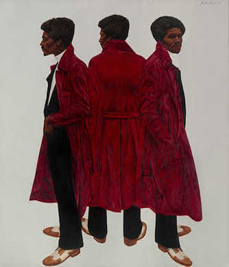
Hendricks is a resolutely representational painter, which is not to say traditional; his figures float on empty white [or gold leaf] canvas. My favorites, like Sir Charles, aka Willie Harris, above, have a triptych/multiple exposure/montage composition. They're not just portraits, they're paintings, in a defiant, powerful sense.

In fact, Sir Charles, painted in 1972, won my first, second, and third vote in the winter of 2009 for paintings the Obamas should hang in the White House. You remember the criteria: the work had to be in a national museum, but borrowing it couldn't remove it from public view.

Perfect, Sir Charles is owned by the National Gallery of Art, and the collection database showed it wasn't on view [of course not, because it was traveling as a star of Hendricks' show.]

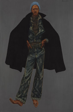
And here's where the double mystery kicked in: Sir Charles has NEVER been exhibited at the NGA. Neither has the other incredible Hendricks painting in the collection, George Jules Taylor, also 1972.

hendricks_george_nga.jpg

How could this be? The National Gallery is cutting edge enough to acquire major works by The New Painting Hotness [sic] before he's on the cover of Artforum, they make the rounds in one of the most admired museum shows of the year, and yet they never show them themselves? EVER?

[UPDATE: Uh, no. An unidentified reader has correct me, thankfully. The NGA's location records for the Hendricks works do indeed show that they have been exhibited at various times in the Gallery. The online exhibition history apparently refers only to curated shows, in or out of the Gallery. For more details on this correction, check this post.]

The kicker, of course, was right there in the collection info page. The accession numbers for the two Hendricks paintings are 1973.19.1 and 1973.19.2, which means, obviously, that they were acquired new. In 1973, the National Gallery purchased a newly minted Yale MFA's triple portrait of the corner drug dealer outside his New Haven studio. It completely blew my mind.

There had to be a story there, I figured, so I started digging. And came up nearly empty at every turn. I thought I'd just look in the NGA's archive, but there was nothing there. Who was the curator savvy enough to find his or her way to Hendricks back then? No idea, it turns out the NGA did not even have a curator dedicated to modern and contemporary art until the 1980s.

The NGA website has basically everything that the institution knows about the paintings. Since I started asking around the NGA several months ago, the provenance info has been updated to say when they were acquired: May 1973. They came from the Kenmore Gallery in Philadelphia, where Hendricks had his first solo shows. They're the only works in the collection with the credit line, "William C. Whitney Foundation." Not a lot to work with.

But not nothing. William C. Whitney's son Harry Payne Whitney's wife Gertrude Vanderbilt Whitney founded the Whitney Museum, where Hendricks had been included in a major--and controversial--show in 1971, "Contemporary Black Artists in America." The show had grown out of a compromise with the black art community, which, along with important groups like the Art Workers Coalition, had criticized the persistent absence of non-white artists in the museum's collection and program. When the black advisers to the show's white curator quit, a large group of artists withdrew and called for a boycott. A high profile museum show might explain how Hendricks got on the art world's radar, but not how his work made it into the NGA.

Whitney Whitney Whitney. It turns out the William C. Whitney Foundation had been created, not by the Museum Whitneys, but by Harry's sister, Dorothy Payne Whitney in honor of their father, but for the use of her son, Michael Whitney Straight. At least according to Tragedy and Hope, by Carroll Quigley.

Get out your foil hats and turn up Glenn Beck, because Quigley is the highly influential Georgetown history professor whose controversial writings on the history of Anglophile secret societies is the tenuous basis of classic rightwing conspiracy theory. Beginning in 1970, Quigley's work was mutated, Pale Fire-style, by Beck's favorite Mormon wingnut academic W. Cleon Skousen, into a Grand Unified Conspiracy Theory between the Communists, JP Morgan, and everyone in between.

And guess who Mike Straight's dad worked for? JP Morgan. And guess who Mike Straight was a spy for while he was at Cambridge in the 1930s, and later after he moved back to the US to work at the State Department? The Soviet Union.

His Communist sympathies didn't last through the war, and when Straight was being considered for the head of the new National Endowment for the Arts the Kennedy Administration was planning, Straight came clean, exposing the rest of the Cambridge Five spy ring. Straight became the deputy head of the NEA, which didn't require a Senate confirmation. And he wrote extensively, both about his own spy history, and about the formative people and stories of the NEA.

None of which sheds any light at all on the NGA and their Hendrickses.

Finally, after exhausting every potential archival source, I contacted Trevor Schoonmaker at Duke's Nasher Museum. Who, it turned out, was just taking paternity leave, perhaps I'd rather talk to Barkley himself?

So a couple of weeks ago we set it up to chat on the phone. Here's how it went down:

J. Carter Brown himself had gone to the Kenmore Gallery and asked Hendricks' dealer Harry Kulkowitz to see some paintings for possible acquisition. The selections were made, and Kulkowitz and Hendricks brought the works to DC for consideration. "I went down with Harry, and it was a situation where the pieces were pretty large, and I had to design the stretcher to fold. So once we got down, i unfolded them and put them together. and that set the acquisition ball in motion."

Brown apparently tapped Straight personally for the acquisition funds. I didn't think to ask how much the Gallery paid, but Hendricks said in an interview last year that, "I had reached the $5,000 ceiling that black artists have, in 67 or 68. Someone said that once (that there is a $5,000 ceiling for black artists)." And when I asked Hendricks about the importance of being in the Whitney show, he laughed it off, saying that "Black people were fashionable at that time."

Well, they're kind of hot right now, too. "Birth of the Cool" wraps up at the Contemporary Arts Museum in Houston on April 18th. What better time for the National Gallery to finally celebrate its illustrious former director's prescient acquisitions by finally showing a Hendricks painting or two [again, see correction above] in Washington DC?

the sidebar is now the footer.

Looks like my vintage html blog templates may not survive the game change.

April 3, 2010

Cage Match

I was reading Calvin Tomkins' 1963 New Yorker profile of abstract sculptor Richard Lippold, who was a favorite of the International Style and High Modernist architecture crowd. Depending on your mood, Lippold's giant, intricate, and ambitious metal & wire works were breaking Important Art of The Future out of the twee confines of the gallery and museum. Or he was making quintessentially aggrandizing corporate lobby art, built-in Bertoias for barons and bankers.

lippold_the_globe.jpgMost of the article tells the crazy story of the creation and installation of Lippold's best-known work, Apollo and Orpheus, which tumbles through the lobby of Philharmonic Hall [now Avery Fisher Hall] at Lincoln Center. But this remarkable bit is from May 1962, and the making of his most-seen work, The Globe [later changed to Flight], the shimmering, golden wire sculpture in the Vanderbilt Avenue lobby of the Emery Roth, Gropius & Belluschi's Pan Am building [now Met Life] behind Grand Central Station:

Lippold was also engaged at this time in a curious negotiation with his Pan Am patrons. He had discovered that the building had been wired throughout for Muzak. Muzak has long been one of Lippold's particular abominations, and, with his customary directness, he voiced his dismay at a cocktail party given by the late Erwin S. Wolfson, the New York investment builder who had largely conceived and financed the Pan Am Building. If the building had to have music at all, Lippold suggested jokingly, why not let him commission some contemporary music by John Cage? Wolfson floored him by saying, "Go ahead." At the time, Lippold told a friend, "Wolfson belongs to the new breed of industrialists who respect artists. He trusts them, he's willing to let them do what they want without interference. But, my God! Think of it! Cage is still too avant-garde for the concert halls, and here's a chance for his music to be played to an audience of thousands and thousands a day! It will be the first time in history that music has been commissioned to go with architecture--or at least, the first time since the medieval cathedral Mass." Wolfson said he would take care of persuading his board of directors, and Lippold got Cage started thinking about the project.
Not sure what's more unsettling: the "new breed of industrialists" gladhanding, or the Richter-meets-Kinkade-style paradox of Cage doing Muzak.

But whaddya know, the project went forward. As one might have expected of an artist working in ambient sound, Cage had invested years of thought in solving The Muzak Problem. In his 1998 article in The Musical Quarterly on Cage's approach to silence, Douglas Kahn makes an interesting analysis of Muzak's connection to the development of Cage's best-known composition, 4'33". In a lecture he gave in 1948, four years before creating 4'33", but which he never republished, Cage talked about another silent composition, Silent Prayer:...which would consist of 3 to 4-1/2 minutes of sustained silence (the maximum time being just three seconds short of 4'33") to be played over the Muzak network. Unlike the silence of 4'33", in which not playing is the means for the audience to hear the sounds surrounding them, Kahn wrote that Cage saw Silent Prayer more like an intermission, a "reprieve" from Muzak's unobtrusive yet pervasive performance.

He also makes a fascinating point about Duchamp's readymades and the length of Silent Prayer [and, by a 3-second extension, 4'33"], which was based on the standard duration of commercial music.

Back to Pan Am. With the technical assistance of Bell Labs [Kluver? Anyone? Aha, Max Matthews. see the update below.] Cage's Muzak project had made it to the "elaborate presentations" stage, and by August 12, 1962, the idea was fully developed enough for Raymond Ericson to report the details in the Times:

[Cage] decided to "make use of the things that were right there" in the lobby. This was to include the supply of Muzak, for which Pan Am had a contract; the necessary speakers in the walls, and a set-up of television screens with photo-electric cells for keeping an eye on the passers-by.

Mr. Cage devised a system whereby the people going through the lobby would activate the photo-electric cells. These in turn would release the Muzak music, which would become pulverized and filtered in the process. Even people getting in and out of elevators would have a part in producing the sound. Since the cells would never be activated in the same way, the results would be constantly in variation.

Rather than underscore the pervasiveness of Muzak by giving its unwilling audience a temporary reprieve, Cage would make the pedestrian throngs aware of their collective selves, by giving everyone the power to toggle the Muzak off and on.

Unfortunately, Wolfson, the new breed of industrialist, died in July, and the reason the Times was writing about Cage's piece was because the old breed of board members had just rejected it. "As one vice president said: 'The American business man and the esthete do not always see eye to eye." Really.

Ericson's kicker makes me want to head up to Bard and start digging through the archive at the John Cage Trust: Mr. Cage does not feel particularly disappointed in the failure of his plan. He believes his ideas are sufficiently in the air to be acted on someday.

UPDATE: Apparently, in the Spring 2008 issue of Representations, the University of California Press Journal, Herve Vanel wrote an article about Cage's relationship with Muzak titled, "John Cage's Muzak-Plus: The Fu(rni)ture of Music." which I would buy for something less than the $14 UCP is asking. [UPDATE UPDATE: it seems like I'm the only guy without a subscription, better get on board. Thanks to Douglas and Brian for loaning me their pdf version of Vanel's article.]

Some interesting finds from Vanel's paper: Cage had been thinking about a Muzak composition, called Muzak-Plus, in 1961, which I would imagine his friend Lippold would have known about. It was Bell Labs computer music pioneer Max Matthews who collaborated with Cage on the Pan Am Building, not Billy Kluver. But Matthews' photo-electric switch and mixer design apparently resurfaced as a dance device in 1965 when Kluver participated in Variations V with Cage, Merce Cunningham, David Tudor, and Stan VanDerBeek. Which is like the best Merce & John clip on YouTube.

On the downside, is that renovation related to the 2005 purchase of the Met Life building by Tishman Speyer? Or have security retrofits destroyed whatever spatial integrity the lobby had? Do we know need to wonder what a John Cage piece based on the random, unimpeded flow of crowds into a lobby would sound like before and after September 11?

Since 2001 here at greg.org, I've been blogging about the creative process—my own and those of people who interest me. That mostly involves filmmaking, art, writing, research, and the making thereof.

Many thanks to the Creative Capital | Warhol Foundation Arts Writers Program for supporting greg.org that time.

comments? questions? tips? pitches? email
greg [at] greg [dot ] org

find me on twitter: @gregorg

about this archive

Posts from April 2010, in reverse chronological order

Older: March 2010

Newer May 2010

recent projects, &c.


our_guernica_cycle_ivanka_320px_thumb.jpg
Our Guernica Cycle, 2017 –
about/kickstarter | exhibit, 2017


pm_social_medium_recent_proj_160x124.jpg
Social Medium:
artists writing, 2000-2015
Paper Monument, Oct. 2016
ed. by Jennifer Liese
buy, $28

madf_twitter_avatar.jpg
Madoff Provenance Project in
'Tell Me What I Mean' at
To__Bridges__, The Bronx
11 Sept - Oct 23 2016
show | beginnings

chop_shop_at_springbreak
Chop Shop
at SPRING/BREAK Art Show
curated by Magda Sawon
1-7 March 2016

do_not_bid_or_buy_iris_sidebar.jpg
eBay Test Listings
Armory – ABMB 2015
about | proposte monocrome, rose

shanzhai_gursky_mb_thumb.jpg
It Narratives, incl.
Shanzhai Gursky & Destroyed Richter
Franklin Street Works, Stamford
Sept 5 - Nov 9, 2014
about | link

therealhennessy_tweet_sidebar.jpg
TheRealHennessy Tweets Paintings, 2014 -
about

sop_red_gregorg.jpg
Standard Operating Procedure
about | buy now, 284pp, $15.99

CZRPYR2: The Illustrated Appendix
Canal Zone Richard Prince
YES RASTA 2:The Appeals Court
Decision, plus the Court's
Complete Illustrated Appendix (2013)
about | buy now, 142pp, $12.99

weeksville_echo_sidebar.jpg
"Exhibition Space" @ apexart, NYC
Mar 20 - May 8, 2013
about, brochure | installation shots


HELP/LESS Curated by Chris Habib
Printed Matter, NYC
Summer 2012
panel &c.


drp_04_gregorg_sidebar.jpg
Destroyed Richter Paintings, 2012-
background | making of
"Richteriana," Postmasters Gallery, NYC

czrpyr_blogads.jpg
Canal Zone Richard
Prince YES RASTA:
Selected Court Documents
from Cariou v. Prince (2011)
about | buy now, 376pp, $17.99

archives