July 2011 Archives

One_Picture_Great_Picture.jpg
image: the legacy photo project

Where'd I get this link to The Great Picture, the world's biggest photograph taken with the world's biggest camera?

In 2006, a group of photographers working as part of The Legacy Project, which is documenting the history and decade-plus transformation of the decommissioned El Toro Marine Air Station into the 1,300-acre Orange County Great Park, turned the aircraft hangar into a pinhole camera, and made a 31x111 foot panoramic photograph of the surrounding landscape.

The Great Picture, as it's known, was exhibited briefly a couple of times since 2006, and is now on view at UC Riverside's Culver Center for the Arts, along with The Great Crate, and some other contemporary-style artworks and installations.

Which, hmm.

ucr_great_picture_install.jpg
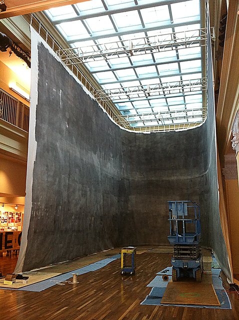
image via UCR Arts Block, picsplz

First of all, wow, what an installation. I guess the Culver Center is trying to keep Riversiders guessing whatever will they hang in that old department store next? On the bright side, this wraparound installation does make the photo look more panoramic, sort of like a peace dividend version of Paul Philippoteaux's massive Cyclorama painting of the Battle of Gettysburg.

The post at Design Art Daily, is by Peggy Roalf, who, in 2005, bless her heart, had just published Colorama: The World's Largest Photographs, just months before The Great Picture was taken. [See the greg.org post on Kodak's Colorama photos.]

Coloramas were 11x60 foot transparencies, assembled from 18- or 36-inch rolls. The biggest photomurals, such as those done by Edward Steichen for his WWII-era propaganda exhibits at MoMA, were printed and assembled the same way, like wallpaper. Steichen's folks then retouched the print and blended the seams using paint, and applied a nice coat of varnish.

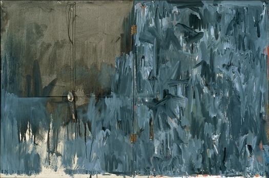
All of which I mention here because while Legacy Project photographer Douglas McCulloh talked about The Great Picture's intrinsic photographicity:

"The Great Picture is an object that to me is kind of a summation, a full circle statement about photo history. It's a camera obscura which is where photography started. And the moment we hung it up, still wet, it was turned into pixels and broadcast around the world. So it starts at the beginning of photography, sums it up and becomes electronic overnight."
It's The Great Picture's painterly qualities which stand out for me, which complicate the once-stark distinctions between painting and photograph, and their separate, often unequal histories.

Because The Great Picture was produced in negative directly on muslin canvas which had been covered--painted, actually, with brushes and mops--with gelatin silver emulsion. I'd even say that the all-over brushstrokes of the emulsion are the dominant characteristic, if not the content, of the image:

ucr_great_picture_det.jpg
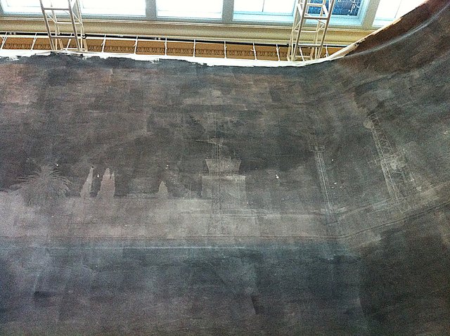
image via ucrartsblock

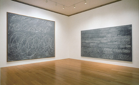
Which is pretty sweet. And which all reminds me of Wade Guyton's massive Epson-printed monochrome painting last year at the Museum Ludwig in Cologne. Well, 25x40 feet seemed massive at the time.

wade_guyton_koeln.jpg
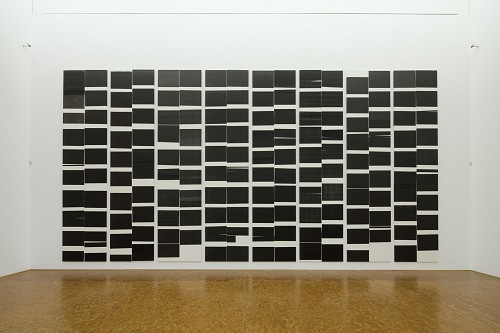
image: museenkoeln.de

The Great Picture at UC Riverside [design art daily via someone awesome]

Robert Smithson, "Conversation in Salt Lake City," 1972:

There's a word called entropy. These are kind of like entropic situations that hold themselves together. It's like the Spiral Jetty is physical enough to be able to withstand all these climate changes, yet it's intimately involved with those climate changes and natural disturbances. That's why I'm not really interested in conceptual art because that seems to avoid physical mass. You're left mainly with an idea. Somehow to have something physical that generates ideas is more interesting to me than just an idea that might generate something physical.
Nic at A Young Hare has had some great posts lately about the not-legendary-enough Italian artist/architect Gianni Pettena, which made me revisit Pettena's discussion with Robert Smithson. The interview took place in January 1972, the day after Smithson had delivered his "Hotel Palenque" lecture at the University of Utah, where Pettena was a visiting professor. It was originally published in Domus in Nov. 1972, and included in Smithson's collected writings.

In the same conversation, Smithson also mentioned his preference for working in "a site that is free of scenic meaning," one with "views that are expansive, that include everything..." In referring to the Spiral Jetty's site:

The Salt Lake piece is right near a disused oil drilling operation and the whole northern part of the lake is completely useless. I'm interested in bringing a landscape with low profile up, rather than bringing one with high profile down.
I'd argue that the lake's utility has only increased since Smithson saw it, and that his installation of the Spiral Jetty has certainly raised its landscape's profile.

Meanwhile, 185 francs. That's the price written inside my copy of the 1996 reissue of Smithson's writings. I bought it at the Musee d'Art Moderne de la ville de Paris, which has [had?] an awesome bookstore. Is it still awesome? I haven't been for a couple of years now, though I expect I'll be back before the franc is.

And from the end of the conversation:

Smithson:...I developed that somewhat with the non-sites, where I would go out to a fringe area and send back the raw material to New York City, which is a kind of center--a big sprawling night mare center, but it's still there. Then that goes into the gallery and the non-site functions as a map that tells you where the fringes are. It's rare that anybody will visit these fringes, but it's interesting to know about them.

Pettena: You always show the places from which you are coming, if you are sincere.

leonni_brussels_masey_ext.jpg

In the early Cold War of the mid-1950s, the Soviet Union countered American condemnation of its repressive actions in East Germany and Hungary with criticism of the US's internal policies of segregation and racial discrimination. Planners of the US Pavilion at the 1958 World Expo in Brussels, the first since before WWII, warned that "the desegregation issue would be 'underlined rather than evaded by omission.'" As longtime USIA design director Jack Masey put it in his 2008 book, Cold War Confrontations, "The Unfinished Business" Pavilion was created by Fortune magazine and/for the State Department "as a way to save face--openly and directly--[by anticipating] negative Soviet propaganda about domestic problems in the US."

Fortune art director Leo Lionni designed both the pavilions and the exhibit as three distinct sections: past, present and future. The form of each pavilion mirrored the content of its exhibit, though none were so programmatically matched as the first pavilion, where the darkly colored "chaotic crystal" of the exterior [below]

Thumbnail image for leonni_brussels_masey_ext4.jpg

was wallpapered inside with a jumbled, kaleidoscopic collage of US newspapers. Headlines related to desegregation battles were interspersed among other front page stories, presumably to dilute the racism issue by expanding the context, and to underscore the country's uncensored media as a site of free debate and progress.

leonni_brussels_masey_int.jpg

The second, present pavilion had some quotes from President Eisenhower and other leaders, whatever, but it was the bright future pavilion that turned out to be the most incendiary. For its expansive, smooth walls featured large photomurals of amber waves of grain, and a group of happy, young children--"white, colored, and yellow"--playing in a flower-filled meadow.

leonni_brussels_masey_int2.jpg

Which basically made segregationist politicians from the South's heads explode when they found out about it. Masey gives an overview of the controversy in his book, including some declassified letters from outraged Dixiecrats to Eisenhower's acting Secretary of State. But Michael Krenns devotes an entire chapter to the political shitstorm surrounding the "Unfinished Business" pavilion in his 1999 history anthology, The Impact of Race on US Foreign Policy: A Reader. Great stuff.

Throughout the Spring and Summer of 1958, angry congressmen criticized the exhibit for "foul[ing] the nation's nest." The pavilion was temporarily shut down--the official explanation was "poor craftmanship" on the part of the "Belgian carpenters" who somehow failed to properly execute Lionni's original concept. By including too many news clippings about Little Rock and Gov. Faubus. Leonni hustled to Brussels to make ordered changes to bring "balance" to the desegregation issue.

They even posted a disclaimer that children of various races playing together "did not represent US policy, but was representative of the freedom of choice available in the US." And still Georgia's segregationist senator Herman Talmadge protested, demanding an end to exhibition's "unwarranted invasion of the rights and prerogatives of the states of the South."

Faced with calls for a congressional investigation that could turn "The Unfinished Business" into The Neverending Business, the Eisenhower administration caved, and by mid-summer, the State Department shut down what the European press had called "the most effective propaganda in the American Pavilion" and replaced it with an exhibit about the unfinished business of public health.

Thumbnail image for jeshyn_dome_meridian_2.jpg

What's the opposite of writer's block, the thing where you have so much damn good stuff to write about, you're paralyzed into inaction? Because that's what I've got, and August vacation voids or not, I just can't help it; I'm gonna blog it all and let Google sort it out.

cold_war_confrontations.jpgFor example, for all the dome- and Expo-loving going on around here, you'd think by now I would have gotten my hands on a copy of Jack Masey and Conway Lloyd Morgan's 2008 book, Cold War Confrontations: US Exhibitions and Their Role in the Cultural Cold War, but no.

As the longtime design director for the US Information Agency, Jack Masey was basically the client, or the producer, of the expo-related architecture, art, media, domes, pavilions, exhibitions, and propaganda that folks like Buckminster Fuller, Shoji Sadao, the Eameses, and George Nelson became famous for.

Cold War Confrontations is a fantastically surfable book, a thick, highly visual memoir of the USIA's greatest hits. It's based on the premise that the structured, official propaganda pageants of world expos, culture exchanges and trade shows, played pivotal roles in the course of post-war world history:

At Expos, however, the teams are not playing games; rather, they competed by presenting to the world examples of a nation's best architecture, technology, arts, crafts, manufacturing, and performing arts. And in so doing, they sometimes, somehow, change the world. [p. 110]
buckminster_fuller_montreal.jpg

There were many people who believe[d] that to be true. I sort of want it to be true, at least in the same sense that I'd rather see street gangs settle their differences by breakdancing instead of drive-by shootings. Maybe it's better to see these expos as reflections of the cultures that produced them, or of their aspirations. Because the views expressed therein do not, it turns out, necessarily represent the opinions of the United States of America as a whole, or of their elected representatives and/or government officials.

leonni_brussels_masey_model.jpg

Case in point: The "Unfinished Business" pavilion, designed by Leo Lionni [!] for the 1958 Brussels World Expo. Holy Smokes, people.

Masey tells a longer version of the story in the book, but here's a condensed version: in 1956, a team that included Boston ICA director James Plaut consulted with MIT economist Walt Rostow on the contents of the official US pavilion, which was being designed by Edward Durrell Stone. The idea was to emphasize the US's people and cultural accomplishments. Rostow's team also called on the US to be frank and self-critical in recognizing its "unfinished business," by which they meant "soil erosion, urban decay, and race relations."

leonni_brussels_masey_ext4.jpg

Somehow, though the giant, donut-shaped pavilion had room for a Vogue fashion show on water; a proto-Pop, pseudo-combine street sign streetscape; and a giant, aerial photomural of Manhattan installed in a half-pipe [WTF!? I don't know! We'll come back to it!]; there wasn't room to "address 'the Negro Problem.'" And so somehow [?] Henry Luce's Fortune magazine became the State Department's partner/sponsor of a smaller garden pavilion devoted to "Unfinished Business," and the magazine's creative director Leo Lionni designed it.

leonni_brussels_masey_ext3.jpg

That's the model above, and it looks pretty damn close to the real thing. Lionni conceived of three linked, raised pavilions, each about six meters long, as a frankly allegorical timeline, in which America's problems get literally smoothed out. Or as Masey put it, "the content of the interior was also to be conveyed through the exterior." Which means that the somber, "chaotic crystal" of the past had already given way to the much brighter, Family of Man-colored present. A little more ironing and the square, orderly, utopian future was just steps away. That was the concept, anyway, but that's not exactly how it turned out.

[to be continued in the morning]

Buy Cold War Confrontations: US Exhibitions and Their Role in the Cultural Cold War on Amazon [amazon]

I'm looking into ways to paint on aluminum, and so I've come back to Gerhard Richter's 4900 Farben, which is made up of 196 Alu-dibond panels, each with 25 lacquered [aluminum?] squares mounted onto them. Whatever the exact process, they are definitely painted objects, not just paintings.

Which is partly why, when, in a Snowpocalypse-bound frenzy, I wrote rather obsessively about the Serpentine's 2008 exhibit of the work, particularly how the images in the catalogue were actually not of the work itself, but a digital facsimile. Which included illusory drop-shadow effects.

So you can guess what the first thing was when I saw the image of three related 25 Farben panels in Sotheby's day sale last spring:

richter_25farben_soth412.jpg

I mean seriously, just look at those shadows. Horribly lit, sure, but at least you know they're real; and I suspect a CG rendering wouldn't bring $200k apiece for those panels.

11 May 2011, Lot 412: 25 Farben [Three Works], est $300-400,000, sold for $590,500 [sothebys.com]
Richter's 25 Farben paintings are nos. 901- and 902-, all 2007 [gerhard-richter.com]
Previous greg.org 4900 Colours coverage starts here and ends here. The discussion of facture and faking the fabrication is here, followed by the drop shadows and diagrammatic abstraction diatribe.

Thumbnail image for johns_memory_feelings_1961.jpg
In Memory of My Feelings - Frank O'Hara, Jasper Johns, 1961

I'm long overdue for updates on the search for the Jasper Johns Flag Painting that went missing from Robert Rauschenberg's 1955 combine, Short Circuit. I'll get to them when I get back home to my files.

Meanwhile, one by-product of searching for a flag: I start seeing them everywhere.

This little multiple by Gabriel Orozco is the first part of a series that doubles the number of rectangles on each sheet.

orozco_flag_esque.jpg

And on C-Monster, Carolina cropped this time-shifted collage she found on Google Maps into a very flaggish shape.

c-monster_g-map.jpg

rs_mirror_stratum_moma.jpg
Mirror Stratum, 1966, Robert Smithson, image via moma

Robert Smithson's Mirror Stratum is a longtime favorite of mine. These crystalline and strata sculptures are like abstracted geological or topographical structures, which is awesome enough. But these mirror [there's at least one Glass Stratum piece, too, and a glass-and-map Stratum] stacks have this material simplicity, like a found object, that I really like.

MoMA has one [above] that's 44 decreasingly smaller square mirrors, the largest of which is 25.5 inches on a side, all stacked on a pedestal. MCA Chicago has one, too, I see, with 32 mirrors, which sits closer to the floor. And it looks a little beat. Let's call it a patina.

But my favorite favorite Mirror Stratum, which I've only ever seen once, is not designed to sit on a pedestal, but on a desk. It's an adorable little stack of 20 mirrors, just 8.5 inches square and 5 inches high, which looks like the top half of the larger, earlier versions.

And in the Jan/Feb 1968 issue of Art in America, I found a great ad for it. It was made by Multiples, Inc., Marian Goodman's editions publisher, in a stated edition of 25. Though it's not clear to me whether the entire edition was actually produced. One of these days I should check. What I do know, is that I wish I'd picked one up back when they were $125 [or an inflation-adjusted $808].

multiples_inc_aiaj68.jpg

The short answer is yes, Dave Hickey's writing was even more off-the-wall in the Seventies, and you really might just as well scroll straight down to the song.

Otherwise, I just brought home a stack of old Art In Americas, including the Sep/Oct 1971 issue with Hickey's long, lyrical essay, "Earthscapes, landworks and Oz." [As in Wizard of, not Australia, though I did check before I bought it.]

Hickey makes some interesting points about visiting earthworks, including hearing his art-shunning, contractor father-in-law go on about

his most Roman topic (the favorite of all adult males west of Fort Worth): the ravages of nature upon the works of man. He would like driving out to the site in his white jeep, wearing his narrow-brimmed Stetson, his khaki slacks and jacket and his Gokey boots The more difficult the trip, the more completely it would reinforce his serene pessimism. would be his idea of going to see some art; mine, too in proper company.
And how "In big country you do not see in the ordinary way. There is no 'middle distance,' only 'near' and 'far,' the dust at your feet and the haze on the horizon."

Of earthworks in the nothing-space in between, Hickey declared

I do know that privative pieces--those which involve cutting away, digging out or marking--have much more authority and intimacy with the country itself than the additive pieces like Smithson's Spiral Jetty or Heizer's Black Dye and Powder Dispersal, which are dwarfed in a way that even smaller privative pieces are not. Smithson's Jetty, particularly, has a beaux-arts look about it, more related to other sculpture than to the lake.
At least, that's the concept. Because it's not that Hickey had actually been to any of these works himself; in 1971, it seems like it was enough to drive in and out of Austin a lot. Hickey namechecks some art world folk who actually "have been out to see Double Negative, and have returned with (literally and figuratively) breathless accounts. If this keeps up, he pretend-complains, "we shall soon need a kind of National Geographic for Esthetes.

It's actually Hickey's incisive identification of the media-mediated Land Art experience that I found most interesting:

The question is: Why have the national art magazines both overrepresented and misrepresented the earthworks movement and its related disciplines, choosing to portray them as a kind of agrarian Children's Crusade against the art market and the museum system, when this is obviously not the case? First: the work is marketable--anything is marketable, as St. Paul so aptly demonstrated. Second: the museum have proved a god source of commissions for these artists. And third: even if the work weren't marketable and the museums were rejecting it, an esthetic trench in Utah is going to have about as much effect on the object market and museum endowments as admission figures at the Grand Canyon.

The answer might be: It is not the Earth artists who are challenging the market and the museums, but the magazines themselves. Earth art and its unpackageable peers cannot hurt the market, but extensive magazine coverage can, since not as much object art will get exposure. The magazines have found in this unpackageable art a vehicle through which they can declare their independence from the art dealers who invented the critical press, nurtured it, and have tended to treat it like a wholly owned subsidiary. Now there is an art form ideally suited to presentation via magazine. Work consisting of photographs and documentation is not presented by journalism, but as journalism--a higher form, needless to say.

The people on the magazines must believe (and I think rightly) that these indefinite art forms might do for the magazines what Pop Art did for the dealers--lend a certain institutional luster, and with it a modicum of arbitrary power.

...

An artist who makes documents needs an editor, not a dealer.

I had some lucid commentary of my own about Hickey's glib comparison of Earth Art & Pop--and his silence on Conceptual Art, which goes unmentioned, or at least uncapitalized, even though I think Hickey's making specific, unspoken reference to Walter de Maria's project in the May 1972 issues of Avalanche and AiA rival Arts Magazine, which zeroed in on the difference between art experience, concept, and media, oh wait, never mind. 1972? I forgot I'm still talking about 1971 here. Actually, I think my brain was just involuntarily ctrl-alt-del rebooted.

Because I just found out that the Terry Allen lyrics Hickey ends his essay with are from an actual song, and listening to it just now has wiped all unsaved art information from my head. And that's just fine with me.

So stop whatever you're doing and listen to Terry singing his masterpiece, "A Truckload of Art." Y'all come back now, y'hear?

Nope, not yet: On Walter de Maria, earthworks and Conceptual Art

Underlying [literally] this whole Spiral Jetty situation is the fact that Smithson constructed the Jetty on so-called sovereign land, the land under a body of water--in this case, Great Salt Lake--that is claimed by the state under Public Trust doctrine. Obtaining a state lease to build Spiral Jetty warrants only a passing mention in Smithson's written account of the project, but it turns out to have rippled through the project over time in ways I'm not sure the artist anticipated. And it brings into the work these kind of odd/fascinating concepts that date back to civilization's earliest attempts to establish a relationship of control over the earth.

In case you think I'm being too hyperbolic, check out this introductory explanation from the most recent draft of the Utah Division of Forestry, Fire and State Land's Great Salt Lake Comprehensive Management Plan, the major policy and administrative initiative currently being developed, which will guide state management of the Lake for a decade or more:

1.1.2 The Public Trust over Sovereign Lands
Under A.D. sixth century Roman law and perhaps earlier, the air, sea, and running waters were common to all citizens and the separate property of none. All rivers and ports were public, and the right of fishing was common to all. Any person was at liberty to use the seashore to the highest tide, to build a retreat on it, or to dry nets on it, as long as they did not interfere with the use of the sea or beach by others. Although the banks of a river could be privately owned, all persons had the right to bring vessels to the banks, to fasten them by ropes, and to place any of their cargo there. The influence of Roman civil law carries forward through English common law to today's Public Trust doctrine, which recognizes the special public interest in rivers, lakes, tidelands, and waters.
There's also this explanation from the previous page:
Under English common law, the crown held title to all lands underlying navigable waterways, subject to the Public Trust doctrine. Following the American Revolution, title to such lands in the United States vested in the 13 original colonies. Under the Equal Footing doctrine, fee title to those lands also vested in each state subsequently admitted to the Union, upon admission. Utah-owned navigable waterways, known as ―"sovereign" lands, lie below the ordinary high water mark of the waterbody. These lands are referred to as Public Trust lands. The boundaries of sovereign lands are established by the location of the ordinary high water mark of a waterbody. For the ocean and most rivers and lakes, the ordinary high water mark is relatively constant and can be identified reliably from year to year. Because rivers and streams establish many important boundaries and can move over time, the common law doctrine of reliction and accretion holds that slow, gradual movement of a river or stream course over time will result in relocation of the property boundary to follow the movement. Sudden changes in course, as by flooding or other upset, will not result in the relocation of the property line.

In 1959, the Bureau of Land Management (BLM) challenged the state's claim to much of the shoreline of the lake, arguing that the declining lake level was resulting in the reliction of shore lands and the relocation of the boundary between state and adjacent federal land, to BLM's advantage. In 1976, the U.S. Supreme Court determined that the state owns all of the lands, brines, and other minerals within the bed and waters of the lake and all shore lands located within the officially surveyed meander line.

[Emphasis added for the parts which, when considered in light of Smithson's interest in entropy and the scale of geologic time, are particularly awesome.]

I actually hadn't thought about the meander line and reliction, and I hadn't noticed the protracted legal battle between Utah and the federal government for ownership of the lake until just tonight. That's when I came across a small article in the "Diggin's" section of Survey Notes, a quarterly newsletter published by the Utah Geological and Mineral Survey. [The cover story of the Aug. 1979 issue (PDF) detailed the results of Amoco's test drilling in the West Rozel oil field that lies under the Lake just offshore from Spiral Jetty.] That article, titled, "Who Owns Utah Lake?" is about a lawsuit between the Army Corps of Engineers and the state over a boat ramp in Utah Lake, near Provo:

The legal dispute is reminiscent of the 10 years of litigation which ended in Utah's ownership of the Great Salt Lake and subsequent oil and gas leasing and exploratory drilling.
Which, ten years? if you start at 1959, that's 1969, right up to Smithson's arrival. Or go back a decade from the 1967 Supreme Court decision, and Spiral Jetty appeared smack in the middle of the court battle.

I think Smithson's overriding concerns for building a Spiral Jetty were formalist; it needed to be a red-tinted salt lake. Plus it wasn't Bolivia, and it was available. The depleted atmosphere created by the varied pieces of abandoned oil drilling equipment were a bonus. But the land under Spiral Jetty, and Great Salt Lake as a whole, turned out to be a site where the interpretation of ancient constructs of law, politics, and sovereign ownership were being hotly contested at the moment Smithson came along.

As you might expect, I've been going deep into the history and context of Robert Smithson's Spiral Jetty lately. I'm in Salt Lake City right now, meeting folks and listening and trying to gather some firsthand perspectives on the issues and dynamics around the Jetty and Great Salt Lake: things like land use, lake management, State leasing, oil and mineral exploration, tourism, climate and ecosystem, and so forth.

While I'm obviously trying to figure out how best to approach the current lease situation, I'm also trying to get a handle on the history of the lake and Rozel Point in the Spiral Jetty era.

petrohunter_blackpearl.jpg

And so I come across things like these oil field maps from a 2007 press announcement by BlackPearl, the Canadian heavy oil specialists who partnered with and then acquired Petrohunter's leases to the West Rozel field. It was the inadvertent discovery in 2008 of Pearl's drilling applications, execution of which apparently had to happen by 2008-9 to keep the leases valid, which set off an environmentalist, art blogger, and art world protest. And yet, the transfer of the leases from American Oil to Petrohunter in 2006 and Petrohunter's detailed plans for drilling test wells, were part of the company's regular SEC filings in 2006.

Which is not exactly the point right now. I'm just kind of caught off guard by the beauty of these maps [well, 3 out of 4.] T8N on the left side of the West Rozel map I recognize: Township 8 North, the same State map page as the Spiral Jetty's site. The contour lines are, I believe, surface topography, while the green forms are the oil deposit or field structures, and black lines are faults or other subterranean geographic features? I haven't looked it up yet.

They remind me of Oil Seeps at Rozel Point, a mid-1960s Utah Geological Survey report of the area that Smithson owned, which makes a cameo in his Spiral Jetty film. I bought a copy years ago. Really should dig it out by now. [They also remind me of passages in a Julie Mehretu painting, maybe with a bit of Bochner thrown in. It's got to mean something that Spiral Jetty made its public debut In Kynaston McShine's 1970 MoMA exhibition, "Information," but what, I can't say just yet.]

The other unexpected discovery also relates to the form of the West Rozel field, only this time, it's language. Specifically, the abstract for "Heavy-Oil Deposit, Great Salt Lake, Utah: Section V. Exploration Histories," a 1987 report for the American Association of Petroleum Geologists, by Louis C. Bortz. It's just fantastic writing, an incredibly dense bit of information encoded in the highly specialized language of the petroleum geologist. It also echoes with Smithson's writing and film about Spiral Jetty. Which is a good reminder that this context of geology and geologic time and structure was important for Smithson, as was the oil drilling and hunting history of Rozel Point. Anyway, here's the whole thing:

The western portion of the Great Salt Lake contains two large Neogene basins, informally called the "North" and "South" basins. These basins are separated by an arch that trends northeast between Carrington Island and Fremont Island. Both basins are filled with Miocene, Pliocene, and Quaternary sediments and volcanic rocks. Each basin has an estimated maximum thickness of over 4300 m (14,000 ft) of Tertiary rocks. Palynology indicates the oldest Tertiary sedimentary rocks present in both basins are Miocene, but a radiometric date indicates the presence of Oligocene rocks. Structurally, the basins are slightly asymmetric, deeper on the east with an obvious boundary fault zone on the east flank of each basin. Faulting is present on the western flanks but of a lesser magnitude. The most common structural traps found in these basins are anticlinal closures, faulted noses, and fault closures. These structures are probably the result of continued differential subsidence of pre-Miocene blocks throughout Neogene time. A total of 13 exploratory wells was drilled by Amoco in the Great Salt Lake, from June 1978 to December 1980, resulting in an oil discovery at West Rozel and oil and/or gas shows in eight other wildcat wells. The West Rozel oil field produces from fractured Pliocene basalts at a depth of 640-730 m (2100-2400 ft). The trap is a faulted, closed anticline covering approximately 2300 acres. The discovery well, Amoco No. 1 West Rozel Unit (NW NW Sec. 23, T8N, R8W, Box Elder County), has an oil column of 88 m (290 ft) but produced at rates of only 2-5 BOPH with a gas-lift system. The oil is 4° API gravity, 12.5% sulfur, and has a pour point of 75°F. Two development wells that have smaller oil columns (No. 2, 26 m [85 ft]; No. 3, 60 m [194 ft]) were equipped with a downhole hydraulic pump and produced oil at rates up to 90 BOPH. Additional development of the field was not initiated because of the high water cut and the high cost of operating an "offshore" field.
I love it. And I love trying to make enough sense of it to visualize the field in my mind.

The other point, though, is Amoco. In 1978. They were exploring for oil, mapping the field and drilling test wells beginning in 1978, eight years after Smithson completed the Jetty and five years after his death. And I think they were doing it right next to the Jetty, which was submerged and apparently forgotten, ignored, or unknown. It's been called the Amoco jetty, so I think the utility jetty just east of Spiral Jetty was built at this time, and used for as the base for exploration activities. Chew on that for a while. Right next door.

But in Artforum in 2002, Nico Israel tracked down Ken Pixley, another onetime oil leaseholder at Rozel Point, who said that he and his father had built that oil jetty in 1980. There are period state documents which show the 500m jetty cutting through a 40-acre "Pixley lease"; I think documenting this site history and activity is going to take some doing.

Spiral Jetty sign

I've begun speaking to enough people on the ground that it wouldn't have gone unnoticed for much longer, but now word's got out that I've established a foundation to bid on the site of Robert Smtihson's Spiral Jetty, a 10-acre parcel of State-owned lakebed in Great Salt Lake. In the simplest terms, I'm bidding for the lease because it seems irresponsible not to.

Several weeks ago, it was reported that the Dia Foundation's lease had expired, and it was not immediately clear that the Utah Department of Natural Resources would grant Dia a new lease as a matter of course. When I called the Department to ask to be notified if the State decided to open the lease for competitive bidding, I was told I'd be added to the list. At that moment, it occurred to me that parties other than Dia were expressing interest in the lease.

As weeks passed, with no resolution, the possibility that Dia might not automatically get a new lease grew, along with the uncertainty of Spiral Jetty's fate. Once I received assurance that submitting an application would not automatically trigger an open bidding situation, I felt the responsible thing to do was to present apparently undecided State officials with the most constructive, credible set of choices: the status quo, or an independent, locally based institution whose purpose is to manage the site and collaborate with the artwork's owners as they fulfill their own missions.

Let me underscore their continued involvement, because it was also important, whatever the status of the lease or the site, that there was an acknowledgement in the process of Dia's undisputed ownership of the Spiral Jetty artwork, and the Smithson Estate's ownership and control of the intellectual property rights associated with it. Any responsible proposal, I felt, should endeavor to support and facilitate Dia's stewardship of Spiral Jetty, not usurp it.

In trying to craft the most effective alternative to the status quo ante, the importance of local engagement came quickly and repeatedly to the fore. There are many significant issues that directly impact Spiral Jetty in its site. To constructively address them, increased local engagement seems critical: environmental, land use, and lake management initiatives; economic development, tourism and energy issues; and art and cultural institutions within the State.

jetty_fndn_lg.png

The Jetty Foundation's mission is three-fold:


  • Support the wise stewardship of Robert Smithson's Spiral Jetty artwork in accordance with artist's vision.

  • Facilitate informed, productive engagement among Spiral Jetty stakeholders, including the artist's Estate and the Dia Foundation; State and local government entities; lake and land use, tourism, economic development, environmental and community organizations; and arts, museum and cultural institutions within Utah and beyond.

  • Support and encourage a greater appreciation of Spiral Jetty in the specific context the artist chose for it: in Utah, in Great Salt Lake, at Rozel Point.

If lease evaluations or bidding proceeds, the Foundation will expand its board to include leaders and stakeholders in Utah as well as recognized figures from the larger art and museum community.

If the State awards The Jetty Foundation the site lease, the board will have responsibility for managing the lease and for identifying and addressing issues that affect the site, in collaboration with the owners of the artwork, who would remain the key stewards of the artwork itself. The details of the board makeup and how the Foundation would support and work together with Dia and the Estate are all things to be figured out if or when it's necessary.

As for the no-doubt invigorating conceptual implications any such arrangement might entail, I will not speculate. It was precisely the recognition that the administrative uncertainty surrounding Spiral Jetty called for more action and less sideline rumination that compelled me along the current course.

If the State decides that administration of the site by a locally engaged institution is preferable to the previous set-up, I want to make as certain as I can that such an organization operates wisely, effectively, and with respect for Dia's and the Estate's standing regarding the artwork. Should the State decide to award Dia a new lease on the site, I would hope that the Foundation's role will be constructive and catalytic in bringing the importance of site and local engagement to the fore for the decades ahead.

Stay tuned.

In the Spring of 1991, I was about nine months out of school, and six months into a new job. After striking up a conversation with a documentary film crew from NHK at Tennessee Mountain in SoHo, I'd bailed on a hard-won banking job right before my analyst training started. I began doing research and pitching and packaging projects. A few months in, I began working on producing a multi-part documentary on the history of the oil industry based on Daniel Yergin's book, The Prize. I went off by myself to Houston to try and persuade oil company executives, particularly Aramco, Saudi Arabia's US operation, to participate. I'd put in some calls and send out some faxes, then basically wait by my hotel phone, hoping a PR or some other contact would call me back. It was at once heady and exhilarating, ridiculously inefficient, frustrating and boring, and ultimately pointless.

Before heading back to Houston one week, a friend in New York suggested I use some of my downtime to find the Rothko Chapel. I knew Rothko from sitting in on the modern/contemporary art history class my last semester, and from MoMA of course, but I hadn't heard of any Chapel.

menil_structurae.jpg
[via]

The concierge at the hotel didn't know it either, but she gave me directions to Sul Ross, which turned out to be very close by [I was staying at the Wyndham.] With no idea what to look for, and not seeing anything particularly chapel-like, I circled around the bungalow neighborhood in vain, until I came upon a long, low, windowless, warehouse-shaped, grey clapboard building. There was no sign. Looking into the glass entry, though, I saw something else from my contemporary art class: a Cy Twombly chalkboard painting.

twombly_menil_grey_ground.jpg
it was Untitled, 1967, on the right. image: menil.org]

If they had a Twombly, I figured, these people might know where the Rothko Chapel is. So I pulled over and went inside to ask directions. A charming lady with her white-hair in a bun at the desk happily pointed me back down the street. And then I asked if that was, in fact, a Twombly painting over there. Yes. Would she mind if I went to take a look. Of course.

As I was standing there, marking the many differences between an actual painting and a slide lecture, a tall, elderly man came out of a set of doors to my left, and joined me in looking. I looked at him briefly, and then the painting. And then back at him, because he was looking unexpectedly familiar.

"Excuse me, but are you Cy Twombly?" I asked.

"Yes," came the reply.

I rambled something about really liking his work, and studying it in school, even though my emphasis was Italian Renaissance, and this being the first time I'd seen one in person while he smiled and nodded and said thanks. He asked where I'd gone to school. And if I had seen other pieces in the museum that I'd liked?

Which stumped me, because I somehow still hadn't realized I was in a museum. I was a little embarrassed and said I'd been looking for the Rothko Chapel, saw his painting through the window, and stopped to ask directions. Twombly, amused, maybe pleased, said well, it's really not like the typical museum, and then he suggested I really should see it, I'd enjoy it.

I said I would, and thanked him, and then he left. Some time later, when the catalogue for Walter Hopps' show of Rauschenberg in the 50's came out, I noticed the dates in a footnote and realized that Twombly had been at the Menil that day to be interviewed. So maybe, I thought, he had the formative art experiences of youth on his mind when he gave me one of mine.

The experience of meeting Twombly in front of his painting completely changed my understanding of artists and art and artmaking. Art was not just history; it was now. And it was being made by people you could meet and talk to. If you happened to bumble along in the most implausible way and fall in with some of the most important and visionary and generous people in the art world, like Dominique de Menil, but still. It was in the realm of the possible. At least until yesterday.

I was going to write how meeting Twombly turned me inexorably toward art made by living artists, even as the impetus for writing is the artist's death. I'd thought about this after Leo Steinberg died; I'd met both him and Dominique that week, too. Maybe it's being involved with art of our time--of my time--that came into focus that day. The artists whose work we admire, the people whose ideas influence us, are around for a while, and we can engage them. And then at some point, they're gone, and we're left with just their works and their words. And with our own experiences and memories.

monk_mari_miami.jpg

Add Jonathan Monk to the list of artist Enzo Mari fans. For the Brussels gallery D&A Lab's show at Design Miami Basel Miami Wynwood Art Week Whatever Fair last month, Monk created Mari Thirteen, an edition of Mari's autoprogettazione chair, Sedia 1. The design calls for 13 pieces of wood, so Monk used thirteen different types of wood, none of them pine: Koto, Padouk, Ash, Maple, Oak, Cherry, Pearwood, Wengé, Afzelia, Ovang, Mahagony, Birch and American Nutwood.

As I understand it, there was one set of 13 chairs to be sold individually for like $9,000 apiece, and one set of 13 to be kept together. No doubt destined to surround some Russian oligarch's beach-cast, triskaidecagonal Max Lamb dining table.

D&A Lab's owner Isolde Pringiers says of the project:

Jonathan Monk's interpretation is just one possible version of the 'Sedia 1′ of Autoprogettazione and hence in essence is very much part of and a continuation of Enzo Mari's project but with the appropriation layer, typical of Jonathan's work. With Autoprogettazione Mari went a step further than Ikea in his time in democratizing design. It broke down barriers in terms of what established design and good taste was. Monk, on the other hand, crosses back over those boundaries in as much as his interpretation offers a fully finished, conceptual object which is anti-Ikea. Enzo Mari offered the liberty of the project and Monk fully indulged.
Which, wow, I think I take issue with just about every single aspect of that statement.

Monk Makes Mari at DesignMiami [designmiamiblog.com]

found_arch_25thst_2.jpg

Japan still has a ton of the kind of awesome, ad hoc architecture that is just barely finding its way to 25th Street.

bleu_et_jaune_espace.jpg

I have no willpower. I was going to hold off posting about this incredible project found on an incredible blog until I happily scored the book, but I couldn't wait. Now I can only hope that my post will somehow bring a copy of the 1974 exhibition catalogue, Le Volume Bleu et Jaune into my clamoring hands that much more quickly.

A Young Hare is a new blog by Nicolas Allinder, aka "nic the intern", who used to contribute to Ro/Lu. Nic posted about this rather insane project at l'Academy de France, where a group of anonymous architecture students petitioned to study a single room, their studio at the Villa Medici in Rome, for two years. The result: a 1974 installation in the studio in which the traces and volumes of light moving over time were inscribed on the surfaces of the space. Somehow, the exhibition was transferred to the Jeu de Paume in 1975.

Espace Tiphaine Bastille [now Edition Tiphaine put on a show dedicated to the project in 2003. The catalogue shows up in numerous library catalogues, but no inventories, and no scanned versions. Please, francophone web, get to work with the scanning and/or selling.

Le Volume Bleu et Jaune [ayounghare via ro/lu]
Previously, unnervingly related: on an unrealized art project

I've always considered John Cage's politics to have been those of conscious non-engagement, but that's because I have really not known anything about "Lecture on the Weather," a text/sound/film/stage performance commissioned by the CBC for the US Bicentennial in 1976.

Cage had twelve performers read chance-selected texts from Thoreau's writing, "On Civil Disobedience," combined with projected images and a weather-related soundscape. Ubu's own poet-creator Kenneth Goldsmith posted the text of Cage's remarkable preface to the Poetry Foundation's website a few years ago.

[It was a couple of years after Goldsmith published his own Cage-inspired work, "The Weather," which consists of transcriptions of a year's worth of Manhattan weather reports from 1010 WINS News, which as Marjorie Perloff wrote about at length, is more fascinating and unexpected than it might first seem.]

In this post on the John Cage Trust's blog, Laura Kuhn writes about a remarkable 2007 restaging of "Lecture on the Weather" to mark the transfer of the Cage archive to Bard College. The slideshow below has a recording of Cage reading his preface and photos of the rather amazing collection of Thoreau readers.

As of last year, the Trust was waiting for some "angels" to fund the release of a recording of the Bard restaging. Maybe they should do a Kickstarter campaign or something.

doug_rickard_helena.jpg
Doug Rickard, Helena-West Helena, Arkansas, 2008, "A New American Picture," via bremser

Thanks to Joerg, I've had it in my browser tabs for almost a month now, meaning to write about it, but the TL;DR version is, Wayne Bremser's essay on his blog It's Never Summer is one of the smartest things I've read on Google Street View and fine photography.

"How to Photograph the Entire World: The Google Street View Era," looks at work by GSV photographers like Michael Wolf, Jon Rafman, and Doug Rickard in relation to the greats of earlier generations of like Lee Friedlander, Robert Frank, William Christenberry, and Larry Sultan. [Bremser doesn't mention, and I just thought it while typing this list, but The Google Gaze is apparently male. Maybe the giant camera stalk with the big balls was the first clue.]

Anyway, Bremser's analysis is excellent in itself, but his premises also illuminate the contours of the gap that somehow persists between photography and art. Or more properly, between fine photography and contemporary art. At this point, I am coming to see these differences in religious terms: they're formative, deeply held, esoteric, easily lost on outsiders, and laughable to an atheist.

Thumbnail image for greg_binnenhof-04.jpg
Walking Man - The Binnenhof, 2009, via greg.org

Though his title hints at more audacious possibilities, Bremser focuses on GSV as a tool for human artists:

As a camera, GSV is used by a photographer to rotate around, frame, and click to grab an image. The images that we see on the screen are raw data, gathered by the drivers; these images do not become photographs until a photographer frames them.
So, framing.

Also, I'm happy to take GSV's ambition to "photograph the entire world" at conceptual face value, and go from there. By the time the Bechers began exploring the futility of documenting typologies of disappearing, industrial manmade structures, astronomers had already begun their second attempt to photograph the entire universe.

From Bremser's photographer-centric beginning, it's logical to say that:

One important process-related issue with GSV images that end up as photographs on a gallery wall is this: they are not screen grabs, but photographs of a screen.
Which, hmm.

michael_wolf_paris2.jpg
Michael Wolf, Paris, 2008

But it is compelling and awesome to see the moire patterns and magnified pixels of Wolf's pictures of his computer screen [above] in the context of photographers taking on the tectonic media shifts of their day, such as Lee Friedlander's "Little Screens" series [below], photos from the 1960s that captured fleeting images on television sets.

friedlander_little_screen_fl.jpg
Lee Friedlander, Florida, 1963, via bremser

And then there's this:

Regardless of how photographs are sourced, it's still essential to see photography in books and on walls. How do these look in the gallery?
Which, again, hmm.

I have used screenshots from both Google Maps and GSV to make both prints and books, because the screen, or the browser window, or Google Earth, is Google's native image format. [Technically, that's not true; Google presumably has much higher-res versions of their imagery which they do not make publicly available.] But I guess this is a distinction between using at Google's imaging as source, and examining at it as subject. The fascinating, mind-blowing process around here isn't Wolf's [or for that matter, mine] but Google's.

immersive_dodeca.jpg

Even though it's not his point, Bremser still moves the aesthetic ball forward. I'm embarrassed to say for all my Street View obsession, I never bothered to identify the camera system Google uses. Or used, since they seem to have replaced Immersive Media's 11-lens, Dodeca 2360 pano camera [above] with an even awesomer camera ball [below].

Thumbnail image for streetview_camera_lg.jpg

Or maybe they've just added the optimized housing. I don't know, but I should. Because this equipment is not Google's secret sauce; it's available. You can take a Dodeca 2360 out to make your own panos or sequences. The Street View aesthetic can now be yours! At least in theory. I suspect I'd find that shooting with a Dodeca 2360 wouldn't make me Google any more than using a Red would make me Steven Soderbergh.

streetview_versailles.jpg
Google Street View camera guy in Versaille's Hall of Mirrors, via [Google's] Google Art Project.

Bremser concludes--and I agree--that GSV is rich and varied enough "that Michael Wolf can make photographs like Michael Wolf, Doug Rickard like Doug Rickard." And Google like Google.

July 3, 2011

Earthworkers

Andrew pulls a great quote from this 1969 New York Magazine article by Rosalind Constable about buying the new-fangled, dematerialized art. But it's the section right before it that caught my eye.

Constable's writing about earthworks, particularly Walter de Maria, is a good reminder of the Conceptual context from which these works emerged:

Walter de Maria is generally conceded to have been the first artist to have used the desert for his canvas, and in so doing, to have reversed the usual art process: the work itself is ephemeral--or inaccessible--and the photograph becomes the art.

There's like five kinds of quaint here, including the immediate invocation of the traditional metaphor of the artist and his canvas. There's the conflation of ephemerality and inaccessibility, even as notions of remoteness and inaccessibility disappear. Site becomes as irrelevant as experiencing the work in person. Knowledge of the work is derived from seeing a photo, or from hearing or reading a description. The apparent novelty of a site-specific artwork in the remote desert is surpassed only by the idea that a photograph could be a work of art.

But what really gets me is the discussion of Smithson.

Robert Smithson is known as an earthworker (Heizer prefers the terms "landforms" or "exteriorization," and Oppenheim prefers "terrestrial art"), but other earthworkers would exclude him. Smithson is currently showing his latest collection of rocks at the Dwan Gallery, and it is precisely because he brings them into a gallery ambiance, rather than leaving htem where he found them, that they disown him.
This seems like a pretty hefty oversimplification of the emergence of Land Art. In the battle for linguistic dominance, "earthworks" was Smithson's coinage; other artists could reject the term, but it seems unlikely they'd claim Smithson wasn't an "earthworker." It also ignores the broader critical round-up by folks like Willoughby Sharp, who'd curated a foundational "Land Art" show the year before. And the "Earthworks" group show at Dwan that preceded the Smithson non-sites that were the subject of Constable's sources' scorn.

Still, it feels directionally accurate, in that from almost the beginning, the art world discourse of earthworks has generally privileged the convenient and collectible--including mere photographs--over the physical realities of the works.

Though this has changed in the last 15 or so years, with the emergence of a contemporary Grand Tour, the lingering critical effects of this devaluation of site can still be felt.

July 1, 2011

Projecktions

blinky_imi_ccs_sc.jpg

In May, Steve Roden wrote very nicely about Fionn Meade's "Time Again" show at Sculpture Center, especially the conversation between one of his paintings and a little-known photograph of Projecktion, a Blinky Palermo project from in 1971, in which a painting was projected onto the facade of a building.

palermo's "projektion" seems to shift certain conditions of an existing architecture through the addition of color and light, while my painting was the first that i have made that was directly influenced by the existing architectural conditions within which it was made (i.e. i could not have been made the painting anywhere else as its visual motif was built through my conversation with specific visual qualities of the space). in this way, palermo and i begin to talk about both painting and architecture in relation to ideas of site specificity, and in particular, i believe that as these works create a kind of conversational ouroboros around architecture and painting, where blinky imposes a painting upon an architecture, while in my own work an architecture is allowed to impose itself upon a painting.
That rather indelible Palermo image has turned up again, this time at CCS Bard's show, if you lived here, you'd be home by now, which pairs it with similar, architectural/cinematic projections by Palermo pal Imi Knoebel. On the Sculpture Center. Knoebel's Projection X was a video collaboration with Gerry Schum. In writing about these works on the SC website, Meade promises more to come. So stay tuned.

Since 2001 here at greg.org, I've been blogging about the creative process—my own and those of people who interest me. That mostly involves filmmaking, art, writing, research, and the making thereof.

Many thanks to the Creative Capital | Warhol Foundation Arts Writers Program for supporting greg.org that time.

comments? questions? tips? pitches? email
greg [at] greg [dot ] org

find me on twitter: @gregorg

about this archive

Posts from July 2011, in reverse chronological order

Older: June 2011

Newer August 2011

recent projects, &c.


our_guernica_cycle_ivanka_320px_thumb.jpg
Our Guernica Cycle, 2017 –
about/kickstarter | exhibit, 2017


pm_social_medium_recent_proj_160x124.jpg
Social Medium:
artists writing, 2000-2015
Paper Monument, Oct. 2016
ed. by Jennifer Liese
buy, $28

madf_twitter_avatar.jpg
Madoff Provenance Project in
'Tell Me What I Mean' at
To__Bridges__, The Bronx
11 Sept - Oct 23 2016
show | beginnings

chop_shop_at_springbreak
Chop Shop
at SPRING/BREAK Art Show
curated by Magda Sawon
1-7 March 2016

do_not_bid_or_buy_iris_sidebar.jpg
eBay Test Listings
Armory – ABMB 2015
about | proposte monocrome, rose

shanzhai_gursky_mb_thumb.jpg
It Narratives, incl.
Shanzhai Gursky & Destroyed Richter
Franklin Street Works, Stamford
Sept 5 - Nov 9, 2014
about | link

therealhennessy_tweet_sidebar.jpg
TheRealHennessy Tweets Paintings, 2014 -
about

sop_red_gregorg.jpg
Standard Operating Procedure
about | buy now, 284pp, $15.99

CZRPYR2: The Illustrated Appendix
Canal Zone Richard Prince
YES RASTA 2:The Appeals Court
Decision, plus the Court's
Complete Illustrated Appendix (2013)
about | buy now, 142pp, $12.99

weeksville_echo_sidebar.jpg
"Exhibition Space" @ apexart, NYC
Mar 20 - May 8, 2013
about, brochure | installation shots


HELP/LESS Curated by Chris Habib
Printed Matter, NYC
Summer 2012
panel &c.


drp_04_gregorg_sidebar.jpg
Destroyed Richter Paintings, 2012-
background | making of
"Richteriana," Postmasters Gallery, NYC

czrpyr_blogads.jpg
Canal Zone Richard
Prince YES RASTA:
Selected Court Documents
from Cariou v. Prince (2011)
about | buy now, 376pp, $17.99

archives