November 2011 Archives

errazuriz_coke_slab.jpg

Sebastian Errazuriz came up with the idea for his coke slab when he saw friends scratching out lines on a coffee table. The indentations make it so easy, a child could do it!

It's so functional and brilliant, I'm surprised someone hasn't invented it already. It's also gorgeous to look at, though it also appears that the actual production version available for sale on Grey Area's website is matte finish, not mirror-finish stainless steel. Too bad.

Maybe better to wait for Rirkrit's version.

[Other things I just thoguht of: Painting Bitten By A Man, 1961, Jasper Johns; Table, also 1961, Yves Klein.]

COKE SLAB
Sebastian Errazuriz, 16 x 9 x 0.75 inches, $2,100
[shopgreyarea.com via museumnerd]

LittleMtn_01_d17_A-555850.jpg

One of the startling images Alan Taylor included from the EPA's DOCUMERICA collection is by Bruce McAllister. The caption:

A train on the Southern Pacific Railroad passes a five-acre pond, which was used as a dump site by area commercial firms, near Ogden, Utah, in April of 1974. The acid water, oil, acid clay sludge, dead animals, junked cars and other dump debris were cleaned up by several governmental groups under the supervision of the EPA. Some 1,200,000 gallons of liquid were pumped from the site, neutralized and taken to a disposal site.
Hmm, is that the only photo McAllister took of railroads and toxic industrial dumps near Ogden in the early 1970s?

No.

EPA-01_412-DA-2268.jpg

"THE UNION PACIFIC RAILROAD'S CAUSEWAY ACROSS THE GREAT SALT LAKE THREATENS THE ECOLOGICAL BALANCE OF THE LAKE, 07/1972"

McAllister's acid pond is "near Ogden," but it turns out it was even nearer the Great Salt Lake. The site was called Little Mountain Salvage.

Following on from the multiple installments of archival World War II images on hisphotoblog In Focus, Alan Taylor has assembled selections from another remarkable public photo archive, this time from the Environmental Protection Agency. In the early 1970s, the newly formed EPA sent photographers around the US to document the environmental and physical state of the country. The project, titled DOCUMERICA, rivals the Depression-era Farm Security Agency's photo effort in scope and scale; more than 100 photographers produced over 80,000 images, and the Corcoran and Smithsonian organized DOCUMERICA exhibitions that toured the country until 1978.

In setting out to "systematically record the ills of the 1970s American landscape," EPA project director Gifford Hampshire consciously patterned DOCUMERICA on the FSA's photo program, consulting with FSA veteran Arthur Rothstein on setting it up and selecting photographers.

Christo_412-DA-2350.jpg

Around 16,000 have been digitized and are available on the National Archive's website, and I've just barely started poking around. The least interesting of the two things I've found so far, both from photographer Bruce McAllister, is documentation of what I believe is the first installation, on October 10, 1971, of Christo & Jeanne Claude's Valley Curtain in Rifle Gap, Colorado.

Christo_412-DA-2358.jpg

I'm guessing it's the first, because McAllister's photo captions mention how "it was ripped to shreds by canyon winds in 24 hours." Christo tried again on August 10, 1972, but that time, a storm forced the curtain's early removal. Which makes McAllister's stated date of 05/1972 incorrect. On the other hand, sundresses and October in the mountains don't normally go together, do they? Either way, as ills of the American landscape go, Valley Curtain was little more than a 24-hr flu.

Alan Taylor's 46 favorite images from DOCUMERICA [theatlantic.com]
DOCUMERICA: Snapshots of Crisis and Cure in the 1970s [archives.org prologue magazine]
Search the Archives Research Catalog for "Christo Javacheff" [archives.gov]

In what is probably the most ideologically analytical essay ever written about paperweights, curator Barbara Casavecchia notes that many of the 60 paperweights she selected from Enzo Mari's collection "are the product of a manual labor--serving as fragmented evidence of the persistence of non-alienating forms of work, specifically within the craftsman-like dimension inherent to production that Mari has investigated for years."

One incarnation of Mari's investigation was an exhibition and discussion forum he organized in 1981 titled, "Dov'e l'artigiano"/"Where is the crafstman". It was presented first at Fortezza da Basso in Florence, and then at the Triennale in Milan. There was a catalogue published--which I can't find anywhere--and at least one review--which I can only find a few quotes from, but otherwise, the Italians have not yet processed or digitized their contemporary design history yet.

In his latest book, Venticinque modi per piantare un chiodo/25 ways to drive a nail, Mari says the objective was to "illustrate the unresolved ambiguity of the relationship between industrial design and 'handmade.'"

Excerpts from an Ottagono review of "Dov'e l'artigiano" place the show and Mari's critical view of the alienating labor conditions of mass production at the center of the debate over Italian design, culture, business, even a national identity of sorts. On the one hand, some Italian producers, still modernizing, hid the fact that their consumer products were partially made by hand because they "did not want to lose the noble title" of industrial design. And others hid the fact that they'd begun using industrial manufacturing processes because they didn't want "to lose the prestigious title of an object 'made by hand.'"

enzomari_artigiano_maddamura.jpg

As he had done in 1973 with his autoprogettazione plans, exhibition, and product line, Mari eschewed theoretical arguments in favor of a "didactic exhibition" of objects and the close analysis of their creation. For the show he uncovered hundreds of examples of artisanal and craftsman-like processes being used to make mass-produced industrial design. Here are the objects and categories I've been able to find so far:


  • Industrial prototypes and models made by craftsmen, such as hand-formed auto body parts by Italdesign's Giorgetto Giugiaro and Aldo Mantovani for Alfa Romeo [top left, I think]

  • Scale models and testing prototypes of turbines.

  • A hand-made mold for high-quality plastic chairs [bottom left].

  • The schematic drawing for an integrated circuit, which apparently took over 1800 man-hours to create. [I believe it]

  • "Technological masterpieces" such as US nuclear submarines, one-off industrial objects.

  • An 18th-century-style table with legs "built in series with industrial machinery, but finished with a stroke of the chisel to make it 'unique.'"

  • A Borsalino custom-made for the Pope [top right].

  • A machine-like sculpture by Mari collaborator Paolo Gallerani [bottom right].


Oh yeah, and the whole show took place inside a geodesic dome.

I'll add more objects and pictures if/as I find them. It's hard to process a 30-year-old exhibit you've only just found out about. But it makes me think of things like, well, obviously, pen plotters and that insane William Shatner integrated circuit drawing movie. And NASA workers using giant clothespins to glue the mylar strips toghether for Project Echo satelloons. And Richard Serra sculptures made in defunct shipyards and Richard Prince car hoods. And hand-embroidered Gap kids' dresses that turn out to have been made by children in India. And etsy and custom Nikes and pre-stressed jeans. And Ikea furniture that offloads all the non-alienating labor processes onto the customer.

Which is all by way of saying I have no grand theories on the current state of the relationship between craft and industrial production; but I think they've turned out to be not quite as incompatible as they seemed in 1981.


LINKS/RELATED
This all started with the catalogue essay for Enzo Mari: Sixty Paperweights, An Intellectual Work, which just closed in Berlin. [kaleidoscope-press.com, tanyaleighton.com]
Maddamura's discovery of the Ottagono review is one of the few online sources of info on the "Dove'e l'Artigiano" show [image, too: maddamura.eu]
Mari's new book, 25 Ways to Drive A Nail, is not available in English yet. [google books tho]

November 23, 2011

'You Are Good Dome Builders.'

Thumbnail image for jeshyn_dome_meridian_1.jpg

kabul_dome_wdsd_vol_2.jpg

(K-2-28) This is the first of our United States, Department of Commerce, Trade Fair domes. It was erected in Kabul, Afghanistan in 1957. The U.S. Department of Commerce came to me in an emergency and with a very small budget. We were given thirty days to design and produce this structure, which we succeeded in doing. It had to be so designed that it could be folded up and put into one DC-4, which was all that was available for that task. It had to be flown across the ocean to Afghanistan, accompanied by only one of my engineers. All its parts were color coded so that the Afghan people were able to erect it by putting the red end to the red hold on the hub and the blue to the blue, etc. The Afghans didn't know what they were building at all. They thought it was meant to be a conventional rectilinear structure, but suddenly found they had produced a hemispherical structure. They were bogle [sic] eyed and excited. The workers began to shoot-the-shoots [sic] down the taut nylon-geon-skin of the dome. The king of Afghanistan acclaimed the dome.

World society is accustomed to the concept of an architectural design which is erected by skilled craftsmen who's [sic] skill, a priori, permitted the architect to design the kind of building which the craftsmen build. It was up to the architect to keep in mind that which the craftsmen could build.

In the case of our Afghan dome, when the Afghan people saw that the Afghan workmen had put up a new dome structure they attributed its spherical success to the Afghans' craft skill. They said to the Afghan workmen shooting the shoots down the dome, "You are good dome builders." The workmen replied, "Yes we are" and the Afghans applauded. So they said it was obviously Afghan architecture--a modern plastic and aluminum super-yurt. This made our dome the hit of the Kabul 1957 Trade Fair and the U.S.A. Departmetn of Commerce who had originally taken on the dome only as a last minute emergency device to stay within budget yet meet a challenge decided to see if this unexpected geodesic virtue, of popular appeal, would meet with equal favor elsewhere. It did time and time again.

kabul_dome2_wdsd_vol_2.jpg

This is a picture of the same Afghan dome which being 100% demountable, without parts loss or deterioration, went on economically in disassembled condition successively by air to New Delhi, Bangkok, Burma, Tokyo, the Philippines, and then down to Lima, Peru, on the west coast of South America and is now back in Africa again. This geodesic dome is now on its second local-stop trip around the world by air. It now has many counterparts doing the same.

Buckminster Fuller, from World Design Science Decade 1965-1975, Document 2: Inventory of World Resources, Human Trends And Needs, 1963, pp. 78-9. [All WDSD documents are available for download at the Buckminster Fuller Institute.]

Previously: Welcome to the Kabul Dome
In Afghanistan Did Buckminster Fuller A Statecrafty Geodesic Dome Erect

ucdavis_dome_amychamp.jpg

Wait, the UC Davis Occupy protestors built a 30-foot geodesic dome for their general assembly? Of course they did.

This is not a drill, people. Welcome to the Pepper Dome.

[image via @amychamp]

Previously: jackboot, Bean Boot

November 22, 2011

Dazzle

uss_maryland_lights.jpg

Apparently, as a state-of-the-art battleship in the US Navy during the 1920s, the USS Maryland was "in great demand for special occasions."

Which might give a hint about why she was tricked out at some point in these dazzling but highly non-camo lights.

USS Maryland [thekingof via reference library]

rirkrit_neuger_artforumberlin.jpeg
image via artreview

Oh, man, oh, man. I think this clears up a lot. Finally, here is a quote that gives some insight on Rirkrit Tiravanija's approach to art objects and object-making. The artist is discussing the making of Untitled 2010 (All the days on the Autobahn), 2010, which was purchased by the Foundation for the Association of Friends of the National Gallery Berlin for Contemporary Art:

untitled 2010 (all the days on the autobahn), is a work extending from a series that I have been working on over the past ten years. It is biographical and also a documentation of the artist and art in action, where the boundaries of life and art merge into one becoming indistinguishable from each other. The artist in his daily life; his movement through time and space becomes his practice. In response to the quotation above which I said many many years ago, the question for me as an artist is how does one continue to make art after Duchamp's readymade? In some ways I found art to be defined by the action taken upon the object, the use of the object when one lives with it; with action and usage one is asked to form meaning. The Peugeot 205 was a car I drove while living in Berlin, it was an economical and efficient utility vehicle - it took me to many places where I had to travel for work, and a so I formed a deep relationship with it. Over time and with all my other concerns, the car became redundant and I placed it aside, and with this work, I encased it and returned it to its original state -- as the readymade. On its heel (rear left wheel) a riddle can be found written on a crushed up coffee cup that states, "is this all there is to life". [emphasis added]
rirkrit_autobahn_neuger_vfn.jpg

So the functional objects of the artist's daily life/practice become redundant [in the US or the British sense? I don't know], and then convert--or revert--to readymade status. It's the ultimate upcycling. But that doesn't quite explain the mirrored steel & Perspex vitrine; can a readymade exist within a custommade?

I can't think; I'm too distracted by the chrome Autoprogettazione bookcase in the back there, part of neugerrimscheider's vast, shiny booth at last year's Artforum Berlin. Do want.

#70 Rirkrit Tiravanija | untitled 2010 (all the days on the autobahn), 2010 [vfn-stiftung.org]
Previously: Transactional Aesthetics, or the highly collectable Rirkrit Tiravanija
howtospendit.com +rirkrit
There's No Such Thing As A Free Lunch

November 22, 2011

Dos Zapatas

Looking through Social Photography II, Carriage Trade's second Phone Camera benefit auction, I find this photo by Sarina Basta, Zapata Headquarters, Cuernavaca, and I'm like, Zapata? I swear, I've seen this before.

basta_zapata_carriage_trade.jpg

But not quite.

In the Diego Rivera murals exhibit at MoMA, there's a full-size X-ray image of the artist's iconic, Agrarian Leader Zapata, which shows the fresco panel's internal steel bracing structure.

moma_rivera_x-ray_krementz_nysd.jpg

Here's an image of it from Jill Krementz's remarkably comprehensive coverage of the preview for New York Social Diary. Krementz, who even managed a photo of anti-Zapata Anna Wintour who was not at the Rivera press preview, but was leaving a meeting for the Film Department's Pedro Almodovar benefit.

November 22, 2011

Close Encounters Jam Session

I'm sure the original's long gone, but I want the Moog synthesizer-equipped lightboard from Close Encounters of the Third Kind.

close_enc_moog_jam_1.jpg

The idea of communicating with extraterrestrials via "a basic tonal vocabulary" synched to a gridded light show is like the lovechild of Carl Sagan and Ellsworth Kelly, conceived at an outdoor Pink Floyd concert. In a good way.

ellsworth_kelly_sculpture_moma.jpg
Sculpture for a Large Wall, 1957, image: moma.org

[Just an aside, the story of Kelly's Sculpture for a Large Wall is utterly fantastic. I'm glad that it's safe and at MoMA, but the utter failure of Philadelphia to keep it should be discussed every time the Eakins or Barnes stories are told.]

finch_highline_baan.jpg
Spencer Finch, The River That Flows Both Ways, image by iwan bann via thehighline

I would have expected Spencer Finch or Leo Villareal to have made one of these already. Or any one of a number of early Silicon Valley IPO nerds. But I can't find any record of replicas anywhere. So I will step in where I must.

close_enc_moog_jam_2.jpg

My first guess was that Douglas Trumbull gets the credit for the board; and maybe he designed and executed it. But according to Ray Morton's definitive-sounding 2007 book on the making of Close Encounters, it was Spielberg's idea to have a colored lights that correspond to each Moog tone. John Williams composed and recorded the music in advance, so it could be played back on set for filming what was called "the jam session." I'll gladly overlook this somewhat Milli Vanillistic approach to jamming in exchange for the score and the rig's schematics.

rirkrit_mca_artforum.jpg
Rirkrit Tiravanija, Untitled (Rehearsal Studio No. 6, Silent Version), 1996, installed at MCA Chicago, image via artforum

Because obviously, when you exhibit this, you'll expect the first thing everyone will play is that iconic five-note greeting. Then they'll get into a jam session of their own. You'd probably want to make it possible, via the web or USB stick or something, for people to execute their own compositions, to let the computer "take over the conversation" once in a while. And you'd probably stream the piece over the web, too, give it its own channel. Maybe schedule some performers to come in and use it.

Then for good measure, put the whole thing on a golden CD and launch it into space, and wait for a response.

Off the Golden Record

November 19, 2011

Jackboot, Bean Boot

The video is absolutely riveting, all the way through. And though it's outrageous &c &c., the casual pepper spraying of the seated student protestors is only the second or third most important takeaway from this clip.

That said, I have to confess that the, like, third thing I thought when seeing Louise Macabitas' photo [via motherjones] was, "Hey, Bean Boots!"

ucdavis_pepper_macabitas.jpg

November 19, 2011

Rijksoverheid Rood 5: Mirror

rijksoverheid_rood_1_spon1.jpg

Theoretically, I can get the prep and sanding and tacking and painting of a new coat, and the cleanup, and a bit of documentation, done in a little over an hour now. But I also find it takes a certain kind of hour.

And anyway, I wanted to switch to a roller, and so I went looking at neighborhood hardware stores, to no avail. I explained to one ACE manager what I needed: a roller for laying down smooth oil enamel on steel panel. Yes, it's primed. No, it's just a panel. No, can't spray; it's custom mixed in a can. Monochr-- Just the one color. Not going to paint anything on top of it. He finally said, "It sounds like art." Well, that remains to be seen. Right now, it's just a painting.

Well, yes and no. It's taken me several coats or sessions to realize that I've been handling these panels very carefully, like art--but like someone else's art. Art I've bought and need to take care of. I think I'm over that. They need to be made before they need to be conserved.

rijksoverheid_rood_2al_sp1.jpg

And now that I'm handling them a lot more, and less hesitantly, I'm finding I like the feel of the steel panel [top] better than the aluminum [above]. At least at this gauge, the aluminum is just too light and flimsy. And since I don't want the metal to have an edge profile of its own, I'm wary of moving up to a thicker gauge.

The sponge brush, well, I'm not sure I'm for it. It does produce a much finer striation than the natural brush I've used till now. What I think is that for these layers I know I'm going to sand, it's not as important. I am interested, though, in how the brush strokes differ, horizontally and vertically, or portrait and landscape [sic or heh, I'm not sure which]. If I can't get rid of it entirely, I may keep that somehow.

[Note: I missed posting an update #4, but it was sanding, and then cutting the drip/stalactites off, rather than wait any longer for them to dry, which they'd never really do, and then you'd sand across one, and it'd break and shmear like a rood zit.]

November 18, 2011

You'll Be My Mirror

red_mirror_richter.jpg
gerhard richter, blood red mirror, cr736-3, 1991, image via gerhard-richter.com via jenettem's twitter/tumblr to cavetocanvas's tumblr

You see the problem: this is exactly the effect I'm trying to get with my Rijksoverheid Rood paintings. Only with a brush.

I totally love Gerhard Richter's mirrors. And his mirror paintings. There was that diptych in Rob Storr's show. And oh man, that installation at Dia Beacon? I think it was the early gray paintings that helped me into the mirrors. Which is probably why I had never noticed that there were red mirror paintings, too. Of course, the mirrors don't look like this.

They look like this:

richter_mirror_735-1_3529.jpg
mirror, grau, cr735-1, 1991, image gerhard-richter

There are at least 44 mirror works so far. Including this one I'd never seen, an edition done in 1986 for the Kunstverein in Dusseldorf. I love Richter's website description of this cork-backed mirror: "This object is not a ready-made but was made to Richter's specific instructions."

richter_mirror_ed_swann356.jpg
I think this one sold at Swann last year may have a little chip in the lower corner.

Richter's specific instructions: make it 210x298mm, a dimension better known as A4. Less well known as the size of the metal panels I'm painting right now.

I think this helps me to sort the things I make into two categories: things I make because other people made them; and things I make and then find out other people made, too.

I confess, I haven't checked out Utah's Dugway Proving Grounds since the Terraserver era. But I just checked them out again

This crazy, Toyo Ito-ish tangle of 20m-wide white lines in the desert of Gangsu province have been stumping folks on Googlesightseeing for 2+ years. [Scrolling down, they found Google Earth images of the feature under construction in the spring of 2005.]

chinese_desert-earthart_2.jpg

This is my favorite, though, an 18-mile-long grid [!] in Xinjiang. The speculation is that it's a calibration grid for Chinese spy satellites. I like to think of it as the world's biggest Agnes Martin painting.

Gizmodo's been adding more Chinese Google Earth oddities to their original post. I'd still put Dugway into the top 3, or at least the top 5.

[thanks ryan, patrick, dt, and a couple of other people who also consider me their go-to guy for oddball Google earth art links.]

Byron_Kim_Untitled_for_SB.jpg
Byron Kim, Untitled (for S.B.), image via jamescohan.com

Byron Kim's first show at James Cohan consists of large, nearly monochromatic paintings of the night sky in Brooklyn. Or perhaps they're of memories of the night sky in Brooklyn, or evocations or references to specific phenomena of the night sky in a city. From the press release:

In this new series of work, Kim paints night in the city, evoking the quality of light and hazy cloud formations in the transition from dusk to dark and beyond. He depicts the state of constant suspension that city dwellers experience; the omnipresent lights block their view into the cosmos and deny a resolution to the day that true darkness delivers. The paintings in this ongoing series, measuring 90 x 72 inches, often have hard-edged, painted borders on two or three sides that act as reminders of the architectural elements like windows, cornices and facades of buildings that frame our views of the city sky. Kim paints his crepuscular skies from memory, creating open spaces that act as trigger points for the viewer's inner dialogue, giving the imagination room to resonate and remember.
Art in America's Faye Hirsch talks with Kim about the work, which is somewhat related to his ongoing Sunday Painting series, quick renditions of the daytime sky, which are much more representational [or maybe not? Some of those Dark paintings seem very atmospheric, and the borders do feel like architecture.] And they all kind of remind me of the varied blues of Donald Moffett's monochrome photographs of the sky, which always felt very poetic to me, and which were always framed and matted in strong white so they looked like windows. Which all makes me wonder if the other unmentioned reference here is James Turrell's PS1 piece.

Byron Kim, Nov 4 - Dec 17, 2011 [jamescohan.com]
Night Rider: Q&A with Byron Kim [artinamerica.com]
previously: what I looked at today: NGA monochromes, [including Byron Kim]

davis_mcgowin_giveaway_1.jpg

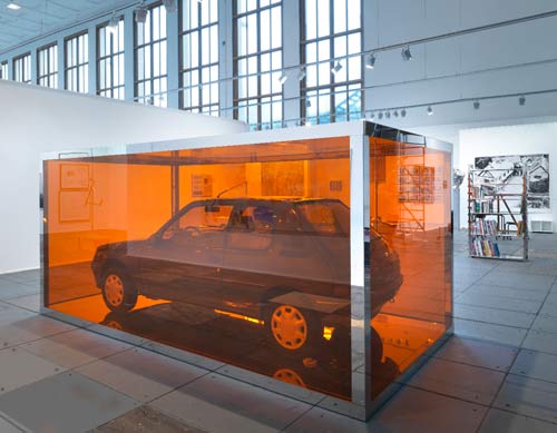
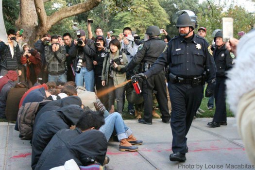
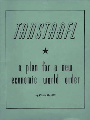
There are so many fascinating things about the Gene Davis Giveaway, I almost don't know where to start. And I'm embarrassed to not have known about it sooner. Gene Davis Giveaway, or Give Away, or as it was called at the time by its creators, The Event, was an amazing art project, part Happening, part Conceptual Art, part ur-Post-Modernist appropriationist market critique, and--yes--part Relational Aesthetics mayhem. And it happened in Washington, DC, in 1969.

The story, as it was fed to Washington Post critic Paul Richards, is that in the spring of 1969, DC sculptor Ed McGowin and art critic/artist Douglas Davis were at a party, trying to figure out how to declare the end of the once-edgy, now "Establishment"-friendly Washington Color School movement. Douglas wanted to "gather [all] the color paintings and destroy them," and McGowin said no, "let's give them all away."

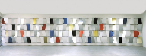
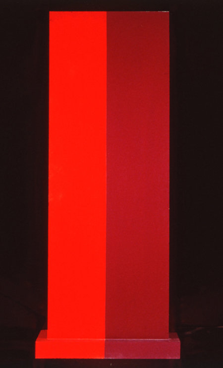
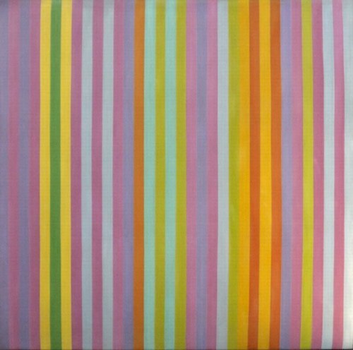
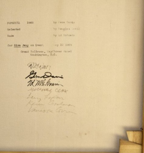
So they approached Gene Davis, who agreed to let McGowin and Davis make 50 replicas of Popsicle, one of his trademark stripe paintings. Davis mixed and supplied the paint, while McGowin and some art students from the Corcoran produced the 6x6-ft paintings. When it was all done, Gene came to silkscreen the three creators' signatures on the back of each canvas. Sometimes the fabricators signed the works, too.

giveaway_screening_fig14.jpg
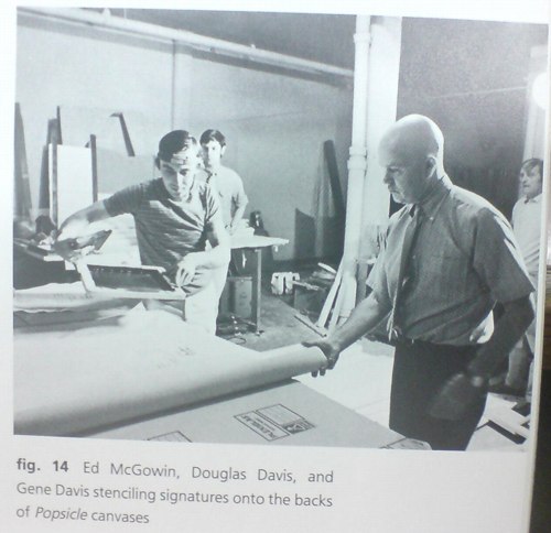
McGowin and Gene Davis screening Giveaway signatures with Douglas Davis looking on, from Douglas Davis's The Giveaway Box, via Gene Davis: A Memorial Exhibition, 1987

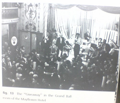
Meanwhile, Douglas invited 500 local swells to a black-tie party in the ballroom of the Mayflower Hotel, where the 50 "Gene Davis Paintings" would be given away, free, to lucky attendees whose names were pulled from a large bowl. [Actually, I think it was 40 paintings, because 10 had been pre-sold to folks who underwrote the production of "The Event." I'd bet they were exchanged for around $1,000, an attractive discount from the $3,000 price of an "original" Davis painting at the time.]

And that's how the Gene Davis Giveaway was positioned at the time, and apparently, for long afterward: Gene Davis paintings by any other name that still looked as sweet. At 0% of the price.

davis_mcgowin_giveaway_2.jpg

In his uncannily prescient and expansive preview of Gene Davis Giveaway in the Post, Richards likens the project's collaborative "assembly line production" to "a different sort of event that not so long ago celebrated the dominance of another kind of painting." Which, obviously, I must quote at length:

That earlier event was performed on a Willem de Kooning drawing by Robert Rauschenberg, a painter then unknown [sic]. The drawing had been made freely, almost automatically, in the abstract manner with soft pencil on fine rag paper. Working freely, almost automatically, in the abstract expressionist manner, Rauschenberg erased it.

Traces of pencil marks remained so that the handwritings of both artists were visible when their work was shown as "Erased de Kooning by Robert Rauschenberg."

Rauschenberg's gesture marked a point in the history of art. His erasing did not destroy--but underlined--the premise of the artwork it altered. Freehand erasing is to freehand drawing as mass production is to the tedious production of an "original" Gene Davis stripe.

That's one way of looking at it. There are others. Some see the Giveaway as a publicity gimmick and others see it as a way to get something nice for nothing and still others regard it as a joke. Douglas Davis feels the Giveaway--with its color, its lottery, its glamor, its suspense--is itself a special work of art.

Wow. Exactly! Except that I think Richards' actual take was one or more of those unnamed "others," and that Davis & McGowin fed him the rest. When Douglas looked back on Gene Davis Giveaway in 1987 in a catalogue essay for the recently deceased painters' memorial exhibition at the Smithsonian American Art Museum that re-examined the project in light of postmodernism's challenge to originality and authorship, Richards poo-poohed it all as "self-congratulatory hyperbole."

Which you'd expect if Richards thought the Event was a "publicity gimmick" or a "joke," but not if it were "a special work of art" which just so happened to align with, if not prefigure, the contemporary art world's next two decades of conceptual and theoretical developments.

gd_giveaway_ballroom.jpg

By Douglas Davis's 1987 account, though, there's no question that he and his collaborators "were in the midst of artmaking," and that the art was "The Event" itself:

What I remember most about that evening is the roar. The crowd was enormous, virtually filling the gigantic ballroom [above]...The atmosphere approached that of a ritual, yes, but the ritual of Wall Street or striptease. Very early, the chanting began: "Give it away, give it away." When we finally drew the names of the winners out of a large silver bowl, the yelps and screams of the victors, and the groans of the losers, were earsplitting. I began to feel ashamed of myself. Barbara Gold of the Baltimore Sun was the only critic who sensed the conceptual edge in "Giveaway." She claimed that the patrons calmed down toward the end, stunned by their own vulgarity, by the shock of recognizing "how totally monetary value could get in the way of the aesthetic pleasure." "A vague air of sheepishness became pervasive," she wrote. I hope her reportage is more accurate than my memory. I recall nothing but loud, overbearing greed to the last. Photographs reveal the winners waving their rolled Popsicles in the air as they left the Mayflower, dancing above a sea of black-tied oglers. At least for the moment, free art, having found its owners, returned to the realm of the precious. No, Walter Benjamin, the aura of Popsicle glowed that night in fifty different directions.
Alright, maybe that is a little hyperbolic.

In any case, I think it's clear that under the Erased de Kooning analogy, Gene Davis Giveaway is really a work by Douglas Davis and Ed McGowin. But that poses the uncomfortable question, what if you erase a de Kooning, but you don't become Robert Rauschenberg? For all his DC Happenings and on-point conceptualizing, Douglas Davis is less well known for making art than for his 1970s tenure as the art critic at Newsweek, and for organizing the Open Circuits symposium that brought video art to MoMA in 1974.

And while Gene Davis's market is pretty sleepy, it's still more established today than either Douglas's or McGowin's. And so it is that most of the Popsicles in public are optimistically/delusionally presented and traded as Gene Davis. Because even in 1987, Douglas didn't realize his project would also prefigure the eventual acceptance of editioned originals and outsourced painting.

So while you can put on a happy conceptual face and say the piece is still working, on another level, it's gotta hurt when, as recently as 2010, Douglas Davis's own copy of Popsicle is being sold--along with his Giveaway Box, the trove of ephemera, documentation, and related materials he'd assiduously collected as part of Gene Davis Giveaway--as a Gene Davis. That's like the A/P right there, the ur-After Popsicle, and it still only makes $11,000.

November 15, 2011

Maintaining Power

zuccotti_whiteshirt_nyt_afp.jpg

Gotta hand it to the Bloomberg Administration: scheduling the expulsion of the Occupy Wall Street protesters for the middle of the night, and then arresting and beating and harassing journalists covering the raid, thereby minimizing--but apparently not eliminating entirely--the creation of images of white-shirt violence like the one above by Agence France Presse, was slick.

But then scheduling the cleaning performance at Zuccotti Park for sunrise, when the dawn's early light hits the golden trees just so, and the Times' photographer can get an NYPD relaxing against a barricade just so? That is pure political poetry.

zuccotti_sanit_nyt_stolarik.jpg

It reminds me of Mierle Laderman Ukeles, longtime artist-in-residence for the Department of Sanitation, who identified the political and aesthetic power of maintenance when she asked, in her Manifesto for Maintenance Art 1969! [pdf via feldmangallery.com], "After the revolution, who's going to pick up the garbage on Monday morning?"

Unfortunately, I think this is the opposite answer Ukeles was seeking.

hammons_how_ya_wpa.jpg

How Ya Like Me Now?, a large painting of a white Jesse Jackson by David Hammons, was one of seven outdoor works in "The Blues Aesthetic: Black Culture and Modernism," an ambitious exhibition organized in the Fall of 1989 by Richard Powell at the Washington Project for the Arts.

The other six outdoor artworks were installed without a hitch, but approval for Hammons' painting to be erected on a DC city-owned parking lot dragged on for six months, three months after the show opened. When the OK was suddenly given [with no explanation of either the delay or the decision], WPA staffers hurriedly erected How Ya Like Me Now? on the lot at 7th & G Streets [where the Verizon Center currently sits], across the street from one of the intended target audiences for its questioning title, the National Portrait Gallery.

The NPG had no portraits of blacks on display at the time. And Hammons suggested that a portrait of Jackson, arguably the most prominent African American in the US in 1988, would already be in the museum if he'd been white. Jackson had lost the Democratic Party's nomination for president to Michael Dukakis after hitting a wall of white voter resistance in Wisconsin, a phenomenon of racist reluctance pundits called "the Bradley Effect."

But a billboard-size portrait of a pink-cheeked Jackson suddenly appearing on the streets of DC with no explanation and a Kool Mo Dee lyric for a title was bound to arouse controversy. And when WPA curator Powell, who is black, left three white staffers to finish installing the piece, a crowd of young black men formed, voiced their protest against the artwork--and then took a sledgehammer to it and tore it down.

hammons_head_wapo89.jpg

The Washington Post showed a photo of the only piece left standing on 7th Street, Jackson's blonde afro and part of his blue eyes. After some back and forth in which Hammons kind of complained that the WPA did not install the work as high off the ground as had originally been called for, and the WPA complained about the city's footdragging delays and said it was going to send the scalped Jackson back to Hammons for repair, the damaged tin painting went back on view, encircled by hammers, for the remainder of the exhibition.

All of which makes me very interested to know when and how How Ya Like Me Know? ended up in its current home in a private DC collection.

The most complete account of this story I can find online is this 1998 Duke Alumni Magazine article on RIchard Powell, who went on to become a very prominent art historian and author [duke.edu]

These two quotes from Coco Fusco and Christian Haye's 1995 Frieze essays on David Hammons reminded me briefly of, say, gala artists and, say, Jacob Kassay, respectively:

'Visual art may be the obdurately white and upper-middle class field of our culture. I have a notion why. Art objects are tailored for physical spaces owned or controlled by the social elite. To make appropriate objects for or even (or especially) against the spaces takes even more than talent and more than technical know-how. It takes intimate familiarity with those rooms where art enters history.' Of course, critics also have a role to play as gatekeepers of history, and Schjeldahl is sly to entirely shift this responsibility to the museum.

...

During the 80s the road taken by many artists was to become known for creating a visual style and milking it for a lot more than it was worth. The road less travelled is to develop that autograph and then drop it in order to invent an entire new language.

For what it's worth, I also want to see if anyone's discussed Alma Thomas's Watusi (Hard Edge) in terms of Henry Louis Gates' theory of Signifyin'. Will look. Also, Christian Haye, where are you these days?

[frieze via hans ulrich obrist's top 20 list]

November 13, 2011

Let Them Eat Cake

OOPS! Never mind!

trecartin_marina_head.jpg

In my dead-serious indignation, I had completely overlooked the potential of Marina Abramovic's MoCA Gala for pathetic comedy. Fortunately, we have Ryan Trecartin, who speaks diva absurdity fluently. Trecartin's livetweeted photo report from inside the tent is hilarious.

First, of course, the page of "INSTRUCTIONS FOR BEHAVIOR WITH THE CENTERPIECE," which, yes, but. The second you read the instructions, you know the piece has already failed, or has at least missed an opportunity.

In 1974, Abramovic executed a piece called Rhythm 0, in which she sat completely impassive next to a table full of objects, including a gun and a knife. A sign informed the audience they could use anything they wanted on the artist's body. It got kind of aggressive, and contested, and Marina says later she "felt really violated." Surely the norms of gala culture would have tempered any actual violence, but would it not have been more illuminating to not tell the gala crowd to behave with basic human decency toward the human performer--and then see what happens?

But that's not what was on the menu for this piece. Oh, the menu. "THE SURVIVAL MOCA DINNER" featured "Super Human Cocktails: Purity MoCA Martini, The Minimalist, The Conceptualist" and "John Cage Symphony," which was a frisee salad with crostini and a fruit-nut loaf. Rauschenberg, de Kooning and Warhol were the other artists with courses named after them. I have no idea.

Holy moley, what is this extraordinary thing where people chant Marina's artist manifesto at the audience? And Debbie Harry gets carried out by four Hollister doormen? A runway-like stage seems to be a trademark of the MoCA gala medium. Vezzoli had it. Aitken had it. Now Marina had it.

trecartin_marina_cake.jpg

As Marina says, you can't judge a work unless you've experienced it. Fortunately, Trecartin and his intrepid entourage stayed until after the bitter end, after the body part cakes in the form of Miss Thang and Ms. Harry were reduced to roadkill, and they investigated the underside of the table and then popped their own heads up. This is close looking and arts journalism, right here folks.

And in the service of art. For then our man in Los Angeles headed [sic] back to his hotel room with the greatest gift bags imaginable, containing kits to make centerpieces at home. So. Awesome.

trecartin_marina_cake_head.jpg

Off with their heads!


All images via Ryan Trecartin's Twitter

At the invitation of Jeffrey Deitch, Yvonne Rainer has seen a rehearsal of Marina Abramovic's performance art project for this year's MoCA Los Angeles gala. And in a new letter to Deitch, she has refined and reiterated her condemnation of it as an exploitative and "grotesque spectacle [that] promises to be truly embarrassing."

Would that it were actually embarrassing to the people involved, and to Marina herself. Rainer goes to great, cordial lengths in her open letter to Deitch [reproduced below] to separate her criticism of the gala from Abramovic's work. While generous, I believe this is incorrect; the only context in which a revolving human head centerpiece on a $100,000 table could be realized is as an artwork. I mean, Abramovic's certainly not claiming this is just edgy party decoration, is she?

If that were so, the case for embarrassment would be easily made. No, I think the reason this rankles so much is precisely because the gala does take on the mantle of art--and the stamp and stature of the artist. It's not possible to say that this gala is not art; it is art you cannot afford to experience. It is art that you find humanly, ethically, and socially objectionable. And it is being produced and shown for money in one of our [sic] most reputable museums, by an artist who shows and is celebrated in similar institutions.

That's a reality of the art world as it's currently constructed.

Last year between the blog post where I declared the Gala as Art Movement and my presentation on it at #rank, I found two things: 1) Abramovic was deeply engaged in the luxury/sensual/sensory spectacle that is the gala experience's stock in trade. And 2) Doug Aitken's MoCA gala Happening was, on one level, a critique of the real estate and cultural forces which used art and museums to shape Los Angeles to serve their own needs. And that critique was utterly and completely subsumed by those very forces, probably without Aitken realizing it.

The Gala is bigger than any artist's attempt to subvert it from inside the party tent. Aitken tried and failed, but I think Abramovic is just fine with it.

Yvonne Rainer Blasts Marina Abramović and MOCA LA [theperformanceclub.org]

Previously: An Incomplete History of The Gala-as-Art Movement [greg.org]
"Relational Aesthetics for the Rich, or A Brief History of the Gala as Art" [vimeo]

Yvonne Rainer's revised letter to Jeffrey Deitch, along with its growing list of signatories, is after the jump.

truitt_insurrection_corcoran.jpg
Insurrection, 1962, image: corcoran.org

I needed to see some hard-to-find Chris Burden catalogues--more on that later, but soon--and the quickest place I could find them was the Corcoran School's library. I called ahead, and they had them waiting for me, so I was in and out of the library in no time.

Which left me with a little time to wander. And there is a very nice gallery with a nice, old Ellsworth Kelly diptych, and this wonderful Anne Truitt sculpture in the center of the room.

Insurrection was installed very dramatically with Hardcastle, another 1962 work, in Kristen Hileman's Truitt retrospective at the Hirshhorn. Hardcastle confronted you head-on through the doorway, while Insurrection was turned sideways; on edge, with only the slab's thinness and wooden brackets visible. It was only as you moved around it--following the contours of those unfortunate Karim Rashidian raised platforms--that they switched out: Hardcastle's heft gave way, and Insurrection widened, revealing that they shared the same structure.

truitt_hardcastle_back.jpg
Hardcastle, 1962, via annetruitt.org

The install of Insurrection at the Corcoran, meanwhile, is much less enigmatic. There are off-center approaches from three different sides, so the sculpture is what it is when you see it. Moving around it is an experience, not a discovery. [The full frontal orientation faces the Kelly, Yellow with Red Triangle, from 1973.]

kelly_yellow_red_corcoran.jpg
Yellow with Red Triangle, 1973, image corcoran.org

Even though they're the same shape/structure, I remember Hardcastle's monochrome face felt more massive--and then artificial, as its red brackets popped into view. Insurrection's two-tone reds make it feel more like two volumes immediately, which turn out to be one.

Back down on the floor where they belong, Truitt's larger sculptures always feel like a presence, in space, and yet they're paint[ings?] [ed?] And yet there is paint. Maybe 1962 was before her reportedly vigorous sanding and multiple coats kicked in, because Truitt's surface is most definitely painted with a brush. Kelly's surface, meanwhile, is only disturbed by the weave of his canvas; I'm going to assume he used a roller. But wow, there's a brush going around the edges. And how. Just slapped right on there.

I'm trying to better understand the sense of paintings as objects, of the picture plane as nothing of the sort. I didn't plan today to see these two artists' works--Truitt's and Kelly's--which explore this very idea, in the form of painting/sculpture, but here they were. I still have to look some more, but basically, I came away thinking I might be really knocking myself out too much over my smoothly brushed-on painting surfaces.

previously: many Anne Truitt posts on greg.org
and a little on looking at Ellsworth Kelly

moma_fire_stairs.JPG

You'd think I'd learn the importance of clearing browser tabs by now. I've had this eBay listing open for a couple of weeks now, thinking I'd buy it. And then last night I decided to pull the trigger. And then to just do it in the morning. And it was gone.

It's a rather awesome press photo from September 1958 of a temporary staircase erected in the Museum of Modern Art's Sculpture Garden after the fire that destroyed a couple of Monet's Water Lilies paintings.

The Tribune Company was selling the print, liquidating the photo morgues of various of its venerable newspapers at $15 a pop, while stamping its watermark across the digital version "to deter image theft [sic]." Mhmm.

This kind of provisory structure, something more than a scaffold but less than an actual building, is awesome to me. It's a type of architecture that doesn't often get documented, much less studied, and almost never preserved. The related exception, though, are 19th century Army-issue observation towers at Gettysburg, but even those seem to have been designed, not just built.

Previously: MoMA on Fire

November 9, 2011

Intergalactic Lens Flares

he_1104-1805_lensing.jpg

i love that the headline on this story, "Hubble Directly Observes The Disk Around A Black Hole," has to be followed immediately by, "but it's not that disk."

The spectacular patterns and rays in the photo above of the double quasar known as HE 1104-1805 are apparently imaging artifacts from the Hubble Space Telescope, They're caused by the circular aperture and the structural elements of the telescope itself.

Meanwhile, the accretion disk is only visible at all because HE 1104-1805 is subject to gravitational lensing, distortions in the light caused by the gravitational pull of an intervening galaxy.

I can't quite articulate it yet, but there's something here about the appeal and limits of opticality; the utility and limitations of the narrow, visible part of the spectrum; and the documentation and characterization of distortion that I find very interesting. And then there's the inextricable relationship between the instrument and its object; which then collapses as the universe itself--the galaxy-as-lens--becomes the instrument for viewing itself.

Hubble Directly Observes the Disc Around a Black Hole [spacetelescope.org, via]
What's That Strange Disk Around That Black Hole? [discovery.com]

Jerry Saltz tells Artinfo a few of his least-favorite art world things, including:

an endless stream of art-school-trained artists trying to crawl up the asses of Andy Warhol, Richard Prince, and Gerhard Richter in order to stake out a microscopic piece of insular, already-approved territory
Oh yeah, I hate those guys, too!

19 Questions for Jerry Saltz [artinfo]

bhqf_gate_adelman.jpg

In 2005, designer Ian Adelman and his colleagues spotted The Gate chasing Robert Smithson's posthumously realized Floating Island. Adelman snapped a photo, which ended up on the front page of the New York Times. It was only revealed some years later, after several arch, art world stunts established their reputation, that the pseudonymous collective Bruce High Quality Foundation acknowledged The Gate had been their inaugural project. Meanwhile, they have developed an irreverent, thoughtful, often amusing practice that remained admirably critical of the market fetishization of authorship, originality and young talent.

Until now, I guess, when they printed a big-ass version of Adelman's photo as it ran in the Times onto a canvas and put it into a "selling exhibition" at Sotheby's "curated by Vito Schnabel."

Looks pretty sexy. I hope it's an edition, so they can give Adelman an A/P.

The Gate: signed and dated 2011 on the overlap
silkscreen and acrylic on canvas
47 1/2 x 67 1/2 in.
[sothebys.com]

2005: Water Gate
2009: Things we did not know in 2009: BHQF did The Gate
2009, a week later: Never Mind! Bruce High Quality Foundation made The Gate, but not The Article

paul_thek_tatlin_ica_phila_1977.jpg

Paul Thek's birthday was last week, so I probably should have posted this photo of his re-creation of Tatlin's Monument to the Third International then.

Thek installed this version of his Tower of Babel at his only US museum show in his lifetime, at the ICA Philadelphia in 1977. That's Uncle Tom's Cabin and a bathtub full of water inside it there.

Whatever points it loses for verisimilitude Thek's Tatlin's Monument makes up for being ahead of the game. The only widely known Tatlin replica at the time in the West was Pontus Hulten's first version, built in 1968 for the Moderna Museet [where Thek had a show in 1971.] Hulten had made that one with T.M. Shapiro, Tatlin's collaborator in the "Creative Collective." Then in 1975, Shapiro went on to make another, more accurate version himself in Moscow, after gaining access to more original notes and documentation.

But then, I don't get the sense that historical accuracy was ever Thek's goal.

Previously: On The 2nd Through 8th Tatlin's Monuments To The Third International
John Pearrault's 2010 look back at Thek's work and non-career

Not sure what's cooler about JWZ's post about visiting the repurposed Christian Science church that is now The Internet Archive's San Franscisco Mothership:

their slick and simple book digitizing station setup, or the "terracotta army of avatars of their long-term employees" which are gradually filling the pews.

The Internet Archive [jwz.org]

November 7, 2011

Luminous Canvas, Sham Paris

sham_paris_longstreet.jpg

Sweet, near the end of World War I, Paris planned and began construction on a "Sham Paris," decoy trains, stations, avenues and factories, to confuse German aerial bombers.

Above, a detail from the photo, "Luminous canvas on the ground to represent, to German airmen at night, oneof the great Paris railway stations: The Camouflage Gare de l'Est."

Like the 1920 editors of The Illustrated London News, I would have liked some aerial photos of the deception.

A Paris Made to be Destroyed--Sham Paris, 1917/18 [ptak science books]
Suspiciously related: Maskelyne's Sham Alexandria, or The Greatest Camo Story Ever Told

ipk_bipm.jpg

I count it as a matter of pride and oddly satisfying accomplishment to learn I'd been thinking some of the same things about the International Prototype Kilogram that Charles Ray was thinking about the International Prototype Kilogram.

Picture Piece: Same but different, the many ur-Kilos [frieze, jan-feb 2000]

Previously: The International Prototype Kilogram, or le Grand K
Here is the International Prototype Kilogram again

no_free_lunch_study-2.png

The classic saying, so closely associated with the conservative icon economist Milton Friedman, just sort of came out last night during a brief Twitter discussion with Bill Powhida and Magda Sawon about what, exactly, my point is on Rirkrit Tiravanija's gorgeous, mirrored objects.

And basically, I think it comes down to my dissatisfaction with what feels like the persistence of a critical adulation of Rirkrit's socially oriented practice--and, by extension, Relational Aesthetics generally--as anti-market, anti-commodity, gifty experientialism, which does not acknowledge, must less seek to understand and account for, the beautiful luxury goods at the center of so many of these projects.

This seeming contradiction or paradox--I will not call it hypocrisy, at least not on the artist's part--should be adding a level of complication and contestation to Rirkrit's work. Instead, it's reduced to the critical comfort food of free soup and socializing.

I think Rirkrit knows about the "there's no free lunch" concept, at least on some level. Thanks to Friedman and to Robert Heinlen before him, who popularized the acronym, TANSTAAFL [There Ain't No Such Thing As A Free Lunch] in a 1966 sci-fi story about lunar colonists rebelling against their earthly overlords, the saying is pretty deeply embedded in the history of postwar liberalism and globalization, the very political and philosophical context Rirkrit's work engages [and from which he appropriates so many of his forms.]

So now, against my better judgment, perhaps, I think I want to take a closer look at Rirkrit's practice and the Relational Aesthetics construct from the perspective of Friedman's foundational libertarianism. It'll be like opposition research as art criticism. Or maybe it won't be. To ignore the highly market-oriented aspects of Rirkrit's work, and focus solely on the dinner parties and sleepovers is to almost perfectly miss Friedman's point: nothing comes without a cost; it's just a matter of identifying it and figuring out who's going to pay.

While no one seems to be paying much critical attention to Rirkrit's objects specifically, Relational Aesthetics and its evangelist Nicolas Bourriaud have been worked over repeatedly by other critics in ways that can implicate and/or illuminate these shiny baubles. Claire Bishop, Miwon Kwon, and Stewart Martin are just three prominent voices in the debate, which takes RA to task for both feeble anti-aestheticism [Bishop], and for neutralizing and commodifying social practice within the institutional apparatus [Martin]. I really don't have the chops or the stamina to lay all this out right now [or maybe ever, who knows?] But the Radical Cultural Research Collective's RA critique critique provides a handy reference point, as does Dave Beech's horribly formatted analysis of participation.

What I can do right now, though, is ogle this awesome book cover from 1949, which just became a study for a painting I will have to make. This slim book, TANSTAAFL: A Plan For A New Economic World Order by the hard-to-research Pierre Dos Utt, is one of the earliest published references to "ain't no free lunch."

TANSTAAFL_pierre_dos_utt.jpg

The phrase has its own Wikipedia page, of course.

There ain't no such thing as a free lunch. [wikipedia]
thanks to Brent for help in approximating Rirkrit's font for the mockup up top.

sachs_ikea_judd_2.jpg

For he that hath eyes and was paying attention last year, The Selby let him see. For the rest of us, the show at Sperone Westwater is the first time to see Tom Sachs' awesome Donald Judd furniture hacked together from particleboard scraps from the IKEA AS-IS department.

sachs_ikea_judd_1.jpg

Hacked is, of course, not the right word. The chairs are constructed with Sachs' characteristic attention to craft and process: they show every drip of resin, every bubble and lump in the fiberglass joinery.

sachs_ikea_judd_3.jpg

For me, the best part is that the pieces date from 2009. And in November 2009, the first issue of Bricolage Magazine, Tom's zine, included a feature titled, "Ikea vs Judd." Because as awesome as they are on their own, they're even better for not being Enzo Mari furniture.

Tom Sachs: WORKS, Nov 4 - Dec 17, 2011 [speronewestwater.com]
Tom Sachs site [tomsachs.org]
6.14.10 Tom Sachs in his studio [theselby]
Tom Sachs studio film, by The Selby [vimeo]

Previously, resonant, not related: Enzo Mari X Ikea mashup

November 4, 2011

howtospendit.com +rirkrit

Thanks to Awl for reminding me that not everyone is not talking about Rirkrit Tiravanija's sexy, blingy objects. I'd found this last week, but it was crashing my browser, and it may do the same to yours, probably because it's designed for folks who trade up their computers with the same frequency Steve Jobs traded his AMG SL65.

The Financial Times' luxury lifestyle magazine supplement How To Spend It loves Rirkrit's work.

rirkrit_nada_ping-pong.jpg

In "Art Works: Spectacular Sculptures - with a purpose," Helen Chislet delivers servicey with a smile by revealing the "spectacular and tremendous fun" that can result "when artists are asked to design functional outdoor objects." Objects like Rirkrit's "ping-pong table of flawless mirror-polished stainless steel in an edition of ten--a piece of perfectly executed workmanship that carries a price tag of $55,000." [no correction to my original price mention; if you want to pay 10% more that's your business -ed.] Objects which are still likely to appeal to the FT's ideal UK-centered international demo, typified by one garden folly maker's client base as "City workers relocating to the country, but now includes European royalty and "extraordinary people."


And the Palm Pavilion at Inhotim gets a starring role in "Artward Bound," Pernilla Holmes's round-up of far-flung private art parks, which, I love this:

"So much contemporary art is commodified," says [Doug] Aitken. "A place such as Inhotim works against that. It empowers the artist rather than curating the artist. It's a phenomenal template for a modern museum." Unlimited by budget constraints, bureaucracy, timescales and space, such privately owned modern museums are popping up in spectacular, middle-of-dowhere locations around the globe as moneyed art collectros turn the traditional museum model on its head. Each is as unique as the personality of the person who dreamt it up.
Aitken really does have his finger on the pulse of these things.

previously: relational aesthetics for the rich
the gala-as-art movement [vimeo]

November 3, 2011

Richard Prince And Friends

cariou_prince_appeal_scr.jpg

I've tweeted on this a bit already, but it's really worth repeating: Richard Prince's appeal of the Patrick Cariou copyright infringement decision is a really great read. The brief was filed last week, and I finally got around to reading on Halloween night. I find it makes a very clear and persuasive argument for throwing out Judge Batts' sweeping ruling, and it's a nice, not too esoteric discussion of appropriation and fair use as well.

Basically, Prince, his new lawyers, and Larry Gagosian argue that Judge Batts wrongly applied the prevailing legal standards for fair use, especially the most recent, relevant case which had been before the same court, Blanch v. Koons.

I think I've written before that Prince's work, and his first-round defense, relied very heavily on Koons's winning argument that an artist's transformations of size, scale, material, and context were sufficient for fair use. But their briefs almost never cited Blanch and did not make that transformative use argument clearly or well. That has changed.

Prince's lawyers also argue that Batts overreached and erred by finding all 30 of Prince's Canal Zone works to be infringing, regardless of what, how, or how much of Cariou's imagery they contained. And that it's wrong to force Prince to hand over all the artworks to Cariou when the settled precedent of monetary compensation exists.

I think that, at the very least, the court will find that each painting must be evaluated, and that the court will have to decide Prince's transformative efforts. While I would love to publish such a document, because it would just be the best kind of worlds-colliding art criticism around, I suspect a check will be cut before the judges take out their rulers.

I could rattle on about this all day, but why not just read it yourself? Here is a copy of Prince's filing, which I'll host on my Dropbox own site for a while. The 135-page ruling has a lot of very nice, full color illustrations and clocks in at around 7mb.

[OBVIOUS DISCLOSURE ABOUT GREG.ORG AND THE CREATIVE CAPITAL | WARHOL FOUNDATION ARTS WRITERS PROGRAM, WHICH IS COMPLETELY UNRELATED TO THE FOLLOWING PARAGRAPH, HERE.]

And in even more interesting news, Joy Garnett just gave me a heads up that the Warhol Foundation has actually filed an amicus brief in Cariou v. Prince, warning the courts that if Judge Batts' ruling were to stand, it would put works by other artists in jeopardy, and would cause "such uncertainty in the field as to cause a chilling effect on the creation of new works." I expect I'll come back to this after I read it all, but the Foundation's brief defends Prince's work as part of a broad, artistic history of appropriation, quoting, and collage. Should be interesting. The Foundation's 57-pg brief [pdf] is linked directly here.

Previously: the five most ridiculous things about the Richard Prince copyright decision
The Richard Prince decision? You're soaking in it!
Richard Prince's Spiritual America
Size Matters?
"THE WITNESS: This could be a cool book."
"The Movie is called 'Eden Rock'"

punishment_park_interro.jpg

Punishment Park? How did I not know about Peter Watkins' incendiary 1971, anti-war, anti-fascist, faux-news documentary? I mean, it was the movie Rirkrit chose to broadcast on his unlicensed TV station in the Guggenheim. I sat in Anthology's rickety seats for the entire 5+ hours of The Commune (Paris, 1871). Is it one of those things that just looks so completely, unrecognizably different in the light of Occupy Wall Street, that--no.

When Punishment Park was finally released on DVD in 2005, it was the peak of a globally unpopular war, which was tainted by torture, unlawful detainment and military tribunals, violations of basic constitutional and human rights, and polarized rhetoric within American culture. So no, I don't think I registered what Watkins had done.

punishment_park_zp.jpg

Which, holy smokes. Here's how Holland Cotter describes Punishment Park in his 2005 review of Rirkrit's show:

it is a docudrama about the brutal silencing of antiwar protesters during the Vietnam period. Many of the actors were amateurs. The people cast as activists were, in fact, real-life activists; the police were played by former police officers.

Their lack of theatrical training gives the film a curious tension, making it seem both authentically documentary and stagy. It feels something like that era's political street theater, which was cropping up all over the United States and Europe at a moment when anger and paranoia were at flood tide. This aesthetic certainly suits the low-tech character of the broadcast facilities, which are pretty rudimentary.

Shooting in an army tent and the Mojave Desert, a British news crew follows two groups of activists/protestors as they are run through a sham tribunal and are given the choice between excessive federal prison sentences and an impossibly brutal three-day race across a vast desert reservation, aka "Punishment Park," where they are hunted down by National Guardsmen training for the next Kent State.

punishment_park_haze.jpg

It's like Predator and The Tenth Victim gave birth to the sequel of Zabriskie Point, starring the Chicago Seven. It is not pretty.

Punishment Park may not be a great movie, but it is definitely a fascinating one, one which is difficult to watch, and apparently difficult to like. I think that's by design, though; it seems calculated to antagonize and/or enrage basically anyone with a political opinion and a stake in the outcome of the American experiment. It deserved a little more credit than it got, though, and certainly better consideration than Vincent Canby was capable of:

Because all literature, including futuristic nonsense like this, represents someone's wish-fulfilling dream, I can't help but suspect that Watkins's cautionary fable is really a wildly sincere desire to find his own ultimate punishment.
Yow.

The freaky thing, I guess, is the way Punishment Park manages to both over- and under-predict the cultural rifts and abuses of power in American politicized culture over the intervening 40 years. I think had I seen Punishment Park in 2005, I would have distanced it as a historic, histrionic artifact. But given the last few years/months/weeks, I can't help but see parallels and hear echoes between the film, its time, and today.

The other, less uncomfortable thing--I mentioned Zabriskie Point for a reason--is how Punishment Park alters the context of the 60s and 70s for me. I can't help but see the counterculture and the desert, the military and the desert, war and the desert, art and filmmakers in the desert, quite differently now.

The New Yorker Films DVD release of Punishment Park is available on Amazon and Netflix.

November 1, 2011

Sarah Sze Street View

Just this morning, while I was watching Sarah Sze's 2010 lecture at the Smtihsonian American Art Museum, and she was showing videos of her installations for the first time [borrowed, with permission, she said, from various YouTube users, which is nice]. And I found myself thinking, "Hah, try running the Google Street View Trike through that!"

But of course, Google already did.

sarah_sze_street_view1a.jpg

Street View just announced the release of imagery from The High Line, which was apparently captured by the Trike this spring, just before the second, Northern section opened.

sarah_sze_street_view2.jpg

And whaddyaknow, there's Sarah Sze and her crew, installing her bird city, Still Life with Landscape (Model for a Habitat). That's Sze and her updo on the left. On the LEFT. Focus, people, focus.

And I do believe that is dearly departed High Line curator Lauren Ross with the lanyard, checking in on things. [Happily, Ross isn't dead; she just moved to Tulsa.]

These photos are actually in reverse order; the Trike was driving south. I haven't spotted any traces of a Google Guide yet. But I do notice that with this early morning shoot, the Street View pano stitching algorithm erases the Trike's shadow. Leave no trace.

Since 2001 here at greg.org, I've been blogging about the creative process—my own and those of people who interest me. That mostly involves filmmaking, art, writing, research, and the making thereof.

Many thanks to the Creative Capital | Warhol Foundation Arts Writers Program for supporting greg.org that time.

comments? questions? tips? pitches? email
greg [at] greg [dot ] org

find me on twitter: @gregorg

about this archive

Posts from November 2011, in reverse chronological order

Older: October 2011

Newer December 2011

recent projects, &c.


our_guernica_cycle_ivanka_320px_thumb.jpg
Our Guernica Cycle, 2017 –
about/kickstarter | exhibit, 2017


pm_social_medium_recent_proj_160x124.jpg
Social Medium:
artists writing, 2000-2015
Paper Monument, Oct. 2016
ed. by Jennifer Liese
buy, $28

madf_twitter_avatar.jpg
Madoff Provenance Project in
'Tell Me What I Mean' at
To__Bridges__, The Bronx
11 Sept - Oct 23 2016
show | beginnings

chop_shop_at_springbreak
Chop Shop
at SPRING/BREAK Art Show
curated by Magda Sawon
1-7 March 2016

do_not_bid_or_buy_iris_sidebar.jpg
eBay Test Listings
Armory – ABMB 2015
about | proposte monocrome, rose

shanzhai_gursky_mb_thumb.jpg
It Narratives, incl.
Shanzhai Gursky & Destroyed Richter
Franklin Street Works, Stamford
Sept 5 - Nov 9, 2014
about | link

therealhennessy_tweet_sidebar.jpg
TheRealHennessy Tweets Paintings, 2014 -
about

sop_red_gregorg.jpg
Standard Operating Procedure
about | buy now, 284pp, $15.99

CZRPYR2: The Illustrated Appendix
Canal Zone Richard Prince
YES RASTA 2:The Appeals Court
Decision, plus the Court's
Complete Illustrated Appendix (2013)
about | buy now, 142pp, $12.99

weeksville_echo_sidebar.jpg
"Exhibition Space" @ apexart, NYC
Mar 20 - May 8, 2013
about, brochure | installation shots


HELP/LESS Curated by Chris Habib
Printed Matter, NYC
Summer 2012
panel &c.


drp_04_gregorg_sidebar.jpg
Destroyed Richter Paintings, 2012-
background | making of
"Richteriana," Postmasters Gallery, NYC

czrpyr_blogads.jpg
Canal Zone Richard
Prince YES RASTA:
Selected Court Documents
from Cariou v. Prince (2011)
about | buy now, 376pp, $17.99

archives