How to account for my dogged fascination with the temporary/permanent, futuristic/historic paradoxes of Expo art and architecture?
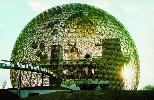
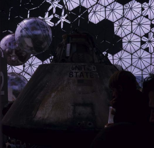
Buckminster Fuller’s 20-story Biosphere was far and away his greatest single success and the hit of the most successful modernist world’s fair, the Expo 67 in Montreal. And yet how little did I consider what was in it: a giant exhibit of the movies; The American Spirit, an exhibit of NASA satellites and space capsules; some crafts or whatever, and American Painting Now, 23 huge paintings commissioned by Alan Solomon from a “Who’s Who of modern art,” including :
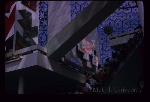
James Rosenquist, Claes Oldenburg, Andy Warhol, Jasper Johns, Jim Dine, Ellsworth Kelly, Barnett Newman, Robert Rauschenberg and Roy Lichtenstein. Their works illustrated trends such as abstract expressionism, op, pop, hardedge and geometric art. Like the space component, this part of the American exhibition was truly spectacular. The works, gigantic, simple and colourful, paid a vibrant tribute to the creative vitality of artists who now count among the great masters of 20th century painting.
Uh, and from Fuller, too, from the looks of that giant Dymaxion Map right there.

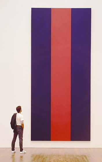
From a 1996 book on Voice of Fire, Barnett Newman’s own 17-foot tall contribution, we learn Solomon requested that the artists [all male?] “contribute paintings that are (a) large in scale and (b) vertical in format.”
 I want to quote “Exorcism in Montreal,” the April 30, 1967 review by NY Times critic and famous Newman nemesis John Canaday, in its entirety, but I won’t:
Here we have the same old clique of names that have been handed the favors regularly in Venice and everywhere else on the circuit. A natural response to the list is “Oh, no, not again!” There is that tiresome Barnett Newman, who this time turns out three vertical stripes in two colors–but they are 17 feet high. There’s Jim Dine, with nothing but two big slabs of enameled canvas, in two flat colors, bearing in one corner a notation as to the brand of paint used–and the panels are 35 feet high. There is Roy Lichtenstein being Roy Lichtenstein again, but now 29 feet high.
There are all the rest of the club, not including some whose work was not fully installed on press day, and some whose work seems to me to have more substance than the ones listed, for instance James Rosenquist’s colossal “Firepole.” I have chosen the most vacuous because in this setting even they are part of a genuinely spectacular show fulfilling demands that could not have been met by any other kind of painting.
The dimensions given above tell that the paintings, most of them done for this spot (what other spot could hold them?), are gargantuan…they are played against strips of sail cloth in heights up to that of a 10-story building. It is as if the whole water-treading esthetic that they represent had been originated and sustained by some genii who knew that one day a form of painting bold enough and shallow enough to supply enormous bright banners for this pavilion would be necessary.
And then there’s Canaday’s assessment of the NASA artifacts, which basically hits it home for me with the art/science beauty paradox:
…since technology is creating the most beautiful objects today, and the most imaginative ones, Apollo might also be thought to have added one more muse to the group that he has always chaperoned.
Of course, there is no separating the fascination of the Apollo Command Module as a scientific object from its quality as an esthetic one, with its self-generated form and its patina burnt into it during the minutes of its descent rather than by centuries of weather, but it is a beautiful object all the same–inherently beautiful, and no other word than beautiful will do–as well as an historical monument with emotive associations And that is what great works of art used to be.
Ah, so it’s just the domes and the satelloons.

Update: From Architecture & Nature (2003), more details/corrections on who showed what: Kelly had a 30′ canvas, no title given. Robert Indiana, Cardinal Numbers. At just 13’x15′, Robert Motherwell’s Big Painting #2 was anything but. Lichtenstein: Big Modern Painting [sensing a theme here?] Helen Frankenthaler was The Woman Painter. And the Dymaxion Map was by Johns, “a small [sic] token to his friend Fuller’s desire to have the map be the centerpiece of the pavilion.”
Interior images of Biosphere, the US Pavilion at Expo 67 from The Dixon Slide Collection at McGill University. [mcgill.ca]
Q: was this the Ellsworth Kelly? [no, see update above]
Previously: Hmm. That satelloon & command module show was so good, they used it again at Expo 70 in Osaka.
