June 2008 Archives

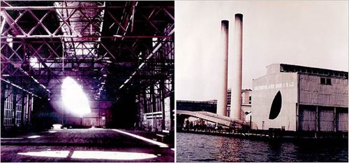
matta_days_end.jpg

Gordon Matta-Clark's 1975 film, Day's End, is on view at MoMA right now. It documents a guerrilla project where he and a couple of collaborators cut a giant, moon-shaped hole in the wall of an abandoned sanitation warehouse on Pier 52, at the end of Gansevoort St in the Hudson River. Matta-Clark said of the necessary illegality of the project:

I had no faith in any kind of permission … there has never, in New York City’s history, with maybe one or two minor exceptions, ever been any permission granted to an artist on a large scale.
via ny mag
Day's End is also showing at the incomparable Ubu Web. [ubu]

Look, I love Car Talk as much as the next guy, but holy smokes, the excerpt from their new, animated sitcom for PBS, Click and Clack: As The Wrench Turns, is utterly unwatchable. It's three minutes long, and they have maybe 25 words between them; what's the point of having these two supposedly great characters if you don't use them?

I'd much rather watch them drive around the LA freeways looking for car trouble. Which happens to have been the pitch for their first TV show:

Their initial foray, some two decades ago, was to be a show in which they roamed the freeways in and around Los Angeles, looking for broken-down cars. But after numerous missteps, including taping before obtaining a permit, the project was shelved, Ray Magliozzi recalled.
Welcome to Toontown, Radio Guys [nyt]

June 28, 2008

The East River School

olafur_waterfall_paf1.jpg

I'm out of town, so I haven't seen Olafur Eliasson's New York City Waterfalls in person yet. But even though I'm a fan and a friend of the artist, I'm getting a kind of relieved, embarrassed enjoyment reading the underwhelmed reactions to the project.

There's something about "public" art that just gets under peoples' economic skins in ways that art on display in public doesn't. Do Aby Rosen or Damien Hirst get grief for the comparably priced statue of a dissected pregnant girl that's been on view at Lever House for the last few years? Are the owners of the $100 million worth of Koons sculptures parked on the Met's roof taking heat for not funding public schools instead?

If the oft-quoted number of $13-15 million is right, the Waterfalls cost about as much as a decent 3BR on the park. On a monthly basis, the 4-month project is about twice as much as the $20 million/year, $1.67/mo. Citi pays the Mets for naming rights to their new stadium [which is being built with 450 million taxpayer dollars.]

But whatever, if NYC Waterfalls' boring comparisons to the empty, execrable spectacle of The Gates only exposed of the pitfalls of the existential argument for Art as Economic Development, it would be a success.

Waterfalls are supposed to be Nature's most spectacularly wild destinations, yet on the East River, they're tame to a fault. Never mind the futility of trying to upstage the wonder that is the Brooklyn Bridge; in the competition for inspiring American scenery, Olafur's cobbled-together waterfalls invariably lose to the cityscape he put them in. Which I suspect was part of the plan all along.

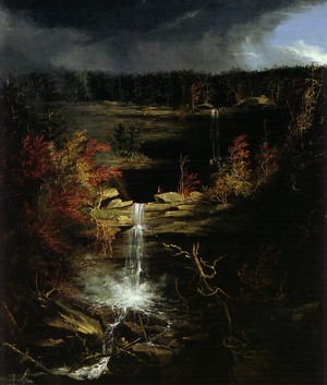
cole_kaaterskill_falls.jpg, warner paper collection

Here's Thomas Cole, the founder of the Hudson River School, in his 1836 "Essay on American Scenery," explaining how the divinely anointed wildness is the first point of evidence of God's favor on His Country [Waterfalls, by the way, are point 3.b., listed under "3. Water" between "a. Lakes" and "c. Rivers."]:

[Wildness] is the most distinctive, because in civilized Europe the primitive features of scenery have long since been destroyed or modified--the extensive forests that once overshadowed a great part of it have been felled--rugged mountains have been smoothed, and impetuous rivers turned from their courses to accommodate the tastes and necessities of a dense population--the once tangled wood is now a grassy lawn; the turbulent brook a navigable stream--crags that could not be removed have been crowned with towers, and the rudest valleys tamed by the plough.

And to this cultivated state our western world is fast approaching; but nature is still predominant, and there are those who regret that with the improvements of cultivation the sublimity of the wilderness should pass away: for those scenes of solitude from which the hand of nature has never been lifted, affect the mind with a more deep toned emotion than aught which the hand of man has touched. Amid them the consequent associations are of God the creator--they are his undefiled works, and the mind is cast into the contemplation of eternal things.

Though both varieties evoke "the beautiful, but apparently incongruous idea, of fixedness and motion," Olafur's waterfalls are the diametric opposites of The Hudson River School's. As unabashed works of Danish-Icelandic Man the creator set in the sublime mess of the East River waterfront, they cast the mind into the contemplation of mundane, daily, man-made things.

olafur_pre-dawn_nyt.jpg

So far, I haven't seen my favorite aspect of the perfectly cultivated Waterfalls discussed anywhere at all: their schedule. The waterfalls get turned on every day at 7 AM, and turned off at 10pm. Except, as it happens, on Tuesdays and Thursdays, when they get turned on at 9 AM. New Yorkers have nothing against communing with nature's sublime majesty, as long as you can guarantee we can squeeze it in on the way to work, or maybe during a smoke break. [One by-product of this schedule is the impossibility of reproducing the NYT's Vincent Laforet's lush photos of the falls in the dawn's early light until the very last days of the project, and only then if they turn the lights on in the morning.]

But the idea of turning waterfalls on and off to suit human needs is not limited to the Public Art Fund. One of the biggest controversies in Iceland the last decade or so has been the Karahnjukar Dam, which was built on a pristine glacial river solely to generate electricity for a massive aluminum smelting plant run by Alcoa. Opponents criticized the project, not just for drying up 100 scenic waterfalls, but for planning to turn them back on from June to September during the summer tourist hiking season.

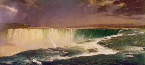
church_niagara.jpg corcoran museum

Even the "uncontrollable power" of the Hudson School's favorite, Niagara Falls, is cut by 50-75% at night and during the off-season to power upstream hydroelectric plants. Cole got a little moist: "In gazing on it we feel as though a great void had been filled in our minds--our conceptions expand--we become a part of what we behold!" Which goes the same for Olafur's waterfalls, too; the only difference is what we become a part of.

spotted while driving back from the Outer Banks yesterday.

sander_ctrl-c_stylecom.jpg

I haven't bought any yet, but since Jil Sander was sold to Change Capital Partners a couple of years ago and Raf Simons began designing it, the label has mostly moved out of the way of my grudge against Prada for ruining it. I only hope the sale price [EUR50 million] and the reported losses are real, so that in the end, the whole deal cost Prada a shitload of money.

Which is all unnecessary rationalization for my saying I like Simons' work for Sander.

But what I like most about this suit is the photographic dissonance of it. As Marcio Madera's runway photo shows, the black-in-back makes the model look like part of a collage of magazine cut-outs, or a rough cut-n-paste job with Photoshop's lasso tool.

Like those t-shirts with pre-pixelated logos or the sunglasses shaped like black censor bars, the suit transposes the photo-mediated consumption of fashion into real space.

At least that's what it does from head-on. From the side, you'd probably look like a total dork.

image: Spring 2009 Jil Sander collection [men.style.com]

The scale of the scandal of the management of BYU's art collection was becoming clear just as I entered the art history program there in the late 1980's. For years, the collection had been ignored by everyone except one professor who served as an ersatz administrator/curator. Without a museum or any galleries to show it in, and without even an inventory or an institutional awareness of what was in it, the collection was just left unattended. Faculty could go grab a Homer drawing or a Rembrandt etching for their offices. The always-open conference room where we met for our contemporary art seminar had a Mark Tobey painting on a hook.

By the time the University announced plans to build an art museum and had begun a computerized inventory, they found that almost 10% of the collection, over 1,200 objects, had gone missing, 900 through theft, fraud, forgery, misplacement, unauthorized sales or trades, or returns to original donors. As this long, fascinating, but maddeningly incomplete article in the Deseret News reports, a couple of folks at BYU have been doggedly pursuing the return of the artworks since 1986.

The story focuses on a couple of high-profile cases where unscrupulous dealers seduced or duped the BYU professor in charge of the collection. A NY dealer named Dion O'Wyatt took a Monet and some Homer drawings from Provo to NYC, ostensibly for appraisal in advance of an unapproved sale. Then he had a street artist copy the works, and he quickly sold the originals. The forgeries went undetected for 16 years.

To their credit, BYU went public and disclosed the full scale of their mismanagement. Al the missing works have been entered into the Art Loss Register. Some works, like a Julian Alden Weir painting now in the Metropolitan Museum's collection, have been located, but their return or ownership are in dispute. The article has no mention of any of the donors who got/took work back, or of the other dealers or instigators of this fascinatingly obtuse escapade. I'm glad the movie mentioned in the story didn't get made, but I'd love to read a fuller accounting.

Stolen art -- BYU searches the world to recover pilfered pieces [deseretnews.com via mom]

Brian Eno and Kevin Kelly traded outrageous predictions for the future back in 1993. Here's one of Eno's I will definitely be looking forward to:

* 2025 AD: A social archaeologist discovers a cowshed built from nineteen old Julian Schnabel paintings.
Of course, it kind of reminds me that in 1993, I glued all the pages of my extra copy of Madonna's Sex book, then jigsawed the center out of it to make a box. So the future's mocking me to the tune of about $800 right now.

Unthinkable Futures [kk via jk]

Though I've never built a domehome or anything, I've been as much of an armchair fan of Buckminster Fuller as anyone. I mean, come on, man! DOMES!

But it also bugs that most of the discussion of Fuller today is wildly uncritical, tinged either with Boomer-era nostalgia for a near-paradise lost, or with the Koolaid-drunk ecstasy of the True-Believing dome builder. [Also, I've been annoyed by the seeming indifference among Fullerites for the material objects and artifacts of an ostensible architect/artist. But that's just my collector's bias.]

So the upcoming Whitney show on Fuller should be a winner on both fronts. Meanwhile, I wonder why it feels like it matters that Fuller apparently made up the oft-quoted anecdote of quasi-divine intervention that prevented him from killing himself and set him on his path to save Spaceship Earth and all her passengers? Is it because Fuller so unabashedly put on a messianic mantle? Or because even non-culty admirers like myself realize that they'd given the myth some kind of critical weight?

The Love Song of R. Buckminster Fuller [nyt]

June 17, 2008

I See Dead Careers

I haven't watched an M. Night Shyamalan film since I made the mistake of watching The Sixth Sense twice. So every time one comes out, I have to wait for someone to reveal the gimmick. That one with Joaquin Phoenix took forever. [They live in the present! Deal with it!]

Finally, someone is catching on, though I worry it comes too late, just as Shyamalan's career is committing elaborately choreographed, ominously lit suicide. Christopher Orr's review of The Happening is exactly what I want: a giant list of ridiculous spoilers so people don't have to see the crappy movie. One of many best lines:

It's like the climax of Twister, without the twister.
[via jason]

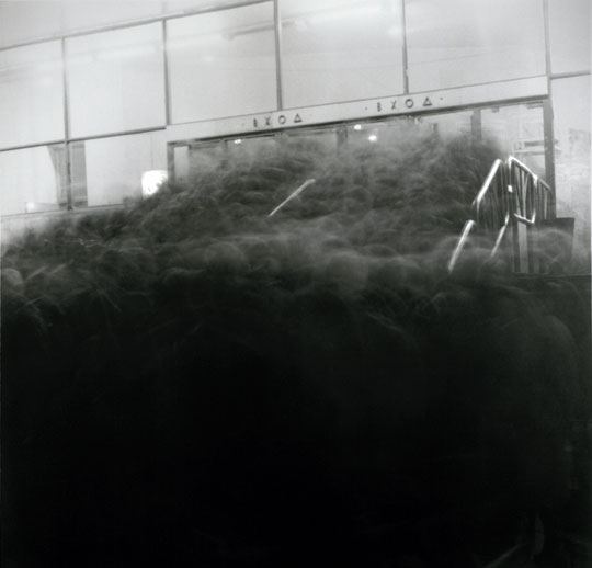
titarenko_shadows.jpg

Though I find Alexey Titarenko's City of Shadows long-exposure photos of crowds in St. Petersburg a little too melodramatic, Geoff's comment about them struck a chord:

But I suppose this is what the world would look like if we could see the residue of everyone who's ever passed through.
Though I'd probably say trace instead of residue.

cellarius_celestial_bodies.jpg

Christie's is calling Andreas Cellarius' Harmonia macrocosmica "PROBABLY THE FINEST CELESTIAL ATLAS EVER PUBLISHED." But then, they would; they have a first edition from 1660 they're hoping will sell for $80-120k next week.

Cellarius compiled the celestial maps of Ptolemy, Copernicus, and Tycho Brahe into one exquisitely illustrated volume which was reprinted first in 1661, then after Cellarius' death in 1708, and in a couple of contemporary re-editions up to and including Taschen's reproduction.

Plate 10 [above]: CORPORUM COELESTIUM MAGNITUDINES - The sizes of the celestial bodies.
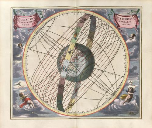
Plate 17 [below]: SOLIS CIRCA ORBEM TERRARUM SPIRALIS REVOLUTIO - A map showing the pre-Copernican theory that seasonal changes were attributable to the sun's spiral orbit around the earth.

cellarius_solar_spiral.jpg

LOT 50: CELLARIUS, Andreas (ca 1596-1665). Harmonia macrocosmica, est. $80,000-120,000, June 17 at Christie's [christies.com]
There are several scans of Harmonia macrocosmica online: the University of Utah Library has one; and so does The Warnock LIbrary in A'dam. The images above come from scans at the extensive Cellarius site published by R.H. van Gent at the University of Utrecht.
Buy the Taschen reissue of Andreas Cellarius' landmark 1660 celestial atlas, Harmonia macrocosmica, at Amazon [amazon]

In a guestblogger post on the NY Times' The Moment, some guy in Berlin named Nick Currie, claims that the Japanese word for Muji addicts is Mujirers.

This is wrong. And by mixing up the L and R, it is wrong in a way that boomerangs nicely on people who poke fun at Japanese speaking English. [Not that I think that's what Currie, of all people, was doing.]

Mujirer is a transliteration of Mujiraa [ムジラー], which is, in fact, what some people call Muji addicts. [As a 10-year-plus Muji obsessive, I confess I've never heard or read this term, but it's out there, so I'll go with it.]

The Japanese syllable ラ, is the one that's used to transliterate both L and R. Sonically, it's somewhere in between. Where Mujiraa is easy and smooth to say in Japanese, in English, Mujirer sucks. Before this Mujirer thing gets too far, I suggest using comparable Japanese words to come up with a better Roman spelling:

One possibly etymology for Mujiraa [ムジラー} is Gojira [ゴジラ], the Japanese name for Godzilla. Compare that to Mozilla, which is transliterated as mojira [モジラ], and except for the long A at the end of Mujiraa, you could make the case for Mujilla.

But I think there's a better option. The Japanese transliteration of killer--and killah, for that matter, as in Ghostface--is kiraa [キラー]. This pattern would transliterate Mujiraa as either Mujiller or Mujillah. Either one of those is more accurate and sounds better than Mujirer. Use the former for Muji nerds, and the latter for badass Mujihadin who are smuggling suitcases full of that no-label stuff back from the mothership in Yurakucho on a regular basis.

pageos_test_wiki.jpg

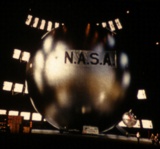
When I first discovered satelloons a few months ago, I admit, I was a little disappointed to have fallen so hard for the first generation satelloons of Project Echo. This disappointment kicked in when I saw this photo of the PAGEOS satelloon being tested before its June 1966 launch. It wasn't much bigger than Echo I [31m vs 30m; Echo II was 40m]; what set it apart was PAGEOS' incredible mirror-like skin.

Which, I find out, was by design. PAGEOS, short for PAssive GEOdetic Satellite, was used in the impressive-sounding Worldwide Satellite Triangulation Network, an international collaboration to create a single global characterization of the earth's surface, shape, and measurements.

Geodesy, the science of measuring and representing the earth, helped identify things like plate tectonics and the equatorial bulge. From what I can tell, the WSTN involved taking pictures of the PAGEOS against identical star fields from different points on the earth's surface, then backing out precise values for latitude, longitude, and elevation from the photos' variations.

Stellar geodesy was obsoleted during PAGEOS' lifetime by lasers [more on that later], but not before the WSTN, under the direction of the Swiss scientist Dr. Hellmut Schmid, was able to calculate the accuracy of locations on the earth's surface to within 4m. According to Wikipedia, between 1966 and 1974, Schmid's project, using "all-electronic BC-4 cameras" installed in 46 stations around the free world [the USSR and China were not participating for some reason], produced "some 3000 stellar plates." Photographs of the stars with a 100-foot-wide metallic sphere--designed to capture and reflect the sun's light, and placed in an orbit that provided maximum visibility--moving in front of them.

I'd love to see some of these plates, or find any useful reference sources beyond the kind of scattershot, autotranslated Wikipedia articles.

Balloon Satellite [wikipedia]
PAGEOS
Stellar Triangulation
Hellmut Schmid

As the guy married to the officially coolest scientist at NASA, I admit, I took a personal, even a slightly defensive, interest when I read on Gizmodo that

Scientists from NASA's Space Sciences Laboratory have made [magnetic fields] visible as "animated photographs," using sound-controlled CGI and 3D compositing. It makes the fields, as explained by the scientists, dance in an absolutely gorgeous movie called Magnetic Movie. You don't want to miss this one, which is the coolest video that you'll see all week, guaranteed. You can't argue with a combo of beautiful effects and amazing science.
Of course, I needn't have worried. Gizmodo's is just the most concretely inaccurate description of Magnetic Movie, which was produced by Animate Project. The directors are Ruth Jarman & Joe Gerhardt, a visual performance/sound-film artist duo who work as Semiconductor. It was shown last year on Channel 4 in the UK as part of the Animate TV series

But since Gizmodo's also among the most influential blogs to have covered the film, its errors have been amplified across the web. Now Semiconductor's aesthetic experiment is being either passed along as actual science or angrily debunked as fraud. These visceral responses based on some combination of ignorance and misinformation are the inadvertent, negative corollary to Semiconductor's own creative process. From an interview for Animate Project:

RJ: With Magnetic Movie, it's a short film we've made where we've interviewed space scientists about a quite specific subject that they study: magnetic fields.

JG: As the scientists would explain their ideas, their science to us, we could only understand the very beginnings of it, the surface of it. And this leads to a very kind of creative imagination of what it is they're trying to explain to us.

...

RJ: And so we've listened to the scientists' descriptions, which are very elaborate, and then we've tried to make our own interpretation of what these descriptions are. And we've created visualizations of these descriptions and placed those back within the Space Sciences Lab.

brilliantnoise1.jpg

Semiconductor also tapped SSL for unprocessed scientific imagery of solar flares for their 2006 sound-film, Brilliant Noise, "We're quite interested in things that go unseen or unheard. And a lot of scientists are dealing with these things and revealing these things to us in new ways," said Jarman. Only the visual seductiveness of the solar imagery stands in sharp contrast to the lab itself, a shabby series of storerooms populated by a bunch of amiable nerds speaking impenetrable nerdspeak.

The irony, if that's the right word, is that the real unseen and unheard elements in this world are the bureaucratic dishevelment and the people, the ones who amuse themselves by calling planet-dwarfing solar flares "hairy balls." And while sound-film artists are by definition different, some of the space scientists I know are actually incredulous about the seen and the heard. When you're dealing with magnetic fields or high energy particles all day, you work to understand the data in the format you have; the fact that they're "invisible" is irrelevant.

Just the opposite, the inherent subjectivity and limitations of the human visual and audible spectrums actually makes them suspect. I've heard X-ray astrophysicists heave exasperated, skeptical sighs over the attention given to the latest spectacular photos from the Hubble telescope which, they point out, contain next to no useful data, but which are colorized to enhance their aesthetic appeal.

See the Magnetic Movie page at Semiconductor's site [semiconductorfilms.com]
Brilliant Noise is, but Magnetic Movie is not and on Worlds in Flux, the Semiconductor DVD released last year [amazon]
At the moment, the full 4:50 version of Magnetic Movie is on YouTube [youtube]

celmins_artic_nightsky2.jpg

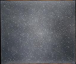
A guard at the Carnegie International defaced a Vija Celmins painting, Night Sky #2, making a "long vertical gouge" with a key. The conservator calls it a "total loss," though the Art Institute of Chicago, which owns the 1991 painting, said they would look at the possibility of repairing it.

Though the story only surfaced on Friday in the Pittsburgh Post-Gazette, the incident occurred on May 16th [a Friday]. The guard, an Azerbaijani immigrant named Timur Serebrykov, was confronted about the action and arrested on May 20th [a Tuesday]. He initially denied any wrongdoing, but then he confessed, adding, "I didn't like the painting." There were eight Celmins paintings of night skies in the gallery at the time.

Guard charged with ruining museum piece [post-gazette.com via artforum]
Night Sky #2, 1991, Vija Celmins [artic.edu]

mari_table_ikea_logo.jpg

In the early 1970's, Enzo Mari suggested using 1-by pine lumber to make his autoprogettazione furniture because it was cheap, standardized, easy to cut, and universally available at the corner hardware store. Now, my local hardware is a Home Depot, and the boards they sell come from New Zealand. So in keeping with the spirit of Mari's design, I'm going to use components from Ikea furniture kits instead.

The dining table I'm going to make is called either F or EFFE, depending on which plans you look at [Mari's own autoprogettazione book uses the former; Peter Stamberg's 1976 blueprint anthology, Instant Furniture, which reproduces four of Mari's autoprogettazione designs, uses the latter.] It calls for wood in two sizes. The truss and leg structure is made of 1x2 in lengths ranging from 10 1/2" to 51". The top calls for four 79-inch 1x8 planks, which actually comes to about 30" across. [After it's dried and finished, 1x8 boards are usually 3/4" x 7 1/2". I had no idea.]
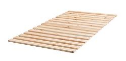
ikea_bed_slats.jpg

There turns out to be far fewer useful sources of lumber in Ikea than I originally thought. [The idea hit me when I passed giant warehouse shelves filled with rolled up pine bed slats.] But most of the pine pieces in Ikea furniture are only 1/2-inch thick, too thin to use for underpinning a table.

Though I stuck to pine on principle, there is some solid wood furniture, mostly birch, with some aok. But by far, most of the wood-looking furniture is made from veneered particleboard; who knows what'd happen if you cut it?

ikea_lack_table_red.jpg

I don't doubt you could make a quintessentially Ikea Mari table by using only these kinds of components; the sleek, plastic-over-sawdust goodness of Ikea's signature Lack tables and shelves could make for a very conceptually tight mashup, but that'd be the second or third piece I'd make, not the first.

ikea_trofast_storage.JPG

The other major constraint is the length of the boards for the top; only three products have decent width pine boards within range of 79 inches [which is 200cm, if you're wondering why Mari picked that length]. The 5/8-in. thick sides of the tallest Trofast storage units [above] are either 11 3/4 in. or 17 in. deep, but only 69 in. tall. And some of them have regularly spaced grooves for sliding bins.

[Though it felt like cheating, I did check out readymade tabletops. The Vika Furuskog tabletop comes in pine, and is 78 3/4 in. long, but only 23 5/8 in. wide; too narrow to use, too wide to double up on.]

ikea_mandal_bed.jpg

The new Mandal bed [king-size, $249] comes really close to being the perfect Mari table kit. It has a smoothly sealed headboard and footboard of solid pine, which, on the king size model, are each 78 in. long. The headboard is 23 1/2" wide, and the footboard is 12"; placed top-to-top, they'd be 35 1/2" wide, which isn't too far off. As a bonus, they have both taper on the bottom edge, which would be nice on the underside of the tabletop. [There is a row of pre-drilled holes along the base of each piece, though, which kind of bugs.]

Mari's table calls for more than 66 linear feet of 1x2 wood underneath. It's close, but the Mandal's inner support rails may provide enough wood without buying extra pieces. The siderails are smoothly finished, too, and each 78 in. piece is 3 in. wide on the outside face, tapering to 2 in. wide on the inside face. The unfinished pieces underneath the bed are either 7/8 x 1 3/4 in. [i.e., 1x2], or 1 3/4 square. Four 1 3/4 sq. pieces are 27 1/2 inches long, just 1/4-in. longer than the table leg specs. If more wood is needed, a $20, twin-sized Sultan Lade bed slat offers one of the best options for raw wood. The 15 slats are 2 3/4 x 3/4 x 38, with slightly beveled top corners.

ikea_ivar_shelf.jpg

The Mandal has the added benefit of being factory sealed with a smooth acrylic finish. If it's important to stick close to Mari's original idea of unfinished wood, the far-and-away winner is the Ivar storage system. Ivar's component-based, which means the shelves, side units, and corner posts may be all you need to make a table.

One pine top shelf [$19] is 3/4 x 11 3/4 x 82 5/8 inches Cut off the embedded metal brackets from each end, and it's right at 79 inches. There's also a vertical piece to cut off [or to not attach in the first place; the shelf I saw didn't have it at all.] If you use three shelves, the table will be 35 1/4 inches wide, which adds 5+ inches to the horizontal pieces underneath the table, too.

Corner posts are 1 3/4-in. square and filled with drilled holes [$8, $12]. The side units are their own standard dimension--1 3/4 x 1 1/4 inches--which could be pulled apart and used as lumber. But it's also tempting to use the ladder-like pieces whole. Both parts come in 70 1/4" and 89" lengths [$12, $15].

Maybe you could cut down [sic] on the sawing required by just making the table to Ivar's dimensions instead of Mari's. Then instead of a lengthwise shelf, you could build a top from shorter 33 x 11 3/4-in. shelves [$6] set crosswise.

I sit here trying to juggle the variables to the best effect: faithfulness to Mari's original design; faithfulness to his concept, which is not quite the same thing; the inherent "Ikea-ness" of the inputs; the quality and utility of the output; the amount of tweaking, finishing, and labor required. And I repeatedly find myself creating a conceptual justification for the path of least resistance. All conceptual stunts being equal, I'm drawn toward the one that involves the least labor and mess. Which turns out not to be the same as requiring the least time, cost, or effort, as the 8-month over-analysis of making a simple table attests.

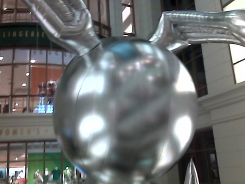
Macy's, State Street, Chicago, originally uploaded by Katnp.

Macy's has installed Jeff Koons' 53-ft tall Bunny balloon in its Chicago store [f/k/a Marshall Fields] in conjunction with the Koons retrospective at the MCA. Katnp has more Bunny photos on flickr.

June 6, 2008

Yeah, Bubby!

"Sex, for Zohan, is like hummus: there is an endless supply, and no occasion on which it could be judged inappropriate."
- Anachronistic taste, hedonism, international man of mystery, yet AO Scott's review makes no mention of Austin Powers at all. Is it a Jewish conspiracy, what?

June 1, 2008

Face Time

Looks like I picked the wrong week to give up Basel:

Ferreira finally teased the name out of the Englishman, who turned out to be Nicholas Logsdail, founder of Lisson Gallery, at which everyone around me seemed to tense up a bit.

After a brief chat with him, he motioned to step away. Shaking my hand he said, “Pleasure to have met you. I suppose if you’re successful, I’ll see you everywhere, and if you’re not, you’ll disappear.”

— Andrew Berardini

[artforum]

Oh my heck, if you read the Washington Post's article on black folk in Utah, be sure you read it to the end. I love my people and all, but seriously, it is time to wake up:

When [Rodger] Griffin [an African American HR administrator who moved to Utah from Delaware] was voted secretary of the Utah Correctional Association, the 300 people casting ballots did not lay eyes on him until he rose, expecting the applause showered on every other winner asked to stand. What greeted him instead was "exactly" the silence Cleavon Little encounters in "Blazing Saddles," when his character, the black sheriff, enters a small Western town.

"I've had so many weird experiences like that," said Griffin. "I went to San Francisco, and people didn't stare at me. And it made me very uncomfortable, because everyone always stares at me."

A Different State of Race Relations

Since 2001 here at greg.org, I've been blogging about the creative process—my own and those of people who interest me. That mostly involves filmmaking, art, writing, research, and the making thereof.

Many thanks to the Creative Capital | Warhol Foundation Arts Writers Program for supporting greg.org that time.

comments? questions? tips? pitches? email
greg [at] greg [dot ] org

find me on twitter: @gregorg

about this archive

Posts from June 2008, in reverse chronological order

Older: May 2008

Newer July 2008

recent projects, &c.


our_guernica_cycle_ivanka_320px_thumb.jpg
Our Guernica Cycle, 2017 –
about/kickstarter | exhibit, 2017


pm_social_medium_recent_proj_160x124.jpg
Social Medium:
artists writing, 2000-2015
Paper Monument, Oct. 2016
ed. by Jennifer Liese
buy, $28

madf_twitter_avatar.jpg
Madoff Provenance Project in
'Tell Me What I Mean' at
To__Bridges__, The Bronx
11 Sept - Oct 23 2016
show | beginnings

chop_shop_at_springbreak
Chop Shop
at SPRING/BREAK Art Show
curated by Magda Sawon
1-7 March 2016

do_not_bid_or_buy_iris_sidebar.jpg
eBay Test Listings
Armory – ABMB 2015
about | proposte monocrome, rose

shanzhai_gursky_mb_thumb.jpg
It Narratives, incl.
Shanzhai Gursky & Destroyed Richter
Franklin Street Works, Stamford
Sept 5 - Nov 9, 2014
about | link

therealhennessy_tweet_sidebar.jpg
TheRealHennessy Tweets Paintings, 2014 -
about

sop_red_gregorg.jpg
Standard Operating Procedure
about | buy now, 284pp, $15.99

CZRPYR2: The Illustrated Appendix
Canal Zone Richard Prince
YES RASTA 2:The Appeals Court
Decision, plus the Court's
Complete Illustrated Appendix (2013)
about | buy now, 142pp, $12.99

weeksville_echo_sidebar.jpg
"Exhibition Space" @ apexart, NYC
Mar 20 - May 8, 2013
about, brochure | installation shots


HELP/LESS Curated by Chris Habib
Printed Matter, NYC
Summer 2012
panel &c.


drp_04_gregorg_sidebar.jpg
Destroyed Richter Paintings, 2012-
background | making of
"Richteriana," Postmasters Gallery, NYC

czrpyr_blogads.jpg
Canal Zone Richard
Prince YES RASTA:
Selected Court Documents
from Cariou v. Prince (2011)
about | buy now, 376pp, $17.99

archives