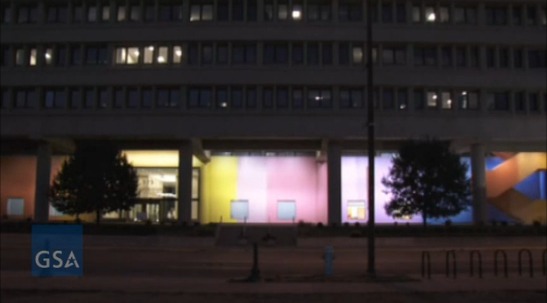
I've been wanting to write about Color Fuses, Milton Glaser's 1974-5, 27x672-foot gradient mural in Indianapolis, all week, ever since Richard McCoy's great Art21 post about the GSA's restoration of the work's 34 monochrome sections, and the realization, finally, of Glaser's original lighting effects.
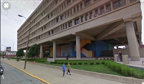
image: google maps
Besides my well-documented fascination with monochromes and gradients, I found myself intrigued by Glaser's stated purpose for the mural, which wraps around the stark, ground-level loggia of the Minton-Capehart Federal Building, designed by local modernist eminence and Philip Johnson alumnus Evan Woollen. Glaser wanted to create "a mural that would express a spirit of openness and thus a new sense of government."
The architect, for his part, hoped the mural would help make the building feel "cheerful, disarming, fresh, welcoming, and inviting." Which is, let's face it, a helluva thing to hope for your Brutalist, concrete, ziggurat superblock.
[Walking around the building on Google Maps gives a nice sense of the mural in daylight, including the backside, which is across the parking lot, and the bluish south end, which is largely blocked by privacy wall around the building's daycare center. Even ignoring the unfortunately undulating wall--an out-of-place motif picked up by the single, sad wave of shrubs on the building's strip of security plinth grass--the Minton-Capehart can only be my second favorite example of brutalism and daycare, way behind the playground on the plaza of the J. Edgar Hoover FBI Building.]
So I'm inclined to believe that the project went down a little differently at the time, a time when the GSA had revitalized and professionalized its Percent For Art program under the 2nd Nixon administration. [A distracting sop to the elites, he figured.] It's not clear, for example, whether Glaser came to the project under the new system, as a world-class, committee-reviewed pick, or the old way, in which case he would have been suggested by, and thus, subsidiary to, the architect.
Which would be interesting to know, because another benefit of not blogging about immediately, is reading Alexandra Lange's post about how modernist architects [occasionally] recognized that their severe forms might [just sometimes!] have needed a bit of humanizing.
But then watching the GSA's video of the original/new lighting scheme, which adds slow ripples [undulations!] of light/dark around the building, I immediately thought of art. Specifically, Paul Sharits, who had been making painting-like, flickering, multi-projector, monochrome film installations for several years already when Glaser created his mural. [Writing about Sharits' 1972 piece, Soundstrip/Filmstrip, Rosalind Krauss said it "muralizes the field of projection."]
Paul Sharits' Shutter Interface, first shown at ArtPark in NY in 1975, here at Greene Naftali in 2009.
And I wondered about the different ways art functions, and is treated, both at the time and through the lens of history and criticism. Partly because I'd never heard of Glaser's mammoth mural before. Or of any other art he's made. It seems to fall into this population of things people commissioned, made and showed, that are/aren't/look like/function as art, which are [happen to be?] made by designers. And which are excluded from consideration within the context of art and art history. And politics is at the center of this boundarymaking.
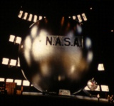
The clearest example of this is the US Pavilion at Expo 67 in Montreal, the geodesic sphere designed by Peter Chermayeff and his exhibition firm Cambridge Seven Associates. Which had both spacecraft and satelloons and flag-like, Ellsworth Kelly-like supergraphics, and giant, commissioned paintings from the likes of Barnett Newman, Warhol, and Johns.
I don't know yet how to make sense of Glaser's mural, but I bridle at what I instinctively feel, that despite its awesomeness and Glaser's immense influence, Color Fuses is somehow a less significant work because it's art by a designer. Or art for the government. Or art the architect will put up with. Especially when I read Glaser's intentions for the piece, which, by 1974, transparency and a new form of government were certainly on a lot of peoples' minds.
And finally, last night, I found Hillman Curtis's video profile of Glaser on Brainpickings, where the designer talks about art's role in culture. It's "benign" and "pacifying," he says, and succeeds best when it creates "commonalities" by which "the likelihood of us killing each other is diminished."
Again, I don't think that perspective has been very prominent in the art world discourses of the day. It could be dismissed as hyperbolic, an at once idealistic and yet embarrassingly low bar. And yet, lately, the polarization in our cultural and political spheres make me wonder if not throttling each other is actually something we'd do well to focus on. Even if pacification by painting undulating rainbows on government buildings is not the best role demanded by the times for art.
Restored & Renewed: Milton Glaser's 1975 Artwork, "Color Fuses" [art21.org]
Color Fuses' Mural Restored at Minton-Capehart Federal Building [gsa.gov]
Art Matters To Architecture [designobserver]

