November 2014 Archives

November 25, 2014

Through The Perilous Fight

johns_inverted_flags_ulae.jpg
Flags, 1968, image metmuseum.org

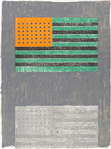
In 1968 Jasper Johns produced an edition, Flags, with ULAE featuring two American flags and an optical phenomenon. After staring at the inverted spectrum flag, green, black and orange, on the top, a viewer would then switch to the bottom flag, which would momentarily appear red, white and blue.

donald_judd_negative_spectrum_flag.jpg
American Flag in Negative Colors of the Spectrum, 1968, image: juddfoundation.org

This was more than a visual trick. It carried symbolic and political meaning. Or at least such things could be ascribed to an inverted flag. In 1968 Donald Judd had American Flag in Negative Colors of the Spectrum made. It was included in "The Public Life," a 2011 show at the Judd Foundation about the artist's civic and political engagement. I have not been able to find out much background for this object or its creation.

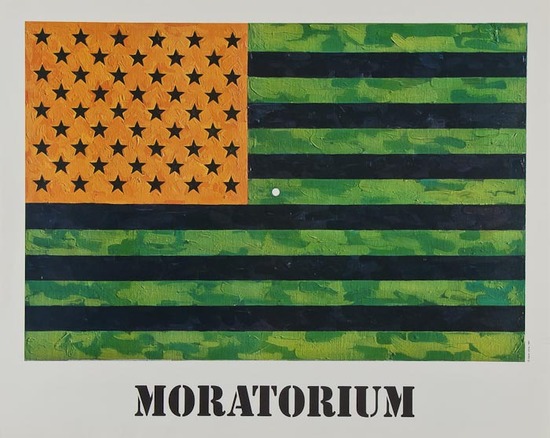
jj_moratorium.jpg
Flag (Moratorium), 1969

In 1969, Johns again used the inverted flag, for Flag (Moratorium), a fundraising/protest poster for the Committee Against The War In Vietnam. The small white focal point in the center facilitates the same optical phenomenon as the ULAE edition, in which the viewer is called to action to envision, produce, and correct the flag in her own mind.

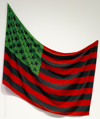
hammons_african_american_flag_moma.jpg
African American Flag, 1990, image: moma.org

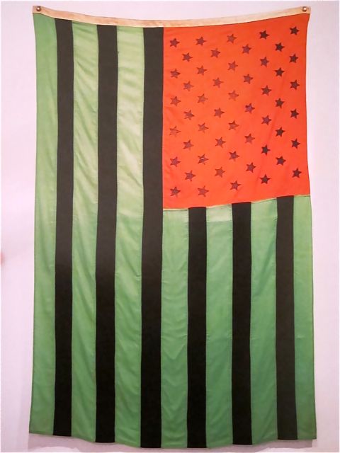
David Hammons' 1990 African American Flag is different. It's red, black and green colors derive from the Pan-African or Black Liberation Flag designed by Marcus Garvey in the 1920s. Miami collector Craig Robins has a Hammons flag; Rirkrit installed it for Design Miami Basel in 2011. It is also in MoMA's collection, and one flies over the Studio Museum in Harlem.

November 25, 2014

Hong Kong Police Street View

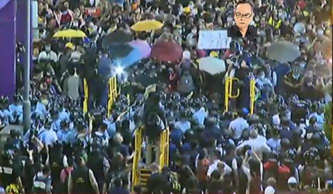
hk_pepper_spray_platform4_krischeng.jpg

Police in Hong Kong have deployed a new mobile pepper spray platform against protestors near Mong Kok.

I start with this image via @krislc, Kris Cheng, because it gives nice context, also the guy is watermarking it with his face? I'm filing that trick away for future use.

At first it looked like it's made out of PVC pipe, but it's surely painted steel. Actually, it looks like a smaller variation of the stairs in Home Depot.

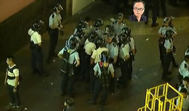
hk_pepper_spray_supersoakers_galileocheng.jpg

Most of the info comes from @galileo44, Galileo Cheng. Like this picture of the police conferring on Portland St. With their pepper spray cannons on their backs. Unless those are #umbrellas.

Here is krislcc's Vine of the new platforms in use on her. Galileo calls them castles. They're hand pumped. Like Super Soakers or something. Incredible.

Here's another. What is most striking to me about this one is how the two police officers move together: one with the pepper spray, the other with a video camera. Kris Cheng says the the pepper spray isn't that strong; the effects didn't last more than 45 minutes. But the police will play a long game with those images.

Speaking of long game, holy smokes. I thought I'd scout out the Mong Kok streetscape on Google Maps, and this is what came up:

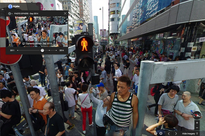
mongkok_gmap_201409_njohn.jpg

It was startling to be met by an unblurred face. And the vantage point was so high. But turn around. This is a pano. Or a "Photo Sphere." From September, of the intersection blocked by a sit-in. It's credited to nJohn.

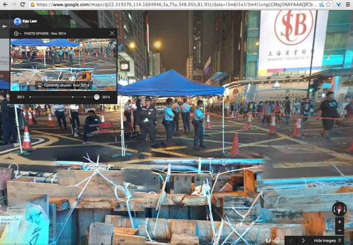
mongkok_gmap_201411_kaulam.jpg

There are more recent Photo Spheres, too. Including November, by Kau Lam. The protestor-decorated police barricades are stitched together pano-style. Google Maps as a reporting platform. When will it go live? Will Google get castles of its own, or will cameras on long sticks suffice?

November 25, 2014

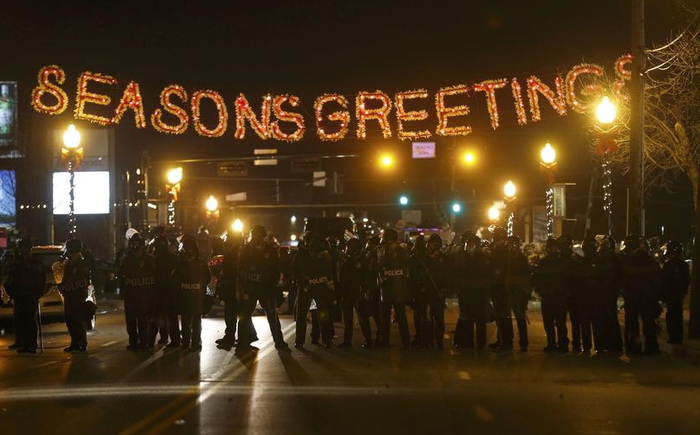
Seasons Greetings

ferguson_seasons_greetings_reuters.jpg
Reuters from Ferguson last night

November 24, 2014

Well, It's A Gursky Now

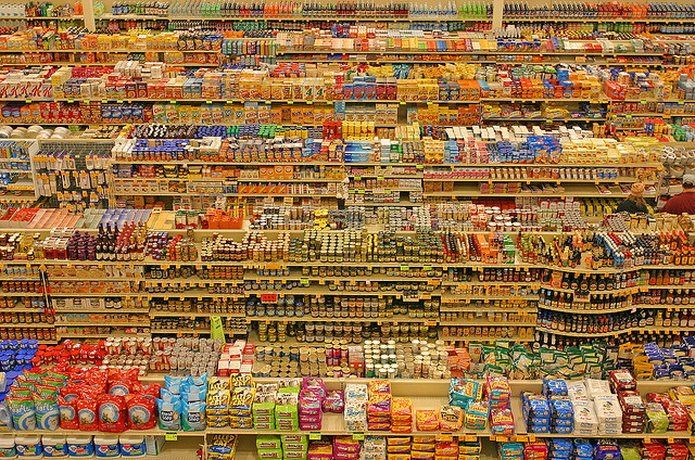
lyza_danger_fred_meyer_640.jpg

This is just so fantastic. Last month Eugene, OR photographer Blake Andrews wrote about this 2004 photo by Lyza Danger, which has gradually become confused and conflated with Andreas Gursky's 99 Cent photos.

Danger's photo, an unaltered image of a Fred Meyer in Portland, is CC-licensed on flickr, which has aided its circulation and re-use. Andrews discovered several instances where Danger was accused of both ripping Gursky off, and of claiming Gursky's image as her own. But the best part is that Google Images include Danger's photo in searches for Gursky's 99 Cent. The authoritativeness of Google, coupled with the plausible Gurskyness of Danger's image, create a virtuous cycle of re/mis-attribution that may or may not be slowed by Andrews' investigation.

And basically, I love it. Clearly, it's Gursky enough. Or rather, Danger's verite' image shifts what makes a Gursky a Gursky from the grand scale of globalist capitalism to the artist's manipulation of the same.

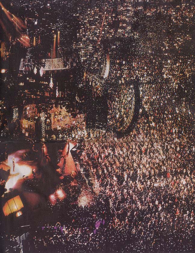
Danger's photo is not a Ghetto Gursky, or a Shanzhai Gursky either; those terms don't fit this scenario. It's an image made in the wild, a Found Gursky, which we now recognize and appreciate because of Gursky's influence. It's an example of a shift from Gursky as author to Gursky as worldview. It's of a piece with the photo that Brent Burket flagged last year, Taylor Swift's selfie with a Dallas stadiumful of people.

gursky-madonna-0913.jpg
Andreas Gursky photo of a Madonna concert in Los Angeles on Sept 13, 2001, image via centre pompidou

And now I see a connection to the ruins of the World Trade Center I'd wanted to see Gursky photograph in September 2001, except he was touring with Madonna.

99 Cent | Blake Andrews [blogspot via petapixel, thanks giovanni garcia-fenech for the heads up]

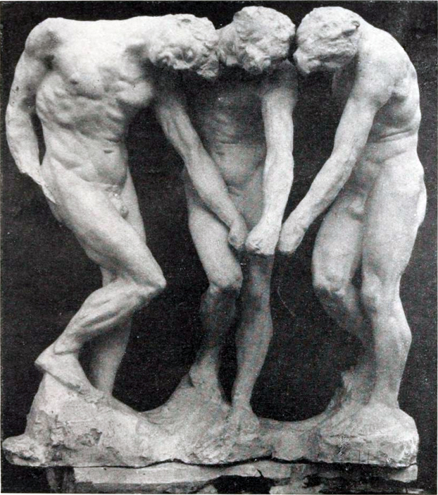
rodin_shades_pre-1886.jpg
Auguste Rodin, The Three Shades, plaster, for The Gates of Hell

This edition of Better Read, an experiment in transforming art-related texts into audio works, is awesome. I really feel like the kinks are working out, and this whole computer voice-generated pseudo-podcast thing is really going to take off in a big way very soon.

Like an hour from now, when you've finished listening to "Sincerely Yours," by powerhouse art historian Rosalind Krauss. In 1981 Krauss published one of her foundational texts, "The Originality of The Avant-Garde," in October Magazine, which prompted a long, irate response from Rodin scholar and curator Albert Elsen. "Sincerely Yours" is Krauss's fierce, icy, and vigorously argued, 9,200-word response to Elsen's criticisms. It was originally published in October 20, in the spring of 1982. And it is performed here by Ava, an American English synthetic voice from Apple with a surprisingly good grasp of French pronunciation. The 80mb mp3 file lasts around 56 minutes. Like I said, this is going to be big, I can feel it.

Sincerely Yours, Rosalind Krauss (1982), read by a computer [dropbox greg.org, mp3, 80mb, 56:00]
Previously: Better Read: A Lively Interview with Ray Johnson c. 1968
The ur-text: W.H. Auden's poem "The Shield of Achilles" read by a machine

November 19, 2014

Google, Water, Color

FSW_Paddle8_Google_Art__det.jpg
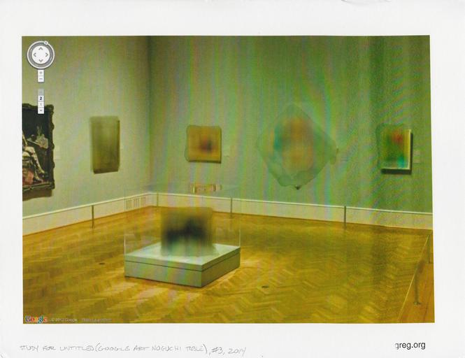
Study for Untitled (Google Art Noguchi Table) #3, 2014, 8.5 x 11 in, inkjet and water on archival matte finish paper

I was very happy to donate this study to the benefit auction last week for Franklin Street Works, the Stamford, CT art space where some Destroyed Richter Paintings and Shanzhai Gursky photos were in a show.

FSW had asked for furniture- or design-related works on paper. I have been trying for a couple of years to figure out how to make sense of the real-world, real object anomalies of Google Art Project panos, like the blurred out paintings, and especially the blurred out Noguchi game table [furniture!] at the Art Institute of Chicago. And I thought this would be a good opportunity to experiment, rather than simply print out the GSV image [not that there's anything wrong with that, as Paul Soulellis's very nice Webdriver Torso-related print demonstrates].

What mattered to me was getting the blur just right. Years ago, in the early Iris Print era, I'd seen some amazing Gabriel Orozco works--which I can't find a trace of now--where he'd dripped and brushed water onto inkjets of lush Baroque paintings of the Madonna, dissolving the center into an abstract mess. Very non-archival, but very beautiful.

And all but unreproducible. In terms of inkjet and paper coating technology, we've come a long way, baby. I tried several printer & paper setups, but nothing would bleed like I wanted. Finally, in desperation, I emailed my sister, who had a clanky old [2003] desktop printer in her basement, and she printed some images for me. Even this modern paper resists staining and dissolving like the inkjets of old. After several test, though, I found if I let water sit on the paper long enough, it'd give me a blur. Study #3 was the first one to be successful enough to let out of the house. I don't know where it went yet, but I hope it stays out of the rain.

A Benefit Auction for Franklin Street Works [paddle8]
Opening In Stamford: It Narratives, at Franklin Street Works
Previously: Google Art Institute Project

November 16, 2014

Part Of A Scripture Writing

Thumbnail image for therealhennessy_tweets_hbo.jpg

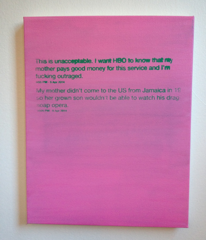
Although these paintings initially seem straightforwardly banal, at second glance their neutrality becomes more difficult to decipher. The viewer laughs but then perhaps questions how he reacted. The underlying tension to each of these tweets seems awkwardly dated to 2014 middle class America. @TheRealHennessy Tweet Paintings' tweets explore forces of sexual identity, and social acceptance revealing a dark underside. Many of the other tweets in the series leave the viewer in similar states of disbelief. greg.org deconstructs and examines the authenticity of the author, masculinity and his own identity. He is concerned with our fascination, fetishization, and acceptance of the image of social media. Chameleon-like, he changes from a consumer to a writer, and now artist.

Artists were casting sculptures in bronze, making huge paintings, talking about prices and clothes and cars and spending vast amounts of money. So I silkscreened jokes on little canvases and sold them for $1800 each. I have never thought making anything new. I make it again. I am very much against trying to make anything new in a modernist approach. I think you can do only something for yourself.

The true meaning of the @TheRealHennessy Tweet Paintings is still a matter of discussion. From a distance, they could even be read as abstract works. But viewed closely, their formal simplicity and their repetition seem to set them in the tradition of conceptualism. All in all, greg.org's works are loaded with references to Structuralism and Post-modernist theories. Repetition deprives the tweet of its humour thus reducing it to a mere text in which the signifier takes over on the signified. After this, what is left?

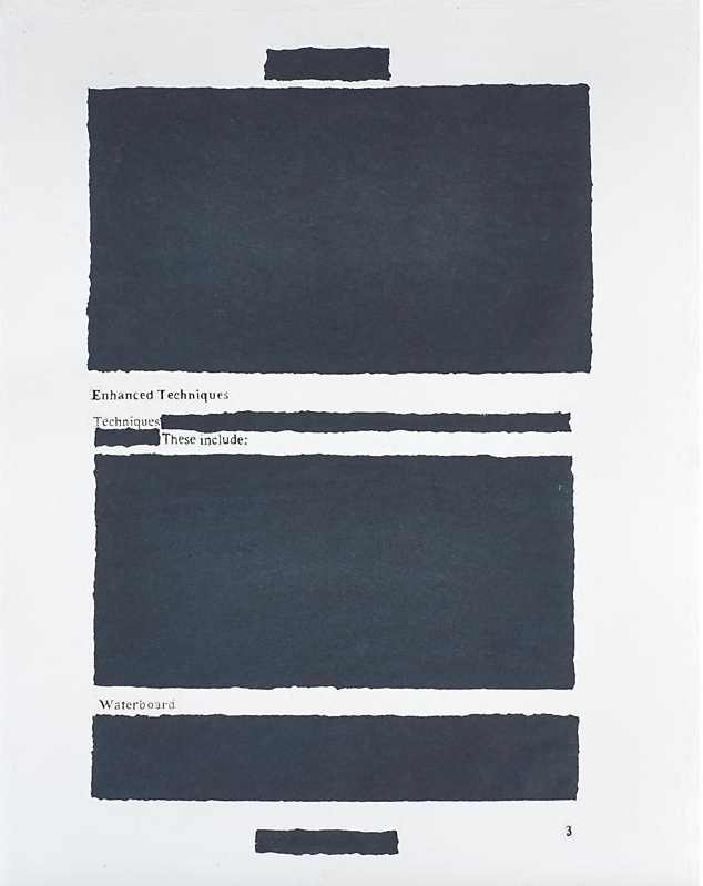
holzer_enhanced_technique_paper.jpg

After seeing these epic FOIA monochromes from the Dept. of Homeland Security a few years ago, I've been collecting the best examples of redacted documents. I've never quite figured out what to do with them. Maybe a book.

I know Jenny Holzer's been working on it for a while now. But I found her first batch of giant silkscreen on linen Redaction Paintings a little too slick. The Dust Paintings and Constructivist-inspired redaction paintings she showed this fall, though, are pretty great. Score one for the hand.

But then I just noticed this rather incredible, mysterious, and seemingly modest object in an upcoming Rago Arts auction. It's a large (35x27 in) work titled Enhanced Techniques 3, and it's described as a signed sheet of handmade paper. So the redaction is molded right in! I think Holzer has a winner here. But what? Where? And why is this thing only estimated to sell for $1000-1500?

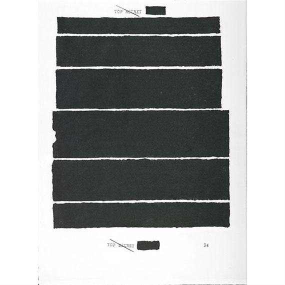
jenny_holzer_topsecret24_rago.jpg

A search for Holzer and handmade paper turn up other, similar pieces in the flotsam-filled auction reporting sites and secondary market print dealers. Try as they might, MutualArt couldn't hide the fact that Rago had sold a handmade paper piece called Top Secret 24 last Spring. Rago certainly doesn't want to hide it. I'd never thought of redaction in the same context of watermarking before.

On Caviar20 Top Secret 24 is pitched as Holzer's "return to painting." Hmm. At least they finally have pictures showing where this damn thing comes from. It's ironic that people selling artworks about redaction leave out so much basic information.

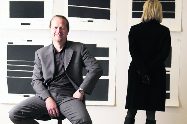
griffelkunst_dobke_holzer_abendblatt.jpg
griffelkunst director Dirk Dobke sitting in front of Jenny Holzer's Top Secret portfolio. image: abendblatt.de

Anyway, the answer is griffelkunst, a 90-year-old print association in Hamburg with 4,500 subscribers and a closed 5-year-waitlist. Members pay €132/year for four contemporary artworks, which the association, currently led by curator Dirk Dobke, commissions and produces.

I don't quite understand how that maps to Holzer's Top Secret project, which was a suite of six handmade paper redaction editions, available to members only for €150 apiece, or €900 for the set. I guess they made as many as people ordered?

The labor-intensive process sounds like it syncs nicely with the subject: the white pulp on the redacted areas was scooped out by hand and filled in with black as each sheet was being made. And all of this sounds like fascinating context and backstory for the work. But no one's using it to sell these things; just the opposite, they're keeping it quiet. Whether it's because griffelkunst frowns on flipping, or because it's hard to explain a 10-20x markup, I can't say.

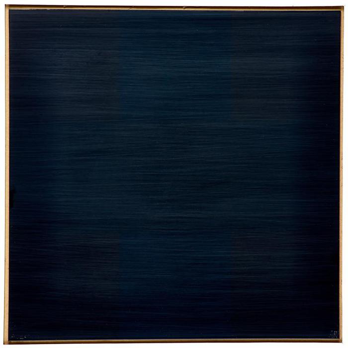
ad_reinhardt_ny_international_plexiglass.jpg

Holding back information is power, and the occlusion of information comes as no surprise. Strategic vagueness and decontextualization is as likely an art-selling technique as transparency and information overload. That same Rago auction also has an atypical-looking Ad Reinhardt. Well, it might look typical, but the small black monochrome square is actually an edition, silkscreened on plexiglass. It was "from NY International, 1966," which turns out to be the title of a 10-artist Tanglewood Press print/multiples portfolio organized by Henry Geldzahler. Portfolios like these get broken up, and the slightly more marketable pieces parted out, all the time. But so many dealers and auctioneers redact the reason and context for which the artist created the work as part of their enhanced sales techniques.

November 10, 2014

Wait, What Cady Noland, 2008?

I got stopped by this line from Andrew Russeth's report on the disclaimer Cady Noland required at the entrance to the Brant Foundation's group show containing her work:

Since then she has shown very, very few new works (the Walker in Minneapolis has one from 2008), and she has been notoriously meticulous in controlling how her work is handled and presented.
A 2008 Noland? In the wild? Sure enough. Untitled, a familiar-looking locker room basket containing some motorcycle helmets, steel subway straps, a 16mm film reel, and a piece of metal. It's a form Noland used since 1989, but it's dated 2008.

cady_noland_2008_walkerart.jpg

How'd they get that? In 2009?

A clue might be the donor credit, where it is listed as "Gift of the artist and Helen van der Miej-Tcheng [sic], by exchange, 2009." Which means the museum traded a previously donated work with the artist. But what? It doesn't say, and it's obviously not in the collection anymore. But it's safe to assume it was a work by Noland herself.

Sure enough, the Walker's 2006 annual report lists a gift of a 1990 Noland from van der Meij-Tcheng. It was titled Cowboy Blank, made of aluminum and rope.

noland_cowboy_showboat_eating.jpg
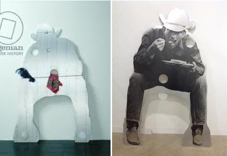
Cady Noland, L: Cowboy Blank with Showboat Costume, and R: a Cowboy, not blank, with breakfast, both 1990

But a work titled simply Cowboy Blank doesn't show up on Google anywhere. There is a Cowboy Blank with Showboat Costume, though, an aluminum plate sculpture cut in the silhouette of a crouching cowboy, with a bandanna and an ostrich plume in its cutout holes. The Guggenheim says the cowboy's aiming his gun, but another variant is flipped and silkscreened with a photo of cowboy eatin' some waffles. Or maybe it's Texas Toast. Noland executed the same silhouette in plywood, too, with a basket hanging between its legs.

Forced by no one to speculate, I'd say that van der Meij-Tcheng's Cowboy Blank was without Showboat Costume or a fork; it had just a rope. And whether it was because it was damaged, a la Cowboys Milking, or it was just not sitting right with her, Noland decided it was not a work she wanted in public circulation. And so she took it back, but only after making the Walker a little something to replace it with.

therealhennessy_tweets_chain.jpg
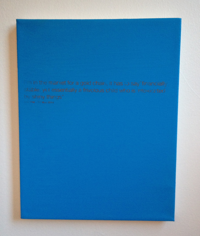
@TheRealHennessy Tweet Painting, Gold Chain, 2014, 14x11 in., acrylic and screenprint on canvas

Just in time for the Fall auctions, greg.org is pleased to present more @TheRealHennessy Tweet paintings, inspired by Donelle Woolford's Dick Joke series which debuted at John McWhinnie in the 1990s, and which continue to be a source of brouhaha since Michelle Grabner's 2014 Whitney Biennial.

The present work is one of greg.org's @TheRealHennessy Tweet paintings, which rank among the contemporary era's most iconic series by one of the most celebrated artists. Dryly presented with a deadpan sensibility, they consist of visual expressions of humor that are disarmingly immediate and resonant, yet abstract in their presentation. Describing his selections of form and content in his initial tweet paintings, greg.org later stated, "Within about six months I...started to do the tweets in 'colors.' I thought the color would be a substitution for an image. The background would be one color and the tweet would be another. I picked tweets that were 'meaningful' to me. I don't know how to explain that except that the tweets' 'content' was something that I could identify with. These 'tweets' were later identified as the '@TheRealHennessy Tweet paintings.' I fell into them. I was walking around in a dark room looking for the light switch. I was moving by wading more than swimming. I was mowing the lawn. No direction home. I was caught in a landslide. My headaches were gone. I started painting with my fly open. I stopped crying. I started to laugh. Rock bottom sometimes isn't the bottom. Barnett Newman, Willem de Kooning, Clyfford Still--look out."

Three of the six remaining @TheRealHennessy Tweet paintings are available for sale for $1,800 shipped. Please tweet, DM, or email for further information. Additional images are below.

It's just one word in one tweet, so it really shouldn't become the point, but those who follow me on Twitter know I have a thing for the language of art news sites, and their poetic idiocies of the market. This, however, just pissed me off.

It is as pure a sign as you'll find of the pathology of current money-fixated art world that last night a half dozen media outlets filed hundreds of bid-by-bid tweets from an Impressionism auction, yet the "bizarre news" is that artists are literally trying to save lives by drawing attention to one of Europe's existential political crises.
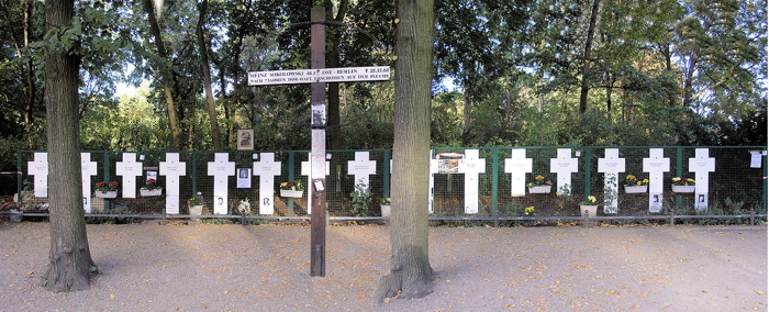
berlin_wall_Gedenktafel_Ebertstr.JPG

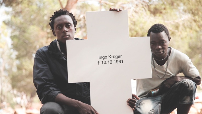
I had never heard of the Center for Political Beauty before this morning. They are the artist collective whose mission is to engage "in the most innovative forms of political art: a type of art that hurts, provokes and rises in revolt in order to save human lives."

They removed crosses commemorating some of the East Germans killed while trying to cross the Berlin Wall, and have reinstalled them on what they're calling the European Wall. The Center for Political Beauty has announced that they will cut down portions of the EU's border fence on November 9th, during the official ceremonies surrounding the 25th anniversary of the fall of the Berlin Wall.

Berlin_Border_Political_Beauty.jpg
">politicalbeauty.de: Keine Benutzung der Bilder ohne vorherige Genehmigung!

The photo above of a cross on a fence along the Bulgaria-Turkey border is circulating with the AFP wire service story that is the lone, primary source of English-language coverage of CPB's project. I'll never look at a Cy Twombly chalkboard painting the same way again.
Berlin_Wall_Cross_Ingo_PoliticalBeauty.jpg

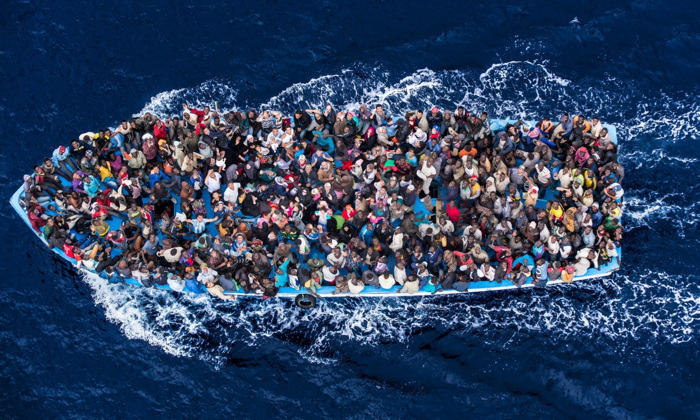
The images and details that don't circulate, though, are more damning: At least 136 people died or were killed trying to escape across the Berlin Wall between 1961 and 1989. The UNHCR says over 2,500 Africans trying to reach Europe have drowned or gone missing this year alone. The CPB says the number of people who have died trying to enter the EU since 1989 stands at over 30,000.
african_asylum_boat_massimo_sestini_sm.jpg

Here is a photo by Massimo Sestini of a boatful of African and Syrian asylum seekers who were intercepted by the Italian navy last June. This situation is anything else--an outrage, a humanitarian crisis, a "rendering void of the legacy of the Holocaust," as the CPB puts it, but it is not bizarre.

And artnet should be shamed for their tendentious attempts to mock and marginalize artists pursuing something beyond the callow complacencies of the market.

UPDATE: I'm still not satisfied with this yet, or how or why it bothers me, but I'm reading Thierry du Duve's "Art in the Face of Radical Evil" [October, Summer 2008, pdf], about MoMA acquiring and showing photos of Khmer Rouge execution victims from Tuol Sleng, and about whether they're "art," and what are the implications if they are:

Sobriety in exhibition design, noncommittal wall texts, and clever avoidance of the word "art" in press releases won't succeed in hiding the fact that our aesthetic interest in photography is shot through with feelings, emotions, and projections of sympathy or antipathy that address the people in the photos beyond the photos themselves. I am convinced that something of that emotional response to the properly human ordeal of the subjects in the Tuol Sleng photos had a say in MoMA's decision to acquire them. To suppose otherwise would be to lend the acquisition committee undeserved cynicism.
This feels like it's inching closer.
November 4, 2014

Welcome Back, Gwenfritz

gwenfritz_reinstalled_nmah.jpg

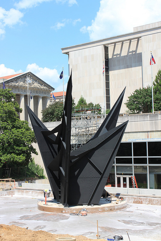
[The] Gwenfritz is back where it belongs. The National Museum of American History has conserved Alexander Calder's site-specific stabile and reinstalled it in a reflecting pool on the building's west end, 30 years after it was displaced by a vintage band shell from a mental hospital.

The removal of Gwenfritz in violation of the artist's intentions was cited as a contributing precedent to attempts to move Richard Serra's Tilted Arc from its site in Federal Plaza a few months later.
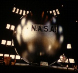
Anyway, it all sounds good, and from the NMAH's flickr feed, it looks good. "It's always great when you're able to honor the artist's vision," said Smithsonian American Art Museum sculpture curator Karen Lemmey, in a way that unsettles me, perhaps because it reminds me of the offhandedly mercenary Lumbergh in Office Space.

Conservation of Alexander Calder's Gwenfritz [eyelevel.si.edu]
Previously, 2010: After 26 Years, The Smithsonian Will Put Alexander Calder's Gwenfritz Back Where It Belongs.

1965_jeep_van_corner.jpg

Except for every Grumman LLV I pass, I've never wanted to turn a mail truck into a slicked out room-on-wheels as much as I want this 1965 Kaiser Jeep FJ-6A Fleetvan.

mari_librimobile1.jpg

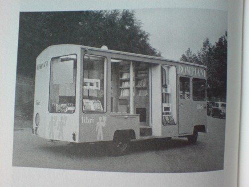
And since the USPS is not letting the Grummans loose in the wild yet, this Jeep may be my best chance. I mean, check out that glass, it may even be better. I could totally park that as an office somewhere. Or a roving gallery. Or a podcast studio. Or an Enzo Mari mobile bookstore. This is Cabin Porn™ I can get behind.
Hm, actually, after reading through all the projects, rat rods, parts salvages and failed snowcone stand dreams in the FJ boards at ewillys.com, I may pass.

Hard to find 65 FJ-6A Fleetvan - $3500 (Grapeview) [seattle.craigslist.org via bringatrailer.com]
Which, given the ad histories here, seems a little high [ewillys.com]
Previously, most definitely related: Bombiani Librimobile, 1955, by Enzo Mari

Since 2001 here at greg.org, I've been blogging about the creative process—my own and those of people who interest me. That mostly involves filmmaking, art, writing, research, and the making thereof.

Many thanks to the Creative Capital | Warhol Foundation Arts Writers Program for supporting greg.org that time.

comments? questions? tips? pitches? email
greg [at] greg [dot ] org

find me on twitter: @gregorg

about this archive

Posts from November 2014, in reverse chronological order

Older: October 2014

Newer December 2014

recent projects, &c.


our_guernica_cycle_ivanka_320px_thumb.jpg
Our Guernica Cycle, 2017 –
about/kickstarter | exhibit, 2017


pm_social_medium_recent_proj_160x124.jpg
Social Medium:
artists writing, 2000-2015
Paper Monument, Oct. 2016
ed. by Jennifer Liese
buy, $28

madf_twitter_avatar.jpg
Madoff Provenance Project in
'Tell Me What I Mean' at
To__Bridges__, The Bronx
11 Sept - Oct 23 2016
show | beginnings

chop_shop_at_springbreak
Chop Shop
at SPRING/BREAK Art Show
curated by Magda Sawon
1-7 March 2016

do_not_bid_or_buy_iris_sidebar.jpg
eBay Test Listings
Armory – ABMB 2015
about | proposte monocrome, rose

shanzhai_gursky_mb_thumb.jpg
It Narratives, incl.
Shanzhai Gursky & Destroyed Richter
Franklin Street Works, Stamford
Sept 5 - Nov 9, 2014
about | link

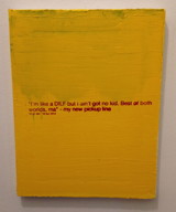
therealhennessy_tweet_sidebar.jpg
TheRealHennessy Tweets Paintings, 2014 -
about

sop_red_gregorg.jpg
Standard Operating Procedure
about | buy now, 284pp, $15.99

CZRPYR2: The Illustrated Appendix
Canal Zone Richard Prince
YES RASTA 2:The Appeals Court
Decision, plus the Court's
Complete Illustrated Appendix (2013)
about | buy now, 142pp, $12.99

weeksville_echo_sidebar.jpg
"Exhibition Space" @ apexart, NYC
Mar 20 - May 8, 2013
about, brochure | installation shots


HELP/LESS Curated by Chris Habib
Printed Matter, NYC
Summer 2012
panel &c.


drp_04_gregorg_sidebar.jpg
Destroyed Richter Paintings, 2012-
background | making of
"Richteriana," Postmasters Gallery, NYC

czrpyr_blogads.jpg
Canal Zone Richard
Prince YES RASTA:
Selected Court Documents
from Cariou v. Prince (2011)
about | buy now, 376pp, $17.99

archives