May 2009 Archives

haus_rucker_oasis7.jpg

In 1972, the Austrian architecture collective Haus-Rucker installed Oasis Nr 7 at Documenta 5.

A steel pipe structure was cantilevered out the window of the Friedericianum, and a platform, two palm trees, and a hammock were installed. The entire thing was enclosed in an 8-meter translucent vinyl bubble.

Oasis 7 was re-created last September It was built on a fake Friedericianum facade at the Victoria & Albert Museum for the exhibition, "Cold War Modern: Design 1945-1970.

Haus-Rucker project archive [ortner.at]
Time lapse making of video: Oasis 7 in the Victoria & Albert Museum [iconeye.com]
via atelier, where I've been lifting all sorts of interesting things this week.

May 29, 2009

Bought A Bing

And in other "laughable corporate attempts to build brand equity through campaigns designed to intentionally genericize trademarked-but-tangential phrases that rhyme with ding-a-ling" news:

Microsoft's marketing gurus hope that Bing will evoke neither a type of cherry nor a strip club on "The Sopranos" but rather a sound -- the ringing of a bell that signals the "aha" moment when a search leads to an answer.

The name is meant to conjure "the sound of found" as Bing helps people with complex tasks like shopping for a camera, said Yusuf Mehdi, senior vice president of Microsoft's online audience business group.

And if Bing turns into a verb like, say, Xerox, TiVo or, well, Google, that would be nice too. Steven A. Ballmer, Microsoft's chief executive, said Thursday that he liked Bing's potential to "verb up." Plus, he said, "it works globally, and doesn't have negative, unusual connotations."

Mhmm. "Verb up." I wanted to Twitter about leaving a Zing! on Bing, but the URL just redirects to decisionengine.com.

Microsoft's Search for a Name Ends With a Bing [nyt]
two's a trend?: Miracle Whip: The App

Dear Sirs and/or Mesdames:

I recently purchased [Brushes/ Red/ a stack of legal pads] after it was featured [all over the Internet and newyorker.com/ Cannes/ in every author Terry Gross has ever interviewed]. It is with great disappointment that I must write to inform you that your [iPhone app/ HD camera/ notebooks] are defective and do not perform as advertised.

It's been several days already, and still your product has not produced a [New Yorker cover/ feature film/ novel]. What gives? I even watched the instructional [YouTube animation/ director's commentary track on Che, both parts/ Booknotes with Brian Lamb on C-SPAN], and still, nothing even close.

So I am forced to return your product, and I expect a full refund in the amount of [$5/ $26,000/ since I stole them from the office, the legal pads were free] to be paypalled to me promptly. Thank you.

Respectfully,
Greg Allen

Below: Untitled (with apologies to Olafur and his dad on that boat, William Anastasi on the subway, and Brice Marden anywhere), 2009

brush_oe_wa_bm.jpg

image via flickr by RobieRob

Composer Brian Eno is projecting some of the 77 million iterations of his 77 Million Paintings series onto the Sydney Opera House as part of the Luminous Festival.

The Festival, which Eno is also curating, consists of three weeks of performances, talks, and exhibitions. It runs through June 14.

I'm not a huge fan of Eno's painting, necessarily, but it looks pretty fantastic in the photos that have hit flickr so far. I've got a short list of buildings which should have art projected on them, and I was wrong not to include Utzon's opera house.

That said, once the infrastructure's in place to project Eno's work, it should be equally possible to project other artists' works, too. I know he has 77 million works to get through, but maybe Eno could have curated someone besides himself into his big show?

Luminous Festival, curated by Brian Eno [sydneyoperahouse.com via city of sound]

May 26, 2009

Bueller!!

ben_rose_house_speyer.jpg

OK, why did no one tell me when I posted about A. James Speyer's awesome-but-maybe-never-realized Miesian Adirondack cabin that the Chicago architect was responsible for the most important Glass Box-in-a-Forest of the entire 1980s?

ben_rose_speyer_int.jpg

Of course, I'm talking about Cameron's house in Ferris Bueller's Day Off, which just went on the market for $2.3 million. [realtor.com, or try cinematical when that one expires]

nasa_mariner2_float.jpg

Amazing to think that all this was happening at the same time as the satelloons of Project Echo and just five years after Sputnik.

NASA Jet Propulsion Laboratory director William Pickering was the grand marshal of the 1963 Rose Bowl Parade. Behind him followed a float of the Mariner 2 space probe, which had successfully reached Venus in December 1962.

A Venus made of roses with a flower satellite probe orbiting it. And a little window cut out of Venus so the driver can see. Fantastic.

Mariner 2 Rose Parade Float [nasa jpl via nasaimages.org]

May 26, 2009

Pastel By Numbers

nasa_mariner_GPN-2003-00060.jpg

In 1965, after the Mariner 4 probe had possibly transmitted its first closeup images of Mars and in the many hours before JPL computers would finish processing that image, mission scientists were concerned about what, if anything the data would reveal.

So Richard Grumm and his fellow mission managers came upon the idea of printing out the brightness values onto vertical strips, taping them up on the office divider, and coloring each number in with pastels. Thus it was that the world's first transmitted, televised image of Mars was drawn by hand.

That drawing, cut out of the divider, framed, and presented to JPL director William Pickering, was included in "Data + Art," an exhibition curated by JPL educators Dan Goods and David Delgado at the Pasadena Museum of California Art, which closed in April 2009.

The closeup reminds me of Beuys: Data + Art installation shots and closeups of Grumm's Mars drawing [directedplay.com]
The full making of story, plus additional images, by Dan Goods--AWESOME [directedplay]
Dan detailed the circumstances of the making of the drawing in the comments on Boing Boing Gadgets today. [g.bb]
The image above, "First Image of Mariner 4," is available via NASA Images, a service of the Internet Archive [nasaimages.org]

b_hendricks_nga.jpg

According to the very slowly reported story [1] in the Wall Street Journal, the Obamas have been selecting modern and contemporary art for the White House from among pieces in national and museum collections. The artists they requested includes several African American artists, including the wonderful DC abstractionist Alma Thomas, whose paintings from the Hirshhorn are already installed in the White House's private quarters. But they've also chosen plenty of white contemporary artists, too, though the Journal obviously doesn't identify them as such: works by Ed Ruscha, Richard Diebenkorn, Robert Rauschenberg, Louise Nevelson and Jasper Johns all came from the National Gallery, for example.

The Obamas' decorator Michael Smith apparently insisted on borrowing only works that were not currently on view. Hmm, African American artists, in national collections, not currently on view. Why didn't they ask--or why didn't the National Gallery offer--a major work by the art world's longest-time-coming overnight sensation, Barkley Hendricks?

I'm dying to hear the story of how the National Gallery came to acquire their awesome, awesome Hendricks, Sir Charles, aka Willie Harris, 1972, in 197-freakin-3, when the paint was barely dry And as soon as that story's finished, someone tell me how it is that the intensely classical triptych portrait--inspired, we are told, by van Dyck, Rubens, and Botticelli, with a little Shaft thrown in for good measure--is not only not on display now, but has never been exhibited at the National Gallery, ever.

I'd certainly be willing to look at one less Thomas Demand mural of the Oval Office in exchange for three Willie Harrises. And I'd trade all five Demands to see Harris in the Oval Office itself.

Holy smokes, the comments are a seething pit of powerless white guy rage: Changing the Art on the White House Walls [wsj]

[1] Though the story's filed 5/22, Kerry Brougher is quoted as acting director of the Hirshhorn, a position he hasn't held for over a month.

May 26, 2009

Miracle Whip: The App

miracle_whip_loser_1983.jpg

I guess the "and that's half the battle!" view of MTV's relentless pursuit of their demo is their success in completely baffling someone who's aged out of it. I hadn't watched MTV once in the last five years, at least, before we ended up watching the last half of Star Wars Sunday night, because there was literally--literally--nothing else to watch in our entire cable/HD/VOD/TiVO-verse.

And wow, besides the commentary bumpers with a hatin' it Mark Hammill, and a cuh-razy Peter Mayhew, the greatest thing was the commercials. MTV has commercials for things I had no idea even had commercials. Brands who have a strategy, but don't have enough money for a campaign, just a commercial. Which they run in MTV spot buys late at night.

Brands like Wonka, not Nerds--or not just Nerds, they want to get the umbrella brand in there, too. And Miracle Whip. As befits a commercial from the dweebiest condiment in history, Miracle Whip's attempted ad makeover is an instant classic of the Gigantic Corporation Tries Way Too Hard To Look Way Too Edgy genre [cf. Intel, HP, Sprint, Zune]. The kind of commercials where you don't know who to be embarrassed for more--the company with a hopelessly banal product to sell, the agency who's stuck with the account, or the target demo, who you really, really, really hope is able to see through Cheap Fake Mayonnaise's attempt to be their coolest friend.

So far, though, I can't find the commercial to link to, probably because unlike all Kraft's desirable customers, I'm not on Facebook. I'm left to read about the campaign, which is fine, because almost every word in BrandWeek's recent article, Miracle Whip Whips Up Social App" makes me giddy with excitement for the future of the English language:

"What we're trying to do with Miracle Whip is really get our target of 18 to 34 who grew up on brand. Many of them have just stopped using the category," said Chris Kempczinski, svp of marketing for meals and enhancers at Kraft. "This campaign was about reengaging with 18- to 34-year-olds. The biggest place to go after them is in digital, and a big part of what they're doing there is in social media."
So perfect.

zingr_screenshot.jpg

But that means the commercial I saw, with grungy hipsters gettin' all Pop-Up Video with their Miracle Whip label-shaped thought balloons, was just a sop thrown to the mangy, three-legged dog of television. The real action is in digital, in social media. Which is why Miracle Whip created a Firefox extension/"app" called Zingr, which lets you annotate the web with Miracle Whip-lookin' "Zings!" which it then shares for you while you social media in digital:

Miracle Whip hopes the use of Facebook Connect, which allows third-party developers to tap into a users' social network, will spread Zingr (and the brand) far and wide. Leaving a "zing" on Kraft's site, for example, triggers this message to a user's Twitter network: "I just left a Zing! On brands.kraftfoods.com Check it out: http://tinyurl.com/oorhaa#Zing!"

The subtle branding was a tradeoff to make sure Zingr didn't appear "too corporate," Kempczinski said. But Miracle Whip will benefit from its own association with "zing," he said. "If we can get 'zing' adopted as part of the digital vernacular, it will be tied into everything else we're doing."

Oh no, don't worry, it's really subtle, doesn't look "'too corporate'" at all. And it is indeed tied very well to everything else Kraft has been doing for their demo's entire lives. In the Depression and the Baby Boom, Miracle Whip was about being a thrifty mayo substitute. But since at least 1979, when a chorus of hamburgers sang the enhancer's "Zesty" praises, Z words have been central to Miracle Whip's brand essence. In the 80's it was "Zip" for your late-night sandwich binges, and even when America abandoned hamburgers for chicken in the 1990's, we still "gotta have our Zip!"

Of course, by "we," Kraft meant the now-grown, suburban Boomer schlubs in their ads, who were even then a caricature of anti-MTV lameness. But WTF, dude, that was over 18 years ago! Before some of Kraft's awesome, new, social mediaing digital demo was even born! Now Miracle Whip is not all about consuming the category anymore. It's all about Zing!ing and stuff; you know, part of the digital vernacular like you guys.

"It's a pretty cool app," Kempczinski said. "Even if you're not a Miracle Whip lover, you can fall in love with the app and hopefully you'll fall in love with Miracle Whip along the way."
Miracle Whip Whips Up Social App" [brandweek]
Tangentially related, and from the same week, practically, as BrandWeek's found poetry: "Hackers Can Sidejack Cookies" by Heather McHugh [newyorker.com]
Also, mad digital props to Harry Shearer Le Show. "Reading The Trades" is like the funniest parts of business school, for free, on the radio.

David Kurtz, writing on Talking Points Memo about finding the grave of Corporal Pearl B. Wilkerson, who was killed in action in April 1945, just before the European war ended:

But what lingers for me about Wilkerson is how Memorial Day -- for all the somber remembrances and displays of military hardware -- is a small strike against the inevitable forgetting. Poor Wilkerson got a head start on being forgotten: buried in a now-churchless cemetery with headstones knocked over and steadily sinking into the ground, near a briefly prosperous village of Irish immigrants that was long past its prime when Wilkerson died and will eventually be a nameless crossroads. His is the same fate as that of the overwhelming majority of men who ever fought and died for their clan, tribe or country. Today we acknowledge how much we've forgotten by paying homage to what we have managed to remember.
Kurtz is right, of course, but it's worth remembering [sic] that forgotten and buried--if buried at all--in an unknown, even unmarked grave has been the standard fate throughout history of those killed in war. Remembering and memorializing individual soldiers is a modern, i.e., 20th century, i.e., post-WWI practice.

Lutyens' triumphal arch tower at Thiepval was one of the first attempts to recognize all the British soldiers who died at the Somme; their names cover every available surface of the arch. From the WWI innovation of dog tags to identify the dead to our current ability to match DNA from the tiniest fragment of a fallen soldier's body, technology has rendered the idea of an unknown soldier obsolete. Perhaps it is time to switch to the Tomb of The Unremembered Soldier instead.

Gone and Largely Forgotten [tpm]

ikea_manhattan_munich.jpg

The Neue Sammlung design museum in Munich has organized the first [??] exhibition of the history of Ikea design. The idea of vintage Ikea fascinates me, and not just for the incongruity of it. Alright, mostly for the incongruity of it.

"Democratic design" and "beauty for everyman!" have a nice, if slightly messianic ring to them, but the reality of Ikea's cheap furniture is often that it doesn't last, doesn't get preserved--by design. That Spike Jonze Ikea ad about how it's crazy to cry for the lamp that gets thrown away, even though it still works? Obsolescence and replaceability are baked into Ikea's strategy as surely as the ruthlessly unsentimental winnowing of any designs that don't perform as well over time. Or that get too expensive to produce and thus get replaced by some sawdust&resin replica with a fatter profit margin.

To the extent that history is nostalgia, it just doesn't exist in Ikeaworld. So there's no way the company would keep making the totally solid-looking, mid-century Scandinavian all-wood product like Bengt Ruda's 1960 Manhattan cabinet; it's just not in their DNA.

Still, there's a history there--and no doubt many interesting design stories and inspirations--to be had. I'd like to see more Ikea scholarship, frankly. And I'd like to see more vintage Ikea design; it can't all have been thrown away, can it? Wouldn't it be a riot if someone licensed some of Ikea's original designs, which can't be mass produced at Ikea's price/profit point anymore, and brought them back into small-scale production? Anyone?

Democratic Design - IKEA runs through July 12 die-neue-sammlung.de via atelier]
Stylepark's a little snobby-cranky, but they have a lot of pictures [stylepark]
A couple of nice flickr sets here and here, though the exhibit looks a little PR-y. [flickr]

enzo_mari_autop_artcurial.jpg

Résultats de la vente 1567, Livres et manuscrits modernes, Lot 73, Enzo Mari PROPOSTA PER UN AUTOPROGETTAZIONE Milan, Galleria Milano, 1974. Cat. in-16 à litalienne, Vendu EUR 497 [artcurial.com]

ikea_mari_wood_stack.jpg

An update on the Enzo Mari x Ikea autoprogettazione table project:

I just finished putting on the second coat of varnish sealer, and now everything's drying and curing in the basement. The picture above was how the wood sat for a week between the first coat and this morning, stacked on our radiator [I moved it up after about 24 hours when it wasn't quite cured, and then my schedule got away from me for the week.]

swamp_stilts_fritz_goro.jpg

Fritz Goro was the longtime science photographer for LIFE magazine. He covered the Manhattan Project, including shooting at the original Ground Zero. His image of a fetus in an artificial womb inspired Kubrick's 2001. He crafted photo-simulations of x-ray diffraction and created elaborate graphics in-camera using multiple exposures, lenses and focal depths to depict atomic structure. Much of America's 20th century image of science was either made or influenced by Goro.

In 1945, he also shot an unidentified collection of slightly odd 19th century technologies and inventions. Such as these rocking stilts, for crossing a swamp. Goro's technique for shooting these objects was to cast as strong a light as he could on them. The harsh, high-contrast images remind me of some of Charles Sheeler's domestic photography, which reveled in the hard edges and abstractions of pre-Industrial machinism.

Also, the 19th century folks were just as crazy as we are.

But also brilliant. Just look at this photo of a "reflection candlestick," more commonly called--when it's called at all anymore, I mean--a candlestick reflector. It's somewhere between Olafur Eliasson, the end of Diamonds Are Forever, and ye olde ocularift fhoppe in downtown Fitchburg. Fantastic.

candlestick_fritz_goro.jpg

ellsworth_kelly_dress_scan.jpg

Though I suspect the easiest thing would be for Michael to let Cerre know where he scanned the image from, here's what I can figure out about this dress made by Ellsworth Kelly in Sanary, France in 1952:

Sanary, west along the Mediterranean coast from Toulon, was where Kelly spent a great deal of time during his formative postwar sojourn in France, from 1949 to 1953 1948 to 1954. It was where Kelly found color:

While working in Paris after the war everything was grey and, as I've said, I used very little colour. When I finally went to Sanary, I did Colors for a Large Wall. It was the first work I painted in the south of France.
That was in 1951, when his, um, friend and fellow artist Ralph Coburn was with him on one of his four 6-mo to 1-yr long visits. [Is it, to quote a too-well-known idiot, impossible to fully understand Kelly's work unless you know he's gay? Was Coburn his boyfriend, or just the guy he lived with and took to dinners with John Cage and Alice B. Toklas the whole time? Kelly's certainly out, but from the way Coburn's bio was written, there are still closet doors a-slammin'.]

Kelly was looking at the colors around him, using found, "readymade" colors from papers and color wheels as inspiration and raw material for studies and collages. Such as this 1952 collage in the Philadelphia Museum, Boats in Sanary Harbor:

ellsworth_kelly_sanary_pma.jpg

Back to that Tate interview, where Kelly talks about other seminal developments in his work that took place in Sanary, including his interest in "painting objects," monochrome canvases abutting each other [e.g., Colors for a Large Wall, 1951, at MoMA; and Méditerannée,1952], which prefigured Minimalism's interest in a painting as a thing itself, not a depiction or image of something:

I didn't want to paint an overlap, meaning that it would be a deception or illusion. I no longer wanted to depict space, but to make a work that existed in literal space. Thus, my recent works are one canvas as a relief over another canvas. Another important example of a panel painting that explores the idea of the mural was Red Yellow Blue White (1952). It's the only one I ever did using actual dyed fabric of ready-made colours, which moves the painting into the realm of real objects. It consists of five vertical panels, each with five canvases. The vertical panels are separated on the wall and the intervals of the wall surface between them are part of the painting. [emphasis added on the seemingly dress-relevant part]

kelly_rybwbl_1952.jpg

Seemingly relevant indeed. In Branden Joseph's book, Random Order, on Robert Rauschenberg's relationships with the "avant-garde," the extensive discussion on Kelly's highly specific use and treatment of color confirms that Kelly used the same fabrics from Red Yellow Blue White to make a dress for his friend Anne Weber. The footnote says "a photograph of Weber wearing the dress designed by Kelly" was reproduced in Diane Waldman's catalogue for the Guggenheim's 1997 Kelly retrospective--what a spectacular show that was, btw, though I remember Lisa Dennison telling stories of the museum expecting Kelly and other artists who get retrospectives to donate their work, essentially a quid pro quo, and then she bragged about the giant, arced Kelly sculpture that was in the theater at one point--as well as in Nathalie Brunet's extremely detailed and informative "Chronology 1943-1954," which appeared in Ellsworth Kelly: The Years in France, 1948-1954, the catalogue for the National Gallery's 1992 exhibition, which looked infinitely better at the Jeu de Paume.

Weber, who was married to the cubist pioneer Max Weber--really? He had to have been in his 70's in 1952, yet in that photo, she doesn't look 30--later ran a gallery in Georgetown, Maine. [Mar 2015 update: No. Thanks to a reader Laura's incredulity, which was stronger than mine in 2009, I dug a bit and realized that Anne was not married to Max. I had to have read that somewhere, because it's just too odd a pairing to make up. She turns out to have been married to Swiss artist Hugo Weber, who taught at the Illinois Institute of Technology with Mies van der Rohe and Moholy-Nagy. Glad to have that straightened out.]

Last year, Kelly was on hand for the opening of theWeber Kelly Preserve and Trail . Weber financed the 1999 purchase and donation of 105 acres on Georgetown Island by selling an early Kelly painting.

So there you go. Ellsworth Kelly dress.

[Other March 2015 update: However obscure this dress has been, my friend and former MoMA board colleague Sharon Coplan Hurowitz worked with Kelly to recreate the dress in late 2013. It was created as an edition of 10 by Calvin Klein's Francisco Costa. Copies were donated to the Met's Costume Institute and the Philadelphia Museum, where Kelly donated Red Yellow Blue White in 2010. Nice hustle.

May 20, 2009

300x404: The Making Of

300x404_after_untitled_cowboy_2003.jpg

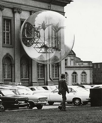
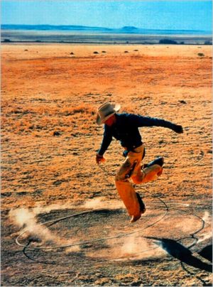
So the other day, I was still trying to wrap my head around the fact that Slate's editors were, "ironically, unable to get permission" to reproduce Richard Prince's Untitled (Cowboy), 2003 for Sarah Boxer's slideshow review of "Into The Sunset," MoMA's exhibition of photography's role in creating the concept of the American West. [The irony, of course, is that Prince's work is actually a rephotograph of a Marlboro Man ad, which was probably photographed originally by Jim Krantz.] [Update: actually, last year, PDN identified the original photographer as Sam Abell. thanks Joerg.]

And so I blithely grabbed an image of Untitled (Cowboy) online, resized and retitled it, and republished it as my own work, 300 x 404, After Untitled (Cowboy) 2003 by Richard Prince, and offered to let Slate show it instead. Though I've written for Slate before, they have not, as yet, taken me up on my offer.

Not that I expect them to. The point that Slate felt copyright-constrained while Prince so clearly didn't was so obvious, it's barely interesting. And even their complete abrogation of fair use principles, which specifically allow reproduction of copyrighted work for purposes including "criticism, comment, [and] news reporting," is kind of equivocal.

Boxer's piece was decidedly not a review, and it could arguably not be news, but I can't see how Slate could decide it wasn't comment. I have to assume they just accepted some publicist's refusal--whether MoMA's or Prince's dealer Barbara Gladstone [at the time the work was made, anyway. Now it's Gagosian.] they don't say--to provide a suitably hi-res file. If they'd wanted to run the image, they could have grabbed a slightly smallish version online, or they could have scanned Prince's work from the catalogue, but they acquiesced to the wishes of someone somewhere who, ironically, did not actually control the copyright anyway. Fine, now we know.

300x404_detail.jpg

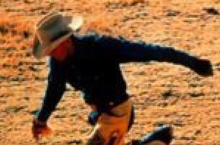
After posting my one-liner, though, I started thinking more about this work I'd just created, what claim I really had to it, and what relationship it really had vis a vis Prince's--and Krantz's Abell's--work. The pixel count in the title seemed to hold a key. A relatively new articulation of fair use exemptions has emerged specifically to deal with the no-permission-necessary reproduction of images online. Though it didn't offer any technical guidelines, a 2002 lawsuit, Kelly v Arriba Soft Corporation, helped establish a fair use exemption for thumbnail images.

And that's what interests me most about my re-reproduction. What's a thumbnail? What size and quality does an image have to be to qualify for online fair use? What does its thumbnail-ness relate to? The size of the screen? Of the page? Of the original? Does it relate to the resolution, or just the display size? It's an issue I think about every time I grab someone else's image and post about it here. Beyond just giving credit and a link, I try not to create a perfect substitute for someone's original, or for the context they put it in. [Ironically-again, that word--when I started greg.org way back in 2001, I was still a little hippie dippie Xanadu-ey about it all, and would hotlink to too many images. Too many of those impolite, dead links are still lurking in my archives, waiting for my ghost army of interns to fix.]

And what happens when you start reproducing a work that begins online and is defined first and foremost, not by its resolution, but by its pixel count?

300x404_1000pct.jpg

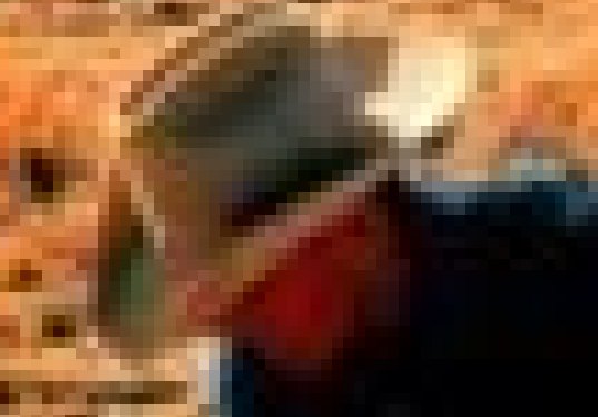
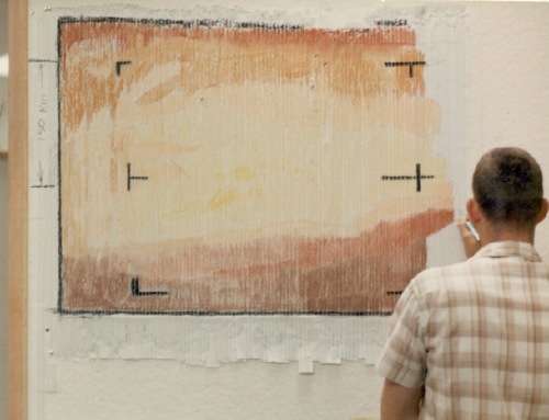
When I started looking for a place to print 300 x 404 on canvas, I found that it wasn't so easy. The original web resolution, 72 dpi, would only produce a tiny, 4x5-in painting. I wanted to see something, you know, more Princeian, a 30 x 40-in. painting [10 ppi] or maybe even a Gurky-esque 60 x 80-in. [5 ppi], 60 inches being the maximum width of canvas today's printers can handle.

As any Photoshop user can tell, increasing the pixel size is like zooming in on a digital image. Except in this case, it's not the size of the magnifying glass, but the size of the pixel itself that increases. And since it's the pixel count, not the size that's important, I figured I'd go with a round number, 1 px = 1 mm, or 25.4 ppi, which would produce a nice, manageable little 12 x 16.2 painting.

Or at least it should. According to all the print studios I've spoken to, you can't adjust the print resolution on their state-of-the-art inkjet printers; you can only get "the best" resolution. And if your image isn't hi-res enough, no problem; they'll fix it for you:

We understand that almost no one has a digital camera capable of producing native resolution for a 30X40 giclee at 150ppi. We can use image interpolation to compensate.

For example, if ordering a 30X40" print, we would generally require to have a file that measures 30X40" at 200 ppi.

Digital cameras compete on megapixel counts, and generations of printers claim they can [finally!] be "true" to an original work of art. And when an original doesn't hold up, "image interpolation" comes to the rescue. The assumptions of accuracy, authenticity, and fidelity are embedded deep in our image-saturated world. And just as HD television forced the development of new makeup techniques to save large-pored actresses' careers, our own perception of veracity is constantly changing in ways we don't acknowledge.

Now consider Sarah Boxer's assessment of Prince on Slate which is, at every level, incorrect:

Although the photo looks authentic, it is, at every level, inauthentic...Prince didn't really take the picture of the cowboy himself. And even the original photographer wasn't catching a real moment in a cowboy's life; he was just shooting an ad.
That "just shooting an ad" kills me. Has there ever been an ad campaign more relentless in its pursuit of visual and content authenticity than Marlboro's? Is the photo "inauthentic" because it's an ad? Because it's not a "documentary"? Is the cowboy inauthentic only if he is auditioned, dressed, placed or directed? Isn't Prince's photograph of the photograph a near-perfect 1:1 representation? Prince's work provokes these kinds of questions and challenges these kinds of assumptions, the very ones Boxer seems completely oblivious to.

But I can't laugh too hard; as my little offhand attempt to accurately reproduce my 121,200 pixels is proving, I'm just as likely to be oblivious to the limits of my own assumptions, too.

futuro_house_wright20.jpg

Bring your architect! Uh, on second thought, you'd probably be better off bringing your boatwright.

Wright20 is auctioning off one of Finnish architect Matti Suuronen's 1968 Futuro Houses on June 2.

After creating the first fiberglass and polyurethane modular structure as a ski cabin for a friend, Suuronen began producing and delivering Futuro Houses in 1969 Around 100 were built, maybe 60 survive, and up to 18 of them are supposedly in the US. There's one on Hatteras in North Carolina. Another is used as the VIP room atop a strip club in Tampa.

Futuro expert Richard Pisani, who starred in a 2005 NY Times article about the Futuro revival, has a global registry going at futuro-house.net. What, was futurohouse.com taken? Yes, yes it was. And the competing saucer directory has tracked the current Wright20 house--last known location, Bailey, Colorado--from its 2002 sale on eBay to its 2006 return to the market.

No matter how awesome Suuronen and his design might be, it's kind of a freakshow, and most of the Futuro House owners seem like weirdos for whom a Fuller-style geodesic dome home was just too conventional.

So whether you go by the architecture-as-collectible standard of a Prouve prefab, or the modernist real estate standard, a portable saucer house in need of a gut restoration is going to be a tough sell at $50,000-70,000.

Lot 138: Futuro House, Matti Suuronen, est $50-70,000 [wright20.com]
lots of Futuro House photos on flickr, including a family lounging in a vintage brochure and an abandoned saucer in Texas [flickr]

May 18, 2009

West Trademark F(*#$Up

From Slate's review of MoMA's "The Wild West," "Into the Sunset," [thanks todd] a scattershot exhibit on photography's role in forming perception of the American West:

And the opening shot of the show--right at the entrance to greet you--is Untitled (Cowboy), a Richard Prince photo from 2003 that was stolen, adapted, or made--depending on what you think of this artist--from a Marlboro ad. Although the photo looks authentic, it is, at every level, inauthentic. (We were, ironically, unable to get permission to reproduce it here.) Prince didn't really take the picture of the cowboy himself. And even the original photographer wasn't catching a real moment in a cowboy's life; he was just shooting an ad.
Here, let me help. I can't do anything about the review's stubborn fixation on unnuanced terms like "authentic," "true," and "lie." But I can and do hereby grant Slate permission to reproduce my latest work, 300x404, After Untitled (Cowboy), 2003 by Richard Prince, 2009. It's much lower-res than the original [sic], but at least I will not try to thwart fair use of it by reviewers. Seriously, people, wtf.

prince_untitled_cowboy2003.jpg

On an evening in October 1986, two well-dressed men approached Dan Rather on Park Avenue, began asking him, "Kenneth, what is the frequency?" and then started pummeling him. They were never identified or caught, and the motive behind their question and their attack was never explained.

In a 2002 article in Harper's magazine, however, Paul Limbert Allman "solves" the riddle. The answer: New Yorker short story writer Donald Barthelme.

As his analysis unfolds, and hypothetical interactions between Rather and Barthelme become bitter vengeance. Allman begins to sound more than a bit like Charles Kinbote, the protagonist of one of my absolute favorite novels ever, Pale Fire by Vladimir Nabokov. Which is not who you want to sound like if you're really gunning for credibility.

Pale Fire is structured an eponymous epic poem by a dead poet named John Shade, and the increasingly unhinged footnotes added by Kinbote, Shade's self-deluding neighbor/colleague/groupie/stalker.

So if the Pale Fire logic holds, then [calculates on fingers] I think that means Allman attacked Dan Rather. Or that Allman is a figment of Rather's imagination. It could go either way.

The frequency: Solving the riddle of the Dan Rather beating [harpers.org via jessamyn]
"Kenneth, what is the frequency?" [wikipedia]

mari_librimobile1.jpg

Hans Ulrich Obrist - Yes, I see here - there's a vehicle, a truck, in the picture.

Enzo Mari - The editor [of Bompiani] had a problem, and we're speaking about the fifties, in that he needed to transport retail books to remote places in the Italian provinces. These remote places were not as we know them today, as they didn't even have bookstores. We had to create a truck that could be used as a small bookstore. Once it arrived in a small town, people could make use of it like a shop. The truck, from one point of view, presented itself as a bookstore with windows; inside there was a small parlor, a sofa, a small collection of books, where the merchant could receive and converse with the visitors.

mari_librimobile2.jpg

images from [I think] Mari's 2004 book, La Valigia senza manico, reproduced in Hans Ulrich Obrist & Enzo Mari: The Conversation Series - 15 [amazon]

remington_white_otter_moon.jpg

Did you know that the National Gallery had the first show ever of Frederic Remington's paintings of night in 2003? Me either:

Frederic Remington (1861-1909) has long been celebrated as one of the most gifted interpreters of the American West. Initially, his western images appeared as illustrations in popular journals. As he matured, however, Remington turned his attention away from illustration, concentrating instead on painting and sculpture. About 1900 he began a series of paintings that took as their subject the color of night. Before his premature death in 1909 at age forty-eight, Remington completed more than seventy paintings in which he explored the technical and aesthetic difficulties of painting darkness.

remington_apaches_night.jpg

Surprisingly, Remington's nocturnes are filled with color and light--moonlight, firelight, and candlelight. These complex paintings testify to the artist's interest in modern technological innovations, including flash photography and the advent of electricity, which was rapidly transforming the character of night. The paintings are also elegiac, for they reflect Remington's lament that the West he had known as a young man had, by the turn of the century, largely disappeared.

Remington's interest in painting darkness was indirectly inspired by Whistler, via the 1899 exhibition of moonlit paintings of a Whistler follower, Charles Rollo Peters.

darren_almond_fullmoonspr.jpg

Peters' and Remington's moonlit paintings remind me of Darren Almond's Fullmoon photographs, whose otherworldly colors almost feel like anomalies of the printing process. Which is funny, because the NGA quotes Remington complaining about how hard he finds it to paint color:

"I've been trying to get color in my things and still I don't get it. Why why why can't I get it. The only reason I can find is that I've worked too long in black and white. I know fine color when I see it but I just don't get it and it's maddening. I'm going to if I only live long enough."

remington_sunset_moose.jpg

Remington kept on trying to capture the extreme light and color of fireside scenes, and sunsets until his death in1909. As the NGA presents them, they were loaded with uncertainty, melodrama, anticipation, and overwrought interpretations. I'm not sure whether the limits and shortcomings are in Remington or his audience.

Frederic Remington: Color of the Night [nga.gov]
"Museum Quality" painted reproductions of Remington's night scenes are $55-385 wholesale [chinafineart.com]

images, beginning with the most awesomely titled:
"Pretty Mother of the Night--White Otter is No Longer a Boy," c. 1900, Bellas Artes, Nevada, LLC
Apache Scouts Listening, 1908, Private Collection
Fullmoon@Springs, 2001
Coming to the Call, c. 1905, Collection of William I. Koch

remington_artic.jpg

Frederic Remington, Ceremony of the Fastest Horse, c. 1900 [art institute of chicago]

Look, I'm as surprised as you are that I was stoked to see a Frederick Remington painting, but here we are.

As a card-carrying East Coast Art World Elitist, I've never given Remington's work a second's thought, not even an ironic revisionist, "Well, he's alright, but he's no Norman Rockwell!" Which is exactly where I placed him art historically, buried somewhere in Appendix B of Janson.

But we were at the State Department the other night, at a dinner held in the Diplomatic Reception Rooms, and a Remington painting was the freshest, most modern thing around.

state_adams_room.jpg

When they opened in 1961, "The Rooms" looked like typical, International Style boardrooms of the period, which, oddly for a government agency housed in a 2 million-sf pile, the State Department thinks is a slam:

Then they were very much like the rest of this modern State Department building, with wall-to-wall carpeting on concrete floors, brown panelled [sic] walls such as those found in offices, and unattractive acoustical ceilings. The exterior walls of the entire eighth floor (where the Diplomatic Rooms are located) were floor-to-ceiling plate glass with explosed [sic] steel beams.
In 1969, Nixon's newly appointed ambassador to Britain, Walter Annenberg, initiated a vast, classical makeover, replacing the steel and glass with 18th- and early 19th century-style woodwork and antique furnishings.

They're a spectacle--the bathrooms are absurdly fantastic--but complete artifice. [Though all the artifacts are real enough. It was incredible to see the Treaty of Paris just sitting there on the desk.] Many wall texts in The Rooms and on most pages of the DRR's website --which was also apparently last remodeled in 1969--are relentlessly dismissive of modernism:
diproom_before.jpg

Once paneled in brown plywood, with oppressively low ceilings and wall-to-wall carpeting on concrete, the hall is now a handsome space with thirteen-foot high ceilings and a Tabriz rug on a mahogany floor.

It's amazing, because the building's lobby, which is all chrome and glossy black stone and linoleum, with a giant, glass-enclosed garden and phalanxes of security desks, gives off a nearly pitch-perfect aura of cool, postwar power. And The Rooms' balcony has round skylights in the overhang, and reads like an amped up homage to the terrace for the Member's Lounge in Goodwin & Stone's original MoMA building.

state_dept_balcony.jpg

Edward Durrell Stone had finished 2 Columbus Circle in 1964 [even abandoned, the top floor's superluxe mahogany paneling, travertine, and bronze made me want to have our wedding party there], and he was working on the Kennedy Center nearby, which would open in 1971. And in 1960, Eero Saarinen was finishing his US Embassy in London, and in 1962, his soaring terminal at Dulles opened--named after Eisenhower's Secretary of State, no less! True, looking back, Establishment Modernism of the late 60's doesn't pack the punch of the heyday works a decade earlier, but it should've been good enough for government work, right? And yet in 1969, modernism apparently had no one able to challenge Annenberg's transformation of America's seat of diplomatic power into the American Wing at the Met.

But anyway, back to the Remington. Unsurprisingly, it's not on The Rooms' website, and I didn't take a photo or even note the title. But it was a landscape, of the West somewhere, with some guys on some horses, crossing some river, all not important. What struck me was that it was painted in black and white. Or more precisely, it was painted in a fascinating, dynamic range of grays. It was too painterly to be a Mark Tansey, but it could have been an early Gerhard Richter.

I had no idea Remington often painted in monochrome, but when you realize why he did, it makes total sense. It's not that he was painting from photographs, although he often did, and the 19th century paintings' resemblance to 20th century photographs is striking; what's awesome was that Remington was painting to photographs. He was usually making images on assignment for Harper's Weekly or some other weekly publication, which only printed in one color. Deeply interested in reproduction technologies, Remington would optimize his work for the particular medium, whether lithography or, in this case, photoengraving.

remington_artic2.jpg
First and Best Camp of the Trip, 1895 [artic.edu]

Critics chided Remington for painting from photographs--and he equivocated about it himself, and periodically claimed to have given up the practice--but it's precisely this cross-pollination of photography and painting that made Remington's painting feel so modern. Photography's role in defining the American West has been explored to death, but I can't remember Remington ever coming up in those exhibitions or discussions. And yet he was the one who almost literally created the cowboy as an archetype, and it was his images--or the photo-like, photo-processed reproductions of his images--which enjoyed the widest audience and had the most formative influence on the popular culture.

Other painters were using photography at the time, too; Eakins and Sargent both come to mind. But Remington seems to have gone beyond those two in his experimentation. All three treated photos as source documents and reference tools. Remington gets credit for accurately depicting in paint what Eakins' friend Edweard Muybridge proved photographically: that a galloping horse's feet all leave the ground at once.

But Remington also explored painting using innovations like flash photography and artificial lighting. And by optimizing his painting for mechanical reproduction instead of naturalistic or visual authenticity, it feels like he took a significant conceptual leap before anyone knew what conceptualism was.

The Art Institute of Chicago has many monochromatic Remington paintings [artic.edu]

via Artforum:

At its May meeting, the College Art Association board of directors made difficult decisions on behalf of the esteemed organization, including strategic budget reductions and other measures. These have been instituted throughout the association to balance the budget and keep core programs, publications, and services in operation. The annual conference in Chicago in 2010 will be reduced by one day. CAA News will only be distributed online in a new design. The Art Bulletin and Art Journal will continue to be published. Illustrations, however, will be limited to black-and-white for 2009-2010, except where editorial and budget decisions may allow the insertion of color. [emphasis added]
Perhaps the CAA could agree to only publish articles about black & white art: Franz Kline, Irving Penn, early Cindy Sherman, Hans Namuth [but no Pollock], Twombly, Anastasi, Kosuth--or would Kosuth's photostats take up too much toner?

Hey, what about late Warhol?

warhol_apt_building_round2.jpg

May 13, 2009, LOT 221: est. 400,000-600,000

Sold 2007: $964,000
Sold 2009: $458,500

May 13, 2009

Many Happy Returns

cattelan-elephant.jpg

I know it deeply doesn't matter, and I feel kind of dickish pointing it all out, but since it involves the famously impolitic Daniel Loeb, I'll just say Carol Vogel's account of last night's Sotheby's sale was like one blind man trying to describe, not even an elephant, but a jpg of an elephant sculpture with a ghost costume thrown on top of it.

First off, Tobias Meyer says the market is "recalibrated." Which is a term of art used by tailors: "After Captain Dan's legs were blown off in 'Nam, I sent his trousers out to have the hem recalibrated."

koons_loeb.jpg

Also:

The evening's star was Jeff Koons's "Baroque Egg With Bow (Turquoise/Magenta)," which went to Larry Gagosian, the Manhattan dealer who represents Mr. Koons. He paid $5.4 million, under its $6 million low estimate...it was being sold by Daniel S. Loeb, a hedge fund manager who bought it from the Gagosian Gallery in 2004 for an estimated $3 million.
But Gagosian had already been selling the Loeb egg; it was in the gallery's massive Moscow exhibit last fall. [It's even mentioned in the Sotheby's exhibition history.] The $5.4 million price sounds like a $4.5 million bid. Tobias would not have started off at 4.5, so presumably, one other person was bidding, what? 3, then 4? Or just 4?
The more sober market is now looking for staying power.

And one who fit that category is the German artist Martin Kippenberger. A 1988 self-portrait, in which he depicts himself as paunchy and middle-aged, was estimated to bring $3.5 million to $4.5 million. It was bought by Iwan Wirth, a Zurich dealer, for $4.1 million, but it still set a record price for the artist at auction. He has been the subject of a major retrospective that closed this week at the Museum of Modern Art.

The painting was being sold by Dakis Joannou, a Greek industrialist and it had what Sotheby's calls an irrevocable bid, meaning that before the sale, a buyer had already agreed to purchase the art for an undisclosed sum.

Except Wirth isn't just a dealer; he's Kippenberger's dealer, and Dakis is a major client.

sothebys_kippenberger.jpg

Also, it was only a couple of Tate and MoMA retrospectives ago that Kippenberger was being covered in the Wall Street Journal as the kind of artist hedge fund managers liked to take "positions" in, then run the prices up to increase the value of their "portfolio." Loeb, not coincidentally, has boasted in print of owning more than 200 Kippenbergers.

And before the market had its chair recalibrated out from under it, "irrevocable bids" were known as "third-party guarantees," and I have never seen an accurate account of how they were used or even how they worked. Auction houses, especially Phillips, but the others, too, set up third party guarantees all the time, and not just to ensure a successful sale, or to hedge the auctioneer's risk, but to reward and woo collectors with, literally, money for nothing.

When a house guaranteed a work that didn't end up selling at auction, it was "bought in," and became the [somewhat diminished in the eyes of the market] property of the auction house. But when the auctioneer arranged for a collector--or dealer--to guarantee a work, it sold, whether anyone besides the guarantor "bid" on it or not. On the one hand, the practice helped smooth out uncertainty from the transaction and to preserve the perception of an artist's market success.

On the other hand, the third-party guarantee also removed at least one interested, qualified buyer from the market for the piece, which can be enough to influence the outcome of the sale. These arrangements were disclosed only inconsistently, and often not at all. [Sotheby's says its irrevocable bid disclosure policy took effect in October 2008.] To anyone outside the auction house, it would be all but impossible to know if a work "actually" sold, or if it was simply brokered on the auction stage from the seller to the guarantor. [Which is obviously a sale, I know, but it's not the kind of liquid, open market transaction the auction house purports to facilitate.] Sotheby's irrevocable bid policy allows the guarantor to bid beyond the guarantee, but it doesn't require any disclosure of the amount of the identity. If Wirth were both the irrevocable bidder and the winning bidder--and I have absolutely no reason to think he was or wasn't--Sotheby's policy does not require that disclosure.

Meanwhile, in the event another bidder bought the piece, the house would split its commission--and in some cases I heard of, the entire difference between the guaranteed price and the final price--with the guarantor. I heard of some collectors receiving as much as $500,000 for, essentially, agreeing to but not buying the work.

Also, I guess the Times is waiting for gay marriage to be legalized in New York before it properly identifies Mark Fletcher, the guy who Tobias Meyer sold that Dan Colen painting to, as his own husband.

Don't get me wrong, I'm totally fine with literally half a dozen men selling work back and forth to each other as many times as they like, and I wish them all happiness and rainbows. I just don't pretend it's the art world, or even the art market. And in that respect, I differ from my esteemed colleagues at the Times.

update: Sarah Thorton got the sale right at Artforum, right down to the ignoring of Dan Colen.

update update: Just drop everything and read the report of the International Herald Tribune's man in Bizarro Art Market Land, Souren Melikian. "Optimistic Buyers Push Up Sales of Contemporary Art," is a fascinating, blow-by-blow account of the dismal, deflated sales what's flitting across Melikian's blissed out, untethered mind as he flipped through the first three pages of the auction catalogues:

An uncanny optimism is driving the art market. Consider the happy mood that came forth this week at the New York contemporary art sales. These went like a dream, which in this high-risk area that filled some professionals with misgivings is remarkable.

On Tuesday, Sotheby's sold 39 lots for $47 million, leaving only nine works unsold and posting an 81 percent success rate. Amazingly, three world auction records had been set by the time the session switched to the eighth lot. Was it their importance? Hard to tell -- no one has yet defined quality and importance criteria in plain English concerning politically correct contemporary art as acknowledged at auction and in leading galleries.

Deep! Someone get that man an editor, a buyout, or an agent, tout de suite!

At Sotheby's Contemporary Art Auction, Even The Star Is Dimmed [nyt]
Hedge Fund Experts Put Art In Deal [wsj, 2005, via realestatejournal.com]

jalopy_vondutch_toolbox.jpg

Ever since discovering Mister Jalopy's blog Hoopty Rides a couple of years back, I've been low-grade obsessed with vintage tools and vintage toolboxes. There's something about the combination of lost quality, survival, and embedded history that makes an intact box of tools a veritable mirror of at least one man's soul--or less loftily, of his life and his projects.

Von Dutch was apparently a racist a##hole drunk, so I just admire his hand-lettered, gold Snap-On tool chest as an object. An object that was too expensive to be my first vintage toolbox purchase when it came up for auction in 2006 or so.

jalopy_journal_nealinca.jpg

But a remarkable thread full of vintage tool chests and tool boxes has developed on the message board at JalopyJournal.com [no relation]. Many of the boxes were bought at garage sales. A user named Nealinca got the cabinet above from the estate of a high school shop teacher.

jalopyjournal_59imp.jpg

Many more, though, are inherited from fathers and grandfathers--especially grandfathers. A man rarely gives away his tools as long as there's a chance he might need them. To commemorate his late grandfather's 80th birthday, Imp59 had his awesome artillery shell-shaped toolbox pinstriped--later on in the thread, someone identifies it as a 1947 Nuggets socket case from Blackhawk.

And every few pagedowns, there's a shot of a shiny metal toolbox, stripped clean of stickers, paint, chips, and grime, every sign of its previous history. It's tempting to say it's sad, but then someone'll point out their daddy didn't give'em anything but alcoholism, and you realize that wistful embrace of the past can be a luxury, or certainly an indulgence, that is not to everyone's taste.

Hand Lettering [hooptyrides]
The H.A.M.B. "Vintage" Tool Box Club [jalopyjournal.com]

Hans Ulrich Obrist - My last question, Olafur, is one I've asked you many times before: what is your favorite unrealized project?

Olafur Eliasson - I would like to build a museum--to reevaluate the nature of a museum and build it from scratch, not renovate an old one. It should be both an art school and a museum and in between the two there should perhaps be a little hotel--a place where people come and spend time.

HUO - A relay?

OE - Yes, and maybe the rooms themselves will be the artworks. Maybe the way people end up spending time in the hotel rooms will be what the students do and the museum shows. Maybe the life in this building is what, from a museological point of view, will be the performative element. And the building itself is just the form -- it's a content machine.

HUO - Ah, yes--another vessel! This is our vessel interview, and that should be part of the title.

OE - A vessel interview--it's its own vehicle.

HUO - Thank you so much.

from "The vessel interview, part II: NetJets flight from Dubrovnik to Berlin, June 2007", published in Olafur Eliasson & Hans Ulrich Obrist: The Conversation Series: Vol. 13 [also in pdf: part II]

Especially interesting since Olafur was just coming off a soon-to-be-unrealized renovation of the Hirshhorn Museum in Washington.

Also, I would like to see this blanket of which they speak, Skyblue versus landscape green, the one NetJets Europe commissioned from Olafur in 2005 in exchange for use of the plane.

May 7, 2009

Classy Raccoon

Yo te amo, Cintra Wilson:

One $75 T-shirt bore the word ARTIST across the chest in a bold glitter font. Now, any artist I know who's worth his salt would print the shirt himself if it cost more than $22 -- and it would never say ARTIST. It might say JANITOR, or IDIOT, or possibly HOOKER. But wearing a $75 T-shirt that says ARTIST suggests that the most artistic thing about the wearer is the T-shirt itself, much as you know that anyone who actually uses the word "classy" probably isn't. Even if they could afford it, real artists wouldn't wear such redundancies, any more than raccoons would buy themselves $75 T-shirts that say RACCOON.
Or should I say, je t'aime? [critical shopper - nyt]

tom_friedman_soap.jpg

Untitled, Tom Friedman, 1999


rachel_harrison_perth_amboy.jpg

Untitled ( Perth Amboy Series), Rachel Harrison, 2001 [via]


050109_gregorg.jpg

Untitled (My Bathroom), Greg Allen, 2009


Reservations
Advance reservations for an overnight stay at Untitled (My Bathroom) are required, and are accepted beginning March 1 for the current year's visiting season only. Visits by parties of up to six people (one night only) are available from May 1 through October 31, seven days a week. Day visits and visitors without reservations cannot be accommodated.

We recommend that you call or email us to check availability of dates, however, reservations are made through written correspondence only and are confirmed only upon receipt of your Reservation Form and payment in full at least 48 hours before your visit.

expo58_corbu_philips.jpg

Hello, Earth to Le Corbusier archive!

Corbusier conceived Poeme electronique for the Philips Pavilion at the 1958 Expo in Brussels. It was an 8-minute immersive light, film and sound experience which told mankind's long, hard slog towards peace.

Don't forget the architecture. The multi-channel version of Poeme electronique, with a score by Edgard Varese, was projected on the walls of the tensile tent-like pavilion, which was designed by composer/architect Iannis Xenakis, who was working for Le Corbusier's firm at the time. Xenakis recalled--perhaps wishfully, I don't know--that the parabolic concrete forms came directly from his graph-based score for his 1954 composition, Metastasis. [The piece was staged last March at the Barbican as part of a Xenakis program, concurrent with the Corbusier exhibition.]

xenakis_metastasis.jpg

Here's Poeme Electronique in its single channel version:

This brief segment produced in 2000 for a virtual reality recreation of the Poeme Electronique experience also includes period footage, photos, and a couple of interesting looking models from the Philips archives:

Le Corbusier; Iannis Xenakis; Edgard Varèse
«Poème électronique: Philips Pavilion»
[mediaartnet.org via things]
previously: E.A.T. and the Pepsi Pavilion, Osaka Expo 70; a lost piece of corporate-sponsored installation art?

Since 2001 here at greg.org, I've been blogging about the creative process—my own and those of people who interest me. That mostly involves filmmaking, art, writing, research, and the making thereof.

Many thanks to the Creative Capital | Warhol Foundation Arts Writers Program for supporting greg.org that time.

comments? questions? tips? pitches? email
greg [at] greg [dot ] org

find me on twitter: @gregorg

about this archive

Posts from May 2009, in reverse chronological order

Older: April 2009

Newer June 2009

recent projects, &c.


our_guernica_cycle_ivanka_320px_thumb.jpg
Our Guernica Cycle, 2017 –
about/kickstarter | exhibit, 2017


pm_social_medium_recent_proj_160x124.jpg
Social Medium:
artists writing, 2000-2015
Paper Monument, Oct. 2016
ed. by Jennifer Liese
buy, $28

madf_twitter_avatar.jpg
Madoff Provenance Project in
'Tell Me What I Mean' at
To__Bridges__, The Bronx
11 Sept - Oct 23 2016
show | beginnings

chop_shop_at_springbreak
Chop Shop
at SPRING/BREAK Art Show
curated by Magda Sawon
1-7 March 2016

do_not_bid_or_buy_iris_sidebar.jpg
eBay Test Listings
Armory – ABMB 2015
about | proposte monocrome, rose

shanzhai_gursky_mb_thumb.jpg
It Narratives, incl.
Shanzhai Gursky & Destroyed Richter
Franklin Street Works, Stamford
Sept 5 - Nov 9, 2014
about | link

therealhennessy_tweet_sidebar.jpg
TheRealHennessy Tweets Paintings, 2014 -
about

sop_red_gregorg.jpg
Standard Operating Procedure
about | buy now, 284pp, $15.99

CZRPYR2: The Illustrated Appendix
Canal Zone Richard Prince
YES RASTA 2:The Appeals Court
Decision, plus the Court's
Complete Illustrated Appendix (2013)
about | buy now, 142pp, $12.99

weeksville_echo_sidebar.jpg
"Exhibition Space" @ apexart, NYC
Mar 20 - May 8, 2013
about, brochure | installation shots


HELP/LESS Curated by Chris Habib
Printed Matter, NYC
Summer 2012
panel &c.


drp_04_gregorg_sidebar.jpg
Destroyed Richter Paintings, 2012-
background | making of
"Richteriana," Postmasters Gallery, NYC

czrpyr_blogads.jpg
Canal Zone Richard
Prince YES RASTA:
Selected Court Documents
from Cariou v. Prince (2011)
about | buy now, 376pp, $17.99

archives