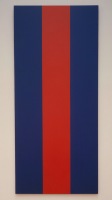
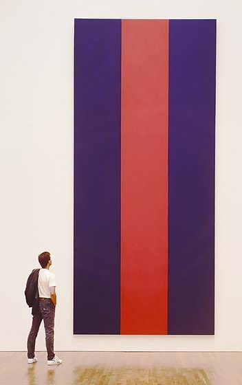
 When it was publicly announced in March 1990 that the National Gallery of Canada had purchased Barnett Newman's 1967 painting, Voice of Fire for $1.8 million (Canadian), there was an immediate press and political uproar that so much public money would be spent on what seemed like so little. A conservative MP, who was also a pig farmer, challenged that anyone with "a couple of cans of paint, a roller, and ten minutes" could make Newman's 18-ft tall bands of red and blue.
Greenhouse owner and house painter John Czupryniak's wife Joan, upon seeing the news reports, told him, "Hey, anyone could paint this, even a painter." And so he did.
Mr. Czupryniak studied reproductions of Voice of Fire and because he was unfamiliar with canvas painting techniques, he built up a 16x8 panel of plywood, and made a full-scale replica of Newman's work. He struggled with the title before arriving at Voice of the Taxpayer.
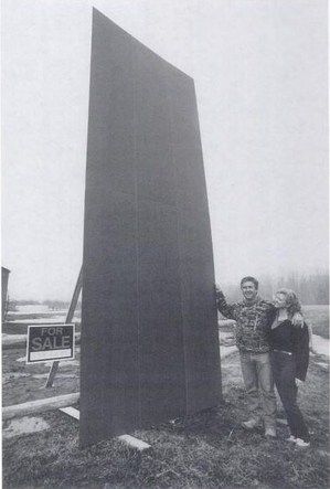
Then he offered it for sale. The government price was $1.8 million. For you, though, or any Pierre off the street, it was just $400, the cost of time and materials. Almost immediately, Voice of the Taxpayer became part of the art controversy. The picture of the Czupryniaks posing with the [for sale] painting was published in The Ottawa Citizen.
In the art world's critical self-examination of the Voice of Fire controversy, noted art historian Thierry du Duve published an essay, "Vox Ignis, Vox Populi," in the Montreal art journal Parachute which focused on Mr. Czupryniak's response. It is awesome:
Like many avant-garde painters, Czupryniak paints against. A transgressive gesture along the lines of Dadaism, Voice of the Taxpayer assumes its full significance only in diametrical opposition to the tradition it attacks. A postmodern parody of modernism's celebrated flatness, Voice of the Taxpayer is a quote, a pastich that appropriates the work of another, empties it of its meaning, and presents itself as a critique of 'the originality of the avant-garde and other modernist myths.' Better still, in its abstract guise Voice of the Taxpayer is a real allegory of the art world as institution, neither more nor less than Courbet's L'Atelier du peintre. Is it a bad painting? No it is bad painting, if you get the difference.
It is actually a subtle and refined conceptual piece whose feigned innocence makes the emperor's new clothes visible to all. The "indispensable vulgarity' (Duchamp) of its title provokes the return of the repressed of the sole 'convention' that modernism forgot to deconstruct, the money of the people on whose back the elite builds its culture. In short, Czupryniak has got it all: he is more provocative than Rodchenko, more sarcastic than Manzoni, more strategic than Buren, more political than Haacke, more nationalist than Broodthaers, more demagogical than Koons, more neo-geo than Taaffe, all this with Duchamp's caustic humour, and sincere to boot!
It is an epic of art criticism. Or maybe Parachute was punked by the theorist's smartalecky brother, Jerry du Duve, I can't quite tell. Whichever du Duve, he, too, expressed his doubts:
The critical interpretation of his Voice of the Taxpayer which I gave above is perfectly plausible, and that's what worries me. A perverse and cynical art historian, I would have appropriated Czupryniak just as he appropriated Voice fo Fire. I would have taken a painter and made him into an artist, an 'artist in general." But I am not interested in defining an artist in this way.
Oh wait, never mind! Du Duve suddenly flips ["I only played at being cynical to show you how absurd it is."] and makes an argument for
Voice of the Taxpayer based not in cynicism, but in sincerity. Czupryniak "emulated Newman by simulating him just as Newman had emulated Mondrian by painting against him." In fact,
Voice of the Taxpayer embodies what du Duve calls "the fundamental
ethical meaning of the 'reductive'
aesthetic governing
Voice of Fire, as well as
all great modern painting" [italics in the original, bold added because, holy smokes!]: painting that demonstrates its true universality precisely
because "anyone can paint this, even a painter."
 Du Duve then considers at great length how Mr. Czupryniak's pricing scheme deftly maps out the incongruities between artist and painter, value and worth, elites and the public, boss and laborer, exploiter and exploited. Every dollar between $401 and $1.8 million, he writes, accrues to Newman's status as an artist as perceived by the cultural elites--and as extracted by them for their own aesthetic pleasure from the unappreciative public [the Taxpayers] who got stuck with the tab.
I'm surprised du Duve doesn't mention it, because I can't stop marveling at how Mr. Czupryniak's project maps so closely with Newman's and the creation of Voice of Fire.
Newman, a celebrated artist was invited by his government, to make a work almost to spec, for which he received $423.60 to cover the cost of materials. But not his labor. Instead, his contract with the USIA guaranteed him full control over the painting's "equity," which his wife went on to monetize rather successfully. I guess we should add Voice of the Shareholder to the chorus.
What is the fate of Mr. Czupryniak's historically important masterpiece? Did he sell it? Did he keep it? Does it still exist, perhaps turned into a red and blue storage cabinet in the nursery? In 20 years, no one seems to have asked, so I have put in a call to find out. Stay tuned.
Thierry du Duve's "Vox Ignis, Vox Populi" was reprinted in the 1996 anthology, Voices of Fire: art, rage, power, and the state. Buy it from Amazon, or try to read the essay in Google Books' preview mode.
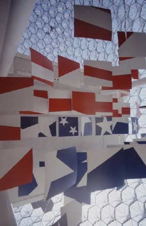
[image right of Ivan Chermayeff's Newmanesque flag panels in Buckminster Fuller's US Pavilion at Expo67: Mark Kauffmann for LIFE]


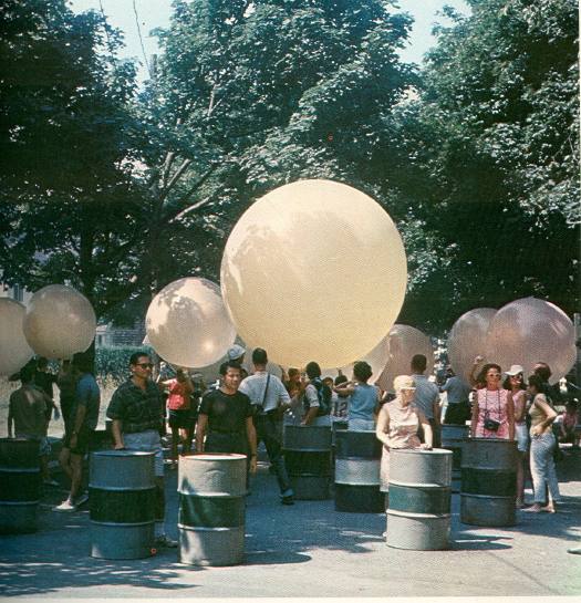
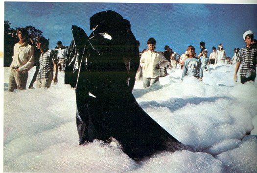
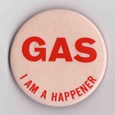 Someone was barking through a megaphone: "Keep moving . . . not too fast . . . don't look at the cameras. . . ." We were told to move deeper into the sandy pit, slowly, toward a group of people wearing black plastic capes at the bottom of the slope. We wore pink buttons that read "GAS -- I'm a Happener" and blew whistles as we marched downward. Stacks of multicolored oil drums were pushed from a ledge, and we were told to roll them back up the slope through the sea of firefighting foam.

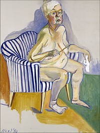 I watched the documentary Alice Neel last night, made in 2007 by the late artist's grandson Andrew Neel. It's pretty good, definitely worth a watch. Documentaries by family members come with a whole set of conflicts and challenges baked in, but Neel succeeds, I think, at identifying the craters and unexploded mines as he maps out the family's emotional landscape.
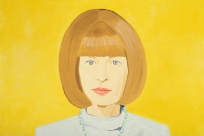
 Speaking of National Gallery of Canada upheavals, Walrus Magazine, late-career post-minimalist kitsch, and Blake Gopnik:

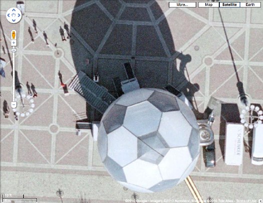
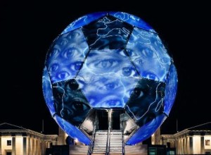
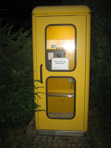 I've been trying for months to figure out the designer of what I think is one of the slickest phone booths around, the

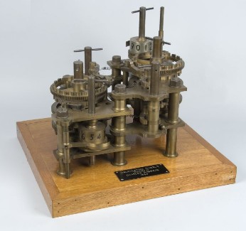
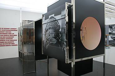
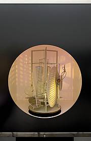
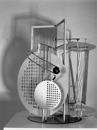
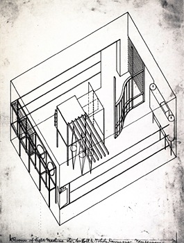 In addition to being the subject of his film and photographic work, Laszlo Moholy-Nagy's Light Space Modulator modulated light and space as a sculptural installation, and it served as a Light Prop for an Electric Stage. But in 1930, the artist had also planned on installing it at the Hannover Provincial Museum.
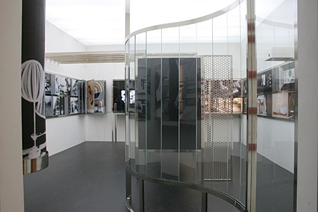


