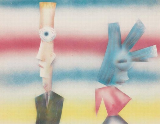
![]()
"Our lives are spent trying to pixellate a fractal planet." - A. King in Society. [via mathowie]
March 31, 2011
![]()
"Our lives are spent trying to pixellate a fractal planet." - A. King in Society. [via mathowie]
March 31, 2011
As I have tried to make sense of the Cariou v. Prince decision, to figure out how Judge Batts found it so easy to dismiss Prince's detailed explanation of his transformative ideas and process, I can come up with two possible rationales.
One is the distinction absolutely no one except Prince--Cariou, the judge all the lawyers, including Prince's and Gagosian's--makes between photographs and images, reproductions in a book. It's one of Prince's consistencies that reveals itself throughout his deposition and affidavit. [Always be selling!]
And it's a point that Joy Garnett makes very cogently in her editorial in artnet which looks at the difference between mass produced images and fine art objects.
The very existence of Prince's "Canal Zone" series is apparently now in peril, in part because no one seems to be able to tell the difference between a painting, which is a one-of-a-kind object, and a photograph, which is by definition mass-producible.
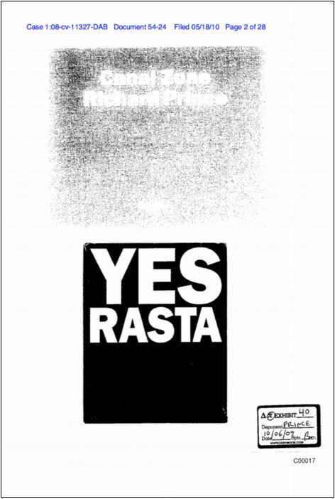
The other distortion I see is scale. Patrick Cariou and his lawyers prepared an exhibit [it's in the book, $25 hardcover, $16 paperback!] detailing all the Yes Rasta images Prince used, in whole or in part, as source material in his paintings.
Photocopied side by side, the book pages and paintings can seem remarkably similar, even interchangeable. The comparison images that Cariou and friends released to the press are even more persuasive. But if this isn't technically deceptive, it certainly obscures the scope of Prince's transformations.
Cariou's book is 10x12 inches. Prince's paintings are 6-12 feet. Graduation, the painting made by altering the coloring of Cariou's image, reprinting it, painting and collaging it, rescanning it, cropping it, inkjet printing it onto canvas, and then overpainting and collaging it again, is 5x6 feet. A more accurate side-by-side comparison would look like this:
These details of size, color, cropping, and format might seem like minutiae. But they are also exactly the kind of transformational changes cited by the judge in Blanch v. Koons. More importantly, they map directly to the decisions Cariou used to describe his own creative process--and they were also cited by the judge in declaring Cariou's work "highly original."
Maybe if the judge had compared object to object instead of image to image, she might have found Prince's efforts a little more worthy of copyright consideration. In their filings, Prince and his lawyers repeatedly invited the judge to view the paintings themselves, either in Prince's studio, or in a gallery or other space in town. It does not appear that this happened. But maybe she looked at Cariou's exhibit, and figured she didn't need to see anymore.
March 31, 2011
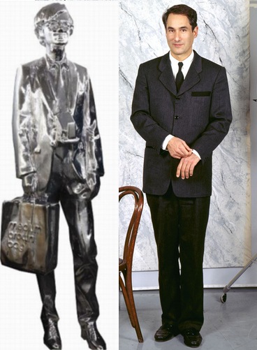
We know that Rob Pruitt made the chromed fiberglass figure for The Andy Monument by bodyscanning his friend and collector, the Cincinnati former car dealer Andy Stillpass.
But am I the only one who thinks the sculpture's face, too, looks more like Stillpass than Warhol?
And it IS called The Andy Monument, not The Warhol Monument.
Anyway, that is awesome. Or as Andy [Warhol] would've said, That's so great! Andy deserves it!
Stillpass image on right: modeling his Andrea Zittel Uniform, 1993 like I said, awesome. [zittel.org]
Ah, the memories. It was A year ago today that I began searching for a Richard Neutra house that was supposedly built in Utah, a hunting lodge commissioned by a Neutra client in Los Angeles, but which had never been identified or documented.
After charging me $10 for the same one-line info I had already found a half dozen places online, I gave up on the Neutra family/office. Who also wanted me to sign over, for free, all the copyrights for any photos I may eventually take of the house, should I ever actually find it.
Cold-calling the organization that preserves Utah's historic buildings and architecture for information about the only Neutra house in the state, I was asked by more than one person if this was an April Fool's prank.
Anyway, since finding, visiting, and publishing the house last year, well, not much, really. That's fine.
March 31, 2011
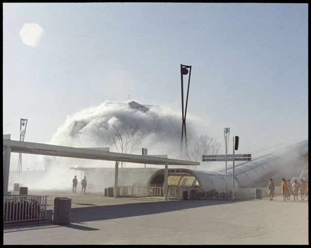
I may be too late to see the Getty Research Institute's exhibit on postwar Japanese art, but I think it's also past time I hotfoot it out there and start digging through the E.A.T. archives.
If there are more photos like this of Fujiko Nakaya's fog sculpture at E.A.T.'s Pepsi Pavilion at the Osaka '70 expo, I should be booking my study carrel right now.
Pepsi Pavilion with Fog Sculpture, Japan World Exposition '70 [getty.edu]
I guess if you think about it, archivists really wouldn't think it's exciting, or even that amusing, when you tell a story that wrongly makes it sound like they've been taking smoke breaks for 25 years, leaving their random blogger patrons to discover lost art treasures under their noses.
But that is apparently how my post a couple of weeks ago about opening an unprocessed box of archival material from the Alan Solomon papers sounded to Barbara Aiken, the Chief of Collections Processing at the Smithsonian's Archives of American Art.
Fortunately, she was kind enough to correct my errors, chief among which is the implication that the box I found some Jim Dine drawings in had not, in fact, been sitting unprocessed in the Archive for 25+ years; it only came in in 2007, and they are, in fact, getting to it.
On this error and the larger issues of archive processing and of artworks inside the archives, Ms. Aiken graciously sets me aright, and for that I thank her and her most professional, capable colleagues.
Previously: from the mixed up files of basically everyone [except the people who leave their papers to the AAA, where they are very well looked after and made accessible]
Before I talk about Microworld, the 1976 industrial film made for AT&T by Owen Murphy Productions, let me just state the obvious, and get it out of the way:
We are long, long overdue for a comprehensive, scholarly retrospective of William Shatner's spoken word pieces. The mandarins who keep our cultural gates should not be able to just drop a masterpiece in our laps on their own whim, not we who have known "Lucy In The Sky With Diamonds" for decades. I give you three months, and if I don't see any movement, I'm taking the curatorial matters into my own hands.
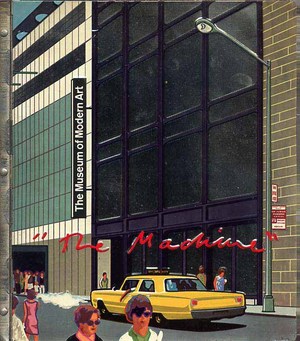
OK. Microworld. Holy crap, who made this thing? Owen Murphy Productions, who made several other films for Bell Labs over the years, including Incredible Machine (1968) which screened as part of the film program [PDF] at "The Machine As Seen At The End Of The Mechanical Age," Pontus Hulten's 1968 exhibit at The Museum of Modern Art. [that's the show with the exhibition catalogue with the crazy, stamped metal cover.] Owen Murphy probably needs his/their own retrospective, too.
[11/2011 UPDATE: Thanks to Robin Edgerton, who has been working on the AT&T film archive, for pointing out that the correct title was Incredible Machine, not The Machine, as MoMA's press release had it. You can watch Incredible Machine online.]
That will give us a chance to appreciate the backlit photomurals
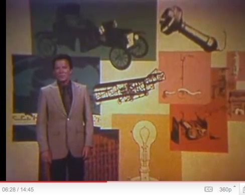
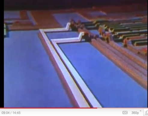
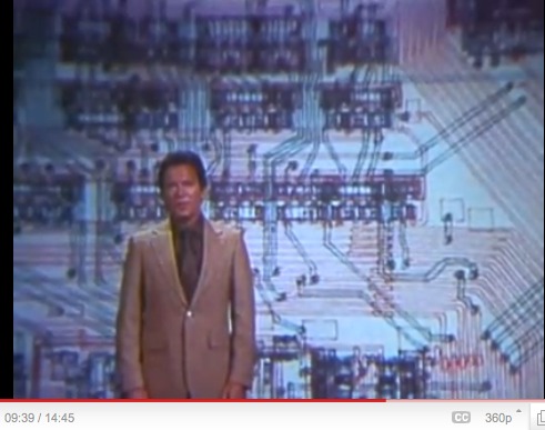
and the rather incredible prop circuitboard dioramas. [I left the timestamps in for easy reference.]
Shatner marvels for us at the minute intricacy of circuitboards reduced to eye-of-a-needle-sized microchips. Microchips which are apparently still designed in large-format, paper schematics.
Which are drawn. With a pen. By a [computer? punch card? stencil?] controlled mechanical printer.
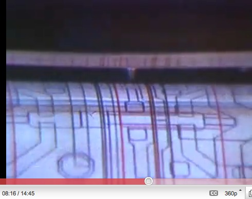
Holy crap, people, this is a drawing.

Turned into a backlit transparency, but whatever. A DRAWING.
Jean Tinguely's Metamatics drawing machines, we know. Olafur Eliasson's studio folks set up that acoustic drawing machine at Tanya's in 2008. [Wasn't there also a thing with pulleys that drew on the wall? Who was that?]
Anyway, just saying, there are--or were--amazing drawing machines creating amazing, massive drawings, in the service of America's most advanced scientists and engineers--who apparently didn't bother keeping them? Where are they? What are/were they? Do any survive? What else could they be used for? I think I must find the answers to these questions.
UPDATE: ASKED AND BEGINNING TO BE ANSWERED
Thanks to Beau [aka @avianism], who points me to pen plotters and their adaptation and creative deployment, apparently in the last few years, by artists such as Douglas Repetto, whose drawing below, is part of the chiplotle group on flickr.
Chiplotle is a Python library created by Repetto and Victor Adan at the Columbia University Computer Music Center which allows you to code for and operate pen plotters from a laptop. The future of the past is here.
UPDATE UPDATE And whaddya know, via @johnpyper, there is a show of the Spalter Collection of computer code-generated art right now at the deCordova in Lincoln, MA, which includes, of course, Stan VanDerBeek, who worked on early animation and computer graphics languages at Bell Labs.
March 28, 2011
When I saw it on Matt Connors' blog, I realized I've never seen the 1985 music video for Culture Club's "The War Song," but it's amazing for how familiar it feels.
Not the particular specter of war, of course; it's worth remembering that the nuclear disaster we lived in fear of back then was quite different.
I mean the kind of dramatic, operatic style of the video itself. It FEELS like 80's MTV. And no wonder. Turns out "The War Song" was directed by Russell Mulcahy, who is basically the Orson Welles and John Ford of MTV's Golden Age. Not only did Mulcahy direct the first video ever shown on MTV, The Buggles' "Video Killed The Radio Star." He made two of Duran Duran's three greatest videos--"Hungry Like The Wolf" and "Rio." [The 1981 video "Girls on Film" was made by Godley & Creme.] Spandau Ballet's "True." Billy Joel's "Allentown." Kim Carnes' "Bette Davis Eyes." And on and on.
Holy smokes, in between Culture Club and Falco, he directed the original Highlander, too.
March 28, 2011
Enough Prince! Let's talk about someone else! Richard Serra, for example.
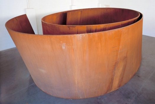
Bellamy, 2001, Richard Serra, image via gagosian.com
Did you know--I did not, which is why I am kind of fascinated to mention it here--that one of Richard Serra's early torqued spiral sculptures, Bellamy, from 2001, was traded for...for three Richard Prince Canal Zone paintings?
March 28, 2011
Thanks for the support and feedback on the Canal Zone Richard Prince YES RASTA: Selected Court Documents &c., &c. book. [updated link info below]
Some folks who ordered the electronic version--the first to get the compilation in their hands, since the print editions take a few days to arrive--have emailed wondering where "the rest" of Richard Prince's deposition transcript is, because there are gaps and missing pages.
That's exactly right, and it's why I decided to make this thing in the first place. As far as I can tell, the entire 378-page transcript of the 7-hour deposition was not entered into the court record, only the excerpts that pertained to quotes or points referenced in the two sides' various legal motions. As I was reading those scattered snippets in various places in the court record, I realized it would be more useful to have a single compilation of all Prince's testimony. And it'd be easier if it was in order. So I took apart the pdfs and sorted the pages, then interlaced the other exhibits [i.e., images from Cariou's book and Prince's show and catalogue] as they came up in the course of testimony.
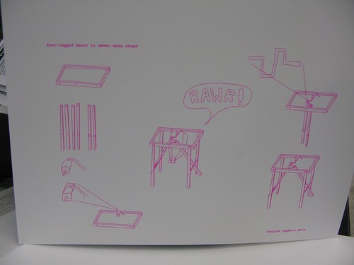
Here are a couple of sample spreads taken from my original [sic, heh] pdf. There are about 250 of these transcript pages in total, four per printed/pdf page.
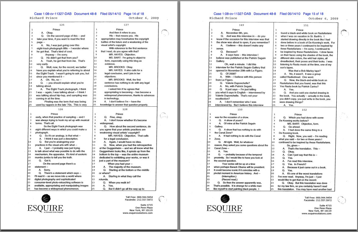
pp. 125-8, 149-152
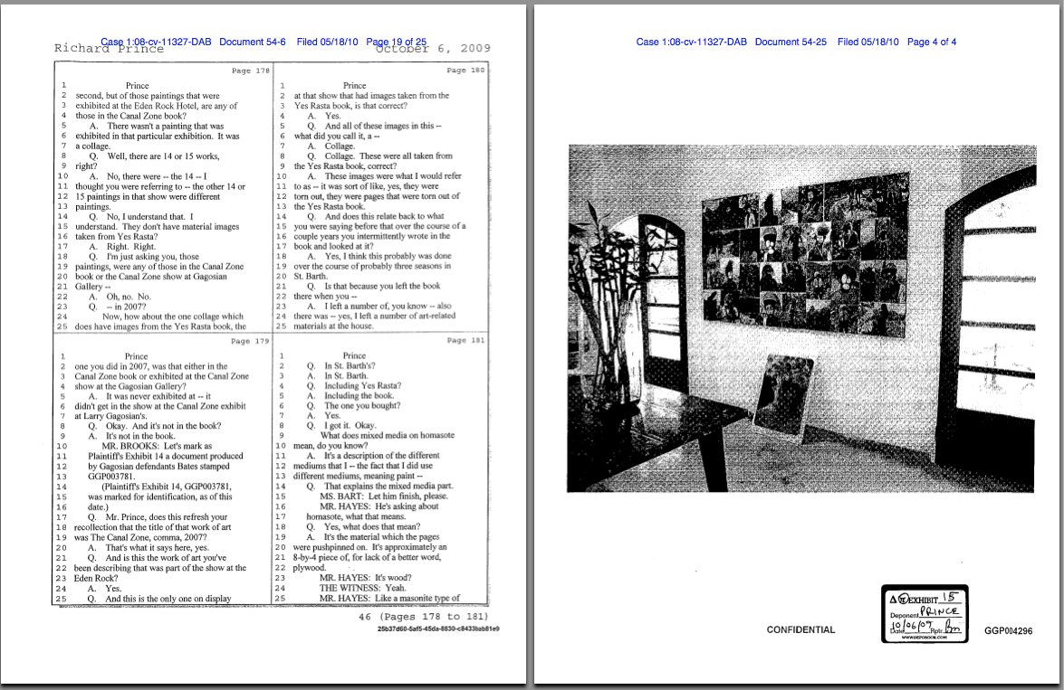
pp. 178-181 and Exhibit 15, installation shot at the Eden Rock Hotel, St. Barth's
APR 2011 UPDATE: Here is the link to buy the new, expanded edition, which includes Prince's entire deposition transcript--an additional 101 pages--plus other key legal documents. It's a new printer, and the finish of the book is nicer, I think.
March 26, 2011
from greg.org: Canal Zone Richard Prince YES RASTA: Selected Court Documents, &c., &c. in
hardcover, 290pp. $24.99 [updated link info below]
Because really, why not?
It's always bugged me when I read a news story about a legal case, or a scientific report, and there's no link to the original source material. And since I've been quoting from them a lot lately, I have been fielding a lot of requests for copies of the court filings and transcripts in the Patrick Cariou vs. Richard Prince & Gagosian case.
It was yesterday afternoon, though, when I was sending my fourth email [or eighth, since the attachments are so big] that I realized Richard Prince's deposition is not only the longest interview he's ever given, it's probably the longest interview he'll ever give. [Go ahead, Hans Ulrich, you just try!]
I mean, seriously, the guy talked for seven hours. Under oath. In insane detail about his work, process, and ideas. Granted, he was being grilled by a guy whose art ignorance is only surpassed by his obvious contempt for Prince, a lawyer who can't tell a photograph from a painting from a reproduction in a book. But still, he got Prince talking.
And Prince was surprisingly [to me, anyway] and admirably consistent and credible, at least in terms of his work. Yeah, it's a nice bit of fact-checking trivia to strip away the coy mystery crap that surrounded his Guggenheim retrospective: Prince testified that he is Prince, and that he did live in the Panama Canal Zone, but only as a very young child.
But I found his explanation of his early formative inspirations, particularly Warhol and punk rock, to be both relevant and sincere. The deskilling argument that you could pick up a guitar for the first time, and by the end of the week, go up on stage and perform, with visceral effect, sounds real to me. It makes sense, at least in its own context [and in my own high school experience.]

The cover of the paperback edition includes the full title. 290pp 376pp, $17.99
Anyway, Prince's entire deposition transcript has not been released [update: it has now; see below], but a patchwork of 250 or so pages out of about 375 were attached as supporting documents to various filings and motions in the case. So I sifted through and pulled them all out, and then placed them in numerical order. There are a lot of gaps, of course, and legalistic joustings, but there's a lot of information, too.
Combined with his 28-page affidavit, it really is the most extensive discussion of his work, practice and biography I've ever seen Prince make. The fact that it's all coming out in the context of a copyright infringement lawsuit is really too perfect to pass up.
Into this I wove the major documents and exhibits Cariou's lawyers discussed with Prince: all the Canal Zone series paintings; installation shots from the Eden Rock hotel in St. Barth's; Prince's "Eden Rock Pitch," a rough movie treatment whose characters and story fed into the paintings; and Cariou's extensive visual comparison of Prince's Canal Zone paintings and the YES RASTA images that ended up in them.
And for good measure, I added both sides' memoranda, where they make their fullest legal arguments for their fair use/transformative use and copyright infringement positions. And of course, I included Judge Batts' ass-whooping of a ruling.
In all, 290 pages, all taken--appropriated, one could say--from the court record, but organized into a clearer, more readable format. And with a focus, not on an exhaustively documenting the case itself, but on Prince and his work.
If you were to download all of this material from pacer.gov, it's run you upwards of $24 [$0.08/page]. And then you'd still have to sort it all out. For that money, I thought, you could have a nicely printed book. And so that's what I did.
There are hardcover and paperback editions, and electronic copies, too, which I haven't tested yet. I'm still tinkering with the cover design. Both versions are included inside the book, as frontispieces or title pages or whatever, but right now, the b/w cover cover is on the hardcover, and the red, made-with-Preview's-default-annotation-settings version is on the softcover.
This is definitely an experiment, so any and all feedback is welcome. But if you're looking for the perfect book to take to spring break, or to class up your summer share, then you have come to the right place. Enjoy!
Buy your own copy of Canal Zone Richard Prince YES RASTA: Selected Court Documents, &c., &c. in or in paperback [$17.99]. [createspace.com]
hardcover [$24.99]
APR 2011 UPDATE: OK, the response to this book really caught me off guard, so I've done some more work on it. The new, expanded edition now includes Prince's entire deposition transcript, an additional 101 pages of testimony not previously released publicly, and several additional key legal documents from each side. In addition, while lulu.com was a quick and decent way to release a book almost instantly, I decided to switch to a higher quality printer for the new edition. The facsimile pages are a little smaller, which I'm still working on, but the quality of the book is noticeably higher. It now clocks in at 376 pages, for $17.99.
March 26, 2011
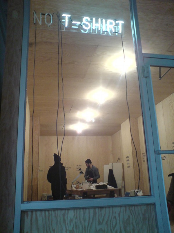
Has it already been two weeks since I went to Rirkrit's show at Gavin Brown? Sheesh. Despite being there on a Thursday, there was no soup, but there were T-shirts. Nick was cranking them out, and I wanted to get one.
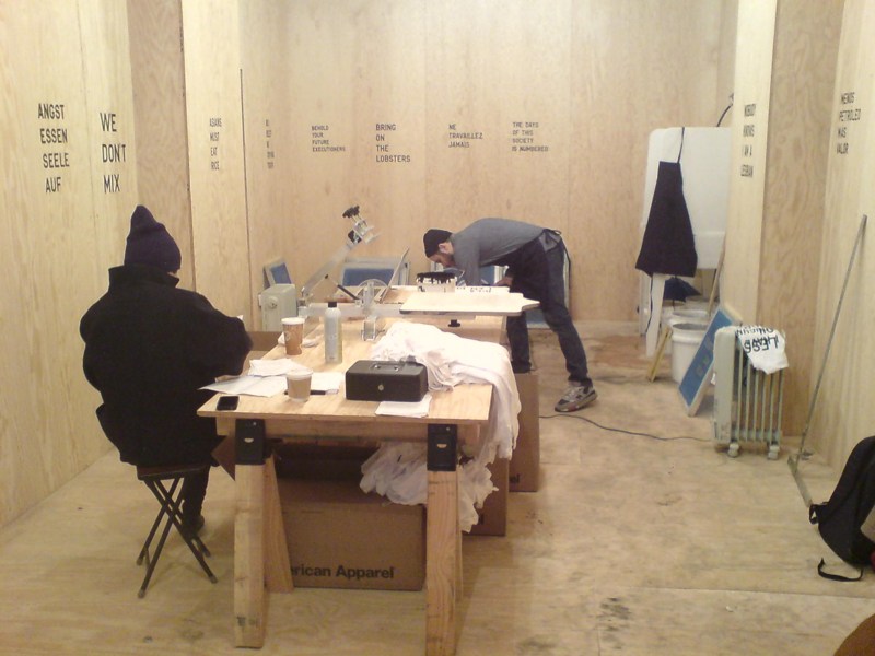
But I was stymied, couldn't decide which of the 24 different sayings I wanted. And since they didn't have my size anyway [XL, just one X, thank you], I knew I wasn't ever going to wear it, so. So I got them all. Which Nick thought was amusing. Apparently hadn't happened before. He gamely offered to crank them out while I talked to Gavin, but we decided it'd be easier to just pick them up later.
Or ship them, since he also still had a stack of orders from the opening. And then I went out of town, and I'm all, maybe I should send a couple of my goons over to the gallery and have them throw the shirts in the back of Gavin's car and hotfoot them over to me.
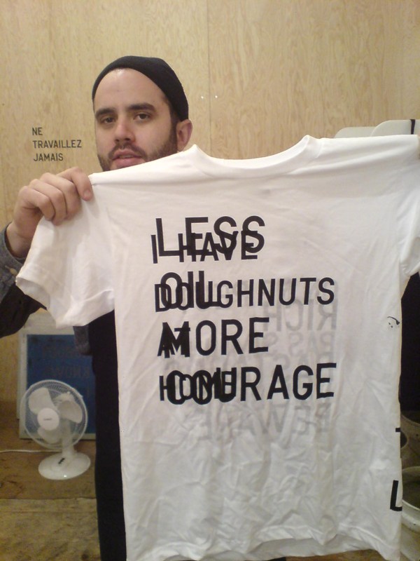
Maybe I'd tell them to only give the car back if they threw in a couple of the test shirts and rejects. Less Doughnuts More Courage. I Have Oil At Home.
March 24, 2011
What with all this Prince in my head, I start seeing and reading and remembering things in relation to the Canal Zone case. For instance:
In conjuring up a meaning for Richard Prince's Canal Zone work that fit the crime she was convicting him of, Judge Batts cited part of a 1978 essay on Appropriation Prince wrote, which he was asked about in his deposition. 1978!
I feel that I like to get as much fact into my work and reduce the amount of speculation. I believe there's too much--I like an artwork where that when you see something, like a cowboy or a girlfriend, I mean these are, in fact, true.Batts decided that this meant Prince appropriated Patrick Cariou's photos because he was trying to convey the same "core truths" about Rastafarianism as Cariou. But it actually made me think of a quote from Greg Foster-Rice's essay in his just-released anthology, Reframing the New Topographics, where he discussed the influential early 70s photography show in terms of systems theory, and in particular the system of photography itself:
Photographs, in other words, are distinct from other forms of representation in that their connoted messages are built upon a widely held belief in the medium's denotative status as an almost perfect copy of the real.I have to say, I really hated Canal Zone when I first saw it, but the more I study and think about it, I'm coming around. In one sense. Prince was making paintings about photography, and about the different expectations of truth and subjectivity, fact and fiction, each medium embodies. Which is nice.
Then there's the kicker from Steven Stern's review of Spiritual America: The Guggenheim Retrospective in Frieze:
Perhaps the key joke for the retrospective is one that appeared in several different paintings: 'Man walking out of a house of questionable repute, muttered to himself, "Man, that's what I call a business ... you got it, you sell it, you still got it".' A museum is, after all, a house meant to settle questions of repute. And this particular museum exhibition was, among other things, a comment on Prince's clearly impressive 'business'. Like the one described in the joke, this industry depends on a seemingly magical economy: the slippery way that things that aren't exactly objects - such as images and sex - get valued. Prince is a connoisseur of such economies. For better or worse, no matter how much he's sold, he's still got it.That is just awesome.
And last but certainly not least, is Pablo Picasso, who Prince cited repeatedly as a model and an inspiration for his work. This quote is from an awesomely forthright talk Frances Stark gave at Mandrake Bar in LA in December 2009 as part of the Contra Mundum series. Ro/Lu, you're off the hook, but the rest of you out there, are in deep trouble for not telling me about the published version of Contra Mundum I-VII. I'm the big man, need the info. Anyway, Picasso:
"But of what use is it to say what we do when everybody can see it if he wants to?"
Paddy and her commenters have already done a pretty good job sorting through the decision in the Cariou vs. Prince & Gagosian case, and there are other folks out there with far more expertise and time than I who are also weighing in.
And while I still think this case is really troublesome for the whole fair use ecosystem as it applies to the art world--or more specifically, to artistic practice--that effect may not be lasting or widespread. Fair use and transformative work are still messy, ambiguous principles, almost by design, and artists are gonna do what artists have to do. And really, Judge Batts' decision is so poorly constructed, and ignores or misconstrues so many basic facts of the case, that it can't hold up to the inevitable, coming scrutiny, much less serve as any kind of practical impact going forward.
Still, it's so awful, I can't let it go without calling out a few of the most egregious passages, arguments, and errors. So here goes.
1) Cariou's Photos Are Copyrighted. NO $#%ing DUH.
This is the first section of Judge Batts' decision, and it has gotten a lot of media mention from the skimming crowd, even though it seems utterly and entirely irrelevant to anything at all. [p.10]:
Cariou's ownership of a valid copyright in the Photos is undisputed. However, Defendants assert that Cariou's Photos are mere compilations of facts concerning Rastafarians and the Jamaican landscape, arranged with minimum creativity in a manner typical of their genre, and that the Photos are therefore not protectable as a matter of law, despite Plaintiff's extensive testimony about the creative choices he made in taking, processing, developing, and selecting them.I have looked, and I cannot find any documents where Defendants actually made this ridiculous claim that Cariou's photos--arty, black & white, published in a book--are not copyrightable. It's like the stupidest tumblr excuse ever [I found this image on the Internet, so it must be public domain!], not the argument the copyright lawyer for the most powerful art dealer in the world would make. Why is this even in here?Unfortunately for Defendants, it has been a matter of settled law for well over one hundred years that creative photographs are worthy of copyright protection, even when they depict real people and natural environments.

Look, the closest argument/evidence I could find is an exhibit [Doc. 61-1] rounding up dozens of Google Image searches for Rastas and Jamaican jungles and ganja tours, but that was to counter Cariou's inference that the only way to take pictures of Rastas is to do what he did, and live with them for ten years. [Which, according to his deposition, it turns out he didn't do, But whatever.]
Wow, is it really 12:30? I've gotta get some sleep. OK, we're back. And what follows is, by any measure, too long.
March 23, 2011
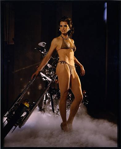
Holy smokes, Richard Prince, Patrick Cariou, Larry Gagosian, Judge Batts, Bob Marley, Richard Serra [! I know, right?], Brooke Shields, $18 million in artwork, the fate of appropriation, the implosion of the gallery system, copyright apocalypse, there's so much mayhem to discuss, where to start?
Let me cut to the chase here, and focus on the single most important takeaway of the Cariou v. Prince & Gagosian Canal Zone case: he won't be suing me.
During a deposition, Cariou's lawyer Daniel Brooks asks Prince about his 2005 work Spiritual America IV [above], for which he appropriated Sante d'Orazio's photo of an adult Brooke Shields re-staging the 1975 Gary Gross photo of a 10-year-old Shields which Prince rephotographed and showed in 1983, in a temporary storefront gallery he rented on the Lower East Side and called Spiritual America:
March 22, 2011
Holy crap, I go away for a long weekend, and what happens?
The death toll in Japan doubles,
The number of meltdowns triples [or something],
We are at war in Libya,
The Death Star has the T-Mobile rebellion caught in a tractor beam,
and Richard Prince somehow lost his open & shut copyright infringement case.
I totally did not see that one coming.
UPDATE: OK, I've read through a bunch of the motions, affidavits, and depositions, and the decision [pdf here via aphotoeditor.com], which is basically a flabbergasting shitshow. I'll probably write a bit more specifically later today, but if it stands, it would have major, sweeping, and stifling effects.
Not only would the current operating assumptions of fair use and transformative use be ratcheted way back, but the contemporary art world would be turned upside down. It would restrict both how artists appropriate, or even refer to, copyrighted work. And it would turn galleries into copyright police, with an affirmative responsibility to clear images, sources, and references for the work they show and sell.
If visual artists and the art market have been operating in some kind of an appropriation bubble, this decision would pop it. Artists would have to adopt the sampling, licensing, and rights clearing practices and infrastructures of the music industry, or the entertainment industry.
But the decision has some glaring omissions and relies rather heavily on almost-20-year-old textbooks and articles from law journals, while ignoring several highly relevant, recent decisions. The most notable ignored precedent is Blanch vs. Koons (2006), which happens to involve another Gagosian artist, and which seemed to set out a workable test of transformative use.
From reading the case materials, including Prince's detailed descriptions of the making of each of the 29 Canal Zone paintings, it seems obvious to me that Prince and Gagosian were operating under the transformative work/fair use assumptions of Blanch, where changes in scale, medium, context, and color, along with process, editing, collaging, or other process-related elements, are used to identify a transformative work. Judge Batts doesn't even address process, or any relevance of Blanch to the transformativeness; instead, she makes a blanket assumption that all 29 Prince paintings are infringing because they include Cariou's Rasta images in some way. It's really an eye-popping and untenable conclusion.
At the least, the fact that Gagosian the man and Gagosian the gallery were found equally liable for infringing, I am almost certain that this decision won't go unchallenged. In a series of truly amazing statements, the most shocking is Batt's cursory finding that Prince, Gagosian, and the gallery all acted in bad faith by not proactively pursuing permission from Cariou to use his images. In other words, operating under the assumption that an artist enjoys a fair use exemption to use or reference a copyrighted element, or that an artist is using copyrighted material in a transformative way, is, on its face, bad faith.
With upwards of $20 million in artwork and unspecified but certain punitive damages pertaining to bad faith actions on the line, there is NO way that Gagosian will let this decision stand.
On the other hand, the photographer crowd is jumping up and down with schadenfreudian glee. [Zaretsky's rounding up more reactions at The Art Law Blog]
March 16, 2011
NYT Mag staffer Aaron Retica posted some childhood recollections from Akira Kurosawa of the horrible aftermath of the 1923 Kanto Earthquake, and the xenophobic hysteria that followed.
It makes me wonder, though, if Kurosawa ever spoke about his decision not to depict the earthquake in film.
March 16, 2011
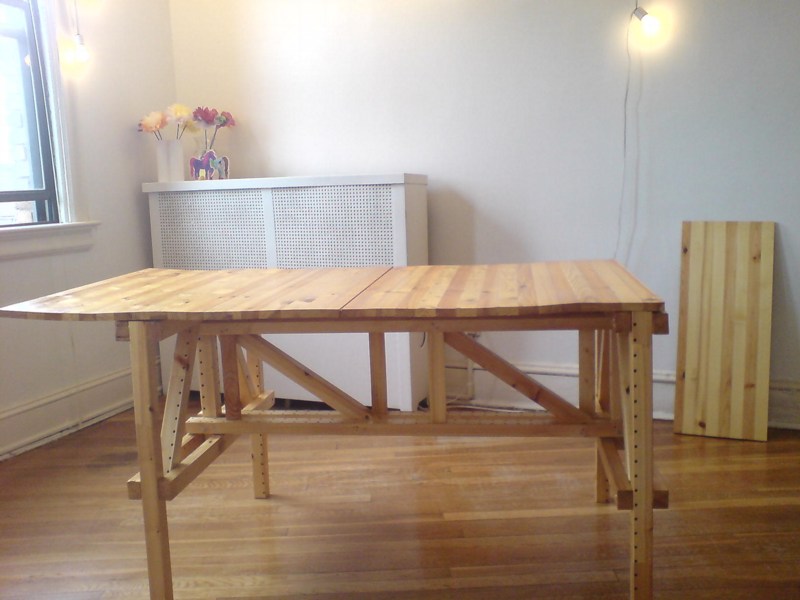
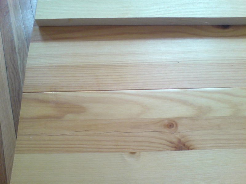
So I guess you could argue--and you wouldn't be completely wrong--that no matter how many coats of hand-rubbed varnish it has, no matter how carefully calculated its design, or how flush its finishing nails, how stainless its many steel screws, a dining table which a six-year-old girl can snap apart like a pair of ramen truck chopsticks cannot, in the end, truly be considered a success.
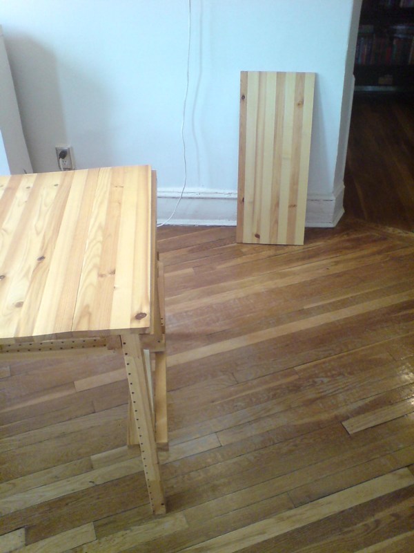
But anyway, it's not worth arguing, because that's what happened the other day. And it's not important or even relevant to discuss exactly how it happened, or who did it. Because obviously, it's my fault. In fact, if the Enzo Mari X IKEA autoprogettazione table survived a day in our house, it's only because our family and regular visitors were living in fear, subjected to a constant, low-level psy ops campaign of tense looks and warnings, with suspected leaners getting regularly guided toward the table's side seats and away from the cantilevered ends.
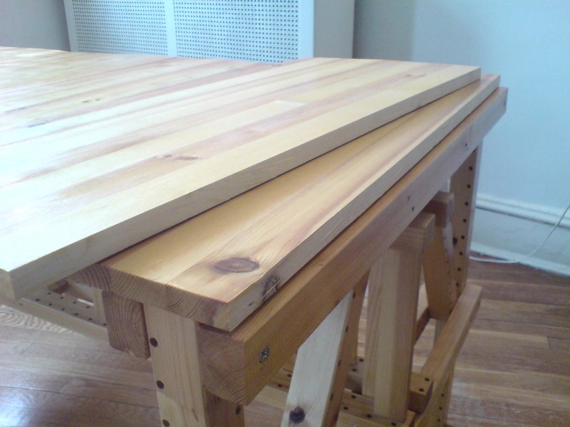
Because the top clearly broke on Ikea's butt joint, and not my own is of little comfort; it broke where the fulcrum was--the base. I knew it would/could happen when I decided to make my table top from horizontally built up Ivar shelving instead of the other two options I had: 1) tracking down the original, 200cm long Ivar shelves that had just been discontinued when construction began, or 2) using the thick, pine slab head and footboards from a king-size Mandal bed. The former, I nixed because I decided that building a table from discontinued Ikea parts might hinder the vast revolution in autoprogettazione-inspired Ikea hacking that would surely follow the debut of my project. The latter, well, the bed frame came already finished, and that felt a little like cheating.
Now, of course, with a card-table sized dining table, I'm more than ready to compromise. But Ivar long shelves are still discontinued, and now, it turns out, so is the wood-intensive Mandal bed, which has been redesigned to use no headboard, or a weird, slatty thing you mount on the wall.
That means I'm going to need to re-create the table top as-is, and reinforce it underneath, and hope that it holds. Or I'll replace it entirely, probably with some slabs of sick, slick, ultra-deluxe 500-year-old sinker pine from the bottom of some icy river somewhere. Either way, I'll be back in the basement, varnishing something soon.
Previously: The making of an Ikea X Enzo Mari table, in many chapters
March 15, 2011
You know, I tried. I really tried, but there just are not enough hours in the day. You can all take down David Colman's John Currin & Rachel Feinstein Style section article yourselves. Lord knows everything but the headline--"Their Own Best Creations," which at least gives a nod to the existence of artifice, spin, image management, the subjective construction of the self--is ripe for the kicking.
I will say that it's the conveniently swattable straw men that bugged me the most. The specious [or is it?!] notion that "the art world" somehow punishes those artists who aspire to--or even approach--their collectors' lifestyles. When, in fact, "the art world," such as it is, is all but obsessed with art's wave/particle-like duality, its near-magical power to transform culture into capital and vice versa.
The art world has been laboring mightily for decades to accommodate and cater to the needs, desires, lifestyles, and politics of wealth-flaunters, hyper-capitalists, and consumptionists of all kinds, and it pisses me off to see all that hard work go unrecognized by the Style section, of all sections!
The idea that Currin and Feinstein's conservative political views somehow transgress anything but the feeblest cliche of liberal "art world" orthodoxies. I guess it's the notion of "an" "art world" that's so easily thwarted by John & Rachel's unabashed fabulousness that really gets me.
Such an art world is a fairy tale. There are also more art worlds, and a far greater range of political views within them, than the Style section cares to acknowledge. I can think of a dozen conservatives--even some card-carrying neo-cons--who are prominent, active participants in New York City's art scenes: artists, dealers, and curators, too, not just collectors or museum people. This heterogeneity is who "we" are, and to pretend otherwise, or to ignore these differences is willful or naive, or both.
Or maybe it's that political differences in "the art world" have long been tolerated, negotiated, or if need be, consciously set aside or even suppressed in the interests of achieving an art-related goal. And really, are there any political chasms that can't be bridged by Blanchette Rockefeller's noble response to questions of whether his years as an enthusiastic Fascist activist might preclude Philip Johnson's election as a MoMA trustee: "Every young man," she reportedly said, "should be allowed to make one very large mistake." I'm sure it works, try it at home!
As for Rachel's work, and her career, and the inevitable comparison to her husband's, how can it not be eclipsed? Is it apparently impossible to say that? But what is Rachel to do? Not show? Not make? Show under a pseudonym? Is it impossible to wonder if Rachel's career differs from John's because of her medium? Or her content? Or her concept? Or her gender? Was it "being that glamorous" that caused Feinstein to "take [her] eye off the ball" over the last few years, Jerry? Might having and raising three kids play a part? Maybe what Rachel's career is really missing is a good wife.
March 14, 2011
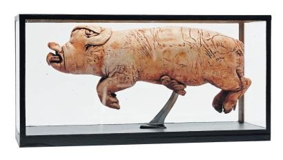
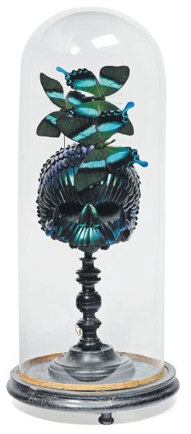
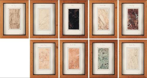
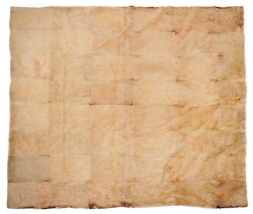
Have we considered Damien Hirst's vitrine sculptures from the Wunderkammer perspective? Because the giant grab-bag auction at Pierre Berge & Associes in Brussels is stuffed [heh] with disturbing taxidermy, eerie medical/scientific specimens, and elaborate butterfly displays. Yes, that is a butterfly skull under glass. If you're playing any Hirstian drinking games, you are now passed out on the floor.
Or have we considered Olafur Eliasson's art to be inhabiting a similar historical aesthetic trajectory?
Because seriously, put something in a bell jar, or on a tiny little display stand, and it gets immediately objectified and pretty damn near artified.

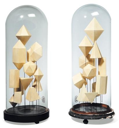
If not, then hop to it, Art History. Because right now, I'm too busy planning my show of found conceptualism and ur-Post-Minimalism:
Lot 451: a suite of 9 framed marble samples [est. EUR1300-1500]
Lot 562: a cube-shaped Oryx-skin pouf [est. EUR 300-450]
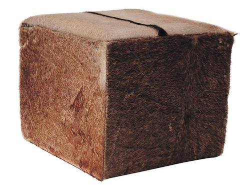
I guess it's really a pair: Lot 563: a cube-shaped boar-hide pouf [est. 300-450]
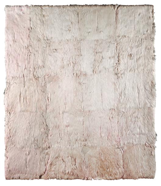
Lot 561: a large monochrome grid made of white wolf skin [est. EUR3000-5000]
I guess it's really a diptych: Lot 823: a large monochrome grid made of pink flamingo feathers [est. EUR 1500-2000]
And a couple for the back room:
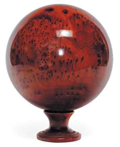
This could be bigger: Lot 504: a sphere [23cm dia.] of polished thuya root burl [est. EUR 150-200]
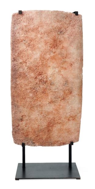
And this could be a bit less Madison Avenue, but still: Lot 576: a plaque of caravan salt from Mali [est. EUR 1200-1500] [ref. flickr]

I totally remember seeing John Cage's The First Meeting of the Erik Satie Society in the summer of 1994. An unbound version was on view at the Fuller Building on 57th Street. Susan Sheehan Gallery. It was on during Cage's phenomenal retrospective/exhibition/performance, Rolywholyover: A Circus, at the Guggenheim SoHo. [I followed that show around the country like a Phish head, from MoCA, to the Menil, the Guggenheim, to the Philadelphia Museum. The PMA show coincided with my graduation from business school, and I had a couple of weeks where I was able to go every day, and watch the museum's art handlers perform their I Ching-generated list of reinstallations. A formative experience, one of the absolutely greatest museum exhibitions ever, and probably the greatest catalogue I own. Reproductions of works, poems, and texts are packed loosely in a mirrored aluminum box. It's a good segue to the Satie Society, and 'm going to go pull it out right after I post this.]
Anyway. The Merce Cunningham Dance Company just sold a copy of The First Meeting of the Erik Satie Society at Christie's last week, and I'm a little surprised at how vague the description is. Apparently, Cage's box set of artist books, drawings and prints was supposed to be an edition of 18, or 9, but then the edition of 9 is described as unrealized, plus an "unbound" edition of 6... Sounds a bit of a mess.
The gist of the piece is that in 1992 Cage invited artists to a birthday party for the French composer who influenced him so profoundly, and the gifts are the artworks, which Cage combined with his own Satie-themed mesostic/acrostics based on writings he admired, too. It's basically an exercise of homage, inspiration, collaboration, and transformation. Folks like Johns, Rauschenberg, Sol Lewitt and Robert Ryman contributed works, and Cage used texts from the likes of Joyce, Duchamp, Thoreau and McLuhan. The whole thing came in a steel-framed, broken-glass valise, a reference to Duchamp's famously cracked Large Glass.
I'm going to guess that the version I saw was unbound, because the elements were mounted between freestanding glass panels around the gallery. So there's one. How there could be ambiguity about work produced by this constellation of major artists just a few years ago--holy crap, almost 20 years ago--is a mystery to me.
Sale 2441, Lot 177: The First Meeting of the Erik Satie Society, by John Cage, est. $90-120,000, sold for $116,000 [christies.com]
Holy crap, $500? Rolywholyover: A Circus on Amazon [amazon]
Previously: Richter's 4900 Colours and Cage's Rolywholyover via sippey
March 13, 2011
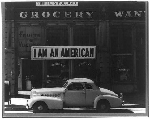
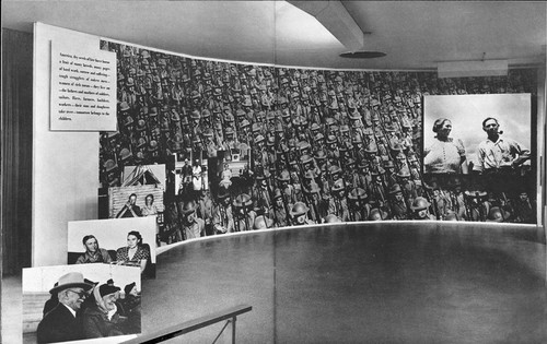
I've written and been inspired by Ansel Adams' WWII Japanese-American internment camp photos for years, but inexplicably, I haven't looked closely at Dorothea Lange's. Paul has some intriguing examples at Eyeteeth. He also notes that Lange was actually covering the internment process for the War Relocation Authority, which quickly became as complicated as you might imagine. According to the Library of Congress, the US government immediately censored many of Lange's photos, which tended to highlight the patriotism of the Americans being imprisoned without cause or charge. They weren't widely seen or known until 1972, when the Whitney organized an exhibition about the internment titled Executive Order 9066.
The caption on this photo, taken in San Francisco in March 1942, when the store was being confiscated and its owner jailed, says the UC graduate nisei had installed the banner outside on Dec. 8, 1941. So on the bright side, in those four heated, panicked months, no one tore it down.
Day of Remembrance - Dorothea Lange's Japanese Internment Photos [eyeteeth]
Dorothea Lange: Women Come To The Front [loc.gov]
March 11, 2011
Looks like I picked the wrong week to not start that awkward Twitstream juxtaposition tumblr.

March 9, 2011
I don't know how this slipped by me, but now it's going up for sale tomorrow at Christie's: a very early Jim Shaw pencil & airbrush drawing from 1981 with the obvious-now-that-you-mention-it title, Mormon Missionary and Prostitute Making Each Other Feel Guilty.
In 1981, Shaw wasn't even really showing his art yet--the earliest group show in his current, abridged bio wasn't until 1986. And he was years away from the unveiling of O-ism, his homebrewed, Life of Brian-style, parallel universe version of Mormonism, which he showed at the Swiss Institute and Metro Pictures in 2002. [O, and there was The Donner Party his awesome O-ist reimagining of Judy Chicago's feminist masterpiece, The Dinner Party, which was at PS1 in 2007.]
Anyway, Shaw was still busy in 1981; Ed Ruscha helped him publish Life And Death, an artist book compilation of airbrush drawings that do look a bit like this Mormon Missionary here. Perhaps they are related.
Lot 30: Jim Shaw, Mormon Missionary and Prostitute Making Each Other Feel Guilty, est. $3000-5000 [christies.com]
March 9, 2011
What's that, dear? Oh, nothing, just some legendary but unknown drafts for the first film adaptation of Ian Fleming's Casino Royale, by veteran Hollywood screenwriter Benjamin Hecht.
After reading various references to the early 60s script, Jeremy Duns decided to go looking for it, and whaddyaknow, there it was, sitting in Hecht's archive, which is at the Newberry Library in Chicago. Apparently, in the intervening decades, no one had ever bothered to actually look for it:
[T]hese drafts are a master-class in thriller-writing, from the man who arguably perfected the form with Notorious. Hecht made vice central to the plot, with Le Chiffre actively controlling a network of brothels and beautiful women who he is using to blackmail powerful people around the world. Just as the theme of Fleming's Goldfinger is avarice and power, the theme of Hecht's Casino Royale is sex and sin. It's an idea that seems obvious in hindsight, and Hecht used it both to raise the stakes of Fleming's plot and to deepen the story's emotional resonance.It's exactly the kind of mind-boggling, serendipitous archive find that keeps me going on this Johns Flag hunt, even when the more skeptical part of me is saying, "Seriously, how could Jasper Johns' first flag painting have been stolen, and missing, and then resurface in his own dealer's office, and then disappear again, and no one knows where it is or even what actually happened to it?" But the more I dig and ask around, the more I find that, though plenty of people gossiped or speculated, almost no one has ever actually searched for it.
UPDATE/CLARIFICATION/APOLOGY/&C. Ha, ha, I guess if I think about it, yeah, my meant-to-be-exciting-thrill-of-discovery-in-uncharted-archives anecdote below could make actual archive professionals cringe. And I guess I didn't think of that. OR mean it as any kind of criticism of the way the AAA works, just the opposite, in fact.
Fortunately, Barbara Aikens, the Chief of Collections Processing at the Smithsonian's Archives of American Art took the time to correct some inaccuracies and clarify some of the wrong implications in my account. Which, I didn't really-- I mean, it was really meant to be kind of an amusing offhand story, not a transcript, which-- Anyway. My bad.
A few trips ago, while researching at the Archives of American Art, I opened a white cardboard box, indistinguishable from all the others on the outside. But instead of the neatly labeled, acid-free folders, I faced a mishmash of giant envelopes, ragged edges, and old, manila folders. And a rubber banded brick of old AmEx bills. And some matchbooks. What a mess. It was more time capsule than archive.
In the middle of a sheaf of clippings and tear sheets, interviews and reviews and feature articles about Robert Rauschenberg, I came across an odd little card. No, it's a transparency showing an Apollo alnding capsule. No, there's three. Blue, magenta, cyan, waitaminnit, this is taped together by hand. It's an object, maybe even a work, made of layered transparent sheets, similar to Rauschenberg's editions made from multiple sheets of plexiglass. Shades (1964) is one; I have a similar set of plexi discs somewhere from 1970-1, in a boxed set of multiples titled, Artists and Photographs. Here you go: Revolver.
The other day, i recognized that space capsule image as the one in the Hirshhorn's big Rauschenberg screen/painting, Whale, which is also from 1964. Maybe Bob sent that little objet home after a studio visit or something. But should it really be in here, in the archives, hanging out with greasy-fingered riff-raff like me? Maybe I should say something.
A couple of folders later, I carefully extract a large, tattered, manila envelope with something about a group show or benefit scribbled on the outside. The first thing I pull out is a signed Jim Dine drawing. Then another. The next one is an Oldenburg. I pull out a piece of black paper, which turns out to be a chalk drawing. A little dust gets on my hands. At which point--I mean, fingerprints, right? I'm totally busted--I call the attendant over with a hearty, "Uh, did you know there's a bunch of original art in here?"
No, she did not, but yes, that happens, because, in fact, budget, priorities, low demand, &c., &c, some of this collection's boxes had not been processed yet. I was probably the first person to even look through this box since it had come in over 25 years earlier. She gave me a stack of acid-free paper to slip in between the various drawings, and I decided that, though it looked like a blast, the stuff in the packet was obviously not related to my research--at the very least, if Johns' Flag had been stuffed inside, I would've seen it--so I put it all carefully away.
I guess I'm just saying, there's stuff out there. And no one's been looking for it, so get cracking.
UPDATE I thought I was being helpful by not identifying the collection I was using here, but of course, Barbara knew right away what it was: the Alan Solomon Archives. The Solomon material had come into the AAA in waves, and the unprocessed box had actually entered the Archive in 2007, not, as I misunderstood, 25+years ago.
The presence of art, drawings, sketches, etc., while not a collecting goal of the Archive, is also not unheard of, and such material typically remains in accessible within the collection, where it is to be handled with care.
Barbara points out that while I made it sound like there I worked through a stack of acid-free paper, in fact, I only inserted three sheets between a couple of drawings. This is true. I was given a stack, but after replacing the works I'd taken out, I figured I'd leave the rest of the handling to the professionals, and so I closed up the box.
On the point of processing, I can't do better than Barbara's statement:
On average, we process and preserve about 500-700 linear feet per year; this includes writing full and detailed electronic finding aids that are available on our website. In addition, we are the only archival repository in this country that has a successful ongoing digitization initiative to digitize entire archival collections, rather than just selected highlights from collections. To date, we have digitized well over 100 collections, totaling nearly 1.000 linear feet and resulting in 1.5 million digital files. Archival repositories from across the country regularly consult with us on our large scale digitization methodologies, work flows, and infrastructure.And thank you for it. And for the clarifications. Carry on.I would hate to think that users will think less of our major efforts here at AAA to increase access to our rich resources, or, worse, think that we do not care about the stewardship of collections. It is one of our ongoing mission goals and we devote considerable staff resources to our processing work. However, the work is never done to be sure.
Casino Royale: discovering the lost script [telegraph.co.uk via daringfireball]
March 9, 2011
Is there a tumblr for awkward Twitterstream juxtapositions? Because there oughta be.

March 8, 2011
Warm nostalgia apparently equals d-bag public access video + time.
Reading Andrew's report from the Dependent Art Fair, I kept flashing back to the Gramercy, and all the art in the bathrooms, and on the beds, and the insanely crowded hallways.
And whaddya know, there's a link to a 1995 Gallery Beat episode from "the Gramery Hotel," where those asshats wandered in on work by unknown artists like Mark Dion, and Tracy Emin, who was not quite protected by the utterly baffled Jay Jopling.
I'd totally forgotten how much I hated that show. And now I'll probably end up watching the entire archive.
Classic Gallery Beat TV [gallerybeat.net via 16miles.com]
March 7, 2011
Holy smokes. Of course you know that blogger/collector/scholar Jim Linderman published The Painted Backdrop: Behind the Sitter in American Tintype Photography 1860-1920. Which would make him the go-to guy for anyone with some actual, original, extraordinarily rare, painted 19th century photographer's studio backdrops to sell.
Jim's correspondent, in fact, has two. And they look awesome.
I love that they're painted in black and white. Just like the 19th century itself.
Pair of original 19th century painted photography studio backdrops (for sale) [dull tool dim bulb]
Related: Frederic Remington's black & white paintings-for-engraving
March 6, 2011
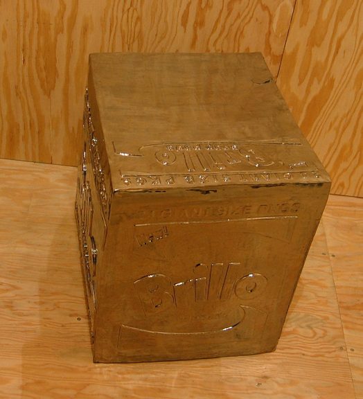
So awesome. Is there nothing that can't be made better by Rirkrit chroming the hell out of it?
Fear Eats The Soul, Rirkrit Tiravanija, through April 16 at Gavin Brown's Enterprise [gavinbrown.biz]
Awesome photo of chrome stainless steel Brillo Box and wok, one of many by Andrew Russeth [16miles.com]
Previously: Enzo Mari X Rirkrit Tiravanija
Extensive Brillo Box coverage on greg.org
March 5, 2011
We went to Monticello this weekend--Jefferson was a complicated guy, brilliant, thanks for the Declaration etc, etc., but wow, high maintenance--and came away with a question about the Latin motto in the Jefferson coat of arms, which adorns the gate of the family cemetery where Jefferson and his white lineal descendants are buried.
Though we got the gist of it, the motto, "Ab eo libertas a quo spiritus," had enough prepositions in it to make it hard to parse. But as we walked down the hill, trying to figure out "eo," we realized we probably couldn't. All we could do is look it up, and then we'd know.
That's the binary situation the net has put us in: we either know something now, or we know it the instant after we look it up. There's no figuring it out, no hints, just the answer.
Of course, this isn't true for everything, or even most things--Google's not just cold telling me where Jasper Johns' Flag is, that's for sure--but it's true for enough things.
And that kind of bums me out a bit.
As for the motto, it does turn out to be a prepositional mess, which Jefferson may have added himself: "The spirit (comes) from he from whom Liberty comes," or "Liberty comes from he who gives life."
March 4, 2011
Yeah, there's photomurals, but anyone who's spent some time poking around greg.org might have found my even longer-lasting photo obsession: the Palomar Observatory Sky Survey [see background and making of info here and here.] The idea is to take he 1,870 pairs of photos that resulted from this ambitious, 9-year project to systematically document the universe, into the art context. Where it had not, to my knowledge, ever been. [Thomas Ruff comes the closest, obviously.]
And so one would understand the excitement at finding this entry--right after Moholy Nagy and Wright Morris, and above Muybridge and Nadar--in the checklist [pdf] for the 1964 inaugural show in the Edward Steichen Photography Center, MoMA's first dedicated photography galleries:
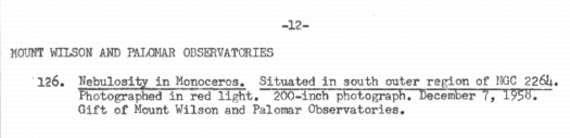
Mount Wilson and Palomar ObservatoriesDude, not only was the Palomar Sky Survey IN an art context; it launched the art context. Dude, with a 200-inch photograph, it owned the art context.
Nebulosity in Monoceros. Situated in south outer region of NGC 2264.
Photographed in red light. 200-inch photograph. December 7, 1958.
Gift of Mount Wilson and Palomar Observatories.
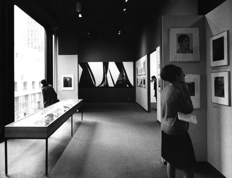
So what did this look like? It must have been spectacular. But I can't find any installation photos, or any reproduction of the work, or any writeups at all for what had to have been the biggest of the 239 photos on view in that first show, bigger, even, than Lennart Olson's mural.
No problem, I can find the image from the artist's [sic] side. Though it has been superseded by several far more advanced surveys, imagery from the 1950s-era POSS-1 is still available in the Space Telescope Science Institute's Digitized Sky Survey. Here's the red plate showing nebulosity in the constellation Monoceros on the south outer region of NGC 2264:
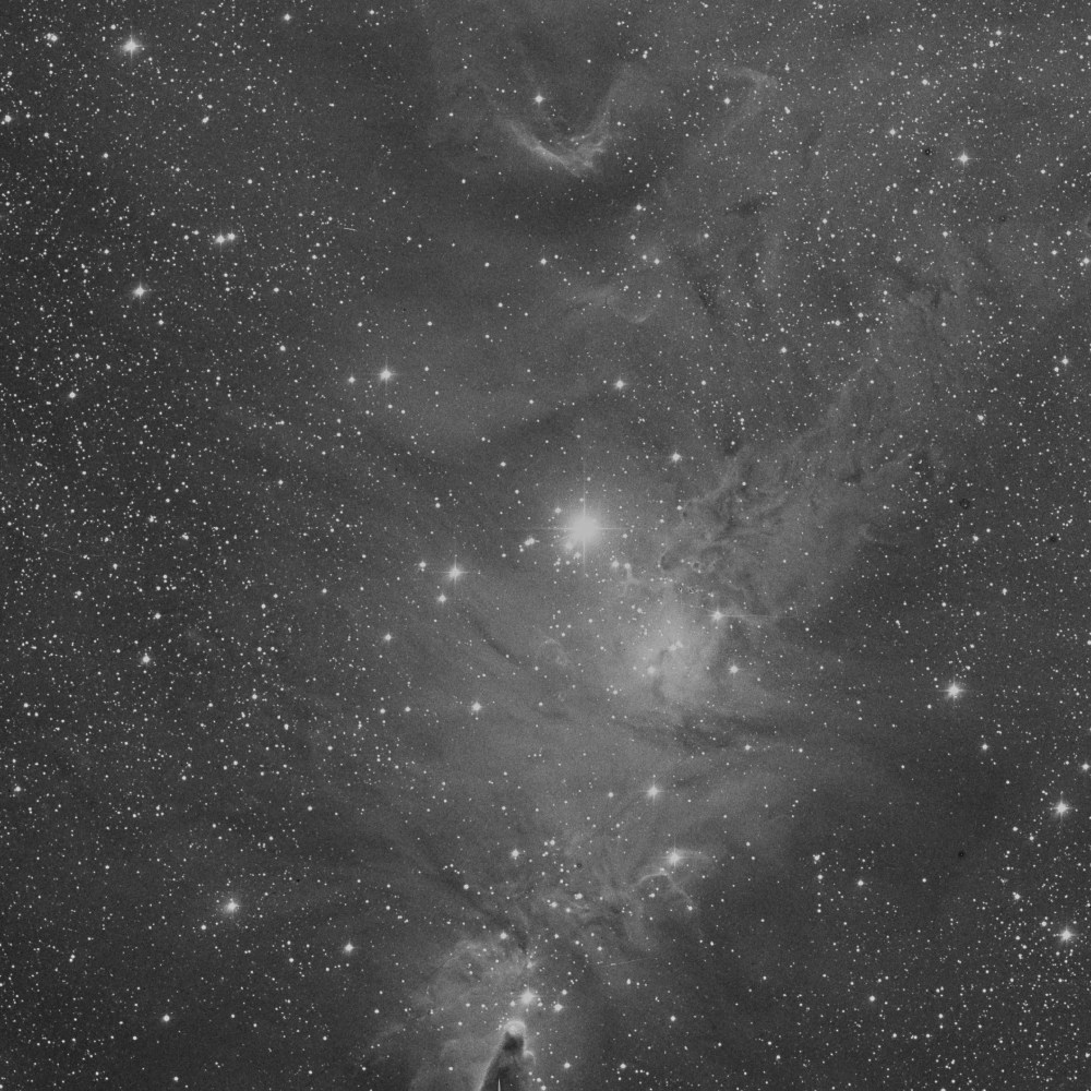
That's the Cone Nebula down there at the bottom, just on the edge of the plate. Now imagine this photo printed nearly 17 feet tall, striking visitors to the newly reopened Modern with awe as they see how far photography has come.
And you'd have to imagine it, because it didn't happen. There wasn't a 17-foot tall photo gallery in the Museum in 1964. In fact, I'd wonder if the ceilings in the then-new Philip Johnson annex were even 16 feet.
Also, it turns out that the POSS-1 image of NGC 2264 was made on Nov. 30, 1951, not Dec. 7, 1958. So the 200-inch photograph does not refer to the print size. It is likely a reference to the telescope that took it, Palomar's Hale Telescope, which was the largest in the world from 1948 to 1993. It was conceived by George Ellery Hale, who secured $6 million for the project in 1928 from the Rockefeller Foundation.
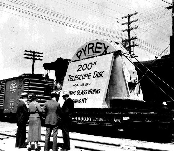
Corning cast the 200-inch mirror from Pyrex in 1934-36, and it was transported across the country by train to Pasadena where, after eleven years of polishing and shaping, the 40-ton mirror was hauled to the top of Mount Palomar and installed in the 1000-ton, Pantheon-sized rotating observatory. Edwin Hubble took the first photograph with the 200-inch telescope in January 1949.
I still haven't found the details of the photo MoMA exhibited, but the mirror story makes up for it a little. And I thought artists were crazy.
March 3, 2011
So I'm searching through the New York Times archive, trying different combinations of keywords to find references to photomurals at the Museum of Modern Art, and I find this intriguing 1934 headline:
TWO FORSAKE ART TO FOUND A PARTY; Museum Modernists Prepare to Go to Louisiana at Once to Study Huey Long's Ways. GRAY SHIRT THEIR SYMBOL Young Harvard Graduates Think Politics Needs More 'Emotion' and Less 'Intellectualism.'But the Times' archives purchasing has been acting up for a few months [it's not just me, right?], and my 10-pack of articles has been stuck at five since October, so I can't click through to see who these Museum Modernists are.
And a couple of weeks ago, I could have searched the rest of the internet and not found the answer, but now that Google has added the complete run of Spy Magazine, a search for "Museum Modernists" and "Huey Long" turns up one result: the devastating 1988 Spy article by Michael Sorkin detailing the fascist and Nazi activities of the young Philip Johnson.
I mean, holy crap. Gray Shirt Their Symbol barely scratches the surface. Johnson's fellow modernist was Alan Blackburn, the Museum's executive director. As MoMA's archive puts it, "Both Blackburn and Philip Johnson resigned from the Museum in December of 1934 to pursue outside interests."
Those interests ranged from donating large sums of money to and founding a youth wing for raging anti-semitic demagogues such as William Lemke and Father Coughlin to spying for the Nazis during the invasion of Poland.
Where was Philip? Spy, Oct. 1988 [google books]
Here's an image of the Times article and photo. Amazingly vague. [uncommonplace book]
March 2, 2011
In other seemingly obscure art historical news from 53rd Street: while Googling around on Compo Photocolor, I found this mention in a 1964 press release [pdf] from The Modern, which turns out to be a checklist for the newly remodeled and reopened museum's first dedicated photography galleries, The Edward Steichen Photography Center:
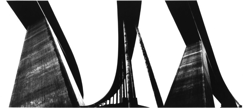
OLSON, Lennart. (TIO FOTOGRAFER). Swedish, born 1925So just like the first exhibition in MoMA's original 53rd Street building 32 years earlier, the first show in the new building includes photos specifically conceived as a photomural.139. The Tjorn Bridges, near Sternungsund, Sweden. November, 1960. Conceived as a mural; here executed for the first time. Photomural by Compo- Photocolor. Courtesy of the Photographer.
[via]
Olson was a well-known Swedish photographer, though from this 2010 bio for him, his MoMA exposure was the source for much of his hometown fame. And unfortunately, the namechecking is hardly mutual. The only mentions of Lennart Olson on MoMA's website are from the period press releases.
Steichen included Olson's work in a 1953 survey of Postwar European photography [pdf]; in 1960, Steichen ends the department's announcement of new acquisitions [pdf] with this: "Of particular interest is an 8-foot wide photographic panel, "Project for a Mural," (1960) by Lennart Olson." Which sounds related to the work that debuted in 1964.
In 1960, Olson was also included in an exhibition titled, "The Sense of Abstraction," [press release pdf], which was organized by Grace Mayer and Kathleen Haven, who had put out a call for hundreds of photography portfolios. [It's interesting to read that as a corollary to "straight" photography, abstraction meant producing "works whose sole function is to delight--or affront--the eye."]
Anyway, Olson's "monumental architectural studies" opened the show; the Museum described them as "abstract through individualistic interpretation of design."
[via]
I can't find images of the 1960 study, but here is an installation shot of the 1964 mural itself. At first and second glance, the scale and form remind me of Franz Kline, who arrived at his signature large-format abstractions by enlarging small drawings projected onto the wall.
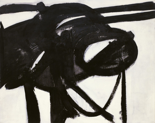
Chief, 1950, acquired by MoMA in 1952
The prominence MoMA gave to Olson's large, abstract photomural seems to have been confined to the end of the Steichen era, aka the early 1960s. I don't have any way yet to figure out whether this resonance between Ab Ex painting and large-format photography was conscious or coincidental, but it sure seems convenient.
Talking with artist John Powers today about this speculative painting vs photography dialogue/contest, he suggested looking, not at the artists themselves, but at their mediators: the curators and the museum. It's easy to imagine curators sharing an attraction to the powerful scale and immersive gallery experience of large, trophy-sized artworks, just as it's easy to imagine the ambitious size appealing to painters and photographers alike.
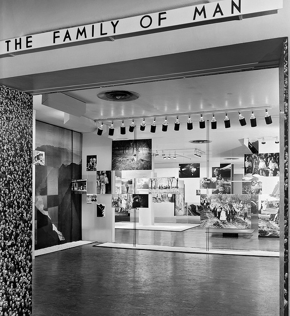
On the dust jacket for the book version, Steichen rather immodestly calls The Family of Man "the most ambitious and challenging project photography has ever attempted," which serves as "a mirror of the universal elements and emotions of the everydayness of life." Doesn't sound like he regretted giving up painting much.
When I first came across the pixelated Dutch landscapes on Google Maps , I imagined the polygonal camo distortions hovering over the sensitive sites. From the ground, I thought, maybe it looked like a Gerhard Richter overpainted snapshot.
But now I think it looks more like the bright, beautiful gouaches by Louise Belcourt which Sharon featured on Two Coats of Paint recently.

Images: Louise Belcourt's place in the world [twocoatsofpaint.com]
March 2, 2011
Frieze's 20-year retrospective of itself continues apace, and wow, it's like running into an old flame on a train platform.
I hadn't thought about Daniel Birnbaum's 1996 essay, "IKEA at the End of Metaphysics" in years, but wow, it's just all flooding back.
From a Heideggerian perspective IKEA best sellers such as 'Billy', 'Ivan', and 'System 210' do not represent a corruption of everyday life, but have merely formalised what is already there; the IKEA catalogue only makes the tendency towards uniformity more conspicuous. Heidegger's global 'levelling' is not a critique of the common forms of everyday life as such, but of their passive acceptance. At the end of metaphysics, levelling is complete - no one questions the catalogue.Obviously--well, now it's obvious, anyway--my own Ikea X Enzo Mari mashup project has its origins in the critical perspective of the company and its ideology which Birnbaum mapped out 15 years ago, and which I absorbed.
Also, I'm reminded how I miss Jason Rhoades.
IKEA at the End of Metaphysics [frieze.com/20/ via ronald jones]
While trying to find out where and how to make a photomural, or at least how they used to make them, I found this slightly ridiculous 1966 Popular Science article about making photomurals in your very own home. And how you basically shouldn't do it, but instead just mark up a negative and send it off to a photo enlarger somewhere.
Someplace like--hey-o!--the outfit mentioned in a caption, "Compo Photo Color, 220 W. 42nd St., NYC, specialists in murals and exhibition prints who did famous 'Family of Man' photo show." And so it comes pretty much full circle, back to the most famous photomural exhibition of all.
So who is Compo Photo Color? Or was. Immediately available references are pretty scarce, but Compo seems to have been in business from the 1950s until the early-to-mid 1970s. Its principals were a German immigrant photographer Richard J. Schuler and Ernest Pile, and it was eventually consolidated into Wometco Photo Services, a division of the Miami-based movie theater owner. But back to the apparent heyday, in the 50s.
In a 2001 interview, photographer Wayne Miller, who was Steichen's assistant and co-curator on Family of Man, and who contributed the most images to the show, talked about working with Compo on the prints:
Riess: About Gene Smith, can I ask you to repeat the story that I lost last time about asking Gene Smith for a print of that image in The Family of Man?You know, it didn't occur to me at all until just now, but Paul Rudolph designed the installation for Steichen's Family of Man, which was photographed by Ezra Stoller, in January 1955,Miller: Oh yes. In The Family of Man, after we had made our final selections of what pictures we wanted to have in the exhibition we asked some local photographers if they'd like to make the print for us, or would they give us the negative and we ll have the print made by Compo Photocolor in New York. Actually we wanted Compo Photocolor to make all of them so the prints would have a commonality, and they would match the other prints quality-wise. And they were very good technicians.
But in this case, because of Gene, he wanted to make the prints, he didn t feel anybody could make the print as well as he could. And he invariably spent not only hours, but days in the darkroom. In fact, in a Life story he would disappear in the darkroom and return, and you almost-- here he was seemingly weeks or months afterwards, with a beard and other things, and with the final prints. And it would drive the Life people mad.
In this case, we had a print that I'd found in the Life morgue of what he [Smith] called "A Walk in Paradise Garden," something like that, of two children walking out from underneath this frame of bushes. A nice picture, and we wanted to use it at the end of the exhibition. It was going to be about, maybe 30" x 40".
I told Gene we wanted to do this and asked him if he'd like to make the print, and yes, he
certainly wanted to make the print. So I arranged for him to get the necessary paper and
chemicals to do this, because his wife Carmen said, "Don t give Gene the money for it, because he'll spend it on other things." So after he told me what he wanted, I did get the materials for him. And I gave him a deadline, knowing that he was often not able to meet a deadline, of about three weeks early. So he took this material.Now the print we had that I'd gotten out of the files had been handled a great deal and it had some cracks in it. It was dog-eared, and it wasn't a fine print at this point. So at the same time I gave these materials to Gene I sent the print from the Life files over to Compo Photocolor and asked them to make a copy of it, make a negative, and make a print to size. Just so we wouldn t get stuck in case he didn't come up with the print. Later, when he did do it, we could always replace it. And sure enough, the deadline came and went and we had to put this copy print up on the wall. Because Gene hadn t shown up with his.
A couple of weeks later Gene shows up with these photographs rolled up under his arm. We went up to the museum exhibition space in the morning because the museum didn t open to the public until noon. And I took this print that we had down off the wall, and he unrolled his prints. He had half a dozen of them there, different qualities, and he laid them out beside this print. I was worried about this because I know how he struggles and works so hard on it. He will darken this or lighten that, and he ll use ferro cyanide to bleach little bits. And the delicacies with which he treats a print are just great, they re very great. So I was interested in seeing how it would work.
He laid his out, and he stood back there and looked at these prints. And he walked around a little bit and looked at them some more. Finally, he said, "You know, I think the print you have on the wall is the best one. Let s use that one." [laughter] So he rolled his up and went along.
That I think points out the fact, I believe, that when you make a photograph, a print of a
photograph of larger than normal size, it picks up a new quality other than one of maybe an 11"x14" or something. But one like this, maybe 30"x40", it has a new quality to it.
the same year Robert Rauschenberg was collaging photos into such giant combines as Rebus. Hmm.
March 1, 2011
The question or theme or whatever hadn't crystallized for me, but when Tyler linked to the previous two posts about Lt. Comm. Edward Steichen's wartime propaganda exhibitions at the Museum of Modern Art, he noted that "there's a lot of art historical work yet to be done on the impact World War II had on art and artists."
It's an interesting way to consider my fascination with the aesthetics and paradoxes of photomurals: their apparent historic status as something other than artwork, much like the photographic medium they're derive from; their powerful scale, which creates a certain kind of all-encompassing viewing experience that is typically associated only with the later works of revolutionary "high art," namely the Abstract Expressionists; and of course, the abstract and modernist aspects of the images themselves.
I'm not ready to go beyond the grand theory of "this looks like that," but I keep seeing and finding resonances between photomurals, which were born in the Depression and came of age during WWII, and some of the major developments of postwar art.
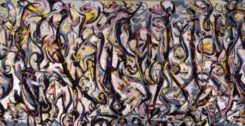
Mural, Jackson Pollock, 1943, collection: UIMA
I mean, I'm re-reading Tyler's interview with Pepe Karmel about Jackson Pollock's Mural [above], which was painted in 1943, and there are moments where I can't help thinking about the 15- and 40-foot images in Steichen's 1942 Road To Victory show:
It's an important painting for Jackson Pollock because it's the moment that announces his future as a painter of large, mural-scale paintings that become environments, and furthermore paintings that are in this distinct, all-over style that changes people's idea of what a painting might be.Which isn't to say that Pollock was referencing or even influenced by photomurals, just that both Herbert Bayer's installation of Steichen's photos and Pollock's first epic-scale painting create an overwhelming spatial experience....
It's like Barnett Newman's Vir Heroicus Sublimis or Pollock's own Number 1, 1950. You have to be there. You have to be standing in front of it and feel it filling up your field of vision and feel it wrapping around you and feel yourself falling into the field of the painting. If you don't have that experience first-hand, you won't get the feeling of the painting.
...
MAN: You talked about how important the painting was in terms of Pollock's oeuvre. Can you detail why it's so important to what came next in American and modern and contemporary art?
PK: The next step is off the wall and out into space. In contemporary art that deals with installation as an art form, which comes out of those paintings in 1950 and that comes out of this painting in 1943. It just doesn't get more historic than this.
It's truly a kind of unrecognized monument of American art.
Photomurals were out-and-proud propaganda which had connections to filmmaking and the cinematic screen and to world's fairs, [See Alvar Aalto's Finnish Pavilion at the 1939 World's Fair and the Japanese pavilion at the Golden Gate Expo that same year].
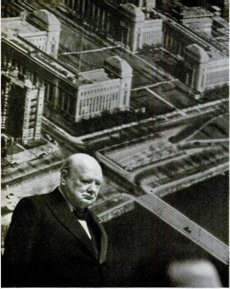
Which is one of just a handful of references to photomurals in LIFE magazine's archives. In a moment of greg.org confluence, LIFE's most prominent depictions of photomurals are not in museums or world's fairs, but in political rallies--they are the ur-Sforzian backgrounds. For example, In 1949, FDR Jr. has a giant wall of smiling children behind him at a UAW convention. A chorus line of garment workers kick in front of a selection of "union heroes." And when he spoke in Boston in 1949, Winston Churchill stood in front of an aerial photomural of the MIT campus [above] which reportedly "confused [the] television audience."