October 2011 Archives

October 31, 2011

Dazzle Camo Colour Chart

Britannica_Color_Chart_camo.jpg

Razzle dazzle camouflage painting was not, as the photographs would have you believe, entirely black and white. [For that matter, neither was WWI itself, but that is a matter for another day.]

In any case, British camoufleur Norman Wilkinson published a camo color chart [sorry, colour chart] in the 1922 edition of the Encyclopedia Britannica, which the esteemed camoölogist Roy Behrens re-created using Pantone colors. Sorry, colours.

We had some hints, and Dakis and Jeff already knew about this, of course, but for the rest of us, it's useful to review.

Roy Behrens' Camoupedia blog [camoupedia]
Previously: Bedazzled; Dazzle camo design lithos at RISD

I love a lot of Jason Rhoades' work, but only have a little. I wish I'd known about this sooner:

Jason_Rhoades_Love_Seat.jpg

Blue Room and Love Seat is an edition produced with 1301PE's Brian Butler in 1995, maybe when it was still only 1301.

Anyway, it's a steel trunk with a cushion on top, for sitting, which contains an inflatable room made from blue tarps. Which sounds delightful, except that it's inflated by a leafblower, so it's noisy. And it's actually inflated by the blower exhaust, so it also pumps noxious fumes into the blue room. Which sort of makes it a portable gas chamber. Which is now kind of depressing.

1301pe_blue_room_inflating.jpg

On the other hand, there must be at least one left in the edition, because the gallery inflated it last year for a show.

Blue Room and Love Seat, 1995, Jason Rhoades [1301pe.com]
"Musée Los Angeles, Blue Room and Love Seat [1301pe blog]

rirkrit_tv_transmitter_gugg.jpg

A piece I left out of my Rirkrit's blingy objects post yesterday may be more important than I originally thought, and for more reasons than its shininess.

Untitled 2005 (the air between the chain-link fence and the broken bicycle wheel) was the Guggenheim installation Rirkrit got to do for winning the Hugo Boss prize. It was a low-power, unlicensed TV transmitter, the blueprints for building your own, and wallpaper full of texts about freedom of speech, the revolutionary power of media, and the political and economic contradictions of the FCC.

I was thinking of mentioning it because it atypically included structures made of both plywood and of mirror-finished steel. The glass and steel vitrine held the TV transmitter, the source of media power, while the similarly sized plywood shed contained the antenna and a TV. The steel cube was closed off; the ply cube had a door, windows, and 2x4 furniture. Oh, and an antenna made in the form of Marcel Duchamp's bicycle wheel.

rirkrit_tv_receiver_gugg.jpg

The instructions for making your own TV station were printed on posters, made available on the floor in a Felix-style stack. If there were a more explicit evocation possible of contemporary art and the political clashes of the 60s, 70s, 80s, and 90s, I guess I can't think of what it was. Except maybe for Rirkrit's collaboration the next year with Mark di Suvero to create an Iraq War-era version The Peace Tower.

rirkrit_tv_stack_gugg.jpg
Untitled 2005 (the air between the chain-link fence and the broken bicycle wheel), detail, via

And then I found Holland Cotter's unexpectedly extraordinary-in-parts review of Rirkrit's 2005 Guggenheim show:

The installation is basically a bare-bones statement of the practical fact that anyone who wants to participate in shaping the communications media that are shaping the world at large can do so. "Everyone is an artist" was Joseph Beuys's potent rallying cry in the 1960's and 70's, which made artists and "the people" one. Mr. Tiravanija, who has learned much from Beuys, adds his own variation: "Everyone is a broadcaster. Make this transmitter at home."

rirkrit_tv_interior_gugg.jpg
Hmm, mirrored TV: Untitled 2005 (the air between the chain-link fence and the broken bicycle wheel), detail, via

At the same time, he has customized his own version with a couple of features that are not necessarily meant for replication. One is the glass box encasing the transmitter. Its presence is symbolic, a reminder of how resources that should be available free to everyone become the closely guarded valuables of a privileged few.

Yow, that suddenly puts a polemical shine on Rirkrit's deployment of chrome; makes me not want to get caught with a shiny ping-pong table when The Revolution comes.

But then, in one sense, it's already here.

The complicated connection between politically charged art of the 00s and today's Occupy Wall Street protests grew starker as I read Martha Schwendener's sharp piece in the Voice [thanks, Tyler] about the implications of #OWS for art, and vice versa:

Art was, for a long time, a utopian model. But with bohemianism eroded by gentrification and the 1 percent end of the art spectrum devoted primarily to vapid, overfunded gestures, you wonder if a recent Columbia University symposium, which described art as "a catalyst and platform heralding justice, solidarity, and a peaceful future" is nostalgia--or just wishful thinking.
Schwendener's piece read to me like a wakeup call for artists: "Practice [sic] is over. This is not a drill."

Which made me think right back to Cotter's opening, clear-eyed for a child of the 60s, a reflection on the very idea of "Power to the people":

Who were "the people," anyway? Blue-collar workers, African-Americans in the civil rights movement, immigrant laborers. Students? Some, though even engaged young people tended to want to help the people rather than be the people.
There's a Rirkrit t-shirt in there somewhere, I can just feel it.

Art Review | Rirkrit Tiravanija: Work Whose Medium Is Indeed Its Message [nyt]
What does Occupy Wall Street mean for art? [villagevoice]

I've been writing this post in my head for months, years, even, but so many pieces have piled up in my browser tabs, it's slowing my computer down. And plus, this weekend MoMA announced that they acquired and will exhibit Untitled (Free/Still), the original [sic] free-Thai-curry-in-a-gallery work, so it's time to step back and look more closely at Rirkrit Tiravanija's art practice. First, by starting with what we are fed. Here is a small sampling platter of familiar statements by and about the artist and his work:

"It's part of what has been called 'relational aesthetics,' " said Ann Temkin, chief curator in MoMA's department of painting and sculpture. "Joseph Beuys created social sculpture; it's the act of doing things together, where you, the viewer, can be part of the experience."
That's from MoMA's press release in the NY Times.
You could say his art is all about building "chaotic structures." Then again, it's about lots of things; his work is so open-ended and departs so radically from the art market's orientation toward precious objects, that it's earned many labels, many - like utopian or chaotic - that only tell part of the story. But one that's stuck, for better or worse, is French theorist-critic Nicholas Bourriaud's "relational aesthetics," the idea of judging the social relationships sparked by an artwork instead of merely considering the object.
That's Paul Schmelzer, now/again of the Walker Art Center, an early and frequent supporter of Rikrit's work, writing in 2006.

rirkrit_caravan_musac.jpg

Tiravanija's art is free. You only need the experience. In fact, the essence of his work resides in the community, their interrelationships, and chance. Make art without objects, their purpose is a complaint against the possession and accumulation.
The Museo de Arte Contemporáneo de Castilla y León, which owns Untitled (Caravan), a 1999 plywood model of a camping trailer, with kitchen, above.

Rirkrit as quoted by Bruce Hainley in Artforum, 1996:

"Basically I started to make things so that people would have to use them," he has said, "which means if you [collectors, museum curators, anyone in these roles] want to buy something then you have to use it. . . . It's not meant to be put out with other sculpture or like another relic and looked at, but you have to use it. I found that was the best solution to my contradiction in terms of making things and not making things. Or trying to make less things, but more useful things or more useful relationships. My feeling has always been that everyone makes a work - including the people who . . . re-use it. When I say re-use it, I just mean use it. You don't have to make it look exactly how it was. It's more a matter of spirit."

rirkrit_print_aia.jpg

And here's Faye Hirsch in Art in America this summer, perfectly teeing up her making-of story for Untitled (the map of the land of feeling), [above] an extraordinary 84-foot-long print edition Rirkrit has worked on for the last three years with students and staff at Columbia's Leroy Neiman Center for Print Studies:

Rirkrit Tiravanija has never been known as a maker of elaborate objects. In a market-riven art world, he has remained, since the early '90s, a steadfast conceptualist whose immaterial projects, enmeshing daily life and creative practice, have earned him a key role in the development of relational art. At galleries and museums around the world, he has prepared meals and fed visitors, broadcast live radio programs, installed social spaces for instruction and discussion, set up apartments--where he or visitors might live for the duration of a show--and dismantled doors and windows, leaning them against walls. At two of the three venues for his 2004 retrospective, the "display" consisted of a sequence of empty rooms referencing (in their proportions and an accompanying audio) his selected exhibitions over the years.

When Tiravanija does make objects, they are generally of a modest nature--most often multiples and ephemera connected with exhibitions. At his show this spring at Gavin Brown's Enterprise in New York, for example, he set up a room where an assistant screenprinted white T-shirts with his signature terse, block-print headlines, ranging in tone from vaguely political (LESS OIL MORE COURAGE) to hospitably absurd (I HAVE DOUGHNUTS AT HOME). They cost $20 apiece.

Ah yes, the t-shirts. Not sure if I ended up being the only one, but I was apparently the first to order a complete set of all 24 shirts. So there's that.

rirkrit_playtime_gavin-thumb.jpg

I have been an admirer and follower of Rirkrit's work since his earliest shows at Gavin's, and Untitled (Playtime), the awesome, ply&plexi, kid-sized replica of Philip Johnson's Glass House he built in MoMA's sculpture garden in 1997 [above] bought him at least a decade of good karma in my book.

And so it's only very recently that I've started to watch and wonder if I'm the only one who-- See, this is why Faye Hirsch's quote is so perfect: because it encapsulates exactly how people talk and write and think about Rirkrit's work, and it's perfectly and exactly wrong.

I'm sorry, that's the overdramatic hook in this post. What I really mean is, as his social, experiential, ephemeral practice, his "art without objects" has taken off, Rirkrit has also been making some of the blingiest, sexy-shiniest, most ridiculously commodified luxury objects around. I love them. Why can we not talk about them more?

here_there_rolu.jpg

I'm so blown away by this. RO/LU's and welcomeprojects' project for this year's High Desert Test Sites was called Here There, There Here. To call it a contemporary nod to earthworks almost feels backward; it's like the earthworks movement was building to this.

It's a two mile [!] strip of white felt run across the open desert outside Joshua Tree. While I was waiting for more photos to turn up, I kept seeing Here There, There Here everywhere:

richard_long_line_walking.jpg

Richard Long's 1967 work A Line Made By Walking [spotted on It's Never Summer, Wayne Bremser's tumblr]

contrails_noaa.jpg

And then whenever I'd see a contrail across the sky. High fives all around, what a stunning project.

Well that's kind of fantastic, like Victorian- era Rauschenberg.

queen_victoria_silk_newspaper.jpg

Apparently, to commemorate Her Majesty the Queen's to the Isle of Jersey, The Jersey Herald printed copies of the September 11, 1846 edition of the newspaper on silk panels, which were then stitched together with beaded pearls. Here's a detail shot:

victoria_silk_paper_detail.jpg

Did they only make the one copy? Is this the only printed silk newspaper facsimile out there? Can I find these in any boot sale of dead queen paraphernalia, or only Malcolm Forbes's?

UPDATE AFTER TEN MINUTES OF GOOGLING So printing newspapers on silk is/was a commemorative thing. The first copy of the first issue of the Grand Rapids Times was printed on silk in 1837 and presented to its largest subscriber/investor, while additional souvenir copies were printed on cloth. A silk copy of an 1852 edition of the San Francisco Daily Whig came across book conservator Nicole Wolfersberger's desk [and into her flickr stream] a couple of years ago. The Upper Hunter Courier made a silk presentation copy of their paper for Lord Belmore after he came to open a section of railway in Scone in 1871. It was not nearly as nice as Queen Victoria's.

scone_silk_newspaper.jpg

And in 2007, the Jiefang Daily Press Group gave the V&A a copy of the 2005 silk front page which was carried into orbit on China's second manned space flight.

The Forbes Collection at Old Battersea House - Sale 338 - Lot 415
TWO PRINTED COMMEMORATIVE SILK FACSIMILE NEWSPAPER SHEETS
Est. £500-800
[lyonandturnbull.com]
Previously: Rauschenberg Currents Event

kassay_lm_angle.jpg

Huh. I guess Artforum's back-of-the-book review section does not purport to ignore the art market's overdetermining forces any more.

Ben Carlson's review of Jacob Kassay's show this summer at L&M Arts in Los Angeles is framed around the burning question, "Does Kassay's work properly account for the auction hype and thus, its own presence in this high-end gallery?"

But L &M Arts' interest in this young painter is no mystery: Regardless of their merit, Jassay's silvery-reflective monochromes made a splash at auction last fall. Anticipating the cynics, the staff penned a press release that was quick to distance Kassay's older output from the new work he made for this show. Calling attention tot the differences in surface treatment, it announced that his most recent paintings would feature a "surprising yet deliberate lack of reflection."

[part where 29-yo Kassay is chided for not taking better hold of his secondary market and is as yet found to be no Ryman or Kelly omitted]

Offered a chair at the high rollers' table, Kassay could have made only one compelling move--a wager with the potential to break the bank. Of note: His Paris dealer, Art: Concept, has already offered public assurances that the artist is not about to meet the market's demand for more of the same. In fact, had Kassay overperformed (or overproduced) this summer, he might have presented a distance from these overdetermining forces or even productively embraced them...It appears, however, he's chosen to ignore them altogether. [ellipsis original]

Some day, maybe the discussion of what we see when we look at Kassay's distorted, mirror-like work will not be characterized by such a surprising yet deliberate lack of reflection. But that day is not yet.

Previously: On Jacob Kassay and collaboration

October 23, 2011

#OccupyMarkdiSuvero

disuvero_zucotti_ourtravpix.jpg
Joie de Vivre, Mark di Suvero, Zuccotti Park, detail of image via ourtravelpics.com

Or maybe #OccupyJoiedeVivre, then? Either way, please tell me I'm not the first or only one to think of this. Actually, please tell me someone's already working on it.

Mark di Suvero's giant steel sculpture, Joie de Vivre was built in 1997 and stood for several years in the exit plaza for the Holland Tunnel, then at Storm King, and in 2006 it was installed in its new home, Zuccotti Park. Whether its art historical significance is fully appreciated, or whether it's called "The Big Red Thing," di Suvero's sculpture has become an icon of the Occupy Wall Street protests.

disuvero_peace_tower.jpg
The Peace Tower, 1966, image via newsgrist

Which is good, because di Suvero himself is an icon of artistic involvement in political action, activism, and social justice. In 1966, along with Irving Petlin and others, di Suvero designed The Artists' Tower of Protest, also known as The Peace Tower, one of the earliest and largest artist-organized protests against the Vietnam War.

The Peace Tower stood on a vacant lot on the corner of Sunset and La Cienega Boulevards in Los Angeles, which Petlin's Artists Protest Committee rented for three months. They solicited 2x2 art objects from 400 artists, which were installed onsite. Documentation of The Peace Tower is currently included in Pacific Standard Time at the Getty.

whitney_peacetwower_wjff.jpg
Peace Tower @Whitney Biennial, 2006, image via wjff

In 2006, Rirkrit Tiravanija worked with di Suvero and Petlin to re-create The Peace Tower as a protest to the Iraq War as part of the Whitney Biennial. The new tower was festooned with 180 2x2 panels created by invited artists, including many artists from the LA original. [And Joy Garnett, hello!]

So it would seem to me, that when you're organizing a global protest against injustice at the foot of a Mark di Suvero sculpture, shouldn't you organize it on the Mark i Suvero sculpture? And shouldn't you do that, NOT by climbing the sculpture and demanding cigarettes be delivered to you by police cherrypicker, thereby precipitating the fencing off of said sculpture and the park space around it, but by tracking down the artist himself and enlisting him in a call for artists to create 2x2 panels that will be installed on Joie de Vivre itself?

And though it might be hard to measure--or identify, for that matter--the impacts on policy of the war protests in 1966 and 2006, circumstances almost seem to demand an incarnation of a protest tower in 2011-12. And at the very least, art people, doesn't this make 10000x more sense than marching on the Frick?

Related: Jeffrey Kastner's remarkable interview with Irving Petlin, Mark di Suvero and Rirkrit in the March 2006 Artforum [artforum via findarticles]

road_victory_cutout.jpg

See, this is why I wonder about whether Gerhard Richter, "shocked" by seeing Edward Steichen's MoMA exhibit Family of Man in West Berlin in 1955 while he was a student, ever went on to research Steichen's earlier photography exhibitions, such as the 1942 Road To Victory.

Because all around the life-size photo cutout of a GI on Corregidor is a whole series of giant aerial photos of US bombers and fighter planes at work. Over the skies of Germany.

road_to_victory_planes.jpg

And though Atlas shows Richter took a specific image from a newspaper for his first airplane painting, it does look very much of a type--and of a scale--that Steichen was using, too.

richter_bombers_2439.jpg
Bombers, 1963, image: gerhard-richter.com

And then this one which, like the one behind the cutout, is clearly taken from the ground--and, just as clearly, from the business end of a bombing run:

richter_airplanes_2445.jpg
Airplanes, 1963, image: gerhard-richter.com

Loads of death, tons on tons of annihilation, out of
the sky and down down down on the enemies of
the free world--killers with wings--dropping
polished cylinders to let loose tornadoes of hell
and ashes on the hideouts of the "New Order."

Carl Sandburg's rather plush poem/captions for Road To Victory sound a little different in this context.

In comparing photography's postwar cultural positioning to the prewar modernist era in relation to the work of Bernd and Hilla Becher, Blake Stimson wrote,

Photographers once again assumed a special role for this reconstruction, this production of a new, new vision and new, new man. Such was the mission adopted programmatically by Edward Steichen for The Family of Man, for example,
So whatever Family of Man's photographs may have told Richter "about modern life, my life," once he came West and started painting, I'm not so sure he was still buying it.

richter_serota_1.jpg

The Tate video of Nic Serota and his team in Gerhard Richter's studio is nice for many reasons: it includes some squeegee action scenes from Corrina Belz's Gerhard Richter Painting [which I'm trying to get a copy of; Is there anyone in London who can pick up a DVD for me? Or in the UK anywhere who can accept a shipment and forward it onto me?]

richter_serota_.jpg

For filming, they moved the model of Tate Modern's galleries into the main studio room, which was full of strips of the Strips series [and hey-ho, a bent strip too, what's up with that?]

richter_serota_2.jpg

But the most interesting thing to me, anyway, is this exchange from Serota's interview of Richter, about leaving East Germany:

GR: We had also the possibility to go every a year at least twice to West Berlin, to saw movies and exhibitions. It was the first time I saw the wonderful Family of Man
it was a famous exhibition.

NS: This was the exhibition made by Edward Steichen

GR: Uh-huh, and this was a real shock for me, this show.

NS: Why?

GR: Yeah, so, to see these *pictures,* and I only knew paintings, I was very interested. And they showed so much, and they told so much, these pictures, these photographs. They told so much about modern life. my life.

NS: So was this the moment when you discovered photography? Or the power of photography?

GR: Let's say the power, yeah, of what photography can do.

steichen_berlin_family_moma.jpgSerota delivers that question with an intensity that makes it feel like a scoop, and I don't think his reaction is [just] for the camera. I haven't found any previous mention of Family of Man either by Richter or in relation to his work. Steichen isn't in the index for the collected writings. There's no mention of it in Christine Mehring's study of Early Richter. And though Elger's bio for the period in question--Family of Man opened 17 September-9 October 1955 at the Hochschule für Bildende Künste--mentions Richter's trips to West Germany during what was his last year studying mural painting at the Academie in Dresden, there's no mention of the photo exhibit itself.

As for Richter's nascent interest in photography, the artist did tell Rob Storr that he received copies of Magnum magazine from an aunt in the West. And Elger notes that his family photo album was "one of the few belongings Richter would take with him when he fled to the West." But the artist now adds Family of Man to the list of his early photographic influences. It makes me wonder what the show actually showed Richter about photography's power, and whether the artist went on to study Steichen's other MoMA photo exhibits, the ones that didn't travel to Berlin.

Image above: Edward Steichen in the Berlin installation of Family of Man, 1955, via moma.org

Tate Channel | Gerhard Richter (21:58) [tate.org.uk via @aodt]
Previously: The Family of the Family of Man: Steichen, Miller, Rudolph, Stoller

I'm sure photomural historians out there are chuckling, wondering when I was finally going to catch up on this, but

HOLY CRAP, PEOPLE! ANSEL ADAMS PHOTO MURALS!

Alright, it's not quite so unknown. The Polaroid ransacking auction last year at Sotheby's included a very large print, what Adams called "mural-size," of the photographer's iconic image, Moonrise, Hernandez, New Mexico.

adams_moonrise_polaroid.jpg

But The Mural Project was actually an Adams thing, a series of images commissioned by the Department of the Interior. Adams traveled around the US, shooting--he took Moonrise on the same trip, and because he hadn't expensed that day, the photo was his, not the government's. World War II derailed the project, though, and it was sort of forgotten. Until last year, apparently. When Adams' original prints were rediscovered in a file somewhere [really?? looking into it. Hmm, this book of the images, which are now in the public domain, was published in 1989.], Interior Secretary Ken Salazar gave the OK in 2010 to install full-scale versions of The Mural Project for the first time. They're still there, at the Interior Dept Museum. Viewing them requires a reservation.

Adams wrote an essay/letter titled "Photo-Murals" for the November 1940 issue of U.S. Camera [looking into it] in which he argued for large-scale prints, permanently mounted on panels, over wallpaper-style murals. He made such "mural-size" prints for the lodge at Yosemite, and for various exhibitions, but he also took orders for large prints. Most were smaller, around 40x60, but they did get bigger, up to 6x9 feet. The 2003 show of monumental Adams photos Andrew Smith Gallery spent ten years assembling included one such 6x9 print.

But not a screen. Because apparently Adams would occasionally make photo screens, giant prints on multi-panel, folding screens. Which, what?

adams_sonoma_screen.jpg
Clearing Storm, Sonoma County Hills, image via christies.com

He didn't make very many, though; when they sold a big, awesome 1951 screen a couple of weeks ago, Christie's said there were between 12 and 15, mostly in museums and the Adams Estate. Apparently, he sold one to Interior Secretary Harold Ickes in 1935, though, a deal which according to biographer Jonathan Spaulding, led to the Mural Project commission.

The screen he made for the Skirballs originally had an image on each side; the lot description says how when Jack Skirball invited Adams to come visit in 1981, they were "most anxious to have your opinion on what Audrey has done with the panels of the screen. I don't want to tell you more until you see them." It sounds like she remade them into a set of five one-sided panels. No word on what she did with the other image--or what Adams' reaction was. Even so, the ex-screen sold for $242,500.

Though Adams was always very cognizant of the particular physical qualities of his prints, these screens seem to pose an entirely different argument for the concept of photo-as-object. If murals are related to frescoes, and "mural-size prints" evoke paintings, then Adams' photo screens--printed to human scale, mounted in angled strips, freestanding in space, where they are intended to be viewed and experienced by moving around them--are akin to sculpture. Photographic sculpture.

Or maybe they're also sculpture. Because check out this one, Grass and Pool, a three-panel landscape photo and abstract action painting and freestanding object, all in one, and made in 1935. Oh wait, never mind. The image is from 1935, the screen is from the mid-50s. No need to rewrite the history of abstraction today. It was made for David McAlpin, a banker and collector who, as a trustee at MoMA, helped found the photography department in 1940.

adams_grass_pool_screen.jpg
Grass and Pool, sold in 2001 at Christie's

Adams talked at length with Ruth Teiser about his photomurals and screens--actually, he talked at length with Teiser about everything; she recorded and edited 24 interviews with Adams between 1972-4 for UC Berkeley's Regional Oral History Project, and later published the 818-page transcript as Conversations with Ansel Adams.

I transcribed some excerpts about photomurals from the Internet Archive after the jump. Adams' main concern was the quality and character of large-scale prints, a topic which regularly veers into details of what an expensive, annoying, labor- and material-intensive pain in the ass it was to make good, big work.

October 17, 2011

Camo USS Recruit

I'm not sure what's cooler:

That during World War I, John Purroy Mitchel, "The Boy Mayor of New York," built a giant plywood battleship called the USS Recruit in the center of Union Square to drum up volunteers for the Navy,

uss_recruit.jpg

That it was repainted overnight by the Women's Reserve Camouflage Corps in brightly colored dazzle camouflage to get more business,

Or that there's a site--and a book!--called Camoupedia.

Camoupedia: A Compendium of Research on Art, Architecture and Camouflage, by Roy R. Behrens (Bobolink Books, 2009) [camoupedia]

October 15, 2011

Doug Rickard At Pier 24

ellsworth_kelly_meschers_moma.jpg
ce ci n'est pas un Razzle Dazzle? Ellsworth Kelly, Study for Meschers, 1951, moma

When tiny scans of Gwyneth Paltrow's Interview interview with Ellsworth Kelly first appeared on tumblr, the only thing you could read was his pullquote about his tour of duty in World War II:

I was in what they called the camouflage secret army. The people at Fort Meade got the idea to make rubber dummies of tanks, which we inflated on the spot and waited for Germans to see.
Which, nuts, right? I guess I'd heard of Kelly's camouflage involvement before, and I remembered somewhere that Bill Blass had also been in a camouflage division, but I'd never put it all together that these guys were in the Ghost Army, whose operations remained largely classified and unknown until the mid-1990s.

Here is Kelly's fuller quote, and his photo of himself standing next to a burlap jeep:

ellsworth_kelly_burlap_jeep.jpgPALTROW: Did you design camouflage while in the army?

KELLY: I did posters. I was in what they called the camouflage secret army. This was in 1943. The people at Fort Meade got the idea to make rubber dummies of tanks, which we inflated on the spot and waited for Germans to see through their night photography or spies. We were in Normandy, for example, pretending to be a big, strong armored division which, in fact, was still in England. That way, even though the tanks were only inflated, the Germans would think there were a lot of them there, a lot of guns, a whole big infantry. We just blew them up and put them in a field. Then all of the German forces would move toward us, and we'd get the call to get out quick. So we had to whsssh [sound of deflating] package them up and get out of there in 20 minutes. Then our real forces, which were waiting, would attack from the rear.

PALTROW: So in a way, it was just like an art installation! That's amazing.

KELLY: One time, we didn't get the call and our troops went right by us and met the Germans head on. Then they retreated, and they saw our blow-up tanks and thought they were real and said, "Why didn't you join us?" So, you see, we really did make-believe.

PALTROW: It's the perfect job for an artist in combat.

KELLY: We even had the tank sounds magnified because tanks would go all night long.

It sounds like Kelly was actually in the 603rd Engineer Camouflage Battalion, one of four units in the 23rd HQ Special Troops, which entered France just after D-Day and ended up seeing quite a bit of action, all with balloons and loudspeakers instead of actual weapons.

23rd_inflatable_tank.jpg

As Edwards Park explains in a fairly detailed history, the 23rd's main objective was to impersonate various active divisions in order to cover or obscure troop movements. The inflatable weaponry was designed to fool aerial reconnaissance, but the 23rd also acted out the operations of the units they were impersonating/replacing, visiting fake garbage dumps, and laying fake tank tracks at night under the cover of pre-recorded troop sounds and fake radio broadcasts. And they created fake badges and mingled with local civilian populations, passing along disinformation. As Park puts it, "It wasn't long, in fact, before the 23rd had a voluminous file on visual identifications and the men suffered many a bloody finger sewing bogus shoulder patches on their uniforms before going into action."

It's one of many not-too-thinly veiled references to the 23rd's apparently fruity reputation. I'm sure there's at least one queer studies dissertation out there on masculinity, war, and the confluence of camouflage, artsiness, and passing for "real" soldiers.

As NPR reported in 2007, most camo/deception soldiers were apparently ordered never to discuss their wartime efforts. But Jack Masey was never told to keep quiet--waitaminnit, Jack Masey? The USIA design director and serial Expo geodesic dome commissioner? Holy smokes! It all makes filmmaker Rick Beyer's documentary Ghost Army feel like a race against time. I hope he got some good stuff.

23rd_deceive_defeat.jpg

Meanwhile, I guess I'm on the hunt for some 23rd material myself. In 2004, Sasha Archibald wrote in Cabinet about the Ghost Army's unauthorized insignia for itself, which featured the three-legged triskelion and the motto, DECEIVE TO DEFEAT. [Christoph Cox's excellent history of sonic deception in the military leads me to believe that everything I knew about the 23rd I learned in Cabinet Magazine.]

And I guess it's too optimistic to imagine any rubber tanks or vintage camo have survived all these years; I can't imagine if the top secret thing preserved such artifacts or doomed them. But at the least I could start tracking down some of those Ellsworth Kelly posters.

OK, Meyers' site points to this 1992 video by/about the WWII paintings of Harold Laynor, who describes himself as part of the "famous Ghost Army," and says its activities were "unknown to the general public until well after 1980." Hmm. Laynor also says there was an initial plan in 1942-3 for the 603rd to focus on domestic camouflage. But that the British successes with battlefield camo in North Africa inspired the US to deploy the deception unit in combat.

Related: British WWII bullshit camo stories
The Civilian Camouflage Council, included a lot of folks at Kelly's school, Pratt

Sounds so-so, but full of facts/details: military historian Jonathan Gawne's 2002 book, GHOSTS OF THE ETO: American Tactical Deception Units in the European Theater, 1944 - 1945

reuters_flight_sim.jpg

Speaking of huge, impressive balls, Reuters reports that a Belgian firm called Barco is delivering its first order of eight, brand new, 360-degree flight simulators, each of which is a 3.4 meter-diameter cast acrylic sphere. The sphere is ringed by thirteen hi-res projectors, whose images are all laser-stitched together or something in some suitably seamless way.

Alls I know is, 10-foot-wide acrylic sphere screen. Also, Top Gun? Really?

Belgian firm unveils new Top Gun flight simulator [reuters via boingboing]

yucca_crater_section_ballnogue.jpg

Hoo man, David has an interview with Ball and Nogue about their High Desert Test Site project which is called Yucca Crater, and which appears to be an earthwork, but is man-made. It's a tricked out plywood recreational structure half-embedded in the desert which looks a bit like a half-pipe, an abandoned pool, and one of those deadly carnivorous pitcher plants. Because it'll have a climbing wall and a pool in it, in which some random tripping art student will, I'm afraid, drown one day.

talus_dome_model_ballnogues.jpg

But that's not important now. Yucca Crater is made from the leftover formwork from another Ball-Nogues project, Talus Dome, a public art commission for the Edmonton Arts Council. [Quesnell Bridge. Holy smokes, people, a mountain dome of giant mirrored spheres.

But why, you may ask, is the form available to bury in the desert if the Telus Dome is not actually complete yet? This is not some CAD/CAM hit ENTER and 3-D print operation. They actually pack those balls into that thing to make it.

ball_nogues_cradle_hursley.jpg
image: Timothy Hursley via arch mag

Like how they made Cradle, Ball-Nogues' shiny ball 2010 commission for the "updated" facade of what [used to be] Frank Gehry's Santa Monica Place parking garage. [It's called Cradle I guess because calling it a bulging "men's Speedo" or "a big banana hammock" before they finished it might have raised some eyebrows.]

ball_nogues_cradle_dboom.jpg

Anyway, who else but Design Boom has a big photo set of the making of Cradle. These balls are just hanging there, each held in place by a steel cable, the specific length of which was determined by rigging the whole thing up in a giant, wooden banana hammock mold. Designboom also shows how the balls themselves were made: they were welded together and blown in China. See how I avoided any innuendo there?

Whatever, I can't stop staring.

Karen Meyerhoff, Managing Director of Business Development at the Guggenheim Museum, and my new hero:

marc_detail_gugg_fpe.jpgPeople come to an art museum in part to be inspired by the works of art on view there. And we develop an emotional relationship with those works of art and with the artists that created them.

So much of that emotion is evoked from the imagery and the colors that the artist uses to create that imagery. Color can be...an unconscious communicator. And when we use that color in our living space, we share that emotion with anyone who enters the space.

In creating this second collection, we used our permanent collection at the Guggenheim as inspiration. The permanent collection at the Guggenheim spans from the late 19th century all the way to the present, and we decided to focus on the early part of the 20th century for this purpose.

We had an exhibition on view of--called, "Great Upheaval," of works from Cezanne all the way up to Kandinsky, and we spent hours and hours in the gallery, working with these paintings, drawing colors out of them.

One of the things that became interesting about that process was that certain colors kept repeating. Not just within canvases by a single artist, but from artist to artist. So it became clear that there was a commonality to this early 20th century palette.

We call the collection The Classical Colors from the Classical Modern period in a sense. And when we had the opportunity to lay these colors out, finally, on a table together, it was very clear that there was this very rich, soft, elegant, classic palette that represented the paintings on view at that time.

These are very complex colors. And we relied heavily on Fine Paints of Europe and their unique tinting system to accurately match those colors and recreate that classical modern palette.

I am nerding out on this so hard right now. The Guggenheim Museum, in "an exclusive licensing arrangement with Fine Paints of Europe, Inc. of Woodstock, Vermont, will introduce two paint collections suitable for residential and commercial use in October 2011." The "second collection" Meyerhoff refers to above, in a video intro which I transcribed from the website for Guggenheim Color by Fine Paints of Europe, is Classical Colors, "a set of 150 wall colors drawn from much-loved paintings in the Guggenheim's permanent collection."

Beyond the concept itself, which is obviously golden--no, wait, it's conceptually golden precisely because of the art that was chosen, why it was chosen, and how it is being packaged and presented.

Cezanne, van Gogh, Delaunay, de Chirico, Kandinsky, Modigiliani, Gaugin, Pissarro, Franz Marc, whose Stables provides the illustrative detail above. I suspect these artists' primary commonalities--besides their "very rich, soft, elegant, classic palette," are being in the Guggenheim's collection and being dead long enough for any copyright and trademark claims to evaporate.

What makes the Guggenheim Color Collections superior to run-of-the-mill museum merchandise is that it's actually paint, the stuff the art is made of. Or at least that's what it's meant to evoke. Great word, evoke. There's ample scholarship and conservation data, dissertations and grant-funded research projects galore, on what paints artists actually used. Technology exists to analyze the paint's spectral and chemical properties with great precision and match it to historical manufacturing information.

None of that seems to have been brought to bear here. In addition to Fine Paints of Europe's "unique tinting system," the Collection was "refined." "Refined in consultation with exhibition designers to ensure the colors are appropriate for a variety of architectural settings." and "further refined" and "fine-tuned" for a variety of "lighting situations, to precisely match each hue." These are not recreations, but evocations, and each color "relates to the painting from which it was derived and the artist who created it."

guggenheim_color_fan.jpg

This is distinct from other collection, Gallery Colors, which is--students of The White Cube, rejoice!--actually based on the Guggenheim's archives of wall paints used in the galleries "by generations of Guggenheim Museum curators, artists, and designers-including Wright himself." And Jean Nouvel. Up in the middle of the fan there is the charcoal-black he used in the Rotunda for the Brazil exhibit. "These fifty hues," FPE's website says, "are intended to guide homeowners and designers in the presentation of art."

Guide on, Fine Paints of Europe, and art will follow.

Previous Fine Paints of Europe coverage on greg.org, because hello, it's an officially licensed manufacturer of Pantone Matching System paints: Rijksoverheid Rood

October 12, 2011

The Plying Of Lot 52

This is pretty awesome. Or it was, for the second there when I first saw the thumbnail in the lot list and thought Maurizio was channeling Baldessari or Prince or whomever.

this lot is of a challenging nature. those of a delicate sensibility may with not to view it. click here if you still wish to view this lot.

It'd still make a nice painting, though. And it does make you wonder about all the other lots.

Lot 52, Sale 7990, London, King Street
Maurizio Cattelan (b. 1960)
Untitled
est. £900,000 - £1,200,000
[christies]

UPDATE: Hmm, GalleristNY discovered the exact same image--that's been online for over a month--and made the exact same Baldessari comment just thirty minutes after I posted it. Great minds.

UPDATE UPDATE Hah, "This lot is of a challenging nature and hanging over the bar at our Vanity Fair party. With a spotlight on it."

October 12, 2011

Orvieto Street View

orvieto_street_view.jpg

Just because it wasn't mapped out by the Google Trike crew doesn't mean there aren't some nice Street View self-portraits in the fortress-like Italian hill city of Orvieto, the Papal Aspen of its day. [thx brian dupont]

It's all in the book, so you could definitely buy it and read about it in depth, but it didn't occur to me until Brian Dupont tweeted about it ["Aspen : #OccupyWallSt :: St. Barts : Canal Zone. Every apocalypse needs a last stand."], that there might be a connection between the Occupy Wall Street protests and Richard Prince's movie pitch.

See, in defending his Canal Zone paintings against Patrick Cariou's copyright infringement claims, Prince and his lawyers repeatedly cited The Pitch, a 1.5 page text for a post-nuclear apocalyptic movie called Eden Rock in which Cariou's Yes Rasta photo subjects were one of several tribes. The strategy--failed so far--was apparently to demonstrate how completely Prince had transformed Cariou's work, thus obviating the infringement claim.

prince_canalzone_cariou.jpg

Prince included the The Pitch text in Eden Rock Show, a brief 2007 exhibit of a large collage/painting made up of pages from Yes Rasta at St. Bart's Eden Rock Hotel. It was included in court exhibits in Cariou v. Prince and, like I said, is in the Selected Court Documents &c. book.

When I started typing this, the way I had remembered The Pitch had me thinking it is occasionally starting to sound like a future documentary, minus the global thermonuclear war part, anyway. Now that I've re-read and typed it all in I don't think that anymore. But I'm not so sure Prince agrees with me. But as the view from his position as a pessimistic artist in the lower reaches of the 1%, but not of the 1%, it does have a certain authenticity, and so I thought The Pitch is worth posting:

The Pitch

Charles Company, his wife, son and daughter arrive at the St. Barts airport, late afternoon two days before Xmas, he's meeting up with his brother and sister-in-law... staying on the island for a couple of weeks...vacation...

As he's landing, he sees out the window a lot of people running around...general commotion.

As the plane taxis up to the gate he asks the pilot what's going on...
As the Company family disembarks the plane, there's more pandemonium...
People grabbing, shouting, some hysterical...it's a tiny airport, but there's an overload of people waiting to get thru customs and many people literally "crying"...they're "crying because there are no planes going out...no planes returning to St. Martins...returning to Miami...returning to NYC...returning to London...returning anywhere...
There are no returning flights because these cities and many other major "areas" in the continental U.S. and Western and Eastern Europe have just been obliterated by nuclear attack.

Charles Company and his family are informed of this fact and seemed to melt into the tarmac under 88 degree temps...holding their bags, their backpacks...what will come to be as all their worldly possessions.

They hook up with Charles's brother, who will fill them in with a bit more detail on the events "round" the world. "What are we suppose to do?" is Charles's wife's first question...

"There's nowhere to go", is the first answer.

A good part of the world, "most" of the world, has been nuked and they are here on a tiny French island in the middle of nowhere...which in a year's time will become part On the Beach, part Lord of the Flies.

Background: Charles is 55, has no military background, is pretty much out of shape...makes his living as an architect.

To make this pitch even shorter I'm going to cut to a year later...

People on the island have broken up into "tribes"...most of the houses have been ransacked and all of the hotels occupied.

Charles Company is now Charlie Company. He has been exercising. Hes also learned to load a weapon, field dress a wound, cook without a fire. His daughter is the #1 scavenger...

He his wife, son and daughter, brother and sister-in-law, (along with several followers) have taken over the Eden Rock Hotel. It's headquarters.

Stockpiled. A Mini-Mart. As best a fortress as can be under the circumstances. Everything is rationed, everything is "used"...

Next: Charles's son is standing lookout. Thru his telescope out in the ocean he sees what appears to be a periscope...he sounds the alarm...

The movie is called Eden Rock...

[from an October 2008 email prepping for the Canal Zone show at Gagosian]

Additional Eden Rock/Pitch Material written MARCH 2008--

More on Eden Rock

1. Rastas and Reggae...they escape from one of the Cruise ships, (they were the band aboard the ship) three days after the bombs went off. They go to the Hotel Manapany. Six band members, two roadies and a manager.

2. The Backpackers...these are college kids, use to spring breaks, know nothing of responsibility or the real world.

They gather first in bars then take over a small hotel just above Shell Beach. They keep partying, drinking, smoking..they are the first to "go native"...the first to smear "war paint" on their bodies...they're also the first to get wiped out...

3. The Amazons...Four Lesbians who escape a second Cruise ship, who bring along part of hte crew and take over the Guanahani Hotel. These are large well built women along the lines of Shena Queen of the Jungle, Wonder Woman, Cat Woman, think Raquel Welch meets Linda Hamilton in the Terminator. Their outfits, hair and make-up remind us of Road Warriors...

4. The Ultimate Ones...this tribe is made up of rich, affluent masters of the universe...these are guys who own the huge private boats parked in Gustavia...they have the loyalty of their crews, they have their own weapons and in the beginning access to food and water. They quickly make deals with the local St. Bart police force. They stay on their boats at first but then take over the Ill de France hotel...these guys are use to privilege and shaping the future...they don't take "no" for an answer...they believe they "own" the island and everyone is their subject...several come to be assassinated, held hostage, and hanged upside-down...in an opening scene one of them is pictured buried up to his head in the sand at Saline Beach with the tide coming in...

These are the four main tribes along with Charlie Company...

Charlie Company represents "family"
Rastas and Reggae represents "The disenfranchised"
Backpackers represent "alternative"
Amazons represent "sex"
Ultimate Ones represent "power"

Richard Prince

----- End of Forwarded Message

[spelling and punctuation original]

Previously: Canal Zone Richard Prince Yes Rasta: The Book

Ever since Wired's article on the history of the International Prototype Kilogram, or Le Grand K, and the debate over its replacement, I've been thinking I'd write something about them again. So I went back to reread my 2009 post thinking about the kilos as both minimalist objects and conceptual constructs, and the occasional appearance of the IPK in other art contexts. And then this one looking at some of Walter de Maria's early shiny metal objects.

So far, though, the only result has been having this guy and his silicon orb popping into my face a couple dozen times a day as I switch browser tabs.

1kg_silicon_sphere_apco.jpg

Not nothing, but no great breakthroughs yet. I'll keep you posted.

October 11, 2011

It's Dick's Chick In A Box

You know, for a couple of weeks now, I've had this thing Bomb Magazine tumbld sitting in my browser, some teaser for their archive about Richard Serra dangling a chicken in Rauschenberg's face at Yale, which, of course, he did, in 1966.

Here's the actual quote from David Seidner's 1993 BOMB interview with Serra:

DS Here's another question you're not going to like. Can you define early Serra and late Serra?

RS If you talk about the pieces that were done in '66, that's early work. If you talk about the work I'm doing now, I wouldn't call it "late work." But I would call it work that's certainly more developed.

DS Speaking of the early work, is it true that at Yale you put a live chicken in front of Rauschenberg's face?

RS No, I actually tied it to a dowel, which was anchored into a block and the chicken was in a box. And when Rauschenberg opened the box, the chicken flew up in the air about fifteen feet, and then stopped, because it was tethered. It began to flap its wings, it crowed and shit. (laughter) They kicked me out for two weeks. They told me I wasn't "polite to guests." How can they kick you out of art school?

1966, when Rauschenberg was a full decade beyond his own Chicken Period, but when his taxidermied Combines were getting their first sustained public attention in museums.

What I hadn't noticed, because I'd stopped at the chicken, and then had been stopped by a tall image of Stacked Steel Slabs, is the next part, where Serra discusses what might be called his High Chicken Period. Oh wait, that's right, Time Magazine already dubbed it his "Zoo Period":

DS Why did you give up painting?

RS I was using paint with a certain disdain, with the attitude that any material was as good as any other material. And once you find that you're not using paint for its illusionistic capabilities or its color refraction but as a material that happens to be "red," you can use any material as equally relevant. I started using a host load of materials. I was living in Fiesole outside of Florence at the time and I started using everything that was in the parameters of my surroundings: sticks and stones and hides. I did a whole show of 22 live and stuffed animals.

DS Cages.

serra_salita_animal_habitat.jpg

RS Well, cages and habitats. I got very fascinated with the history of zoos. The first zoos were in Florence and the Florentines saw zoos not only scientifically but as aesthetic displays.

DS That was the bridge for you between painting and sculpture?

RS Yes, that was the bridge, I referred to Jasper John's beer can (Is it real, is it painted?). At one stage, I had a double cage with a live chicken and a stuffed rabbit. I showed the work in Rome and all the Italian artists came and screamed, "ignoble, brute."

DS The Arte Povera artists?

RS Arte Povera hadn't started at that time, a year and a half later Arte Povera began and they were all too willing to line horses up in a basement but up to that point they looked at my work as not being legitimate, it wasn't even Dada.

Dada, again, was the charge/context leveled early on at both Rauschenberg and Johns. Buchloh had brushed off Serra's first solo1 show, at the influential Galeria la Salita in Rome as "rather literal responses to Rauschenberg's combines," yet here is another example, from 1993, pre-Torqued Ellipse revival, of Serra discussing this early show as a "bridge" from painting to sculpture and his early work in direct relation/response to both Rauschenberg and Johns. [Johns' studio, of course, was also the site of Serra's first thrown lead corner piece.]

I think the power [or assertions] of Serra's subsequent achievements overwhelm this first, early body of work. But Serra repeatedly brings it up and has now[once, at least] connected it to his move into sculpture. Whether it ends up being major, earth-shattering work, it is important to Serra's beginnings and should really be looked at more thoroughly.

1 Serra made the work in the show with his then-wife, fellow Yale classmate and sculptor Nancy Graves. The type of work, and now, Serra's mention of early Italian zoos, all have direct resonance with Graves's early animal/taxidermy/museum display work. Much of it will probably never be known now, but there is a lot more to the story of this show.

Just read the whole thing, it's pretty loopy, with some good comments on Richter, Polke, Tuttle, and Hesse: Richard Serra by David Seidner,
BOMB 42/Winter 1993
[bombsite]

October 10, 2011

Practice Practice Practice

From the Frieze blog, the Goldsmiths brain trust answers the burning question, "How to get to Turbine Hall"?:

'Eleven Statements Around Art Writing' is co-authored by the teaching team -Maria Fusco, Michael Newman, Adrian Rifkin and Yve Lomax - of MFA Art Writing at Goldsmiths, University of London. It proposes a moment in contemporary production: writing as art practice.
That's right, call it a practice and let the curators and art historians sort it out.

best tweet update ever: "frieze_magazine: Dan Fox asks the MA lecturers to clarify their statements about art writing on frieze blog. It's pens at dawn!"

11 Statements Around Art Writing [frieze via @crosstemporal]

rood_missed_a_spot.jpg

I now know that the bubbles sand right out. But what I learned this time is the importance of checking to see if you missed any spots in your smooth, monochrome surfaces before you clean up your brush and your workspace.

I ended up touching this up not too well with some scavenged drips and a leftover sponge brush. Obviously, it will not survive the next sanding.

October 10, 2011

On John Neuhart, 1928-2011

neuhart_solar_do-nothing.jpg

I was very saddened to learn that the great designer John Neuhart passed away last month. He and his wife and fellow designer Marilyn were early and influential colleagues of Ray and Charles Eames, and have been heavily involved in documenting and propagating the history of the Eameses and the Eames Office.

I have long admired Marilyn Neuhart's work with Alexander Girard, but I most wanted to meet John someday and ask him about his first and [to my mind] greatest project for the Eames Office, creating the Solar Do-Nothing Machine [image above via the scout]

In 2000, Neuhart told the LA Times the story of the making of the Solar Do-Nothing Machine:

I was hired as a graphic designer in the summer of 1957 and was immediately put to work building the mechanical motion displays for the Alcoa solar energy toy, christened the "Do-Nothing Machine." (Part of a national ad campaign forecasting future uses of aluminum, the Eames Office contribution was one of many solicited from designers nationwide.) Past experience building model airplanes, bookshelves and learning to cut metal in my jewelry class at UCLA had hardly prepared me for what I faced. And the pressure was on; several starts and attempts had been made before I arrived, and the office was facing a looming deadline. We were experimenting with new technologies for which there was little existing experience to fall back upon, adding pressure to the project.

I battled my way through four months of ad hoc, trial-and-error attempts fraught with anxiety. Would I still have a job if this fails? Would my 7-month-old marriage survive the all-night sessions and constant stress? Would I ever get back to graphic design? Was Parke Meek's ulcer contagious? Finally, I seemed to be on the brink of success. I managed, with advice from co-workers Don Albinson, Parke and Charles, to arrive at a workable system that harnessed solar energy through photovoltaic cells to drive six small electric motors that set in motion a series of decorative pinwheel shapes mounted on an elliptical aluminum platform. We had enough to produce the desired end result--the photograph that would appear in national magazines. My next lesson about the Office was that no one was allowed to even contemplate basking in the glow of success (or to expect praise). It was always on to the next project--in this case, shooting the photograph, wherein I was destined to learn the answer to the age-old question: What did Ray Eames actually do?

At noon one day we started to set up the solar machine and the lights, and by 3 a.m. the next morning we had it placed on a mound of dirt and rocks in front of a sky backdrop that suggested a desert scene. We were all exhausted and irritable by the time Charles started shooting the 8-by-10 images. After a couple of hours, he was on the last sheet
of film. Suddenly Ray screamed, "It isn't shining!"

Charles emerged from under the camera's black hood, his hair standing up like a cock's comb. We all groaned. "What isn't shining?" he yelled at Ray. "The diamond isn't shining," she moaned. "Does anyone know what she is talking about?" growled Charles. "I do," I said. "She means the diamond-shaped intermittent wheel at the upper part of the machine." There was stunned silence. Getting it lighted meant more scrambling onto ladders and readjusting the lights. "OK," said Charles, "If you can get a light on it within 10 minutes, we'll do another shot." I ignored the exasperated looks from my fellow staff members and climbed to the top of the ladder to maneuver the light around until Ray shrieked, "It's shining! It's shining!"

Charles made the last exposure and we all went home. The next day, when we looked at the six sheets of developed film, you can guess which one was chosen--the one with the shining diamond. I had just passed another rite of passage and now understood Ray's position in the Eames equation: shining. And, yes, I had a job, my marriage survived and, after more tangential trials by fire, I finally did get back to graphic design. Parke had surgery for his ulcer and made Charles pay for it.

And here is a very nice interview from last year, when Marilyn released her encyclopedic reference book, The Story of Eames Furniture:

If I've accomplished little else with my grandiose ambitions for my satelloon fetish, it has at least turned me into several people's go-to guy for odd projects involving shiny balls and/or large amounts of Mylar.

So thanks Michael Dumontier of Stopping Off Place for passing along this video short, Masanao Hirayama Memory Master, which is thoroughly awesome.

Hirayama is a Tokyo-based zine artist, and from the timing and the decor, I would guess this was made as part of Hon to Sakuhin (Books and Works), his just-closed exhibition at Pantaloon, a design/event firm in Osaka. The show traveled the Japanese art book circuit, starting out at Edition Nord and Utrecht in Tokyo.

The un-Google Translate-able single jpg website for the Pantaloon show mentions a transformed cafe, video, and "movie-like sequences," but has no mention of silent Mylar spirits.

Hirayama Masanao's website, HIMAA [himaa.cc]
Hirayama Masanao show at Pantaloon, 8.20 - 9.25.2011 [pantaloon.org]

October 7, 2011

Defendant's Request #2

While doing some family history research, I discovered that one of my grandmother's cousins, Charles Burr, a farmer in Burrville, Utah, had been killed by W.A. "Boss" Lipsey, a neighbor, in March 1943.

The Burr family version of the story says that Lipsey had run-ins with many other farmers in the valley, and that, after a water rights argument, he lay in wait in the bushes until Burr ventured out to feed his animals, and then he shot him in the back with a 12-gauge shotgun.

A version of the story online mentions a years-long feud between the two, and specifically referred to a fight a couple of years earlier between Burr, Lipsey, and Lipsey's sons.

I just received the court records for Lipsey's murder trial, including some information the defense drafted for the judge to pass along to the jury during their deliberations. Here is one, with the judge's handwritten notations in italics:

DEFENDANT'S REQUEST #2.

The Court instructs the jury that the evidence in the case shows, without dispute, that on August 7, 1941, Charles Burr, with his fingers and hands, dug out the left eye of the defendant.

Refused
July 1, 1943
John L. Sevy, Jr
Judge

The Burr account I have ends:
The family could not believe the verdict of second degree murder with a fifteen-year prison sentence with eligibility for parole after five years. Needless to say, the Burr family did not believe justice had been served.
The account does not mention what I found from newspaper accounts: that Boss Lipsey was denied parole once and appears to have died in the Utah State Prison. As of 1995, when this Burr family history was privately published, it doesn't sound like there's been much attempt to reconcile the Lipseys and the Burrs' versions of their intertwined history. I don't know if I'm up for trying, or if I'm too close or too far to do it.

05/12 UPDATE Thank you, Google. I have heard from one of Boss Lipsey' great grandchildren that Boss was, in fact, released from prison shortly before he died. As one might imagine, their family stories emphasize details that the Burr versions omit, like that Lipsey was in his mid-70s when he and 40-yo Charley first fought over their turns for the Koosharem Reservoir's irrigation water. I may end up putting the Burr family version of the incident online sometime; it was written by Charley's son Ned, who was around 13 at the time his father was killed.

extra_window_gmap.jpg

I'm bummed to miss it but "While You Wait," a group show organized by Brian Dupont in Extra Gallery, his Chelsea art firm's expropriated lobby is opening right now. [Spoiler alert on the venue's lobbyness? I can't quite tell, but I figure it's clear from the show's press release.]

Anyway, after Brian invited me, I was trying to figure out what I might do, and saw this image of the building--and the space's window--on Google Street View. And then it was obvious.

I'll write some more about the piece later; right now I've got to pick up the kid from riding lessons. I mean, proletariat lessons.

OK, comrades, I'm back. Basically, Google Street View is increasingly the first impression, the reference point, even the authority of sorts, for the new places we go in the physical world. In Extra's case, the distinguishing feature of its unassuming architecture is the mismatched seam Street View gave it. Untitled [Extra Street View] is an attempt to approximate that digital reality in the physical experience of the building, to sort of sketch it into the space. Or maybe to capture it in one spot--the window--or one perspective, from inside the place you've just traveled to, looking back toward the pano-mapped street. It's like a shot reverse shot between the viewer and the Google cam.

richter_mgparis_strips_install.jpg

Alright, I've looked into it and talked to some folks, and while I was and am right to be incredulous, I now feel a little better about Gerhard Richter's Strip series of digitally printed works Marian Goodman is showing in Paris [above].

So I talked with some Richter collectors, some people who have seen the work in person, either in Paris or elsewhere, and some folks at Marian Goodman, who thoughfully listened to my grave declaration that "I have some real issues with these works," and gamely engaged it, almost as if a real sale were hanging in the balance, which, obviously, it was not.

The easiest and best first thing to do: ignore Buchloh. I started reading his catalogue essay, and just decided that his ruminations on the implications these digital prints under plexiglass have for the history of facture would just piss me off, so I set it aside for another day. Ultimately, the way I've come around to the work, or at least come to see it as credible, is by considering it within Richter's own practice and history, not as a dubiously hyped innovation of global import.

Invariably, in every conversation, the first reply to my skepticism about these giant pixel extrusions was, "Have you seen the book?"

richter_patterns_koenig.jpg
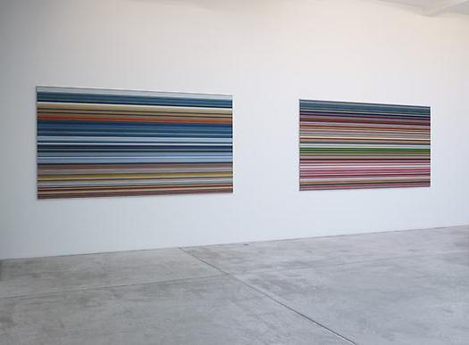
"The book" is not the slim exhibition catalogue for Goodman's show, which reproduces 14 examples of Strip, and edition of 72 unique digital prints [53x105cm, mounted on Aludibond] which were chosen from 4,096 possible strips by "chance operation"; as well as the much larger [160x300cm, plexi] works made by combining "selected" strips. [There are also the oil-poured-on-glass Sindbad pictures, but whatever. Off topic. I just want to contrast the different processes, one clearly Cageian, one clearly not, that went into making works out of the system Richter devised.]

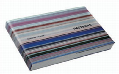
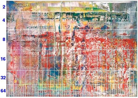
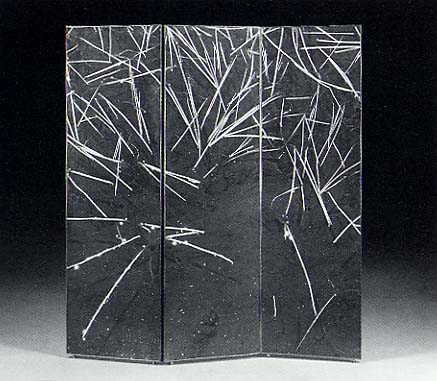
And that system is what's only really expressed fully in "the book." Patterns. Divided - Mirrored - Repeated, the massive artist book [41x27cm, 520 pages] published by Walther Koenig in an edition of 800+50, is overwhelming. It consists of 221 spreads showing strips from each of the "twelve stages of division" being mirrored and repeated. I found myself constantly turning back to the key, a diagram of Abstraktes Bild CR724-4, the 1990 squeegee painting which is Richter's "ready-made" source overlaid with the division and subdivision matrix used to generate the strips. I should have snapped a photo of it, but instead, I've simulated it here by hand, with only six divisions, instead of Richter's twelve:

richter_strips_source_724-4.jpg

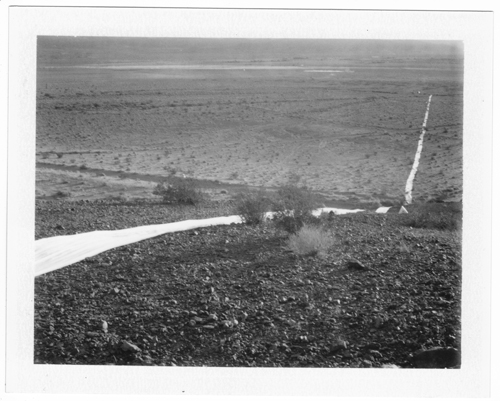
The exponential increase reminds me of the old illustrations of a nuclear chain reaction, which is kind of relevant; Richter has printed digitally manipulated photos of atoms taken with an electron scanning microscope, like his Strontium photomural [below] at the deYoung in San Francisco. Richter conceives of a similarly infinitesimal division continuing here, too, and he apparently only stopped at 4,096 0.8mm-wide strips because the next level of would require magnification to see.

richter_strontium_4251.jpg
Strontium 2004, 910x945cm, CR888, image via gerhard-richter

Before seeing Patterns, I originally thought these Strips were just pixel-wide extrusions. They are not. The wider, lower-order strips clearly show the mirroring and repeating. Here's a detail from the cover of Koenig's 2011 catalogue [pdf] and an unsatisfying page shot from inside. I'd say these are from the 256 and 128 divisions, respectively:

richter_strip_koenig_som11.jpg

richter_patterns_pg_koenig.jpg

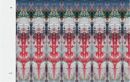
Even on the 2,048 division strips, you can still see the pointy, mini-Rorschach forms. And yet all the stand-alone editions and works came only from the 4,096 level. Which I assume means the static/boring horizontal stripes running across the larger prints should vibrate up close with nearly invisible mirrorings. And since no one has mentioned it, and everyone's first and last resort to the book instead, I'm going to assume that effect is either not evident, not successful, or not compelling.

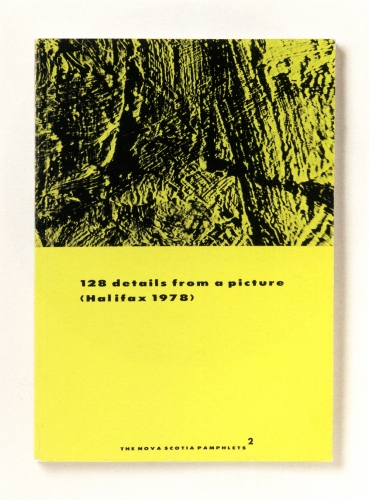
This is not the first time Richter has undertaken a photographic dissection of a painting, of course. He reworks reproductions of his paintings for editions all the time. [He also cut at least one squeegee painting into pieces, which were sold separately, but that's another story.] His most closely related experiment dates from 1978, where he took black and white pictures of an abstract painting, Halifax, which he used in a photogrid, 128 Photographs of A Picture, and in several artist books, beginning in 1980 with the edition that inspired the title of this post, 128 Details From A Picture (Halifax 1978) I.

richter_128_details_1980_5288.jpg

Unlike the computational precision that generated Strips, Richter took the 128 Halifax photos "from various sides, from various angles, various distances and under different light conditions." And yet the end result of both is an apparently randomized, disorientated view of deracinated fragments. A nod to photography's mechanical "magnifiying vision," but also a deliberate and thorough sandbagging of its objective, informational idiom.

richter_128_photos_prints98_5327.jpg
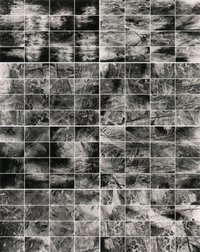
128 Details from a Picture (Halifax 1978) II, 1998, offset prints, image via gerhard-richter

For years, I've loved the Halifax photow way more than the painting. Richter's expedition across the surface of the painting turns it into a landscape, which his images don't even pretend to map. Richter must like them, too, because he's kept reissuing them over the years as new books and editions.

So already in 1978, Richter demonstrates there is no way to reconstitute the image of the original painting from the distorted, incomplete photofragments. Not news. But that might be fine. I bet you could reverse engineer a pretty reasonable approximation of 724-4. Or at least an actionable one. Or an interesting one.

And I would bet that, if you fed a hi-res photo of Halifax and the 128 photos into a computer, it would now be possible to crunch the images and solve the puzzle. Not only could you identify all the parts in the photos, analyzing the light angles and camera distances in a 3D animation program should reveal Richter's position, sequence, and the path he took as he wandered around the painting with his camera.

Richter was able to stay a generation or so ahead in his flight from intentionality, but it seems to have caught up with him.

Previously: Gerhard Richter Strip Show
Similar but not related: Marion Thayer MacMillan's Water Pictures
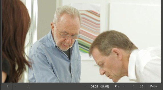
Thumbnail image for doug_rickard_helena.jpg

At MoMA yesterday, I was talking about some Google Maps and Street View projects with a trustee, who was all, "There's an artist in the New Photography show that uses Google Maps, they're stunning!"

And it only occurred to me at that moment that the Doug Rickard in New Photography 2011 is the Doug Rickard of American Suburb X, and that he was showing his incredible series, A New American Picture. [The show opened last week; I hadn't seen it, and the galleries were closed yesterday.]

I really should be discussing it more, because A New American Picture is pretty much the most successful and powerful Street View-based art project out there. Rickard's images are haunting, and he's right when he said [somewhere, I'll find it later] that these photos could not be taken by a camera-wielding photographer; the presence of a human with a lens would destroy the scenes.

Which, as I type it, makes me think of the old Michelangelo chestnut about finding the sculpture in the block of marble. In a way, A New American Picture feels like the photos Rickard uncovered in Street View. Now I've got to get back to the museum and see the actual show.

American Suburb, A New American Picture, by Doug Rickard [americansuburb]
New Photography 2011, Sept 28 - Jan 16 2012 [moma.org]
Previously: On Bremser on Street View

October 5, 2011

Extra Street View

extra_street_view_detail.jpg

So I got the piece installed last night for "While You Wait...", organized by Brian Dupont. It really only works in the daylight, so I won't know yet how it actually looks, but it went in just as I expected it would.

I like this little corner detail here, sort of an Urs Fischer meets William Anastasi meets Roni Horn on Google Street View kind of thing.

October 5, 2011

Richter Schtick

For the record, I think a press conference is a pretty suboptimal forum for discussing art, even worse than for discussing film.

So while I was first leaning towards laughing at Gerhard Richter's apparently gruff, uselessly short-for-a-sound-bite answers at yesterday's Tate press preview, now that I read the mostly stupid questions, I will cut him some slack. If I were a museum marketing guy, I might wish for the artist's quotable help in promoting a big show, but that is also clearly not Richter's M.O. He paints, they shoot, he leaves.

This exchange toward the end, though is pretty damn funny:

Q: Members of the press may be surprised to hear that the published version of your collected words runs to more than a thousand pages (laughter) all of which are fascinating and enlightening. And I wondered if you still write about your work?

GR: "No. not enough!" (laughter).

Gerhard Richter talks about Panorama at Tate Modern [phaidon.co.uk]

Holy smokes, The Brooklyn Rail reviewed Canal Zone Richard Prince Yes Rasta:

Appropriation art is such an accepted part of the contemporary vernacular that some already find it passé--or at the very least no longer trendy. Gagosian isn't exactly at the forefront of art discourse; perhaps the texts of Cariou v. Prince reintroduce the still-revolutionary possibilities of Prince's proposition within the broader, non-art context. The court takes the role of the beleaguered parent who has just discovered that her child is having sex, to the point where Judge Batts employs pointed scare quotes in her introduction of "appropriation art" as a term.
A "scrapbook-style curiosity" that reads like a parent discovering their child having sex? I can't really top that.

Canal Zone Richard Prince Yes Rasta: Selected Court Documents, &c., &c, reviewed by Andrea Neustein and Alex Neustein [brooklynrail.org]

October 3, 2011

Creative America

expo67_photomural_masey.jpg

This interior shot of Fuller/Sadao's US Pavilion at Expo67 almost has it all: installation view of the giant paintings Lichtenstein, Newman, Warhol and Johns made for Alan Solomon's American Painting Now; plus a giant photomural of the moon, perfect for posing in front of.

There's another photomural, earthrise from the moon, on the other side, which was a backdrop for the lunar landscape diorama. You can see it in Carl Harstad's photo:

wexpo67_lunar_charstad.jpg

And the satelloon-like weather balloons were just out of both pictures' edge. Fortunately, Bob Charlton's mother captured them below:

American Pavilion - Expo '67

The underside approach for the lunar platform has this awesome installation [image from fan train's flickr], a series of panels or canvases with abstracted elements of the American flag. It's a little Ellsworth Kelly, a little Helio Oiticica, and a little Richard Lippold at Lincoln Center, all rolled into one piece of exhibition filler created, I assume, by Cambridge Seven.

American Pavilion

This other photo from Carl Harstad of the Hollywood section of Cambridge Seven's exhibit features, what? I don't know. I'd guess it's left over from Joseph Manciewicz's disastrous Cleopatra shoot, in front of a giant, multipanel headshot of Humphrey Bogart.

expo67_bogart_charstad.jpg

Cambridge's exhibition carried the overall title, Creative America, and I think it very successfully steamrolled everything--paintings, photomurals, dioramas, film props, spaceships, cultural effluvia--into a single, unified, spectacularized drive-by aesthetic experience. And it was all done by and for the US Government. As I go on about reconsidering 'non-art' things like photomurals and satelloons in an art context, I keep coming back to the Expo67 pavilion. At one point, it was all art, or something like it. And vice versa.

[note: I've seen it elsewhere, but I took that top photo from former USIA design director Jack Masey's powerpoint deck on the history of postwar World's Fairs, which he presented last October at the National Building Museum. I'm about to listen to his archived talk now.]

I'll probably write some more about Andy Warhol's Shadows, but I want to find more details about its creation and Heiner Friedrich's involvement. In the mean time, though, I just came across a 1985 Richard Serra quote from the Pratt Journal of Architecture that directly relates to seeing Shadows, which extends more than halfway around the Hirshhorn's curved wall:

i keep thinking of a very simple phenomenon that struck me when i was a little kid. i used to walk to the beach every day, down to the end of a jetty and back the other way, and it always struck me as being completely significant that the ocean was on the left when i was going down, and when i turned around, it was on the right, and i had a totally different experience just from turning around and walking the other way. i always thought this was very curious. i always thought there were two different places. everybody knows that you don't have the same experience in turnabout - your relation to the sun has completely changed, left/right brain coordinates are off - everything is different. in fact, you probably have a side you favor as you walk. you probably think differently in each direction. your anticipation and memory change. to me, that's a sculptural concept. if a sculpture allows for that experience, it implies self-awareness. the content of the work is that the viewer looks at himself in relation to what he's looking at...
The no-caps is a big clue, but I found the quote in a 2007 post on Airform Archives. As in so many things, Steve Roden was there first.

thinking differently in each direction [inbetweennoise]

A finalist on a 2006 ABC reality series spent years inventing a car seat that would withstand the type of crash that killed his own infant son. Skyscraper evacuation technology experienced a surge of innovation in 2002. And six months appears to be the amount of time required for Japan's nascent personal earthquake/tsunami survival shelter industry to go from disaster recovery to product launch.

cosmo_noah_ap.jpg
image: ap via guardian

Here is Mr. Shoji Tanaka, CEO of the 10-person, Cosmo Power Co., who has, naturally, removed his shoes to demonstrate the firm's new Noah disaster shelter. The fiberglass pod fits four, has airholes [presumably watertight], and can "also be used as a toy house for children."

One would assume the 200-300,000 yen price could be offset by selling advertising. In the event of an actual emergency, live feeds of Noahs being plucked from the receding sea would provide great logo placement opportunities. Assuming the Noah's occupants survived, of course.

cosmo_noa_ads.jpg
image via goo.ne.jp

Hmm, maybe it's better to base advertising revenue projections on pre-disaster exposures. Noahs will surely be parked outdoors, in precious parking spaces, on roofs, hanging off of balconies, someplace from whence they can float clear from debris. Ad network them together, and paint or paste the pitches on the side with saltwater-soluble ink or glue.

Anyway, Cosmo has apparently been too busy taking 500 or 600 orders for Noah pods, they haven't had time to update their homepage for two years. Actually, the Shelter Noa was registered with the patent office in 2008. And yet as of Friday they had only delivered two.

kimidori_disaster_shelter.jpg

That goo.ne.jp link led to an even better related story, the launch the very same day of the Kimidori Baria 4S, a "soccer ball-shaped" disaster shelter. Because when you're a prefabricated geodesic dome manufacturing company like Gifu-based Kimidori Kenchiku, the best obvious solution, whether it's for a dog house, a comic book coffee house, or a tsunami survival pod, is a dome.

kimidori_barier.jpg
Barier concept video intro is probably Gifu, but looks very similar to the cover image of Lloyd Kahn's 1971 classic Domebook 2.

Hmm, on Kimidori's YouTube channel contains three seaworthiness testing videos. A warning: these might be too upsetting for sensitive viewers and/or actual tsunami survivors.

For example, here is a Barier 4S floating in a portable pool.

barier_pool_test.jpg

In this open water test, the Barier 4S must endure the wake of a small ski boat.

barier_wave_test.jpg

The third video features a new tsunami shelter shape, a dodecagonal tube, which holds six and can be walked safely to shore like a hamster ball. The first videos were posted within weeks of the actual earthquake itself. I guess it's a fine line between ganbaro! and too soon!

UPDATE Or too late. I'd meant to post a link to Ken Isaacs' 1970 dodecahedron pod for Pop Sci, which was designed for another type of escape, when the fellas from Ro/Lu sent along the link to n55's micro dwellings (2005), the water testing for which included 100% more naked Danes than the Barier.

October 1, 2011

Rijksoverheid Rood 2

Here's a look I'm calling Red Steel.

rood_steel_2-2.jpg

The other side. These stalactites form after the panels are put away to dry, I guess by the paint settling across the surface. Then I have to sand them down before doing the next coat.

rood_steel_2-1.jpg

last coat, I switched up the direction of the brushstrokes, which has created a bit of a cross-weave and stalactite thing to sand down. Plus all these bubbles, not sure how those got there.

rood_alum_2-1.jpg

Seriously, this is like the most boringest thing in the world to be typing right now.

Since 2001 here at greg.org, I've been blogging about the creative process—my own and those of people who interest me. That mostly involves filmmaking, art, writing, research, and the making thereof.

Many thanks to the Creative Capital | Warhol Foundation Arts Writers Program for supporting greg.org that time.

comments? questions? tips? pitches? email
greg [at] greg [dot ] org

find me on twitter: @gregorg

about this archive

Posts from October 2011, in reverse chronological order

Older: September 2011

Newer November 2011

recent projects, &c.


our_guernica_cycle_ivanka_320px_thumb.jpg
Our Guernica Cycle, 2017 –
about/kickstarter | exhibit, 2017


pm_social_medium_recent_proj_160x124.jpg
Social Medium:
artists writing, 2000-2015
Paper Monument, Oct. 2016
ed. by Jennifer Liese
buy, $28

madf_twitter_avatar.jpg
Madoff Provenance Project in
'Tell Me What I Mean' at
To__Bridges__, The Bronx
11 Sept - Oct 23 2016
show | beginnings

chop_shop_at_springbreak
Chop Shop
at SPRING/BREAK Art Show
curated by Magda Sawon
1-7 March 2016

do_not_bid_or_buy_iris_sidebar.jpg
eBay Test Listings
Armory – ABMB 2015
about | proposte monocrome, rose

shanzhai_gursky_mb_thumb.jpg
It Narratives, incl.
Shanzhai Gursky & Destroyed Richter
Franklin Street Works, Stamford
Sept 5 - Nov 9, 2014
about | link

therealhennessy_tweet_sidebar.jpg
TheRealHennessy Tweets Paintings, 2014 -
about

sop_red_gregorg.jpg
Standard Operating Procedure
about | buy now, 284pp, $15.99

CZRPYR2: The Illustrated Appendix
Canal Zone Richard Prince
YES RASTA 2:The Appeals Court
Decision, plus the Court's
Complete Illustrated Appendix (2013)
about | buy now, 142pp, $12.99

weeksville_echo_sidebar.jpg
"Exhibition Space" @ apexart, NYC
Mar 20 - May 8, 2013
about, brochure | installation shots


HELP/LESS Curated by Chris Habib
Printed Matter, NYC
Summer 2012
panel &c.


drp_04_gregorg_sidebar.jpg
Destroyed Richter Paintings, 2012-
background | making of
"Richteriana," Postmasters Gallery, NYC

czrpyr_blogads.jpg
Canal Zone Richard
Prince YES RASTA:
Selected Court Documents
from Cariou v. Prince (2011)
about | buy now, 376pp, $17.99

archives