I am stoked and a bit daunted to be participating in a session on appropriation at this year's Contemporary Artists' Books Conference. It will be this coming Friday at PS1, as part of the NY Art Book Fair, and will take place in the Performance Dome:
2:00-3:30 pm
Appropriation and Intellectual Property
Debates on the the legal complexity of appropriated imagery have resurfaced in light of a recent lawsuit between artist Richard Prince and photographer Patrick Cariou. Artists Greg Allen and Eric Doeringer and lawyer Sergio Muñoz Sarmiento will discuss notions of "fair use" and "transformation" with our digital culture, as well as the question of how copyright law should adapt to rapidly evolving artistic practices and whether copyright law might constitute a medium in and of itself. Organized and moderated by Stephen Bury.
I hope you can come to the Fair, of course, because it is amazing. And while you're there, I hope you'll come by the session. It's a big dome, and it'll feel even bigger if it's empty.
CABC Conference Sessions [nyartbookfair]
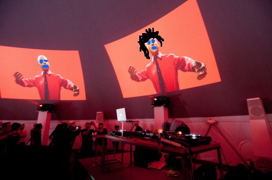
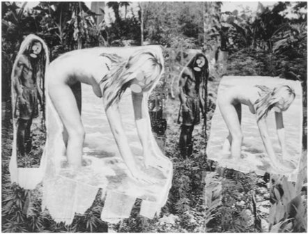
image: from DJ Francois and Juan Atkins' performance during the MoMA PS1 Kraftwerk Festival, via timeout
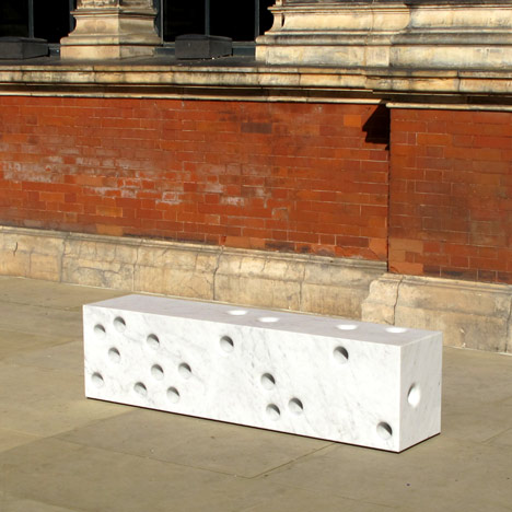
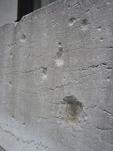
They were inspired by shrapnel marks left in the V&A museum's western facade after the Second World War. "It's something that always fascinated me and Ed on the way from South Kensington tube up to the Royal College when we were students, and so when this project came up we thought it was a nice way to reference that," explained Jay Osgerby at the opening.
Which, of course, immediately brings to mind the facade of JP Morgan's former headquarters, 23 Wall Street. The building was damaged by an explosion on Sept. 16, 1920, that was believed to be carried out by Italian anarchists. A donkey cart laden with 100 lbs of dynamite and 500 pounds of cast-iron window sash counterweights exploded at 12:01, killing 38 and injuring more than 143 people on the street and in the building.
Morgan refused to repair the shrapnel marks, which are still visible on the pink marble Wall St. facade to this day. The building, long vacant, is currently being marketed as a retail site, perhaps for a department or Apple store.
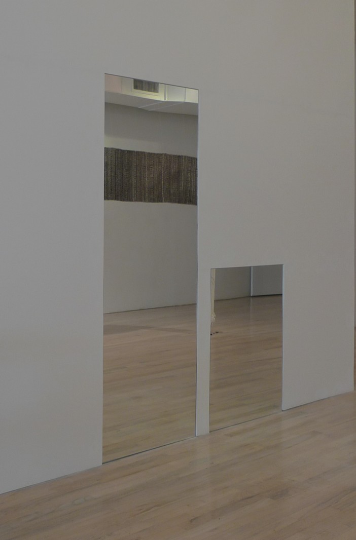
For "Untitled" (Orpheus, Twice), 2012, Greg Allen alters Felix Gonzalez-Torres' elegiac 1991 work, cutting one of the pair of identical, adult-sized mirrors down to a toddler's height. In Gonzalez-Torres' original conception, the work's evocation of the musician of Greek myth who travels to Hades in hope of bringing his beloved Eurydice back from the dead, has been understood as a reference to the artist's own partner Ross Laycock, who had just died from AIDS-related illnesses.
Former MoMA curator Rob Storr has also noted a formal resonance between Felix's piece and Jean Cocteau's 1950 film version of Orpheus, set in postwar France, in which a bedroom mirror becomes the mourning hero's gateway to the underworld.
By transmuting the twinned mirrors' allusions from lovers to parent and child, Allen's simple gesture renews and expands the senses of personal loss and political outrage of Gonzalez-Torres' original. By faithfully preserving the rest of the work, including the title, "Untitled" (Orpheus, Twice) marks the ground traversed in the intervening decades; from a fight for survival against homophobia and the AIDS epidemic to marriage equality and gay dads. Changes Felix might have taken measure of himself, if only he were still here.
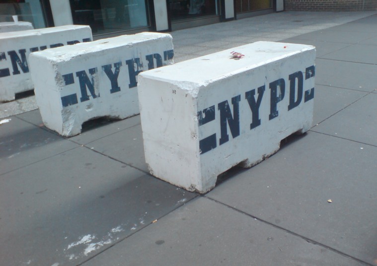
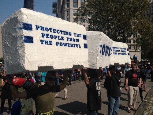
It's UN Season in New York, and the streets are filled with people enjoying the sun, and squeezing through these flat-out gorgeous NYPD barriers. Seriously, I mean, Tony Smith, Donald Judd, Richard Serra, Beverly Pepper, Anselm Kiefer, Janine Antoni, Scott Burton, Robert Gober--you see where I'm going with this? I mean, Rachel Harrison--I'd love to make a Rachel Harrison-style version of these. That would be awesome. and so much more manageable, too.
So the next thing would be a Cow Parade-style celebration across the whole city. These barriers could become a vibrant platform for artists the world over, and highly collectible, too. Munny dolls-meets-street security furniture.
Joy Garnett posted audio from the Richard Prince Canal Zone discussion she, Chris Habib and I had Saturday night at Printed Matter. It's available for streaming or download at the Internet Archive. OR for remixing, autotuning, and stop-action animating, whatever you want, since artpanelsjustwanttobefree it's public domain.
It clocks in at almost an hour and a half, and who knows what you'll find in there. I was too high on life and drunk on power--I was running the projector, too-- to really remember what was said. Though I do remember something about megayachts, Perry Mason vs Law & Order; and wishing you were Rasta and/or punk. So really, something for everyone.
Many thanks to Chris and Joy, to Keith and Max and the PM Crew, and especially to the awesome and engaged audience. We'll do it again for either the damages hearing or the Supreme Court phase.
I'm really stoked to be participating in two events in New York in the next few days. Please come if you're in town, and pass the word.
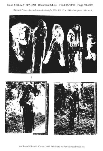
crappy photocopy court exhibit of Specially Round Midnight and the Patrick Cariou photos that went into it
The first is at Printed Matter this coming Saturday evening, Sept. 22, from 6-7:30PM. It should be a hoot:
The ongoing Cariou v. Prince trial have presented a high-stakes platform for debating copyright, appropriation, fair-use and artists' rights. One thing that's been oddly missing from the discussion, though, is the art itself.
Printed Matter will host a raucous crit of Richard Prince's little-seen but much-contested Canal Zone paintings, culminating in an open-forum, Iron Chef-style evaluation of each artwork in terms of content, aesthetics, and infringiness.
The Ocean Club, 2007
Using bootleg copies of Prince's banned exhibition catalogue and excerpts from the artist's own sworn deposition testimony which were never entered into evidence in court, panelists Joy Garnett, Greg Allen, and Chris Habib will take a closer, critical look at Prince's paintings and practice in an art historical context.
Joy Garnett is an artist and writer in Brooklyn, NY. She is also the founder of the blog NEWsgrist (where spin is art).
Greg Allen has been writing about the creative process at greg.org: the making of, since 2001. He published Canal Zone Richard Prince YES RASTA: Selected Court Documents from Cariou v. Prince et al. in 2011.
Chris Habib is an artist and the curator of HELP/LESS, which runs through Sept. 29th at Printed Matter.
And then next Friday, Sept 28 at 2-3:30, I'll be speaking at the Contemporary Artist Book Conference as part of the NY Art Book Fair at PS1. The session, led by Stephen Bury, will be on the limits, excesses, and future of appropriation and copyright law. Artist Eric Doeringer and artist/lawyer Sergio Muñoz Sarmiento will also speak. It should be awesome. If you're at the Fair, definitely come join us in the Dome.
Maurice Berger has a fascinating post on the NY Times Lens blog about Malcolm X's sophisticated use of the media, particularly photography, and particularly the antagonistic white/mainstream media, to reach out to potential black constituents.
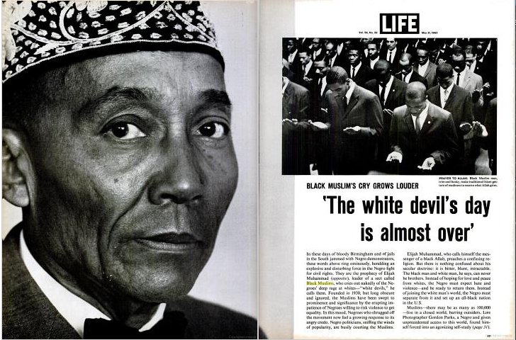
Exhibit 1--actually and unfortunately, it's the only photo in the post--is Robert Flora's 1963 photo for UPI, the caption for which:
Malcolm X, the nation's number two black Muslim leader, reads a story about the Muslims in a national magazine as he sits in court with other Muslims awaiting verdict of an all-white jury deliberating the face of 14 Muslims accused of criminal assault against Los Angeles police officers.
manages to mention Muslims four times in once sentence. Impressive.
As Berger notes,
The men in the picture are focused on articles about the Nation of Islam. The Life magazine story that engrosses Malcolm, for example, was typical of the derisive coverage of the Black Muslims in the mainstream press: "The White Devil's Day Is Almost Over: Black Muslim's Cry Grows Louder," screams its headline.
It only proves Berger's astute point to point it out, but Malcolm X is anything but engrossed; he's holding the magazine up for the photographer. Even if he were able to read at that angle--he seems to actually be looking at the paper in the hands of the man to his left--a quick search of the actual LIFE Magazine article shows there is nothing to read. The other half of the spread is a full-page shot of Elijah Muhammad, by Gordon Parks. [The cover line for the feature reads, "A Negro Photographer Shoots From The Inside - THE BLACK MUSLIMS."]
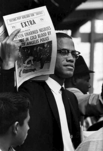
Which, it turns out the man to Malcolm's right is also reading. Berger doesn't mention the headline on the paper the guy behind is very much not reading: "Seven Unarmed Negroes Shot in Cold Blood by Los Angeles Police."
Which turns out to be Muhammad Speaks, the NOI's newspaper. The first Google result for it appears, perfectly, in Gordon Parks' LIFE feature. Parks was following Malcolm at the trial. Which only underscores the newspaper's--and eventually, the magazine's--function as a prop, intended not [necessarily, nor not solely] for the jury, but for the photographers covering the trial.
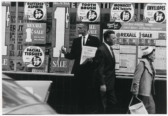
If there's any doubt of the paper's message-within-a-photo, here are other shots by Parks, of Malcolm X selling the paper,
I don't know why it has literally never occurred to me, but Berger's account of the vehemence and derision Malcolm X received from the white establishment, and the extraordinary calculation and discipline with which Malcolm carried and presented himself, and his unfailingly calm, cool, self-assured and buttoned-down image, really jumps out at me now. Especially when it's coupled with the terms Muslims and Black Muslims, which get repeated in the press of the day with such divisive, alienating force.
As if that was the absolute worst, scariest thing you could call someone. In 1963. In 2012, meanwhile, it's settled into a niche birther conspiracy.
Sterne wrote and designed Tristram Shandy [1759] not just as a story, but very much as a reading experience. Which is why the death of the parson Yorick in Vol. I is followed by a page printed solid black. It's usually called [by Shandyheads] The Black Page.
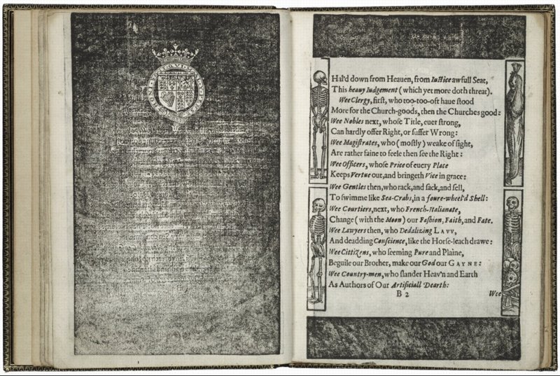
Lachrymae, 1613, Joshua Sylvester, image via folger.edu
Whitney has pulled together an incredible assortment of mourning pages, which usually appeared at the beginning of a book as a memorial to a deceased king or the author's patron.
They sometimes had text or a crest, or designs or illustrations, but a solid monochrome monolith of black was not unheard of. Except, of course, by me.
In 2009 the Laurence Sterne Trust organized an exhibition titled, The Black Page, for which they solicited 73 artists to create their own interpretation of the black page. The artists ranged from John Baldessari to Kenneth Goldsmith to Lemony Snicket.
I think that by now, three+ years later, the artificial suspense has played out, and the Trust can go ahead and reveal the identities of the artists of each work on their little blog.
It's not like this hasn't happened before. I remember one time, in the late 1990s, at the Stedelijk, being transfixed by a series of videos Gabriel Orozco had made. I was already very interested in his work for a while, but there was something about those videos.
Orozco had basically edited them in-camera while walking around New York and Amsterdam, and they had this wonderful, stream-of-perception-like quality, almost as close as you could get, it seemed, to the artist's own visual experience.
It basically changed the way I see. He was making off-hand, formal connections between things. There were a lot of circles, for example. Cups, bicycle tires, stickers on windows, bar coasters, bubbles. And once the connection had been made, it became impossible not to think of Orozco every time I saw circles in the world. There was much in Gabriel's early work that was similarly, quietly powerful in the way it awoke you [me] to nuances of seeing and understanding the world around you [me].
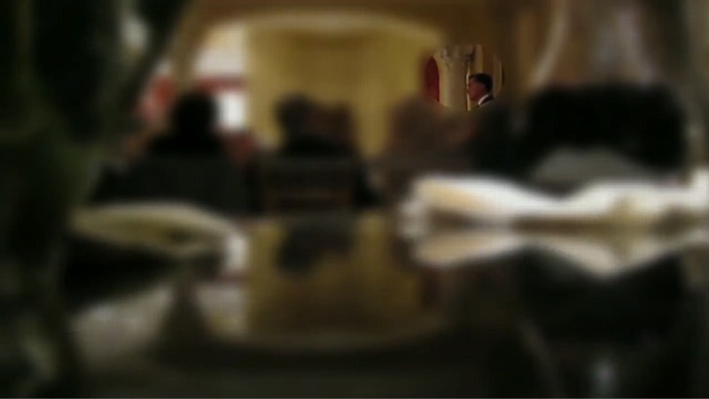
Which is not quite the point here, except that just as with Orozco and his circles, it's now basically impossible for me to see a blur and not think of Gerhard Richter. And not wonder, for example, how awesome it might be as a painting.1
Like--oh, I'll just pick any random thing--a still from the damning video of Mitt Romney speaking unguarded Republican truthiness at a private fundraiser in Florida, which was shot and disseminated anonymously for weeks before Mother Jones picked it up today. And attempted to protect the video's source--by blurring the footage. Except for Romney himself, whose face is unblurred, and the Corinthian capital behind him. Hey look, a circle.
1 The answer, of course, is it'd look awesome. Just look at those colors. The different segments of the video have different blurs, too. I think this one's especially velvety. Chinese Paint Mill certainly has their work cut out for them.
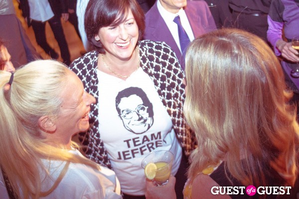
Because on Wednesday night, director Jeffrey Deitch was all smiles and business as usual, headlining Baguettemania, a pop-up store-in-store/booksigning at Maxfield to commemorate the 15th anniversary of Fendi's iconic It Bag.
There was a whole crew of MOCA folks in attendance, including MOCA publicist Lyn Winter and leading board members Steven Mnuchin and Maria Bell. That's Deitch in the purple up top, talking to Rudi Geinreich supermodel Peggy Moffitt. And that's Maria on the right-- whose hair looks fantastic, wow--talking with art book publisher and Chemosphere resident Lauren Taschen. Who, as Women's Wear Daily reports, "made her own fashion statement with a 'Team Jeffery' T-shirt."
WWD continues
Apparently an anonymous donor sent a box of the shirts over to MOCA in support of the embattled museum director. Deitch even posed with women wearing them in front of the giant plaster Baguette in the courtyard.
Apparently. So much journalism embedded in that single word. Did these women get their shirts from MOCA? Did someone from MOCA bring a stack of shirts to hand out at someone else's event?
To answer these exciting questions, I looked through several hundredimages from Baguettemania, and it appears Mrs. Taschen was the only member of Team Jeffrey to be rocking this particular look. I can't guess where WWD might have gotten that report.
Instagram Update: I have learned the Team Jeffrey shirt was discussed in the social media coverage of Baguettemania, and that Deitch cheerily said the shirts were made by "a street artist" as a gift. Which is very thoughtful. And also gives us a chance to reflect on the difference between anonymous and unleaked.
Wow, is it that time of Election Year already? When superblogger and apparently self-hating theater queen Andrew [Lloyd] Sullivan posts a WTF Obamafied version of a Les Mis anthem?
This time it's "One Term More" which, Holy Cameron Mackintosh, people. Just go watch it this very instant. Don DeMesquita, ladies and gentlemen.
Because it even has "A Political Parody" right in the subtitle, I'm forced to wonder what, exactly, it's a parody of. And then how do I really know it isn't some kind of super-jiujitsu triangulating GOP countermeasure to psych out musical theater liberals? But no, the fair use disclaimer is so desperate, they must be real.
HOW COULD I HAVE EVER DOUBTED UPDATE: I forgot the couplet, "Emboldened by Star-Spangled myth,
We want a JEDI...NOT a SITH!!!"
Anyway, in 2008, it was "Les Misbarack," UltimateImprov's straight-up lipsynch of "One Day More," set in the Obama National Campaign HQ on election eve.
Which Sullivan introduced on Sept. 12th, at 4:53 AM, with the comment, "Whatever happens, the McCain campaign could never pull this off. Patience, steel... triumph."
To which I will only add, "Malgre tout, la Resistance demeure." Or in this case, "So hat doch, la Resistance gesiegt!"
Ooh, I've been going through boxes of books in storage, and there have been some great finds. [And also some total crap books that, what, I have no idea, except that at one point in my life it was apparently impossible for me to leave Rizzoli emptyhanded.]
On the bright side, there was also Maurice Tuchman's original 2-vol catalogue raisonne for Chaim Soutine, published in 1993, which I don't think I've opened for 15 years. It's so fantastic. Full-page, full-color illustrations for almost every work [of course, the Barnes's Soutines are reproduced in black & white.]
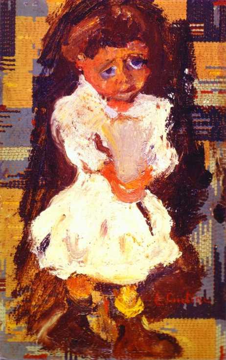
One painting I've never seen in person, and hadn't noticed before, is this late [c. 1934 or 1937] Portrait of a Small Child, also known as La Pauvrette. [The artist told Max Kaganovitch, the dealer who bought it in 1937, that she was embarrassed by her worn out shoes. He always painted from life, too, so I'm willing to believe he didn't just imagine this.]
What caught my eye this time--besides the kid's eyes, which, right??--was the abstract gridded dot pattern in the background. As if Soutine painted the girl on top of an Alma Thomas, or this was part of his geometric pointillism period, which, given his manic, spontaneous expressionism, would make him even more disturbing.
But it turns out to be linoleum. For whatever reason, I can't figure out, but maybe it was Soutine's perennial poverty, he painted this on a 9.5 x 15-inch piece of linoleum flooring.
Though he occasionally painted on wood, or on canvas mounted to a board, this is the only known painting Soutine did on linoleum. Kaganovitch wrote that upon purchasing the piece, the artist initially wanted to "finish" it by painting out the patterns, but he decided to leave it. Which seems unprecedented.
In 2006, Kaganovitch's heirs sold La Pauvrette at Sotheby's in London for around 388,000 pounds. So on the bright side, it's not in a museum, which means it is now on my to-buy list. On the other hand, to clear that list, I will need a billion dollars.
I am stoked to announce my participation in "Domestic Objects," at Bridge Gallery on the Lower East Side. The show opens tonight, Wednesday, September 5th, and runs through October 18.
In addition to my piece, the show includes work by John Powers, Susanna Starr, and Jer Thorp & Diane Thorp. "Domestic Objects explores concepts of our constructed private spaces, belonging, family, domesticity, and material possessions."
Which seemed to me like an excellent context and time for "Untitled" (Orpheus, Twice), 2012. It's a piece I've actually been thinking about for a couple of years, but this is the first time it will be installed.
I've been thinking about art that doesn't exist, and why not. "Untitled" (Orpheus, Twice), 2012, is a speculation, or a wistful reimagining, of Felix Gonzalez-Torres' 1991 work of the same title. I'll probably write more about it later, and how it came to be, but now I'm going to hit the road.
If you're able to make the opening tonight, it'd be great. Otherwise, I hope you'll get to see the show while it's up.
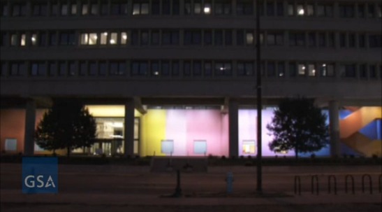
I've been wanting to write about Color Fuses, Milton Glaser's 1974-5, 27x672-foot gradient mural in Indianapolis, all week, ever since Richard McCoy's great Art21 post about the GSA's restoration of the work's 34 monochrome sections, and the realization, finally, of Glaser's original lighting effects.
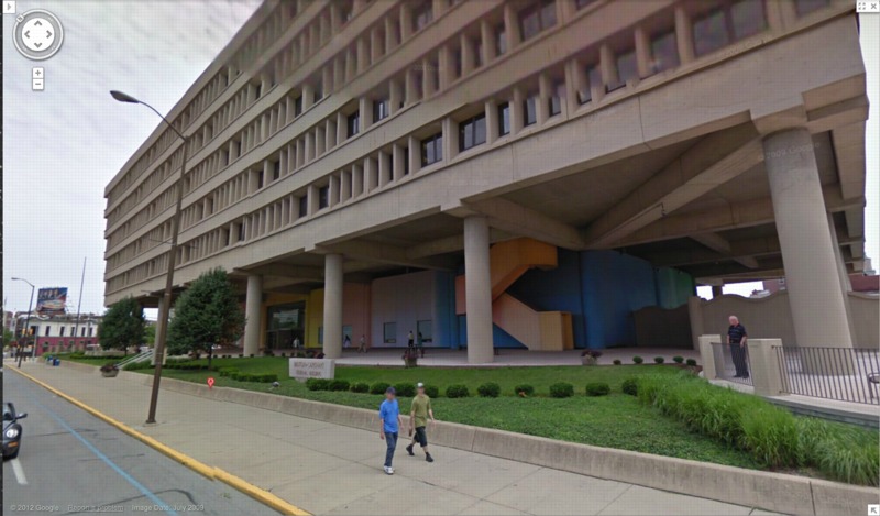
Besides my well-documented fascination with monochromes and gradients, I found myself intrigued by Glaser's stated purpose for the mural, which wraps around the stark, ground-level loggia of the Minton-Capehart Federal Building, designed by local modernist eminence and Philip Johnson alumnus Evan Woollen. Glaser wanted to create "a mural that would express a spirit of openness and thus a new sense of government."
The architect, for his part, hoped the mural would help make the building feel "cheerful, disarming, fresh, welcoming, and inviting." Which is, let's face it, a helluva thing to hope for your Brutalist, concrete, ziggurat superblock.
[Walking around the building on Google Maps gives a nice sense of the mural in daylight, including the backside, which is across the parking lot, and the bluish south end, which is largely blocked by privacy wall around the building's daycare center. Even ignoring the unfortunately undulating wall--an out-of-place motif picked up by the single, sad wave of shrubs on the building's strip of security plinth grass--the Minton-Capehart can only be my second favorite example of brutalism and daycare, way behind the playground on the plaza of the J. Edgar Hoover FBI Building.]
So I'm inclined to believe that the project went down a little differently at the time, a time when the GSA had revitalized and professionalized its Percent For Art program under the 2nd Nixon administration. [A distracting sop to the elites, he figured.] It's not clear, for example, whether Glaser came to the project under the new system, as a world-class, committee-reviewed pick, or the old way, in which case he would have been suggested by, and thus, subsidiary to, the architect.
But then watching the GSA's video of the original/new lighting scheme, which adds slow ripples [undulations!] of light/dark around the building, I immediately thought of art. Specifically, Paul Sharits, who had been making painting-like, flickering, multi-projector, monochrome film installations for several years already when Glaser created his mural. [Writing about Sharits' 1972 piece, Soundstrip/Filmstrip, Rosalind Krauss said it "muralizes the field of projection."]
Paul Sharits' Shutter Interface, first shown at ArtPark in NY in 1975, here at Greene Naftali in 2009.
And I wondered about the different ways art functions, and is treated, both at the time and through the lens of history and criticism. Partly because I'd never heard of Glaser's mammoth mural before. Or of any other art he's made. It seems to fall into this population of things people commissioned, made and showed, that are/aren't/look like/function as art, which are [happen to be?] made by designers. And which are excluded from consideration within the context of art and art history. And politics is at the center of this boundarymaking.
I don't know yet how to make sense of Glaser's mural, but I bridle at what I instinctively feel, that despite its awesomeness and Glaser's immense influence, Color Fuses is somehow a less significant work because it's art by a designer. Or art for the government. Or art the architect will put up with. Especially when I read Glaser's intentions for the piece, which, by 1974, transparency and a new form of government were certainly on a lot of peoples' minds.
And finally, last night, I found Hillman Curtis's video profile of Glaser on Brainpickings, where the designer talks about art's role in culture. It's "benign" and "pacifying," he says, and succeeds best when it creates "commonalities" by which "the likelihood of us killing each other is diminished."
Again, I don't think that perspective has been very prominent in the art world discourses of the day. It could be dismissed as hyperbolic, an at once idealistic and yet embarrassingly low bar. And yet, lately, the polarization in our cultural and political spheres make me wonder if not throttling each other is actually something we'd do well to focus on. Even if pacification by painting undulating rainbows on government buildings is not the best role demanded by the times for art.
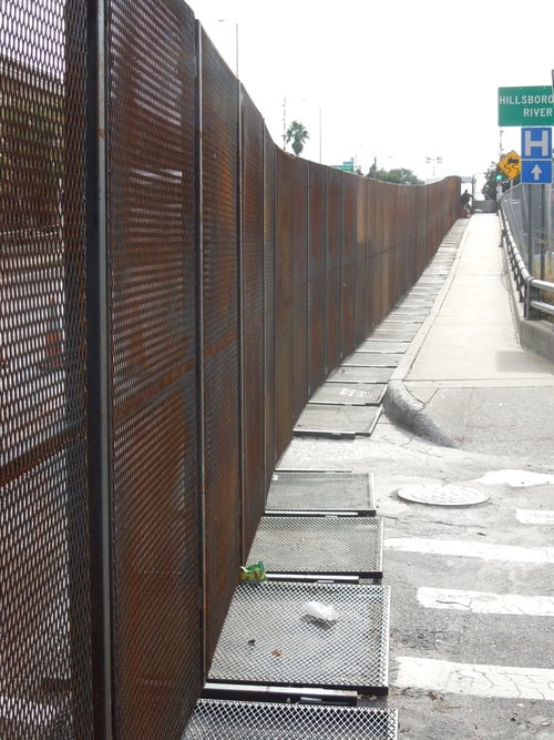
I'm really trying to get this writing thing done tonight, but I just have to point out that Richard Smith's photo of the Secret Service's six-mile perimeter fence at the RNC in Tampa is awesome. It's like if Christo and Serra were cellmates and Cady Noland was their baton-wielding guard.
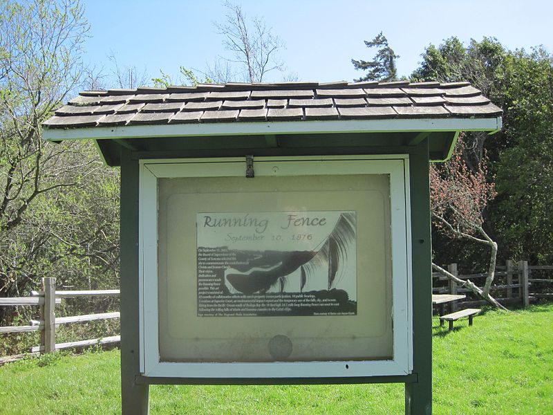
This anniversary marker is located in the quarter-acre Watson School Historic Park in Bodega. An outdoor vitrine contains an installation photo by the artists onto which was added the following text:
Running Fence
September 10, 1976
On September 11, 2001,
the Board of Supervisors of the
County of Sonoma selected this
site to commemorate the contributions of
Christo and Jeanne-Claude.
Their vision,
dedication and
perserverance made
the Running Fence
possible. This art
project consisted of:
42 months of collaborative efforts with ranch property owner participation, 18 public hearings,
3 sessions at Superior Court, an environmental impact report and the temporary use of the hills, sky, and ocean.
Rising from the Pacific Ocean south of Bodega Bay the 19 foot high 24.5 moile long Running Fence ran west to east,
following the rolling hills of Marin and Sonoma counties to the Colati ridge.
[Format and italics original.]
Watson School Park is currently listed as closed for renovation. It is not known whether the marker is affected.
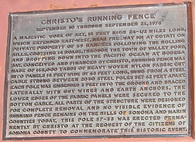
Meanwhile, in December 1976, the County Landmarks Commission in Sonoma designated Pole #7-33 as Historic Landmark #24, and installed a bronze plaque [above] that reads:
CHRISTO'S RUNNING FENCE
September 10 through September 21, 1976
A majestic work of art, 18 feet high 24-1/2 miles long, which extended east-west, near Freeway 101 at Cotati on private property of 59 ranches following the rolling hills, crossing 14 roads, through the town of Valley Ford, and dropping down into the Pacific Ocean at Bodega Bay. Conceived and financed by Christo, Running Fence was made of 165,000 yards of heavy woven nylon fabric cut into panels 18 feet wide by 68 feet long, hung from a steel cable strung between 2050 steel poles set 62 feet apart. Each pole was embedded 3 feet into the ground and braced laterally with guy wires and earth anchors. The lower edges of the fabric panels were secured to the bottom cable. All parts of the structure were designed for complete removal and novisible evidence of Running Fence remains on the hills of Sonoma and Marin Counties today. This pole #7-33 was erected permanently by Christo at the request of the citizens of Sonoma County to commemorate this historic event.
The County's landmark information lists the site as "containing steel pool [sic] from original art installation."
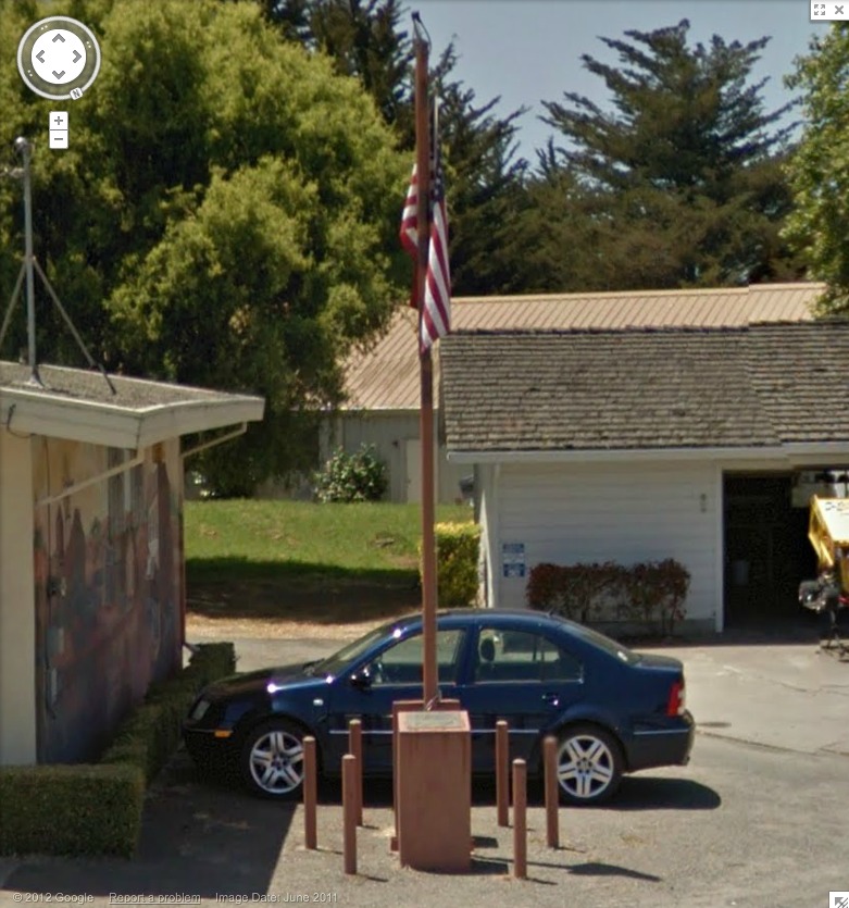
I believe this is it, next to the post office. Looks like it's presently being used as a flagpole.
Oh, the Bodega bay Heritage Gallery has a photo of the fancier plaque on the other side of the pole. Also, Running Fence was acquired by the Smithsonian American Art Museum. Remembering Running Fence was on view in 2010.
If moving it away from that mural didn't destroy its context, I would definitely replicate that, as is, stanchions, flag and all. Maybe a vinyl wallpaper photomural would work.
Since 2001 here at greg.org, I've been blogging about the creative process—my own and those of people who interest me. That mostly involves filmmaking, art, writing, research, and the making thereof.