September 2009 Archives

September 30, 2009

BeDazzled At RISD

dazzle_risd_1.jpg

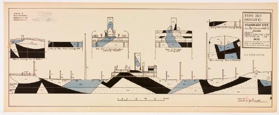
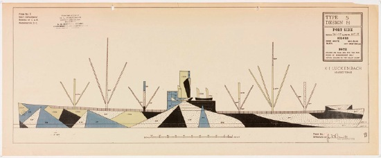
BeDazzled was an exhibition organized by the appropriately named RISD librarian Claudia Covert of the library's collection of WWI Dazzle Camouflage patterns and photographs from the US Shipping Board:

Maurice L. Freedman donated the plans and photos in the collection of the Fleet Library at RISD. Maurice was the district camoufleur for the 4th district of the U.S. Shipping Board, Emergency Fleet Corporation. The Shipping Board was a precursor of today's Merchant Marine. The Navy gave dazzle plans to each Shipping Board district. Maurice's job was to take the plans and hire painters (artists, house painters) to paint the ships accordingly.
dazzle_risd_2.jpg

Freedman went on to design the first version of the game Battleship, which is set to be ruined by a giant Hollywood movie.

The rather excellent website for BeDazzled, which closed in April 2009 [risd.edu/dazzle]

September 30, 2009

Razzle Dazzle

guilty_monacoeye.jpg

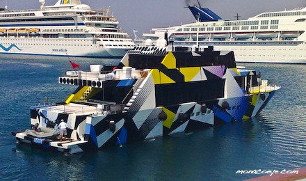
Last year Jeff Koons covered Dakis Joannou's angular yacht Guilty [designed by Ivana Porfiri] with a pattern inspired by WWI naval camouflague. The technique, known in the US as Razzle Dazzle and in the UK as just Dazzle Painting, was created by the British artist Norman Wilkinson.

mahomet_dazzle_gotouring.jpg

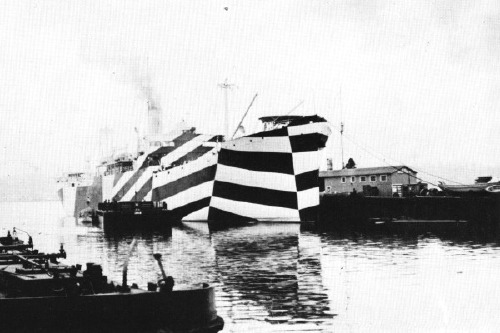
Dazzle deployed Cubism's multiple perspective and fragmentation to thwart the aim of German U-boat attacks by obscuring the ships' dimensions and traveling directions. The advent of sonar eliminated the need for visual targetting--and the utility of Dazzle Painting.

Ironically, Koons camo design made it exponentially easier for the yachtspotters at Monaco Eye to shoot Guilty in port last summer.

Dazzle Painting history and images [gotouring.com]

The US Navy apparently kept using Razzle Dazzle techniques through WWII. A large collection of 455 lithographs of camouflage designs was discovered in 2008 at RISD, the 1919 donation of an alumnus, Maurice Freedman, who was a camouflage painter during the war. They were exhibited for the first time last spring. [Dazzle Camouflage on Wikipedia]

September 28, 2009

Gerhard Street View

g_richter_13403.jpg

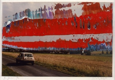
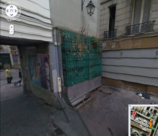
A Google Street View image of a French radar-jamming installation obscured by order of the Ministry of Defense or an overpainted photograph by Gerhard Richter? You decide.

September 27, 2009

Houses Of Orange

dutch_palace_gmap4.jpg


NL Architects
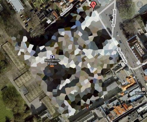
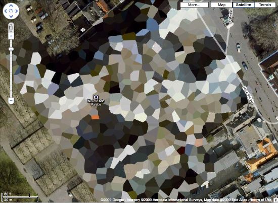
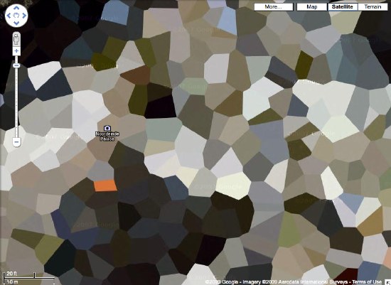
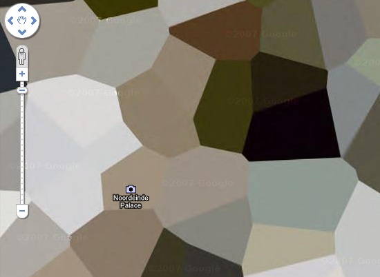
thinks it might make a good Herzog & deMeuron project, but I think Google Maps' security pixelization of the Dutch Royal House's Noordeinde Palace in Den Haag would make an absolutely fantastic series of landscape paintings.

dutch_palace_gmap3.jpg

dutch_palace_gmap2.jpg

dutch_palace_gmap1.jpg

Where else in the world are such things? The DRH's summer palace at Huis ten Bosch; an AZF chemical weapons factory in Toulouse...

There's a surely incomplete list of obscured satellite images on Wikipedia, and a map. Which includes Mastercard's corporate headquarters in Westchester, which actually looks like it was painted over. They call it "watercolored." Perfect.

here's the list of camo'd Dutch sites I've been working with.

Previously:
architecture for the aerial view, including WWII factory roof camouflage: the roof as nth facade
art for the aerial view: Calder on the roof

Sheesh, build an Empire State Building out of Erector Sets at Rockefeller Center and the NY Times still thinks you're dead:

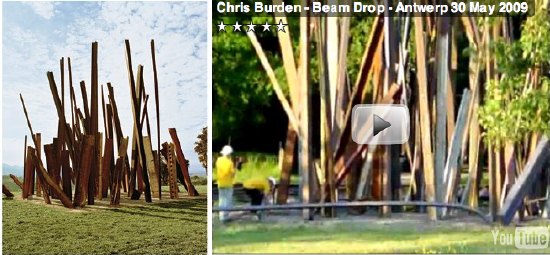
The greatest enchantments at Inhotim are produced by works that not only draw on powerful subconscious currents but that also could only have come into being in this place, in Brazil. I am thinking, for instance, about Chris Burden's ''Beam Drop,'' a sculpture that -- like a lot of work by this artist, who is so steeped in art-world legend it sometimes seems surprising that he exists and is still at work -- was realized only once before, in 1984, in a version that has disappeared.
Never mind that Burden made another "Beam Drop" in Antwerp. Or that the original "Beam Drop" was made in New York, too.

burden_beamdrops.jpg

Meanwhile, this is as good a time as any to hate on the insanely intrusive ads that pop over Every. Single. #$)(%*ing. Page of T Magazine? It's like walking into Saks and getting spritzed by a hundred perfume salespeople desperate not to lose their jobs.

September 24, 2009

Tripod-For-Handheld

Gruber calls this Windows 7 Launch Party video "cringe-inducing," and it certainly is. Though I'm pretty sure the technical term for erratic, pointless, exaggerated simulation of handheld camera movement using a fixed camera and a pan handle is seizure-inducing.

That said, the dialogue is so bafflingly abstract, it's almost sublime. I'm sure it's because they didn't have party "activities" website finished before the shoot, but this video could have a future as an insider's critique of the corporate existential void. "Windows for Godot."


au.bondi.2009.058, originally uploaded by africadunc.

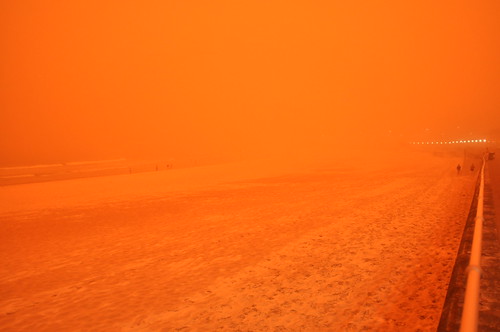
au.bondi.2009.058

1. Pop open a Diet Coke.
2. Eat all the Red Vines you want.
3. uh, actually that's as far as I've gotten.

uconn_olson_F139a7.jpg

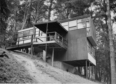
Last month, when I tried to identify this kind of awesomely simple house at Black Mountain College [from a photo in UConn's Charles Olson Collection], the best I could do was a guess, that it was A. Lawrence Kocher's plywood-based Service Building, built in the 1940's to house the BMC's African American kitchen staff.

Well, thanks to the Internet, these things have cleared themselves up. I just got an email from Leigh, who lives and works at Lake Eden Events, an event and destination operation on the BMC site. She pointed me to the BMC Project website, which has the answer.

This is, in fact, the Science Building, designed and built between 1949 and 1953 by faculty architect Paul Williams in collaboration with students Dan Rice and Stan VanDerBeek. [Yes, that Stan VanDerBeek.] From BMCProject:

A site on the lower rim of the knoll just south of the Studies Building was selected, and Williams, Rice, and VanDerBeek started construction in December. By August 1950 lights were on in the building. By January 1951, construction was not complete. An engineer was called in to help find the cause of structural problems which were causing the window panes to shatter the lower front frame to separate where the floor overhung the columns. He concluded that the building was structurally sound, and that bending 2 x 4s had caused the problem.

The building was finished in the winter of 1953 not long before the resignation of Natasha Goldowski, science teacher. She refused to use the building, concerned that it would collapse on the hill. When the lower campus was closed, the looms were moved from the art studio in the Studies Building to the science building.

The building is, in fact, still standing. Camp Rockmont uses it for staff housing. Check out blackmountaincollegeproject.org for some tiny photos.

Now about that Kocher Service Building. Leigh also notes that the only photos she's ever seen of it are from the NC State Archives, [also on BMC Project]. It looked pretty basic and boring, with a shallow, pitched roof. Also, it burned down less than two years after it was completed.

bmc_fuller_dome.jpg

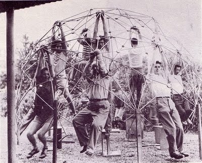
As for this VanDerBeek at Black Mountain thing. Buckminster Fuller taught at BMC for two summers. In 1948, he had his students try to build the first of his geodesic domes out of venetian blind strips. By 1949, Fuller brought a much more successful prototype of a collapsible dome made from aircraft aluminum tubing threaded with cable. I suspect VanDerBeek--who went on to build his own countryside dome for showing immersive, multi-projector films, the Movie-Drome, is one of those khaki monkeys hanging off of it in the photo above.

That's the thing with domes; even if you head out in the opposite direction, eventually, you find your way right back.

10/2014 update: URLs for the Black Mountain College Project have been updated. The BMC Project materials are being prepared for inclusion in the Western Regional Archives collection, which opened last year near Asheville, NC. The khaki monkeys picture above is credited to Masato Nakagawa.

warhol_crime_alert.jpg

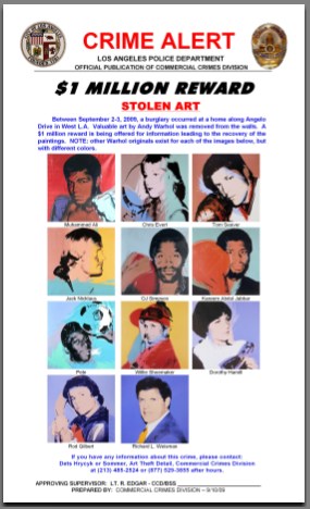
Earlier this month eleven portrait paintings by Andy Warhol were reported stolen from the home of Los Angeles collector Richard Weisman. The paintings, known the Athletes Series, depict some of the greatest athletes in the world in 1977, plus Weisman. There is a $1 million reward for information leading to their return.

When one man's Warhols are stolen, all our Warhols are stolen, because no matter how many Warhols you technically own, Warhol belongs to all of us. It's imperative that we band together to help these Warhols return to their rightful home [so they can be sold]. Which is why greg.org is announcing The Find The Warhols Project.

MISSION
The Find The Warhols Project seeks to facilitate the safe return of the Weisman Warhols by assisting in the dissemination of crucial identifying information where it is needed most: on the front lines of the art world.

FTW will educate and empower an ever-vigilant grass roots army of Warhol Watchers who will be able to quickly spot the stolen Warhols from among the thousands of Warhols streaming through the art world every day.

THE PROJECT
Many, many Warhols look the same, especially the 40x40-in. square silkscreened portraits of seemingly random people who were rich and/or famous in the 70's and 80s. This can make it hard to tell if a Warhol is hot or not.

For example, just look at these three seemingly identical Muhammad Ali portraits. Can you tell which one is stolen, which one sold for triple its high estimate, and which one was still available last summer in Beijing?

warhol_alis.jpg

Fortunately, on September 10th, 2009, The Los Angeles Police Department's Art Theft Detail released a one-page, notepad-sized Crime Alert [top] with reproductions of the exact eleven stolen paintings and a critical detail: "NOTE: other Warhol originals exist for each of the images below, but with different colors."

This is an invaluable crimebusting tool that needs to be distributed as widely as possible and studied regularly whenever you buy, sell, see, hang, ship, frame, conserve, appraise, authenticate, license for marketing, or critique a Warhol.
ftw_poster.jpg

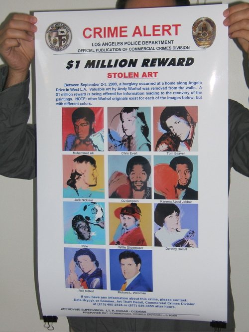
To that end, FTW will take this crucial-but-small Crime Alert and make larger versions which will enable quick and certain detection at a glance. These giant, poster-sized versions will be offset print in full color on 100-lb glossy paper, and will be suitable for hanging by Warhol Watchers at key art world locations with high Warhol traffic, including:


  • Art gallery backrooms

  • Private dealers' showrooms

  • Hedge fund conference rooms

  • Park Avenue cosmetic surgeons' waiting rooms

  • West Village real estate developers' conference rooms

  • West Village townhouse stagers' conference rooms

  • Collectors' offices

  • Private curators' offices

  • Museum curators' offices or cubicles

  • Independent curators' hallways, since it is unlikely they have offices

  • Curatorial studies graduate program student lounges

  • Auction house cube farms

  • Art magazine offices

  • Art magazine freelance writers' walls above the beds where they write because they can poach the neighbor's wi-fi from there

  • Art organization benefit auction organizers' conference rooms

  • Art fair booth backrooms

  • Art fair concierge desks

  • Art fair VIP lounges

  • Art fair sponsor VIP lounges

  • Fractional ownership jet terminals

  • Museum development directors' assistants' offices

  • Museum registrars' offices

  • Museum freight elevators

  • Crate fabricators' workshop offices

  • Framers

  • &c., &c.


HOW YOU CAN HELP

  1. Get some FTW Crime Alert posters.

  2. Put them up in your own corners of the art world.

  3. Study the details of the Stolen Warhols frequently to keep them fresh in your mind.

  4. Whenever you buy, sell, or otherwise encounter a Warhol, check it against the Crime Alert poster to see if yours is one of the Stolen Warhols.

  5. Encourage others to do the same by writing about the FTW Project on your blogs, by giving posters to other collectors and dealers and art world friends, by holding FTW Happenings in your lofts to build awareness and learn the paintings, &c.

FTW Crime Alert posters are available for pre-order through Kickstarter starting at $10 for two, to cover the cost of printing [$883] and shipping [$3.62/order]. Orders will only be processed and the posters will only be printed and shipped as soon as 141 pre-orders are received. If the Stolen Warhols are found before FTW reaches 141 pre-orders, the Project will cease, no posters will be printed, and no orders will be charged or fulfilled. The FTW Project Kickstarter page has more information, including details of how Kickstarter pledges work, as well as options for ordering multiple posters, for international shipping, and for collectors who own more than 11 Warhols.

BACKGROUND
The Warhols, known as the Athlete Series were commissioned by Richard Weisman in 1977 for the purpose of bringing the world's two greatest leisure pastimes--sport and art--together. They are all portraits of famous athletes posing with the primary implement of their chosen sport next to their heads. Plus a headshot of Weisman himself, whose mother co-founded the Museum of Contemporary Art in Los Angeles, and whose uncle Norton Simon founded the Norton Simon Museum.

Warhol produced eight complete sets of the paintings for Weisman, plus an unidentified number of additional individual paintings. Two sets were broken up and given to each athlete and his or her sports governing body. Weisman donated two sets to university collections. Weisman's three kids each got a set. And he kept one for himself. Total price tag for the project: a reported $800,000.

All the works are 40x40 inches, silkscreen and polymer paint on canvas. Warhol also created other, differently sized versions of some images. Except for the Muhammad Ali paintings, all the canvases were signed by the athletes at the time of their completion. For Ali, Weisman had Ali sign five paintings [presumably the non-donated ones: his own, his kids' and one extra, see below] during a visit to Los Angeles in 1991. Each silkscreened canvas was painted in a unique color combination.

Weisman began marketing his set several years ago. He loaned it to the Warhol Museum in 2005. In 2007, it was offered for sale in London by the dealer Martin Summers for $28 million, along with several individual paintings. It was still for sale in 2008, when he showed it in Beijing during the Olympics.

The 2007 show also included a loosie Ali portrait with a purple ground, above right.] A couple of months later, Ali's own red & green painting [above middle], which had been given to his ex-wife, sold at Christie's for $9.2 million.

So you can see how vitally important these Warhols are, especially to Weisman. They're practically his children. Children he can sell for an eight-figure price. And children whose safe return could bring a million dollars to the one who makes it happen. Won't you help?
station_total_wiki.jpg

So I'm just walking back in from the hardware store, when I realize I missed a call from a Utah number. I call it back, the ringer goes all funny, and it turns out to be the cell phone of my mom's new husband Spence [congratulations, you guys!], and they're on the side of the road in Giverny, on their way to dinner when the bad tank of gas they bought finally does their Hertz car in, and it won't start.

Hertz France doesn't do jack, and the Hertz Paris office closed early, apparently, and while the Hertz US folks are helpful and promise to file a poor service report on their French counterparts, that still doesn't help them get back to their inn. American Express and their concierge service, for which they pay an inordinate annual fee, primarily on the off chance that, if they get stuck on the road somewhere, AmEx has their back, got disconnected just as they got all their info into the system, and that's right when I called back.

So I call Hertz Paris, and it's supposed to be open for another 45 minutes, but there's no answer. Then I go to Mappy.fr, because really, their maps kill for Europe, and sure enough, there's their hotel, and I can map all the service stations nearby and even see how much gas is. But there are no phone numbers, so I Google up the closest one with a service bay--because in the country, they sometimes just have tiny little gas-only stations--and call.

And some guy answers, and I explain I'm calling from the US, and my mother's on the side of the road, trying to get back to the inn in whatever village, and he's all, "Is that the one run by Nicole?" And I'm like, "Je ne sais pas," but it's the one just off Rue du Port, and he's all, "Yeah, Nicole."

And I tell him what they're driving [grey Opel], and about where they are, and he says he'll call Nicole and let her know, then head out to pick them up. And so I call them back, and I'm like, "Do you know someone named Nicole?" And they're all, "Oh, she's the woman who runs our inn." And I'm all, "A guy from the Total station will be there in a few minutes."

And then I primed the inside of the closet and called them back, and they were at the inn, eating dinner, and the guy had told them, sure enough, "mauvais essence," and he's bringing their car back in the morning, pas de probleme.

And now I'm thinking it was only 1992 when we were freaking out over them monitoring the terrorist kill from Langley in real time in Patriot Games, and now here I am, literally watching paint dry while I give directions to the tow truck driver half way around the world. What a crazy world.

September 17, 2009

The Thom Assclown Affair

tbrowne_jakjil.jpg

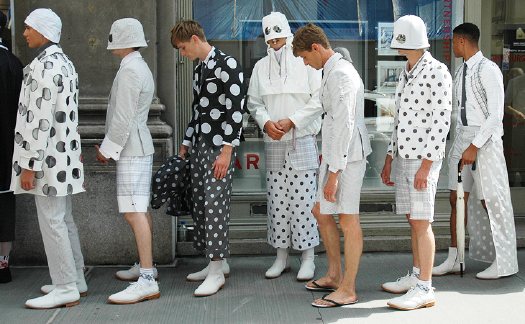
In the past, people criticized fashion shows because the looks from the runway never made it to the street. Well, Thom Browne sure showed them.

Tommy Ton's photoset of Browne models waiting to enter his show is an instant classic.

Backstage: Thom Browne Lineup [jakandjil.com via kottke, the awl]

For a month after being beaten and detained by Chinese police, artist Ai Weiwei had complained of constant headaches. While in Munich to install a show, he went to a doctor, who sent him into emergency surgery to alleviate a cerebral hemorrhage. The news was reported, of all places, by the editor's blog at Frieze magazine, which published accounts from his assistant and one of the artist's fellow activists involved in publicizing the names of 5,000 children killed in school collapses in the Sichuan earthquake.

Ai has been publishing photos and updates [in Chinese] on Twitter.

Ai Weiwei in hospital after police brutality [frieze.com]
Ai Weiwei erhebt schwere Vorwürfe gegen Peking [sueddeutsche zeitung]

September 16, 2009

The Sentence As Earthwork

Not that it doesn't sound fascinating, but a diagram of this sentence would be as big as the Lightning Field itself:

In this lecture Chris Taylor will present Land Arts of the American West as a work that makes other works through a field program that investigates the intersection of geomorphology and human construction beginning with the land and extending through the complex social and ecological processes that produce contemporary landscapes.
From the description of "Measures of Time, Travel, and Space: exploring Land Arts of the American West," presented last April at Yale. [land arts via tyler]

From Henry David Thoreau's Walden, quoted by Mark Noonan in the Columbia Journal of American Studies

But while we are confined to books, though the most select and classic, and read only particular written languages, which are themselves but dialects and provincial, we are in danger of forgetting the language which all things and events speak without metaphor, which alone is copious and standard. Much is published, but little printed. The rays which stream through the shutter will be no longer remembered when the shutter is wholly removed. No method nor discipline can supersede the necessity of being forever on the alert. What is a course of history, or philosophy, or poetry, no matter how well selected, or the best society, or the most admirable routine of life, compared with the discipline of looking always at what is to be seen? Will you be a reader, a student merely, or a seer?
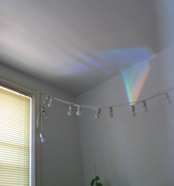
rays_stream_through_shutter.jpg

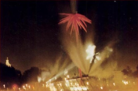
For a long time we had construction on our street. The crew would store their portable signs in such a way that, on many mornings, they would reflect a rainbow in our window and across our living room ceiling. The kid took on the job of spotting them, which led to her taking pictures of them. This is one of the earliest examples. I suspect the memory of the rays will far outlast our shutters which, frankly, are nothing special and which I can't wait to remove.

It's got shiny spheres, and science re-creations, and DC artists and quotes from curator and museum director friends. But it's been a few weeks now, and the only thing I can say about Blake Gopnik's mind-numbing/blowing article on Jim Sanborn is that this passage on public art is pretty damn funny:

The fame of the CIA commission "funded me for all the years since," Sanborn says. It put him on the public-sculpture gravy train. He stopped living in his scruffy studio building in Northeast Washington (it's where he met his wife, Jae Ko, a well-known local sculptor), bought a house in Georgetown, designed a home in the Shenandoahs and continued to fund his more "serious" art, such as "Atomic Time."

But lately, the commissions have dried up. Today's selection panels, he complains, go for "decorative embellishments."

Damn those panels. If only noted art historian/author Dan Brown would write a book about Washington, he could include another mention of Sanborn's work.

??!!??: Sparking Interest Within the Sphere of Art | 'Physics' May Be Most Substantive D.C. Piece in Half-Century [washingtonpost via man]

September 14, 2009

LLC Tuymans

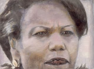
tuymans_condoleeza.jpg

16 Miles found the money quote [heh] about his upcoming US retrospective in Luc Tuymans' TAN interview : "The US tour should lead to steady sales."

But wait, there's more! That guy has had it up to _here_ with American slowness in gettin' on board the Tuymans train:

TAN: Are you happy with the selection of works for your US tour?

LT: Yes, it's taken a long time for a US institution to ask me to do a show. There are 76 works. [Ed.: Exactly how long is a long time, Luc?] I've installed all 80 of my solo shows myself. This is the first time I can trust other curators to install my art. They've decided to re-create three exhibitions as they were shown in commercial galleries ["At Random", Zeno X gallery, Antwerp, 2004; "Der Architekt", Galerie Gebauer, Berlin, 1998; "Mwana Kitoko", David Zwirner, New York, 2000] and then will work around this chronologically. It's interesting as they're not the most iconic works.

TAN: How do you think US audiences will respond to your work?

LT: The Demolition painting (2005) will be shown which has 9/11 connotations along with the Condoleezza Rice portrait (The Secretary of State, 2005). [1] Museum people didn't buy it at the time because it was too topical. But then Glenn Lowry, MoMA director, decided to acquire it because she's a public figure [Tuymans's US dealer David Zwirner gave the painting to MoMA as a fractional gift in 2006]. It had been misunderstood in a private collection, it was out of place. The fact that it's been acquired by a public collection is an interesting insight into how the American people think.

Belly up to the Tuymans bar, you molasses-assed American museum-curating bitches! Waitlist forms to the right, er, left!

Update/Note [1] Wait, a fractional gift? You mean David gave the Modern a great discount on his cut, or he bought it himself? Does your dealer still count as a private collection? Because Paul Schimmel told Tyler Green that "a lot of people wanted to buy the Condi," and that Tuymans saw it as a diptych with Demolition. Both are now in MoMA's collection. Demolition is listed as a 2006 fractional gift of Leonard and Susan Feinstein [of the Bed Bath & Beyond Feinsteins]. Ah, here it is: "The Secretary of State, Fractional and promised gift of David and Monica Zwirner," with an accession number consecutive to Demolition. Sounds very smoothly orchestrated.

tuymans_demolition.jpg

FWIW, MoMA's description of Demolition directly contradicts Schimmel's [or Green's] statement that the painting "was not painted from photographs or video of the collapse of the World Trade Center, but it certainly recalls countless images from that day."

fuller_cloud_nine_orig.jpg

Just like how, once you've learned it, you start hearing a word all the time, now I see satelloons everywhere. Including at the Buckminster Fuller retrospective last year at the Whitney [which went on to Chicago this summer.]

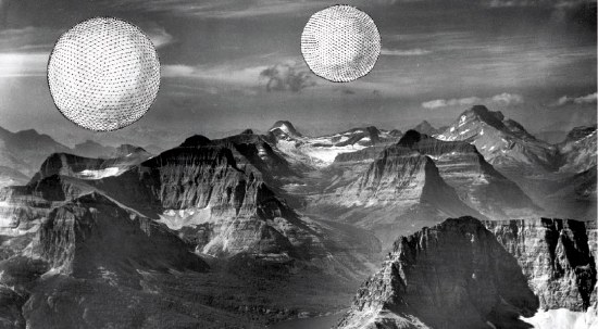
Buckminster Fuller and his architecture partner Shoji Sadao mocked up this photo of a photocollage, Project for Floating Cloud Structures (Cloud Nine) , around 1960. Cloud Nines are self-contained communities of several thousand people living inside enclosed geodesic spheres a mile wide, which float over the earth's surface.

Because the geodesic structure increases in strength as it gets bigger, and its surface increases at a power of two, while its volume increases at a power of three, Fuller hypothesized that heating the interior air even one degree will set the Cloud Nines aloft.

Obviously, as a sexy, futuristic utopian image, Cloud Nine is hard to pass up, but holy crap, Bucky, did you think for two seconds about the urban fabric and the social experience of living trapped in a floating dome? I'd love to see someone write an SF story about it. Because I think it might be a fantastically totalitarian disaster.

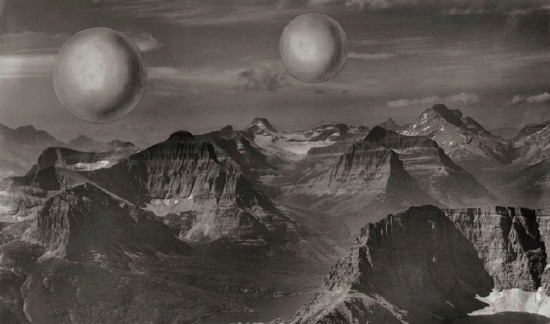
fuller_cloud_nine.jpg

There are two versions of the Cloud Nine image: [the earlier?] one has smooth, silvery, featureless spheres. I'd call them satelloons, even. The other [above] has line drawings of the geodesic structure collaged onto it.

It was only now, as I get around to finally posting about them, that the relationship between Cloud Nines and satelloons might be more than formalistic. The original satelloon, Project Echo launched in 1960, the same year Fuller and Sadao designed their giant floating spheres. Could there have been a connection?

The easiest, most obvious thing to do might be to ring up Shoji Sadao. What is he up to these days, anyway? You'd think that given the recent interest in Fuller's work, a guy who worked so closely with Fuller on so many major projects--he's credited with the dome at the 1967 World Expo in Montreal, arguably the most spectacular Fuller structure ever realized--would be all over the place. I mean, it was only a few years ago that he gave up his position as executive director of the Noguchi Foundation in Long Island City. And then he curated that great Fuller-Noguchi show in 2006. [Sadao was also a longtime collaborator with Noguchi and the chief overseer of his legacy.] Anyone spoken with him lately?

In a 1970 paper, two Harvard/Smithsonian scientists proposed A Passive Stable Satellite for Accurate Laser Ranging. Dubbed project Cannonball, the 38-cm spherical satellite would be covered with triangular reflectors and would weigh--did someone drop a decimal?--a prodigious 8000 pounds. Cannonball would be a stable laser target which would allow surface mapping of the earth with 10cm accuracy by reflecting laser light between earth base stations. It was designed to be launched using an extra Saturn rocket left over from the Apollo program, but it didn't happen.


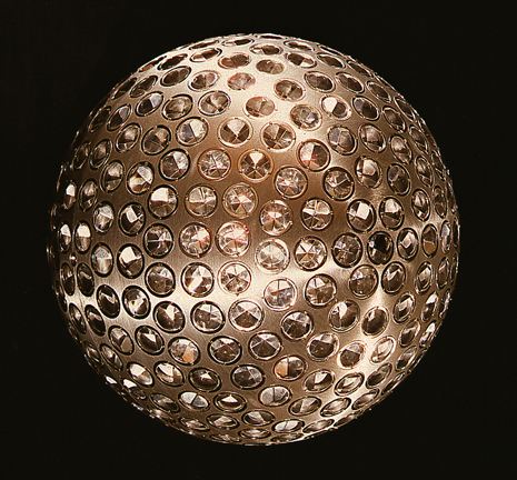
lageos_1.jpg

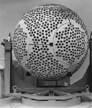
The passive laser reflector disco ball-lookin' satellite trend didn't really kick in until 1976, when NASA launched LAGEOS I [LAser GEO-something Satellite, above], which was built by ASI, the Italian Space Agency, from a NASA design. The 60cm-diameter aluminum-coated brass sphere is set with 426 cube-cornered retro-reflectors--4 are germanium, the rest are glass.

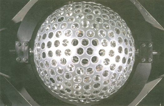
ASI built another, identical satellite, LAGEOS II [below], which was launched in 1992.

lageosII.jpg

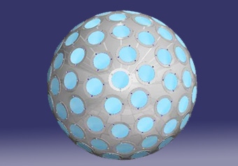
A third passive retro-reflector satellite, called LARES, was designed as an all-Italy project, and is set to launch in 2009 on an ESA rocket. LARES is smaller [36cm], made of solid tungsten, and contains 92 retroreflectors.

lares_mockup_asi.jpg

In 1989, Russia launched two Etalon satellites [below], which are each 1.3m in diameter and contain 2,145 retro-reflectors.

etalon_1_satellite.gif

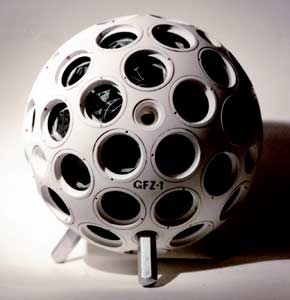
NASA launched Larets, a tiny 21cm sphere with 60 prismatic reflectors into low-earth orbit in 2003. It is very similar in design to the German GFZ-1 [below], which was launched in 1995 and burned up in 1999. They also look llike Buckminster Fuller Fly's-Eye Domes.


gfz_satellite.jpg

The most disco ball-looking of all, though is Project Starshine, a series of three student project satellites [??] which launched between 1999 and 2003. Built from spare hardware, each Starshine sphere was covered with almost 900-1500 mirrors polished by students around the world. The satellites reflected sunlight, enabling a network of schools to track their movement. They all burned up as they re-entered the atmosphere, and Starshines 4 & 5 have been waiting for a ride into space since 2004.


starshine_nrl.jpg

LAGEOS I also contains a plaque [below] designed by Carl Sagan and drawn by Jon Lomberg. It consists of three maps showing the position of the continents in the distant past, the present, and 10 million years from now, when the satellite is expected to re-enter earth's atmosphere. The idea being, I assume, to let whoever retrieves the beautiful, shiny artifact from space some time before that happens know that we totally knew they were going to do that.

lageos_plaque.gif

September 11, 2009

Share Your Bed

mj_share_your_bed.jpg

I've steered way clear of architect's Michael Jackson Monument Competition because--hello, in what universe does that decision actually require any explanation? Because.

Anyway, after seeing the winners, I just have to raise a single, ungloved--and as yet unmittened, hold that thought--hand in apology and salute. They're kind of hilariously fantastic. Kottke is all tight between the winner [a nice copyright play] and second place [the perpetual desert disco dance floor powered by a gold-plated windmill].

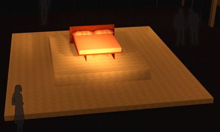
Me, I find the third place entry, by an architecture student named James at the University of Utah, to be borderline brilliant. Its title, "Share Your Bed," comes from testimony Jackson gave during his trial for child molestation: "Why can't you share your bed? The most loving thing to do is to share your bed with someone. It's very charming. It's very sweet. It's what the whole world should do."

The jurors liked the "almost cheeky minimalism" and transformation of "an ordinary domestic object," apparently forgetting that these are both now standard-issue for memorials [c.f Oklahoma City bombing=chairs, Pentagon = benches]. For his part, James cites the "dialectic manner Michael lived life by," where "Innocence clashes with social ideals." I'd rank not molesting children a bit higher than an "ideal," but he's right that the bed is a potent site and symbol of personal/political, private/public paradox.

bed_in_lennon_ono.jpg

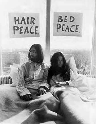
Beginning in April and running through the end of 1969, Yoko Ono and John Lennon conducted bed-ins as peace protests in hotels around the world. First was their honeymoon bed in Amsterdam, where the press converged, expecting to see the couple have sex. Instead, they were talking about peace all day. In bed. "Give Peace A Chance" was recorded in bed at the Queen Elizabeth Hotel in Montreal that June.

Felix-gozalez-torres-billboard.jpg

And of course, there's Felix Gonzalez-Torres' classic billboards showing a couple's--his and his partner Ross's--unmade bed, which were installed across New York City in 1991. Either way, not artists or works I'd have ever thought to associate with Michael Jackson.

Whoops, I almost forgot. Huge shoutouts to etoile's King of Pop In Orbit, the plan to launch Jackson's shiny, gold coffin into space, which I have to love for obvious shiny-objects-in-space reasons--and to CUP's The Michael Jackson Mitten Jamboree, for which the whole world knits themselves a pair of MJ mittens. Again, explanation is neither needed or possible.

September 11, 2009

Show Me The Monet

The [Modern] bought its first large waterlily painting -- at 18 feet across, the widest painting to enter the collection up to that point -- in 1955, for the equivalent of $11,500. A mere three years later it paid the equivalent of $150,000 for the triptych, acquiring it as a replacement for the first work, which was destroyed in a fire at the museum.

Arriving at the museum in poor condition, the triptych was extensively restored and put on new stretchers. Dorothy Miller, one of the museum's early curators, gave Monet's original stretchers to three young New York painters: Ellsworth Kelly, Jack Youngerman and Fred Mitchell. Those were the days.

Roberta Smith, referencing Ann Temkin's essay on Monet's waterlily paintings, which are now on exhibit together at MoMA.

I just checked back to the quick acquisition history I wrote two years ago of the Met's and Modern's giant Pollocks. 1955 was also the year Barr first attempted to drum up acquisition funds ($8,000) to buy a Pollock, Autumn Rhythm (1950), from his own trustee, the dealer Sidney Janis. He couldn't shake the money loose, and the work went to the Met in 1958 for $30,000. Also taking place in the middle of the Modern's Monet purchases: Frank O'Hara's 1957 Pollock show, which the artist did not live to see.

Whether it's out of fashion for art historians to read premonitions of postwar New York School action painting in Monet's waterlilies, those histories from the 50's onward were together at MoMA.

September 10, 2009

Authenticity vs. Realness

Look, I dragged out my old Topsiders, too, same as the next guy. But I've just about had it up to _here_ with the obsession with "authenticity" that is the uncritical core of this dragging-on moment in men's fashion.

It ranges from picayune discussions of selvedge denim carried on over your dad's Miller High Life; to competitive fleamarket picking to rediscover the most obscure canvas tote bag manufacturer; to American-made worker boots for publicists; to the umpteenth reincarnation WASP-y preppy fashion, called Trad, just like it was in Japan in 1986. It's as if the Emperor could somehow be naked and wearing two NOS Izod shirts, small batch, reissued Duck Head khakis, and Japanese export Redwings at the same time.

It all reminds me of nothing so much as Jennie Livingston's documentary, Paris is Burning. Schoolboy Realness, Town & Country, Executive Realness. Here's the late, great drag queen philosopher [and accomplished body-stasher!] Dorian Corey:

In a ballroom, you can be anything you want. You're not really an executive, but you're looking like an executive. And therefore, you're showing the straight world that, "I can be an executive. If I had the opportunity, I can be one. Because I can look it." And that is a kind of fulfillment.

Your friends, your peers, are telling you, "Oh, you'd make a wonderful executive."

And just line this quote from Pepper LaBeija [above, in fur], legendary head of the House of LaBeija...

To be able to blend. That's what realness is.

If you can pass the untrained eye, or even the trained eye, and not give away the fact that you're gay, that's when it's real.

The idea of realness is to look as much as possible like your straight counterpart.

The realer you look means you look like a real woman. Or you look like a real man. A straight man.

It's not a takeoff, or a satire. No. It's actually being able to be this.

...up against the Trad guy in the Observer yesterday:
"When done right, it should almost be invisible," said John Tinseth, 52, an insurance broker and longtime traddy who's been writing a blog called The Trad--anonymously, until now--for the past two years. He was on the phone from his West 57th Street apartment, dressed, he said, in L. L. Bean khakis and moccasins and a striped yellow Oxford University rugby shirt.

"A guy should walk right by you and he'll have the whole thing down and you won't even notice," Mr. Tinseth said. "That's when it's done perfectly."

Authenticity is a pose, people, plain and simple.

ian_james_lcc.jpg
House exterior (test)
Malibu, CA

ian_james_lcc2.jpg
Kitchen
Malibu, CA

Ian James is a recent CalArts graduate. He posted a series of images--photos--of Lens color cast correction on his blog. which are kind of fantastic:

Lens Color Cast is an dilemma specific to digital photography. Digital sensors are incredibly flat and are designed to receive light straight on. In the case of ultra wide angle lenses, light reaches the sensor diagonally and creates wild color casts and flares which are incredibly difficult to fix in Photoshop. Thus to the only way to correct is at the time of shooting by utilizing a particular lens filter that is a combination of diffusion and a translucent diamond pattern that evens out the light coming hitting the sensor. This image is saved in capture software as an adjustment setting and then applied to all related images as a set. A new LCC image must be made everytime the camera is moved into a new lighting scenario.
The images generated for the LCC are thus abstract functionaries of a larger endeavor. The LCC images in this set were all generated from an architecture shoot of the ins and outs of a Malibu beachfront home. Each image relates to one particular setup, such as master bedroom, guest bedroom, office, kitchen, outside patio, front exterior, etc.
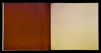
They remind me a bit of Bruce Nauman's monochrome photographs of the Los Angeles sky, which he published in a couple of artist books: CLEA RSKY (1968-9) is all blue skies. Which is fine.

nauman_la_air.jpg

But I like L A AIR (1970) better. The point/joke is that the smog-filled air of Los Angeles produced a much more varied and interesting range of colors. Both were included in "Elements and Unknowns," a beautiful little show of enigmatic artist books organized last fall by May Castleberry, the contemporary editions editor at MoMA's Library Council.

Lens Color Cast Correction [ian james eats photographs]

September 8, 2009

Still In Saigon

"I don't know if you can escape what you are," said Philip Van Cott, a retired US Marine and Vietnam War veteran who began treatment for PTSD ten years ago.

Generation B | The Damage of Vietnam, Four Decades Later [nyt]

Space Flight Dolphin is a life-sized "inflatable dolphin sculpture/satellite by the space artist Richard Clar. The sculpture/satellite will be made from a memory alloy that springs into shape when heated by the sun.

It will transmit a magnetic signal "modulated by dolphin 'voices'" [Clar's quotes] in an attempt to communicate with extra-terrestrial intelligence. Also, "as the sculpture/satellite orbits the Earth, the dolphin voices will be monitored in various museums around the world, providing a link between different people and cultures on our own planet."

Near as I can tell, Space Flight Dolphin was conceived in 1982, and was approved by NASA for inclusion in its special payload program in 1986. Which is the same year Star Trek IV came out. So if anyone copied anyone, it was Star Trek.

This still is from an animated short which was screened last year at the San Francisco Ocean Film Festival.

Space Flight Dolphin: An Art-and-Technology Payload for the Space Shuttle | Richard Clar's Art Technologies [arttechnologies.com]

centerbeam_on_mall.jpg

While we contemplate the Colombian Heart Attack that has befallen Washington DC, it might be worthwhile to remember the good old days, such as they were, when the National Mall was the site of ambitious public art projects. Projects like Centerbeam and Icarus.

Centerbeam was the result of a 22-artist collaboration organized by MIT's Center for Advanced Visual Studies under the leadership of the artist Otto Piene. It was a 144-ft long 128-ft long [in DC] steel sculpture resembling a radio tower on its side, which served as a platform for an array of artistic deployments of cutting edge technologies, including laser projections on steam, holograms, neon and argon beams, and electronic and computer-generated music. And giant inflatable sculptures.

After a highly acclaimed debut at Documenta 6 in 1977, Centerbeam was reinstalled on the Mall during the Summer of 1978. The site was the open space north of the newly opened National Air & Space Museum, and directly across the Mall from the just-opened East Gallery of the NGA [where The National Museum of the American Indian now stands].

Centerbeam gave nightly performances/happenings/experiences throughout the summer, culminating in two nights' performance of Icarus, a "sky opera" in steam, balloons, lasers, and sound created by Piene and Paul Earls.

Based loosely on Ovid, Icarus cast Piene's 250-ft tall red and black flower-shaped sculpture as the title character; another red anemone-shaped balloon was Daedalus, and Centerbeam was the Minotaur.

Centerbeam was officially sponsored by the National Park Service, which has jurisdiction over the Mall, and the Smithsonian. The directors of both the NGA [Carter Brown] and the Hirshhorn Museum [Abram Lerner] are thanked for their encouragement in MIT's 1980 catalogue of Centerbeam, but no Smithsonian art museum--and no art curator--appears to have been involved in the presentation of the work. Most of the coordination was handled by Susan Hamilton, who worked in the office of Charles Blitzer, the Assistant Secretary for History and Art. In fact, the Air & Space Museum's director and staff gets the most effusive praise and seems to have been the most closely involved with the project, even to the point of using the NASM as Centerbeam's mailing address.

The Washington Post did not review Icarus, and in the paper's only feature on the opening of Centerbeam, Jo Ann Lewis cited anonymous critics who "generally saw it as a big, endearing toy, but not art. There seems no reason to amend that conclusion here."

Of course, no one cares what the Post says about art, and Piene and his CAVS collaborators probably did not mind the absence of more traditionally minded art worlders. Since his days as a founder of Group Zero in the early 1960s, Piene had been self-consciously seeking a path that would lead art out and away from the rareified, precious object fixations of collectors and museums.

Group Zero was ahead of several curves, and their place in the story of conceptualism, minimalism, Arte Povera, and other important developments of art in the 1960s is getting a boost. And Piene's work looked pretty nice and strong in Sperone Westwater's very fresh-looking Zero show last year. Are Centerbeam and Icarus really just wonky art/science experiments, examples of the played out model of unalloyed, Utopian technophilia that spawned earlier collaborative dogpiles like the Pepsi Pavilion at the 1970 Osaka World's Fair?

Or is there a real history of "real" art by Piene and his collaborators that needs to be looked at again? Despite the apparent indifference of its official art world at the time, was Washington DC actually the site of some significant artistic production that did not involve freakin' Color Fields? Inquiring balloon-sculpting minds want to know.

September 5, 2009

District Of Colombia??

W. T. F.???

The National Mall is ringed with Smithsonian museums, none of which seem to have programmed a piece of public art or sculpture outside their own walls in at least a generation.

Washington DC has no public art program to speak of. And that's not just because you can't call those insane "parades" of paint-a-pandas and paint-a-donkey/elephant "art"; they're tourist marketing, pure and simple.

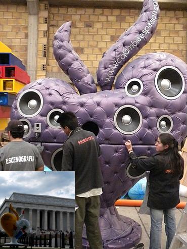
And yet. Another such parade seems to have miraculously materialized on the District of Columbia's streets. A parade of hearts. There was one in front of my family's hotel when we picked them up to do the tourist circuit. There were three along our walks to the Washington Monument, the Lincoln Memorial, and the Smithsonian's American History Museum.

colombian_crap.jpg

Each is painted with quotes and factoids about Colombia, the country. They turn out to be part of Colombia es Pasion, an official [Colombian] government branding campaign designed, according to a regurgitated press release in the Examiner, "to educate and show the world the true Colombia." In addition to the three we saw, there are 37 other giant fiberglass hearts which "appear along city streets in high-traffic areas. They will be hard to miss, standing eight feet tall, featuring colorful, hand-painted designs that showcase a particular aspect of Colombia that may surprise visitors."

Visitors and locals both. Who the hell gave this thing the green light? The campaign was created for the Colombian government by BBDO Sancho, the Colombian subsidiary of the global ad agency, and was designed by another Bogota agency called Sistole. But there is absolutely no one--no agency or overseeing organization or authority from Washington DC or the US mentioned in the press release/article.

I can think of approximately one thousand art projects that would be better to see on the streets and plazas of Our Nation's Capital before a bunch of South American heart-shaped billboards.

So the only way I can make sense of their presence is that Washington DC is now an open, international platform for sculpture, art, whatever! The way Houston has no zoning laws, and you can build whatever the hell you want next to whatever the hell is already there, Washington's many complex, overlapping bureaucracies have thrown out the rulebook and thrown open the streets for whatever cockamamie scheme you've been cooking up. Bring'em down and set'em up!

An invitation to Discover Colombia Through Its Heart [examiner.com]
Colombia llegó a Estados Unidos/ Colombia came to the US [and just dumped their marketing bullshit on our street corners] [colombiaespasion.com, google translate]

September 4, 2009

Fall 2009 NY Events Calendar

For anyone interested in improving his chances of running into Brian Sholis at a brainy and/or arty event, he has compiled a rather awesome calendar of openings, symposia, talks, readings, screenings, and other happenings in New York.

Me, I just loaded it onto my iPod Touch calendar, so I can be reminded nearly every day that I'm missing something interesting. Though I definitely plan on going to James Welling's talk with Jan Dibbets at MoMA on--well, it's right there in the calendar.

Fall 2009 New York Events Calendar [briansholis.com]

david_klein_stlouis.jpg

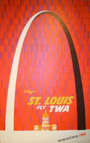
Grain Edit has some truly spectacular gouache/lithograph-based advertising work done for the late TWA by the late David Klein. It's one truly beautiful poster after another, starting with this piece featuring the Gateway Arch.

Tyler Green just got back from St Louis, where he was blown away by Saarinen's arch, and rightly so. It is a sculptural and engineering marvel. Seeing as how I'd just loaded up the ol' blog here with shiny stainless steel sculptures by Walter de Maria, Tyler put forward an interesting idea, namely that there might be some significant-but-under-acknowledged [or under-examined] connection between Saarinen's arch and de Maria's own truly great addition to the shiny, dropdead gorgeous Western Sublime, the Lightning Field. Very interesting.

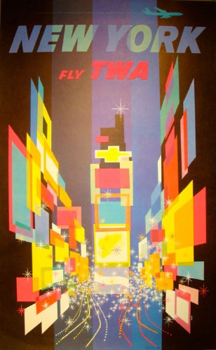
Meanwhile, for my part, I realized that I might have been inadvertently quoting a Klein myself. Because way back when I was still a hardcore suit and setting up private equity funds for whichever giant retailers, I had a crazy idea to make some paintings [I know, right?] of Times Square, where all the billboards were replaced by floating, perspectival parallelograms of solid color.

At the time I was thinking Malevich, especially the photo of the gallery installation of his paintings with that one square black one tucked up into the corner. As I describe it, it probably sounds a little Mehretu-ish, but she wasn't on the scene yet.

david_klein_nyc_twa.jpg

But as I look at it in my head, I recognize it now as the billboards in David Klein's New York TWA poster--which has been in MoMA's A&D collection for over 50 years. It's like I'm running a private install of fffound! in my head, and it takes this long to figure out where all the images actually come from.

David Klein Vintage TWA Posters [grainedit.com]
Fly TWA, David Klein, 1956 [moma.org]
David Klein Art [davidkleinart.com]

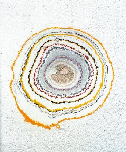
As Antoni helpfully pointed out in an email, Canadian artist Brian Jungen has created a work wherein he carves a design into the gallery wall with a router, which leaves a bevel-edged channel which, as one viewer in Vancouver described it, "revealed all the coloured layers of paint like layers of sediment."

Sounds awesome, and awfully similar to Huyghe's and ___?__'s pieces. And Jungen's one-man show did travel to the New Museum's temporary Chelsea location in 2005. [Which is kind of problematic: did the New Museum's 22nd Street space walls even have hundreds of coats of exhibition-related repainting to expose and contemplate? And so what happens to this work without the supposed burden of Art History lurking right behind that fresh coat of paint? Please tell me there's more to a piece like this than expedient aesthetic pleasure.]

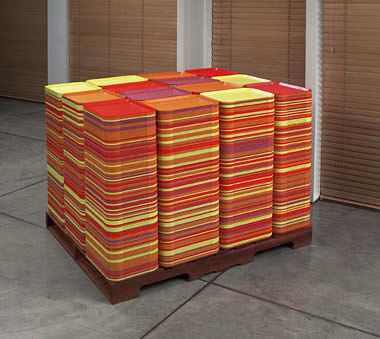
And anyway, I didn't see Jungen's show. Which is really too bad, because this piece sounds kind of sweet. Isolated Depiction of the Passage of Time, 2001:

consists of a handcrafted cedar pallet that is surmounted by neatly stacked cafeteria trays in several colors. While the form can be understood in terms of the classic minimalist cube, it is also a facsimile of an escape pod that was fashioned by an inmate at one of Canada's largest prisons. Knowing that the cafeteria trays were delivered by truck to another facility for cleaning, the prisoner had built up and glued together many cafeteria trays, leaving a void at the center in which he could hide while the trays were being transported. In this sculpture the void is taken up with a television playing daytime programming and soap operas.
Hmm, not getting the TV aspect, but still. It's got some nice Tony Feher-meets-Swiss Baroque-period Judd-meets-early Michael Phelan vibe going on. Also, and obviously, the title just backed into me in the lunch line.

huyghe_timekeeper.jpg

And speaking of "The Quick And The Dead," I swear I've seen a nearly identical piece to Pierre Huyghe's Timekeeper, 1999, before.

I thought it was at the 1995 Whitney Biennial, on the east wall of the central gallery, opposite the Ellen Gallagher paintings. Only instead of sanding down the layers of paint on the gallery wall to reveal the space's history like tree rings, the Whitney version was chiseled or routed out, leaving a smooth, beveled edge.

Did it make a shape like a striated, inverted Mayan pyramid? Or was it more of a trench, like a miniature LA River running horizontally across the wall? Was it by Lawrence Weiner? Am I right on the wall, but wrong on the show and date?

September 2, 2009

Above The Weather

dodge_above_weather.jpg

Clearly, I miss some good things that are posted to the Walker Art Center's blogs in between my visits. Such as Peter Eleey's discussion last April on the opening of "The Quick And The Dead," the Walker's exhibition of conceptual art and the limits of our knowledge and experience." Whoa, no small plans, then.

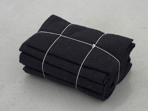
From the page above, it's not clear that Jason Dodge's Above The Weather is actually included in the show, but it sounds rather nice. He commissioned an Algerian weaver, Djidjiga Meffrer, to make a tapestry from a length of thread that can reach "to where the weather ends-essentially the border with outer space," Eleey said. "Though it leads your mind to the outer reaches of the atmosphere, the cloth turns out to be much smaller than you might think."

According to the Kadist Collection in which this piece [example?] resides, the color is the color of a night in 2007. Which is either interesting or a typo; the piece itself is dated 2005.

The Quick and The Dead runs through Sept. 24 [walkerart.org via briansholis.com]

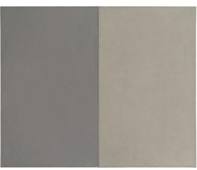
marden_aucentre.jpg

Ouch. As if things weren't bad enough in the art world last October, a 1969 Brice Marden diptych titled Au Centre fell off the brackets in its travel crate while in transit from Moscow to New York. The fall apparently went unnoticed until the painting arrived, which meant its fragile oil and beeswax surface jostled and rubbed against the inside of the crate all the way home. It was destroyed, and now after paying out the $3 million claim, the insurer AXA Art is suing the hell out of everyone who ever touched the painting or the crate. [The case just moved to federal court in Manhattan after a couple of months in NY State Supreme Court.]

The owner is/was Gagosian Gallery. According to the NY Post, the painting was en route to Manhattan to be sold at Sotheby's. Which is odd. The original court filings had Au Centre leaving Moscow on October 9, 2008. [Actually, the date is listed as October 9, 2009. Which, if it were true, means AXA could just make sure someone's properly escorting the painting in the future, and there'd be no trouble at all.] Gagosian had just opened a major show in Moscow a couple of weeks before, a nearly encyclopedic survey of contemporary art. Which did not, though, officially include the Marden. So maybe it was there for a back room showing, or as extra inventory? Who knows?

But we do know that the crate makers named in the suit are from Brooklyn. And the painting had last been seen in New York--at Sotheby's. Despite its general awesomeness as an early Marden, Au Centre was a notable disappointment in the fall 2006 contemporary auction. The painting had both a high estimate [$3.8-4.5 million] and a guarantee [?], but it went unsold.

And it's not so clear that Larry just snapped it up on the rebound, either. The painting is listed as coming directly from dealer Yvon Lambert, who had purchased it from his own 1969 show in Paris of Marden's work. Yet Artforum seems to imply in their coverage of the sale that Bob Mnuchin was the "constipated"-looking seller.

Maybe he was the buyer. In 2006, Sotheby's had yet to institute a disclosure policy for third-party guarantees, or as they eventually called them, "irrevocable bids." In the late boom, third-party guarantees were a popular, if dodgy way for auction houses to extend guarantees to sellers while mitigating their own risk. But they were also a great way to reward big collectors and financiers, who reaped a significant portion of the surplus if a work sold beyond the guaranteed price. In other words, the guarantor was paid hundreds of thousands or millions of dollars not to buy the work. And they provided the sure public appearance of a sale, preventing the work from acquiring the aura of, uh, damaged goods.

Though I guess that didn't happen here. And somehow Larry gets an early Marden for $3 million. In New York at the beginning of 2007. Given that auction history, it seems odd to me that in the Fall of 2008, with the art market bubble popping, Gagosian would really have been planning to put the painting back into play at Sotheby's New York.

September 1, 2009

l'Arroseur Arrosé

mur_antipipi_ecuries2.jpg

Maybe it's a matter of missing the reportorial bowl, but Paris's experiments with anti-public urination architectural technology are more interesting than the Wall Street Journal makes them out to be.

First off, the utter untimeliness of the story. Paris's public toilets have been free since 2006. The single anti-urination wall, or mur antipipi, mentioned in the piece has been in place since 2005. The UK Telegraph and the Guardian re-covered the topic at length in 2007, basically by translating a Nouvel Observateur story featuring Etienne Vanderpooten, municipal architect for the City of Paris, and the inventor of the mur antipipi.

We'll get to that in a minute. Among the other piss-thwarting streetscaping strategies: filling corners with "treacherous concrete cones"; and a steeply sloped "granite parapet" which is designed to be hard to stand on, especially after "la 3e cannette de bière."

But here's the wall from Google Streetview. About the zig-zag profile, Monsieur Vanderpooten explained it with a cinematic reference: "The jet of pee is rather oblique. If it meets a sloping surface it is sent back to the trousers...It is the case of the arroseur arrosé."

Originally titled, le Jardinier, l'Arroseur Arrosé, or The Waterer Watered/ Sprinkler Sprinkled, was one of the Lumiere brothers' first short films. It was shot in the Spring of 1895, first screened in June, and it was one of the ten shorts in the Lumieres' first public cinema screening in December. Other shorts captured slices of life or street scenes; l'Arroseur Arrosé was the first one staged for the camera, the first comedy/gag, and some would argue, the first cinematic narrative.

You can imagine a remake set in the corner of the Cour des Petites Ecuries and starring a drunk football fan who step out of a nearby tabac would be pretty damn funny.

Ryan McGinley in Vice:

[Dash] and Earsnot also loved to tag bums. They would give a bum $20 to let them tag all over his clothes. Bums never change their clothes, so the tags would never get buffed out like on a door or grate. And they just wander the streets. It was amazing advertising and such a genius idea that it still makes me crack up when I think about it.
Haha, good times.


Remembering Dash Snow [viceland]

Since 2001 here at greg.org, I've been blogging about the creative process—my own and those of people who interest me. That mostly involves filmmaking, art, writing, research, and the making thereof.

Many thanks to the Creative Capital | Warhol Foundation Arts Writers Program for supporting greg.org that time.

comments? questions? tips? pitches? email
greg [at] greg [dot ] org

find me on twitter: @gregorg

about this archive

Posts from September 2009, in reverse chronological order

Older: August 2009

Newer October 2009

recent projects, &c.


our_guernica_cycle_ivanka_320px_thumb.jpg
Our Guernica Cycle, 2017 –
about/kickstarter | exhibit, 2017


pm_social_medium_recent_proj_160x124.jpg
Social Medium:
artists writing, 2000-2015
Paper Monument, Oct. 2016
ed. by Jennifer Liese
buy, $28

madf_twitter_avatar.jpg
Madoff Provenance Project in
'Tell Me What I Mean' at
To__Bridges__, The Bronx
11 Sept - Oct 23 2016
show | beginnings

chop_shop_at_springbreak
Chop Shop
at SPRING/BREAK Art Show
curated by Magda Sawon
1-7 March 2016

do_not_bid_or_buy_iris_sidebar.jpg
eBay Test Listings
Armory – ABMB 2015
about | proposte monocrome, rose

shanzhai_gursky_mb_thumb.jpg
It Narratives, incl.
Shanzhai Gursky & Destroyed Richter
Franklin Street Works, Stamford
Sept 5 - Nov 9, 2014
about | link

therealhennessy_tweet_sidebar.jpg
TheRealHennessy Tweets Paintings, 2014 -
about

sop_red_gregorg.jpg
Standard Operating Procedure
about | buy now, 284pp, $15.99

CZRPYR2: The Illustrated Appendix
Canal Zone Richard Prince
YES RASTA 2:The Appeals Court
Decision, plus the Court's
Complete Illustrated Appendix (2013)
about | buy now, 142pp, $12.99

weeksville_echo_sidebar.jpg
"Exhibition Space" @ apexart, NYC
Mar 20 - May 8, 2013
about, brochure | installation shots


HELP/LESS Curated by Chris Habib
Printed Matter, NYC
Summer 2012
panel &c.


drp_04_gregorg_sidebar.jpg
Destroyed Richter Paintings, 2012-
background | making of
"Richteriana," Postmasters Gallery, NYC

czrpyr_blogads.jpg
Canal Zone Richard
Prince YES RASTA:
Selected Court Documents
from Cariou v. Prince (2011)
about | buy now, 376pp, $17.99

archives