December 2010 Archives

cp0900

See, this is what I'm talking about. And by see, I mean look. Last Spring, while trying to save Richard Neutra's Gettysburg Cyclorama building from destruction by the Park Service and misguided preservationists, I backed into the idea of adapting it as a wheelchair-accessible battlefield observation platform. [Observation platforms are the primary category of structure the Park Service exempts from its professed objective to "restore" the battlefield to its 1865 condition.]

A perfect complement to a disabled/wheelchair-accessible structure would be a memorial or exhibit for those soldiers wounded in battle. While honoring those who sacrifice so much for their country, such a tribute would also bring the issues of the disabled and the disfigured out from the shadows where they have been relegated for centuries, educating all visitors as to the truer human cost of war.

Fortunately, such an exhibit and the educational value it can provide have long been contemplated by folks like Mike Rhode and his colleagues in the archives of the National Museum of Health and Medicine, which boingboing points out began during the Civil War as the Army Medical Museum. Rhode posted a photoset of documentary photos, artifacts, and period documentation of Civil War casualties and medical treatments. The almost industrial scale of battlefield injuries and the largely forgotten threat of disease and infection spurred on major advances in treatment, surgery, amputation, prosthetics, and sterilization.

So check out Rhode's flickr for a difficult-to-see example of what an important-to-see exhibit might look like.

And consider that if Neutra's Gettysburg building were to hold such a memorial, it would begin to pay back some of the karma deficit modernist drum-shaped architecture incurred when the Army Medical Museum was torn down to make way for the Hirshhorn Museum.

Related, next, a year later, in fact: Gettysburg and the Disney/Ken Burns Effect

December 27, 2010

Deck The Halls With Satelloons

cl75_aircrane.jpg

Via David at BoingBoing comes slow word that the world's largest airship hangar is now a Malaysian conglomerate-owned water park. So says the Smithsonian's Air & Space magazine.

The structure was built in 2000 on a repurposed military base south of Berlin in the former East Germany by Carl von Gablenz' industrial airship startup, CargoLifter AG. It is 360 meters long, 210 meters wide, and 107 meters high, more than large enough to accommodate the firm's proof-of-concept vehicle, the CL75 Air Crane.

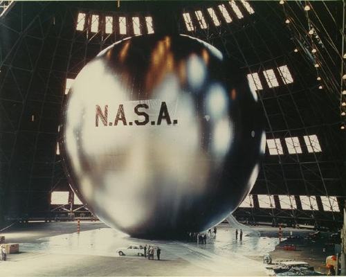
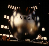
The CL75 was built and tested in 2001. The 60-meter diameter spherical balloon was 60 meters in diameter. Also, it was 60 meters in diameter. That's almost 200 feet, people. It's almost as if someone heard about Project Echo's 100-foot satelloon, and decided to double it [apologies to all the 7th graders in the audience, who know that doubling the diameter of a sphere more than doubles the volume. The point here is the pure optics of the number.]

MFG021_servicings.jpg

But why a gratuitous reference to Project Echo, one wonders? Oh, maybe because the CL75's airship was manufactured by TCOM, the former Westinghouse subsidiary which began in 1960 as an attempt to commercialize British WWII barrage balloons for aerial surveillance. And which, since 1996, has been housed in the disused USN airship hangar in Weeksville, NC. ["The TCOM Manufacturing and Flight Test Facility near Elizabeth City, NC has become the East Coast hub for all airship activity."]

Which is the same disused USN airship hangar the original Project Echo team used to test inflate their first satelloon. Just check out the vented windows in the giant clamshell doors:

echo_satelloon_color1.JPG

The CL75 was destroyed in a storm in 2002, the same year CargoLifter went bankrupt. But fortunately, the East Coast hub for all airship activity soldiers on.

It's exactly the kind of scribbled note I dug through five boxes of Smithsonian archival material hoping to find: "Someone may have loc. stolen ptg. So Charles will talk to Bob about it."

Well, I talked to Charles about it. The artist Charles Yoder worked for Robert Rauschenberg for five years, until around 1975-6. So I called him, and unfortunately, he had no idea where the Johns flag painting was, the one which had been removed from Short Circuit in the mid-60s [Michael Crichton says before 1965.] He did say there was "scuttlebutt," at the time, a general awareness that there was a Johns flag painting on the loose. But it never went beyond the, "I heard some guy was trying to sell it on the Bowery," type urban legendry.

But though I didn't find any smoking guns, or burned flags, in the records from Walter Hopps' 1976 Rauschenberg retrospective at the National Collection of Fine Arts, I did learn some more interesting details about Short Circuit and its complicated history.

Like, for one thing, the 1955 combine was not actually shown in Hopps' retrospective.

December 20, 2010

Browser Tab Cut Or Run

So much to blog, so little time. I may have to institute a new practice of dumping my interesting-looking browser tabs if I don't write about or use them within a month, or blogging about them.

weiner_manhole_paf.jpg

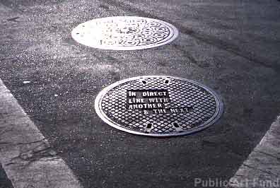
For example, ever since seeing a Le Corbusier manhole cover from Chandigarh sell for almost EUR18,000, I've been meaning to take this list of locations for Lawrence Weiner's 2000 Public Art Fund project, and see which of his 19 downtown manhole covers looks the most lootable. But you know how it is with scheduling, holidays, pangs of conscience, snow, &c. &c...


trafik_c-c_3D.jpg

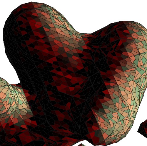
So via Zelkova's long essay on interactivity and digitization, I find this intriguing 2003 project, C & C, from the Lyon design studio Trafik. Joel, Pierre, and Julien all responded [merci, fellas!] to explain that C & C began as an exploration for a method to create designs for a handmade carpet. So they created a program in C that used the 3D coordinates of shapes created in Autodesk 3ds Max [above] to generate a 2D vector graphic [below].

trafik_c-c_2003_polycamo.jpg

Needless to say, I like the translational aspects of the project almost as much as I do the Dutch camo landscape-like polys.


One nice consequence of my recent Short Circuit research is seeing and reading up on Sturtevant. From Bruce Hainley's Aug 2000 essay in Frieze:

As Sturtevant puts it: 'Warhol was very Warhol'.

This is a complicated statement. How did Warhol get to be 'very Warhol'? How does one come to recognise - see, consider - a painting, film , or anything by Warhol once he and everything he's done are slated only to be 'a Warhol'? It is Sturtevant who knows how to make a Warhol, not Warhol. It is Sturtevant who allows a Warhol to be a Warhol, by repeating him. Copy, replica, mimesis, simulacra, fake, digital virtuality, clone - Sturtevant's work has been for more than 40 years a meditation on these concepts by decidedly not being any of them.

I'm kind of disheartened by how interesting Chris Burden's post-minimalist undergraduate work sounds in this fully illustrated repro of Robert Horvitz's Artforum cover story from May 1976 [volny.cz]

toy_pet_plexi_ball_68.jpg

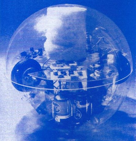
Via the awesome cyberneticzoo.com comes Toy-Pet Plexi-Ball a the 1968 artist/engineer colabo sculpture by Robin Parkinson and Eric Martin, which was included in Pontus Hulten's MoMA show, "The Machine: As Seen at the End of the Mechanical Age." The light-and-sound-activated Toy-Pet rolled around the gallery following viewers, until you put it in its fake fur bag. Which made it look like a tribble. Which can't be a coincidence, can it, Pontus? If you have an engineer collaborating with an artist a year after the Star Trek episode airs?

Awesome kinetic/robotic artist James Seawright was one of the six artists--along with Aldo Tambellini, Thomas Tadlock, Allan Kaprow, Otto Piene, and Nam June Paik--who contributed to WGBH's groundbreaking TV show/happening The Medium Is The Medium. Which is right in front of my face. And I've been staring at everyone but Seawright and Tadlock for a year. At this rate, I'll be fawning over Tadlock sometime next summer.

Since my Google Street View Trike book project is entirely about the subject, I suspect I'll keep Olivier Lugon's November 2000 Etudes Photographiques essay, "Le marcheur: Piétons et photographes au sein des avant-gardes," open a little longer. Along with the Google translation.

You know, some things have just been bugging me about this Blake Gopnik/Washington Post situation. I deeply don't care about Gopnik in a gossipy way. I suppose if I were pressed, I'd be generically glad for him now that it has been reported that he's going to work for Tina Brown in New York as a "special correspondent, arts," even though the I could also imagine that gig could/would be utterly irrelevant, and the specifics of it could be excruciating. Fortunately, that's not my problem.

I'm more interested in what his departure says about art-related writing and criticism in Washington, DC. In other words, what does it reveal about state of the Washington Post, does it have any implication for Gopnik's replacement?

Because, this:

It hasn't been two weeks since Tyler Green wrote that Gopnik "has been doing the best work of his career on the Smithsonian fiasco."

I'd say that's a bit of a low bar, but I have to agree; Gopnik came out quickly, clearly, and strongly in defense of art, Wojnarowicz, and curatorial independence. And before that, he'd already given the National Portrait Gallery's "Hide/Seek" an excellent and strong review.

Fine.

But here's the thing: we know now that when he wrote this "best work," he was either interviewing, auditioning, or negotiating for his new gig.

Did I mention that I got a copy of the 316-pg instruction manual for Lego Set 10179-1: The Ultimate Collector's Millennium Falcon? It is worth every penny. It is a thing of beauty. And gigantic, the first coffee table LEGO instruction manual.

badass_lego_guns.jpg

But not the only awesome LEGO instruction manual. There is another. Martin Hudepohl, a German composer and programmer who works under the moniker Xubor, just released Badass LEGO Guns, which includes detailed instructions for creating five working guns from stock LEGO Technic pieces.

It's not clear, but Badass may overlap with Xubor's 2009 manual classic, WEAPONS for LEGO LOVERS. Both feature variations on the THRILLER LEGO crossbow, for example. I assume the compleatist will acquire both on principle.

Badass LEGO Guns: Building Instructions for Five Working Guns

December 17, 2010

Lucienne Bloch's Muralphotos

rivera_crossrds_bloch.jpg

I didn't realize how closely the Modern's 1932 Murals and Photomurals exhibition and the anti-communist controversy it provoked dovetailed with the far better known confrontation over Diego Rivera's rejected and destroyed commission at Rockefeller Center.

Rivera had a hugely successful one-man show at MoMA in 1931. Lincoln Kirstein's exhibition of murals by American artists was, as he said in the catalogue, "Stimulated in part by Mexican achievement, in part by recent controversy, and current opportunity." The recent controversy, it turns out, was a January 1932 protest by art students from the New School, who objected to reports that John D. Rockefeller Jr. had selected foreign artists, Rivera and Jose Maria Sert, not Americans, to paint murals in Rockefeller Center. Check out this incredible NYT headline:

WANT NATIVE ART IN ROCKEFELLER CITY; Students Protest on Hearing A Report That Rivera and Sert Are to Paint Murals. ARTISTS NOT YET CHOSEN Architect Promises Citizens Will Have an Equal if Not Better Chance for Commissions. FOREIGNERS CRITICIZED Class at School for Social Research Declares Selection of Any Aliens for Building Here "Inconsistent."
Which means the Modern's show, which came together in a matter of weeks, was more an attempt by the Rockefellers to blunt nativist criticism in the wake of a Rivera lovefest as it was a helpful promotion of the work of American artists for anyone who might find himself in the market for a few thousand square feet of murals. [And for the record, ascribing this decision to the Rockefellers and not the Museum per se is fine; the show originated in the Advisory Committee, headed by the 23-yo Nelson Rockefeller.]

But this also means that trustees' objections to anti-capitalist-themed works, and the ensuing threats of a protest and boycott by a dozens of artists in the show, did not happen out of the blue; they occurred in the context of the Depression, where anti-foreign sentiment was as readily expressed as anti-capitalism. And more to the point, it happened in and around a Museum founded by the family that was the symbol of capitalism, who was in the middle of one of the largest building projects in history.

And sure enough, that fall, Rivera was announced as John D. Rockefeller's pick for a fresco in the complex's flagship, the RCA Building. It can't have been a naive decision. The day after Rivera arrived to begin work on the Rockefeller Center mural, his just-finished mural cycle at the Detroit Institute of the Arts, Detroit Industry, came under attack for "blasphemy." [The DIA had invited local religious leaders to comment on it, and because one small panel in the upper corner depicted a swaddled baby being vaccinated by three wise scientist men, some clerics demanded the work be destroyed. Go figure.]

rivera_dia_jesus.jpg

The Times kicked off its play-by-play coverage of the project by "the fiery crusader with a paint brush," by noting "DIEGO RIVERA is again the centre of a raging controversy. and his new job at the RCA Building in the Rockefeller Center is likely to provoke another."

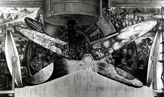
And sure enough, less than three weeks later, after it became clear that that was no random baldheaded, goateed man in the center of Man At The Crossroads with Hope and High Vision to the Choosing of a New and Better Future, but Lenin himself, Nelson Rockefeller was called in to persuade Rivera to genericize the figure. Rivera refused, and he was quickly paid off and barred from the premises. Eager to not have the nearly-completed work photographed, the Rockefellers first covered it with drapery, and within a day, had covered it with canvas. After unsuccessful attempts spearheaded by Abby Aldrich Rockefeller, John D's wife, to salvage the mural, perhaps to put it in the Modern, it was destroyed. Which prompted workers to protest anew in April 1934.

Now I knew it was a controversy, but I had no idea how heated and seat-of-the-pants the whole situation was, nor what a spectacle. It was on the front page of the Times for days, weeks, even. I also didn't realize how incredible it was that Lucienne Bloch managed to take the only photos of the mural before it was covered up. Bloch began working as Rivera's assistant after she was seated next to him at the Modern's 1931 opening dinner.

The whole photo drama was retold [with perhaps a bit of anti-capitalist gloating?] in Bloch's obituary in 1999:

Lucienne Bloch, an acclaimed muralist whose most significant contribution to art may have been a series of surreptitious photographs she took in 1933, died on March 13 at her home in Gualala, Calif. She was 90.

She was the photographer whose sneak pictures taken behind enemy lines on May, 8, 1933, are the sole visual record of the great Diego Rivera's ill-fated Rockefeller Center fresco with its doomed depiction of Lenin.

At a time of economic distress, when capitalism itself seemed vulnerable to competing currents of social change, if anybody was going to pin Lenin on a capitalist wall it was Diego Rivera, the fiery Mexican muralist whose artistic acclaim was matched only by his reputation as a fiercely committed, if renegade, Communist.

If anybody was going to stop him it was John D. Rockefeller Jr.'s son, Nelson A. Rockefeller, who had commissioned Rivera to paint a 1,000-square-foot fresco, ''Man at the Crossroads,'' in the great hall of the new RCA Building, the soaring Rockefeller Center capstone now known as the G.E. Building and at the time an especially potent symbol of capitalism.

Rivera used Bloch's photos to recreate the Man at the Crossroads later in Mexico City.

"Civilization is in an acute form of crisis. But the germs of a future culture are floating in the air. It is possible that one day the first flowers may spring up here on American soil."
- Gordon Onslow Ford, 29, opening his lecture on Surrealism at the New School, January, 1941.

onslow_ford_propaganda_fn.jpg

Gorky, Motherwell, Matta, Tanguy and Pollock were apparently in the audience.

Onslow Ford was sent to the US as part of the Committee to Preserve European Culture. Art historian Martica Sawin transcribed the lectures, which are published for the first time in the catalogue accompanying the artist's first NY show since 1946, at Francis Naumann.

The only online references to this Committee are in relation to this show, and Onslow Ford's bio. [google cache here, as the page is not currently visible from onslowford.com] He was an officer in the British navy, and given leave for the lectures. His 2003 obit says "an expatriate group" invited him, and he was certainly preceded to NY by many of his older surrealist colleagues.

But instead of returning to the war, "he decided to join other Surrealists in Mexico seeking greater isolation to travel his own artistic path." He camped out in a hacienda in a remote village for six years, then moved to San Francisco [where he co-founded that crazy hippie art barge, the Vallejo.] Which sounds an awful lot like ducking the war and hiding out in BF Mexico. Just sayin'.

"Gordon Onslow Ford: Paintings and Works on Paper 1939-1951," curated by Fariba Bogzaran, through Dec. 23 francisnaumann.com via
nyt]

I assume everyone has already clicked through and read the excerpt from Martin Duberman's 2007 Lincoln Kirstein biography where he talks about the controversy that erupted around the Museum of Modern Art's 1932 murals show, right? The one where a couple of outspoken trustees demanded that Kirstein remove the "offensive" [i.e., anti-capitalist] works or else cancel the whole show?

So you probably already know and love this quote about artists and their politics from the Museum's director Alfred H. Barr:

Barr, according to Lincoln, told him that if the artists intended to "mix themselves up with an imposed political ideology, they will lose all the values of a Bohemian laissez-faire which up to the present they have desired."
Indeed, words to live by. Best to leave political, class, economic, and labor issues to the experts uptown.

ant_farm_kohoutek.jpg

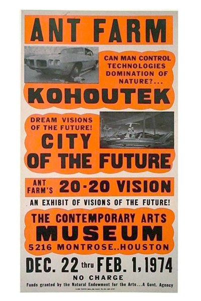
I've been deep in the commercial letterpress lately, and neglecting my Ant Farm. Fortunately, Mondo Blogo is there to bring me back in line, with this awesome poster the Farmers made for 20:20 Vision, their show at CAMH.

20:20 featured a Dollhouse of the Future named Kohoutek, after a comet that was supposed to crash into the earth or something, sending hippies into an apocalyptic panic, but it missed, bumming everyone out. In Kohoutek's Living Room of the Future, naked Barbies lounge around on biomorphic sofas watching a live data feed from SkyLab, seemingly unaware that they're being raised as food for the comet-surviving ants.

According to a review in Architectural Forum, there were 20:20 t-shirts as well as posters for sale. I'm dispatching my army of Houston vintage pickers forthwith.

And even though Houston was the first place Ant Farm unveiled their plans for the Dolphin Embassy, I think my favorite part is there at the bottom:

"Funds granted by the National Endowment for the Arts... A Govt. Agency"

ant farm: sex, drugs, rock & roll, cars, dolphins & architecture [mondo-blogo, thanks andy]
Previously: Cue the Dolphin Embassy [greg.org]

moma_mural_abbott
New York, montage photomural, Berenice Abbott, all images via moma's 1932 catalogue

I've been meaning to post this for a couple of months, but with museum censorship battles and political mural controversies in the news, what better time, right?

When I started researching the history of photomurals--or more precisely, the photomurals of history, since I was mostly just posting various photomurals I'd discovered--I was interested in their context, in the exhibitions and expos they were created for, and whether they were considered or treated as art.

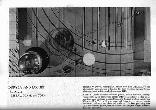
moma_mural_duryea
Metal, Glass and Cork, Hendrick Duryea and Robert Locher

You know what, I could try and just quote the awesome parts, or hold up for scrutiny or amusement the seemingly unquestioned assumptions about art, painting photography, and decoration that inform it.

But instead, I have just typed in all of Julien Levy's catalogue essay on photomurals from the Museum of Modern Art's 1932 exhibition, "Murals by American Painters and Photographers." It's after the jump.

Levy was a pioneering photography dealer who was brought in by Lincoln Kirstein to curate what would be the Modern's first exhibition of photography. It's really hard to overstate the importance of Levy's role in the history of art and photography. He saved, with Berenice Abbott, Atget's photos. He gave first shows in the US to Brassai, Cartier-Bresson, Moholy-Nagy. [He organized the US premiere of Moholy-Nagy's short film work, Lichtspiel in 1932 which, really? Because it barely premiered in Berlin in November 1932. That's hardcore.] He had the first surrealism show in the US. He promoted the found and anonymous photograph as readily as the known artist's work. And though he barely sold any actual photos in the 17-year life of his gallery, he was a remarkable and prescient advocate for the medium as art.

In 2006, the Philadelphia Museum staged an incredible exhibition of photos and material from Levy's archive, which they'd acquired from his widow. Check it out for more details and context of Levy's significance.

Levy opened his gallery in the fall of 1931. The Modern show opened in May of 1932. If nothing else, this essay reflects Levy's thinking of photography and art, cinema and pai.nting, at an early stage of his involvement with a nascent medium. Enjoy.

December 14, 2010

The Gala As Art As Slideshow

The Gala As Art, greg.org, at #rank 2010 from greg allen on Vimeo.

Here's the narrated slideshow I did at #rank during Art Basel Miami Beach.

Many thanks to Jen and Bill for inviting me, to Magda for instigating, to all the SEVEN galleries for hosting, and to Michelle Vaughan for sharing her sharp gala insights. And a huge thanks to Jean, whose advice helped structure a drive-by blog post into a more coherent [I hope] argument. And who insisted I go do the talk, even though it meant celebrating our tenth anniversary early and late.

Thanks, too, to the artists and photo sources, including, in random order as I think of them: Andrew Russeth/16miles.com, Artforum.com, Andrea Fraser, MoCA, LACMA, the Rubell Family Collection, Jennifer Rubell, Kreemart, Christoph Brech, Getty Images, Patrick McMullan, the daily truffle, billionaire boys club, Vernissage TV--don't these credits make you just want to hit play right this second??

The audio's rough, the aspect ratio wonked out at the last minute, and I'd do better to just rebuild the whole thing rather than adapt my Keynote slides. And while there's no gift bag at the end, I did manage to edit out a whopping 12 minutes of um's, pauses, and "wait, I want to go back to the previous slide"s. I guess media training is NOT like riding a bike.

December 13, 2010

Sforzian Up-do

palin_haiti_hair_ap.jpg

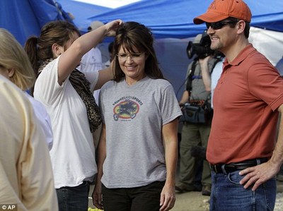
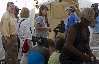
A nice Sforzian moment in Haiti, where Fox News employee Sarah Palin recently got her hair fixed by a stylist, an unwed high school dropout teen mom, during a private tour of preacher Franklin Graham's cholera compound.

palin_haiti_coale_ap.jpg

Private except for fellow Fox News commentator Greta van Sustern, and her camera crew. And Greta's husband John Coale, who is the DC litigator who established Palin's PAC, and who is described as one of her closest political advisors and the top "Protector of the Palin Brand."

Ready for her close-up [ap images via dailymail.co.uk]

Struth_Koln.jpg

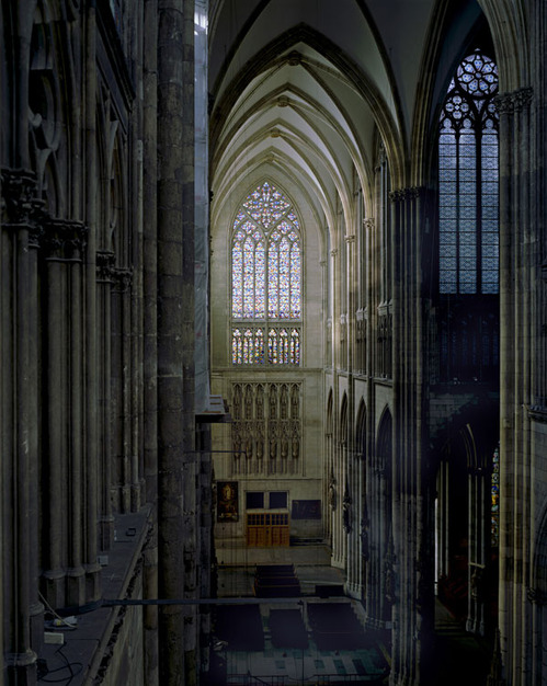
The Minneapolis Institute of Arts has a sweet Struth photo of the Cologne Cathedral, and somehow, Gerhard Richter's pixel-style stained glass window is not the most awesome thing about it. Also, is that a mop on that ledge in the foreground?

See a larger image, plus the photo in situ, at the top of the MIA's grand staircase [artsmia.org via eyeteeth]

I'm trying to imagine this happening today, or this century--or last, for that matter--and I just can't. The best account of it I've found is from Calvin Tomkins' 1964 New Yorker profile of Rauschenberg, so I'll just quote him:

[Rauschenberg and Jean Tinguely] joined forces with several other avant-garde talents to put on a rather bizarre performance in the theatre that is part of the American Embassy.

This spectacle presented simultaneously a motorized Tinguely sculpture that went back and forth across the stage doing a strip tease; a performance, in and around the piano, of John Cage's "Variation II" by the American pianist David Tudor; a picture-shoot by Niki de Saint-Phalle, Tinguely's present [sic] wife, who creates her works by firing a .22 rifle at papier-mache constructions in which plastic bags of paint are embedded; and the onstage creation of a painting by Rauschenberg, whose brushstrokes, hammer blows, and other sound effects were amplified by contact microphones attached to the canvas. (Only the back of the painting was visible to the audience, which expected to see the finished work at the end but was denied that pleasure.)

Jasper Johns, who was also having a show in Paris, contributed a painted sign reading "Entr' Acte" and a large target made of flowers. The performance drew a large and enthusiastic audience, although the Embassy, uncertain what to expect, had forbidden any advance publicity.

I mean, can you imagine it? The performance was June 20, 1961. Johns and Rauschenberg were both in Paris for shows, but from what I can tell, the impetus was the beginning of David Tudor's European tour. [Though Tudor's site doesn't seem to mention a tour.]

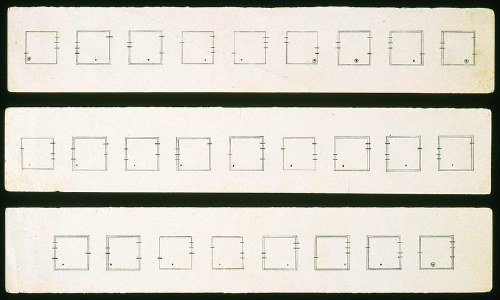
"Variation II" is one of Cage's most complicated, abstract works. Cage's scores almost always baffle me--when described, they often sound like impossible-to-follow instructions for making a Sol Lewitt wall drawing without a wall--and "Variations II" is no different. Here's the Getty Research Institute's explanation:

Cage's original notation consisted of five points and six lines on eleven individual plastic sheets and instructed the performer to create measurements between the dots, representing sound events, and the lines, representing parameters of sounds (amplitude, duration, overtone structure, frequency (pitch), point of occurrence, number of sounds structuring each event). The resultant measurements defined the parameters of each sound event.
cage_tudor_varii_gri.jpg
David Tudor, "Nomographs" designed for a realization of John Cage's Variations II, 1961, image via GRI

Lalalala-- what? Got that? Never mind, because Tudor apparently changed it all so much, at least one scholar has called "Variations II" Tudor's own first composition. [That scholar, James Pritchett, has as clear a description of Tudor's 1961 performance techniques as I can find, btw. As for audio, the closest approximation I can find is a 1967 "Variations II" performance by Tudor, which obviously doesn't include his Parisian backup band.]

So far, I haven't found any documentation of the performance itself. But whatever exists was surely shown at the 2009 Tinguely/Rauschenberg exhibition in Basel I wrote about a little while ago.

st_phalle_bob_jasper.jpg

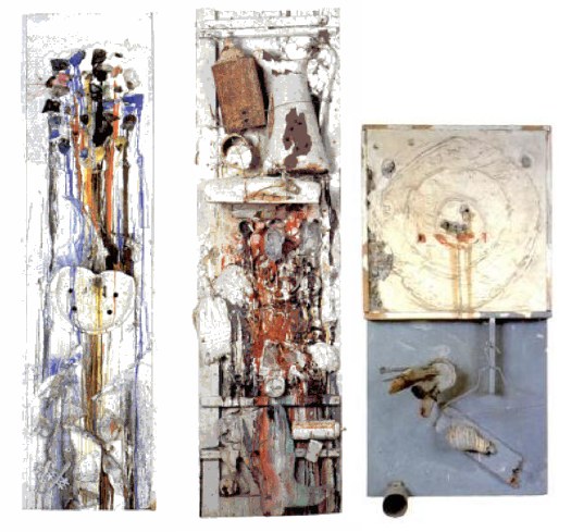
The three Niki de St. Phalle paintings above [not to scale] were all made on the day of the performance, and Shooting Painting American Embassy [left] was in the show, but no actual shooting took place in the embassy. Both Homage to Robert Rauschenberg (Shot by Rauschenberg) [middle] and Tir de Jasper Johns [right] were shot during the day, and her catalogue raisonne says St. Phalle didn't shoot American Embassy until later.

I'm sure the folks in the Embassy were relieved.

Previously: the State Department and modernism in the 1960s
the de la Cruzes loan a Felix candy pour to the Art in Embassies Program
an amazing memo from Nixon calling for a purge of the "little uglies," aka contemporary artworks, from embassies

burden_velvet_water.jpgI realize I only tweeted it, and that doesn't count, so I'll say it here: Nick Stillman's essay about Chris Burden's television-based work at East of Borneo is great stuff:

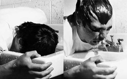
Velvet Water feels like the culmination of a thread that began with Shoot. That performance actualized the sensationalistic stuff of TV dramas and the nightly news. But aside from its sociopolitical connotations, it contained heroic connotations of Burden as lone survivor. He was very much the performance's sole subject. Velvet Water retains the vivid political suggestiveness that spikes many of Burden's best performances. His auto-torture is evocatively similar to how the French police torture the Algerian sympathizer Bruno Forestier in Godard's Le Petit Soldat (1963), not to mention any number of modern waterboarding videos, but I would argue that the audience--not Burden--was the unwitting subject of the performance. Burden had by this point established a reputation for being a careful, responsible coordinator of his own performances. He must have known that nobody would interrupt him. But he was also clearly choking, and was probably close enough to the spectators that his gasps were audible not only from the television monitor but also in real time, from the adjacent room. Unlike in Do You Believe in Television, where his physical presence was only implied, those present at Velvet Water knew he was right there with them. They were set up as examples of conditioned passivity in the presence of a television set. As Robert Horvitz wrote of the work, in Artforum in 1976, "The electronic link between him and the audience tacitly implicated them in this ordeal, even as it seemed to distance them sensually." Burden--onscreen and thus invincible--was demonstrating television's force field of inaction.
Do You Believe in Television? Chris Burden and TV [eastofborneo.org]
Previous Burden coverage on greg.org: the TV ad, and how we can all put ads on TV now, too; the B-Car; remaking Beam Drop.

December 11, 2010

Italian Line, Farm Journal

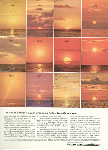
Italian Line ad, 1964

The New Yorker obsoleted my old New Yorker Magazine Database by finally letting Google index their website and adding a search function, and making their archive available online, and that's as it should be.

But whenever I browse the DVD facsimile of the magazine's archive, I am reminded of how much content remains unindexed and invisible. So maybe it's time to liberate the vintage ads of the world from their back issue prisons. Because if I can find ads this awesome completely at random, don't you wonder what else is out there?

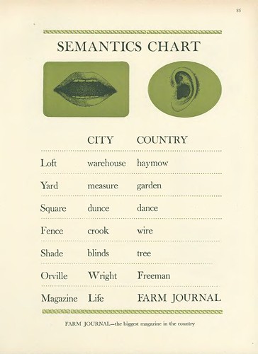
Farm Journal ad, 1964

Haymow!

car_camo_thumbs.jpg

I love it when a tossed-off plan comes together. In this case, it's the idea of artist-designed vinyl car wraps. And camo.

The Times had a great story about auto spyshots, and the increasing use of camouflage vinyl wraps on test cars. Some of the wraps seem designed to thwart a spy photographer's focus, or at least to obscure the contours and details of the car.

The different patterns are discussed as resembling "a Keith Haring painting," and "World War I 'dazzle ships,'" or as sporting the swirly, painterly "Van Gogh Look."

It should only be a matter of time before a collection of contemporary artist vinyl wraps hits the streets. Right?

Secret Cars Kept Under Wraps, in Public [nyt via slow and steady wins the race]

Previously:
The Jeff Koons wrapped BMW
Vinyl wrapped art car: Hirst]
First or worst? Peter Max decal car c. 1968
Razzle Dazzle and Dutch Google Maps camo
OG WWI dazzle design and the Koons revival

There's some interesting background info as well, but the big news [sic] today in piecing together the history of Rauschenberg's Short Circuit is that Finch College is off the hook--and Holland Cotter is right after all.

December 9, 2010

James Turrell At Kijkduin

kijkduin_gmap.jpg

Does an Anglo calling The Hague "Den Haag" sound as obnoxious as one calling Florence "Firenze" or Milan "Milano"? This is not a rhetorical question. I really need to know.

turrell_kijkduin_stroom.jpg
Celestial Vault in 1996, James Turrell, image via: stroom.nl

In 1996, Stroom, the contemporary arts center in Den Haag [!] commissioned a permanent public sculpture from James Turrell. And while Stroom has certainly achieved much since then, it still seems like the most prominent/significant thing they've ever done.

James Turrell at Kijkduin - The Approach

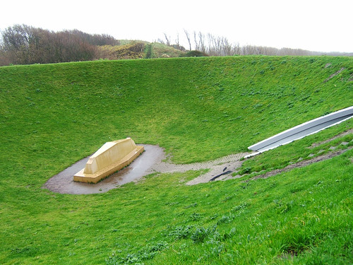
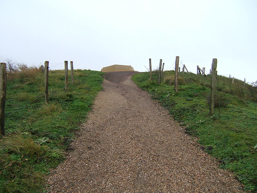
Celestial Vault was built in Kijkduin, a duney seaside suburb about a 20-min. bus ride from the center of town. It consists of two parts: a contoured, elliptical, crater-shaped earthwork with an inclined viewing platform at the center, and an another platform installed on a higher, adjacent hilltop.

James Turrell at Kijkduin - The Tunnel

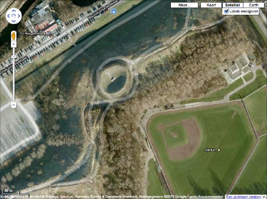
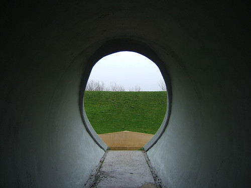
The weather and use had taken a toll, and so in 2008, a significant effort to restore Celestial Vault was undertaken. Stroom's website says the work is open to visit, so I did, only to find warning tape placed across the tunnel entrance to the crater. Obviously, I went in anyway. [On Google Maps, the dune crater looks to be hard up against a restaurant and a baseball diamond, of all things. When you visit it, the topography is such that these both fall completely away.]

James Turrell at Kijkduin - The Crater Lip

It seems so online, and it was really apparent in person, that Celestial Vault functions as a kind of experiment or test run for Turrell's project to reshape Roden Crater. For that reason alone, it seems like it should get more attention than it does. [Is it just me? I follow Turrell's work, and his 1993 retrospective at ICA Philadelphia is a longtime favorite, but it seems the Roden Crater hype overshadows everything else. I'd never heard of Kijkduin, and frankly stumbled on it by accident on my morning visit to Den Haag.]

Also, it's actually built. And you can see it without being on a 10,000-year waitlist or whatever Roden Crater's gonna have.

James Turrell at Kijkduin - The Other Altar

All that said, I confess I couldn't get Turrell's vaunted vaulting effect to work. Maybe I didn't stay still long enough of free my mind or unfocus my eyes or whatever long enough. Maybe I was focusing too much on the rain that was falling on me the entire day. But Turrell [and the Dutch, for that matter] are rather specific about the material qualities of Kijkduin light, and the overcast, rainy lightbox effect IS pretty standard there on the North Sea.

So maybe it was me, and I was wrong to expect something less subtle, a more special-effectsy, fish-eye lens distortion.

Because what you end up with--or what I ended up with, anyway--was a view of the sky where the [shaped] horizon line hovers just barely on the edge of your peripheral vision. The fact that the vaulting worked almost the same way with the actual horizon line, which Turrell used on the hilltop platform, kind of makes you wonder if the whole earthworking effort isn't more for its own sculptural properties than for facilitating any actual retinal impact.

It's a question Turrell seems to have been asking himself, by placing these two identical viewing platforms side by side, but in opposite geographic situations. I guess since work really picked up at Roden Crater since Kijkduin was built, Turrell got the answer he was looking for.

Stroom page with info and tons of photos: James Turrell - Celestial Vault, Kijkduin, Den Haag [stroom.nl]
Celestial Vault on Google Maps [google]
My Turrell @ Kijkduin photoset on flickr [flickr]

December 8, 2010

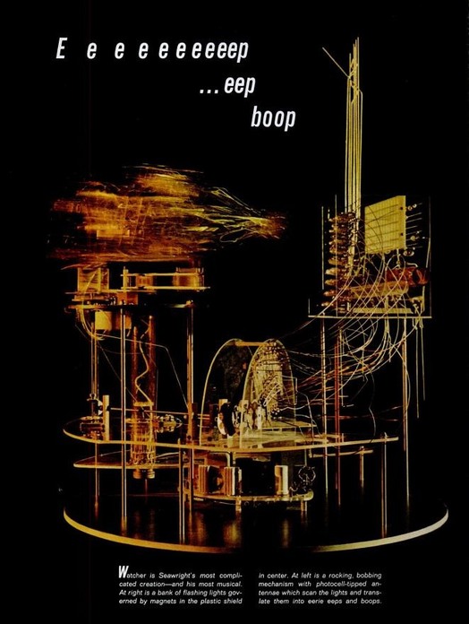
Whoa, James Seawright

seawright_watcher_life.jpg

It's crazy sometimes how long it takes to see what's right in front of your face. I've been thisclose to artist James Seawright's kinetic and electronic sculptures over the last couple of years, and yet I only really discovered them yesterday.

Seawright, who was for a long time the head of visual arts at Princeton, began making Bauhaus-inspired light and sound performance works with his dancer wife in the early 1960s. Bauhaus in this case meant Laszlo Moholy-Nagy, whose Light Space Modulator has been much discussed around here.

Trained as an engineer, Seawright began taking sculpture classes at the Art Students League in New York, and scored a solo show at Stable Gallery in 1966. Among his awesome work in that show: Watcher (1965) [above, from a 1967 LIFE Magazine spread.]

Like much of Seawright's work, Watcher is designed to activate and react to the presence of the viewer--or to itself--via photovoltaic sensors. It looks remarkably similar, both formally and functionally, to the Eames Solar Do-Nothing Machine (1958).

After his Stable Gallery show, Seawright was involved in shows at Howard Wise, and was one of a handful of artists--along with Allan Kaprow, Otto Piene and Heinz Mack--to participate in The Medium is The Medium, an early experiment in video art/"tele-Happenings" produced by WGBH in 1969. Which I now must watch again, for the Seawright part.

James Seawright [wikipedia]
seawright.net [the artist's portfolio site]

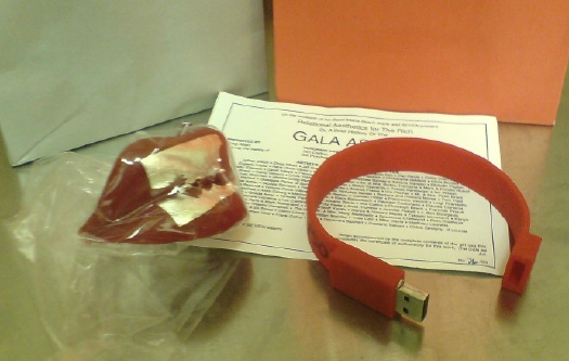
gala_gift_bag_pic.jpg

I was nervous, I admit, but I really had a blast last week giving my Gala As Art presentation last week at #rank. The crowd was great; the other #rank folks I met were nice, with interesting projects and conversations; SEVEN looked fantastic, a really smart, low-key way to show a fair's worth of work [I hope all the participating galleries made a bundle of money.]

It seemed obvious that the talk required gift bags, so I decided to do them as an edition. The artist-licensed perfume I hoped to include didn't pan out, though. I'd toyed with the idea, no pun intended, of making a version of Marina Abramovic's party favor/dessert for the The Artist is Present gala, where the dessert art foundry Kreemart cast her lips in Belgian chocolate covered with gold leaf.

Then I priced edible gold leaf, and opted for silver leaf on edible wax lips, which really set the gift bag's entire color scheme. [Actually, Diet Coke probably set the color scheme without me being aware of it.] Applying silver leaf was a pain in the butt, but there were only a couple of rejects. They traveled amazingly well, thanks to Jean's careful wrapping. The certificate is designed like an invite, with a bajillion artists and collectors and curators on the committee, everyone I mentioned [or planned to, anyway.]

And at the last minute, I decided that burning and printing 50 DVDs full of the gala-related video and pdf files I'd assembled would be not so interesting. [A friend pointed out that no one ever opens the jewelcases in their gift bags, and I realized, in 20 years, I never had either.]

So I hustled to find a cool USB drive I could load. Maybe get my logo or url on it. Or maybe find anything at all in stock. Finally, I found exactly what I was looking for, and I ended up loading, signing and numbering the silicone bracelet flash drives the morning I left.

I'm discussing them at length here because they're apparently so stealth, several people didn't realize they were anything more than a wristband. So now you know. I saved a couple for the archive. And because I didn't want to leave the lips melting in the trunk, I ended up not going to Art Basel at all. Crazy.

Meanwhile, I'm trying to find the best/easiest way to release the slideshow and audio together, either as a screencast or a podcast or something. Watch this space.

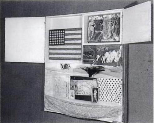
rausch_johns_short_circuit.jpg

After a brief break, during which I briefly pwned Miami Art Basel, the search for the Jasper Johns flag painting which was included in Robert Rauschenberg's 1955 combine-painting Short Circuit [above], continues.

Actually, because I had to carry on the oddball contents of the gift bags I did for my #rank presentation, I went to the airport freakishly early and ended up with extra lounge time, which let me read through all the details and footnotes in my pristine, OG copy [apparently from the library of Artforum!] of Dr. Roberta Bernstein's definitive 1985 dissertation-cum-catalogue raisonné, Jasper Johns' Paintings and Sculptures 1954-1974, "The Changing Focus of the Eye."

Only guess what, it wasn't there. Not a mention, not a photo, not a footnote, not a trace.

[UPDATE: Since posting this in December, I have communicated with Dr. Bernstein about the Short Circuit flag and its absence from her thesis, as well as its status in her forthcoming Johns catalogue raisonne. Scroll down for her gracious and informative reply.]

Via Ubu comes a provocative essay, "Constructed Anarchy," from the poet and John Cage critic Marjorie Perloff. She takes the death of Merce Cunningham and the company's plans to dissolve after a worldwide farewell tour as an opportunity to ask a tough question of Cunningham's and Cage's philosophy: basically, if art is life, what happens to it after you're dead?

When in June 2010 I had the chance to see Roaratorio performed at the Disney Concert Hall--a beautiful Roaratorio but no longer graced by the presence on stage of Merce or by the actual speaking voice of John Cage--what seemed especially remarkable was the tight formal structure of a composition once billed (both in its radio and dance incarnations) as an anarchic Irish Circus, bursting with random sounds and unforeseen events. For, however differential the leg, arm, and torso movements of the individual dancers (sometimes in pairs or threes, sometimes alone), all are metonymically related in a network of family resemblances, and all are, as the charts show, mathematically organized. Yet wasn't it Cage who defined his music as "purposeless play"--"not an attempt to bring order out of chaos . . . but simply a way of waking up to the very life we're living, which is so excellent once one gets one's mind and one's desires out of its way and lets it act of its own accord"? And wasn't it Cunningham who insisted that dance "is not meant to represent something else, whether psychological, literary, or aesthetic. It relates much more to everyday experience, daily life, watching people as they move in the streets"?

The very life we're living: the Gelassenheit so seemingly central to Cage-Cunningham was hardly anarchic, much less unpredictable. But their own statements, and hence the critical writings about their work, have regularly insisted on what Joan Retallack, in her seminal series of conversations with Cage, calls "an aesthetic pragmatics of everyday life." "[Cage] told me," she recalls in her Introduction, that "the art that he valued was not separated from the rest of life. . . . The so-called gap between art and life didn't have to exist" (Musicage xix-xx). And Cunningham repeatedly made the same point, using traditional ballet as contrast.

Or that's how it used to be.
It sounds convincing: to see RainForest or Roadrunners, Channels/ Inserts or Beach Birds, is to perceive that there is no central focus or storyline, no prima ballerina flanked by a corps de ballet, no symmetry or detectable unifying principle. But if the dancers are free to introduce their own variations and tempo, if the piece is as non-hierarchical and collaborative as Merce suggests, why has each work (dance and music) been plotted out geometrically and arithmetically? Why have the dancers received so much less acclaim than Cunningham himself, in his role as director /producer /choreographer? And why has the decision been made that the ensemble will not be able to function without him? Similar questions can be put about Cage's work: is his recorded voice reading Roaratorio essential to the work? Can a "decentered" Cage Musicircus perform without Cage?

The more we probe such Cunningham-Cage concepts as "free form" or "anarchy," the more apparent it becomes that theirs is an anarchy that is carefully simulated. Their works are by no means "happenings," in Allan Kaprow's sense of the word, nor is Cunningham producing performance art.

As in Duchamp's case, no "accident" is really accidental, and discipline is central. [emphasis added because, yow, kinda harsh]

Perloff's argument is definitely worth a read, and she had a front row seat--and she quotes longtime Merce collaborator Carolyn Brown and others--on Merce and Cage's egos and steely artistic wills, which seem to undermine a carefully cultivated [or at least prevailing] laissez-faire, see-what-happens image.

But I'm just half-informed enough to take issue with Perloff's takedown. She sets up seeming contradictions between professions of randomness and artistic control, but I think that's false and unfair. Cage wasn't an evangelist for randomness, nor for anarchy, but for chance and chance operations. And there's a meaningful difference that I suspect Perloff knows well.

Randomness is whatever happens, but chance operations is a tool for determining what happens. Perhaps Cage and Cunningham's meant their obliteration of the distinction between art and life, between music and sound, between dance and movement, to be a production strategy for the artist, not a life strategy the audience.

Constructed Anarchy [lanaturnerjournal.com via ubu]
Interesting/related, and the 2nd time in 2 days to see Cage compared to Warhol: Ubu founder Kenneth Goldsmith's 1992 review of Perloff's first posthumous Cage essay. [electronic poetry center]

In my talk at #rank in Miami Friday, I called for more scholarship on the growing genre of yacht art. Which, via this NY Times Style section slideshow caption, now includes at least one work of hybridized performance/institutional book party critique by the artist Al Czervik:

During a high school band performance at the Bruce Weber and Andre Balazs party at the Standard Hotel, a massive yacht passed the dock, sending three enormous waves crashing up through the dock, drenching the guests.
Until Taiwanese animated news comes up with something, this youtube video will have to do.

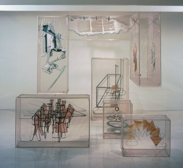
johns_walkaround_wac.jpg
image: walkerart.org

Welcome to one of the oldest tabs in my browser: the inflatable balloon set for Merce Cunningham's 1968 piece, Walkaround Time, which is based on Marcel Duchamp's Large Glass, which was made by the company's artistic director at the time, Jasper Johns.

I'd backed into the pieces--seven cubes of silkscreen-and-paint on clear vinyl, reinforced with aluminum frames--a few months ago, and realized I'd seen them--and not thought much about them--at the opening of the newly expanded Walker Art Center in 2005.

Which I now regret, but which makes Merce's title resonate a little more. Cunningham dancer and longtime collaborator Carolyn Brown explains that Walkaround Time was a reference to a particular kind of purposeless movement taken from ancient computer history, when "programmers walked about while waiting for their giant room-sized computers to complete their work." It's just taken me this long to appreciate--or even to see--the work. And for some great additional links to appear.

I can already tell this is going to go long.

03/2012 UPDATE: Unfortunately, none other than former MCDC stage manager Lew Lloyd informs me that the term "balloon" is not really accurate; they were transparent vinyl boxes fit onto armatures, which could be broken down for travel. Given my noted satelloon bias, I will still think of them as balloons in my heart. For the rest of you, though, remember: not balloons. [end update]

buried_wojnarowicz.jpg

I recently went with my daughters to see "Hide/Seek" at The National Portrait Gallery. They're 2 and 6, so most of the content of the show is way over their heads. [Much of the work, like the vintage photographs, was literally over their heads.]
felix_ross_la_pour.jpg

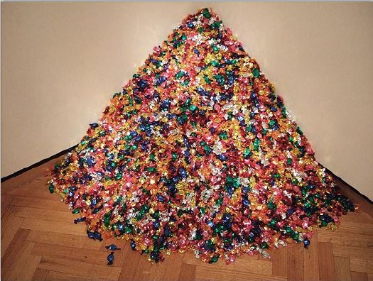
Felix Gonzalez-Torres' shiny, multi-colored candy pour, Untitled (Portrait of Ross in LA) was an immediate and repeated hit. As my kids were going back for "just one more piece," I laughed with other visitors at the sign the museum had posted next to it, warning that these small candies might pose a choke hazard.

At first I was going to write that we mostly stuck to the bright, colorful works, but that's not correct. While a giant camo Warhol was front and center, and the kids both recognized it immediately, I didn't think either one would be ready for the most colorful work in the show, A.A. Bronson's massive, epic portrait of his AIDS-ravaged partner Felix's body. Fortunately, the curators had placed it in its own semi-enclosed niche, to the side. It was a careful presentation of a devastating and important work, thoughtfully non-confrontational without seeming sequestered or hidden.
hartley_crane_memorial.jpg

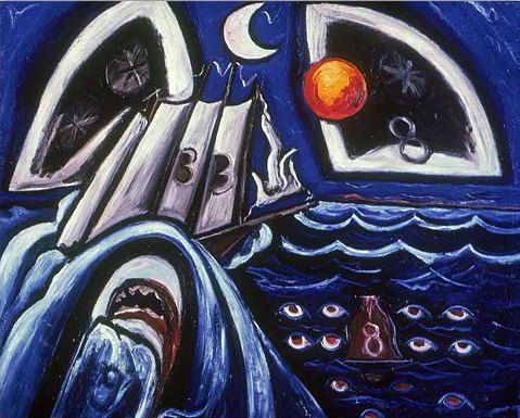
We saw Jasper Johns' face on a plate. Larry Rivers' giant nude portrait of Frank O'Hara, which was hard to miss, of course. We played I Spy with some of Marsden Hartley's elements--the ship, the waves, the bells, the sun &moon, the shark--in his Memorial for Hart Crane. The older kid read the title, so we talked about the painting for his friend who drowned. I couldn't not tell her that Crane had jumped from the ship, not fallen. No, I didn't know why, except that he must have been very, very sad and thought that his life was so bad, it'd be better to be dead. Which we decided did not make sense and was not true.

We saw the lady in the tuxedo and laughed at the very idea that long ago, some people thought only men could do things like work, or vote, or paint. And that there were things people thought only women do that men shouldn't--like pose nude for a painting [gesture to giant, nude Frank O'Hara].

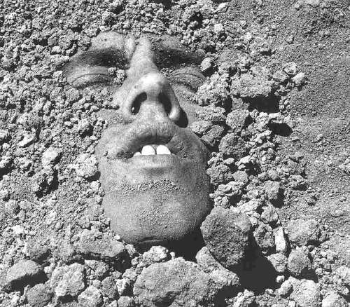
We talked about David Wojnarowicz's self-portrait, above. And that when he knew he was dying, he made a picture that looked like he was buried. Or maybe it looked like he was coming out of the ground.

There were two small video monitors and a touchscreen, which attracted the 2yo like a giant iPad, but we didn't come to a museum to watch TV [this time.] One turns out to have been an excerpt from the David Wojnarowicz film, A Fire In My Belly, which the NPG just censored on the demand of William Donohue of the Catholic League, the self-appointed arbiter of offenses to Christian sensibilities. Republican leaders in the House of Representatives seized on the work and the show and demanded the Smithsonian cancel it immediately.

Pulling Wojnarowicz's work in the face of such bullying is a breathtakingly cowardly betrayal by the museum, one which either ignores or mocks the artist's own work and history. That it's happening on World AIDS Day, that Wojnarowicz' work is singled out for silencing on what used to be called A Day Without Art, is deeply offensive and damaging to the artist, the show, the curators, the museum, and to the principles of our country.

From Michael Kimmelman's obituary for Wojnarowicz in 1992:

Like the artist himself, his art never pulled punches. Mr. Wojnarowicz gained the national spotlight in 1989, when the National Endowment for the Arts decided to rescind money for a catalogue to an exhibition about AIDS because of an essay in which he attacked various public figures. The endowment reversed itself. It also supported a 10-year retrospective of his work that was organized at the University Galleries of Illinois State University in Normal, Ill., which included a catalogue that reproduced the essay.

Mr. Wojnarowicz was in the news again after the American Family Association of Tupelo, Miss., an antipornography lobbying group, and its leader, the Rev. Donald E. Wildmon, issued a pamphlet criticizing the endowment. The pamphlet included photographs cropped from works by Mr. Wojnarowicz that included sexual images. The artist sued the organization for misrepresenting him and damaging his reputation. In 1990, a Federal District Court judge in New York ruled in his favor and ordered that the organization publish and distribute a correction. Mr. Wojnarowicz was the only artist to challenge Mr. Wildmon in court.

If the exact same people and groups attack the exact same artists and institutions and outcome is actually more punitive--remember, the NEA reversed itself and Wojnarowicz stood up to his critics and won--how can we call it progress? It doesn't get better by itself.

update: Incredible. Tyler's confirmed that it was Smithsonian Secretary Wayne Clough who ordered the Wojnarowicz video pulled. From the way it went down, it sounds like he censored the video over the objections of the NPG staff--and without even watching it himself. Not that the content is at all obscene or even offensive. To anyone whose job isn't professional offensetaker, that is.

Since 2001 here at greg.org, I've been blogging about the creative process—my own and those of people who interest me. That mostly involves filmmaking, art, writing, research, and the making thereof.
Many thanks to the Creative Capital | Warhol Foundation Arts Writers Program for supporting greg.org that time.

comments? questions? tips? pitches? email
greg [at] greg [dot ] org

find me on twitter: @gregorg

about this archive

Posts from December 2010, in reverse chronological order

Older: November 2010

Newer January 2011

recent projects, &c.


our_guernica_cycle_ivanka_320px_thumb.jpg
Our Guernica Cycle, 2017 –
about/kickstarter | exhibit, 2017


pm_social_medium_recent_proj_160x124.jpg
Social Medium:
artists writing, 2000-2015
Paper Monument, Oct. 2016
ed. by Jennifer Liese
buy, $28

madf_twitter_avatar.jpg
Madoff Provenance Project in
'Tell Me What I Mean' at
To__Bridges__, The Bronx
11 Sept - Oct 23 2016
show | beginnings

chop_shop_at_springbreak
Chop Shop
at SPRING/BREAK Art Show
curated by Magda Sawon
1-7 March 2016

do_not_bid_or_buy_iris_sidebar.jpg
eBay Test Listings
Armory – ABMB 2015
about | proposte monocrome, rose

shanzhai_gursky_mb_thumb.jpg
It Narratives, incl.
Shanzhai Gursky & Destroyed Richter
Franklin Street Works, Stamford
Sept 5 - Nov 9, 2014
about | link

therealhennessy_tweet_sidebar.jpg
TheRealHennessy Tweets Paintings, 2014 -
about

sop_red_gregorg.jpg
Standard Operating Procedure
about | buy now, 284pp, $15.99

CZRPYR2: The Illustrated Appendix
Canal Zone Richard Prince
YES RASTA 2:The Appeals Court
Decision, plus the Court's
Complete Illustrated Appendix (2013)
about | buy now, 142pp, $12.99

weeksville_echo_sidebar.jpg
"Exhibition Space" @ apexart, NYC
Mar 20 - May 8, 2013
about, brochure | installation shots


HELP/LESS Curated by Chris Habib
Printed Matter, NYC
Summer 2012
panel &c.


drp_04_gregorg_sidebar.jpg
Destroyed Richter Paintings, 2012-
background | making of
"Richteriana," Postmasters Gallery, NYC

czrpyr_blogads.jpg
Canal Zone Richard
Prince YES RASTA:
Selected Court Documents
from Cariou v. Prince (2011)
about | buy now, 376pp, $17.99

archives