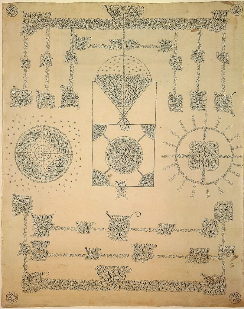
Shaker gift drawing attributed to Sister Sarah Bates, Mount Lebanon, NY, collection: Philadelphia Museum of Art
And there are enough conflicting, self-serving accounts of its creation that it’s understandable, I guess, if it’s not yet universally recognized graphic design history that the CBS logo came from a detail of a Shaker gift drawing, an all-seeing eye spotted in 1950 by William Golden in Alexey Brodovich’s magazine.
Anonymous tantric painting, c. 1970, “Energy traveling through, and regulating the colors of the world”; Udaïpur, Rajasthan, image via archive/featureinc
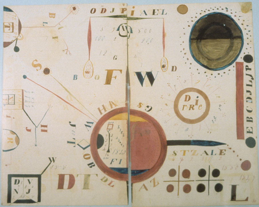
Shaker furniture, via Sheeler, was my bridge from American antiques to modernism. I practice a religion founded in the same mid-19th century hothouse of spiritualism that had Shaker “instruments” seeing visions and dreams and visitations and translating them to “makers,” who drew them on paper. I made my Father Couturier pilgrimages early at Dominique de Menil’s urging at the Rothko Chapel. I swooned over Hudson’s tantric paintings [which were meditative objects, not products, but still]. I MEAN, HILMA AF KLINT, PEOPLE.
And I still can’t help feel that the world has somehow conspired to keep me from ever hearing about Shaker gift drawings. And I am shook.
Untitled (200 x 157, after Achaeans in Battle, 1978, by Cy Twombly), 2019, an appropriated 20opx jpg displayed 800px, via Philadelphia Museum of Art
Two weeks ago on the 378th episode of Modern Art Notes Podcast, Tyler Green discussed Cy Twombly: 50 Days at Iliam, a monograph published by Yale University Press and the Philadelphia Museum, which has the 10-painting series permanently installed in its own gallery. Green’s guest was Richard Fletcher, a classics professor and one of six contributors to the book, alongside PMA curator Carlos Basualdo and Nicola Del Roscio, who heads the Cy Twombly Foundation.
I’d anticipated an episode on Twombly, because Green had recently tweeted about the extremely small and useless images of Twombly’s paintings on the Philadelphia Museum’s website, which, word. I promptly tweeted back an unhelpful joke, by upsizing the jpeg of one of the paintings, Achaeans in Battle, into a uselessly pixelated mess [above].
This is something that has occupied my mind and work for more than ten years, when I first turned a tiny jpeg of a Richard Prince Cowboy photo into my own work as a critique of MoMA/Gagosian/Prince’s refusal to provide images for an exhibition review at Slate. A related concept was articulated a little later by Hito Steyerl as the “poor image,” a low-res image optimized for networked circulation by being stripped of information. A crappy, digital simulacrum of an original [sic], complete [sic], physical and visual experience with an artwork.
Not knowing about the Iliam book, I assumed Tyler was going to be talking to Joshua Rivkin, who has a new biography of Twombly called Chalk: The Art and Erasure of Cy Twombly, which I’d recently finished. Rivkin’s book is a labor of love and pilgrimage; inspired by his regular presence in front of Twomblys at the Menil as a teacher and guide, the book documents his attempts to gain insights into Twombly’s life and work from the places he lived and worked: Rome, Gaeta, and Lexington. What Rivkin finds is the thwarting presence of Del Roscio, who disapproves of the biography project, silences sources, and denies Rivkin access to Twombly’s archive, as well as use of his images.
But no, it was Iliam. Green talked with Fletcher about details of Twombly’s marks and texts; his use of a Greek delta instead of an A to write Achilles and the Achaeans; the symbological vocabulary of the series’ colors; what’s going on with all those phalluses; and Twombly’s relationship to his literary source, Alexander Pope’s translation of the Iliad. [Fletcher also discussed a discovery he’d made, of a different source for some of Twombly’s texts. It’s hot, academic stuff.]
I mention all this scholarly and critical detail because of the sheer bafflement at learning, a few days after the episode was released, that the Twombly Foundation had sent Green a cease & desist letter demanding that images of the Iliam paintings be removed from the MAN Podcast webpage. Those would be the images of the 50 Days at Iliam works whose details were being studied and discussed. By an author of the book. Published by the museum and Yale. It’s an extremely impoverished attempt to exert control over consideration and discussion of Twombly’s work by an extremely interested party, using an extremely wealthy foundation. That it is being done in the name of one of the most important and formative artists in my own life is extremely disappointing.
As soon as I saw Green’s tweet about the C&D, and his removal of the Iliam images, I looked for it on Internet Archive. No luck. But I ripped a screenshot of the page from Google’s cache. In a couple of days, it had been replaced by the stripped down version. So except for anything Green might have archived himself, I think this screenshot is the only record of the original page. I printed it as Untitled (Foundation), an artist book in an edition of 10. The widest printer I could find was 36 inches, so it came out 3 inches wide and barely legible. The images are smaller than even the Philadelphia Museum’s website.
I am sending this artwork to people who appreciate the importance of fair use to progress of Science and the useful Arts; to the freedom of the press and expression; to the transformational creation of new art; and to the accountability to the public good that is expected of tax-exempt foundations and those who control and benefit from them.
I’m slow to realize I’ve only been hyping this on Twitter, but I’m psyched that my essay on Sam Gilliam and his decades-long investigations of abstraction is out now in Art in America magazine.
When the editors asked me all the way back in June, the assignment was to interview the artist in his studio, a regular feature of the magazine. Gilliam had just opened a retrospective in Basel, and was working on a show in LA in the fall. When that show got pushed back, the interview request process got drawn out, and finally, I ended up going to Gilliam’s studio to talk about interviewing him, but very purposefully not interviewing.
He was a gracious and fascinating guy in the middle of a great deal of activity, and we figured it would be best to talk more at length after the show got pinned down. And then the show preparations intensified, and my deadline loomed, and I ended up writing a full-on essay rather than interviewing Gilliam. Which was the culmination of a months-long journey through his work, his career, and his life, digging through archives and clippings files and hours of earlier interview recordings.
My takeaway is utter respect for Gilliam’s work and his practice, which evinces the kind of fierce independence required to sustain six-plus decades of experimentation, only some of which happened in the spotlight of the mainstream art world. I find myself rewriting the essay right now, so just go ahead and read it; I left it all on the page.
Marcel Duchamp, Hommage à Caïssa, 48 x 48cm, wood and printed vinyl, or what the Israel Museum calls “artificial leather,” image:sothebys
For a guy who’d supposedly gave up making art to play chess, Marcel Duchamp made an awful lot of art. Maybe making a readymade edition of a chessboard for a chess-themed fundaiser group show somehow didn’t count. It definitely sounds like it didn’t sell.
Asked in 1965 to help raise money for the American Chess Foundation, Duchamp organized “Hommage à Caïssa,” after the fictional patron wood nymph of chess, which opened at the Cordier & Eckstrom Gallery in New York in February 1966. [A year earlier, Cordier & Eckstrom had staged the largest Duchamp exhibition to date, a 90-object show, most from a single collection, that toured 16 cities in four countries over four years.]
“More than any other artist of his generation,” Francis Naumann wrote, “Duchamp was aware that his signature carried the magical power to transform an object of relatively little value into a work of art.” He was constantly dodging or finessing people at openings who approached him with things to sign–including the non-deluxe editions of his exhibition catalogues. For the chess show, Duchamp created a readymade chessboard in an edition of 30. I’ve seen it called just Chessboard, but mostly it’s titled Hommage à Caïssa, which is what Duchamp wrote on the frame.
On the frame of at least one. Though an edition of 30 was designated, Arturo Schwarz says “fewer than 10” were actually issued. Only two turn up online: one, 3/30, was Schwarz’s, and it went to the Israel Museum. The other is 2/30, which has a dedication to Maria. Could that be Maria Martins, Duchamp’s mistress, and the body model for Étant donnés? Who else would get a lower edition number than the artist’s most important dealer?
Anyway, it’s coming to auction for the second time in a decade. Presumably there was a 1/30, too, and 3 is less than 10, so Schwarz isn’t wrong. But either way, it doesn’t sound like Duchamp’s magical powers to transform chessboards into art transformed any into money. For Chess. But if two dealer flips in seven years can take this piece from EUR 42,000 to EUR 200,000, I guess we’ll know where the real magic lies.
I went back to the Charline von Heyl show at the Hirshhorn yesterday, mostly because I could. Also because it’s good. I never tire of looking and thinking about her paintings.
What stood out to me this time is so obvious I can’t believe I missed it, but also apparently so obvious, no one else has mentioned it either? [update after confirming my suspicions: No one except the artist and the curator Evelyn Hankins, at von Heyl’s talk at the museum, starting at 28:00].
Dub (2018) is in the second gallery, and P. (2008) is in the second to last gallery. It took me a couple of back&forths to figure out that the structure of these two paintings, separated by space and time, are not exact matches.
Charline von Heyl, P., 2008, Collection: Guggenheim
They make me think of two things. Several of von Heyl’s paintings reminded me of big-brushy, 1970s and 80s de Koonings, and now with the likelihood of her painting over a projection of an earlier work, we can add de Kooning’s last phase to the mix. Also, a pair of new paintings with a bowling pin motif are described as von Heyl’s first diptych, but that now seems only technically true.
UPDATE: no, she made it freehand, because it wasn’t clear whether the Guggenheim would loan P. for the show. Dub, von Heyl said, is what P. would be if she made it now, toxic, with a little “party hat.”