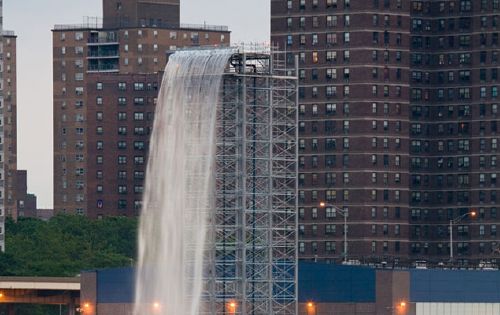
I’m out of town, so I haven’t seen Olafur Eliasson’s New York City Waterfalls in person yet. But even though I’m a fan and a friend of the artist, I’m getting a kind of relieved, embarrassed enjoyment reading the underwhelmed reactions to the project.
There’s something about “public” art that just gets under peoples’ economic skins in ways that art on display in public doesn’t. Do Aby Rosen or Damien Hirst get grief for the comparably priced statue of a dissected pregnant girl that’s been on view at Lever House for the last few years? Are the owners of the $100 million worth of Koons sculptures parked on the Met’s roof taking heat for not funding public schools instead?
If the oft-quoted number of $13-15 million is right, the Waterfalls cost about as much as a decent 3BR on the park. On a monthly basis, the 4-month project is about twice as much as the $20 million/year, $1.67/mo. Citi pays the Mets for naming rights to their new stadium [which is being built with 450 million taxpayer dollars.]
But whatever, if NYC Waterfalls‘ boring comparisons to the empty, execrable spectacle of The Gates only exposed of the pitfalls of the existential argument for Art as Economic Development, it would be a success.
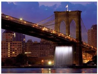
Waterfalls are supposed to be Nature’s most spectacularly wild destinations, yet on the East River, they’re tame to a fault. Never mind the futility of trying to upstage the wonder that is the Brooklyn Bridge; in the competition for inspiring American scenery, Olafur’s cobbled-together waterfalls invariably lose to the cityscape he put them in. Which I suspect was part of the plan all along.
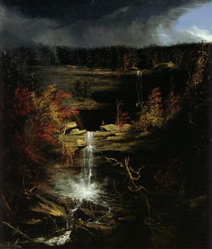
Here’s Thomas Cole, the founder of the Hudson River School, in his 1836 “Essay on American Scenery,” explaining how the divinely anointed wildness is the first point of evidence of God’s favor on His Country [Waterfalls, by the way, are point 3.b., listed under “3. Water” between “a. Lakes” and “c. Rivers.”]:
[Wildness] is the most distinctive, because in civilized Europe the primitive features of scenery have long since been destroyed or modified–the extensive forests that once overshadowed a great part of it have been felled–rugged mountains have been smoothed, and impetuous rivers turned from their courses to accommodate the tastes and necessities of a dense population–the once tangled wood is now a grassy lawn; the turbulent brook a navigable stream–crags that could not be removed have been crowned with towers, and the rudest valleys tamed by the plough.
And to this cultivated state our western world is fast approaching; but nature is still predominant, and there are those who regret that with the improvements of cultivation the sublimity of the wilderness should pass away: for those scenes of solitude from which the hand of nature has never been lifted, affect the mind with a more deep toned emotion than aught which the hand of man has touched. Amid them the consequent associations are of God the creator–they are his undefiled works, and the mind is cast into the contemplation of eternal things.
Though both varieties evoke “the beautiful, but apparently incongruous idea, of fixedness and motion,” Olafur’s waterfalls are the diametric opposites of The Hudson River School’s. As unabashed works of Danish-Icelandic Man the creator set in the sublime mess of the East River waterfront, they cast the mind into the contemplation of mundane, daily, man-made things.
So far, I haven’t seen my favorite aspect of the perfectly cultivated Waterfalls discussed anywhere at all: their schedule. The waterfalls get turned on every day at 7 AM, and turned off at 10pm. Except, as it happens, on Tuesdays and Thursdays, when they get turned on at 9 AM. New Yorkers have nothing against communing with nature’s sublime majesty, as long as you can guarantee we can squeeze it in on the way to work, or maybe during a smoke break. [One by-product of this schedule is the impossibility of reproducing the NYT’s Vincent Laforet’s lush photos of the falls in the dawn’s early light until the very last days of the project, and only then if they turn the lights on in the morning.]
But the idea of turning waterfalls on and off to suit human needs is not limited to the Public Art Fund. One of the biggest controversies in Iceland the last decade or so has been the Karahnjukar Dam, which was built on a pristine glacial river solely to generate electricity for a massive aluminum smelting plant run by Alcoa. Opponents criticized the project, not just for drying up 100 scenic waterfalls, but for planning to turn them back on from June to September during the summer tourist hiking season.
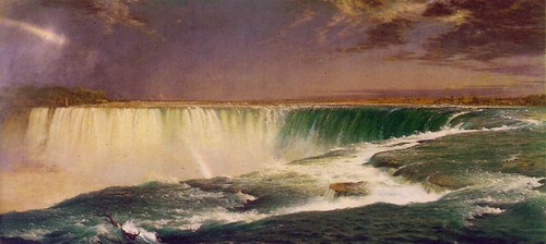
Even the “uncontrollable power” of the Hudson School’s favorite, Niagara Falls, is cut by 50-75% at night and during the off-season to power upstream hydroelectric plants. Cole got a little moist: “In gazing on it we feel as though a great void had been filled in our minds–our conceptions expand–we become a part of what we behold!” Which goes the same for Olafur’s waterfalls, too; the only difference is what we become a part of.