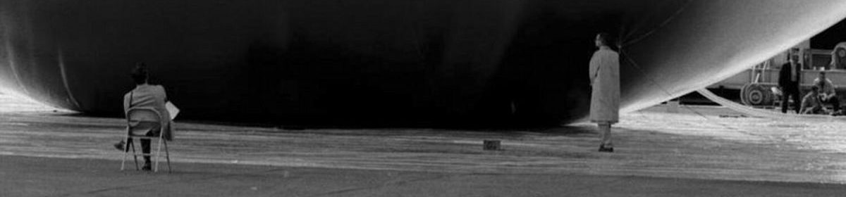
Arist Monica Bonvicini will participate in a panel discussion at Art Forum Berlin, the giant art fair, next week. Her co-panelists: gallerist Joe Amrhein, and collectors Harald Falckenberg and Mera & Don Rubell. The moderator is Marc Spiegler, an srt writer who made this sort of trouble at Basel, too.
The Topic: “Bigger! Faster! Out of control! Does today’s Art Market devour Artists?”
From the description: “Since the early 1990s, the art market has been rocked by change. There are many more collectors today, buying more aggressively. The role of the gallery is being radically transformed (and even threatened) by the surging number of fairs, biennials and contemporary auctions. Artists are treated like popstars and their audience often suffers from Neophilia, a constant craving for the new…Is this a permanent transformation or just a ‘Live Fast, Die Young’ phenomenon, dooming us for a crash and destined to yield only ephemeral art?”
Be sure to bring a pen (to jot down the names of hot new artists) and your checkook. Art Forum Berlin, 9/21 @ 1730 (that’s 5:30 to you, pal)
Category: art
The Woman in the Hefty Bag Speaks
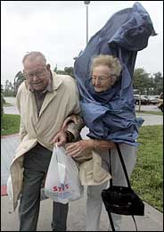 “We are starting to go buggy, just getting on one another’s nerves,” Mrs Mildred Mauney, 81, told The New York Times, after spending the night with some strangers in a classroom-turned-shelter in Palm Beach Gardens, Florida.
Whatever, Millie. Join the club. Mrs. Mauney’s must-have accessory for evacuating their mobile home, an inflated trash bag, reminded me of a Bill Cunningham snap of hard-core fashion muse Isabella Blow that was used to illustrate a NYT street photography story in 2002.
I can’t believe that just two years ago, I would’ve mused so hard on Walter Benjamin, Jean Paul Gaultier, “accidental” street photography, and documentary film staging.
“Well, you have to be a nut, kid.” [greg.org, oct. 2002]
The Cattle Guards of Box Elder County
So how did there come to be street signs for the Spiral Jetty?
For years, the only way to see Robert Smithson’s Spiral Jetty was from the air, or in a photograph, or in the artist’s own making-of film, which was plenty for 99.9% of art worlders and normals alike.
When the Jetty first re-emerged from the Great Salt Lake in 1994, only a few people knew about it, and even fewer actually took the trouble to drive out and see it. But appetites were whetted, and conceptual art was intersecting with an Easy Rider-meets-Wild, Wild West road trip in just the right slightly adventurous, hip enough way that when it resurfaced again in 2002, visiting the Jetty quickly went from curator-esoteric to art-world-must-see to mainstream.
Artforum’s Number One Top Ten
Whoa. Choire Sicha has gone all Kit Carruthers on Artforum’s monthly Top Ten list; it’s truly a site to behold. Usually, even the brainiest people have a hard time coming up with ten relevant things to say, and they pack it with esoteric crap or their friend’s website or something.
Choire doesn’t–um, actually, he does. There’s esoteric crap (“Remember that awesome Amy Globus video shown last winter at Gorney Bravin + Lee, with two octopuses sucking their way through some weird see-through aquarium tubing while Emmylou Harris and Neil Young sang ‘Wrecking Ball’?”) and his friend’s website (Paul Ford’s Ftrain). Just this time, it’s good.
How to get to Spiral Jetty? It’s never been easier.
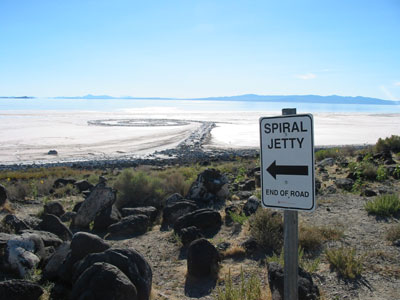
On the 10-year anniversary of the re-emergence of Spiral Jetty and my first visit, and in keeping with our family tradition of visiting the Jetty whenever we attend a wedding in Salt Lake City, we popped on over Saturday in a rented Camry.
These new signs made finding the Jetty so easy, even Artforum could do it.
Benesse Art Site Naoshima, the Marfa of Japan
While we were in Japan, we made a detour to see the growing collection of contemporary art on Naoshima, a tiny island near Okayama, and within spitting distance of the massive Seto Inland Sea Bridge.
 In explaining Naoshima, I’ve taken to calling it the Marfa of Japan, but that’s only partly accurate. Benesse represents one collector’s–not an artist’s–increasingly significant attempt to create an internationally recognized destination for contemporary art pilgrims and to revitalize/transform a dying town in the process. I think it’s mostly successful, and definitely worth the trip.
Benesse Art Site is the new umbrella moniker for four separate art projects: the just-opened Chichu Museum; Benesse House, a small museum/hotel; Seaside Park, a campground surrounded by outdoor sculptures; and Art House, permanent artist installations in abandoned 18th century buildings.
When we arrived on Naoshima, we headed first to Benesse House, which was designed by Tadao Ando. The staff was extremely helpful, even though we knew we couldn’t stay overnight (the hotel fills up a year in advance). The building was impressive, with two or three of the sublime moments Ando’s Fort Worth Museum has dozens of.
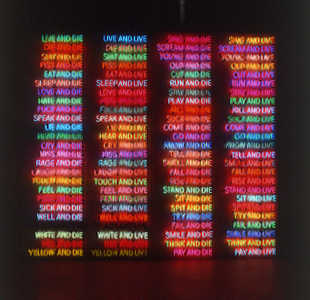
The work was all over the place; there’s stuff from a collecting phase where money outstripped sense, then from the “let’s open a museum” phase where sense caught up. Exquisite siting was a recurring theme. Hiroshi Sugimoto’s Time Exposed seascape photos, installed in a courtyard overlooking the sea; Yoshihiro Suda’s invisible Weeds, and Bruce Nauman’s neon 100 Live or Die, which, by restrictions on how frequently it would be turned on, was transformed from sculpture to eagerly awaited performance spectacle.
A businessman on the ferry had boasted, “There’s a $6 million Monet up there.” [A Water Lilies diptych, which was probably more than that.] Meanwhile, the locals remain unimpressed by the $10 million early Johns hanging next to the Zen-like Pollock.
I’ve mentioned it before, but I’ll post more on the Art House Project later.
Benesse Art Site Naoshima, the Marfa of Japan
While we were in Japan, we made a detour to see the growing collection of contemporary art on Naoshima, a tiny island near Okayama, and within spitting distance of the massive Seto Inland Sea Bridge.
In explaining Naoshima, I’ve taken to calling it the Marfa of Japan, but that’s only partly accurate. Benesse represents one collector’s–not an artist’s–increasingly significant attempt to create an internationally recognized destination for contemporary art pilgrims and to revitalize/transform a dying town in the process. I think it’s mostly successful, and definitely worth the trip.
Benesse Art Site is the new umbrella moniker for four separate art projects: the just-opened Chichu Museum; Benesse House, a small museum/hotel; Seaside Park, a campground surrounded by outdoor sculptures; and Art House, permanent artist installations in abandoned 18th century buildings.
When we arrived on Naoshima, we headed first to Benesse House, which was designed by Tadao Ando. The staff was extremely helpful, even though we knew we couldn’t stay overnight (the hotel fills up a year in advance). The building was impressive, with two or three of the sublime moments Ando’s Fort Worth Museum has dozens of.
The work was all over the place; there’s stuff from a collecting phase where money outstripped sense, then from the “let’s open a museum” phase where sense caught up. Exquisite siting was a recurring theme. Hiroshi Sugimoto’s Time Exposed seascape photos, installed in a courtyard overlooking the sea; Yoshihiro Suda’s invisible Weeds, and Bruce Nauman’s neon 100 Live or Die, which, by restrictions on how frequently it would be turned on, was transformed from sculpture to eagerly awaited performance spectacle.
A businessman on the ferry had boasted, “There’s a $6 million Monet up there.” [A Water Lilies diptych, which was probably more than that.] Meanwhile, the locals remain unimpressed by the $10 million early Johns hanging next to the Zen-like Pollock.
I’ve mentioned it before, but I’ll post more on the Art House Project later.
Spiral Jetty: Still Spiral, Not a Jetty
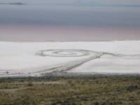 Todd Gibson‘s posting an extensive first-hand account of his recent visit to the Spiral Jetty, which, because of an ongoing drought, is now completely out of the water.
That’s fast. Some friends went in early July, and it still had water around it, although the Jetty itself was entirely walkable. [via bloggy]
Faithful pilgrims of contemporary art will also appreciate Gibson’s account of his visit to the Lightning Field. He does get around.
Related: Other Spiral Jetty and Smithson posts on greg.org
Post about a show that included the intriguing backstory of the official photographs of Lightning Field.
On Collectors’ Museums, or pot kettle, kettle pot
WP art critic Blake Gopnik is wants calling for DC’s bigwig art collectors–capitalists all, who else can afford a Richter?–to go communist, and open a collective to share their hoard with the contemporary art-starved DC public.
It’ll never happen, but not for the reasons Tyler Green thinks. If Miami’s experience is any indication, hyper-competitive, status-hungry collectors who open exhibition spaces have less than a 1 in 4 chance of not embarassing themselves.
[When I first did the rounds of the big Miami collections five years ago, I realized four people had–independently? in competition with each other?–bought nearly identical Oldenburgs, the original of which is at the National Gallery. In DC. And when I was introduced to one as a ‘fellow collector,’ her first question was, “Do you collect Gursky? Struth?” Which is unbelievably tacky art world shorthand for “Do you have over $10 million? or do you make over $2 million a year?” The only possible answers, by the way, are “Oh, not any more.” or “Who?”]
Basically, I worry that most collectors would be too self-important, possibly too clueless, and almost certainly too thin-skinned to be able to pull something like this off.
If Blake’s determined, though, he should get in touch with the Rubells, whose Rubell Family Collection put the pressure on their Miami peers in the first place, and who bought a hotel in Washington last year.
Photos from Japan, with apologies to Lightningfield, Bluejake, et al

Unsurprisingly, next to this store, which I dubbed, “Jen,” was a food court where you could buy a sweetened crepe with bananas, gelato, custard, whipped cream, chocolate syrup, and powdered sugar.
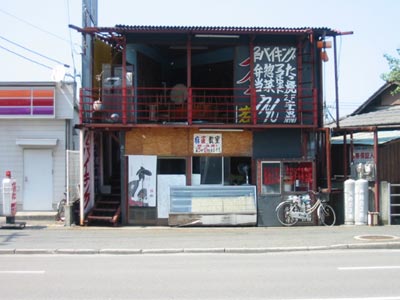
This ramshackle building was next to our Circle K. I didn’t think much of it until we walked by it at night, when it was open, and the upstairs was hopping.
The next day, looking at its inventive, case study-like I-beam construction from across the street, I came to like it.
Continue reading “Photos from Japan, with apologies to Lightningfield, Bluejake, et al”
WPS1: Picking up speed, and not just because I’m on it
Ok, they’re definitely getting the hang of it. This week, WPS1 broadcast an archival MoMA artist panel that was, in retrospect, formative to me, one of the art events that really resonates with me:
In 1994, Kirk Varnedoe hosted Richard Serra, Brice Marden, and Francesco Clemente in a discussion of Cy Twombly. I went for the Twombly and Marden, but I stayed for the Serra.
Through sheer intelligence and what I later came to recognize as great panel stunts–tossing off the exact measurements of a 1959 Twombly canvas as if he’d memorized the catalogue raisonnee, witty tie-em-up-with-a-bow metaphors and descriptors–he OWNED the evening.
One offhand comment he made haunted me for years, how art history since had been based on a misinterpretation of Cezanne. By about the third time I talked with him, I finally had to ask what he’d meant. He politely pretended to remember what the hell I was talking about, but he didn’t, in fact, have some deeply revisionist art historical theory lurking beneath his thick paintsticked hide.
[In painful contrast, Schnabel was there, too, on the front row, pointedly not on the panel, but nevertheless he put himself on it with a rambling self-congratulatory statement about “Cy” and “Cy and Jasper” that took up a big chunk of the q&a.]
I asked my question of Marden, though, and his reticence bit me in the ass. Clemente jumped in and mis-answered my paragraph-long question–the last of the evening. Marden asked me to repeat it, to groans from the audience. For his answer, I’ll just say, let’s go to the tape. But over a year later, I got stopped on the street and asked if I was the guy who’d asked that question at that one MoMA event. And then he laughed at me.
In any case, Marden taught me that making highly successful work doesn’t automatically mean he has to talk very garrulously about it; if Marden could convey everything he wanted to in mere words, he might not need to paint.
In another future-historical broadcast, WPS1 also has Yvonne Force, Tom Eccles, and Anne Pasternak talking for an hour about laying casino carpet in Grand Central.
And last but not least, Steven Schaefer interviews Danish director Per Fly about his new film, The Inheritance.
WPS1: Picking up speed, and not just because I’m on it
Ok, they’re definitely getting the hang of it. This week, WPS1 broadcast an archival MoMA artist panel that was, in retrospect, formative to me, one of the art events that really resonates with me:
In 1994, Kirk Varnedoe hosted Richard Serra, Brice Marden, and Francesco Clemente in a discussion of Cy Twombly. I went for the Twombly and Marden, but I stayed for the Serra.
Through sheer intelligence and what I later came to recognize as great panel stunts–tossing off the exact measurements of a 1959 Twombly canvas as if he’d memorized the catalogue raisonnee, witty tie-em-up-with-a-bow metaphors and descriptors–he OWNED the evening.
One offhand comment he made haunted me for years, how art history since had been based on a misinterpretation of Cezanne. By about the third time I talked with him, I finally had to ask what he’d meant. He politely pretended to remember what the hell I was talking about, but he didn’t, in fact, have some deeply revisionist art historical theory lurking beneath his thick paintsticked hide.
[In painful contrast, Schnabel was there, too, on the front row, pointedly not on the panel, but nevertheless he put himself on it with a rambling self-congratulatory statement about “Cy” and “Cy and Jasper” that took up a big chunk of the q&a.]
I asked my question of Marden, though, and his reticence bit me in the ass. Clemente jumped in and mis-answered my paragraph-long question–the last of the evening. Marden asked me to repeat it, to groans from the audience. For his answer, I’ll just say, let’s go to the tape. But over a year later, I got stopped on the street and asked if I was the guy who’d asked that question at that one MoMA event. And then he laughed at me.
In any case, Marden taught me that making highly successful work doesn’t automatically mean he has to talk very garrulously about it; if Marden could convey everything he wanted to in mere words, he might not need to paint.
In another future-historical broadcast, WPS1 also has Yvonne Force, Tom Eccles, and Anne Pasternak talking for an hour about laying casino carpet in Grand Central.
And last but not least, Steven Schaefer interviews Danish director Per Fly about his new film, The Inheritance.
The Best D.C. Art isn’t in D.C.
 In the late 1990’s the artist Donald Moffett began making extraordinary paintings that seemed like a departure from the politically charged work that first garnered attention–and controversy–in protests against the Reagan/Bush-era AIDS debacle. Seductively minimal paintings where it seemed the material itself was the subject: oil paint extruded–somehow, the technique is hard to grasp–into lush carpets, finely woven nets, menacing razor-like bands. These highly aestheticized paint objects have a powerful physical presence.
Then last year, in a show at Marianne Boesky, Moffett completely transformed his paintings by projecting video–of The Ramble in Central Park–onto their silvered surface. The intricacies and painterly effects were still there, but deliberately harder to read. Meanwhile, the uneven surface of the canvas lent the slightly distorted video loops a ghostlike, immpermanent air. Questions of furtive, hard-to-pin-down identity filled the bucolic, elegant works.
 Now through Saturday at London’s Stephen Friedman Gallery, Moffett is showing D.C., a similar body of paintings-and-projections, and it feels like one of the art world’s veteran protestors has come out of retirement, to show a new generation how it’s done. D.C.‘s projections feature the FBI building, the White House, Watergate and other loaded symbols of power. Definitely check out White House Unmoored, one of the few works where the artist used a handheld, rather than a fixed, camera. And read Moffett’s interview with Kultureflash; he’s one of the nicest, gentlest people I’ve ever met, but boy, does he sound pissed. [US pissed, angry. Not UK pissed, drunk. just to clear that up…]
The Mellowing of Richard Serra
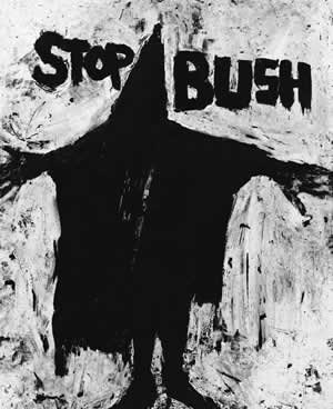
[via MAN] What’s shocking about Richard Serra’s poster for pleasevote.com–a thick paintstick silhouette of the hooded Abu Ghraib prisoner–isn’t his use of text or figurative representation, both completely absent from the rest of his work (with possibly one 1960’s exception).
And it’s not his political activity. He’s always been an active liberal, and his art challenges both easy commodification and conservative notions of authority. And who can forget his legal battle with the GSA and anti-NEA zealots like Jesse Helms which culminated in the destruction in 1989 of his sculpture Tilted Arc (besides pretty much everyone, that is)?
No, what shocked me was his positively statesman-like restraint, which stands in contrast to the horrible image in his drawing and to current levels of Administration discourse. With STOP BUSH, Serra–who’s well known for his angry temper–let’s George off easy.
In 1990, he made an etching as a fundraiser for North Carolina Senate candidate Harvey Gantt, who lost after his opponent ran some race-baiting ads that have become recognized dirty tricks classics. The title of that piece (sorry, mom) was Fuck Helms.
Blake Gopnik Jumps Art Critical Shark
When the chief art critic for your town’s largest paper publishes a front page review of the cafeteria’s “gelato collection”, do you:
A) Realize now’s a good time to rethink the curatorial program of the museum?
B) Wish he’d reviewed the best publicly accessible “bathroom installations” while he’s at it?
B) Develop a strong desire to pummel said critic about the head and face?
C) Remember that next door is a horrible Stella, and next to that was a concert starring Barry Bostwick, Robin “last BeeGee standing” Gibb backed up by the whitey white whitest choir EVER, and Clay Aiken singing the William Tell Overture, so why are you EVEN surprised?
E) All of the above.
Related, but not mentioned, an actual piece of art: Art Domantay’s 31 Flavors of Hell.
Related: Hirshhorn Museum men’s room features “The Lexus of baby changing tables.”