Waiting For Guffman Corbin Bernsen

Red Paper Clip Day could become an annual party, with residents encouraged to wear red paper clips as a Town symbol. The Town is in the process of designing a new logo which is to include a red paper clip.

– from The Citizen, Kipling, Saskatchewan, Canada, 06/30/06
Kyle MacDonald trades a role in snowglobe megacollector Corbin Bernsen’s next film to the town of Kipling.

One facet of the plan is to conduct auditions in Kipling for the part, perhaps as early as September.
MacDonald said he has discussed the idea with Bernsen, who has indicated great interest in the concept. MacDonald even hinted that the movie star and his family might become involved in the auditions and accompanying celebrations in some capacity.
“This is going to launch a cascading series of media events that will turn (yours and my) lives upside down,” MacDonald predicted to Roach.

one red paperclip [via waxy]
In other Kipling news, Kennedy-Langbank School had their Junior Drama Night on June 27. Coincidence?

Edge Displays The Views: The Making Of Grand Theft Auto

making_of_gta.jpg

Edge magazine takes a look back at the torturous, tangled development process that resulted in Grand Theft Auto. At one point, all the artwork was thrown out and redone when programmer Mike Dailly figured out a new way to render the game’s pseudo-3D cityscape; it added a year to the project. Though they came up with film-inspired features and innovative workarounds for technology constraints, they didn’t really have much inkling about what would become some of GTA’s biggest draws:

Elements of the game were added as they were thought of, often as a consequence of some casual tinkering with the behaviour of the living city.
“The Gouranga bonus is a really good example of that,” he points out. “One of the programmers came up with a routine that had pedestrians following each other. This led to the idea of a line of Krishnas following each other down the street and then, once we had all experimented with ploughing through them all in one go, the Gouranga bonus became an obvious addition.”

The Making Of…Grand Theft Auto [edge-online.co.uk via rw]

Urban Nomads, 21st Century-Style

From Hennessy & Papanek’s classic 1973 hippie DIY book, Nomadic Furniture comes the “Resource Tower”:

It organizes living space in a radically different way. Usually we put bookcases and storage walls all over the room’s walls. We suggest [as shown in the lower plan] that getting it all together in the center of the room makes an interesting alternative.

nomad_arch_resource_tower.jpg

Interesting indeed, especially after reading about the freestanding Aristo Pods, Luxo Pods, and Boho Pods being put into Jade, a new mid-block condo conversion in the Flatiron District.

jade_pod.jpg

The project is named after Jade Jagger and promised “Jade Living” [sic] at its finest. As Triple Mint explains the tiny galley kitchens, “These pods are a kind of tacit admission that many people in New York end up living like global nomads.” Yeah, except that, back in the day, the nomads didn’t buy their plywood pods already made and lacquered in Jade-picked colors; they built them their own damn nomadic selves.
Jade by Jagger [triple mint via curbed, whose commenter made the plywood call]
resource tower image via the exhaustively interesting The Legacy of The Urban Nomads

The Making Of A Machinima Feature

Amazingly, Hugh Hancock has been making Machinima–movies created inside video games–since 1997. [If by “Machinima,” he means capturing playing sessions within user-created levels, core functions of the Doom game engine, then hasn’t everybody been making Machinima since 1997? But I quibble.]
What Hancock and his peeps at Strange Company have done is produce BloodSpell, a feature-length machinima film, which they’re releasing in 5-7 minute segments every week. There’s a production blog [on livejournal, which explains why I never saw it], and now they’ve published some more expansive Making Of articles as well. Here’s Hancock’s discussion of the 6-month creation of the animatic:

At this point, we started what was probably the most controversial part of BloodSpell’s development, and also the part that is, today, most crucial in ensuring we can meet our schedule – the creation of BloodSpell’s animatic.
For the uninitiated, an animatic is a storyboard, scanned in and converted to a video file, with voice laid over the top at approximately the pace of the finished film. It’s a handy tool to tell whether or not your film will work for your audience in its finished form.
In our case, our animatic was created by taking screenshots in Neverwinter Nights, based on a rough storyboard (and as you can see in the picture, I’m not kidding about the “rough” part – Ridley Scott I’m not). For each shot, we took either one or several shots of the expected action, then edited them together at about the pace of the film.
It was a mammoth project that rapidly gave us an idea of the scale we would be working at – the first draft of the animatic took from December 2004 to May 2005 to create, with either two or three people working from three to five days a week on it, as we created what essentially was a static version of the whole film.
In hindsight, I don’t think BloodSpell would be half the film it is today without the animatic. We went from shooting half a page a day, maximum, to shooting four or five pages of script per day by the end of the animatic’s production. It was through the animatic that we managed to find and iron out literally hundreds of problems with our sets and characters, and develop the toolset we use today to film. In addition, from the first draft of the animatic to the final shooting-ready draft, we added nearly 20 minutes of new plot, exposition, character development, and de-confusing.

BloodSpell: From Concept to Finished Scene Part 1 [via boingboing]

Zelda And Battle Of “The Hair-Brained Scheme”

In August 2001, video gamers protested the cartoony feel of the new version of Zelda because “it would be nigh impossible to introduce a serious and epic plot and epic characters” into such a “childish environment.”
It’s not unlike that time, fellow old-school Zelda fan Jordan Barry, replied, when Robert Reed sent a memo to Sherwood Schwartz, expanding on his refusal to appear in episode 116 of The Brady Bunch:

There is a fundamental difference in theatre between:
1.Melodrama
2.Drama
3.Comedy
4.Farce
5.Slapstick
6.Satire &
7.Fantasy
They require not only a difference in terms of construction, but also in presentation and, most explicitly, styles of acting. Their dramatis peronsae are noninterchangable. For example, Hamlet, archetypical of the dramatic character, could not be written into Midsummer Night’s Dream and still retain his identity. Ophelia could not play a scene with Titania; Richard II could not be found in Twelfth Night. In other words, a character indigenous to one style of the theatre cannot function in any of the other styles. Obviously, the precept holds true for any period. Andy Hardy could not suddenly appear in Citizen Kane, or even closer in style, Andy Hardy could not appear in a Laurel and Hardy film. Andy Hardy is a “comedic” character, Laurel and Hardy are of the purest slapstick. The boundaries are rigid, and within the confines of one theatric piece the style must remain constant.

Teevision falls under exactly the same principle. What the networks in their oversimplification call “sitcoms” actually are quite diverse styles except where bastardized by carless writing or performing. For instance:
M*A*S*H….comedy
The Paul Lynde Show….Farce
Beverly Hillbillies…..Slapstick
Batman……Satire
I dream of Jeannie….Fantasy

Episode 116, by the way, was titled “The Hair-Brained Scheme.” Here’s a synopsis:

In the final episode, Bobby’s hair tonic turns Greg’s hair orange on graduation day. Robert Reed refused to appear in this episode. Oliver speaks the last dialogue of the series. And the word “sex” is used for the only time in the series.

Wow, protesting the last episode? That’s really standing up for your Craft. Meanwhile, how’d Zelda turn out?
The Odyssey of Hyrule – Letter of the Month – August 200190- [via tmn]

Walter Murch’s “Womb Tone” & “Dense Clarity – Clear Density”

I saw this on Coudal and thought it looked familiar–I’m as much of a Murch groupie as anyone, really–then I realized I’d posted about it last year on Daddy Types. [You know how it goes, come for the womb mentions, stay for the editing tips.]
Anyway, Walter Murch did an online companion piece to his lecture, “Dense Clarity – Clear Density,” complete with sound and video clips, for Transom.org. There’s also an essay called “Womb Tone,” in which he talks about the in utero development of hearing and the shocking discovery a newborn baby makes upon leaving the womb: silence.
Always fascinating, that guy Murch.
The Transom Review: Walter Murch [transom.org]

I Could Read This Stuff All Day

william_eggleston_trike.jpg

William Egglestone

This is just a snapshot. I would not even have considered showing this. If you ware going to post pictures you need to make sure it is of something unusual or with a personal vision. Otherwise you are going to loose the interest of your audience. George Spelvin [Nikon D200, Nikon D70s backup, 17-35 f/2.8, 80-200 f/2.8, 4GB Microdrive (2), Photoshop CS, Epson 2200]

Great Photographers on the Internet [theonlinephotographer via kottke]

Dialing Drawing Restraint: The Audio Guides Of Matthew Barney

Drawing Restraint, the exhibition of Matthew Barney’s complete series of works of the same name, opened this week at SFMOMA. It originated last summer at 21C Museum for Contemporary Art in Kanazawa, Japan, which was the occasion for the production of Drawing Restraint 9, Barney’s latest film, a collaboration with Bjork.
SFMOMA is the only North American venue for the exhibit, which runs through Sept. 17th. Many of the DR9-related sculptures were presented this spring at Barbara Gladstone in New York, but most of the series hasn’t been seen for quite a while, and definitely not all together.
As if that weren’t enough, the show features a “Matthew Barney Learning Lounge” for deciphering the artist’s work. There’s also an audio tour, of course. But along with Acoustiguides and podcast/mp3 versions, SFMOMA has also made the Drawing Restraint audio tour available to visitors via cell phone.
So if you dial 408-794-2844…whaddya know, it works. Here’s a little directory to the ten audio segments. To heighten the effect, immerse yourself in a vat of petroleum jelly while you listen.
20# Drawing Restraint intro, 4th fl landing, looking at DR14, created by scaling the walls of the museum, then worked his way under the bridge to draw, suspended.
21# DR1-6 videos, objects, and drawings. discussed by Nancy Spector, also videos of DR10-13
22# Path, Notes on Hypertrophy,, etc., drawings that followed the early studio DR works.
23# DR7, 1993, discussed by Nancy Spector
24# Ambergris, explained by Barney: “the idea that the diet of a whale contains things it can’t digest.”
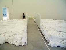
dr90_cetacea_barney.jpg25# Holographic Entrypoint, based on a flensing deck of a whaling ship, discussed along with the Ise shrine by Benjamin Weil
26# Occidental Guest cast from a room used in DR9, with film spoilers by Barney.
27# Occidental Restraint, 1,600 gallons of molded-then-collapsed petroleum jelly, discussed by Nancy Spector, then Barney talking about the connections between whale oil, petroleum, and the cast plastic.
28# Cetacea [left], part of the Field Emblem, discussed by Benjamin Weil.
29# DR8, glass tables containing delicate drawings: “Look closely at those drawings. Quite a few are erotic in nature.”
See exhibition details and download options for Drawing Restraint, which runs through Sept. 17 at SFMOMA [sfmoma.org, thanks to jason]
Ping Magazine covered the 21C Museum and has pictures of the Barney exhibition there. [pingmag]

Like A Glittery Minted Coin At The Everglades State Fair

Q. The Times could set a much needed precedent by creating a culture-news blog that profits from the eyes of an editor, rather than the current norm in blogdom, which is for semi-informed scribblers to post unedited ramblings, and often to claim bragging rights for scooping the dailies. An online column devoted to culture would bring the authority of the Times newsroom to the increasingly fast pace of the Internet. Such a feature could– [&c. &c. and I relish the opportunity &c. &c. demonstrate my expertise &c. &c.make a meaningful contribution to your firm. &c. &c. Some examples of my work are can be found here. &c. &c. ]
-Jason Edward Kaufman

If you’d like to pitch a job or story idea to NY Times culture editor Sam Sifton, send him an email at Talk to the Newsroom.
And you can ask him any questions you have about culture coverage in the paper [hey, self-informed scribbler Theresa Duncan got one!], too. The answer will be, “Um, we’re already doing that like a junebug on a frying pan,” but still, it’s fun to ask.

Same As It Ever Was

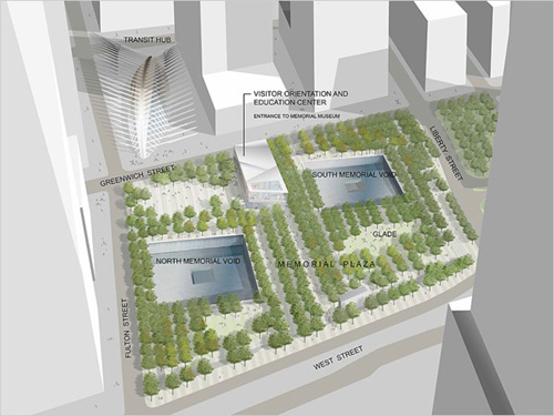
memorial_plaza.jpg

Interesting. The Gutter does a quick handicap of the “winners” and “losers” in the new Frank Sciame-redesign of the WTC Memorial.
There’s one overlooked/surprise winner: Santiago Calatrava, who, the gutter points out, got the Snohetta Freedom Center-turned-Information Center removed from the northeast corner of the Memorial Quadrant, where it had previously interfered with his own soaring crown roast of a train station. [Of course, that must’ve been a pretty short meeting, since Sciame is also working for Calatrava.]
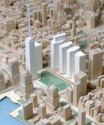
The “winner” to no one’s surprise at all, though, is the Port Authority. Another feature I haven’t seen discussed is in the drawing above: something labeled “Memorial Plaza.” That just happens to be the title of one of the six original rebuilding concepts the Port Authority commissioned from Beyer Blinder Belle way back in July 2002. It was the outcry against those six concepts, titled “Memorial [choose one: Plaza, Square, Triangle, Garden, Park, Promenade].” The original concepts and program can be seen here. Memorial Plaza is below. Look familiar?

wtc_memorial_plaza_bbb.jpg

Ouroussoff today lamented the lack of progress and vision in the WTC site rebuilding and in the Memorial design process both. But maybe we’ve been looking at this wrong from the start. If you’re Port Authority, this whole thing looks to be moving along exactly as planned.
WTC Memorial 2.0: And the Winner Is… [gutter]
“Today the LMDC released its six concepts…” [greg.org, 7/16/02]
Six Plans for WTC Site Unveiled (7/16/02) [newyork.construction.com]

Alexander Calder’s Circus Film On YouTube

Fellow dadblogger sweetjuniper just posted the 18-minute version of Calder’s Circus on YouTube. It was made in 1961 by Carlos Vilardebo, and it’s been shown widely around the world–and in the lobby of the Whitney Museum–ever since. Since the Circus’s actual figures are now too fragile to leave the Whitney, the film usually serves as a proxy, providing a window into this crucial, early body of Calder’s work.
Calder’s fascination with movement and working with wire led him first to create wire sculpture ‘portraits,’ and later informed his creation of mobiles. But the popularity of le Cirque Calder in 1920’s and 1930’s Paris helped Calder form relationships with artists like Miro and Mondrian who were themselves extremely influential on Calder’s work.
Live performances lasted up to two hours and included twenty or more acts and an intermission. [The Calder Foundation’s website rather irrelevantly points out that Circus performances predate so-called “performance art” by several decades. The work is important enough not to try to stretch it so far beyond its obvious theatrical and puppet show precedents.]
A note about distribution-uber-alles, the Vilardebo film is at least the second filmed version of the Calder Circus. In 1953, the pioneering science filmmaker Jean Painlevé made Cirque de Calder, which exists in both 40- and 60-minute versions. But it’s Vilardebo’s later film–and the shorter version of it–which has gained the biggest audience.
If anyone know more about Painlevé’s version, or about the story behind the making of Vilardebo’s film–which, after all, was shot much later, when the artist is an older man, and when the Circus had grown too large to be transported in a trunk back and forth between New York and Paris–please drop me a line.
MoMA curator James Sweeney’s exhibition catalogue essay on Calder from 1951 gives an excellent explanation of the Circus in the context of Calder’s career.]

Morton Feldman & The Man On The Street

A quote from Morton Feldman, reprinted in Alex Ross’s excellent piece on the modernist composer:

My teacher Stefan Wolpe was a Marxist and he felt my music was too esoteric at the time. And he had his studio on a proletarian street, on Fourteenth Street and Sixth Avenue. . . . He was on the second floor and we were looking out the window, and he said, “What about the man on the street?” At that moment . . . Jackson Pollock was crossing the street. The crazy artist of my generation was crossing the street at that moment.

I came to Feldman’s music through his association with John Cage; several Cage concert series over the last few years have included Feldman’s work as well. But Ross’s write up of “Rothko Chapel” makes me wish I lived near a 24-hour classical music CD store so I could listen to it right now.
AMERICAN SUBLIME Morton Feldman’s mysterious musical landscapes. [newyorker.com]
Morton Feldman: “Rothko Chapel; Why Patterns?” on New Albion [amazon.com]