June 2010 Archives

warhol_rain_machine_nr.jpg

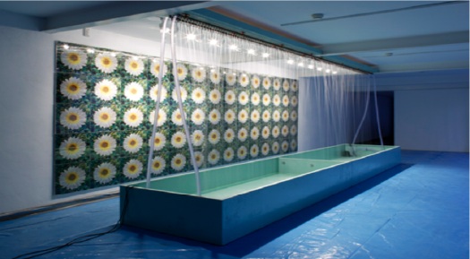
First up, a high five to Andrew Russeth at ArtInfo for highlighting Nicholas Robinson Gallery's summer installation of Andy Warhol's unusual Rain Machine (Daisy Waterfall). What a weird, wonderful--but mostly weird--work.

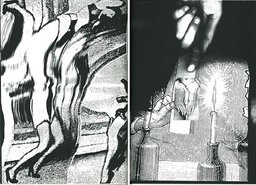
It's basically a mural of shimmering, lenticular photos of flowers behind an illuminated, recirculating, double wall of simulated rain. Let's set aside the fact that the raw mechanicality of Rain Machine makes it look like a missing Pop link in the genealogy of Olafur Eliasson's work. The similarities are both less and more interesting than they first appear.

Begun in 1968, Rain Machine has its origins in two of my favorite pseudo-utopian art/technology events, the Osaka 70 World Expo and LACMA's sprawling Art & Technology collaboration project, which ran through 1971.

warhol_rain_machine_at.jpg

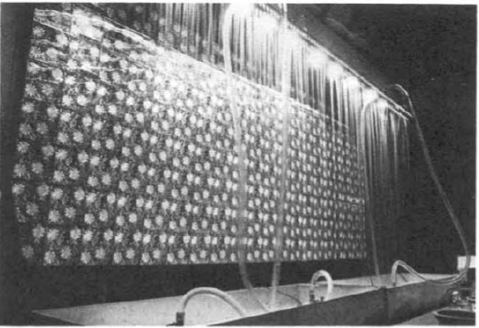
When Warhol was first approached for the A&T Program, which paired artists with cutting edge technology companies to realize a new, innovative work of some kind, he imagined making a wall of 3D holograms that would be barely visible through the mist. But Bruce Nauman had already nabbed RCA's hologram guy, so Warhol fell back onto decidedly low-tech lenticular imaging.

Then the rain wasn't working, the prints didn't line up, the budget was a joke, the US Pavilion exhibition space was cramped, the whole thing was a potential mess. The story is recounted in glorious, play-by-play detail in LACMA's 1971 Art & Technology Report, which is cheap to buy used, and [brilliantly] available as a free PDF download from LACMA's online library:

Perhaps the most important decisions determining the work's final appearance in the U.S. Pavilion at Expo were made not by Warhol but my MT [Maurice Tuchman, LACMA's A&T curator/organizer], the Expo Design Team members, and some of the other artists in the show. The entire installation operation was characterized by a sense of crisis, and there were moments when the peice seemed simply destined to ignominious failure. In the end, somehow, it worked; many people and particularly the artists who were there installing their own pieces, felt the Warhol to be one of the most compelling works in the exhibition because of its strangely tough and eccentric quality. Robert Whitman commented that "of course Andy's forcing everyone into the act;" the work istelf, when completed, made that conspicuously evident, and yet it was unmistakably Warhol. When it was rumored at one point just before the opening of Expo that the work might be taken out of the show, as was suggested by several of the Expo Designers and by a visiting critic who was conversant with Warhol's oeuvre, the American artists who by this time knew the piece intimately objected strenuously.
When Rain Machine came back to LA, it had to be reworked, or debugged, and reconfigured. The most noticeable change is probably the scaled up daisy photos. As Robinson explains, the current installation follows an even newer [remastered?] set of specs developed by the Warhol Museum for its 2002 refabrication of the work.

Update: Interesting, LACMA received a set of nine lenticular daisy photos as a gift in 1999. They're the larger, single daisy-style, which makes me think they were extras, loosies, or maybe even leftovers from the 1971 Art & Technology reinstallation. A few of these have popped up in the market over the years; they're not that expensive, though without the rain--hell, even with the rain--they're a little weird.

Update Update: aha, interesting. according to this auction description, the lenticular photos were commissioned in an edition of 50 for the LACMA show.

kirsch_baby_nist.jpg

53 years later, the guy who invented the square pixel regrets the error.

In 1957, NIST computer expert Russell Kirsch scanned the world's first digital image [a photo of his infant son, above] using the country's first programmable computer. To accommodate the memory and processing capacity of the available equipment, Kirsch had the computer break the image up into a 176x176 grid, and to assign a binary color value, black or white, to each of the resulting 30,976 square pixels.

Apparently, it's been eating at him ever since, because he has, at age 81, published a suggestion for increasing the "precision and accuracy in scientific imaging" by replacing uniformly square pixels with pixels of variable shapes.

I do not know enough about compression algorithms and data/information loss to know whether Kirsch's proposed method is either necessary or superior to the state of the art. But it is most fascinating to see one of the inventors of digital imaging remain so engaged and critical of the system he helped bring forth.

And frankly, though I don't know any of the history or the context, I don't necessarily agree with him that the grid and the square pixel was an "unfortunate" solution. In the 50+ years since the square pixel became the irreducible unit of visual information, it has acquired its own aesthetic and cultural context.

[Looking through the NIST Museum site, it sounds like the "serious mistake" was using a binary [i.e., b/w] basis for computer scanning in the belief that it was an accurate representation of human neural activity and visual data processing. It also sounds like the NIST folks started trying to correct for it almost immediately.]

When he completely agrees with me and validates my own assumptions, however, I agree with him completely. The man is a genius and a living legend:

...we show that the usual assumption that increased precision is accomplished with higher resolution of square pixel images does not necessarily result in the increased accuracy that can be achieved with the use of variable shape pixels...

PDF: Kirsch, Russell A., "Precision and Accuracy in Scientific Imaging" [nist.gov]
Square Pixel Inventor Tries to Smooth Things Out [wired.com thanks Joerg Colberg, who has been experimenting with cooler-shaped pixels himself lately]
related? coloring the pixels of Mariner 4's first image of Mars by hand

How much of discovery is really just rediscovery? or learning remembering?

reinhardt_chron_rose.jpg

I was waiting to read how editor/art historian Barbara Rose had decided to model the chronology at the opening of her 1991 book, Art-as-Art: The Selected Writings of Ad Reinhardt, after the personal+historical "date" portraits of Felix Gonzalez-Torres:

1943 Refuses to help Arshile Gorky start a camouflage school.
1943 Wonders what Adolph Gottleib and Mark Rothko are up to when they announce, "There is no such thing as good painting about nothing."
1943 Continues making paintings about nothing.
1944 Liberation of Paris
But then I scroll up and see that Reinhardt's chronology was his own, and that he was constantly reworking it. The version Rose chose was published in the catalogue for Reinhardt's 1966 retrospective at the Jewish Museum.

felix_untitled_1988_tim.jpg

So Rose didn't get it from Felix, but that means Felix must have gotten it from Reinhardt. And sure enough. I pulled down my special 1994 edition Art & Design, which served as the catalogue for the Camden Arts Center exhibition featuring Reinhardt, Joseph Kosuth, and Felix Gonzalez-Torres. And there is Nancy Spector writing about Reinhardt's influence, both direct, and refracted through the strategies and theories of the intervening generation of conceptualists:

Reinhard's parodic biographical exercise was, at the time of its creation, interpreted as mere 'documentation', as tangential to his artistic enterprise. But, because of Conceptual art's deployment of linguistic analysis and its use of language as a medium through which to demonstrate the discursive foundations of art, a younger generation inherited the freedom to use words as a viable alternative to image-making. Therefore, Gonzalez-Torres' various inventories of disjunctive historical incidents and private moments, followed by the year of their occurrence, can and actually do constitute his art...these 'date' works use now conventional Conceptual strategies to mimic the idea of an 'Artist's' chronology. More importantly, however, in the over-arching equivalency of everything listed in these works, Gonzalez-Torres is underscoring a crucial reality in today's world: that the political cannot be divorced from the personal.
I think Reinhardt makes the same case; and I agree with Spector that Rose's interpretation is incomplete, and that the extremely politically engaged Reinhardt did not mean for his chronology to reveal art to be "a matter of small consequence" when seen from "a perspective of world affairs."

Spector suggests another reading, that "[Reinhardt's] inclusion of cataclysmic world affairs in an 'artist's biography'...bespeaks the impossibility of divorcing cultural endeavours from the social and political context in which they are pursued." [image: Untitled, 1988]

Now about that Arshile Gorky camouflage school...

June 29, 2010

Really? Really.

I'll confess, when I saw the tweets start flying about Mira Schor's essay on Otto Dix, Greater NY, and Bravo's Work of Art, I was skeptical. How the hell was she gonna fit any of those, never mind all three--at once--onto a blog called A Year of Positive Thinking?

By gum, she pulled it off.

Reality Show: Otto Dix [a year of positive thinking]

osaka_70_1.jpg

See, now here is another reason I've gotten so backed up: I was overwhelmed by the awesomeness of this. It's currently freaking me out how much is turning on the Osaka 70 World Expo. It's as if there's a story under every geodesic dome. I'll have to write this one up a bit.

saint_satelloon_popsci61.jpg

This one's been sitting on my desktop since April when I posted about that Jan. 1961 Popular Science article about how they made the Project Echo satelloon on a long table with giant clothespins. It was in May, only a couple of months after NASA's peaceful communications satelloon was made freely available to the world, that Pop Sci informed us of Project Saint, the US Air Force's program to put the "First Warship In Space."

That's Saint on the left up there.

Saint, we read, would disable enemy satellites using one of four techniques: spray paint [for spy cameras' lenses]; sand [for simulating meteor shower damage]; solar mirrors [for roasting electronics]; or an H-bomb.

Project Saint was canceled in 1962 before any test launches were accomplished.

Oh wait, it wasn't since April; it was since March. That's right, April was when I recognized the target, the intersecting circular satelloon depicted on the right. It was called a corner reflector, designed to optimize radar wave reflection, and it was included in the http://greg.org/archive/2010/03/23/shiny_space_balls_yes_please_ill_take_two_no_four.htmlincredible LIFE Magazine cover story from June 3, 1957 about Project Vanguard and the race to launch "the first man-made moon," a race the US would lose a few months later.

See? Here it is, behind the guy bouncing a smaller Mylar satelloon:

corner_satelloon_life57.jpg

US Plans First Warship in Space - Pop Sci, May 1961 [popsci.com]
Project Saint [astronautix.com]
A Man-Made Moon Takes Shape, June 3, 1957 [LIFE/google books]

munari_xerox1.jpg

After I posted about Sigmar Polke's photocopied masterpiece Daphne, Mondo-Blogo emailed the great news that Corraini has republished Bruno Munari's Original Xerographies. I have the original Original Xerographies in a box somewhere; it's more handbook-ish than I remembered--which is a nice way of saying I'd forgotten about it, but it looks kind of relevant and interesting now:

munari_xerographies.jpgAn original xerography is the result of an image which is moved on the plate of glass of the copier, so that it reproduces both the image and its movement. Therefore, it doesn't consist in a mere copy, but on the contrary in an original, which is obtained through a process exploiting the whole potential of the copier. Hence it not only reproduces but produces images as well.
From this starting point Munari develops his studies and experiments about working rules of copiers, originally published in the series Quaderni di design curated by Munari himself for Zanichelli (1977).
Each factor of the copying process (with the copiers available in the 70s), from its reading limits to the concentration of the toner, is deeply and systematically examinated and experimented by Munari in every aspect and possibility. The result is a series of samples ("copies"?) that, following his research method both strict and creative at the same time, do not aim towards a specific purpose, but want to collect as many data as possible in order to describe almost every potential of the machine, including its most surprising and unexpected possibilities.
Buy the new edition of Bruno Munari's Original Xerographies for like $17 [amazon]

I hear blogging is out, everyone's tweeting or facebooking now. While I don't quite buy it, I am finding that I'm more likely to keep something I find interesting in my browser tabs for months rather than post it straightaway.

I will now attempt to clear those tabs to the general amusement and edification of my readers:

anne_truitt_out.jpg

Soon after her first solo show at Andre Emmerich, Anne Truitt followed her then-husband James to Japan for several years. While there, she experimented with making sculptures from aluminum. She showed them at Emmerich, I believe in 1966, but was not pleased with them, and rather famously destroyed them all before her mid-career retrospective at the Corcoran in the early 1970s. Had them all crushed like a soda can. All but two, apparently.

According to Kristen Hileman's catalogue, there was an aluminum Truitt in the collection of the Trammel Crow corporation, which could not be found, and another in the collection of a Connecticut collector whose name escapes me [and my Truitt catalogue is in our other apartment, alas.] Anway, that one was apparently damaged or destroyed by exposure, it's not clear.

I'd never seen images of these lost works, but then suddenly, I stumbled across one on the excellent Los Angeles-based art and space blog, You Have Been Here Sometime.

It turns out to have come from the official site, annetruitt.org, which is a great thing to know about. The piece is called Out and dates from 1964. There are other Japanese works, and also installation shots from the Emmerich show. More geometry and fewer right angles than in Truitt's later work, enough to make me wonder if the artist had issues with form, not just paint, light, and color, as she explained.

vermeer_nyc_averyb.jpg

A little-known, early Vermeer, the CC145 Concrete Cutter, was apparently on exhibit on Bleecker St this week.

@averybrooks' twitpics]
Vermeer CC155 [vermeer.com]

Thanks to Paul Schmelzer at Eyeteeth for pointing to Bob Nickas's great 1999 interview with Maurizio Cattelan. Good times.

I really wanted to focus on his experience with painting, so this excerpt starts kind of in the middle of the story of Maurizio not having enough time to do a show at de Appel in Amsterdam, so he breaks into the Galerie Bloom, steals everything in it, and exhibits it instead:

BOB: Whose work did you take?
MAURIZIO: Actually we took everything from the gallery ...

BOB: Like the fax machine and all the stuff in the office?
MAURIZIO: Everything. We rented a van, and just filled it up.

BOB: This was in Amsterdam?
MAURIZIO: Yes, at de Appel. They wanted me to do a piece in a week. But I'm not used to working so quickly. So I thought the best way to get something that fast was to take the work of someone else.

BOB: That's a new take on the readymade. [indeed, the show was called "Another F___ing Readmade" -ed.]
MAURIZIO: Well, when you don't know what to do ...

BOB: But didn't the people at de Appel ask, "Where did all this stuff come from?"
MAURIZIO: The story finished quickly, because the police came and there were problems ...

BOB: Were you arrested?
MAURIZIO: No. This is why I did the piece in Holland.

BOB: [laughs] Imagine doing that in New York.
MAURIZIO: It took a while for everyone to calm down, but then we became very good friends and they even asked me to do a show with them.

BOB: But that's your ultimate punishment -- you had to figure something out for another show.
MAURIZIO: Yeah, it's true.

BOB: Crime doesn't pay.
MAURIZIO: But I can tell you about the worst punishment I received. Once, I was talking with a collector, and he said, "I really would like to have a painting made by you." And I thought, "Yes, let's take this opportunity for once to see how difficult it would be to make a painting." So I said, "Send me a canvas and some colors and I'll do it." He said, "Whatever you want to do, it's fine for me." A week later, I received a white canvas -- that's probably still in my apartment -- and it was the most horrible nightmare for a year. It was there every morning. Waking up, it was the first thing I saw. After a year, I gave up.

Maurizio Cattelan with Bob Nickas, 1999 [indexmagazine.com]

First, the good news: The Jeff Koons BMW Art Car ran in Le Mans!
The bad news: it totally sucked and crapped out after just a few hours. I know how it feels, Jeff. I once helped organize an all-female driver race team in Le Mans that crapped out after just a few hours, and had to swap a borrowed engine overnight, which the Lloyd's guy said was covered, no problem, and then when the car wrecked, another insurance snake said there was no coverage, so we and our sponsors were gonna have to eat it, and it devolved into an international lawsuit, all because of this one insurance crook boyfriend of one of the drivers, what a disaster. But an absolute blast nonetheless, so a glass to Koons.

Now more good news: it's only been a couple of weeks since I put out the call, and already, an artist has deployed the latest digital printing & vinyl wrapping technology to create his own art car!

damien_hirst_audi_a1.jpg

And the bad news: it was Damien Hirst. Before we complain about people cut-n-pasting inaccurate press releases from Rush Limbaugh's wedding singer about "Hirst spin painting" a new Audi A1 "in his studio," let's make one thing clear: Uh, no.

damien_hirst_audi_a1_det.jpg

And one more thing: no matter what you think about Jeff Koons or his artwork, you gotta admit, at least his vinyl wrapping crew can match a seam. [via designboom, and propagating fast]

And finally, the good news: I got my fine copy of the first issue of Eye Magazine, and now I can read all the details about that Make Your Own Psychedelic Art Car In 4-Hours With These Stickers! article.

The bad news: Yes, it was Peter Max.

I only met Tobias Wong a couple of times, but it took me aback to see so many people I do know were described or quoted in Alex Williams' NY Times piece as Tobi's friends.

Tobi liked to give other artists' and designers' work a sardonic or critical twist. But the first photo in the Times' slideshow featured a work that was different, an idealistic, almost geekily romantic "fix" of an iconic Felix Gonzalez-Torres sculpture.

tobi_wong_nyt_kaufman.jpg

Perfect Lovers [actually, Perfect Lovers (Forever) (2002)] is a remake of Felix's Untitled (Perfect Lovers), 1991, a pair of identical, white wall clocks which begin in sync, but which invariably diverge over time.

For his new and improved version, Tobi attached a radio receiver to each clock that syncs it with the official US Atomic Clock. They'll stay in sync within a second over a million years.

moma_perfect_lovers.jpg

Felix made at least six of his pairs of clocks, which, if they weren't exactly self-portraits, referred to him and his partner Ross Laycock. Tobias's references the white version [on a wall painted light blue], which is now in MoMA's collection, dates from right before Ross's death, and is listed in Felix's catalogue as unique.

Before that, in 1990, Felix made Untitled (Perfect Lovers) with black clocks in an edition of three. The date given for those works is 1987-1990, which is probably to account for the existence of earlier work.

White Columns has a pair of white clocks hanging behind the desk, officially undocumented, it seems, which were included in a 1988 exhibition as coming from an edition of three.

And at the time of Felix's death, a 1987 work [officially listed as "additional material," not work] titled Perfect Lovers, was in the collection of his former partner Jorge Colazzo. It consists of a pair of wall clocks, signed, titled, and numbered, "1/3".

Knowing that Felix made Perfect Lover clocks for all his boyfriends [sic] throws a layer of complexity onto the typically poignant interpretation of the work: yes, they're identical and in sync (for now), but they're also mass produced. And replaceable. You can pick one up at the corner. Of these conditions, the one Tobias chose to "fix" in his version was the eventual slipping out of sync.

as always, an update: Turns out there is also an AP of the 1987-90 edition. And the Renaissance Society in Chicago has reportedly left their locally made exhibition copy of Untitled (Perfect Lovers), made in 1994, up in their offices. And in 2007, Glenn Ligon wrote in Artforum that he still had the Untitled (Perfect Lovers) he made in 1996, soon after learning of Felix's death.

June 25, 2010

Say Amen, Yves Klein!

I may have something to write later about Yves Klein, I don't know. Peter Schjeldahl summed up what I'd already noticed, that the art discourse is very uncomfortable--or at least largely silent--on the topic of Klein's apparently deep or abiding religiosity/spirituality. I thought that again at the Hirshhorn discussion when Kerry Brougher would actively ignore or steer the heavily spiritualist, cosmic comments made by the artist's widow Rotraut Klein-Moquay.

klein_lp_waxidermy.jpgBut that's not important now. What I'm fascinated by at the moment is the very end of this 1959 recording of Klein himself speaking at the Sorbonne. I can't quite tell what this is--I found it at Ubu.com, but the slightly loopy text and original mp3 rip appear to come from Waxidermy--a commenter calls it a conference on "L'Architecture de L'Air," but the quote below matches an artist's text of the same name published in Mon Livre. So it's likely he just read his texts.

Klein's talking about the "monochrome propositions" he showed at the Galerie Apollinaire in 1957 and how, though they're identical, each one is received differently by the public. Then the kicker:

l'observation la plus sensationelle est c'est des acheteurs. Ils choississent parmi les onzes tableaux exposés, chacun le leur et ils le paient chacun le prix demandé--et les prix sont tous différents, bien sûr.

The most sensational observation is of the buyers. They chose among the eleven paintings shown, each to his own, and they each paid the price demanded--and the prices were all different, of course. [my translation]

Then the crowd oohs and roars in approval, Hallelujah! It's like a good old-fashioned tent revival there in the Sorbonne.

On the one hand, there's Klein's presentation of the prices, the transactions, the market interaction, as somehow central to the concept of Klein's monochromes, as dispositive evidence of--what? I'll go with the artist's privilege to characterize his own work and its attributes, of his collectors' readily accepting [indulging?] his value/price-related constructs. The market, of course, has been the other third rail [sic] of art history. Does the market still honor Klein's price differentials for these monochromes, I wonder? Somehow I doubt it.

But it's the other hand, the audience reaction itself, that has me thinking. I made the preacher reference because it seems germane to Klein's charisma and penchant for showmanship. But the give & take also makes me think of a [possibly peculiarly French?] appreciation of rhetoric as spectator sport; the crowd wasn't enthralled by the monochrome paintings, per se, so much as by the deftly argued [and proved! by the market!] monochrome propositions. Klein ran the market gantlet and survived with his propositions intact.

The oohlalas reminded me a bit of Ridicule, Patrice Leconte's classic film of the court at Versailles, where wit and mastery of small talk and jeux de mots are essential to social/political/cultural success.

And the existence of Klein's art in that time and that milieu made me wonder about the historical popular context contemporary art inhabited in the US. What was the perception and reception of art in post-war America? Today we bemoan art's loss of primacy as a touchstone of cultural expression, and the decline of art appreciation among the general public. The art world has become, we're told, too insular and self-absorbed, abandoning its common touch and the concerns and interests of real people. But is that how it went down?

baffling_us_art_life59.jpg

One specific example: I wonder what the role of LIFE Magazine was in shaping the broader view of art, and of influencing artists'--and the art world's--views of themselves? Surely there are worthwhile dissertations on this topic, either written or in process.

The New York-based LIFE seemed to operate as--or at least consider itself--both a kingmaker and a tastemaker. But LIFE seemed to want it both ways: to declare a trend from its privileged vantage point, and then to proclaim its empathetic bafflement on behalf of John Q. Public. LIFE's 1949 anointing of Jackson Pollock as "America's Most Important Living Artist" began a decade of incredulous coverage of Abstract Expressionism as THE American Art.

Just yesterday, I found a 1965 article about Buffalo's Festival of The Arts Today, a remarkable assemblage of avant-garde theatre, music, film, art, and dance, that drew an equally remarkable, diverse-sounding crowd of over 165,000 people in a remote city whose population at the time was just over 500,000:

Can this be Buffalo?
The far-out Festival of the Arts Today was as full of come-ons as a county fair, running from a nude dance number to orchestral works with popping paper bags, to four bizarre plays by Ionesco, to kinetic art that often looked like pinball machines on a jag. Buffalo took it all--the hokum and shocks included--with healthy curiosity and good-humored appreciation, proving how refreshing the arts can be when approached for genuine enjoyment instead of for genuflection.
How well did LIFE's editorializing about far-out hokum and county fair come-ons capture the persepctive of the people who attended the Festival, and how much of it was projected upon them from Manhattan?

The photo next to this paragraph showed a pair of nuns standing in front of a Larry Poons painting at the Albright-Knox:

buffalo_life_nuns.jpg

walking_man_pointing.jpg

Alberto Giacometti's figures look the way they do because he tried to capture what he called, "The moment I see them" and the way "they appear in my field of vision..." Arthur C Danto said this accounted for "the somewhat ghostly feeling of his figures, as if they were persons whose bodies had been all but erased."

These ideas of figures, distorted, hovering on the edge of perception were very much in my mind when I found the incredible-looking sequence of [self] portraits of a man in the Google Street View panos of the Binnenhof, the Dutch Parliament complex in The Hague. The guy is almost certainly a Google Street View worker who accompanied the new Google Trike as it scanned and photographed the pedestrian-only area.

walking man proof - 3

By walking alongside the Trike, the guy ended up inserting himself into thousands of photos, and basically every stitched-together panorama. The stitching algorithm, though, often tried to erase him, or replace his photo with a better [i.e., unobstructed] image of the same spot. The result is a series of fragmented collage portraits, disembodied heads, hairdos and limbs.

I gathered full-sized screenshots from every pano, focusing not of the site itself, but on the guy, and then I bundled them into a book, which I titled, after Giacometti, Walking Man. That was in mid-April.

As I've been tweaking the book the last few weeks, though, I found that several of the Binnenhof panoramas have been removed from Google Street View, including all the coverage of the inner courtyard, and every one I illustrated in my blog post.

Google has been getting heat in Europe for its Street View datagathering practices. I'd suspect that investigations in Germany and across the EU--and now even in the US--for surreptitiously collecting personal data across wi-fi networks is a bigger issue for them than ye random blogger's artbook-ish attempt to fit Street View into critical history of street photography. And yet.

Google had already had the Binnenhof in the bag when they announced the Google Trike last summer, and invited the public to suggest where it should shoot first. Whatever else it was, this seemed like a canny move designed to deflect any possible political heat from the Street View effort: we've already got the Parliament on board, who wants to be next?

Now, though, it seems like someone, either within Google or within the Dutch government, or both, is actively deciding it doesn't want people to examin either the Binnenhof OR the Street View process too closely. And that includes Walking Man, whose portraits are being all but erased.

June 22, 2010

Muybridge Had A Posse

Now before we get too far, let me state for the record that so long as there's no thievery or lying involved, but appropriate credit or consideration is, I got no problem at all with a man who takes another man's photograph, tweaks it a bit, and re-presents it as his own.

That said, I am blown away by the awesomeness of Tyler Green's investigative interview with photography curator Weston Naef that questions the attributions of many early photographs in the Eadweard Muybridge retrospective at the Corcoran.

muybridge_mirror.jpg

Naef has a pretty compelling, I'd almost say irrefutable, argument that before 1872, Muybridge published many photographs under his name [or his brand, really, since the questions arise about the period from 1866-1872, when Muybridge worked under the name Helios Studio] which were actually taken by others, including his friend and frequent business counterpart, the great Carleton Watkins.

Green and Naef cite specific examples of Muybridge photos slotting right into the missing slots in Watkins' photo sequences. There are even cases where the shots are identical.

The implications for the Corcoran's show--the first Muybridge retrospective ever--and the history of photography are pretty significant. Which doesn't necessarily take away from the exhibition or the catalogue, though Philip Brookman's account of Muybridge's career will certainly come in for revision.

I saw the show on opening day, and it is fantastic, an incredible accomplishment, and a wealth of wonderful photographs and stereographs. It was the show and the catalogue that catalyzed Naef's preliminary research, and the whole thing opens a very interesting window on the development of photography in the US, and especially in California, in the 19th century. There's much more research and analysis and discovery to be had here. And it'll be interesting to see how the show changes on its next incarnations at Tate Britain and SFMOMA.

muybridge_mirror_detail.jpg

But I know what you're all thinking: what does this mean for me? And by me, I do mean me, not you. Well, it means that now I don't know who made one of my favorite oddball images from the Corcoran show, a stereograph from Woodward Gardens, an early zoo/amusement park in San Francisco. It shows a slightly generic garden scene, but the focus is on a mirrored garden ornament--in which the photographer's own self-portrait is visible. That thing looks so much like a vanguard satellite, or a satelloon mockup, I am powerless before it. And now I find out it might not be Muybridge at all.

The intro to the 3-part interview: The Newest Eadweard Muybridge Mystery [modern art notes]
Looks like they picked the wrong week to name their otherwise awesome exhibition catalogue: Helios: Eadweard Muybridge in a Time of Change [amazon]
The Corcoran show runs through July 18. [corcoran.org]
note: detail of the mirrored garden orb from UC Berkeley's Bancroft Library, via Calisphere [thanks for that, too, Tyler]

kocher_bmc_mondo.jpg

Looks like I picked the wrong end of North Carolina. While I was bumming around the Outer Banks, Mondo Blogo was surely doing The Lord's Work in the mountains. Black Mountain College, to be precise, or what's left of it.

He and his mom [!] visited Camp Rockmont, the Christian boys camp on the shores of Lake Eden, which absorbed BMC's homebrewed modernist buildings after the school closed. There are great photos of A. Lawrence Kocher's 1940-1 Studies Building, a low-slung, low-key, low-budget International Style marvel of corrugated metal siding and ribbon windows. Including this one, which features the old re-bar cross or somesuch.

If you can piece it together from the BMCProject website, the architectural story of Black Mountain College is as fascinating as the art and curriculum. Kocher, the editor of Architectural Record, was the last-minute replacement for Walter Gropius and Marcel Breuer. He was also the collaborator on Albert Frey's first building in the US, the 1931 Aluminaire House, which bears a strong family resemblance to the Services Building.

After discovering that building and pulling it online last summer, I stumbled across a Black Mountain College mystery, a cool, little, unidentified plywood building that I speculated might have been by Kocher. It turned out to be Paul Williams' Science Building, built in 1949-50 with the help of students Dan Rice and Stan VanDerBeek.

Is there a beautiful, comprehensive exhibition and catalogue for Black Mountain College? Because I really think there oughta be.

Black Mountain Madness [mondo-blogo]

June 20, 2010

Found The Warhols?

Last fall, I was looking for a way to paper the art world with giant versions of the awesome PDF wanted posters the LAPD Art Theft Detail had created for Richard Weisman's stolen Warhol Athletes Series paintings.

ftw_poster.jpg

So I created a tongue-in-cheek Kickstarter project to print up a thousand posters. But satirical altruism for cagey Bel Air collectors wasn't a big draw, and then mysteriously, Weisman dropped his insurance claim, so his company withdrew the $1 million reward offer. [Which you'd think would make the posters all that more collectible. But anyway. I have my proof, I'm content.]

Weisman, who commissioned the series in 1977, said he was not interested in subjecting his family to the invasive scrutiny of the insurance investigation. And it's not like he's really missing the works: he and his family still owns several sets of the paintings, and he has donated several more to museums and sports halls of fame.

Bring it up to the present, and the LAPD still lists the works as stolen. But a couple of weeks ago, the NYT's Virginia Heffernan wrote about a couple of art theft blogs, including Art Hostage.

Had we only known. Barely a week after the heist, Art Hostage chief Turbo Paul had the case all sewn up: "Not Stolen, A Domestic Kidnapping !!!!!"

Which, when combined with Weisman's subsequent actions, makes it sound like he knows who, if not exactly where, and doesn't want to pull that thread.

Now if only there were a break in the Pebble Beach "Pollock" case....

daphne_polke_sop2.jpg

I didn't follow Sigmar Polke's work closely. At least not consciously.

This excerpt from Reiner Speck's essay about Polke's 2004 artist's book Daphne is awesome, even if it sounds a bit like someone's been huffing toner at the end:

An oversize anthology of sources of visual inspiration, a photocopied book that paradoxically reveals the artist's hand, a sketchbook for the machine age--Daphne runs and runs, is caught by the photocopier, and runs some more, only to be bound in the end.

Created directly by Polke himself, Daphne is a book with 23 chapters illustrated in large-format photocopies. Each "copy" of the book differs, as each has been photocopied and manipulated individually, pulled from the machine by the hand and watchful eye of the artist.

Process is revealed, over and over again. Motifs accumulate page after page, as do small graphic cycles. The printed dot, the resolution, the subject, and the speed all determine and are determined by the apparently unpredictable and often impenetrable secret of a picture whose drafts are akin to the waste products of a copying machine.

Even if the motifs in this book provide but a brief insight into the artist's hitherto secret files and archives, it is still a significant one.

For the first time, we witness an artist's book with such an aura of authenticity that Walter Benjamin's seminal essay, "Art in the Age of Mechanical Reproduction," bears consequent re-reading.

Produced in a limited edition of 1,000 "copies," each of which has been numbered and signed by Sigmar Polke.

A thousand copies of a 440 page book [40 pg essay, 400 images], each one manipulated by the artist? How long does that take?

Let's assume, for logic's sake, that he made 1000 copies at a time for each A3 page [16.25x11.5 in.], manipulating it around the surface of the copier as the copies fly. The Konica Minolta Bizhub Pro 1050 commercial copy/printing system had a maximum speed of 105 pages per minute. But that's only for letter-size, and it wasn't introduced to the market until October 2004. [Newer Bizhub Pro models are up to 160 ppm.]

Which means that the 2003-4 state of the copying art was probably around 50-60 larger pages per minute. Say 50, and we have a nice round 20 minutes of copying time per page, 133 hours of copying. That's 16.67 8-hour days of nothing but copying. Add in lunch, breaks, maintenance, and you're looking at three weeks, easy, standing there at the copy machine. Let me repeat the word "copying" again, just for emphasis. Copying.

Now imagine coming up with a suitable repertoire of moves for a page on a glass plate. I mean, how varied can you really get? Do these process-centered motifs and tricks emerge from the book, too? If they could be projected sequentially, like the frames of a movie, the 1000 copies of a single page would compress all of Polke's moves into a 42-second clip. If the movies for two pages were screened side by side, would they reveal randomness, an identifiable bag of tricks, or perhaps Polke's carefully choreographed handjams?

Surprisingly, the least expensive copy of Sigmar Polke's Daphne is on Amazon. $675 [amazon]
More images from Sigmar Polke's Daphne at Stopping Off Place [stoppingoffplace]
[Inadvertently] Related: Nouveau manuel complet du fabricant et de l'amateur de photos

update: oh no/yeah, it's a "new york trend"! [thanks, andy]

So funny, last night at the Brooklyn Museum, Andrew Russeth was saying as how some late Warhol paintings look remarkably like David Salle.

picabia_basel_hopkins.jpg
Villaca Caja, 1929, at Galerie Hopkins-Custot

And I was flipping through The Art Newspaper's Basel daily edition, and saying this Francis Picabia painting at Hopkins-Custot looks remarkably like David Salle.

Day 3: Christoph Grunenberg, director of Tate Liverpool, on his pick of Art Basel [tan, pdf]

Ian Wilson's conversation-based art practice reminded Ben of the introduction to Asif Agha's 2006 book, Language and Social Relations. An excerpt:

...It is therefore all the more important to see that utterances and discourses are themselves material objects made through human activity -- made, in a physical sense, out of vibrating columns of air, ink on paper, pixels in electronic media -- which exercise real effects upon our senses, minds, and modes of social organization, and to learn to understand and analyze these effects. It is true that that utterances and discourses are artifacts of a more or less evanescent kind (speech more than writing). But these are questions of duration, not materiality, and certainly not of degree or kind of cultural consequence....
Definitely worth reading the whole piece at Ben's site, and noting the 60s art context in which Wilson was operating, where artists were actively seeking to supplant the commodified physical object of art with its unbuyable, unsellable concept. In interviews I've seen [quoted in Anne Rorimer's 1995 MoCA catalogue, Reconsidering the Art Object], Wilson talked about his Oral Communication series as art as "speech itself," and "art spoken," a construct which evolved from his earliest pieces, Time [begun in 1968], which seemed to be about the process of conversation itself.

But that was also 40 years ago. A lot of non-material art has been made, bought, and sold since then, and I wonder how Wilson's contemporary continuation or revisiting of these Oral Communication works differs from the originals. And how it differs from any sort of conversational situation which involves one party paying another for the...the what? the time? the privilege? the experience? Is it like a shrink? Or could the payment come from outside the conversation, and in advance? UBS is proud to present Ian Wilson in conversation with Hans Ulrich Obrist?

Speech Objects [emvergeoning.com]

I've long admired Ian Wilson's conversation-based art works, though for years I've wondered if selling conversations as art doesn't complicate one's daily interactions with people, sort of a conceptual version of how doctors always get hit up for medical advice at parties.

As Sarah Douglas reports from Art Basel, though, it seems Mr. Wilson has solved the problem, by having all the conversations he wants, and only selling the documentation. His invoice/certificates are like the commemorative photos on Splash Mountain, available after the fact for your purchasing convenience:

[Wilson's work] consists of a small room in which the artist conducts half-hour conversations on the heady subject of "the absolute" with anyone who makes an appointment for the privilege. "Oh, that's very Tino Sehgal," remarked one fairgoer. "No, no, it's very Marina Abramovic!" countered another.
Holy crap, people. Could they even find enough people in Basel capable of sustaining a 30-minute conversation on one topic? The guy's been doing this stuff since before Tino Sehgal was born.

Circles, Nudity, and the Carnivalesque Rule at Basel's Art Unlimited and Statements Sections [artinfo via @andrewrusseth]

I find Gerhard Richter's squeegee paintings to be both endlessly fascinating and seemingly endless. I don't sweat too much when I think about the one I didn't buy when I could have; it's just so hard to decide that this, this one right here, in front of me, is THE one, not the next one I might see and like even better, oh, let's just wait and see what the next batch is like. Maybe that's the key to understanding them, the way they thwart or mock such attempts at aesthetic hierarchies.

richter_abstraktes_1988.jpg

That said, this one, (Abstraktes Bild (666-5)), from 1988, coming up at Sotheby's evening sale in London, is particularly beautiful, and has a great exhibition history:

...It is the last of a small cycle of five works in this format executed in 1988, one of which is on permanent loan to the Hamburger Kunsthalle (Abstraktes Bild (666-1))
while another is in the Kunsthalle in Emden (Abstraktes Bild (666-2)). The present work is the resolved conclusion of a lengthy process of creation, as described by Dietmar Elger: "the actual making of an abstract painting, which can stretch out over weeks, involves incessant activity, back and forth between opposite poles, with no single element or value permitted to dominate. Richter once described his process for the abstract works as "a multitude of Yes/ No decision, with a Yes to end it all" (Ibid). It also marks one of the earliest instances where Richter started to rescind the use of wide brushstrokes in his abstract work in favour of a rubber squeegee to smear and smudge the paint material across the canvas. This autograph method has since become synonymous with his remarkable output.

[rhapsodic waxing about the harmonies of ultramarine and "the wall power" of Abstract Expressionism removed, but you can read it in the catalogue]

Richter's working practice has been described as remarkably efficient: he begins by placing a number of white primed canvases around the walls of his studio, eventually working on several of them simultaneously and reworking them until they are completely harmonized, which has been compared by Peter Sager as being "like a chess player simultaneously playing on several boards" (Peter Sager, 'Mit der Farbe denken', Zeitmagazin 49, 28th November 1986, p. 34).

Tracts of colour are dragged across the canvas using a rubber squeegee, so that the various strains of malleable, semi-liquid pigment suspended in oil are fused together and smudged first into the canvas, and then layered on top of each other as the paint strata accumulate.

Richter has said "In this process I don't actually reveal what was beneath. If I wanted to do that, I would have to think what to reveal...that is, pictures that might as well be produced direct...The process of applying, destroying and layering serves only to achieve a more varied technical repertoire in picture-making" (Dietmar Elger, Op. Cit., p. 267).

The painting undergoes multiple variations in which each new accretion brings colour and textural juxtapositions until they are completed, as Richter himself declares, "there is no more that I can do to them, when they exceed me, or they have something that I can no longer keep up with" (the artist cited in: Exhibition Catalogue, Chicago, Museum of
Contemporary Art, Gerhard Richter: Paintings, 1988, p. 108).

June 28, Lot 47: Gerhard Richter, Abstraktes Bild (666-5), 1988, est. 1.5-2.5m GBP [sothebys.com]

untitled_300x404.jpgWhen I offhandedly declared a jpg of Richard Prince's 2003 rephoto, Untitled, (Cowboy) to be my own work a year ago, I had no idea it would ever leave my blog post.

As an idea, appropriating an appropriation might be funny/interesting for about 30 seconds. Or it might be a useful provocation for a discussion about fair use, and the unacknowledged constraints it places on our cultural dialogue and production.

Untitled (300 x 404) may look like a jpeg of Richard Prince's Untitled (Cowboy), but it turns out to look nothing like Prince's actual, 30x40 inch work. [Which, itself is actually an enlarged photo of Sam Abell's Marlboro Man ad from a magazine.]

And that's something I only began to realize when I started looking around for the best way to print this jpg file in real life. Obviously, it can be reproduced infinitely online--here, have one! But printing it without dramatically altering the original data turned out to be a challenge.

So when Jen Bekman and I started talking about publishing an edition with 20x200, my first question was for their printer. Since they knew their printer was awesome and could pull it off, their first question was for their lawyer.

But as soon as we saw the proofs come in in various sizes, with the pixels rendered in velvety, matte inkjet pigments on that heavy paper, it was obvious that this piece really needed to be published, and it needed to be done by 20x200.

I have no claim on the image, or the idea, or the technical skill of making them, and yet I feel incredibly proud of these prints, which are these beautiful, physical things.

As I figure out how best to photograph them, I'll post some image of the prints themselves over the next little while. But it might be tough. They're really the kind of thing you want to see in real life.

Check out prints and details about Untitled (300 x 404) at 20x200 [20x200.com]
Read Jen's email announcement of the edition [20x200.com]

Previous greg.org posts:
May 18: West Trademark F(*#$Up
May 20: 300 x 404 [sic]: The Making Of
June 10!: Richard Prints: Untitled (300 x 404)

I'm as excited as the next guy that there's an app for the Yves Klein retrospective at the Hirshhorn. I bought it the first day to try it out. I did not expect it to be as cool as the Yves Klein app in my head, which is a Brushes-like painting program where the choice of brushes consists of a flamethrower or a tiny, naked 20-year-old Frenchwoman. I would pay $5 for that right now, and send $5 App Store gift codes to a hundred friends.

hirshhorn_klein_menu.jpg

As it turns out, the app is so mediocre, I started planning my sobering review almost immediately. Alas, I wasn't quick enough to get ahead of the wave of hype which has crashed on top of the app, including, most prominently, a fluff piece in the Washington Post. The most eyerolling nontroversy so far is from @museumnerd, who tweetwhined about an Android version: "isn't @hirshhorn promoting Apple products?" [Yes, just like they promote Weyerhauser products when they print their brochures on paper.]

Now it's important to get some real, constructive feedback out there early, try and nip the horrible practices in the bud before the museum app world is flooded with poorly designed brochureware.

To be fair to the HIrshhorn and the Smithsonian--and even a little bit to @museumnerd--the cross-platform app development imperative lies at the heart of the Klein app's problem. But I'll get to that in a minute, after taking a quick look at what the Klein app is, and where its greatest failings lie:

The app contains early iPod-like nested directory/menus of the exhibition and Klein's various bodies of work; a timeline, and basic map/visitor info for the Museum. At the end of each branch is an image of a work. There are a couple of film clips, but I could not get them to play. Throughout, most of the text consists of quotes from Klein himself.

hirshhorn_klein_model.jpg

[Thanks to a single image of Klein and a bodypainted model at the Monotone Symphony performance [above], the app carries a warning that nudity makes it suitable for 12yo+. And just like that, the Hirshhorn app corners the 13-yo boy iPhone user demographic.]

The text is incredibly small; the size cannot be changed. The volume of text, combined with the number of menu items and--most of all--the amount of screen space given over to a static header and a navigation footer, require scrolling to do or find anything. Images are zoomable, but they turn out to be merely web-resolution, so they immediately dissolve into pixels rather than allow any meaningful exploration. For Klein's large paintings and close-up surfaces, this is a dealbreaker. Ditto for maps of the Museum, which don't fit the screen.

hirshhorn_map_app.jpg

I understand that most of the content is taken from a documentary playing in the gallery. This content, which would barely fill a three-fold gallery handout, turns out to be way too much. But the real problem isn't the Hirshhorn's 10 pounds of content; it's with the 5 lb bag.

The Museum built their app using Toura, a multi-platform mobile tour guide content management system from a New York-based startup. Museums just insert their content into Toura's cloud-based template system, hit publish, and voila! Apps for Everybody! Toura's model is to give away their easy-to-use development tools for free, and then split the app revenue with the museums and other tourist and travel site operators later.

To museums with no budgets and thinly staffed IT and design departments, a free, insta-app is as compelling as a 10-week, 5-figure app dev project is unworkable. I can't see that changing soon, and until someone proves otherwise by making a fortune with my nude-avatar-paintbrush Anthropometries app idea, I suspect $0.99 repackaged brochures will be the only game in town for a while.

Which is too bad. Because Toura's standardized design is so suboptimal and user-unfriendly, that it's almost better to do without. Especially if it's as poorly executed on an Android as it is on an iPhone. I checked out the only other Toura-based app available, too, for Pace Gallery's Conrad Shawcross installation in the IBM Atrium on 57th Street. It's marginally better, with less text, more iPhone-style slideshows, and working video, but it's still poorly designed, with tons of wasted screenspace, and no content that can't be found or done online.

For the biggest multiplatform bang for the buck, then, is seems like museums should focus on making their websites more accommodating to mobile browsing. And for the app-happy museum directors trying to get some PR, put out a free app that is basically a portal to your mobile-optimized site. You can then program it right alongside your web content management.

But this seems like the hurdle, both from a development and a user standpoint: if an app can effectively be replaced by an exhibition webpage or a gallery handout, then it probably should not exist. And it certainly should not exist as a paid product.

Of course, this calculation might be different for the Hirshhorn, a museum whose small bookstore maintains a large section devoted to the selling of its own mail--including old catalogues and exhibition brochures from other institutions.

20x200_logo.jpgLook, no one is more surprised than I am about this. But when Jen Bekman and I started talking about it a while back, it started sounding like the awesomest thing in the world.

So I've done an edition with 20x200.com. It looks fantastic. And it will be released tomorrow.

You can get the first look at it--and the first chance to buy one--by joining the 20x200 mailing list.

Actually, it looks even better in various sizes, so I recommend buying several.

After it's released, I'll post a bit about the piece and the ideas and work that went into it.

Meanwhile, a huge shoutout to Jen, Eric, Sara, John and the other folks at 20x200.com, who have been great to work with. Thanks, and stay tuned!

20x200.com/mailinglist [20x200.com]

eye_artcar_littlelamb.jpg

The day I watched the video of Jeff Koons' crew wrapping the vinyl decals on his BMW Art Car was also the day I surfed across Little Lamb, Richmond artist/musician Sara Gossett's awesome blogspot compendium of psychedelia [which has lately been supplanted by a tumblr.]

Home for Christmas, Sara was presented with her dad's collection of Eye Magazines, from which she culled just a few of the most incredible countercultural images. Eye was Hearst magazine's demographic play for the youth market of 1968-9, the MTV Generation's parents. It was the Domino and Vitals of its day, with all that entailed. Which means it lasted for just 15 issues.

Among Sara's finds: this incredible car-decorating photoshoot. Look familiar? No, seriously. Look familiar? Let me help read you read the caption: "Finished! Time: four hours and seven minutes (the seven minutes to blow up the balloons)." [emphasis added on the most Koonstastic part]

eye_artcar_littlelamb2.jpg

Alas, as a visually inspired type, Sara had no text, or info about the shoot, or even what issue it was in. With some digging, though, I think I found it: Eye, Vol. 1, Issue #1 from, wow, March 1968, the September 10th of the Sixties:

"The Almost-Instant-Flamboyant-Fluorescent-Decal-Decorated Car"

Like I said, sound familiar? I asked a friend who is well-versed in such things, and he identified the car as, not a BMW, but a Lancia Fulvia. If any was involved, the artist's name is currently unknown. But I bought the cheaper of the two copies of the magazine from the web, so we should know in 5-8 business days.

UPDATE: Uh-oh, could this be true? From a completed ebay.ch auction: "Why is this Man Smiling? Peter Max - 3 pages of Peter's artwork on cars"!

eye_march_68_ebay.jpg

Eye Magazine, 1968 [hello little lamb, thanks sara]

koons_bmw_paris.jpg

It's a testament to the PR-fed, context-free media machine, I guess, that Olafur Eliasson, the last artist to make a BMW Art Car, goes entirely unmentioned in the promotions of Jeff Koons' iteration. [One exception: Richard Chang at the Times.] Or maybe it's a testament to Olafur's machine: he gets to have his over-the-top, ice matrix experiment, but he never has to be trotted out and lined up on the lawn at a car show as another corporate trophy.

koons_bmw_printer.jpg

True, Koons' hyper-graphic BMW is also more in the tradition of earlier, painted Art Cars by the likes of Calder and Warhol. His design, while dazzling and generally awesome, also feels deeply insignificant. It makes clear the difference between art made of cars and cars decorated by artists.

koons_bmw_vinyl1.jpg

Which I don't mean in a bad way, understand. Far from it. Significance is not always a virtue.

koons_bmw_vinyl2.jpg

The breakthrough of the Koons BMW [which I have to laugh at when I say it, because it's a car dealer in Virginia. There's Koons Ford and Koons Nissan, too, and all these cars around DC have the Koons signature on the back, which makes me smile in traffic sometimes, imagining they're all a big, banal, found object edition.] Anyway, the breakthrough of the Koons BMW is technological. It's the opposite of Olafur's impossibility; you can almost literally replicate it anywhere.

As this making of video shows, the design is a vinyl wrap, designed and printed in Koons' studio, and with a double layer of clearcoat. Everyone should have a giant vinyl wrap printer in his house.

The design templates for standard vinyl wraps are widely available. Judging by the mom&poppiness of the businesses wrapping their ads on Scions these days, it can't be that expensive. All that's lacking, obviously, is an artist's touch.

There are now no barriers to an artist making his own vinyl wrap design, and selling it in edition. Be sure the design is flexible enough to look good on whatever car models collectors might have. [Or you could make them work a little bit by limiting it to, say, Range Rovers.] You'd probably let it be reprinted as needed, but also limit the certificate to one car at a time. And consider offering some zipcode exclusivity for sales; you wouldn't want any awkward moments in the parking lot at the Atlantic Golf Club in Bridgehampton. Or maybe it'd be interesting, who knows?

If Editions Schellmann can do a series of editions of artists' doors, and if Art Production Fund can do shower curtains, why can't some enterprising foundry publish a whole set of artists' vinyl car wraps? It would not be significant, but it could be awesome.

celmins_dark_galaxy_mckee.jpg

The Brooklyn Rail's Phong Bui interviewed Vija Celmins about her show at David McKee Gallery

Brooklyn Rail: About the night sky paintings, I always wanted to ask you, with all of the subtleties of gray tones embedded in the white stars and the black sky, how do you build up the surface while controlling the balance of tones?

Vija Celmins: Well, the rather boring technique is this: what I do is I first draw in a pattern that breaks the surface, and then I draw the different sizes of circles for the stars. Next, with a small sable brush, I apply a tiny drop of liquid rubber; it hardens and I build up to a desirable thickness. I then paint different layers of ivory blacks that have been mixed with burnt umber, ultramarine blue, and sometimes with a bit of white. And I use alkyd, which takes about two days to dry, and once it's dry, I then take off the little rubber bumps, which create those little holes with various kinds of white, which is mixed with a little bit of cerulean blue, and sometimes with raw umber or yellow ochre.

Rail: What kind of white?

Celmins: A combination of titanium and zinc white. And I keep filling those holes until they come up to the same level as the black surface.

Rail: That's intense.

Celmins: And I often sand it a little, so that the whole surface is totally uniform, flat, and has very tight skin.

It's the perfect balance between boring and intense that makes her paintings such marvels.

Vija Celmins with Phong Bui [brooklynrail.org via two coats of paint]
image: Dark Galaxy, at David McKee Gallery through June 25 [mckeegallery.com]

Whoa, check that out! The Moon Museum's on the Tee Vee! Or it will be, June 21st.

The PBS show History Detectives is trying to figure out whether the Moon Museum, a SIM card-sized ceramic wafer created in 1969 by Forrest Myer, with help from an engineer at Bell Labs, which contains drawings by Myer and five other contemporary artists, actually made it to the moon.

The show uses Tampa-based curator/writer Jade Dellinger's copy of the chip as the hook. They're making an open plea to viewers with any info on the identity of "John F," the Grumman engineer supposedly responsible for secretly attaching a chip to the leg of the Apollo 12 lunar landing module.

moon_museum_nyt

After I posted the NYTimes' picture of the chip in 2008, it got picked up by Melissa Terras' Blog, where several people involved in the Moon Museum came forward. The comments now hold a discussion between family members of the Bell Labs engineers who worked on the chips, including Fred Waldhauer, Burt Unger, and Robert Merkle.

Though Myers told PBS that 16 or 20 chips were made, Amy Waldhauer [whose mother Ruth Waldhauer donated the chip to MoMA which was exhibited last year at PS1's 1969 show], said there were 40.

Also chiming in: curator Annick Berraud, who exhibited a chip in Paris last year, and who is apparently also working on an extended article on the Moon Museum for Leonardo, MIT's arts journal.

It's all awesome, but it also sounds like I gotta step up my game if I want to get me a Moon Museum chip. Or at least reopen the comments around here.

warhol_mies_iit.jpg

Bell Labs' Billy Kluver guided Andy Warhol to the Mylar balloons the artist used for Silver Clouds, his 1966 installation at Leo Castelli Gallery. And at Ferus Gallery. And at the Cincinnati Arts Center.

At the time, Bell Labs was operating both Project Echo satelloons; after Echo II's launch in 1964 until Echo I's disintegration on re-entry into the atmosphere in 1968, these two giant Mylar balloons were visible with the naked eye around the world.

Flash forward to this week, when the Mies van der Rohe Society opened the largest Silver Clouds installation ever, somewhere between "hundreds" of balloons and "1,000" at the Illinois Institute of Technology's Crown Hall.

At current Armory Show prices, that's up to $5 million worth of balloons!

ANDY WARHOL'S SILVER CLOUDS FILL S. R. CROWN HALL, through Aug. 1, 2010 [iit.edu via c-monster]
video: Warhol and Mies: Floating Silver Clouds [edwardlifson]

So beautiful. Or is it elegant?

Either way, the degraded, abstracted pixelation of user canzona's 1000th ripped & uploaded YouTube video is a great digital tribute to experimental composer Alvin Lucier and the 'photocopy effect,' "where upon repeated copies the object begin to accumulate the idiosyncrasies of the medium doing the copying."

As MeFite DU puts it, "I like how it's called 'the photocopy effect,' but was inspired by a sound recording."

I Am Sitting In A Video Room 1000 [youtube via @joygarnett]

June 2, 2010

Pour Copie Conforme

After bagging on Blake Gopnik's comments on Marcel Duchamp playing the buyers of his readymades for fools, I started looking more closely at Duchamp's actual statements and working process. It's so easy to consider him as just a source of ideas, and to forget that in fact, he expended a great deal of effort and time on the creation of objects.

On the other hand, that dude would sign just about anything that wasn't nailed down. Including readymades that were really made, or found, or bought, by others. All over the place. The only thing that stopped him, it seems, was Arturo Schwartz, who insisted Duchamp stop signing stuff to protect the value of the 1964 readymade editions.

duchamp_hopper_hotel_green.jpg

One example: when the late photographer, painter, and avant garde filmmaker Dennis Hopper met Duchamp on the day of the opening of his 1963 retrospective in Pasadena, he grabbed a sign from the Hotel Green, where Duchamp was staying, and asked him to sign it. And he totally did.

Another, from Francis Naumann's incredible practice history, Marcel Duchamp: The Art of Making Art In The Age Of Mechanical Reproduction, which I picked up at the suggestion of John Powers [Naumann's gallery was the site of that fantastic Duchamp chess show last year.]:

During the time of the Pasadena exhibition, Duchamp was invited to attend a breakfast in his honor at the home of Betty Asher, an important collector of contemporary art who lived in West Los Angeles. Among the thirty or more guests she invited, one of them, Irving Blum, then owner of the Ferus Gallery in Los Angeles, asked Duchamp if he would consider signing a bottle rack he had found and purchased from a local thrift shop. Just in case the artist agreed, Blum brought the item along with him to the breakfast. When Blum asked, Duchamp responded: "Gladly," whereupon Blum retrieved the work from the trunk of his car and Duchamp signed it on the bottom rung, adding the usual inscription, "pour copie conforme," and the date: "1963-14". When Blum was in the process of returning this treasured artifact to the trunk of his car, Richard Hamilton reportedly rushed out of the Asher house and quipped: "You are, of course, aware of the fact, Mr. Blum, that in order to devalue his work, Duchamp signs everything." [p.235, emphasis added for the awesome parts]
Indeed, and one of the last things he signed was the replica of Bicycle Wheel which Hamilton had made, and had asked Duchamp to sign the next time he passed through London. [Blum donated his Bottle Rack, below, to the Norton Simon Museum in 1968 after Duchamp's death.]

duchamp_bottle_rack_blum.jpg

And Pontus Hulten told how Duchamp said the Modernamuseet could save money by making a bunch of readymade replicas for a show instead of shipping them: "Duchamp later signed everything. He loved the idea that an artwork could be repeated. He hated 'original' artworks with prices to match." [p.213]

Which is making me nod and laugh out loud right now as I sit here, with a pile of pens, signing my name over and over and over on the stack of certificates for the edition I'm doing with 20x200.com, which is going to be announced very soon. Stay tuned.

dolphin_embassy_plan_antfarm.jpg

The architecture and art collective Ant Farm first proposed The Dolphin Embassy in Esquire magazine in 1974. When they ended up meeting the owner of the Dolphinarium in Australia a couple of years later, they worked it up into a full-fledged proposal, which got funding from the Rockefeller Foundation and a show at SFMOMA.

Basically, the idea morphed from an underwater building into an open, mobile laboratory craft [above] to facilitate human-dolphin interaction in the wild. [spatial agency has images of both early designs.] First, they would deploy the awesome power of video technology to create a common language with the dolphins. Then...

Here's Ant Farmer Doug Michels talking about the project with Connie Lewallen in the catalogue for the 2004 retrospective at Berkeley Art Museum:

The next year and a half for me [from 1977-8] was filled with trying to make the Dolphin Embassy real. There was a lot of time spent with both captive and wild dolphins and researching dolphins, a lot of design time on the boat, and a lot of public relations time communicating the dolphin idea to Australia. Putting it in historical context, we were feeling pretty confident about accomplishing things. The House of the Century had been built, Media Burn had been done, The Eternal Frame--these large-scale productions. Cracking the dolphin communication code, well, how hard could that be?! (Laughs.)

doug_michels_dolphin_tv.jpgCONNIE: Why didn't the Dolphin Embassy get built?

DOUG: Eventually, it became clear that it was a gigantic project beyond the scale we could accomplish with the funds we had raised. While we didn't solve cetacean communication during our mission in Australia, the Dolphin Embassy experience provided a deeper view into the mystereies of Delphic civilization.

A few months ago by Andrea Grover posted this great 1976 photo of a TV-toting Michels having a diplomatic summit of some kind with his dolphin counterpart. Not sure what they discussed.

From the disbanding of Ant Farm in 1977 up until his unexpected death in 2003, Michels kept developing the Dolphin Embassy concept. By 1987, it was retitled Bluestar, a joint dolphin-human-compatible space colony with a 250-ft diameter sphere of water "ultrasonically stabilized" within a wall of space-made glass. My merely 100-ft satelloon bows in awe at the thought.

doug_michels_bluestar.jpg

Anyway, I'm reminded of all this now because, with the iPad and all, it may be time to dust off those Dolphin Embassy blueprints.

Speak Dolphin press release at Orange Crate Art [mleddy via boingboing]
Doug Michels, Dolphin Lover [andreagrover.com]

Since 2001 here at greg.org, I've been blogging about the creative process—my own and those of people who interest me. That mostly involves filmmaking, art, writing, research, and the making thereof.

Many thanks to the Creative Capital | Warhol Foundation Arts Writers Program for supporting greg.org that time.

comments? questions? tips? pitches? email
greg [at] greg [dot ] org

find me on twitter: @gregorg

about this archive

Posts from June 2010, in reverse chronological order

Older: May 2010

Newer July 2010

recent projects, &c.


our_guernica_cycle_ivanka_320px_thumb.jpg
Our Guernica Cycle, 2017 –
about/kickstarter | exhibit, 2017


pm_social_medium_recent_proj_160x124.jpg
Social Medium:
artists writing, 2000-2015
Paper Monument, Oct. 2016
ed. by Jennifer Liese
buy, $28

madf_twitter_avatar.jpg
Madoff Provenance Project in
'Tell Me What I Mean' at
To__Bridges__, The Bronx
11 Sept - Oct 23 2016
show | beginnings

chop_shop_at_springbreak
Chop Shop
at SPRING/BREAK Art Show
curated by Magda Sawon
1-7 March 2016

do_not_bid_or_buy_iris_sidebar.jpg
eBay Test Listings
Armory – ABMB 2015
about | proposte monocrome, rose

shanzhai_gursky_mb_thumb.jpg
It Narratives, incl.
Shanzhai Gursky & Destroyed Richter
Franklin Street Works, Stamford
Sept 5 - Nov 9, 2014
about | link

therealhennessy_tweet_sidebar.jpg
TheRealHennessy Tweets Paintings, 2014 -
about

sop_red_gregorg.jpg
Standard Operating Procedure
about | buy now, 284pp, $15.99

CZRPYR2: The Illustrated Appendix
Canal Zone Richard Prince
YES RASTA 2:The Appeals Court
Decision, plus the Court's
Complete Illustrated Appendix (2013)
about | buy now, 142pp, $12.99

weeksville_echo_sidebar.jpg
"Exhibition Space" @ apexart, NYC
Mar 20 - May 8, 2013
about, brochure | installation shots


HELP/LESS Curated by Chris Habib
Printed Matter, NYC
Summer 2012
panel &c.


drp_04_gregorg_sidebar.jpg
Destroyed Richter Paintings, 2012-
background | making of
"Richteriana," Postmasters Gallery, NYC

czrpyr_blogads.jpg
Canal Zone Richard
Prince YES RASTA:
Selected Court Documents
from Cariou v. Prince (2011)
about | buy now, 376pp, $17.99

archives