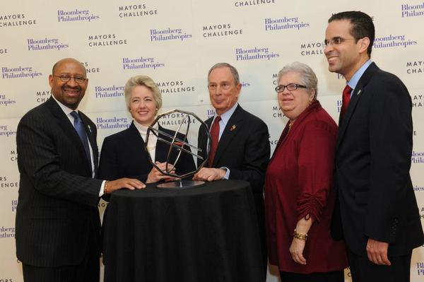
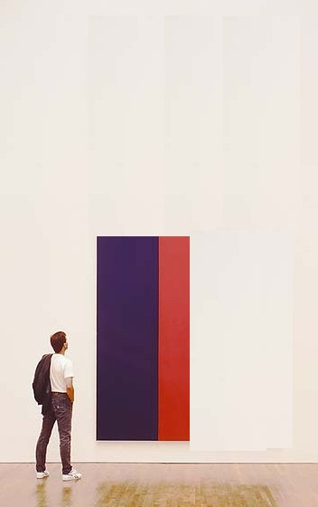
image via Bloomberg Philanthropies' Facebook photostream
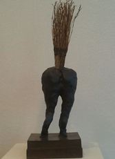
Congratulations to the mayors of Philadelphia, Houston, Santa Monica, Chicago [not present] and Providence for winning Bloomberg Philanthropies' inaugural Mayors Challenge Prize for Innovation Award, thereby securing grants of five or one million dollars for your city's innovative project, plus this wonderful trophy, created exclusively for the Mayors Challenge Prize by noted Icelandic/Danish artist Olafur Eliasson.

image via Bloomberg Philanthropies' Facebook photostream
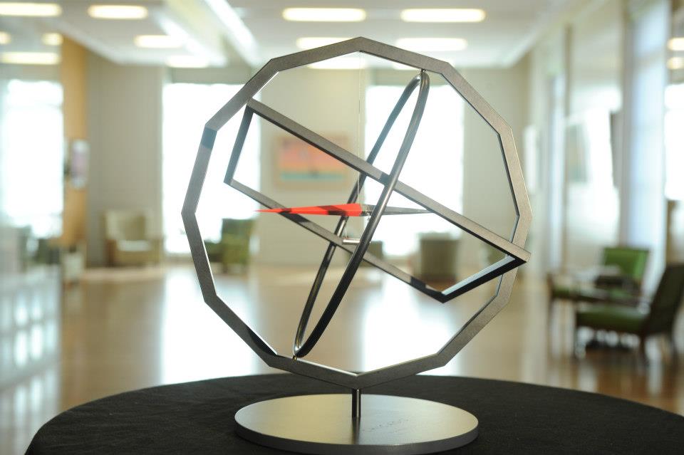
As the LA Times' Christopher Knight reported, the grand prize winner, Providence's stainless steel trophy will be shiny, while the other winners' trophies will have a blacker finish. All will consist, however, of a compass suspended from a circle nested in a square nested in a dodecagon, which represent, respectively, movement toward a common goal; the angle of rotation of the earth; a map; and the demarcation of time in hours and/or months.
Olafur's Mayors Challenge Prize is the slow-ripening fruit of Bloomberg [Mayor's and Philanthropies'] collaboration during the Public Art Fund-sponsored NYC Waterfalls project. It joins a rarified group of trophies designed by artists of the day, including:
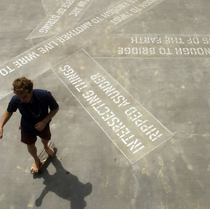
Lawrence Weiner's adaptation in 2012 of his 2004-6 sidewalk installation Bard Enter for the trophy accompanying the $25,000 check that accompanies the newly endowed and renamed Center for Curatorial Studies Bard College Audrey Irmas Award for Curatorial Excellence.
And Jenny Holzer designed Human Rights First's Sidney Lumet Award for Integrity in Entertainment, which was presented in 2011 by Phillip Seymour Hoffman to Michelle and Robert King, the creators of The Good Wife. Here she is at the gala with the Kings and The Good Wife co-star Josh Charles. Not clear what the scrolling truism is. Maybe, "Entertainment industry's self-regard comes as no surprise."
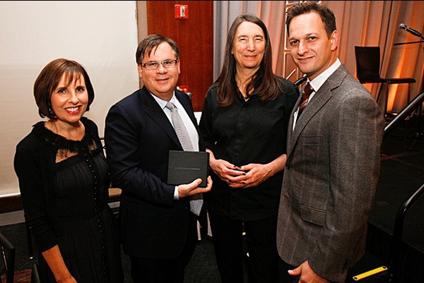
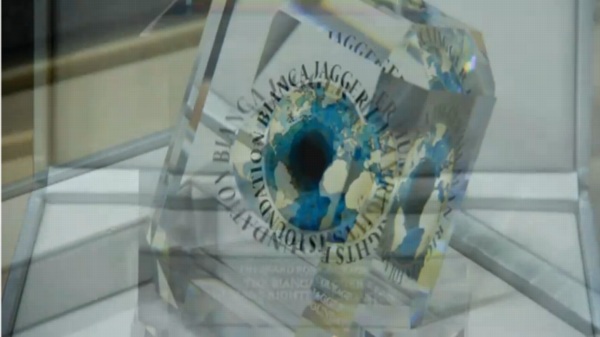
image: swarovski.tv
Also in 2011: Marc Quinn created The Bianca Jagger Foundation For Human Rights' "Award For Courage," in collaboration with Swarovski. It was a painting, which he did for the Foundation's logo, which was used in the award. The inaugural recipient, Ai Weiwei, was unable to attend the gala, held at Phillips de Pury in London, where donated artworks, including Quinn's painting, were sold to raise million of dollars. UPDATE: Quinn also designed the "Award For Leadership," whose recipient, Chief Almir Narayamoga Surui, Chief of the Gamebey Clan of the Suruí People of Rondônia in Brazil appears also to have been unable to attend what looks to have been a dazzling, self-funding evening.
Is this a flurry of artist-designed awards? Perhaps, but the genre does have a history.
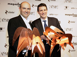
There's the Ellie, of course, replicas of Alexander Calder's stabile Elephant, which have, since 1966, been given by the American Society of Magazine Editors to winners of the National Magazine Awards. [That's Chris Anderson and David Remnick hauling home three each in 2009, via adage] I can find no information on how Calder's sculpture came to be used, nor can I see any info on the "original" stabile. Which situation I find interesting.
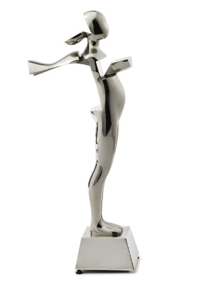
And Ernest Trova's COUNCIL OF FASHION DESIGNERS OF AMERICA AWARD, commissioned in 1981. We read that DVF brought in the life-size version of COFDOAA to CFDA HQ. But this particular one was Brooke Astor's, from 1989, and it was sold last September at Sotheby's.. $1,750.
And my favorite, which has been sitting on my desktop for months now, and whose genesis has the greatest similarity to Bloomberg's Eliasson: Rockefeller's Kelly. In 1967, Governor Nelson Rockefeller commissioned Ellsworth Kelly to create the New York State Award. The felt banner, produced by the noted art banner publisher Betsy Ross Flag and Banner Co. in an edition of 20, was given to admirable arts and culture-related projects and institutions by the New York State Council of the Arts.
UPDATE: I'm sorry, did I say that was my favorite? It was until five minutes ago, when I discovered that in 1998 Robert Rauschenberg created the Equine Posterior Achievement Award for People For The American Way. The horse's ass was cast in bronze by Robert Graham, and has been presented as needed to political and cultural leaders "whose abilities to misrepresent an issue, manipulate his or her followers and pander to our basic instincts reach such ridiculous levels we don't know whether to laugh or cry." God Bless you, Robert Rauschenberg, and God Bless The United States of America.
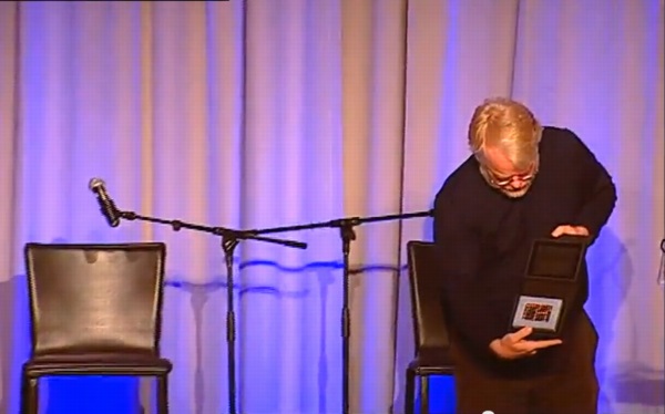
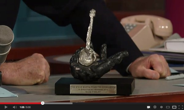
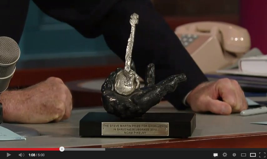
UPDATE UPDATE: via Brent @HeartAsArena comes this news: in 2010 Steve Martin commissioned his friend Eric Fischl to create the statue for the Steve Martin Prize For Excellence In Banjo And Bluegrass. Martin discussed the award on the David Letterman Show whence this screenshot was taken.
Oct 2013 Update: Americans for the Arts presented their National Arts Awards last night in New York to, among others, Dakota Fanning.
And as the AftA press release confirms, Jeff Koons designed the award statue in 2009.
Nov 2013: Another award statue designed by Jeff Koons and unveiled tonight, the Smithsonian Magazine American Ingenuity Award!
Hey look, there's a tiny selfie in there!
The ten winners in this, the 2nd year of the award, include St. Vincent, Doug Aitken, and Dave Eggers. Too bad the first year's Ingeniuses don't get one. I'm sure they got a nice plaque, though. Or a light bulb.
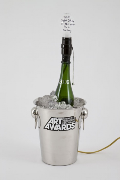
Nov. 2014 update: Did someone say lightbulb? I don't know how I completely forgot that Rob Pruitt designed the trophies for his Rob Pruitt Art Awards, held in association with the Guggenheim in 2009 and 2010. The 2009 trophy was a champagne bucket lamp, with a light bulb that Art in America, at least, saw as a Jasper Johns reference. There were ten distributed, and more made, for sure.
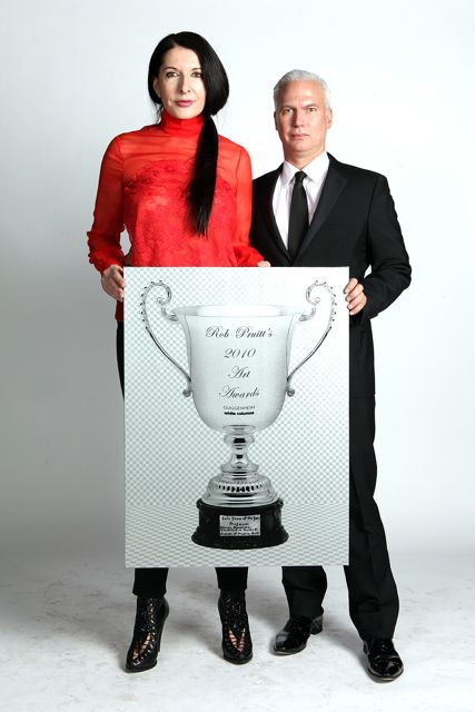
image via guggenheim's flickr
For the 2010 trophy, Pruitt designed an engraved sterling silver goblet--and then handed out screen printed paintings of the rendering. Probably a budget thing. Here is the one for Solo Show of The Year, Museum, modeled by its winner, Marina Abramovic, and her curator, Klaus Biesenbach.
Santa Monica wins Eliasson sculpture; awaits a much bigger one [latimes via @KnightLAT]


