
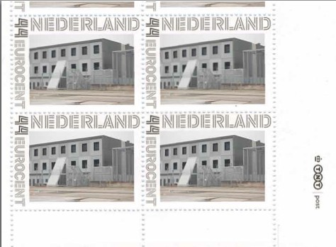
As part of their project Caché-Exposé, investigating the Netherlands’ largely invisible detention and deportation system, the Amsterdam art & design collaborative Foundland documented obscure, anonymous detention sites around the country. Then they used a highly official, public system to distribute their images: design-it-yourself postage stamps.
What with the domes, the minimalist/industrial architecture, these stamps, and–hello, this awesome flag they shot in 2008–I can’t help noticing how beautifully designed the Dutch immigrant prison system is. So thoughtful.
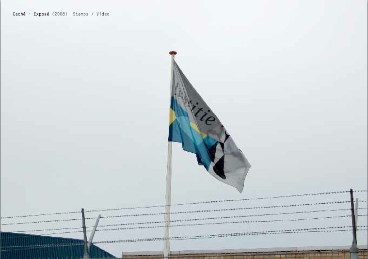
That is the Ministry of Security & Justice flag there, flying over the Zaandam waterfront dome prison. The biomorphic shape is a perspectival view of the scales of Justice, a fragment of the Ministry logo, which is an abstracted, blindfolded Justice.
![]()
Is, or was. Because on Google Streetview, the flag is different. Much simpler.
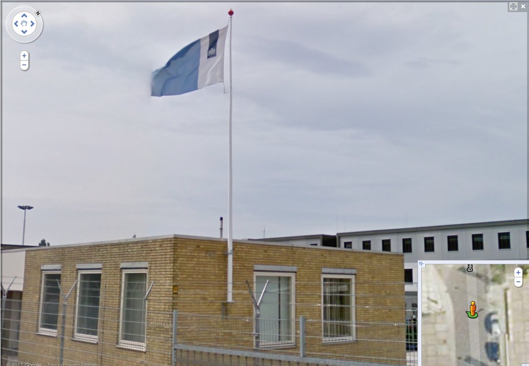
That is the new Rijkshuisstijl, which is officially called the Central Government Visual Identity, but which I gladly transliterate as the State House Style, a four-year effort begun in 2007 to centralize and redesign the Dutch government’s corporate identity. Part of that initiative was the 1 Logo Project, a replacement of 125+ separate ministry and agency logos with a single logo, the national coat of arms on a vertical blue bar.
Ah, I’m told it’s a ribbon. Here’s the English version of the style guide.
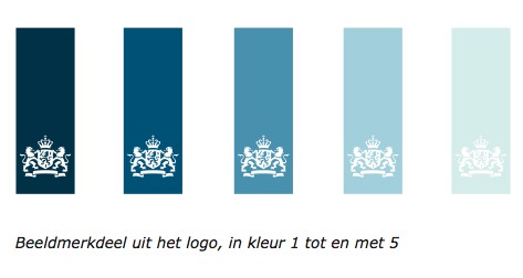
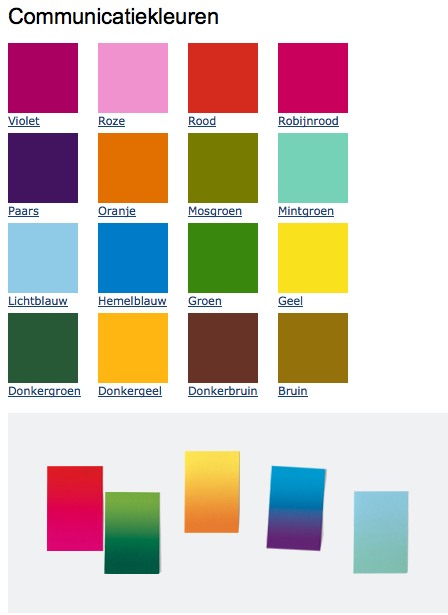
Oh, man, the color palette, 16 colors “inspired by the colorful Dutch landscape painting,” plus five gradients. Get me Colby Poster on the horn.
I am kind of geeking out over this. On the one hand, it’s a normal redesign gig, tastefully done, but typical to the point of banality. On the other, because it’s the state, I can’t help but read every platitude in the mission statement and objectives, every justification of every design decision and element, through a politicized filter. Without knowing really anything about the details or shifts in Dutch poltiics beyond recent surges of right-wing populism, I can’t help but interpret the identification of problems the Rijkshuisstijl was intended to fix as criticism of the parties and governments then in power.
Partly, it’s the Rijkshuisstijl’s incredibly bold assertions of design’s importance and function. And the grand assertions of meaning:
“The symbol exists of a blue ribbon with the coat of arms. Subtle and unpretentious, an authority without being authoritarian.”
The color of the logo is Rijksoverheid Blue. Inspired by the Dutch skies and Dutch light. Blue for calm and reliability. Blue for tradition and enduring values. Blue for harmony and balance.”
“The wide variety of logos previously used by various government organisations made them less recognisable, causing confusion among the public and business community. People were no longer able to see the wood for the trees. Central government organisations seemed to be competing rather than cooperating with each other. This approach compounded the widely held view that central government was fragmented.”
“The mission statement and the motto both underline what central government stands for. They give the central government logo (Rijkslogo) real meaning.”
And then there’s the irony of context, the subjective happenstance of discovering the Rijkshuisstijl while looking at an exposé criticizing the Netherlands’ unjust treatment of immigrants, a project which I’d discovered in turn while reading about the current populist government’s massive cuts to the country’s arts infrastructure. Is this what modernism and Good Design signed on for? Because it’s what they got.
Oh, and there was a symposium, and a book, De stijl van het Rijk/ Style and the State, produced last fall by the Stichting Design den Haag.
Foundland [foundland.org]
Rijkshuisstijl guide in English [rijkshuisstijl.nl]
UPDATE: So the work was actually done by Studio Dumbar in Rotterdam, announced on their site in 2007 [studiodumbar.com]