September 2011 Archives

Well, let's just get this out of the way: if you can only see one Warhol exhibition in Washington this year, see Shadows. The Warhol Headlines show is very slight. It's hard to call it a highlight, but a series of three 1982 or '83 silkscreen paintings of successive pages in the NY Post did remind me a bit of the newspaper On Kawara used to line the boxes of his date paintings. Also, the show includes the three Screen Tests where the subjects appear to be reading and unaware they were being filmed: Alan Solomon, Grace Glueck, and Arman. That really is all.

nga_brick_facade.jpg

But let's back up because, hey-ho, did you know the National Gallery's East Wing was built with red brick infill walls?? It's like Long Island City up in there behind IM Pei's Indiana granite.

nga_pittsburgh_steelers.jpg

I also love that a construction worker in 1975 declared his allegiance to the Pittsburgh Steelers, practically in the Baltimore Colts' own backyard. That was the year the Terrible Towel was invented, and when the Steelers did, in fact, win their second Super Bowl in a row. Also, I thoroughly approve of this epic-scale scaffolding. Glaze it and set it up at the beach for me, please.

Anyway, after the Warhol bust, I went downstairs for a close look at one of the NGA's current strengths: contemporary monochromes. I'm working on some little monochrome panels right now, and I wanted to see surfaces and techniques--and to see if I'm inadvertently copying anyone I don't want to.

I think I want a really immaculate, glassy, brushstroke-free surface, and I definitely know I want a continuity around the edge of the thin steel and aluminum panels I'm trying. So I figure setting out to study the cleanest, smoothest paintings I can find will be yield some hints.

nga_bkim_detail1.jpg

So first up: Byron Kim's Synecdoche (1991-), the multipanel grid of monochromes based on various art world folks' skin tones.

September 30, 2011

'Defining of Art Assailed'

I-- hmm:

Pointing out that the museum's difficulties in importing art duty free have arisen out of the present tariff law's definition of art, Mr Packard said that it was not the function of government to define art "any more than it is a governmental function to define truth."
Prof. Artemas Packard, Dartmouth, and researcher/consultant to the Museum of Modern Art, quoted in "Museum asks end of duty on Cubism," The New York Times, May 12, 1936.

September 30, 2011

On The Nightmare Of The Rack

kristoncapps_immortalized.jpg

Kriston Capps' tweet to Powhida about art and immortality instantly reminded me of RH Quaytman's conversation with Steel Stillman, which ran in Art in America last summer, and which upended my own comfortable memory of first encountering Quaytman's little storage rack sculpture back in 2008:

rh_quaytman_rack_anaba.jpgSS For "Ark, Chapter 10," which was the three-person show you organized at the end of your time at Orchard, you made paintings that related to Orchard's history, and displayed several of them on storage racks similar to ones you have here in your studio. The display of paintings became a sculpture [From One O to Another].

RHQ I felt I needed to acknowledge--within the structure of the pieces themselves--the fact that I would be showing my own works, becoming, in effect, my own dealer. The storage racks, like the racks in a typical gallery's back room, enabled visitors to pull out the paintings the way a dealer might, when showing them to prospective clients.

SS The racks addressed the nightmare, which perhaps all artists have had, that their work will never be seen.

RHQ Making the storage-rack pieces reminded me of the trauma of putting my stepfather's and father's works in storage after they died. Those experiences and the questions they raised--about artists' estates, and about the life of the work itself once the artist has gone--left a big impression on me.

SS In 2008, you made a book, Allegorical Decoys, whose centerpiece is an essay you wrote about the development of your work. Having been your own dealer, you became, in effect, your own historian and publisher.

RHQ I realized instinctively that, in some sense, the paintings wouldn't exist unless they were written about and collected. Otherwise, they would be like trees falling in the forest with nobody there to hear them. Writing that essay was an opportunity not just to reflect on my practice, but to locate my work within a larger critical conversation on my own terms.

[image: [From One O to Another], via anaba]

Features | RH Quaytman, June 2010 [artinamericamagazine]
Previously, Jan. 2010: Nice Rack! RH Quaytman on MoMAPS1's blog

enzo_mari_picnic_ebay1.jpg

Mondo Patrick tipped me off to this a little while back, and for a while there, it was kind of turning my table world upside-down.

enzo_mari_picnic_ebay2.jpg

It's an autoprogettazione table by Enzo Mari, of course, model 1123 xE, one of the most picnic tabliest of them all, made from the original 1970s precut wood kids produced by Simon Gavina.

It was really tempting, but ultimately the condition issues--there were some split and badly repaired wood pieces on one side which would probably mean losing some of the original wood--and really, the shipping from somewhere outside Torino to, wherever really, where am I going to put a second table project on no notice? And maybe if I could wait for the euro to collapse it'd make financial sense, but--anyway, I passed on it.

rirkrit_autoprojettazione.jpg

That hammered, golden patina still shines in my dreams, though. Let's watch the European auctions for a while and see if this bad boy reappears. Meanwhile, I still have this image of Rirkrit's chrome ghost of 1123 xE to keep me company.

September 29, 2011

But Is It Art? c. MoMA 1936

The story of Constantin Brancusi's Bird in Space getting hung up at US Customs in 1926, which did not believe it was a work of art, is well-known. [Just for fun, here's a story about Richard Feigen smuggling a Brancusi out of India by claiming it was a brass lamp.]

What I did not know, though, was that Customs not only didn't learn its lesson from the Brancusi situation, it kept on flagging sculpture it didn't believe to be "art," and even seems to have picked up the pace.

moma_cubism_customs_wilson.jpg
image via moma

You'll never guess how I found it, but I stumbled across this photo from MoMA, which was included in Fred Wilson's 1999 archive-diving online project for The Museum As Muse titled, Road To Victory. The site is still active and interesting, even if it does feel a bit quaint and low-res.

Anyway, it shows a veritable boatload of artwork, imported by the Modern for its 1936 exhibition, "Cubism and Abstract Art," which, the caption says, was "rejected by the United States Customs Service Inspectors for entry into the United States as works of art."

I mean, help a brother out here: Arp, Arp, Boccioni, Boccioni, Duchamp-Villon? Who else you got?

We'll talk about the art handling issue after I get back from lunch.

UPDATE Well, consider that can of worms opened. There turns out to be a whole history of cases where the definition of art runs afoul of customs agents. Cubism and Abstract Art, the show and the genres, were just some of the first.

According to the NY Times, 19 sculptures out of 150 were refused duty-free entry under what abstractionists complained was a post-Brancusian reversion to a 1916 Treasury Department rule that required sculpture--but not paintings--to be "imitations of natural objects...chiefly the human form."

This strict interpretation forced the Modern to delay the opening of the exhibit for a week and to post a $100,000 bond to release the works. I'll post the full list of snagged works after the jump. The incident prompted Museum president A. Conger Goodyear to rally 100 museums around the country in a letter-writing campaign to have the US customs laws amended. His plan, eminently reasonable-sounding at the time, I'm sure, what could ever go wrong, was "to permit recognized museums to decide what art is." The article concludes with a quote Fred Wilson also used:

The issue in which the Museum of Modern Art and all similar institutions are really interested is whether the government is to determine by law what is art. In this instance there is no question as to the 'moral' character of the objects under consideration. They are denied admission, duty free, on the sole ground that they do not completely meet the requirements established by the existing law and court decisions for 'works of art.' The judgment of acknowledged experts is given no weight or consideration.

We believe the act of Congress which makes this situation possible must be amended.

Cubist Art fails to get past Customs [Feb. 22, 1936, NY Times]

UPDATE UPDATE Long and short of it, it's not clear whether the 1916 ruling was really at issue, or whether it was the 1930 Smoot-Hawley Tariff Act, which raised protectionist tariffs against wide swaths of imported goods, that contained the inadvertent language. But remarkably, the abstract art tariff discrimination continued for more than twenty years. There's a NYT story from 1958 about Sen. Jacob Javits introducing legislation to modernize the language of the Customs art rule.

Basically, sculpture could be any material, but it had to depict "natural objects...in their true proportion of length, breadth and thickness," which meant it tripped up African carvings, too. Painting could be anything, as long as it was "traditional materials," which was ruled to exclude mosaic and collage or assemblage.

The Times reported that collector Donald Peters protested when his $450 1956 Alberto Burri collage was taxed 20% duty as "a manufacture of vegetable fibres" because "it had a background of burlap." If it was "vegetable matter," Peters argued, then it was only worth $1, "and the Government was entitled to 20 cents. Mr. Peters lost the argument."

Which almost exactly mirrors the VAT shenanigans perpetrated by EU bureaucrats last year when they ruled that video artworks were actually electronic equipment, not art, and were thus subject to a higher VAT--but on the artwork's price level, not the underlying hardware's. And so it goes.

[Just as an aside, Sen. Javits: kind of a schlub? His wife? Smokin'. What was up with that?]

K32_HMS_Helsingborg_Anchored-of-Gotska-Sandoen_cropped.jpg
"K32 HMS Helsingborg Anchored off Gotska Sandoen, cropped," wikipedia via tna

Every time I go back to James Bridle's tumblr The New Aesthetic, I'm like, "The New Aesthetic! I'm soaking in it!" and remind myself to visit more often.

noordeinde_gmap_shadow.jpg

For example, an awesome roundup of splinter-style camo which bears a striking resemblance to the polygonal camo applied to intelligence-sensitive sites on Dutch Google Maps [above, below] which I've been tracking--and promising myself I'd paint--for, hey, look at that, exactly two years now!

Anyway, Sweden in particular is still keeping the polygon faith, with their M/90 camo pattern, much sought after by paintball aficionados.

The image above is of a Swedish naval vessel, the new K32 HMS Helsingborg corvette, delivered in December 2009. I know the dates don't match up, but it sure looks like this ship Google photographed pulling into a Dutch naval base in 2006:

dutch_naval_camo_det.jpg

September 28, 2011

Gerhard Richter Strip Show

richter_mgp_install.jpg
Gerhard Richter: Peinture 2010-2011, installation view, Marian Goodman Paris, image via

Yes, well.

While everyone is transfixed with Gerhard Richter's c. 2009 on-camera squeegee technique, the artist himself has moved on to a schmear of the digital kind.

Gerhard Richter: Paintings 2010-2011 is on right now at Marian Goodman Paris, and most of the work on view barely seems to meet the promise of the show's title. There is a large glass plate structure at the center of the gallery, and there are some small poured-paint-on-glass works. And then there's the Strip series, unique digital prints mounted under Perspex.

richter_strip_mgp.jpg

To make Strip, Richter digitally mirrored/extruded vertical slices of an abstract painting--here, the description for the project's artist book, Gerhard Richter: Patterns. Divided - Mirrored - Repeated explains it better:

The artist's book documents Gerhard Richter's experiment of taking an image of his original Abstract Painting [CR: 724-4] and dividing it vertically into strips: first 2, then 4, 8, 16, 32, 64, 128, 256, 512, 1024, 2048, up to 4096 strips. This process (twelve stages of division) results in 8190 strips, each of which is the height of the original image. With each stage of division the strips become progressively thinner (a strip of the 12th division is 0.08 mm). Endless more divisions are possible, but they would soon only become visible by enlargement. Each strip is then mirrored and repeated, which results in patterns. The number of repetitions increases with each stage of division in order to make patterns of consistent size.
richter_abstr_724-4_3516.jpg
Abstract Painting, CR:724-4, 1990, via gerhard-richter.com

The 520 page [!], EUR450 book documents 221 of these repeated patterns. Marian Goodman's showing six. At first I expected the Strip works to be the same dimensions as 724-4 (92x126cm), but no, not at all; the Strips are much bigger, 160x300cm.

Buchloh is, as always, agog at the import and implications. An excerpt from a book-length essay as quoted in the gallery's press release:

The status of painting in these new works is figured as exceptionally fragile, yet it is powerfully formulated in its assimilation to its technological challenges, as though painting was once again on the wane under the impact of technological innovations. Yet in its application of almost Duchampian strategies of fusing technology and extremely refined critical pictorial reflection, Richter's astonishing new works open a new horizon of questions. These might concern the present functions of any pictorial project that does not want to operate in regression to painting's past, but that wants to confront the destruction of painterly experiences with the very practice of painting as radical opposition to technology's totalizing claims, and as manifest act of mourning the losses painting is served under the aegis of digital culture.
Mm-hmm. Richter has been working with photos of paintings and photos of overpainted photos for some time, so on the one hand, there is internal context for the artist's pixel-width extrusions.

But the horizon of questions Richter's new works open is only new if you've never left the studio. And how could painting, after all Richter's work over all these years, still have it so rough? If we agree--and we have, cf., Liz Deschenes, Walead Beshty, Cory Arcangel, Tom Friedman (even), Andreas Gursky--that the aegis of painting has long since expanded in the digital culture, then can't we welcome Richter to the party without pretending he threw it?

friedman_selfportr_metmus.jpg
Tom Friedman, Untitled, 1998, image via metmuseum.org

Gerhard Richter: Peinture 2010-2011, through Nov. 3 [mariangoodman]
Same thing, documented work by work on the artist's site [gerhard-richter]

September 27, 2011

Off The Golden Record

golden_record_cover.jpg

I was stoked to see [thanks to Paul's link from the Walker's Off Center] that Trevor Paglen included Murmurs of Earth on the reading list he shared with art21. The book is the authoritative account of the making of the Golden Record, the galactic greeting devised by a committee led by Carl Sagan and attached to the Voyager 1 and 2 space probes launched in 1977.

Designed to last a billion years in the vacuum of space, the gold-plated copper records each contain messages and information about life on Earth for whomever might come across the spaceships, which left the solar system in 2008. The disc includes messages from President Jimmy Carter and UN Secretary General Kurt Waldheim; greetings recorded in 55 languages; nature sounds; and 90 minutes of music [plus one unauthorized, scrawled greeting from the recording tech]. It also includes 116 images, in both black and white and color. The cover includes a map to Earth and instructions for playing the disc. It also includes a stylus.

Which is all great. But what I love most, beside the disc itself, which is gorgeous, is the fact that the images are all recorded in analogue. The upper right quadrant of the cover explains how to decode the rasterized data, one line at a time, into a 512-line image. Color images are encoded three times, in RGB, for reassembly.

wayne_miller_birth_voyager.jpg

The images themselves are mostly information, science, nature, not art, except in the largest sense, that the entire, inspiring folly, a golden object made in a bid for connecting across time, is an artistic project. Or as Carter put it:

This is a present from a small, distant world, a token of our sounds, our science, our images, our music, our thoughts and our feelings. We are attempting to survive our time so we may live into yours.
And there are a few images which aspire for aesthetic distinction, like Wayne Miller's photo of his own child being born [above], which was included in Family of Man, the landmark photo exhibition Miller curated with Edward Steichen at MoMA.

For my money, though, you can't beat the idea itself; I wonder how these objects, and how this content would be received. As objects, machines, sounds, images. I want to output the images from the disk and see what they turn out like. Maybe make some prints, even. Truth be told, I want a Golden Record of my own.

So far, I haven't found one. You have to imagine that NASA didn't take delivery of all the copies, did they? Aren't there a few hanging around in the libraries or attics of Sagan's committee members? Has there ever been a facsimile edition? [I think not.] Don't you think there should be? [Yes.]

Copyright holders for recordings and images on the disc had originally only given permission for playback outside the solar system [seriously]. But after many years of negotiation, Sagan also managed to clear all the music and all but one image for a CD-ROM, which accompanied a 1992 reissue of Murmurs of Earth.

And so it goes that the US intellectual property industry somehow managed to outcrazy the idea of communicating with extraterrestrials by sending records into outer space. Nice hustle, fellas.

Inspired Reading | Trevor Paglen [art21.org]
Voyager Golden Record [wikipedia]
"Please note that these images are copyright protected. Reproduction without permission of the copyright holder is prohibited." [nasa.gov]
Buy Murmurs of Earth in some format [amazon]
goldenrecord.org shows all 116 images [goldenrecord.org]

September 27, 2011

Look Into The Teleprompter

obama_prompter_nyt_crowley.jpg

Ooh, this is nice. I can't remember seeing a White House photographer use a teleprompter to pick up a crowd like this before. Carry on, Stephen Crowley of The New York Times!

Not that Mr. Crowley's colleagues didn't find some classically Sforzian shots there at Denver's Abraham Lincoln High School. The full banner said "Lincoln Lancers." Which may let the photographers feel like they've "discovered" this angle. It's a lower-key, but no less programmatic Sforzianism.

obama_lincoln_getty.jpg

[via Getty/daylife]

villa_america_gerald_murphy.jpg

Sometimes I really just am slow to put things together. I mean, I've written at length, ad nauseam, even, about the history of Mark Cross. Mondo-Blogo had a huge post months ago about what Superfreaks they are. There's the whole F. Scott Fitzgerald thing. [Which, truth be told, is probably why I've willfully ignored them so long.]

But it's only now, while reading Calvin Tomkins' 1962 New Yorker profile on Gerald and Sara Murphy [thanks @maudnewton!] that I've taken a first, real look at Gerald Murphy's paintings.

Well, that, and the fact that MoMA actually has their Murphy, Wasp and Pear, on view for the first time in years. It's certainly the first time I've ever remembered seeing it.

The Murphys fled their uptight, US, 1920s socialite life for France, where they proceeded to invent some combination of summer, the Riviera, and modernism. Under the initial tutelage of Diaghilev designer Nina Goncharova, Gerald took up painting alongside his friends Picasso, Braque, Man Ray, Picabia, and Leger. He stuck with it for seven intense years, then abandoned it completely when his son came down with tuberculosis. Tomkins quotes him as saying that discussions with Picasso led him to realize "I was not going to be first rate, and I couldn't stand second-rate painting."

watch_gerald_murphy.jpg

Which, wow, just does not make sense. It sounds like ex post facto rationalization, or dealing with grief over his son's death, or something but it completely ignores the fact that Picasso himself was often second-rate. I think you just never know until you do. And maybe Murphy did, and knew, but still.

The few paintings that survive [8?] of the few he made [14?] are all pretty great. The Dallas Museum has several, including Watch (1925), an amazing precisionist abstraction that measures an awe-inspiring 6x6 feet. No Sunday painting there.

I'm waiting for the catalogue from the DMA's 2008 ominously subtitled show, Making It New: The Art and Style of Gerald and Sara Murphy. Which better have photos of Villa America, the Murphys' pioneering modernist-ized outpost in Cap d'Antibes referred to in my favorite extant Murphy painting [top].

Murphy_Boatdeck_install.jpg

And which also better have more info and more photos of what is now my favorite missing Murphy, Boatdeck: Cunarder, an 18x12-ft masterpiece which took over nearly the entire American section of the 1924 Salon des Independants. Seriously, what Modern was painting 18 feet high in 1923? That is just nuts.

[update: MacAgy originally had Cunarder in the title, and the painting was originally reported to be based on the Aquitania, but Rubin says Murphy said it was the Olympic and the Paris]

I need a way to put the people in my Twitter feed in touch with each other.

occupy_twitter_juxt.jpg

Because what are we fighting for, if not the right to all 50 flavors of Doritos?

September 26, 2011

Hopping MAD

krementz_MAD_NYSD2.jpg

No disrespect for DPC and whoever else he sends off with The Digital, but Jill Krementz' photoreport from the Picasso to Koons: Artist as Jeweler show at the Museum of Arts and Design, or the MAD1 is the mad-funniest thing I've ever seen on New York Social Diary.

First, the concept for the show, in the words of Mrs Barbara Tober, head of the museum's Global Initiative:

"Eight years ago my husband and I were visiting Diane Venet and her husband [noted traffic circle and corporate plaza sculpture artist Bernar Venet] in France. Diane said, 'I have a dream. I want to organize a show of jewelry by all the important artists of the 20th century.' And so now you can see over 200 pieces of jewelry by 20th-century artists. Her dream has been realized."
Make that "all the important artists of the 20th century--and Lexus Burning Man hack Arne Quinze."

krementz_MAD_quinze.jpg
"he was able to transform his originality into a different sphere."


The packed crowd looks to be exactly who you'd expect to see at an artist as jeweler show: Upper East Siders who can only afford five figure jewelry. They also happen to be exactly the people who you'd never in a million years expect to see on the West Side. So kudos to the Museum for luring them all the way across smelly Central Park South!

This diptych from a curatorial Q&A is the best but my no means only example of Krementz's exquisite composition and captioning craft. She really is The Economist of society websites.

krementz_MAD_NYSD.jpg

But Krementz only keeps the confusion alive over these otherwise awesome enough bunny necklaces, introduced by Jeff Koons for Stella McCartney in 2005 [and apparently not sold out until 2009? Is that what those dates mean?]

koons_bunny_mccartney.jpg

It's been described both ways over the years, and you can't trust a blog any more than you can the press release it regurgitates, so it's never been clear to me whether these bunnies are platinum or white gold. Or maybe there are editions of each. One of which was $50,000. Assuming you paid retail, of course.

Someone was wearing one of these in a party pic recently. Where was that? The New Museum, probably.

1 Can't we all just admit that the Museum of Arts and Design only forefronted its inferiority complex by changing its name just as the craft boom took off, and that they really should fly its craft flag high, and just come out as the MAC?

From a NY Times article about a gay activist's petition for Microsoft to stop participating in an online affiliate sales company CGBG, which earns revenue for anti-gay groups like Focus on the Family:

"This is economic terrorism," said Mike Huckabee, the former pastor, governor and presidential contender, who is a paid CGBG consultant. "To try to destroy a business because you don't like some of the customers is, to me, unbelievably un-American," he said in an interview.
From SFGate, Dec. 6, 2005:
Christian group pulls Wells Fargo accounts / Focus on the Family objects to donation to gay rights group

"We don't expect corporate America to do our bidding on the issues, but when they use the proceeds from our business and give them to others who clobber us over the head, we say enough is enough," said Tom Minnery, who oversees public policy for the organization.

Focus on the Family's move follows a recent spate of conservative boycotts and other actions against large companies that support gay and lesbian causes, including Walgreens drugstores and Kraft Foods Inc., both of which contributed to the Gay Games.

Conservative groups also have targeted Ford Motor Co. for advertising in gay media and Procter & Gamble for advertising during the television shows "Will & Grace" and "Queer Eye for the Straight Guy." The best-known protest may have been the nine-year boycott led by the Southern Baptist Convention against Walt Disney Co. for hosting Gay Days, a week of gay-themed activities at Walt Disney World in Orlando. That boycott ended in June.

From a 2005 Orlando Sentinel article on the Kraft, Proctor & Gamble and Disney boycotts:
As more companies adopt gay-friendly business policies, they risk the wrath of conservative Christian groups prepared to take action with their collective buying power.

"People are willing to fight back with their pocketbooks," says Tim Wildmon, president of the Tupelo, Miss.-based American Family Association, a conservative group that has boycotted such companies.

September 26, 2011

HUNK

Hunk_AAA_leocast_24352.jpg

San Francisco collector Harry "Hunk" Anderson's 1973 letter to Leo Castelli is now in the Archives of American Art. I am going to take a wild guess and say that his awesome letterhead was designed by his good friend Ellsworth Kelly. Which would be awesome. I wonder if Moo got some, too.

UPDATE: Awesome, but incorrect. While Kelly's Spectrum paintings may have been one of the references or inspirations, a quick email to the folks at the Anderson Collection finds that Palo Alto graphic designer Sam Smidt created the awesome letterheads for Hunk--and Moo, too.

And now we know.

Harry Anderson letter to Leo Castelli, 1973 Mar. 30 [aaa.si.edu via letterheady]
About the Anderson Collection [aacollection]
Previously:
What I Looked At Today: Ellsworth Kelly's Writing]

September 25, 2011

Eyeballed Autoprogettazione

Enzo_Mari_Szemeredy.jpg

Toronto-based designer Maté Szemeredy didn't have the plans to make Enzo Mari's Autoprogettazione Square Table, so he eyeballed it, based on online photos and published dimensions of finished tables. I'd say he got pretty damn close--those crosspieces may be inside-out and upside down, or maybe they just look cleaner that way--and he got a pretty sweet finish. And all in just two days, too. Nice.

Enzo Mari Autoprogettazione photoset by Datum-Datum [flickr]
Szemeredy's blog, Things Take Time

I'm going to assume you're as freaked out as I am that neuroscientists at UC Berkeley have constructed video from the brain activity of what someone is seeing. Gizmodo has a bit longer explanation of the research, and here's a making of video, but basically it involves mapping the brain into voxels [volumetric pixels], and monitoring activity across the brain with an fMRI scanner while the person watches video, and then reverse engineering the imagery from the voxellated activity. Once a database of visual/voxel connections was created, they could replicate the process with new video.

And so now they can see the images inside your head.

wenders_end_dream_1.jpg

Which is all freaky enough--even if it didn't end up looking exactly like Wim Wenders said it would, twenty years ago. BUT IT DOES.

Wenders' 1991 film, Until The End Of The World is set in 1999, where a neuroscientist's son [William Hurt] is being chased around the world as he records the neural record of images with a secret device that will enable his blind mother to play them back, and thereby see again. After all the electronics in the world are wiped out by the EMP blast from nuking a renegade satellite that's about to crash into the earth [holy crap, people], the neuroscientist [Max von Sydow] converts the device to read dreams. And then moody, overwrought German actresses [Solveig Dommartin] become addicted to watching their dreams until the batteries run out. Because seriously, who could have predicted the iPad's amazing battery performance, amiright?

wenders_end_dream_2.jpg

Anyway, Until The End Of The World was the first film to use HD, for the dream sequences, which were developed with NHK. And this is what they look like.

wenders_end_dream_3.jpg

Here's the Dream Junky scene on Vimeo, taken from the original theatrical cut.

Wenders was never satisfied with the 158-minute version released in the US, which he had cut down from a "definitive," 280-minute, director's cut. In 2001, the director revealed that he had kept the uncut negative of the film, and that the original, chopped version he had handed over to the distributor in 1991 had been a duplicate positive. And so he was able to re-create his original 280-min version from the original negative. Which he did, and which was released on DVD in 2004.

He presented the director's cut in 2001 at a screening at DGA in New York. The Q&A didn't start until after midnight.

part 2, part 3 [which has a fascinating story about using Vermeer as a visual inspiration, about 10:00 in, and then aroun 12-13m, he starts talking about the dream sequences] and part 4 [cont'd].


Until the End of the World (Bis ans Ende der Wel ) (Jusqu'au bout du monde) on four Region 2 DVDs

September 22, 2011

Google Evert View

In her post about how her Mario Kart reflexes started cropping up while she was driving a real car, Sally Adee introduced me to a new term, "everting," which William Gibson introduced in his 2007 novel, Spook Country, and which she explains as "entering the next phase of its evolution by creeping out of the virtual boundaries that once defined it and into what we consider 'real life.'"

Which I mention here because it turns out to kind of relate to the piece I'm putting in this show in a couple of weeks--right? that's what I thought, too--a site-specific work about Google Street View.

Brian Dupont has put together "While You Wait..." at Extra Gallery, in Chelsea.

The show opens on October 6th, and I'll post more about it after it's done. I, for one, am interested to see how it turns out.

Consensual Hallucination [lastwordonnothing via theawl]
"While You Wait..." at Extra Gallery, October 6 - November 1, 2011 [extragallerynyc]

rirkrit_fifty_j-no.jpg

Rirkrit Tiravanija, ink on paper, shown at Gavin Brown's Enterprise in Nov-Dec 2008 as part of JG Reads, image: detail of a shot by James Nova from the opening. j-No has more images of two other dollar bill drawings.

Here's a 2 min or so clip of the 10h16m film, shot that summer in Giorno's Bowery studio.

For details of the show, check out contemporary art daily.

kelly_spectrum_moma.jpg
Spectrum IV, 1967, image via moma

Amazing how you can look at something so often, for so long, how you can like it, seek it out, even, follow it, poke around the awesome/odd parts, all without really realizing what it is you're looking at.

So as I start trying to paint some monochrome metal panels in a variety of colors, I can still somehow end up not thinking about Ellsworth Kelly. Which is a mistake.

kelly_spectrum_v_jdtaylor.jpg
Spectrum V, metropolitain museum, image via jeffdtaylor

And not just any Ellsworth Kellys, but the Kellys I see most regularly: Spectrum paintings from the late 1960s that anchor both MoMA and the Met. [Jeffrey Taylor's photo on his Tumblr finally set me straight this morning.]

kelly_spectrum_v_ppaine.jpg
image via patrick-paine

But anyway, Kelly's writing. "Notes of 1969" was first published in a 1980 catalogue at the Stedelijk, and was revised slightly in 1993 for inclusion in Theories and Documents of Contemporary Art: A Sourcebook of Artists' Writings in 1996:

The new works were to be objects, unsigned, anonymous.

Everywhere I looked, everything I saw became something to be made, and it had to be exactly as it was, with nothing added. It was a new freedom; there was no longer the need to compose. The subject was there already made, and I could take from everything. It all belonged to me: a glass roof of a factory with its broken and patched panels, lines on a road map, a corner of a Braque painting, paper fragments in the street. It was all the same: anything goes.

I felt that everything is beautiful but that which man tries intentionally to make beautiful, that the work of an ordinary bricklayer is more valid than the artwork of all but a very few artists.

[via Google Books]

I mean, I could have written wish I'd written that yesterday. Except that Kelly wrote it in 1969, and I had no idea about it.

UPDATE: Or maybe I had no idea that's where I got it. In 2009, I was reading Kelly on his early development and his interest in "painting objects," a noun, and the use of fabric for canvas as a "ready-made color":

Another important example of a panel painting that explores the idea of the mural was Red Yellow Blue White (1952). It's the only one I ever did using actual dyed fabric of ready-made colours, which moves the painting into the realm of real objects. It consists of five vertical panels, each with five canvases. The vertical panels are separated on the wall and the intervals of the wall surface between them are part of the painting.
Only, at the time, I was just researching the kind of incredible oddness of an Ellsworth Kelly dress for someone else. 1952, eh, Blinky?

Previously: Dress, 1952, by Ellsworth Kelly??

September 20, 2011

The Glancer Is Present

vandyke_long_glance_still.jpg

For his performance/project The Long Glance, Brooklyn-based artist Jonathan VanDyke spent 40 hours standing in front of and looking at Jackson Pollock's painting Convergence, 1952 at the Albright-Knox Gallery in Buffalo. He carried this out over the course of one week last May/June, looking for eight hours/day, for five straight days.

The Long Glance was streamed live on the museum's website, and he had his own wall label in the gallery which described him as a "living sculpture." Hmm.

Artist Sal Randolph wrote about watching VanDyke online as he watched the Pollock.

The project and its audience all seem to have a resonance with The Artist Is Present, except, obviously, the artist's counterpart here is a painting, not a person.

Thinking about these two projects together makes me interested to hear what VanDyke saw, and what he learned about Convergence, or about its creation, or its creator. Which is kind of funny, because I never had that sense about sitting with Marina Abramovic. I mean, sure, there were people who cried or emoted or developed relationships of some kind with her through sitting. But I always had a sense that the experience of sitting with Marina was its own objective, while looking at a painting is a means to an end: understanding.

And so I'm a little disappointed with VanDyke's essay about The Long Glance because, while it is highly informed and expansive, it is almost entirely about the internalities of his own experience. Which is great, don't get me wrong, just.

But maybe I'm missing the point: both VanDyke's, and Pollock's. In another post about The Long Glance, Randolph quotes extensively from Alan Kaprow's 1958 examination of the experiential nature of Pollock's Action Paintings:

The space of these creations is not clearly palpable as such. We can become entangled in the web to some extent and by moving in and out of the skein of lines and splashings can experience a kind of spatial extension. But even so, this space is an allusion far more vague than even the few inches of space-reading a Cubist work affords. It may be that our need to identify with the process, the making of the whole affair, prevents a concentration on the specifics of before and behind so important in a more traditional art. But what I believe is clearly discernible is that the entire painting comes out at us (we are participants rather than observers), right into the room.
OK, then, carry on.

The Long Glance, by Jonathan VanDyke [thepowerplant.org via wordobject]
The Long Glance (5 of 2400 minutes) [vimeo]

Action: Watching the Watcher [wordobject]
Action: Inaction Painting [wordobject]

cage_cookies_gregorg.jpg

Someone recently tweeted about John Cage's cookie recipe, which the Walker had posted on their blog a few weeks ago

Preheat oven to 350 degrees.
In a food processor, grind:
1 c. raw almonds
1 c. raw oats
Combine almonds and oats in a large bowl. Stir in:
1 c. whole wheat flour or brown rice flour (if you want a gluten free option, you may need to add slightly more than the 1 c. brown rice flour, so that you are later able to form balls with the dough)
Add ground cinnamon to the dry mixture.
To the dry mixture, add:
1/2 c. almond oil (other nut oils work as well)
1/2 c. real maple syrup (no Aunt Jemima!)

Stir mixture until you are able to form one-inch balls. Place on ungreased cookie sheet. Flatten slightly, and press a small dollop of your favorite jam or preserves (jelly is too thin) into the center of each cookie. Bake for 15-20 minutes, turning the pan once, halfway through the baking process. Cookies are done when light golden brown. They store well in the fridge.

Well, yesterday, we tried it, and the recipe works, and they are very good, as good as anything made primarily of almonds, cinnamon, maple syrup, and homemade raspberry jam could be, anyway. They're very rich and dense.

A couple of tips about the recipe:

We have almond flour, or almond meal, which is fine-ground almonds, which I was tempted to use instead of foodprocessing actual, whole almonds. But I didn't, and I'm glad. The more coarsely ground almonds give the cookies basically all of their texture.

We ended up adding about 2 tablespoons more whole wheat flour, because the recipe seemed a little oily [the only liquid is almond oil and maple syrup.]

The recipe says to cook them until they're golden brown. Which has to be a trick, since they started out golden brown. They don't really change color, so I ended up cooking them the full 20 minutes. You'll poke them and think they're not done, and that they won't stay together, but they cooled down and firmed up.

Let Them Eat Cage Cookies [walkerart.org via someone, thanks!]

September 19, 2011

Two Of These Things

As those who kindly email me about run-on italics--and those who don't--know, I don't actually visit this site site as often as I probably should.

Which is part of the reason I didn't notice until just now this nice side-by-side posting of Matt Connors' painting and Barack Obama et al's blast shields at the dedication of the World Trade Center Memorial.

obama_connors_gregorg.jpg

UPDATE: Or three of these things. Mondo Patrick likes the Connors diptych alongside this:

Thumbnail image for flavin_beyeler_christies.jpg

September 19, 2011

Cady's Got A Gun

noland_moma_itgreeds.jpg
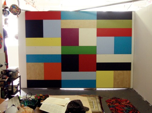
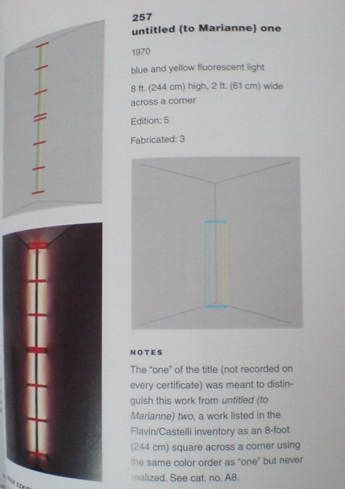
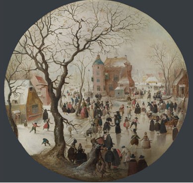
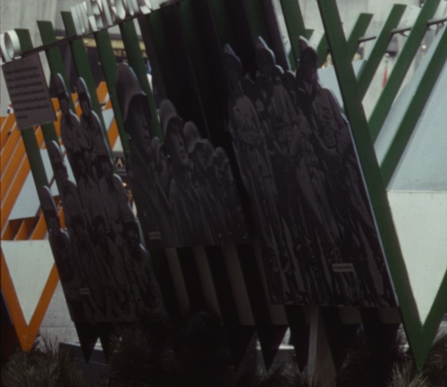
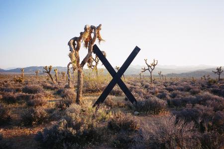
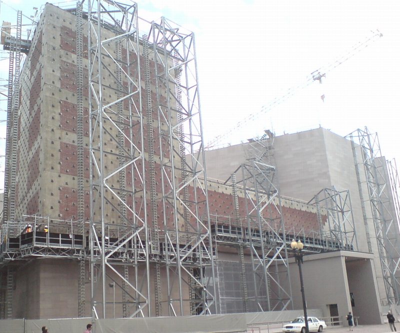
Cady Noland's Tanya as Bandit, 1989, General Idea, and Guerrilla Girls at MoMA, 2010, image via greeds

Welcome to another installment of Things I've Been Meaning To Post For Months. Only this time, the longer I wait, the more examples I see, and so the easier it is to rationalize not having posted these things the first time.

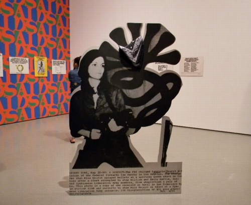
So photo cutouts. These things that blur the line between photograph and sculpture, or object. It started, at least for me, with Cady Noland. She'd do those cutout screenprint on aluminum news photos of folks like Lee Harvey Oswald, or Patty Hearst. Kathy Halbreich installed the latter in MoMA's 2nd floor galleries last summer.

The image above [via last greeds' sept '10 art diary entry] shows Noland's Tanya as Bandit, 1989--which turns out to be a 2007 gift of Kathy and Dick Fuld, very thoughtful and generous of them--in the politicized polemic gallery, with the Guerrilla Girls, and General Idea's Indiana-inspired AIDS wallpaper.

cady_noland_bluewald_newmuseum.jpg
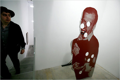
Cady Noland, Bluewald, 1989, Dakis Joannou Collection at the New Museum, image: nyt

And Jeff put Dakis's Cady of the photo of Jack shooting Lee in that show at Lisa's place last year. Which is another great/awful tie-in of violence, photography, media and history.

[One of the things that's held me up was finding something up-to-date to say about Cady Noland's work, which I admire more and more, but which I didn't really click with at the time. And reading back on the 1990's media-centered, post-modernist, white trash America discussions of her work, it all seems a little, so what, you know? Lane Relyea's 1993 Artforum essay [something something Easy Rider, Land Art, lost American Dream] is good, I guess, maybe a little lyrical. Oh, those simpler times. So I'd really like to find some interesting attempts to engage with her work, and not just wistful wonderings of whether her current withdrawal from the art scene is hardcore late-Duchampian or full-on Salingerian.]

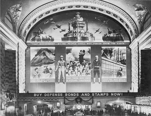
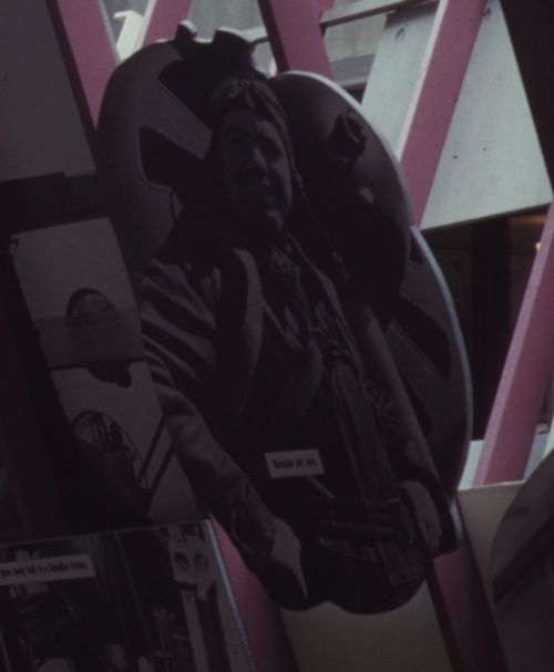
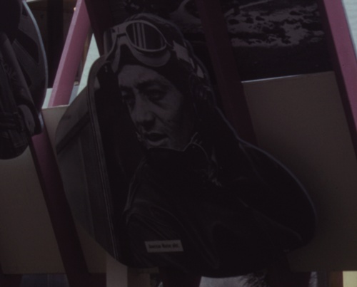
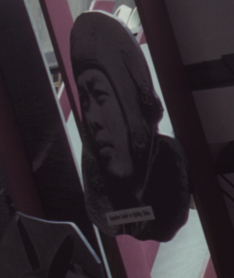
But this gallery was stuck in my head, with Patty's gun pointing at my brain, when I finally saw the installation shots for Edward Steichen's propagantastic 1942 MoMA exhibition, Road To Victory in February. It's a landmark in my little hybrid art history of photomurals. But there's also this one corner:

road_victory_cutout.jpg
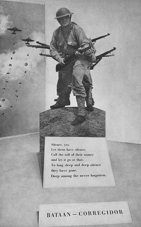
image: moma bulletin, oct. 1942, I think

With a giant, life-size photo cutout of Our Boys at Corregidor. I went through the archives for Road To Victory this spring, so when I find my notes of all the photo credits, I'll add this photographer's name here. I believe this was a news photo, like Noland's, but Steichen drew most of his images from the US Navy photo unit he led and from the Farm Security Agency's photo archive.
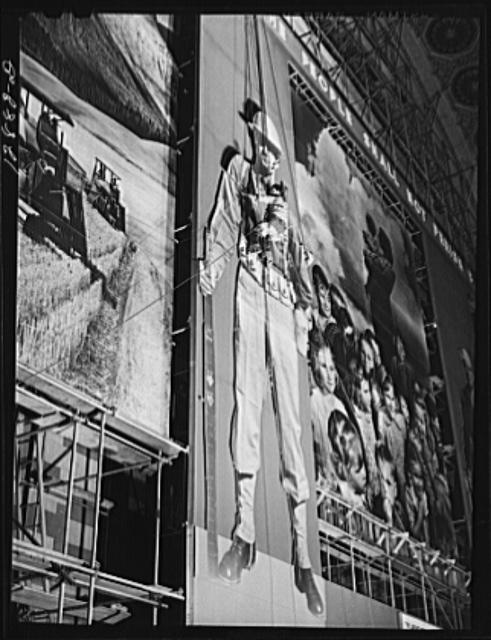
gc_loc_fsa_cutout_8b14682r.jpg
image: loc.gov

The FSA, of course, had already created the giant defense bonds photomural in Grand Central Station in 1941, which also had as its central elements two giant soldier photo cutouts:

Thumbnail image for gc_loc_fsa_cutout_8b37516r.jpg
image: loc.gov

And then by 1942, the FSA had become the OWI, the Office of War Information, where it designed and created propaganda both domestically for civilian consumption, and abroad, as part of Allied military operations. And in the Spring of 1942, they were programming the Channel Garden at Rockefeller Center with these incredible wartime exhibitions, which were basically chock-a-block with giant photo cutouts:

owi_rock_cutout1.jpg

owi_rock_cutout2.jpg

owi_rock_cutout3.jpg

owi_rock_cutout4.jpg

I'm not sure that I have a specific point here, either, except that these cutouts share a context--propaganda, exhibition, war, military, politics--with photomurals; they're ways to put photography to work, to push and expand it beyond the newspaper, or the book, or the album, the slideshow, or--occasionally--the gallery, wherever it had been hanging out until that point. And at these scales, I suspect photography was taking a lot of its cues from cinema, moving pictures.

matt_jones_freight_vol.jpg
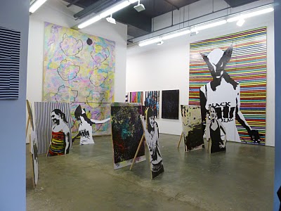
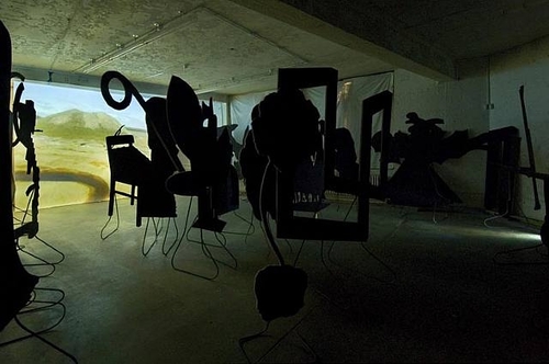
Multiverse, image via kclog

Whatever photomurals are to painting, the cutouts are to sculpture, I figured. Until I saw Matt Jones' show, Multiverse last Spring at Freight + Volume. Jones's plywood cutout works are photo, painting, and sculpture all at once, or in turn.

hkjb_mattjones_16miles.jpg
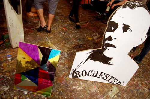
Matt Jones works at HKJB, June 2011, image: 16miles

And then at Control Alt Delete, the one-night studio show organized by HKJB in June, Jones just collapsed the distinctions completely. This pairing in a photo by Andrew Russeth is just so awesome. There's a screened/painted cutout with a screened/overpainted painting propped next to it. HKJB has a nice photo of the backside, too.

hkjb_jones_back.jpg
control alt delete installation shot via hkjb

I wish I'd seen it in person, because it looks more effective than the F+V show, which felt a bit dense. Or maybe they're just different spatial/sculptural experiences.

guyton_hdts_regen.jpg
Wade Guyton's piece at High Desert Test Sites 2, 2003

It didn't occur to me while looking at the work, but now that I see the F+V press release mentions "Peers of Jones, such as Wade Guyton, Kelly Walker and Josh Smith," which, OK, it reminds me that Wade used to do these leaning, cut-out, painted sculpture works back in the day. I always really read them as sculpture. I remember one at Kreps in 1998 or so, a big, black rhomboid thing, which appeared to present the spatial gestalt of peer of Guyton Robert Morris, until you walked around back. Photo illustration-derived Potemkin Minimalism. The X's always seemed like sculpture, too, and graphics, obviously. But they turned out to be paintings. [I listened to Wade this 2006 Frieze Fair talk, "Conceptual Painting," again while I was painting the other day. Interesting, but it didn't help.]

coffin_silhouette_props.jpg

Which felt different at the time, though I can see the similarities, from Peter Coffin's Sculpture Silhouette Props series of 2007. [Saatchi's got a ton of them here.]

And now that I think about it, and look at the back of that little Jones propped up there, I remember walking into Larry's office once, and he had this insanely pristine, little, lead prop piece, just beautiful, by peer of Jones Richard Serra. It was so adorable, so domestic, like Labrador-size. And seriously, it must have been stored in a velvet-lined vacuum chamber for the last forty years, how was that surface in that condition even possible?

That silvery lead square propped up on that unbent roll was as much a painting as anything peer of Serra Jacob Kassay has ever done. Or would eventually do, really, because this was probably 2004, since I distinctly remember quietly despairing how, even if I could come up with the money, there's no way I could get that Serra, or should, because a heretofore unblemished, kid-sized, lickable lead slab sculpture precariously balanced on the floor of a house with a new kid would just end badly for all involved.

Quarterman_Marvella_c-m.jpg
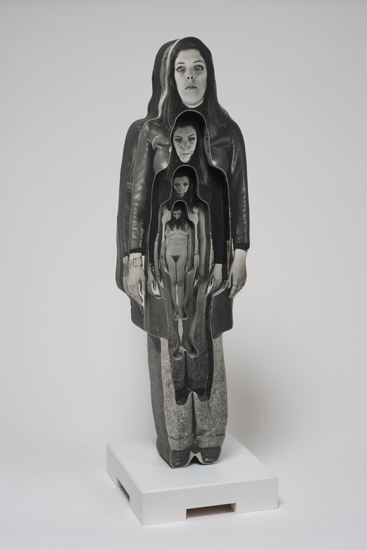
Dale Quarterman, Marvella, 1969, image via cherryandmartin

But anyway. Into the middle of this--my mulling over photo cutouts, that is, which only develops this tangent about prop pieces as I finally blog it out--comes "Photography into Sculpture," which just opened at Cherry and Martin, in sync with Pacific Standard Time. The headline image is above, Dale Quarterman's decoupage-y cutout, which reminds me a bit of that Homage to Muybridge series photo Lewitt did around the same time. These cutout/shaped/contoured works seem like examples of the working-over photography got at the hands of conceptualism. Interesting, if not entirely satisfying. [I'd originally said convincing.]

orozco_pma_photograv1.jpg

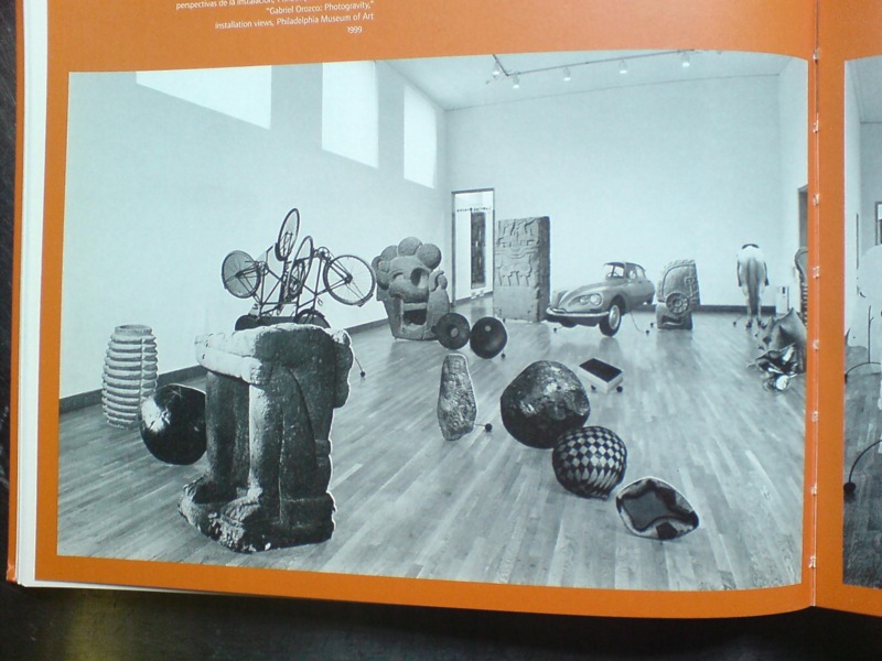
But if it helped till the soil that somehow led to Gabriel Orozco's 1999 show at the Philadelphia Museum, then it's fine. The icon, understandably, of Ann Temkin's show is Black Kites, Orozco's geometric pencil drawing on a human skull, which is flashy and awesome and all. But it also suffers in a way, as the precious, covetous acquired object of the PMA's affections. Like Hirst's skull writ small.

orozco_pma_photograv2.jpg
both images via the 2000 moca catalogue

Which is exactly the problem Orozco's photo cutouts, which made up the bulk of Photogravity, don't have. These flat, 3-D depictions of elements of his own works, mixed with photos of the Arensberg's collection of Pre-Columbian artifacts, were slight, obviously derivative, didactic, ephemeral. They were photographic sculptures of photographs of sculptures. Yet they seem to be nearly invisible online. The only Google Images result for them is an art history slideshow at SDSU, where they're labeled, of course, as "installation."

[Update: Talked to GO's people; it's a single work, and it was shown at MOCA, which I did not remember, and was considered for Tate. So now we know.]

Which doesn't exactly bring me back to where I started, which was this unexpected or overlooked formalist and subject context for Cady Noland. Or maybe it's the inverse: Cady Noland as an unarticulated context for this cluster of later [or sometimes nearly concurrent] work. I guess if I'd figured it out more, I would have written it sooner.

September 16, 2011

What Ikea Lack

Once again, I'm getting burned for procrastinating on a project. And once again, I'm forced to reckon with how susceptible we are to the illusion a company can create of cultural stability and reliability, even as it constantly effects changes that suit its own business purposes.

mari_effe_ikea_wood.jpg

Which is a lot to pile onto a tiny, cheap-ass Ikea Lack side table. Even before I finished my Ikea X Enzo Mari autoprogettazione table in 2009, I had the idea of making another one.

For the first, I'd found the single Ikea product that felt closest to the original lumber Mari specified for his designs: the unfinished pine components of the Ivar shelving system.

ikea_side_table_lack.jpg

I wanted to realize the second table, though, in the product that felt the most Ikea: the Lack table. The Lack collection is pure Ikea: high modern, highly engineered, and super-cheap. The Lack is a marvel of perfect crappiness: sawdust legs and honeycomb cardboard tops encased in a structural plastic shell. You can't cut a Lack without destroying it, but the series' tables and shelves all share proportional dimensions, so it's possible to tile them together.

mvrdv_boijmans_depot.jpg
my favorite Lack reference: MVRDV's 2007 proposal for the Boijmans von Beuningen Museum Depot in Rotterdam. Alas, unbuilt.

The other day when Man Bartlett posted on his tumblr about visiting Brent Birnbaum's studio, this awesome image made my heart leap--off the Ikea ferry, and then to promptly sink into the East River.

brent_birnbaum_ikea.jpg

On the wall of Birnbaum's studio is a piece called Untitled (Ikea), which is assembled from a veritable rainbow of Lack tables and shelves the artist has collected around town. It's like, "WHOA, DOUBLE RAINBOW!" And exactly the patchworked minimalist look I was hoping for.

And the killer thing is, when I came up with the idea 2+ years ago, there was a literal rainbow of Lack side tables stacked in a spiral on the catalogue cover and in every store. But when I finally decided to make it about eight months ago, I found that after introducing a bunch of pastel colors in 2010, Ikea had all but discontinued colored Lack, leaving just red, white and black, and just a couple of wood "effect" finishes. [Seriously "birch effect" is such a sad concept.]

ikea_lack_catalog_2010.jpg

I had some pieces that I'd stashed or stored: a navy blue shelf, dark grey and dark green side tables, and either dumped or gave away a while ago because seriously, it's Ikea. Just go get another one. But it's precisely this misplaced belief that it'll always be there that tripped me up. Ikea IS always full, and it DOES always look and feel the same in its way, but the specific products, even the iconic ones, are constantly in flux.

There were hints, warning signs, which I chose to ignore. A Lack side table was always ridiculously, disposably cheap: $12 or something. But in 2010, Ikea began value engineering them, eliminating packaging, and tweaking the materials a bit, to get the price even lower. For a while, they were $5.99. Now I think they're $7.99. Rationalizing inventory and SKUs was obviously part of this ongoing, profit-wringing process.

And that brings up the implications of Ikea's product choice winnowing, which are thoroughly depressing, yet fascinating. I've been scanning craigslist for months, trying to find any colorful Lack pieces. I've missed a couple in New York because I couldn't get them in time, and I found one pink table in Alexandria, Virginia. But otherwise, the craigslist selection is relentlessly constrained: it's almost entirely these fake wood finishes. And I can't tell what came first: Ikea's eliminating all color from their lowest-end table offerings, or the [$5 table-offloading] public's total embrace of printed plastic that simulates [and poorly] actual wood.

The greatest/saddest listing I saw was from an American University student, who described his Lack side table as, "exactly the same table that everyone else has." And it's becoming even more so every day.

So anyway, if you have a lead on some colorful Lack side tables or hanging shelves [medium or small], definitely drop a line. Because I'm definitely buying.

richter_squeegee_film.jpg

Gotta get a piece of that Gerhard Richter Painting. After completing a documentary about the artist's Cologne Cathedral stained glass windows in 2007, filmmaker Corinna Belz began working on another project, filming Richter at work in his studio. She waited a year and a half for the artist to begin a new series of abstract paintings, and then she pretty much filmed the whole process.

It's kind of crazy how jazzed I am after just watching the trailer. Those squeegees are so huge. And they're clear. And he wields them by hand. Some of this we [I] knew, but it's still kind of riveting to watch. Belz in an interview:

Books are a better medium to articulate theoretical positions. And the actual act of painting is hard to describe in words: The way Richter mixes primary colours on the canvas, generating such a complex colour system. How layers are built up and submerged, how sculptural they appear on canvas. The most important thing for me in this film was to show something uniquely visual.
In related news, I now have new iPad wallpaper [above].

Gerhard Richter Painting, dir. Corinna Belz [gerhard-richter-painting.de via scahweb]

September 15, 2011

Small World Keeps On Turning

david_byrne_globe_nymag.jpg
image: nymag

The awesomeness of David Byrne's giant, inflatable globe shoved under the High Line gives us a good chance to look back.

To remember David Byrne's pioneering show of PowerPoint Art at Pace in 2003.

david_byrne_yes_ppt.jpg

And also to hope that Joshua Foer's got someone updating his "A Minor History of Giant Spheres," which is, of course, my too-infrequently cited source of inspiration for my satelloon fixation.

flavin_beyeler_christies.jpg

When is a Flavin not a Flavin?

Lot 3 in the upcoming contemporary sale at Christie's London is a work by Dan Flavin, or at least part of one. Untitled (to Marianne II) is a signed diagram for a 1970 corner piece, entirely typical of the type of certificate Flavin used to issue when he sold a piece.

[UPDATE - SEE BELOW]

It includes instructions in Flavin's hand, "in blue and yellow fluorescent light, 8' high, 8' wide." But there is no hardware included in the lot. Which makes it the inverse of the scenario I wrote about for the NY Times in 2005:

Each of the more than 750 light sculptures that Flavin designed - usually in editions of three or five - were listed on index cards and filed away. When one sold, the buyer received a certificate containing a diagram of the work, its title and the artist's signature and stamp. If someone showed up with a certificate and a damaged fixture, Flavin would replace it. But without a certificate, the owner was out of luck. Today, Christie's won't even consider a Flavin sculpture unless it's accompanied by an original document.
And looking at the estimate, a scant £12-18,000, it's obvious, but unstated, that Christie's is not presenting this as a Flavin light work, but only as a work on paper. Ephemera, even. Otherwise, it'd be worth 50 times that, easy.

flavin_marianne_257.jpg

But wait, there's more! Tiffany Bell and Michael Govan's catalogue raisonne, Dan Flavin: The Complete Lights, lists the work, Untitled (Marianne) 2 [which is how it's actually signed] only in the Appendix, as a "companion" to Cat. 257, Untitled (Marianne) 1, which was shown in Flavin's October 1970 show at Castelli. Three of the declared edition of five were fabricated. One is in the San Diego Museum of Contemporary Art's collection, and has been widely exhibited since.

Marianne 2 was listed in Castelli's inventory, but "there is no record indicating that this work was ever fabricated." Yet the certificates usually didn't get made until a work was sold. And there are plenty of examples of works in the main CR which were nevertheless not fabricated.

And Christie's says the work was "Executed in 1972." And, I guess unsurprisingly, the auction house doesn't mention The Complete Lights and omits the usual "Literature" recitation at all. [Not that I think there's anything nefarious; the whole catalogue feels atypically ersatz. If the art market's booming again, its excesses are not being lavished on the publications team at Christie's South Kensington.]

Anyway, the provenance of the diagram/certificate is Galerie Beyeler in Basel, so no foolin' around there. Except that maybe this is another situation like Giuseppe Panza's, where the nature of the work, and the strictures on fabricating and hardware, etc. were vague or in flux, or lost in translation and never properly squared away. There were tons of unsold, hence unrealized editions in Flavin's estate when he passed away, so maybe the notion of resale rarely came up.

Or maybe there's more to the story of Untitled (Marianne) 2 than Christie's or even The Complete Lights is telling. If there were more documentation about the 1972 execution of the piece, perhaps.... A story about losing the hardware, or inadvertently throwing it out, maybe how this piece had different instructions, or the practice was different at the time, or something. Anything. But so far, I'm finding nothing. Very odd, and the possibility for a, who knows, really? A score? A pass? An odd lot tomorrow.

[UPDATE: It was nice to hear from the folks at the Flavin Estate, who say that Flavin would specifically write "CERTIFICATE" on his certificates, and this is not one. It is as Christie's presents it: a work on paper. Neither Christie's nor the Estate provided any additional insight into the "Executed in 1972" thing, though. And re-reading the catalogue raisonne text describing Marianne 2 as being "in the Flavin/Castelli inventory as an 8-foot square" which was "never realized," it still sounds like it had some status as a light work, not just a drawing or study. But the absence of hardware renders that moot. Except, again, for the "Executed in 1972" thing, which-- Anyway, net net, it sold for just £20,000.]

Lot 3: Untitled (to Marianne II), Dan Flavin, est. £12,000 - £18,000, but really, who knows? [christies.com]

sforzian_frontdrop_reuters.jpg

An extraordinary Reuters photo from the World Trade Center Mem--wait, I guess now we'd better make that "ordinary." Maybe add an integrated teleprompter or heads up display?

And Joe Biden complains that the Secret Service won't let him drive his Corvette off his driveway.

image: Reuters/Daily Mail via @wagnerblog

matt_connors_suitor_vw.jpg
My Suitor, Matt Connors, image: vwberlin

FInally, images of Matt Connors' show, Line Breaks, which just opened at VeneKlasen Werner in Berlin.

I've slowly/recently come to find his work rather captivating, and after he posted a teaser image or two of the Berlin show on his blog, I wanted to see more. Actually, I'd love to see it in person.

matt_connors_vw_wall.jpg
Second Wall for Jack Spicer, Matt Connors, image: vwberlin

It reminds me a bit, especially this large, wall-sized piece/installation, of a wonderful Rachel Harrison show I saw in Paris at Chantal Crousel in...1999? 2000? 1999. It seemed to be a situation, a year-end group show, where shipping her more typical large-scale sculptures was ruled out.

So instead, Rachel created large, wall-scale sculptural interventions on-site. I read them as slightly atypical, experimental, site-specific in ways that her work hadn't really been before then.

When I mentioned to her how nice the show looked, she sounded glad, and a little surprised. I got the feeling that an out of town show carried a different, distanced sense of accomplishment; without the feedback or dialogue, it could seem as if it hadn't happened.

Anyway, my rambling reminiscence was obviously not planned. It's just that the experience shortfall that emerges from not being able to see a particular show in person can be strong sometimes, and this is one of those times.

UPDATE: "wow. we are on a total matt connors freakout here at the rolu studio." Amen to that. Also, RO/LU has the pictures from Matt's other Berlin show [!] at Luettgenmeijer. More great painted prop works.

Line Breaks, Matt Connors, through 22 October [vwberlin.com]
also, another show I'm missing. BUSY : Matt Connors, "You're gonna take a walk in the rain and you're gonna get wet," at Luettgenmeijer through Nov. 5 [luettgenmeijer.com]
Matt Connors at Canada [canadanewyork]

vonna-michell_carefullyaimed.jpg

It was the other night, while Googling around for Tris Vonna-Michell info, that I found my way back to Carefully Aimed Darts, an awesome art-related weblog which went dormant about a year and a half ago. And I remembered how the very well-(in)formed writing had always left me wondering who was behind it. I'd go to openings or other art world gatherings and try to imagine meeting the writer behind CAD and not knowing it. Maybe I have, who knows?

Anyway, it turns out CAD had carefully aimed his/her camera at the microphone in Pershing Hall, on the Manhattan-side tip of Governors Island, where Vonna-Michell had performed in 2009 as part of a Creative Time show.

And there was this wonderful, slightly frayed-at-the-edges photomural of an aerial view of Governors Island, with lower Manhattan filling the top of the image. Judging by the state of the landfill beach that would become Battery Park City, I'd guess the photo was taken in the mid-1970s.

Tris Vonna-Michell: History-Telling [carefully aimed darts]

September 9, 2011

On Vern Blosum At MoMA

"You cannot imagine how happy I was to read your email."

That was the almost-immediate reply to my request to stop by MoMA's Painting & Sculpture department to discuss Vern Blosum and to review the collection file for Time Expired, the 1962 parking meter painting the Museum acquired in early 1963, just as Pop Art was evolving.

blosum_sjsu.jpg

When we met a couple of weeks later, Mattias, who managed P&S, told me that the Vern Blosum mystery had been nagging the department for years. And he wasn't kidding.

Shortly after the painting came into the collection, questions and rumors arose about its creator. Which I'll get to, but which were apparently answered well enough for Time Expired to go on view, and repeatedly, through the 1960s. As I mentioned last spring, as late as 1967, the NY Times was reporting on visitor questions which the museum would forward to the artists to be answered. Blosum replied that his parking meters formed "a series of time paintings culminating in a giant expiration." Which strikes me as a very conceptual, 1967 thing to have painted back in 1962.

But that's the last mention I've been able to find. It doesn't appear that Time Expired has been shown at the Modern since the late 60s. And I expect that is because of unanswerable questions Alfred Barr and Dorothy Miller had--and that their successors inherited--about Blosum's identity and its implications for their painting. It turns out in 1973 the museum took the extraordinary, even unprecedented step, of searching the birth and Social Security records in Colorado around the time Blosum's bio claimed he'd been born, trying to confirm that he existed. And when they couldn't, the painting went into some kind of archival limbo, a cold case file, which would periodically resurface to perplex curators and interns and archivists.

Which is all kind of amazing, when you consider where the Blosum came from in the first place: Leo Castelli Gallery.

vb_25min_small.jpg

So, my mind is kind of blowing because Vern Blosum is in a show opening tomorrow.

Blosum's work was included in some of the very first exhibitions of Pop Art in the early 1960s. His deadpan paintings of objects from New York City life: parking meters ticking down in five minute increments, like proto-serial art, were acquired by some of the most influential collectors of the day. Thanks to an emerging artist fund set up by Larry Aldrich, MoMA acquired a large Vern Blosum painting in 1963, which was regularly on view for many years.

And then he disappeared. No work, no shows, no nothing. I came across Verne Blossum [not sic] almost two years ago now, when his work Violation ran next to Warhol's in the Washington Post's March 1963 preview of Alice Denney's pioneering show, "The Popular Image."

Then I found the MoMA painting, Time Expired, and started digging.

I'm going to cut to the chase here and reveal that I have found Vern Blosum. I have met Vern Blosum. And I have seen Vern Blosum's work in person. And his story is utterly fascinating. As you may have intuited from the varied spellings as early as 1963, Blosum's own identity has been as much in flux as the history of Pop Art itself once was.

It's taken a while, and a fair amount of research, and negotiating, and puzzling, but I think it's alright to go ahead and tell Blosum's story now. Or at least to tell my story with Blosum, because the artist is still alive and working, and should have the prerogative of defining his own body of work.

Meanwhile, the immediate trigger for this post is an intriguing show that opens in Los Angeles tomorrow, timed to the Pacific Standard Time events. Cardwell Jimmerson in Culver City has put together "Sub-Pop," a survey of early, "non-famous" Pop artists. These are folks who featured prominently in the first draft of Pop's history, and who were included in Walter Hopps' and John Coplans' formative Pop exhibitions.

In "Sub-Pop," according to the gallery's statement,

the smug success sotry of Pop Art is replaced by a somewhat more poignant "failure" story, that loaded word defined in the reductive sense bequeathed us by Warhol as simply, "the failure to become famous."
While researching their show, the gallerists contacted me about Blosum [his West Coast spelling], and we were able to track down the Blosum painting that John Coplans had shown in "Pop Art USA," which he curated in 1963 at the Oakland Museum.

To get my own Blosum saga caught up, I'll start tonight with a post about MoMA's painting. And then next week, I guess, I'll tell about tracking down Blosum, and meeting him, and seeing his work. Because I think he's more than just an amusing story, or an overlooked artist; he and his work occupy a remarkable moment--and an important space, however tiny it may seem right now--in the history of contemporary art.

black_mirror_natl_gallery.jpg

So you should really read Daniel Kasman's review of the Venice debut of Mark Lewis's awesome-sounding short film, Black MIrror At The National Gallery, because Kasman is sensitive to both the tone and surprise/reveal of the film in a way that the official synopsis, oddly, does not.

Szekely_Miroir-Soleil-Noir1.jpg

But if you're not going to read either of those, I'll just say it sounds like Russian Ark meets 2001, with the Marquis de Custine replaced by Martin Szekely's silicon carbide "Black Sun" mirror, the Hermitage replaced by the National Gallery, and everyone and everything else replaced by Hendrick Avercamp's Dutch Golden Era tondo A Winter Scene with Skaters near a Castle.

avercamp_winter_scene_ngl.jpg

Sounds awesome.

Venice 2011. Art Is Terror from Any Other Angle [mubi.com]
Orizzonti - BLACK MIRROR AT THE NATIONAL GALLERY - MARK LEWIS [labiennale.org]
Miroir- Soleil Noir, 2007 [galeriekreo.fr]
Avercamp's A Winter Scene with Skaters near a Castle, 1609 [nationalgallery.org.uk]

billings_strafing1.jpg

Another inadvertent Google find, also from the World War II School of propaganda art. In anticipation for an invasion of Japan, 1945 LIFE Magazine wanted to give the general public a fighter pilot's-eye view of ground attacks.

billings_strafing_2.jpg

Perhaps because actual combat photos were deemed too sensitive or otherwise unsuitable, the magazine asked artist Henry Billings to create a series of strafing attack paintings.

Noted before the war for his machine age-themed murals, Billings' characteristically mild-mannered modernist/precisionist landscape style goes uncommonly well with the scenes of destruction from the air.

billings_strafing_3.jpg

But the most prominent thing in the images, no matter the sometimes dizzying orientation of the earth itself, is the central fixity of the P51 Mustang's reflective sight. A technological advance that only rolled out during the war itself, the gunsight's half-mirrored glass panel meant the pilot could maintain his fix on his target without lining his eyes up directly with the line of fire. It's an interesting perceptual concept to try to capture in a traditional landscape painting.

I don't know what happened to Billings' art career, but his posthumous market is pretty weak, with paintings and drawings selling in the low hundreds of dollars. [Oh, with the exception of this nice precisionist boatyard panel. Wow.] No word on the fate of the strafing paintings, though.

Ground Strafing - LIFE June 30, 1945 [google/life]

gc_photomural_loc.jpg

Instead of jumping to the first search result, Google's "I'm feeling lucky" button should go to something tangentially related but certifiably awesome and probably better than what you were looking for in the first place. For the first datapoint in fitting that algorithm, I submit this post from The Bowery Boys about the "World's Greatest Photo-Mural,' as proclaimed by the New York Herald upon the dedication on December 14, 1941 [!] of the Defense Bonds Mural in Grand Central Terminal, New York City, USA.

At 96x118 feet, and covering the entire eastern wall of the station's Great Hall, it was certainly the world's largest photomural to date. [Only an Axis appeaser would point out that it's actually six photomural elements installed in a larger, non-photographic composition.]

The mural was created by the Farm Security Administration's Information Division, the legendary New Deal documentary photography propaganda unit run by Roy [no relation to Ted] Stryker. The three main photocollaged panels depicted what America was defending: Our* Land, Our* Children, and Our* Industry. [* Offer apparently not valid for non-white Americans, as the NAACP pointed out in protest letters to the FSA.]

Classic racial exclusion notwithstanding, I was most amazed that a giant war bonds photomural in Grand Central Station was the government's instant response to the attack on Pearl Harbor. And I was also wrong. According to a contemporary report in Time Magazine, the FSA photo staff spent three months designing and fabricating the massive photomural. Which should be evidence enough for the conspiracy theorists who suspected that Stryker and his puppet FDR had been planning to get the US into war all along. But it turns out the Treasury Department had already begun its defense bond campaign in 1940, and that the government marketing masters at the FSA had already been enlisted in Treasury's bond-selling campaigns.

Which seems odd, that a Depression-era tenant farmer resettlement program would morph into a historically ambitious documentary project for rural America, and then into a war bond marketer, before becoming the military propaganda operation for D-Day. Odd until you hear Stryker's longtime assistant Helen Wool describe Stryker's vision of the FSA's photographic mission in a 1964 interview for the Smithsonian:

[I]n that drastic difference he still stuck to the same type of basic idea, that America is America and that's all there was to it. We had psychological warfare films, and we had displays, and we had defense bond things, and everything else. But, underneath it he was selling America as it should be sold. [emphasis added because, obviously]
So what does the 3-months making of the world's largest photomural entail? Fortunately, the snap-happy photographers at FSA like Edwin Rosskam and Marion Post Wolcott documented the process, in a group of 53-70 images now at the Library of Congress:

charles_george_twitter.jpg

I admit, after I saw the pair of Chucks, I was just waiting, pretty sure I'd get a post out of it no matter what. So kudos to Anil, who tweets quality.

September 3, 2011

Rijksoverheid Rood

rijks_study_485c.jpg

So.

Found the local Pantone shop and brought home a liter of Hollandlac oil-based enamel in Rijksoverheid Rood, aka PMS 485c.

Ordered some small galvannealed steel and white aluminum panels, both paint-ready, and cut as close to A4 as North Carolina metal shops not called Metal By The Millimeter are able to get. They arrived very neatly packed.

And so I used some of the packing to make a little nest, so they can be covered, with circulation, while the paint dries in between coats.

Diet Coke. Leatherman left in the car, whoops. Tape everything down. Float the panels on little bubblewrap sheets so I can get to/around the edge.

MIneral spirits to clean the surfaces. Oh, right, there's a protective film on the aluminum. More Diet Coke.

Do people really still listen to NPR all day? I can't imagine. I want listen to youarelistening.to, but New York is down, so I head to Montreal. Police scanner with that awesome Quebecois twang.

Nabisco Ginger Snaps, the dog biscuits of the gods. Seriously, how did I fall into this box of tough yet improbably delicious cookies? More Diet Coke.

Unwrap the brush. Open the can. Wow, it seems much oranger than the web version, or the offset ink version. Is it--no, it has to be right. The Netherlands has ceded sovereignty over their Central Government palette to Pantone, Inc., a wholly owned subsidiary of X-Rite, LLC of Grand Rapids, Michigan. One PMS code to rule them all.

Stare at the foam brush again, try to remember what she--no, I'm pretty sure she said she was using foam for acrylic enamel, not oil. Go with the brush, even though foam seems somehow less painterish, and thus less daunting,

Load is not quite the word for what I do to the brush. Introduce. Poke. Alight the brush with paint. Whatever it is, it's not enough paint. A fair amount of pull, this oil.

The steel panel is first. I really am not going to do a stroke-by-stroke account here. The steel feels better. The aluminum plate is so light, it moves with the brush; I have to hold it down. Paint's not as self-leveling as I was originally hoping.

I knew there will be extra coats; I'd hoped there wouldn't be much sanding. But there are definitely still brushstrokes in there. Texting with my brother-in-law, a highly skilled painter of entirely different types of monochromes, he diagnoses it immediately: 'the brush needs to be loaded and moved with confidence.'

I would probably say those are problems #2 and #1, respectively, but loading the brush will be much easier to address. I will leave my paranoia about little paint stalactites on the edges in the kitchen the next time I get a Diet Coke.

But of course, the next coat will only go on 24 hours or so from now. I guess I never quite understood how much of painting is waiting for the paint to dry.

We had a tree limb come down across our driveway last weekend--some freak weather thing, who knew?--and needed to rent a car for a couple of days.

dollar_foreman_desk.jpg

The checkout guy at National Airport was working off of this beauty, the Foreman's Shop Desk, by Relius Solutions.

At under $200, it looks like the cheapest decent foreman's desk out there, no finish fetish or unit construction, or whatever brings the double-to-triple prices. But to my eye, it has a winning simplicity. Had I rented an SUV, I might have just slipped the guy a Hamilton and loaded it into the back. Oh well.

Between 1981 and 1985, Paul Tschinkel and Marc H. Miller produced 17 episodes of ART/newyork, a subscription-based video magazine about contemporary art for use, incredibly, in public schools and libraries.

serra_82_intvu_artnewyork.jpg

Their 1982 interview with Richard Serra, a Yale classmate of Tschinkel's, came just as the Tilted Arc controversy was heating up. And speaking of heating up, hoo-boy, does Serra get going about the Pennsylvania Avenue Development Agency conflict with Robert Venturi. Fiery fun stuff.

His 1980 interview with Douglas Crimp covers a lot of the same PADC territory with a bit more specificity. By pointing out, for example, that Venturi's proposed motif was also favored by Albert Speers, not just that they might as well stick swastikas on Pennsylvania Avenue.

But his story about being told that he'd never get work in this town again is basically the same.

Also interesting, if less incendiary: Serra used to exhibit models of site specific projects-in-progress, such as this rather sexy steel tabletop version of Twain. Do want.

serra_twain_table_artny.jpg

ART/newyork - Richard Serra's Tilted Arc artist interview [98bowery.com]
order copies of ART/newyork to this very day [artnewyork.org]

I am aware of the work of Pablo Neruda Gerhard Richter.

demonstrative67_richter.jpg

I have not been reading Gerhard Richter: Writings 1961-2007 straight through, of course, but it's been with me a lot lately. And it's kind of annoyed me that there is not really anything about this incredible photo, showing part of the installation of Demonstrative 1967, Galerie Heiner Friedrich's weeklong exhibition at DuMont Publishers, down the street from the inaugural Cologne Art Fair, from which he had been excluded.

In addition to Richter, the display included works by his Capitalist Realist cofounders Sigmar Polke [I think that's a raster bild there on the left] and Konrad Lueg [the inflatable cube structures], as well as by Blinky Palermo, Reiner Ruthenbeck, the British painter John Hoyland--and Cy Twombly.

Now about that Richter. That giant color chart painting which looks like a folding screen. For a while, it threw me off precisely because it looked like a folding screen. Considering 1967 was also the year Richter started working with glass panes and doors and other materials that related to a painting plane but were not, I was wondering if this painted, free-standing panel object embodied some lost chapter in the color charts' "pop meets abstraction, quietly upends both" story.

Orrrr maybe, the painting was just too big to go on that wall, and Blinky needed that other wall, and Lueg's balloons block everything anyway, and what the hell, it's a week, and an art fair.

richter_ten_lg_colour_ch.jpg
Ten Large Colour Charts/ Zehn große Farbtafeln, 1966, via gerhard-richter.com

Because there is no color chart folding screen. That work is Ten Large Colour Charts (1966), a ten-panel painting in the K20 collection in Dusseldorf. It is one of the earliest color chart paintings Richter ever showed, but it's probably the first that many German art worlders ever saw. [Eighteen Colour Charts was the first first shown, in Richter's one-person show at Friedrich's Munich gallery in May 1967.]

Anyway, point is, or one point is, I think, that looking at Richter's color chart paintings, and his 4900 Colours grids before that, and his Cologne Cathedral stained glass window before that, and so on, changes the way you look at the world. And by you, I mean, of course, me. It changes the way you look at color samples, whether in the paint store, or at the moment, in a grid laid out on a governmental stylebook website.

richter_polke_tea.jpg

And it's not just a matter of this looks like that, or not entirely. Because there's also the context in which Richter painted his color charts--and the larger biographical/political context that shoots through Richter's entire practice. That Demonstrative 67 photo is in a spread with what may be my favorite snapshot in the Writings book: on the right there, not Table, 1962, CR-1 [!]--which, if Christopher Wool can take up painting with that thing already in the world, color charts are not gonna hold me back--the one on top, with the caption, "Polke and Richter families, 1965."

Oh, just drinking some tea with the kids and Uncle Rudi.

Chiang Mai farmer/laborer Lung Neaw has worked with RIrkrit Tiravanija for several years now. He helped build the artist's house. Tiravanija's footage of him has appeared in various gallery and museum installations.

And Saturday, Tiravanija's film, Lung Neaw Visits His Neighbors, will have its world premiere at the Venice Film Festival. Maybe there should be a spoiler alert somewhere, because from the synopsis, the title pretty much gives the entire 2.5 hour movie away.

In a Q&A on the Lung Neaw website the artist says he sees the film not as "a documentary and not a narrative, perhaps it's more of a portraiture."

He and his longtime Mexico City dealer's brother Christian Manzutto shot a week or so at a time:

So we shot over a period of two years and another to edit and postproduction, the film was really made very simply and with very little by way of crew and equipment, in that relationship for me very much like a documentary but also very much like how an artist would approach the production, also with very small but cost-effective budget. We shot in film (super 16mm) so rather small and light unit but with frames and quality which was not video.
An interesting choice, and an interesting approach. Two of his galleries, kurimanzutto and Gavin Brown's Enterprise, have associate producer credit.

See the Lung Neaw Visits His Neighbours trailer [vimeo]
Thai media article on the project: Lung Neaw goes to Venice [nationmultimedia.com]

"Decent people really didn't live below 40 stories above the street." -Syd Mead

Oh man, the groovy disco music that opens this 1982 13-minute, making-of convention reel for Blade Runner tells you all you need to know.

There are nice, matter-of-fact interviews with the movie's design principals, Scott, Mead and Trumbull, but the best thing is the lights-on footage from the set and the model shop.

[via openculture.com]

Since 2001 here at greg.org, I've been blogging about the creative process—my own and those of people who interest me. That mostly involves filmmaking, art, writing, research, and the making thereof.

Many thanks to the Creative Capital | Warhol Foundation Arts Writers Program for supporting greg.org that time.

comments? questions? tips? pitches? email
greg [at] greg [dot ] org

find me on twitter: @gregorg

about this archive

Posts from September 2011, in reverse chronological order

Older: August 2011

Newer October 2011

recent projects, &c.


our_guernica_cycle_ivanka_320px_thumb.jpg
Our Guernica Cycle, 2017 –
about/kickstarter | exhibit, 2017


pm_social_medium_recent_proj_160x124.jpg
Social Medium:
artists writing, 2000-2015
Paper Monument, Oct. 2016
ed. by Jennifer Liese
buy, $28

madf_twitter_avatar.jpg
Madoff Provenance Project in
'Tell Me What I Mean' at
To__Bridges__, The Bronx
11 Sept - Oct 23 2016
show | beginnings

chop_shop_at_springbreak
Chop Shop
at SPRING/BREAK Art Show
curated by Magda Sawon
1-7 March 2016

do_not_bid_or_buy_iris_sidebar.jpg
eBay Test Listings
Armory – ABMB 2015
about | proposte monocrome, rose

shanzhai_gursky_mb_thumb.jpg
It Narratives, incl.
Shanzhai Gursky & Destroyed Richter
Franklin Street Works, Stamford
Sept 5 - Nov 9, 2014
about | link

therealhennessy_tweet_sidebar.jpg
TheRealHennessy Tweets Paintings, 2014 -
about

sop_red_gregorg.jpg
Standard Operating Procedure
about | buy now, 284pp, $15.99

CZRPYR2: The Illustrated Appendix
Canal Zone Richard Prince
YES RASTA 2:The Appeals Court
Decision, plus the Court's
Complete Illustrated Appendix (2013)
about | buy now, 142pp, $12.99

weeksville_echo_sidebar.jpg
"Exhibition Space" @ apexart, NYC
Mar 20 - May 8, 2013
about, brochure | installation shots


HELP/LESS Curated by Chris Habib
Printed Matter, NYC
Summer 2012
panel &c.


drp_04_gregorg_sidebar.jpg
Destroyed Richter Paintings, 2012-
background | making of
"Richteriana," Postmasters Gallery, NYC

czrpyr_blogads.jpg
Canal Zone Richard
Prince YES RASTA:
Selected Court Documents
from Cariou v. Prince (2011)
about | buy now, 376pp, $17.99

archives